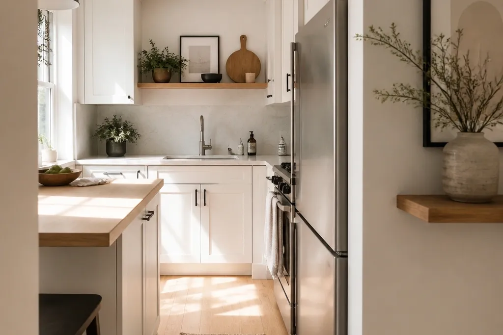
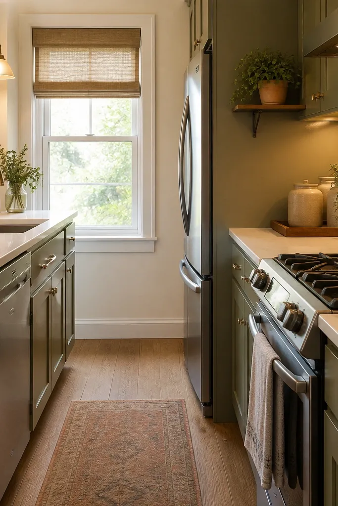
1. L-shape counters with a 30-inch peninsula and two pendant lights
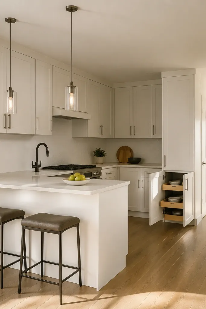
Start by placing the peninsula so the walkway from the entry to the far corner stays at about 36 inches. Use a 30-inch peninsula depth (from cabinet face to countertop edge) and set the overhang to about 10 to 12 inches for stool seating. Install two pendants with 24 to 28 inches of spacing between them, then hang them 30 to 34 inches above the countertop surface. Choose a backsplash that visually ties the peninsula to the main run — I like white subway with gray grout because it keeps the lines crisp. Budget-wise, you’re mostly paying for the pendants, stools, and backsplash tile; the cabinet layout is already doing the heavy lifting.
This layout is the one I copy most for small kitchens because it creates a second work surface without turning the room into a hallway. The peninsula width matters: around 30 inches gives you enough knee space for two stools while still leaving room for cabinet doors to open cleanly. I pair it with pendant lights because the light becomes a visual divider — it tells the eye where the “kitchen zone” ends and the “eating zone” starts. Keep the pendant cords the same length and aim the bulbs slightly above the countertop so the area looks styled, not accidental. For decor, I repeat the same finish twice — black hardware and black pendants — so the whole setup reads cohesive in photos.
Common mistakeDon’t center stools under the pendant cords — center them under the countertop seam so the seating looks aligned.
Try thisHang pendants with identical shades and bulbs. A mismatched mix makes the peninsula look like a temporary workaround.
2. Galley kitchen with a full-height fridge wall and a single continuous backsplash
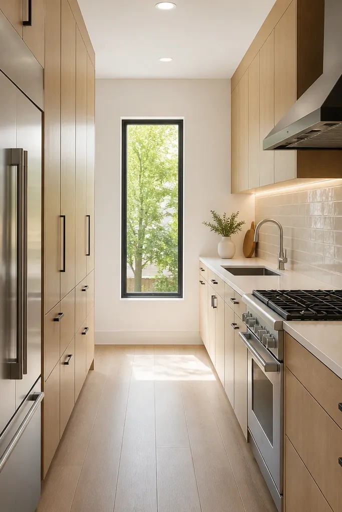
Measure your galley width and aim for 30 to 36 inches between opposing counters. Choose a backsplash tile size that helps the line stay clean — I use long thin tiles or a simple subway pattern with consistent grout width. Start tile installation at the countertop and keep the same grout color throughout to avoid visual breaks. Add two slim shelves on the non-fridge wall, placing them 18 to 20 inches above counter level so cups and tins look at eye height. Cost is mostly tile and any shelf hardware; if you already have a backsplash, refresh it with a matching tile sheet or a high-quality peel-and-stick sample first.
Galley kitchens look best when you stop decorating every surface and instead create one long visual story. Put the fridge and pantry on one wall so the opposite wall can stay calmer, then run the backsplash in one continuous field from sink to stove. That uninterrupted line makes the room feel longer and more intentional, which is what you want when you’re trying to make Small Kitchen Decor ideas look planned. I like warm white tiles here because they reflect light down the corridor without turning the space cold. For decor, use open shelves sparingly - one shelf run for everyday items and a second shelf for a single color group. The runner rug also helps photos; it gives the eye a “floor line” to match the backsplash line.
Common mistakeSkip bulky decor on the counters — in a galley, counter clutter blocks sightlines and makes the walkway feel tighter.
Try thisUse one runner rug pattern with a low-contrast design so it doesn’t compete with the backsplash line.
3. U-shape cabinets with a window-centered sink and a slim curtain panel
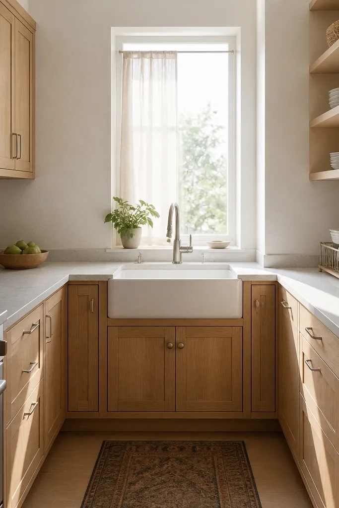
A U-shape makes small kitchens feel bigger when the sink is centered under the window. That window becomes your visual “breathing spot,” and the decor can frame it instead of fighting for attention. I keep the hardware and faucet finish matched (brushed nickel to brushed nickel) because the eye already has to handle a lot of lines in a U-shape. The curtain decision is simple: a slim Roman shade or a tight panel in white keeps the window bright and stops the room from looking heavy. For decor, I use a small shelf above the side counter with only a few items — ceramic canisters in one tone — because the U-shape naturally creates multiple surfaces that can clutter. The result is a kitchen that feels curated without needing extra furniture.
Center the sink so there’s equal space left and right of the window frame, then align the faucet with the window centerline. Use a Roman shade or a straight panel that hangs 1 to 2 inches above the window trim so it looks built-in. Keep the backsplash consistent across the U-shape, and choose a grout color that blends into the tile — gray grout on white tile is my go-to. Mount shelves above the side counter at about 70 to 78 inches from the floor, and keep shelf items to three canisters plus one small tray. Plan for a modest cost: shade, shelf hardware, and canisters; the layout itself does most of the work.
Hang a small framed print at the same height as the window sill, not above the cabinets. It looks intentional and doesn’t crowd the U-shape lines.
Don’t put a tall curtain in a U-shape. It breaks the window’s alignment and makes the room feel tighter.
4. Single-wall kitchen with a 24-inch dining drop table and wall rail
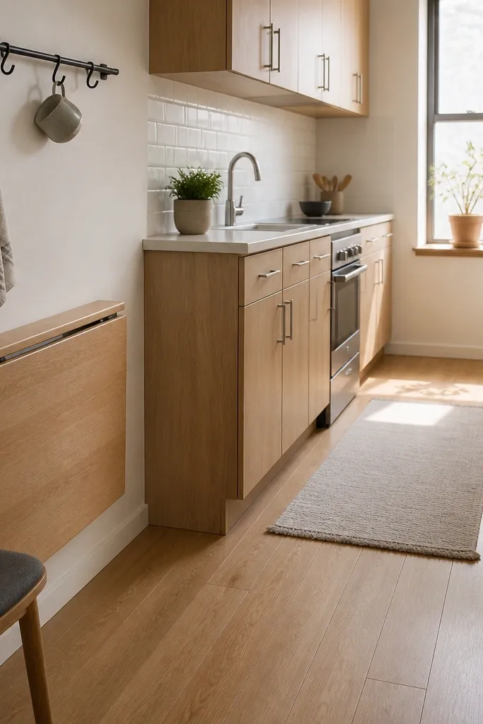
When you only have one wall for the kitchen, the decor has to work like a stage set — clean, repeatable, and easy to live with. A 24-inch drop-leaf dining table solves the “where do we eat” problem without adding a permanent piece that blocks the walkway. I pair it with a wall rail because it moves hanging items off the counter and makes the wall look styled, not empty. Choose a rail in the same finish as your cabinet pulls so the wall reads cohesive. The glossy backsplash tile adds light bounce, which helps single-wall kitchens feel less flat. For Small Kitchen Decor ideas, this is the combo I’ve seen look best in real homes: functional wall storage plus a dining surface that stays out of the way.
Install the wall rail under the upper cabinets at about 2 to 3 inches below the cabinet bottom so mugs hang without hitting the backsplash. Mount it across the main cooking run, not the far end, so it supports the most-used items. Add a drop-leaf table with a folded width that leaves at least 30 inches of walkway when opened. Set the table so one leaf lines up with the countertop edge, which makes the transition from cooking to dining look smooth. Cost is moderate: rail hardware and a dining table; you can keep spending low by using existing cabinet finishes and focusing on the rail and backsplash sheen.
Use matching mug colors for the rail. Even three mugs in the same tone makes the wall look designed.
Don’t hang heavy cookware from the rail. It pulls the look downward and can sag over time.
5. L-shape with a 12-inch open-shelf niche and a counter-height bar
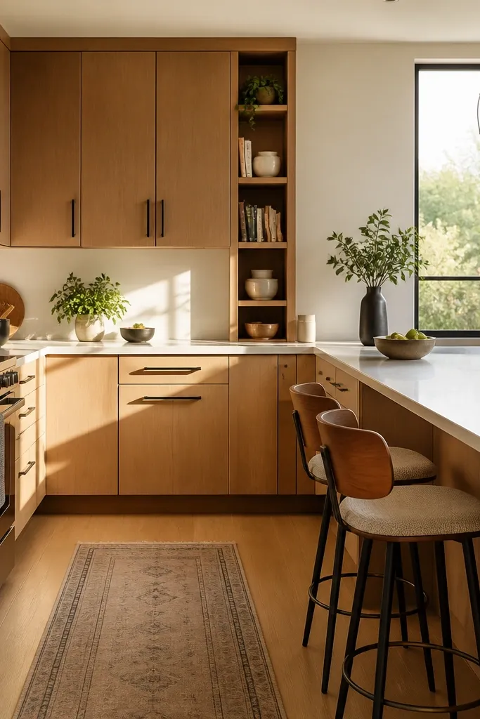
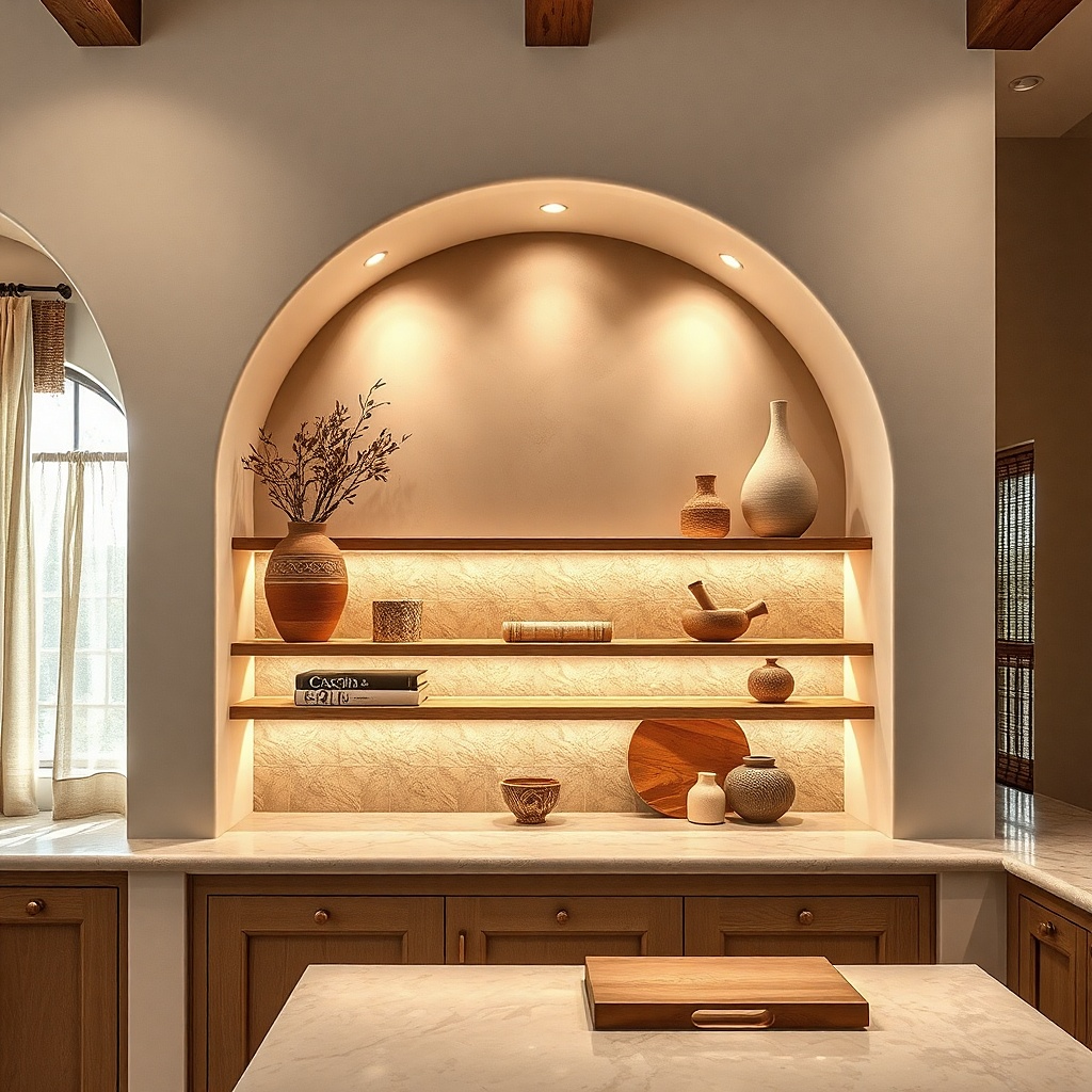
This layout works when your L-shape has a dead corner where nothing looks right. A 12-inch open-shelf niche gives you a place to display small decor without taking counter space, and the shelf width is wide enough for real items, not just tiny knickknacks. I like placing the niche near the bar corner because it becomes a focal point as you walk in. The counter-height bar then handles daily meals, while the niche handles visual interest. Keep your color story simple: one warm neutral on the backsplash, one wood tone in the floor or shelves, and matching metal finishes. It reads warm and intentional, which is exactly what you want from Small Kitchen Decor ideas when space is tight.
Pick the corner spot where traffic doesn’t pass and measure for a niche depth of about 10 to 12 inches. Frame it so the shelves sit level, then install two or three shelves with a slight lip to stop items sliding. Build the counter-height bar at the L-corner with about 24 to 28 inches of length for two stools if space allows. Place bar stools with backs only if they don’t hit the lower cabinets when you sit. For decor, use items that add height variation — bottle necks, a tall vase, a small tray — and keep them in one or two colors to avoid visual chaos.
Add a small LED puck light inside the niche. The shelf looks styled even when the main lights are off.
Skip mixed metal finishes in the niche area. It makes the corner look messy instead of designed.
6. Corner sink with diagonal tile backsplash and a tall pantry column
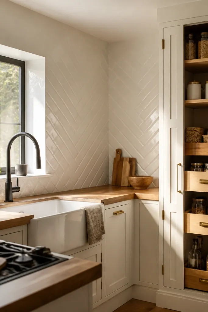
Plan the corner sink so the faucet clears the window or cabinet door swing, then keep the distance from sink to stove within about 48 inches if possible. Install the diagonal backsplash using a chalk line to keep the diamond pattern aligned with the countertop edge. Use the pantry column to break up the visual load — place it near the fridge or main prep wall. Add a pull-out trash or recycle unit under the corner counter with a width that fits your trash bins, usually 15 to 18 inches wide. Budget depends on tile, but you can keep costs reasonable by using a small tile size and limiting the diagonal pattern area to the full backsplash run.
Corner sinks can feel awkward, but they look amazing when the backsplash creates a deliberate “movement” line. The diagonal tile pattern draws the eye into the corner instead of letting it feel like a dead end. Pair that with a tall pantry column so you get vertical storage that makes counters look calmer. I also like narrow pull-out bins under the corner counter because they solve the practical mess that usually accumulates there. For decor, keep it minimal near the sink — one plant, one tray, one utensil crock — because the diagonal tile already gives you personality. This layout is a strong pick when you want Small Kitchen Decor ideas that look bold but still liveable.
Common mistakeDon’t place a lot of decor on the corner sink ledge. The diagonal pattern already pulls attention there.
Try thisUse a matte grout sealer on diagonal tile. Glossy grout shows every tiny flaw and makes the pattern look uneven.
7. Straight galley with open shelving above the stove and a magnetic knife strip
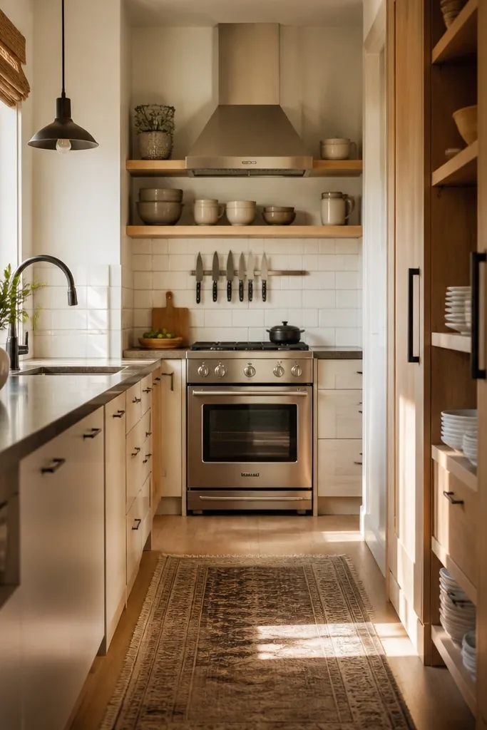
When you have a galley, you don’t need more cabinets. You need decor that turns into storage and stays visible, without blocking the walkway. Open shelving above the stove looks great when it’s the same width as the hood and the shelf depth is shallow enough that items don’t jut out into the corridor. I add a magnetic knife strip because it keeps knives off the counter and makes the backsplash area feel intentional. Use stainless and black accents together — stainless knives with a black hood or black faucet look clean. For Small Kitchen Decor ideas, this layout works because it gives you a “vertical rhythm” that balances the tight horizontal space. The counters stay clear, and photos look tidy even when you’re living there.
Mount open shelves so the bottom shelf sits about 18 to 20 inches above the stove top, then keep shelf depth around 6 to 8 inches. Install the magnetic strip directly adjacent to the backsplash line so it looks like part of the wall design, not a separate gadget. Choose a hood width that matches the stove width, then keep the backsplash tile consistent under the hood. Add one bistro table at the far end only if you can maintain a 30-inch walkway when the chair is pulled out. Cost is moderate: knife strip and shelf hardware are affordable, and the biggest expense is custom shelf brackets if you need them to span uneven studs.
Put only cookware you actually use on the top shelf. A shelf full of random decor makes the kitchen look crowded fast.
Skip long, heavy shelf brackets that stick out. They catch on clothing and make the corridor feel narrower.
8. U-shape kitchen with a slim appliance garage and a contrasting tile band
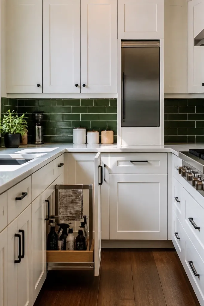
Decor looks better when it has a job, and this one has a clear job: the tile band gives you a color moment without turning the whole backsplash into a pattern fight. In a U-shape, you get multiple backsplash runs, so the band needs to be continuous across them to look cohesive. I also like a slim appliance garage because it hides bulky items that make counters look cluttered — every small kitchen has at least one offender like a toaster or blender. The cabinet doors keep the look clean, and the tile band keeps the wall from reading flat. This setup makes Small Kitchen Decor ideas feel intentional because the color is controlled and the surfaces stay open for daily use.
Install the appliance garage with a width that fits your largest appliance base, usually 10 to 12 inches for a toaster, but measure yours first. Keep the garage door aligned with the cabinet face so it doesn’t look like an add-on. Choose a contrasting tile band height of about 6 inches and run it at the same level across the entire U-shaped backsplash. Place under-cabinet lighting 1 to 2 inches from the front edge to reduce shadows on the counter. Cost is mostly tile band materials and the appliance garage carpentry or ready-made insert; you’ll save money by keeping the rest of the backsplash simple.
Use terracotta or muted clay in a band, not as loose decor. It stays photogenic without cluttering your counters.
Don’t pick a tile band color that’s also in your rug and curtains. If three items compete, the kitchen looks busy.
9. Open-plan kitchen corner with a built-in banquette and round chandelier
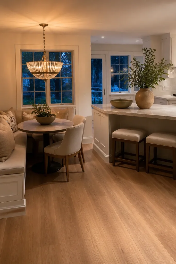
Build or install the banquette with a depth around 18 to 20 inches and a seat height around 18 inches for comfortable dining. Add a backrest height of 10 to 14 inches so the space looks finished rather than like a bench. Hang the chandelier so its bottom is about 30 to 34 inches above the seat or dining surface. Use a consistent art grid on the wall above the banquette — for example, three frames aligned in a row with the same top edge height. Cost depends on construction, but you can do it with a pre-made banquette kit or a custom carpenter; the chandelier is the main visual spend.
This is one of my favorite Small Kitchen Decor ideas because it changes the “kitchen problem” from lack of space to lack of seating options — and it fixes it with built-in comfort. A banquette takes up the same footprint as a narrow table but looks cleaner because it hides legs and clutter. The round chandelier softens the hard lines of cabinets and makes the corner look cozy in photos. I keep the banquette cushion in a light neutral so the room stays bright, and I use a matching frame color for the art so it doesn’t scatter visually. Most importantly, the banquette wall becomes your decor wall, so you don’t have to overload the counter.
Common mistakeSkip deep, dark cushion fabric. It makes the banquette look like a block in tight corners.
Try thisUse slipcovered cushions or removable covers. Small kitchens get spills; removable fabric keeps the look fresh.
10. Floating shelves over a narrow countertop with a two-tone cabinet scheme
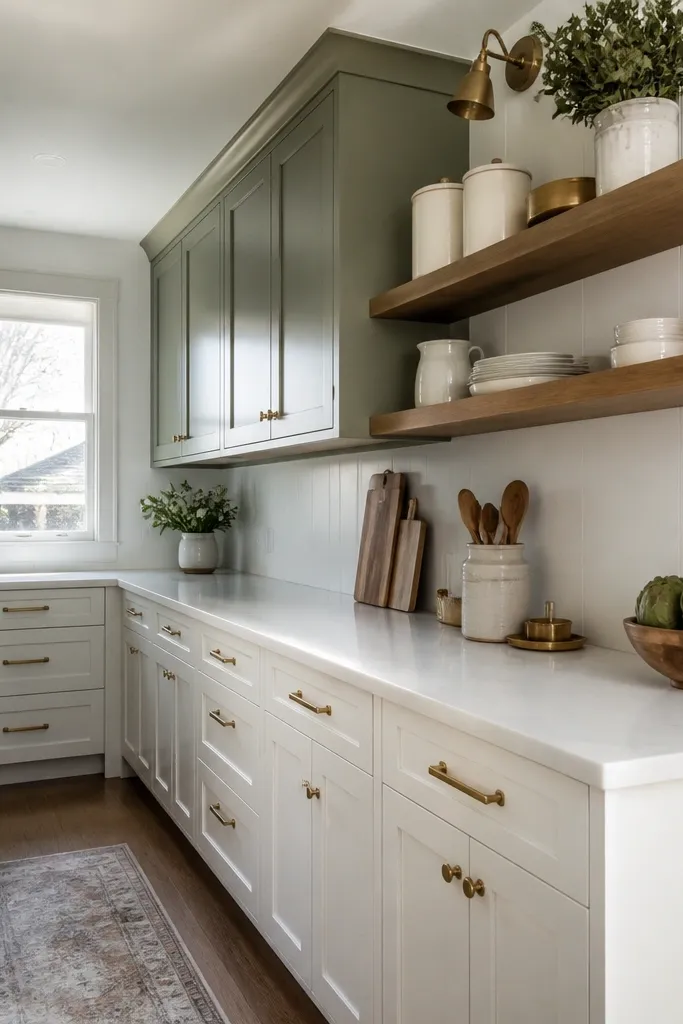
Paint or finish uppers in a soft sage tone and keep lowers white for contrast; keep the sheen semi-matte so fingerprints don’t show as much. Install shelves at two heights: one shelf about 12 inches above the countertop for everyday bowls, and the second about 6 inches higher for cookbooks or decorative items. Mount the shelves with level marks and use at least two studs for each bracket if possible. For decor, keep shelf items in sets: three bowls of the same color family, one cookbook stack, and one tray. Cost is moderate: paint is the biggest variable, plus shelf hardware and a mirror if you need it.
Two-tone cabinets look great in small kitchens when the color split is deliberate and the upper area stays visually light. In this layout, soft sage uppers keep the room from feeling stark, while white lowers anchor the counter. The floating shelves then add storage without adding heavy cabinet bulk — and they also give you a place to style a small kitchen without filling every surface. I like oak shelves because they warm up the sage and make the kitchen look lived-in, not sterile. Add a narrow mirror on the adjacent wall and the kitchen picks up more light, which helps the decor look crisp even in dim hours. This setup is all about creating “layers” — cabinets, shelf styling, and a glossy backsplash that catches light.
Common mistakeDon’t mix too many colors on the shelves. Two-tone cabinets already add color; keep shelf items in the same palette.
Try thisMake one item on the shelf tall and one item low. That height contrast stops shelves from looking flat.
11. Corner banquette style stool seating with an L-counter and vertical stripe backsplash
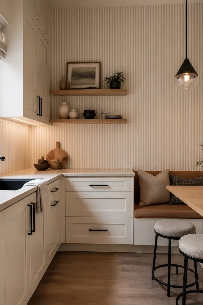
If your small kitchen feels short or boxy, vertical accents fix it. A vertical stripe backsplash draws the eye up, and it also makes the corner feel purposeful when you’re using stool seating instead of a full table. I like pairing the stripe pattern with light wood and white because the stripes stay subtle and don’t turn into a busy wallpaper look. The backless stools tuck in tight, so the decor stays visible and the kitchen stays usable. Add a tall, narrow mirror to the adjacent wall and you get extra height in photos. This is one of those Small Kitchen Decor ideas that looks styled because the pattern does the heavy lifting.
Place the L-counter so the corner has enough room for two stools without blocking cabinet doors — aim for about 28 to 30 inches of clear corner width. Choose vertical stripe tile accents and keep them consistent across the backsplash height, usually from countertop to upper cabinet bottom. Install stools with seat heights around 24 to 26 inches if your counter is about 36 inches tall. Mount the corner shelf high enough that items don’t look crowded — about 74 inches from the floor works well. Cost is mainly the tile and mirror; keep the rest simple with light finishes so the stripe pattern stays the focus.
Use a matte white or soft gray jar set on the shelf. Glossy ceramic can reflect light and make stripes look uneven.
Skip thick, high-contrast stripes. In a small kitchen, bold stripes can overwhelm and shrink the room visually.
12. Galley with a single tall open pantry tower and a pull-out trash drawer
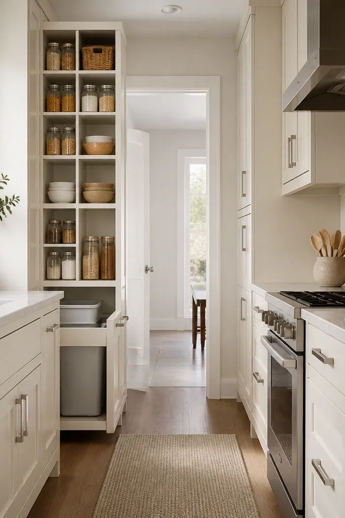
Measure for a pantry tower width that matches your cabinet run — usually 18 to 24 inches. Build or buy a tower with shelves spaced for jars, around 10 to 12 inches apart in height. Install a pull-out trash drawer under the counter with a width that fits your trash bins and a depth that clears plumbing — most setups need about 18 inches of usable depth. Keep the backsplash neutral and consistent from sink to stove so the pantry grid becomes the main visual. Cost is reasonable if you choose a simple open-frame pantry and spend on hardware and a quality drawer slide.
In small kitchens, clutter shows up fast because the room has fewer surfaces to hide mess. This layout reduces the problem by giving you one vertical storage zone that looks decorative instead of chaotic. A tall pantry tower lets you keep jars, bowls, and dry goods visible, and it also gives you a consistent “grid” that looks good in photos. The pull-out trash drawer is a small practical win that keeps the counter clear near cooking. I pair neutral stone-look tile with an open pantry frame in the same color as cabinet hardware so everything feels aligned. For Small Kitchen Decor ideas, this is the trick: make storage look like decor and decor look like storage.
Common mistakeDon’t mix random box packaging in the open pantry. It turns the tower into a clutter magnet.
Try thisUse uniform jar labels or matching jar lids. The pantry looks styled even when you’re just refilling it.