1. Reclaimed-wood tray shelf with two apothecary jars
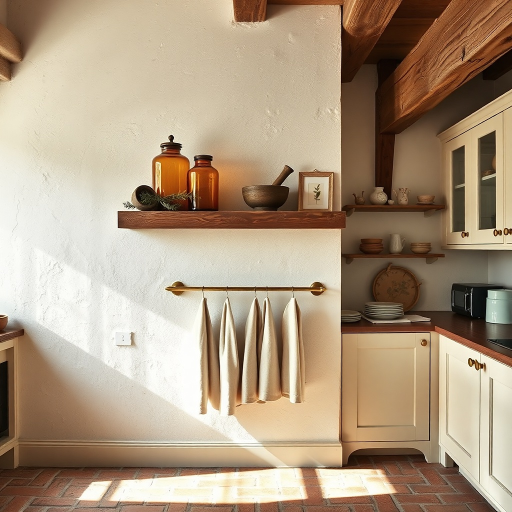
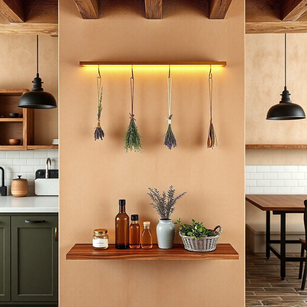
This is the quickest way to make a kitchen wall feel styled without turning it into a storage shelf. The reclaimed-wood tray gives you farmhouse texture, while the two apothecary jars keep the look modern and controlled. Pick jars in clear glass with black lids or warm amber glass with a simple metal top. Hang it where the wall has breathing room usually to the side of the range or above a dining nook so the jars read as a vignette instead of clutter. Keep the wood tone consistent with your cabinet hardware or floor stain for a unified look.
Start by choosing a tray-shelf about 18 to 24 inches wide. Mount it so the shelf top lands around 62 to 66 inches from the floor, then place the jars centered with 2 to 3 inches of space between them. Add one small element on the tray (a ceramic spoon rest, a folded linen napkin, or a single wooden utensil) so the composition looks intentional. Use 2 wall anchors if you’re mounting into drywall, and keep the jar arrangement symmetrical — it photographs cleanly.
Try thisUse matte black or oil-rubbed lids so the glass doesn’t look shiny in kitchen lighting.
Common mistakeAvoid mixing three different wood tones on the same wall.
2. Black metal and wood framed recipe print set (3 verticals)
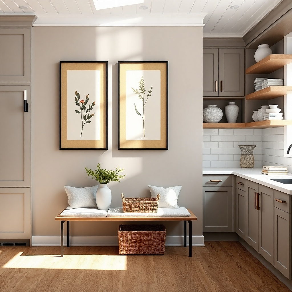
Three vertical recipe prints create a modern farmhouse line that works beautifully in kitchens because it echoes the vertical rhythm of cabinet doors and pantry shelving. The black metal frames give crisp contrast, while the warm wood matting keeps it from feeling cold. Choose prints with limited ink colors black, charcoal, and one muted accent like sage or wheat. This idea is especially good for a wall near the breakfast area where you want visual interest but don’t want heavy decor blocking sightlines.
Pick three frames that are the same size, ideally 8x20 or 10x22 inches each. Space them with 2 to 3 inches between frames and align the top edges. Use painter’s tape to mark the centerline, then measure so the center of the middle frame lands at about 57 to 60 inches. Mount with picture hangers rated for the frame weight so the frames sit perfectly flat.
Try thisIf you want it to look higher-end, use museum glass or acrylic to keep glare down under overhead lights.
Common mistakeDon’t use different frame widths — the mis-match reads sloppy in a kitchen.
3. Oversized linen-framed botanical panel above the table
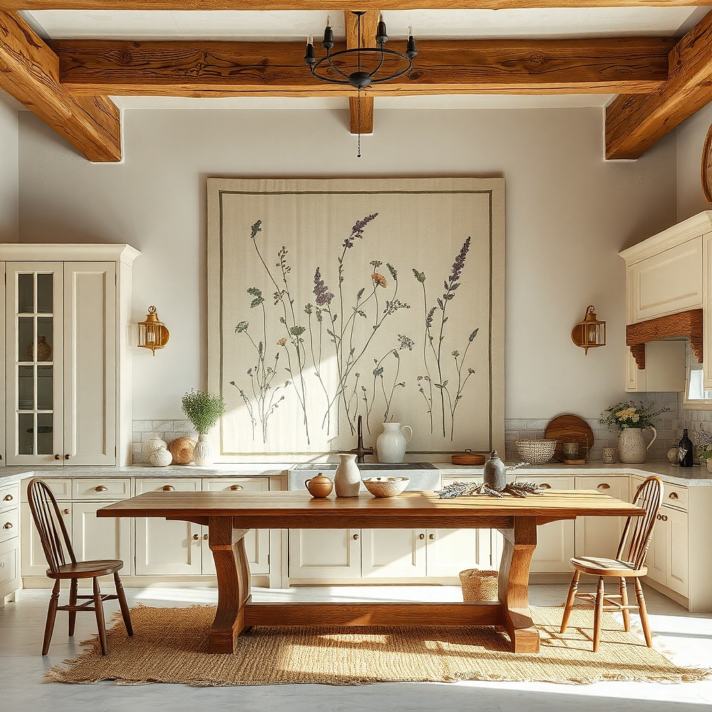
A single oversized panel is the best fix for a dining-area wall that feels plain. Linen texture reads farmhouse immediately, but the clean border and botanical print keep it modern. Go for a light wood frame in a natural oak or pale walnut stain so it brightens the space. Place it above the table so it becomes the visual “ceiling” for your dining zone. The result looks styled in daylight and still looks intentional at night because linen hides glare.
Choose a panel roughly 30 to 40 inches wide so it spans most of the table width. Hang it so the bottom edge sits 8 to 12 inches above the tabletop. Use a level and mark two mounting points on the wall first, then attach the frame hardware. Add a pair of matching sconces or a pendant light below if you already have them — it will frame the panel in photos.
Keep the botanical palette muted (sage, clay, or oat) so it doesn’t clash with everyday dishes.
Avoid glossy prints behind glass — kitchen lighting will smear reflections.
4. White ceramic wall pockets for herbs (set of three)
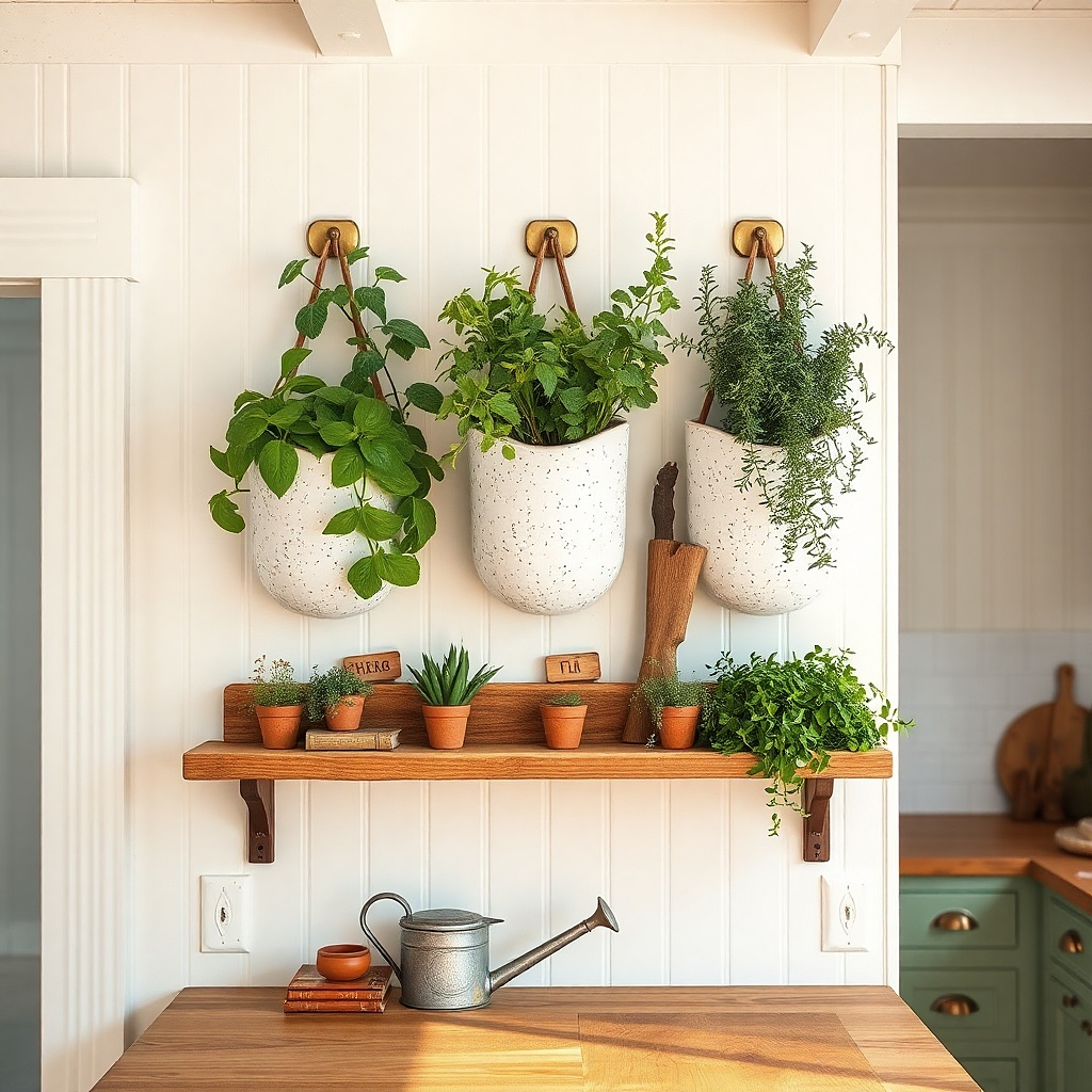
Wall pockets are a practical decorative trick: they add shape, vertical interest, and a farmhouse nod without taking up counter space. Ceramic pockets in white with subtle speckling look modern when you keep the styling minimal. Use three pockets in a straight vertical line or two on top and one centered below, depending on your wall height. This works especially well near a coffee station or small dining corner where you want a tidy, lived-in look. Choose faux or real herbs that don’t shed, because kitchens are drafty and dust collects.
Mount pockets 6 to 10 inches apart vertically so they don’t look squished. Start by positioning the top pocket with its bottom edge at about 64 inches from the floor, then place the other pockets below using the same spacing. Use anchors if mounting over plaster or drywall and confirm the pocket has a back hole for screws. Style each pocket with one herb stem cluster, not a bundle — keep the silhouette narrow.
Use the same herb color across all three pockets so the wall looks planned, not improvised.
Don’t overfill pockets — crowded greenery turns into visual noise.
5. Wood slat shadowbox with a single black-and-white photo
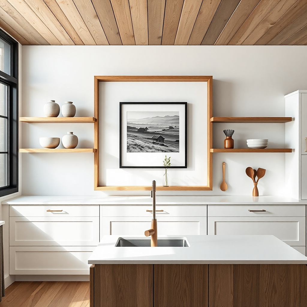
A shadowbox gives you depth, and depth is what makes wall decor feel expensive. Wood slats create farmhouse texture, while a single black-and-white photo keeps it modern and clean. Use a photo with strong negative space architecture, a simple landscape, or a close crop of a utensil so it doesn’t compete with the kitchen’s daily activity. This is a smart pick for a wall that sits near a window because the slats cast soft shadows that change through the day.
Buy or build a shadowbox about 20 to 24 inches square. Place the photo centered, then add a cream mat board behind it so the black-and-white has room to breathe. Mount at the 57 to 60 inch center height rule. If you’re DIYing, use 1x2 slats for the frame and finish with a matte clear coat to avoid glare.
Try thisChoose a cream mat, not bright white, so the photo looks warmer against kitchen tones.
Common mistakeAvoid busy photos with lots of dark elements — slats already add visual texture.
6. Vintage-style clock with distressed wood frame
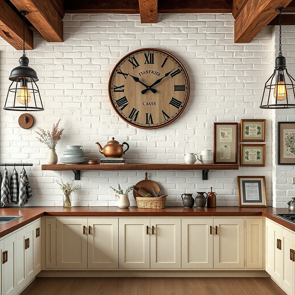
A kitchen clock is decor that also makes sense, and farmhouse versions look great when the frame is distressed but not messy. Pick a round clock with a wood frame in a medium oak or walnut tone, and keep the face simple with black hands. Hang it where it’s visible from the table usually 58 to 60 inches center height. This works well when you don’t want to commit to art prints or you have a wall that needs one clear statement piece.
Choose a clock with a diameter around 14 to 18 inches. Mark the centerline on the wall, then mount using the included bracket or hook. Keep the clock centered above a console or in the open wall space between cabinets and a window. If your backsplash is busy, place the clock on the wall section that’s mostly blank so it doesn’t look crowded.
Try thisUse black numerals or a minimal dial so the clock matches modern hardware.
Common mistakeAvoid oversized clocks above small walls — it swallows the space.
7. Two-tier cane basket wall organizer (decor + storage)
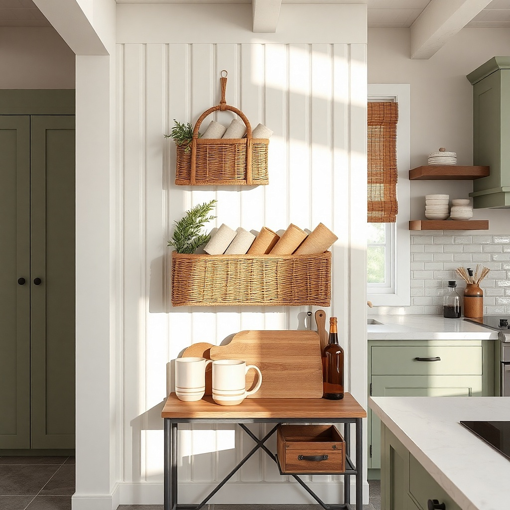
Cane baskets bring farmhouse texture fast, and a two-tier format keeps it from looking like a single random basket. The key to making it look modern is a clean mount line and minimal styling inside. Use baskets in natural cane with a light finish, then add folded linen napkins, small ceramic bowls, or a utensil roll. This works on a kitchen wall near the entry to the dining area or next to a sideboard where you want “just enough” storage that still looks curated.
Pick baskets about 16 to 20 inches wide each, mounted vertically with 4 to 6 inches between tiers. Mount the top basket so its bottom edge is about 70 inches from the floor, then mount the lower basket directly below with even spacing. Secure into studs when possible; otherwise use heavy-duty anchors. Style by placing one folded item per basket so you keep the shapes neat.
Try thisKeep the basket contents in one color family (oat linen and cream ceramics look best).
Common mistakeAvoid stacking too many small items — baskets show every clutter detail.
8. Matte black wall sconce with a slim framed sign
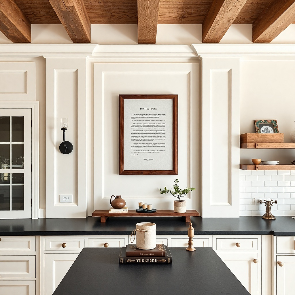
Lighting makes wall decor look intentional, and matte black sconces are the easiest modern farmhouse upgrade. Pair one sconce with a slim framed sign so the wall has both function and style. Choose a sign with simple typography or a small illustration in cream or charcoal. This idea works best on walls flanking a window or on either side of a dining-room doorway where you already have room for two elements. The sconce also improves how prints photograph at night by adding a warm glow.
Install the sconce first if you need wiring, then mount the slim frame so it sits centered between eye level and the sconce height. A good target: frame center at 60 to 62 inches from the floor, with the sign about 10 to 14 inches wide. Use a level and pre-mark mounting points. If you’re renter-friendly, choose plug-in sconces and mount only the frame securely.
Use a warm bulb around 2700K so the wood tones look golden, not gray.
Avoid glossy sign finishes — they catch sconce glare.
9. Oversized wood cutting board as wall art (two-tone finish)
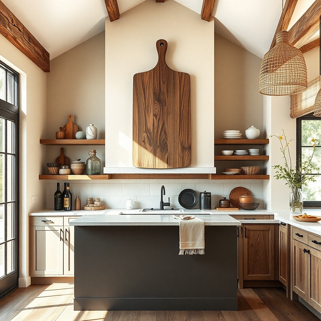
This is farmhouse decor that reads modern because the shape is simple and the material is honest. A large cutting board mounted vertically adds texture and a bit of “kitchen craft” without looking like a novelty. Choose a two-tone board: a lighter edge band and a medium center, so it ties into both cabinet and countertop colors. Mount it where you can see it while cooking usually on a blank wall next to the range or on the wall opposite your main prep area. It’s visually striking but still calm.
Find a board around 18 to 24 inches tall and 10 to 14 inches wide. Mount it using two heavy-duty picture hooks or a cleat system so it stays flat. Place it at the 57 to 60 inch center height rule. Add one small metal detail below (a single hook or a tiny utensil holder) and keep it to one piece so it doesn’t look crowded.
Sand the edges lightly and use a matte food-safe oil so the wood doesn’t look dry or overly shiny.
Avoid boards with heavy carving — busy grain competes with kitchen clutter.
10. Neutral plate rail with three oversized chargers
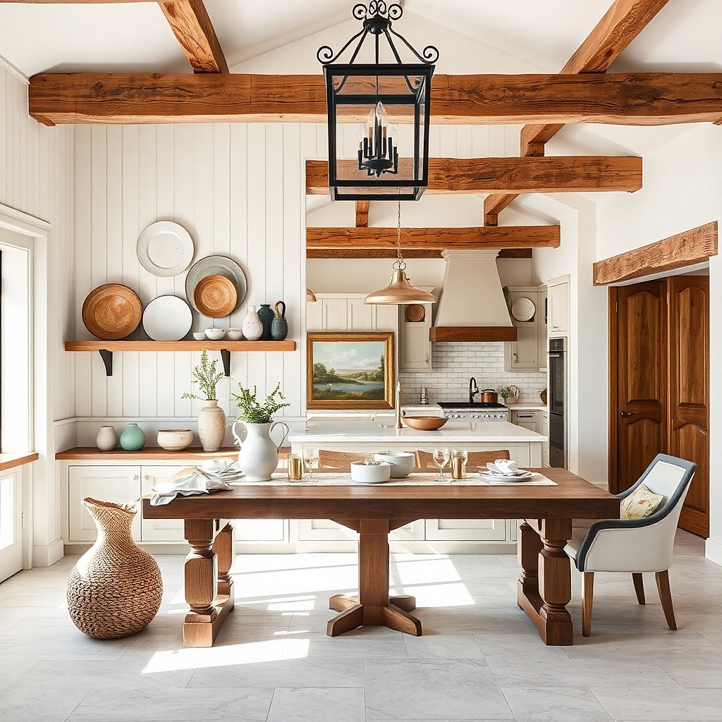
A plate rail is one of those farmhouse moves that becomes genuinely modern when you keep the plate colors neutral and the arrangement tight. Use three oversized chargers in cream, oat, and warm gray, with a matte finish. The rail itself should be slim metal or painted wood in black or off-white. This idea works great for walls above a sideboard, coffee bar, or buffet where you want decor that also feels tied to everyday life. Because plates have strong circular shapes, they look good even from a distance.
Choose a rail length about 24 to 36 inches long and mount it level. Hang the top plate so its bottom edge sits roughly 62 to 66 inches from the floor, then space the next two plates down with 6 to 8 inches between centers. Use plate hangers or small wall clips that won’t scratch the backs. Keep the chargers' diameters within 2 to 3 inches of each other so the wall looks balanced.
Try thisUse plates with a subtle rim pattern, not heavy gold matte looks more modern in kitchens.
Common mistakeAvoid mixing bright blue or high-gloss plates next to warm wood and linen.
11. Gallery wall with matching frames and one oversized centerpiece
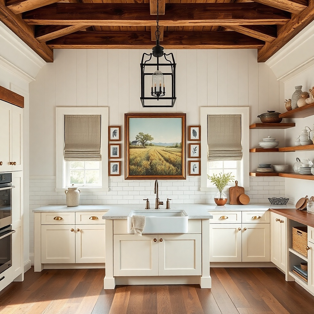
Gallery walls can look messy fast in kitchens because walls are already visually active. The way to make this work is one oversized centerpiece plus smaller matching frames around it. Use all frames in the same finish black or warm wood and keep mats consistent. The prints should share a palette: ink-black text, cream backgrounds, and one muted accent like terracotta. This setup is perfect for a dining area wall where you want a strong focal point without making the wall feel cluttered.
Pick one large frame around 18x24 or 20x30, then surround it with four to six smaller frames around 8x10 or 11x14. Lay the arrangement on the floor first and keep the spacing about 2 inches between frame edges. Mount the centerpiece first at a 57 to 60 inch center height, then use a level to position the rest. Use picture wire and anchors rated for the combined weight.
Try thisChoose art with lots of negative space; it keeps the gallery from competing with cabinets and dishes.
Common mistakeAvoid mixing frame finishes and mat colors — kitchens magnify inconsistencies.
12. Tall vertical mirror with thin black frame
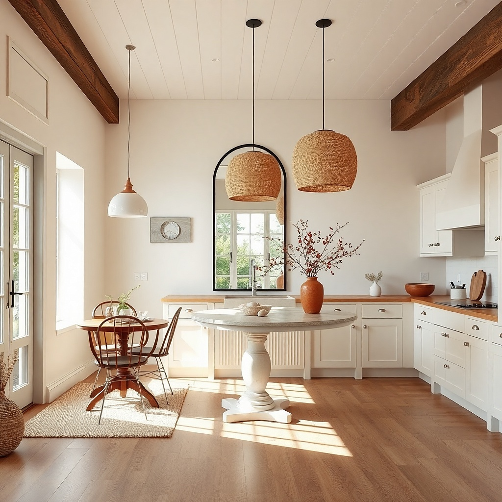
A mirror is decor that instantly improves how the wall looks because it adds light and reflection. Farmhouse style looks best with a thin black frame and a softly arched or clean rectangle shape. This idea is a win when you have limited wall space or your kitchen feels dark — the mirror makes the wall feel larger and more intentional. Place it near a dining area, breakfast nook, or hallway opening that leads to the kitchen so it reflects something pleasant, like a window or pendant light.
Choose a mirror about 24 to 36 inches wide and 60 to 70 inches tall. Mount so the center sits at 60 inches from the floor, and keep at least 6 inches away from cabinets or trim. Use wall anchors if you’re not hitting studs. Style the sides minimally — one narrow console or a single basket nearby looks better than a crowd.
Try thisAim the mirror so it catches a window, not a stove the reflection matters.
Common mistakeAvoid heavy gold frames; they read too formal next to farmhouse textures.
13. Chalkboard menu sign in a white frame (modern farmhouse)
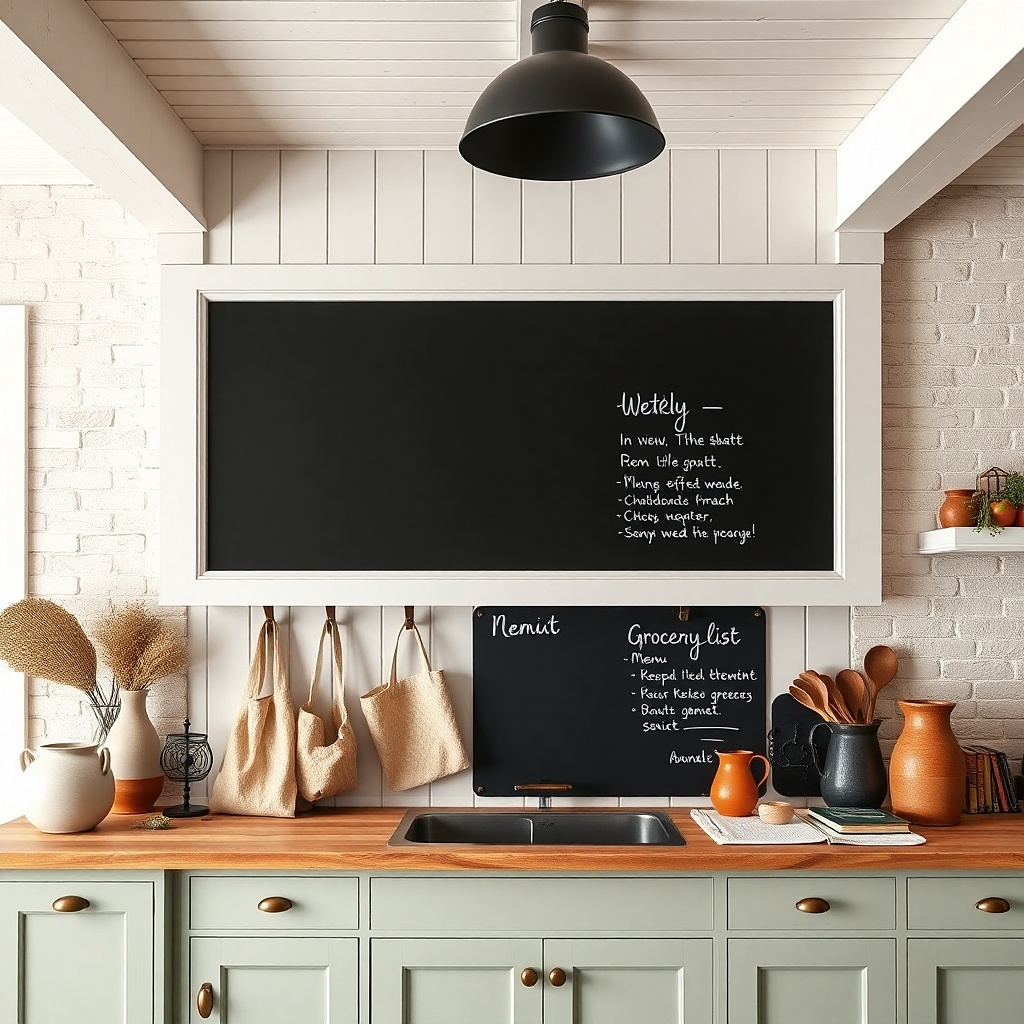
A chalkboard gives you a living element that still looks tidy when the layout is restrained. The modern farmhouse version is a white frame, a matte chalkboard surface, and short menu-style text in a single font. Use it on a wall near the dining table or coffee station where it’s useful and visible. The trick is to keep the writing minimal and the color palette limited to white or light gray chalk. This keeps it looking styled, not like a random message board.
Pick a chalkboard size around 16x20 or 18x24 inches. Mount it with the center at 58 to 60 inches from the floor. Use chalkboard paint markers or standard chalk and keep the layout in two lines maximum. If you want it to look cleaner in photos, wipe the board between changes and keep smudges off the frame.
Try thisUse a light gray chalk for headings and white for the rest it looks softer under warm lighting.
Common mistakeAvoid decorative borders and lots of doodles — they make the wall feel busy.
14. Woven wall hanging with a simple dowel rod (cream and black)
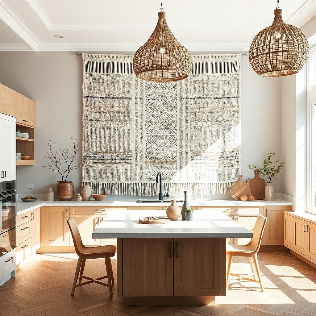
Woven wall hangings bring instant texture, and the modern look comes from a neutral palette and a clean mounting rod. Choose a hanging with mostly cream fibers and small black accents, not bright colors. Hang it in a kitchen where you want warmth without adding more “kitchen objects.” This works beautifully above a breakfast bench, near a window, or on a wall that currently has plain paint and needs texture that reads from across the room.
Choose a hanging about 24 to 32 inches wide so it fills the space but doesn’t overwhelm. Mount it using a wall cleat or sturdy hooks that hold the dowel rod securely. Target a center height of 60 inches from the floor. Fluff the fibers after mounting and keep the ends even so the hanging looks straight, not droopy.
Try thisAdd one small black element nearby (a vase, utensil crock, or frame) to tie the weave accents into the room.
Common mistakeAvoid multi-color weaves next to busy dish patterns.
15. Rustic wood frame with a modern typography print
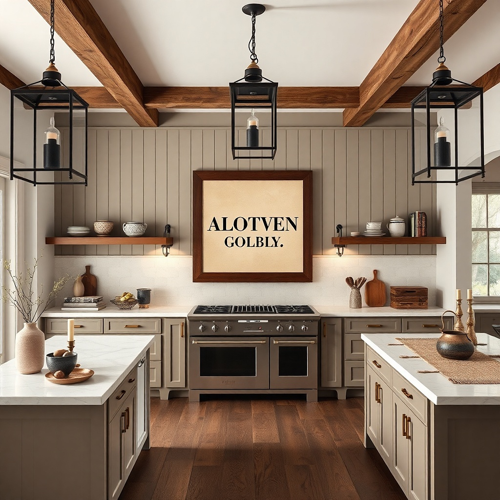
This is farmhouse character with modern restraint. A rustic wood frame gives warmth and age, while a typography print with clean letterforms keeps the wall looking current. Use a cream background and charcoal text, and pick one phrase that matches your space short and bold. This works well when you want a single statement piece that doesn’t add visual clutter above a counter or near a busy backsplash. The print is readable and the frame adds texture without competing with dishes.
Pick a frame size around 18x24 or 20x30 inches. Mount it so the center is at 57 to 60 inches from the floor. Use a mat board in off-white to separate the typography from the frame. If you’re hanging over a counter, keep the bottom edge about 8 to 10 inches above the surface so it doesn’t crowd the backsplash.
Choose typography with lots of whitespace it looks crisp in kitchen lighting.
Avoid ornate baroque frames; they fight the clean typography.
16. Pair of floating shelves with one long ceramic vase
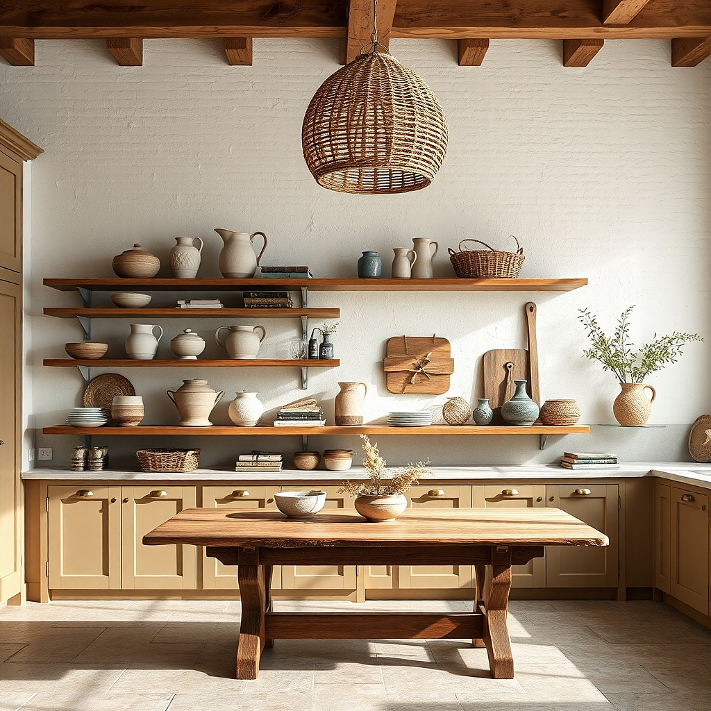
Floating shelves can look modern or cluttered depending on how you style them. The modern farmhouse approach is two shelves, but only one hero object plus a couple of vertical books or a small tray. Use warm ceramic in matte white or ivory, and keep the rest in muted tones like black, tan, and oat. This setup is great on a long wall where you want height and interest without filling every inch. The long vase creates a vertical line that balances the horizontal shelf layout.
Install two shelves about 18 to 22 inches long each. Place the top shelf so its surface is around 60 to 62 inches from the floor, then mount the lower shelf about 10 to 14 inches below it. Style the top with one long ceramic vase and one small book stack; style the lower shelf with a tray and one small jar. Use level marks and anchors, and keep shelf items within 2 to 3 inches of the centerline for a clean look.
Pick ceramic with a subtle texture (micro-speckle or soft glaze) it photographs better than glossy.
Avoid multiple small decor pieces per shelf; it turns into visual noise fast.
17. Three-piece wood-and-metal wall art set (staggered heights)
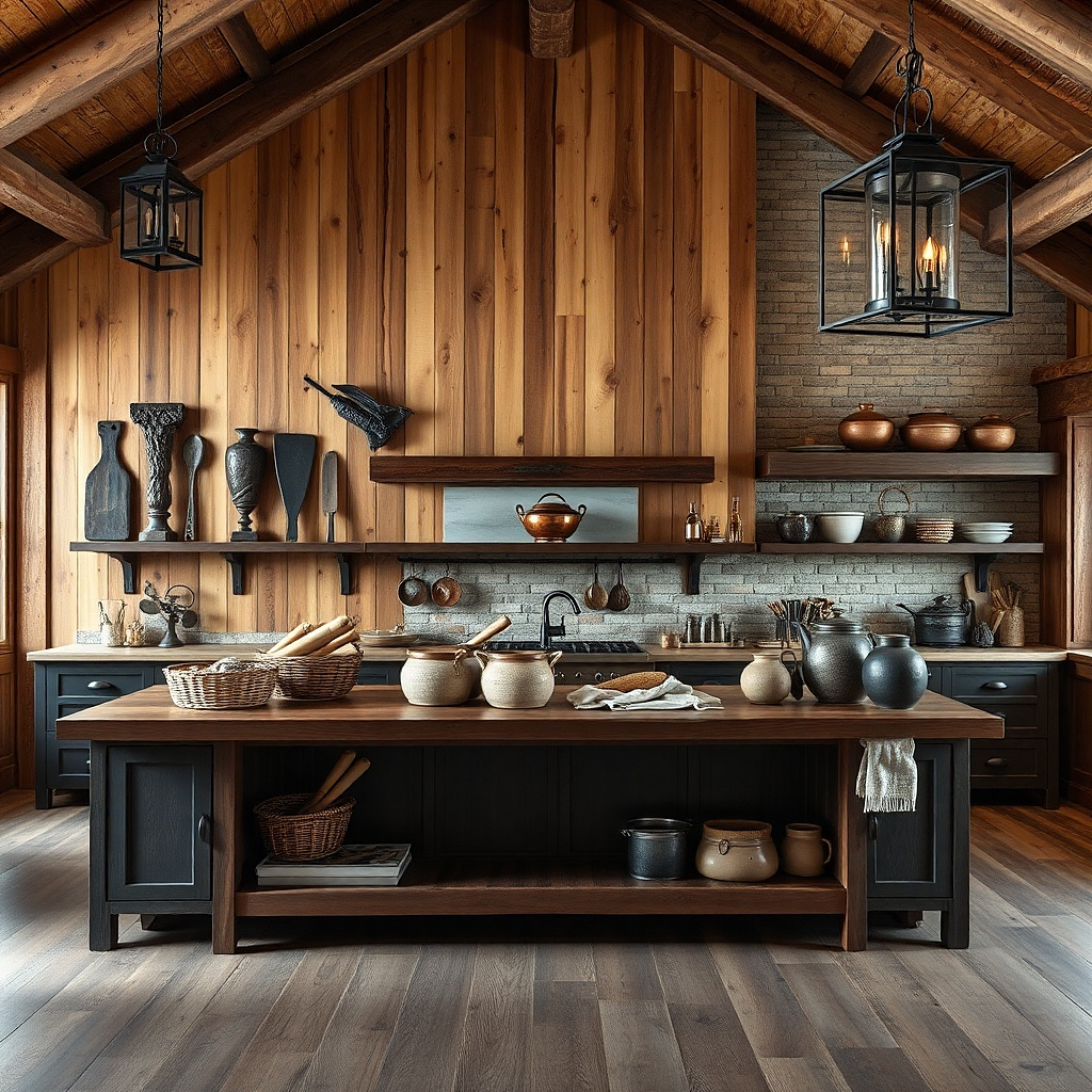
A three-piece set is a strong alternative to a full gallery wall because it gives movement without chaos. Choose pieces that combine wood panels with black metal lines or hooks. The staggered heights create a dynamic farmhouse feel but still look structured. This works best on a blank wall that’s large enough for a 36 to 48 inch wide arrangement. Keep the colors limited to two finishes so the set looks modern instead of craft-fair.
Lay out the pieces on the floor and decide the stagger before mounting. Space the pieces so the total width is 36 to 48 inches, then mount the center piece first at 57 to 60 inches center height. Mount the left and right pieces 4 to 6 inches higher or lower to create the stagger. Use the included mounting points and verify the pieces are level in both directions.
Pick pieces with matte metal glossy finishes can look cheap under overhead kitchen lights.
Avoid sets with five different colors; kitchens highlight mismatch.
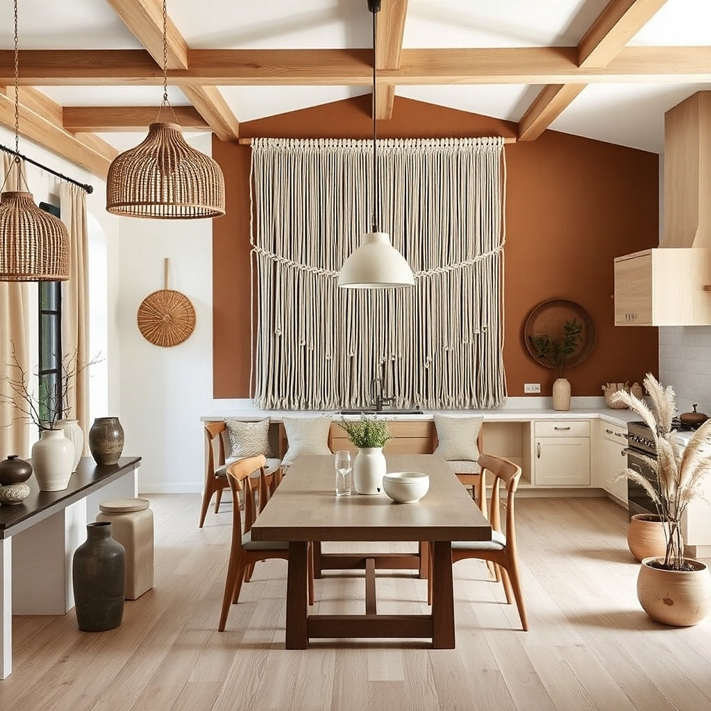
18. Large macrame wall hanging in off-white with a single tassel edge
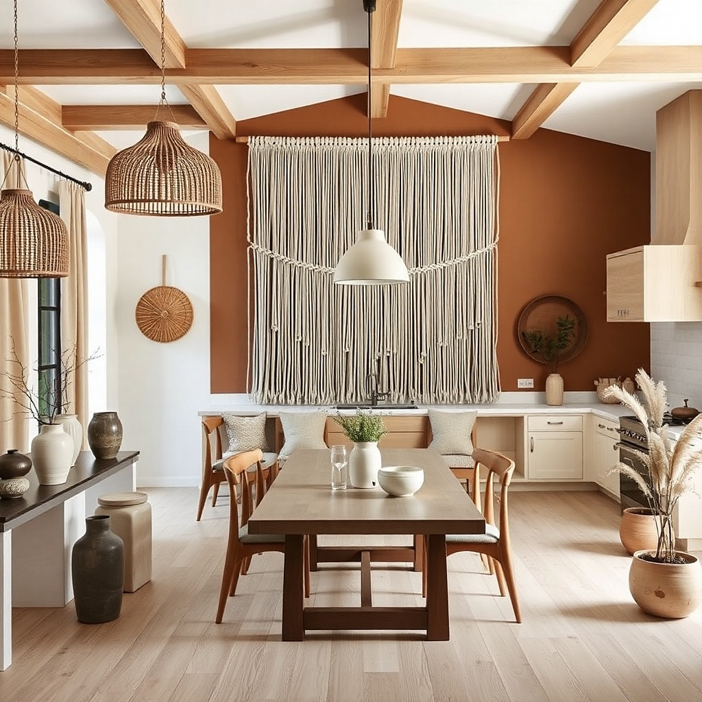
Macrame looks farmhouse by default, but the modern version is large, off-white, and clean at the edges. Choose a hanging with a simple top beam and a single tassel line so it doesn’t look overly busy. It’s a great fix for a wall that needs softness — especially if your kitchen has a lot of hard surfaces like tile, stone counters, and metal appliances. Hang it near a breakfast nook or open shelving area so the texture softens the room’s edges.
Choose a hanging about 32 to 48 inches wide depending on wall space. Mount the top beam so the bottom tassel reaches roughly 10 to 14 inches above the nearest counter or table surface. Use two heavy-duty hooks or a mounted cleat depending on the beam hardware. Keep it centered using a level, then gently spread the knots so the shape reads symmetrical.
Add one off-white ceramic piece nearby to tie the macrame color into your countertop styling.
Avoid dark macrame — it absorbs light and makes kitchens feel smaller.
19. Framed botanical mirror with wood trim
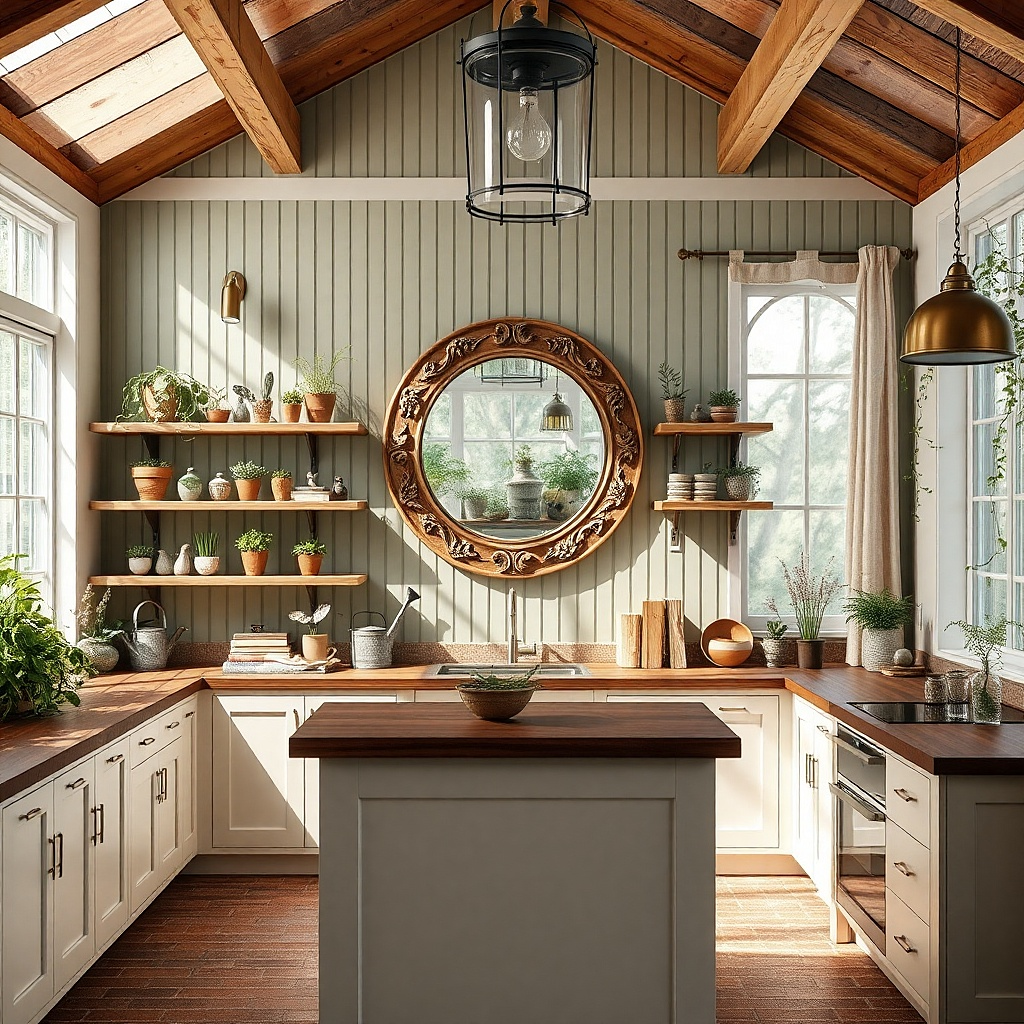
This is a farmhouse mirror idea that doesn’t look like a generic mirror. The wood trim gives character, and a subtle botanical motif keeps it from feeling plain. Choose a round or oval mirror around 24 to 30 inches wide, because those sizes look best in kitchens and dining areas. Hang it at eye level so it reflects light and makes the wall feel finished. This is ideal for narrow walls where you want one statement piece that still feels light and airy.
Pick a mirror with a wood-trim frame and a diameter around 24 to 30 inches. Mount so the center sits at about 60 inches from the floor. If you’re placing it near a window, keep it 2 to 6 inches away from the frame or trim so it doesn’t look cramped. Use appropriate wall anchors for the mirror weight, and test the level twice before tightening.
Try thisUse a matte black or dark bronze hardware finish nearby so the mirror frame doesn’t feel isolated.
Common mistakeAvoid mirrors with thick ornate frames; they can overwhelm farmhouse kitchens.
20. Floating picture ledge with framed photos and a slim tray
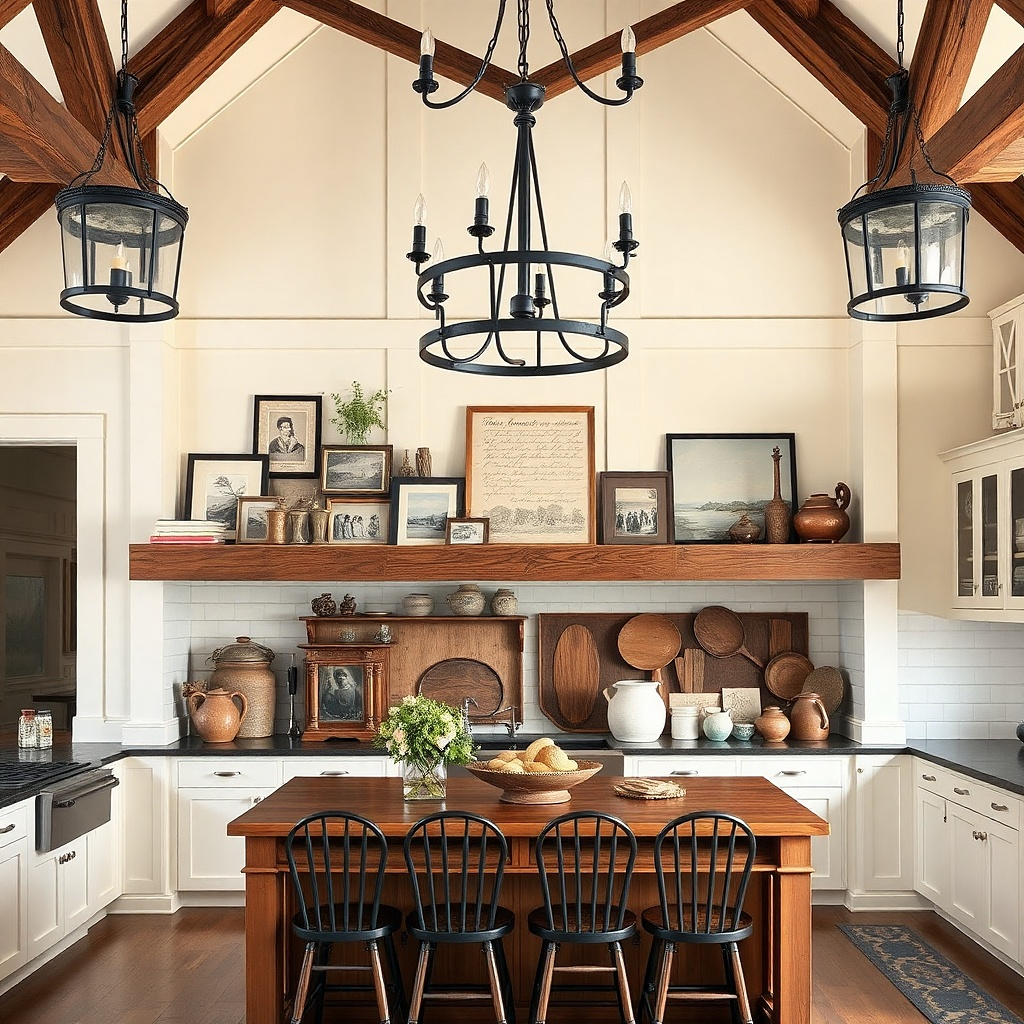
A picture ledge gives you a modern way to display photos or art without making holes everywhere. The farmhouse look comes from natural materials like wood trays and warm-toned frames, while the modern part is the clean horizontal line. Use a slim ledge about the width of your wall’s main focal area, then stack a few frames plus one tray with a pair of candles or a small ceramic piece. This works well on walls near a stairway opening or in a dining area where you want a soft personal touch without clutter.
Install a ledge 24 to 36 inches long at about 62 to 66 inches from the floor. Place two or three small frames on the back edge with equal spacing. Add one slim tray across the front with a pair of candles and a single small accessory. Keep everything within 2 inches of the ledge’s centerline so the arrangement looks intentional.
Try thisUse frames all the same color and mat shade the ledge styling looks cohesive when everything matches.
Common mistakeAvoid mixing tall decor on the ledge; it makes the wall feel top-heavy.
21. Oversized farmhouse sign with distressed edges and matte finish
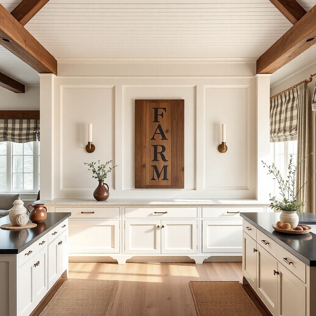
Oversized signs are the most direct path to farmhouse character, and the modern version comes from two choices: matte finish and simple text. Avoid shiny paint and heavy embellishments. Choose a sign in a medium walnut or weathered oak tone with distressed edges that look controlled, not splintery. Mount it as the anchor piece and keep everything else on the wall minimal. This is ideal for a blank wall near the kitchen entrance or a wall that currently feels like it needs one strong focal point.
Choose a sign about 24 to 36 inches wide for kitchens with standard wall spacing. Mount the center of the sign at 57 to 60 inches from the floor. Use a cleat system or secure anchors depending on sign weight. Keep the typography centered and straight; if the sign is crooked, it will look unstyled in photos.
Pair the sign with one black metal item nearby (frame, utensil rack, or candle holder) to keep it modern.
Avoid signs with lots of small decorative icons — kitchens make them look busy.
22. Vertical wooden beadboard panel with framed quotes
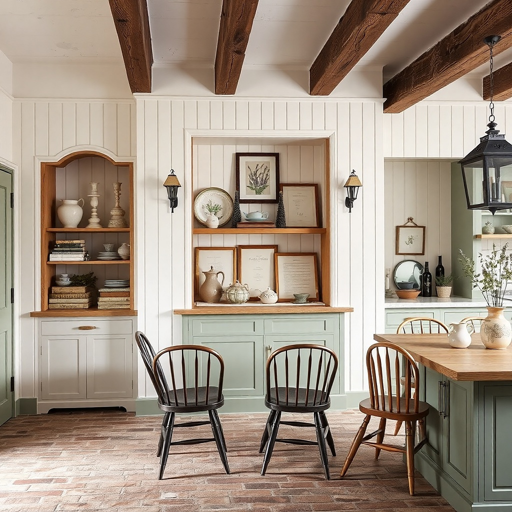
Beadboard adds farmhouse texture, and vertical panels look modern when they’re framed cleanly. You’re basically creating a mini wall feature without turning the whole kitchen into a renovation. Keep the beadboard in a light natural wood or painted off-white, then mount two small framed quotes or recipe cards inside the panel area. This works on a wall that’s narrow or has awkward spacing where a full gallery would feel too wide. The texture also helps the wall handle busy countertops without looking flat.
Buy a beadboard panel around 18 to 24 inches wide and 48 to 60 inches tall. Mount it level, then add two small frames (about 8x10 or 9x12) within the panel, spaced 6 to 10 inches apart. Set the center of the whole feature at 57 to 60 inches from the floor. Use finish nails for stud mounting or anchors for drywall if needed, then hang frames with picture hooks.
Use off-white paint for the beadboard and black frames for a crisp farmhouse-modern contrast.
Avoid dark stained beadboard if your kitchen already has dark cabinets — it gets heavy.
23. Open shelving back panel with two matte ceramic vessels
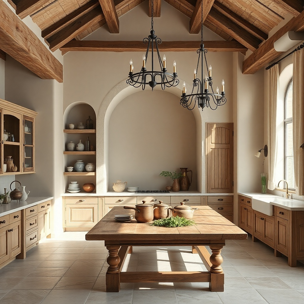
If you have open shelving, the wall decor problem is already halfway solved you just need a back-plan and a tight styling formula. A neutral back panel (painted board or a simple linen-look backing) makes the ceramic stand out and keeps the shelf from looking like random items. Use two matte ceramic vessels in cream and warm gray, placed at different heights for a modern farmhouse look. This is ideal for walls where you already have shelf hardware and don’t want to add more frames. The vessels read as decor even when the kitchen is busy.
Line the shelf back with a neutral board or removable wallpaper panel in a linen or plaster look. Place the larger vessel on the center and the smaller one slightly to the side, keeping 2 to 4 inches between them. Use shelf height so the bottom of the vessels is at least 12 inches above the countertop line for visual separation. Keep the rest minimal: one small stack of books or a single utensil crock.
Try thisMatch one vessel color to your dishware it makes the shelf feel designed, not accidental.
Common mistakeAvoid glossy glaze ceramics; they reflect too much kitchen light.