1. Farmhouse mirror above the dining buffet
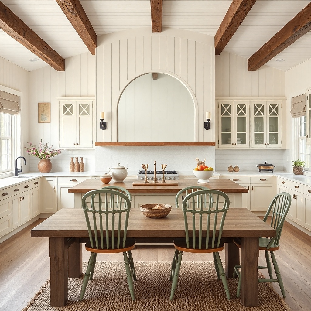
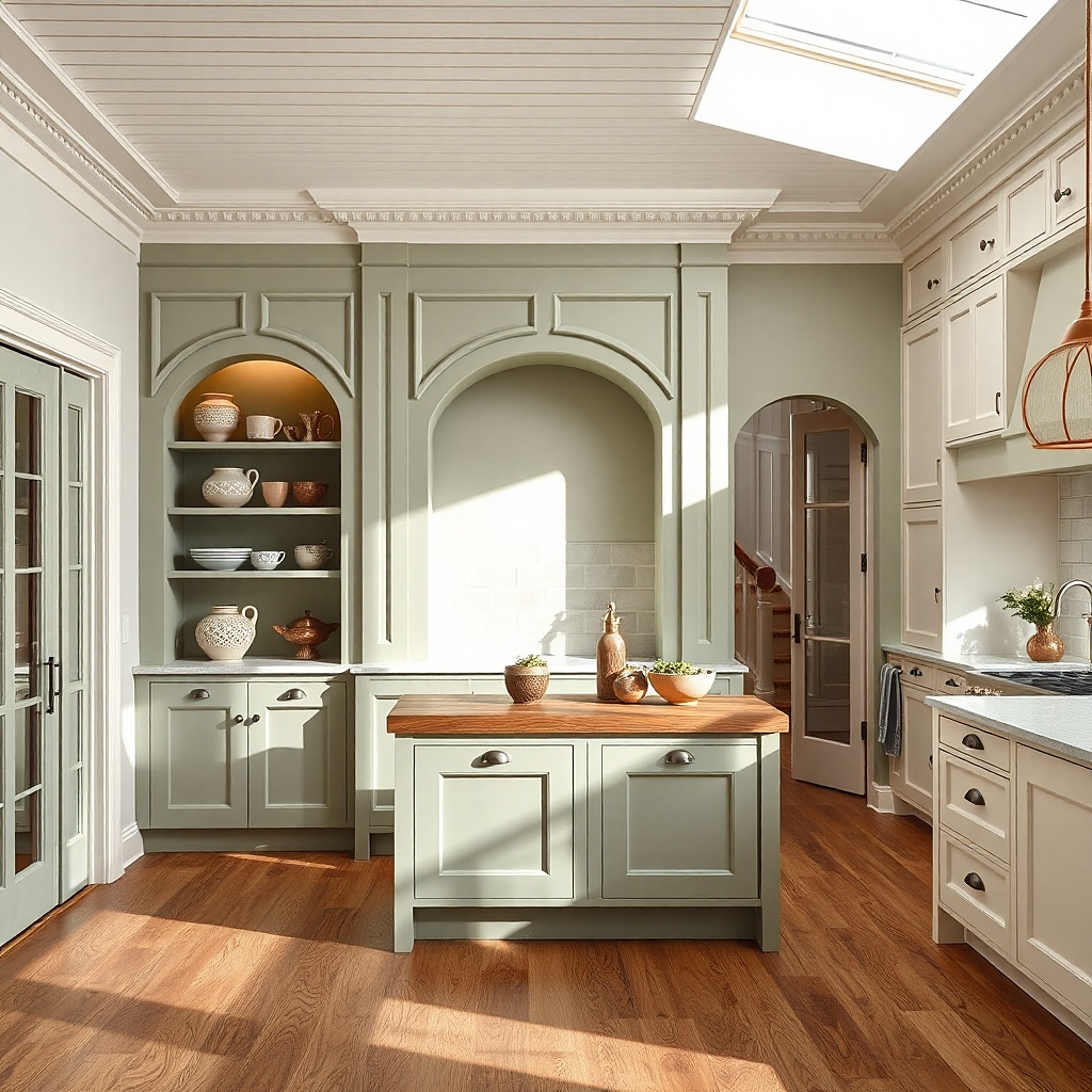
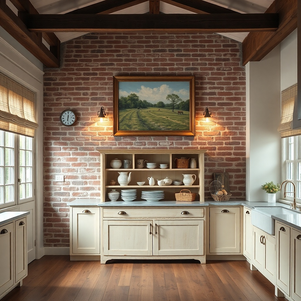
A farmhouse mirror makes the kitchen feel larger and brighter, which matters in country spaces that often use darker wood tones. Choose an oval or arched mirror with a matte wood frame in whitewash or light oak so it looks soft, not shiny. Position it directly above the buffet, centered, so the whole wall looks balanced. Add two small framed prints on either side, leaving consistent spacing so the wall reads like a set. This setup also solves the common “blank wall” problem by giving you a strong focal point that still feels warm.
Start by measuring the buffet width and selecting a mirror that’s about 60-80% of that width. Find the center of the mirror and mark the wall; hang the mirror so its center sits around 57-60 inches from the floor. Install wall anchors if you’re mounting into drywall — use a stud finder and mount into studs when possible. Then place two matching frames at the same height on each side, keeping about 6-8 inches between the mirror edge and the frame edges.
Use a mirror frame in the same finish family as your cabinet hardware for a calmer look.
Avoid hanging the mirror too high; if the center lands above 62 inches, it feels disconnected from the room.
2. Picture rail with layered country prints
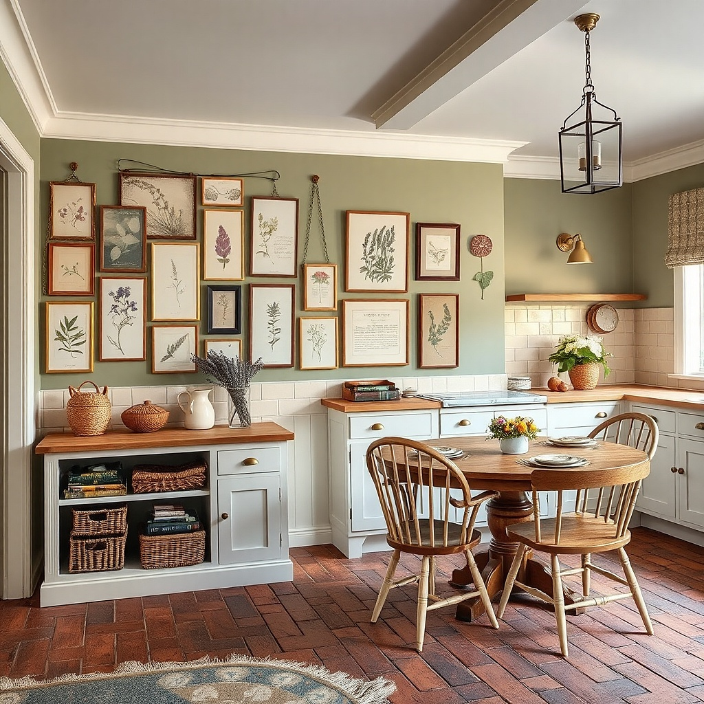
A picture rail creates a structured, country-friendly look because it turns “decor” into a curated gallery without feeling formal. Use a white or off-white rail with a slightly aged finish, then hang prints on cords or small hooks so they sit at varied but controlled heights. Stick to botanical illustrations, simple farm scenes, or typographic kitchen quotes in muted ink colors. The visual layering keeps the wall from looking flat while the rail prevents the clutter that happens when every frame is hung independently. This works especially well over a breakfast nook or along a hallway leading to the kitchen.
Install the picture rail 2-4 inches below your chosen top alignment line, usually around 64-70 inches from the floor depending on ceiling height. Hang three to five prints under the rail with cords or picture rail hooks; aim for the top of the largest print around 70-76 inches. Keep frame widths between 10-16 inches for a tidy country feel. Use consistent frame colors (white, natural wood, or black) across all prints and keep gaps between frames around 2-4 inches.
Try thisChoose one ink color family (sage, black, or warm brown) so the prints look like they belong together.
Common mistakeAvoid mixing frame colors randomly; two or three frame finishes max keeps the wall from looking chaotic.
3. Galvanized utensil rail with hanging enamel mugs
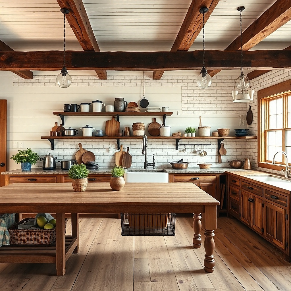
A utensil rail gives you a usable display that still looks decorative, which is exactly why country kitchens feel comfortable. Galvanized metal with a slightly aged finish looks authentic and pairs well with wood shelves and warm neutrals. Hang enamel mugs, small ladles, and a couple of utensils that you actually use, so the wall stays visually interesting without becoming clutter. Keep the arrangement tight and intentional so it reads like a coordinated tool station. This solves the “decor that never gets used” problem because the items belong in your daily routine.
Mount the rail so the hanging mugs sit around 52-60 inches from the floor, depending on your counter height. Use screws into studs where possible; if studs aren’t available, use heavy-duty wall anchors rated for the rail weight. Plan for 8-12 inches of vertical space between hook lines so mugs don’t tangle. Space mugs about 3-4 inches apart horizontally and keep utensils clustered on the ends or between two mugs for a balanced look.
Try thisStick to two enamel colors (like cream and muted red) so the rail looks styled, not random.
Common mistakeAvoid hanging too many pieces; a rail that’s packed tight usually looks messy in country kitchens.
4. Wood floating shelf with mismatched-but-matching jars
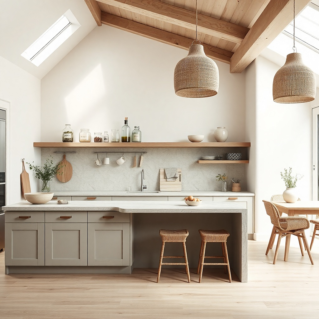
A floating shelf is one of the fastest ways to make a kitchen wall feel lived-in without covering the whole wall in frames. Use a simple, thick piece of wood in a warm finish (light oak, honey, or whitewashed) so it looks handmade. Fill it with glass jars that have linen-look labels or simple handwritten-style tags. Keep jar sizes varied but the label style consistent — that’s what makes it country instead of clutter. Add one small ceramic piece and one woven element so textures show up in photos. This is a practical fix for blank wall space that doesn’t require constant swapping.
Choose a shelf length that spans about 50-70% of the wall width where you’ll install it. Mount the shelf so the top sits around 54-56 inches from the floor, then place jars that are no taller than 10-14 inches so the display stays readable. Use a level and install into studs if possible; otherwise use proper anchors and keep the shelf load light. Arrange jars first by height, then add labels last — keep labels aligned and centered for a clean look.
Use the same label font style across jars even if the jars are different; it ties the shelf together.
Avoid using labels in wildly different colors; it makes the shelf look like an inventory wall.
5. Hanging basket wall with woven texture clusters
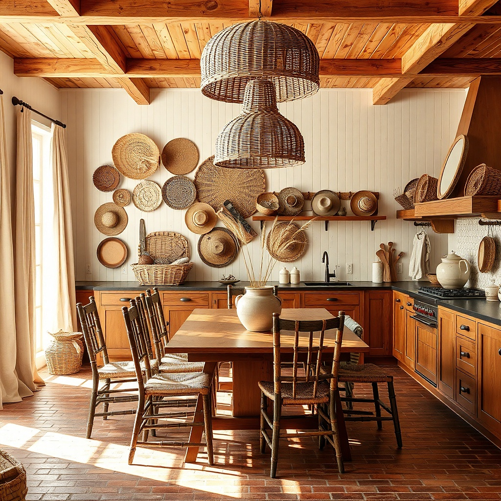
Woven baskets bring softness to country kitchens and add texture that looks good under warm lighting. Make it look intentional by hanging baskets in a cluster, not in a straight line that turns into a grid. Choose baskets in natural tan, oat, or light brown, and vary sizes so the cluster has depth. Add one small framed botanical print near the cluster to create a focal point without overloading the wall. This works well above a dining table, in a breakfast nook, or on a wall that needs warmth but doesn’t need more “items.”
Pick 3-5 baskets with different diameters; include one largest basket and two medium baskets to anchor the shape. Mark a center point and hang the largest basket so its bottom sits around 62-66 inches from the floor. Hang the smaller baskets 4-6 inches above or beside it, keeping consistent gaps so they don’t look accidental. Use sturdy wall hooks rated for weight and secure into studs when possible; baskets should hang straight with their openings facing forward.
Try thisChoose baskets with similar weave thickness; mixed weave styles can look busy instead of cozy.
Common mistakeAvoid hanging baskets too low; if the openings dip below 55 inches, they feel crowded and awkward.
6. Canvas grain sacks framed as a "farm wall" grid
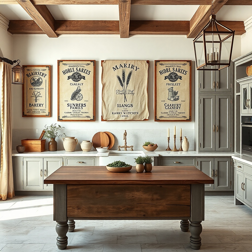
Grain sack art gives you that country fabric look without needing actual heavy textiles on the wall. Use framed canvas or printed grain sack panels in muted tones like cream, tan, and faded charcoal. Arrange them in a neat grid so the wall stays calm even when you use multiple pieces. This works because the repeated shapes create rhythm, while the faded ink colors keep it warm and not loud. It’s a strong option for walls that need color but should still feel casual and everyday.
Select 4-6 panels in the same frame size so spacing looks consistent. Hang the grid with the top row’s center around 68-72 inches from the floor. Use a spacing gap of about 2 inches between frames for a tidy “farm wall” layout. Level each frame carefully — measure from the floor to the same point on each frame, then hang one first and use it as your reference.
Try thisChoose frames in matte black or distressed wood; shiny frames fight the sack texture.
Common mistakeAvoid mixing frame sizes in a grid; the wall loses its calm rhythm fast.
7. Chalkboard menu board on a wood slat backing
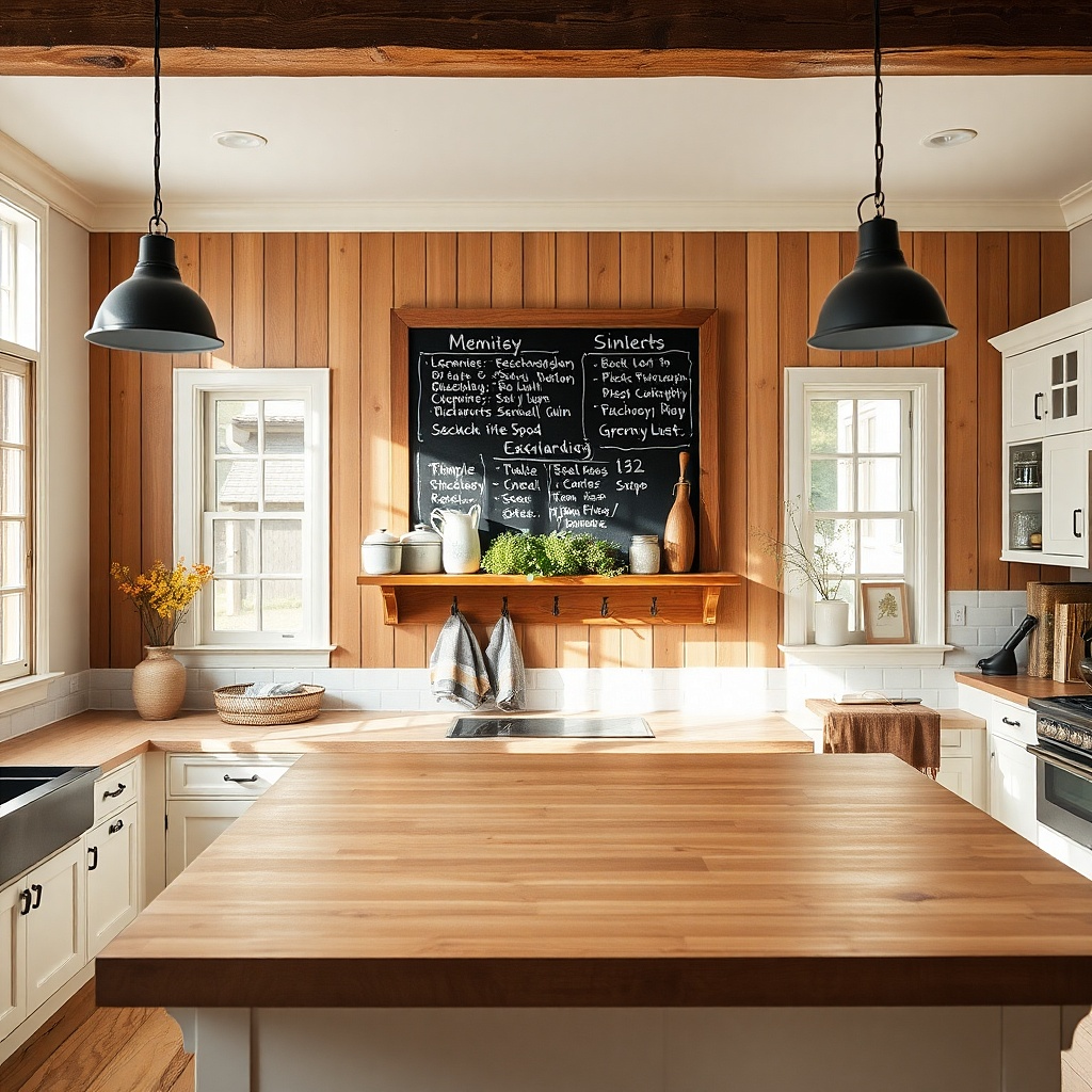
A chalkboard menu adds everyday comfort because it gives you a functional surface that can change with seasons. Mount it on a wood slat backing to keep the country texture front and center. Choose a chalkboard with a simple wood frame, and keep the chalk writing minimal: a couple of short lines or a weekly “special” style layout. Add small hooks below for oven mitts or a towel ring so the board doesn’t float alone. This solves the “decor that feels too permanent” problem you can update it without replacing anything.
Buy a chalkboard panel in the range of 18-30 inches wide so it’s readable but not overwhelming. Mount the top edge so the chalk writing area sits around 60-66 inches from the floor. Attach the board to the slat backing with screws, then mount the backing to the wall using studs or heavy-duty anchors. Add one towel hook line under the board with 3-4 inches of clearance so towels hang cleanly.
Try thisWrite in two font-like styles (block letters for headings, simple script for one line) to keep it looking styled.
Common mistakeAvoid filling the chalkboard with lots of tiny text; it reads cluttered from across the room.
8. Vintage plates in a tight staggered arrangement
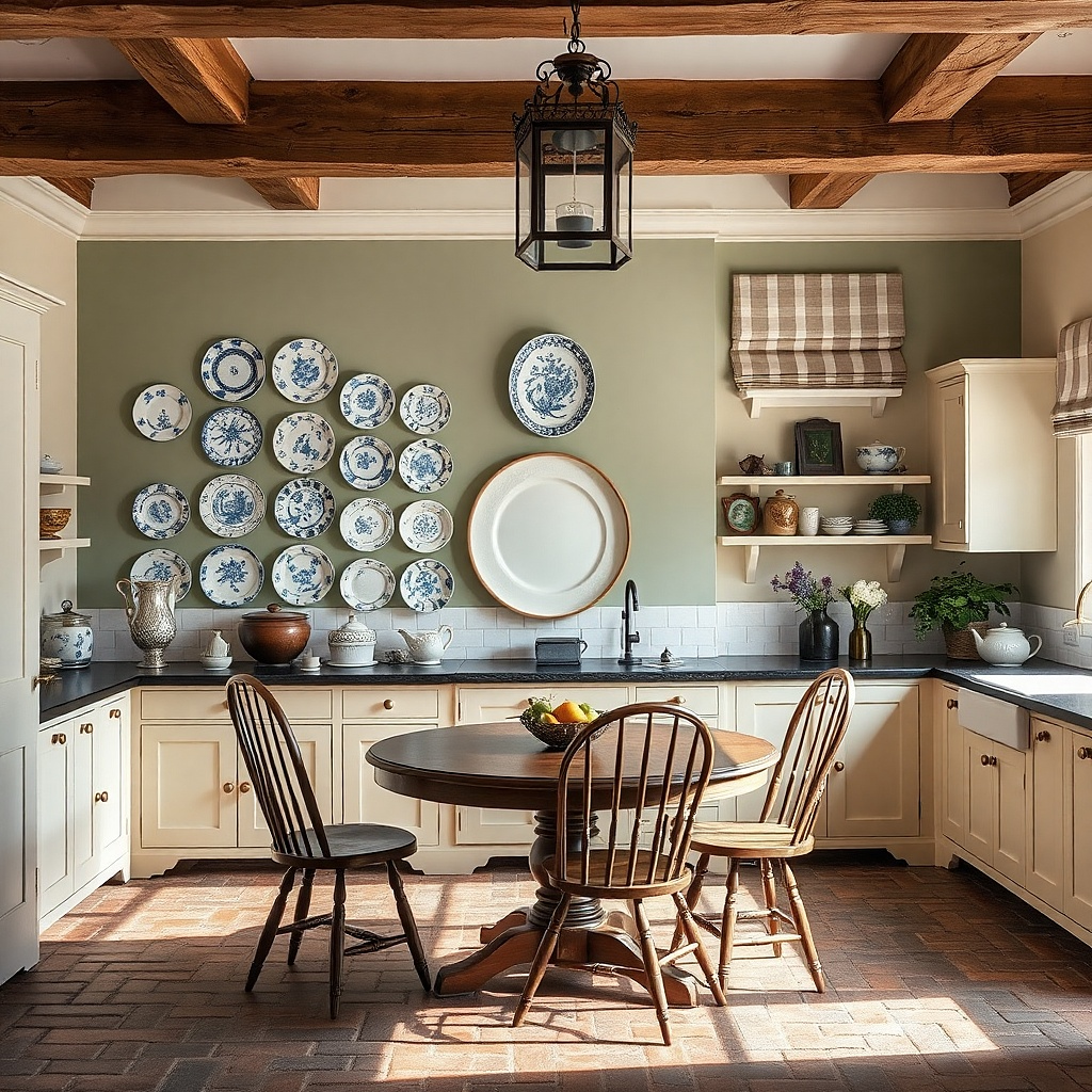
Plate walls can look charming or chaotic depending on spacing and consistency. For a country kitchen, pick plates with a shared palette: cream with muted blue, warm white with small red accents, or sage green with aged gold. Mount them in a staggered cluster rather than a straight row; overlap the visual centers slightly so the wall looks curated. Use plate hangers that keep plates flat and level. This gives you a photogenic pop of pattern without cluttering every inch of the wall.
Choose 6-10 plates, with one large center plate and the rest smaller around it. Mark the center point and mount the largest plate first at about 58-60 inches from the floor for the plate’s center. Arrange the smaller plates around it with about 2-3 inches between plate edges where possible. Use a template or paper mock-up before drilling so you don’t end up with uneven gaps.
Keep plate diameters within a 6-8 inch range to avoid a few oversized plates dominating the cluster.
Avoid mixing plate colors that fight each other; too many palettes make the wall feel noisy.
9. Sourdough theme framed shadow boxes
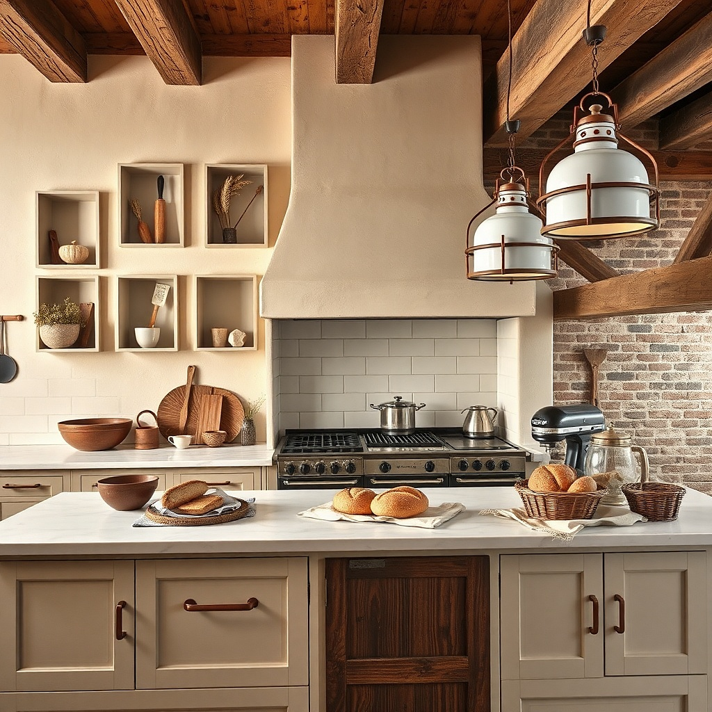
Shadow boxes bring depth and a “kept on purpose” feel to kitchen walls. A sourdough theme works well in country spaces because it pairs natural textures (linen, wood, twine) with warm, familiar visuals. Use shadow boxes with a light wood frame or matte white frame, and include small objects like a wooden spoon, a strip of flour-sack fabric, or a simple printed bread label. Keep the objects small so the box looks neat rather than stuffed. This is a great way to add interest to a wall above a coffee station or near a sideboard.
Pick 3 shadow boxes in the same frame size range, around 10x12 to 12x14 inches. Arrange the boxes in a single row, centering the group so it matches the width of the surface below. Mount the center of the middle box at 57-60 inches from the floor, then keep equal spacing of 2-4 inches between boxes. Inside, use one main fabric element and one small object per box to avoid visual clutter.
Try thisUse twine or linen ribbon as a small accent inside each box so the theme looks consistent.
Common mistakeAvoid adding too many objects inside one shadow box; it turns into a desk drawer on the wall.
10. Macrame-look wall hanging with a simple framed print anchor
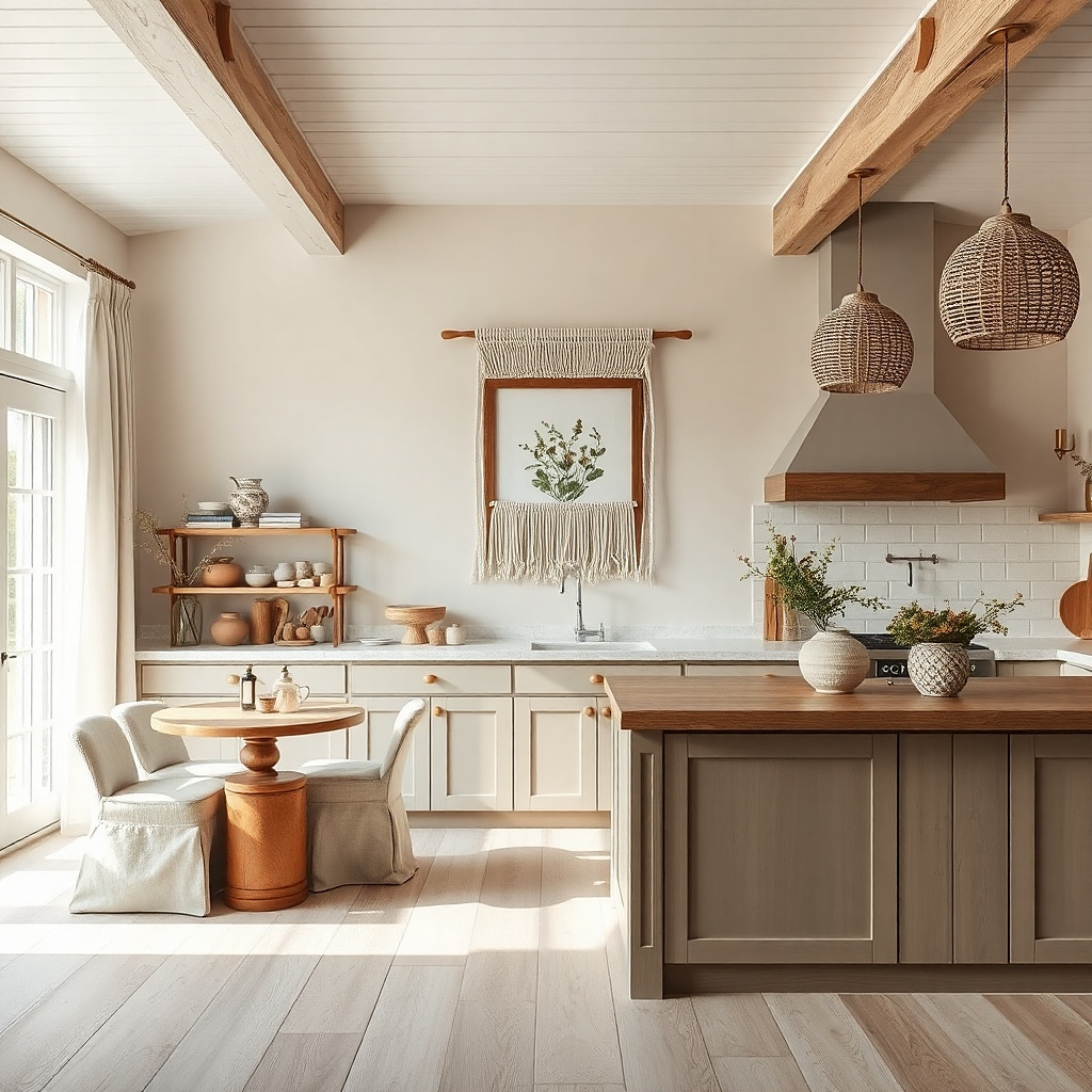
A macrame-look wall hanging adds softness and movement without needing a full gallery of frames. Keep it country by choosing natural fibers in cream, oat, or sand, and pair it with one framed botanical print so the look stays balanced. Mount the hanging above eye level and let it hang with enough clearance to show its shape. This works well on a blank wall near a window or above a kitchen bench where you want texture, not more objects. It also helps when you want a cozy feel but your wall is already packed with cabinets.
Choose a hanging with a rod or loop for easy mounting. Mount the top of the hanging so the bottom sits around 62-68 inches from the floor, depending on how tall your wall is. Place a single framed print to one side at about the same vertical center as the hanging’s middle. Use consistent frame color (white, natural wood, or black) and keep the gap between the frame and hanging around 6-10 inches.
Try thisPick a hanging with a simple pattern; busy knots look dated fast under kitchen lighting.
Common mistakeAvoid placing it too close to cabinets; the overlap makes the wall look cramped.
11. Wood-and-metal open shelving with a small enamelware set
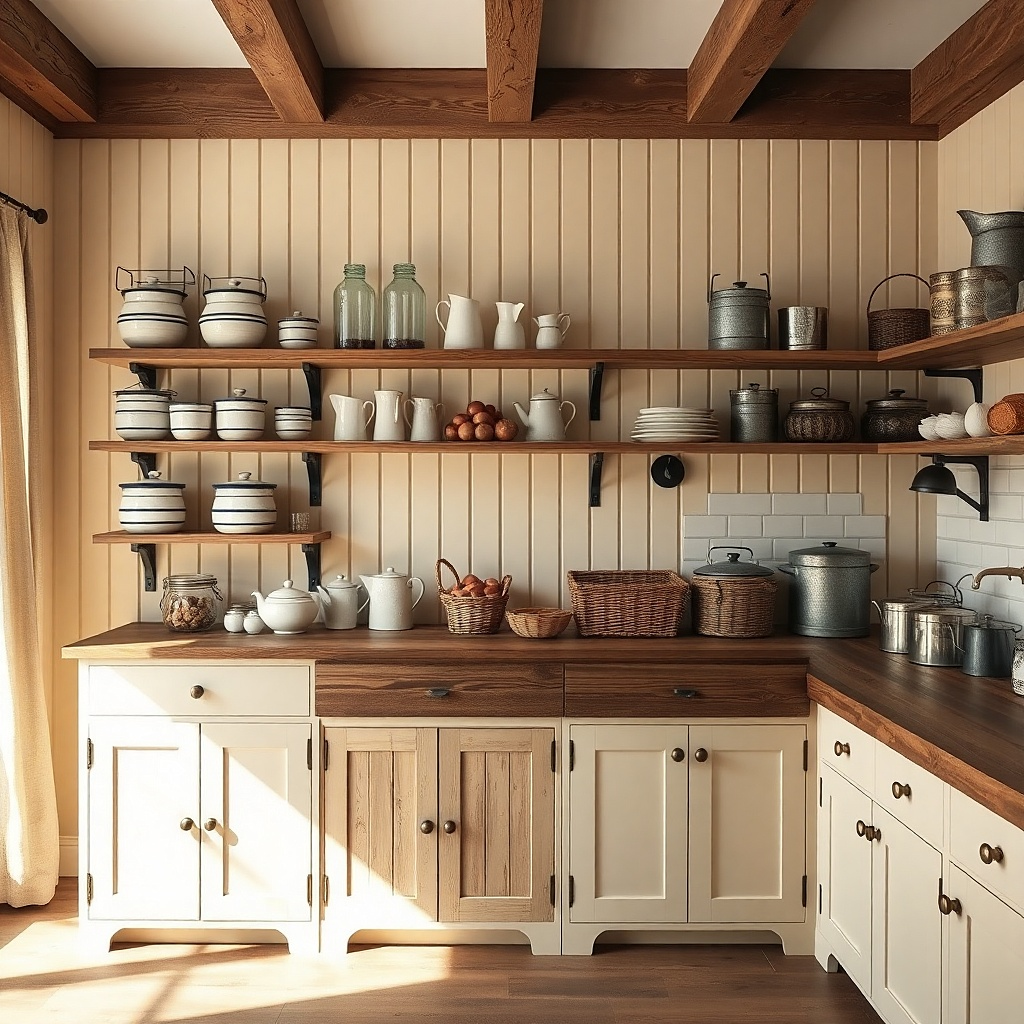
Open shelving gives you daily access and a styled look at the same time. Country kitchens look best when shelves are not jammed full: use a few enamel bowls, a couple of jars, and one woven tray so surfaces look calm. Choose shelves with wood planks and simple metal brackets in aged black or matte bronze. Keep the color palette warm cream, tan, and muted blue so the wall looks cohesive. This solves the “pretty but impractical” problem because the items on the shelf are the ones you reach for while cooking.
Install two shelves or one long shelf depending on wall space; for most kitchens, 24-36 inches long is enough for visual impact. Mount the bottom shelf so the top of the shelf sits around 54-56 inches from the floor. Keep bracket spacing roughly every 16-24 inches and anchor into studs. Style with 6-10 items total, starting with large pieces at the back, then jars, then one tray placed in front.
Use risers or small stands so items aren’t all on one flat plane; it reads more intentional in photos.
Avoid mixing tall cookware and short decor on the same shelf; it creates an uneven skyline.
12. Farmhouse towel wall: rail plus matching striped towels
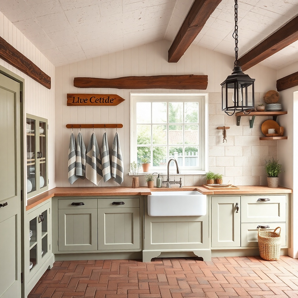
Towels are country decor when they’re treated like design elements. A wall towel rail with two matching striped towels looks clean and cozy, and it’s practical for kitchens that need frequent towel access. Add a small framed sign above in a warm neutral tone, like cream with dark brown text, so you get a focal point without clutter. Choose towel stripes in muted colors such as sage and tan or navy and cream. This solves the problem of towels folded in drawers while the wall stays empty.
Mount the towel rail 48-52 inches from the floor so towels hang within easy reach. Choose towel lengths that land around 14-18 inches below the rail for a neat fold. Install into studs when possible; if not, use anchors rated for the rail’s weight plus towels. Hang the towels so the stripes align vertically and swap them seasonally while keeping the same color family.
Try thisIron or steam the towels so the stripes look crisp; wrinkled towels read sloppy, not cozy.
Common mistakeAvoid using mismatched towel styles; mixing terry, waffle, and patterned prints on one rail looks random.
13. Large botanical print with a warm wood frame
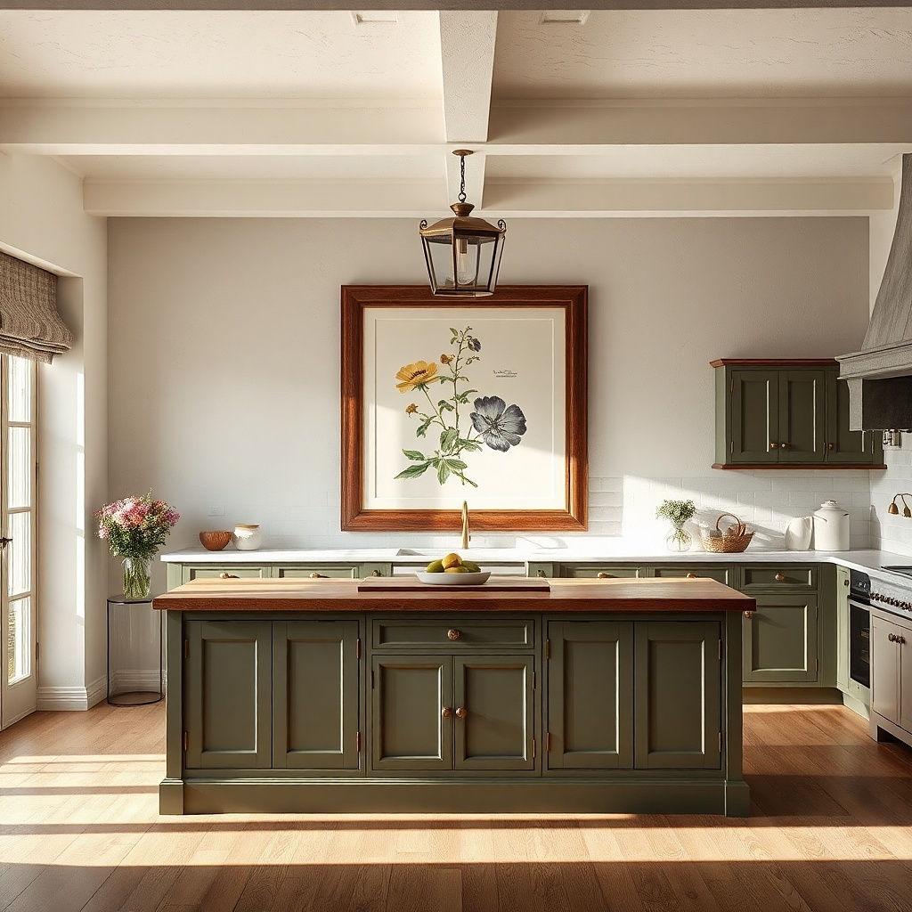
A single large botanical print is the fastest way to make the wall feel finished without turning it into a busy collage. Choose art with muted greens, warm browns, and cream backgrounds the palette matches country kitchens better than bright modern colors. Use a warm wood frame with a matte finish so it doesn’t glare under overhead lights. Hang it above the counter or near the dining area where it becomes a visual anchor. This tackles the common mistake of hanging too many small prints that never look aligned.
Pick a print size around 24x36 inches for most kitchen walls; smaller works only if the wall is narrow. Mark the center point and hang so the center of the artwork sits around 57-60 inches from the floor. Use hanging hardware rated for the frame weight and anchor into studs. If you’re placing it above a backsplash or counter, keep the bottom edge about 6-10 inches above the highest point of decor below.
Match the frame wood tone to cabinet trim, not to your countertop trim is what the wall “reads” first.
Avoid hanging a large print too far off-center; off-center feels accidental even in country styling.
14. Shaker-style wall panel with small hooks and tags
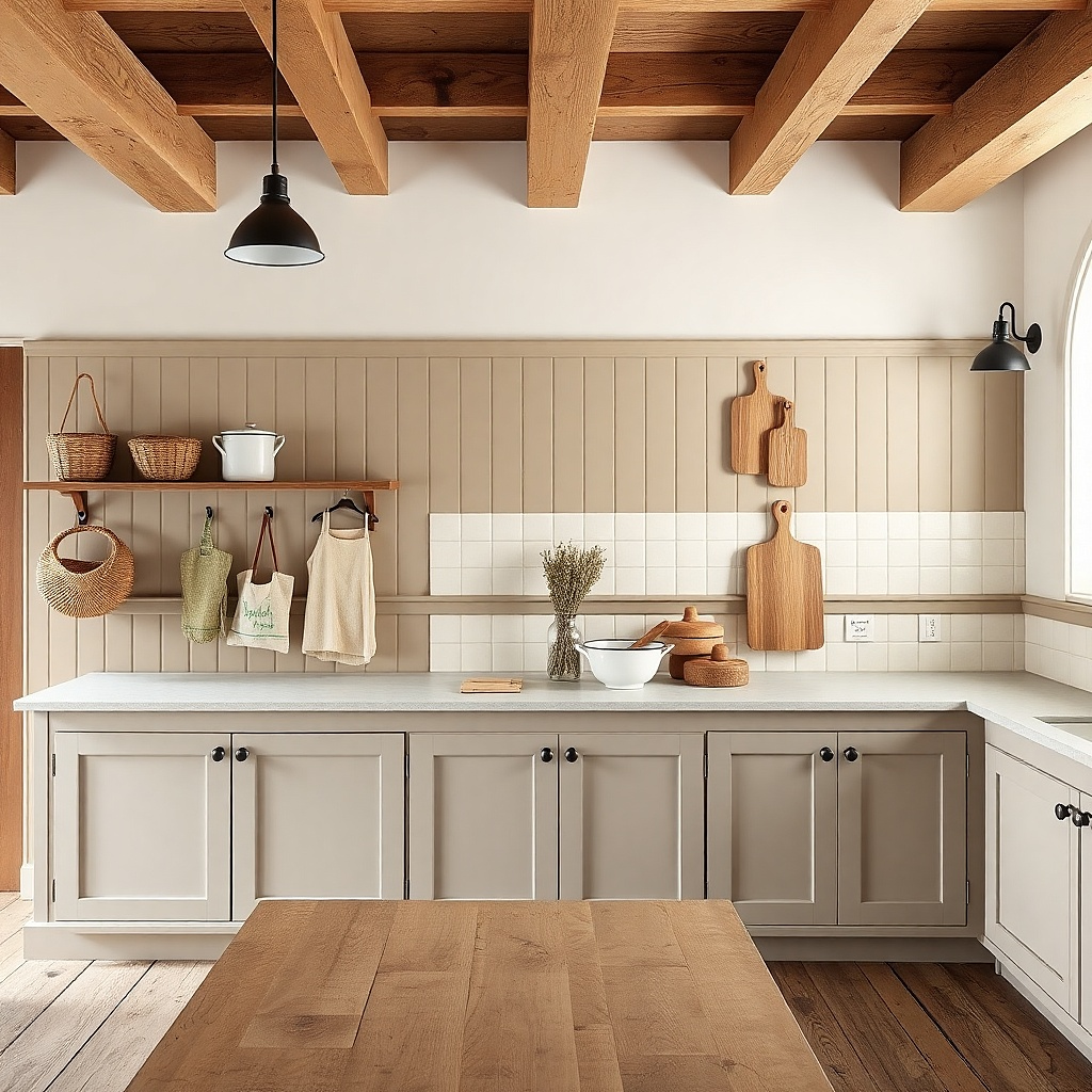
A small shaker-style wall panel adds built-in character and makes your wall look like it belongs to the house. The panel gives you structure, while hooks and tags make it functional. Use a matte white or soft cream panel, then add 4-6 hooks for oven mitts, a spatula, or a towel ring. Include a couple of small linen tags or simple printed labels tied to hooks for that country “organized” vibe. This is great for kitchens where you want decor that still gets used.
Choose a panel sized roughly 24-48 inches wide depending on the wall area. Mount the panel so its center sits at 57-60 inches from the floor. Install hooks into the panel or into studs behind the panel if hooks attach through the panel. Space hooks 3-5 inches apart so items don’t tangle, and keep the tags short enough to hang about 2-4 inches below the hook level.
Use one metal finish for all hooks (black or aged bronze) so the panel looks cohesive.
Avoid mixing hook finishes like black and chrome together; it reads mismatched immediately.
15. Vintage window frame decor with a simple seasonal wreath
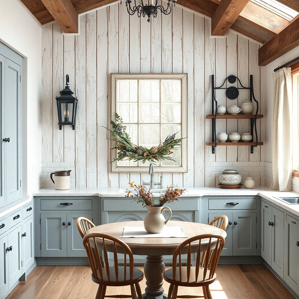
A vintage window frame creates instant country charm because it looks architectural, not decorative. Hang it flat with a distressed wood finish in white, cream, or weathered oak. Keep the inside simple: a small wreath, one dried herb bundle, or a single narrow print panel. The empty space inside the frame prevents the wall from becoming cluttered, which is a common failure when people stuff window frames with too many items. This works well near a breakfast nook, in a kitchen corner, or behind a small table.
Pick a window frame that spans 30-50 inches wide so it’s visible without taking over the wall. Mount it so the bottom edge sits about 4-6 inches above eye level preference, usually around 60-62 inches from the floor for the bottom. Secure into studs or use heavy-duty anchors depending on frame weight. Add a wreath or herb bundle using wire or ribbon so it can be swapped seasonally without new mounting.
Keep the wreath size to about 10-14 inches across; larger wreaths overpower the frame.
Avoid filling the window with multiple layers of greenery and signs; the inside should look airy.
16. Enamelware hooks with a small planter shelf
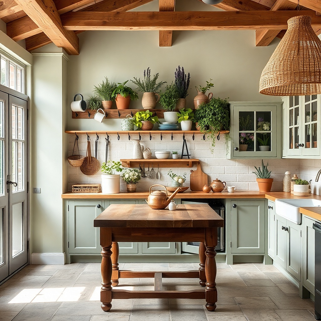
This look mixes hanging decor with a tiny plant display for a kitchen wall that feels alive but still tidy. Use aged black hooks and hang enamel mugs or small utensils that match in color family. Under or beside them, install a narrow shelf for a planter pot with herbs or a small faux arrangement. Choose planters in matte ceramic in cream or terracotta tones so they feel country. This solves the blank wall issue while adding everyday relevance you see your herbs and your tools in one place.
Install hooks first, spaced so mugs don’t bump each other; plan for about 4-5 inches between hook centers. Mount hooks so the mug handles sit around 50-56 inches from the floor. Add a narrow shelf below or adjacent, keeping the top of the shelf around 56-60 inches from the floor. Use a small pot that fits the shelf width (8-10 inches) and anchor the shelf into studs or use anchors rated for shelf weight.
Use two mug colors max and repeat the same color on the planter pot or tray to unify the look.
Avoid oversized mugs; if mugs are too tall, they block the shelf and make the wall feel crowded.
17. Staggered frame ledge with small clocks and recipe cards
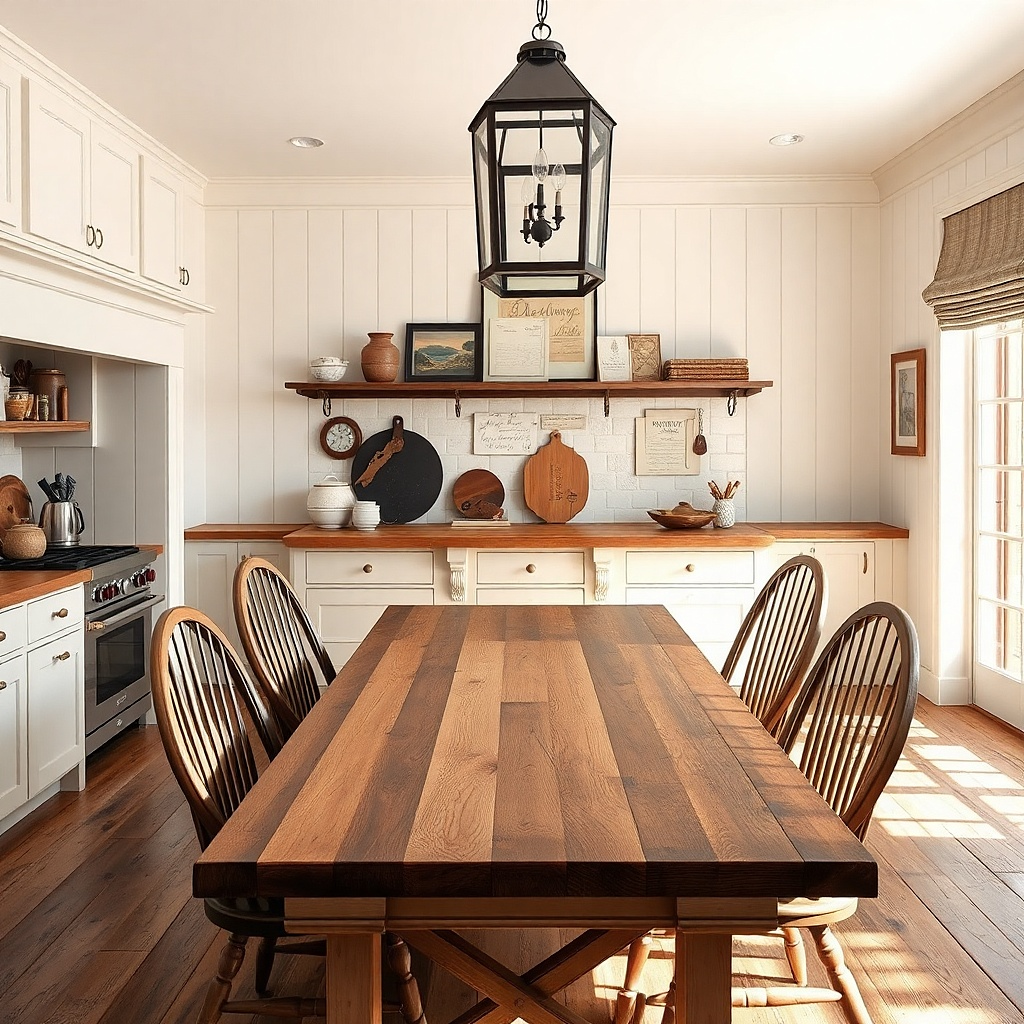
A staggered ledge setup makes the wall feel like a working kitchen, not a showroom. Use a narrow ledge or picture ledge with small frames and one functional clock country kitchens love the mix of practical and pretty. Choose frames in the same finish, then keep recipe cards or small prints in a consistent paper tone like cream. Stagger items at different heights so the wall has depth, but keep spacing consistent so it doesn’t look random. This is a great fix for “I have decor but nothing looks finished” because the ledge gives you a designed baseline.
Install a picture ledge about 6-8 inches wide and mount it so the ledge top sits around 52-56 inches from the floor. Place one small clock centered first, then add two to four small frames on either side at staggered heights. Keep frame edges at least 3 inches apart to prevent crowding. If you’re adding recipe cards, use clip frames or small stands so cards are readable but not loose.
Use a clock with a matte face and simple numbers; glossy clock faces reflect light and look out of place.
Avoid mixing too many frame sizes on one ledge; it creates a scattered look instead of a tidy stagger.
18. Vertical board-and-batten slat wall with one statement sign

Board-and-batten slats add instant country structure, and the best part is you don’t need a lot of decor. A vertical slat wall gives texture and depth, so one statement sign or small framed print is enough to finish the look. Choose a sign with warm wood or matte black text, and keep its size around 12-18 inches wide so it sits comfortably on the textured background. This solves the problem of trying to fill a textured wall with too many items. It’s also very photogenic because the slats create shadows that make the space feel dimensional.
Install a board-and-batten panel section around 24-48 inches wide on a blank wall area. Mount so the center of the panel aligns with your focal point, usually 57-60 inches from the floor. Paint or finish in matte off-white or soft cream so shadows look warm, not chalky. Mount the statement sign centered on the panel, leaving about 6-10 inches of space above and below it so the texture still shows.
Use a matte paint finish; satin paint reflects kitchen lights and makes the slat shadows look harsh.
Avoid putting three signs on a slat wall; texture already does the heavy lifting.
19. Wall vinyl or decal style typography in two lines
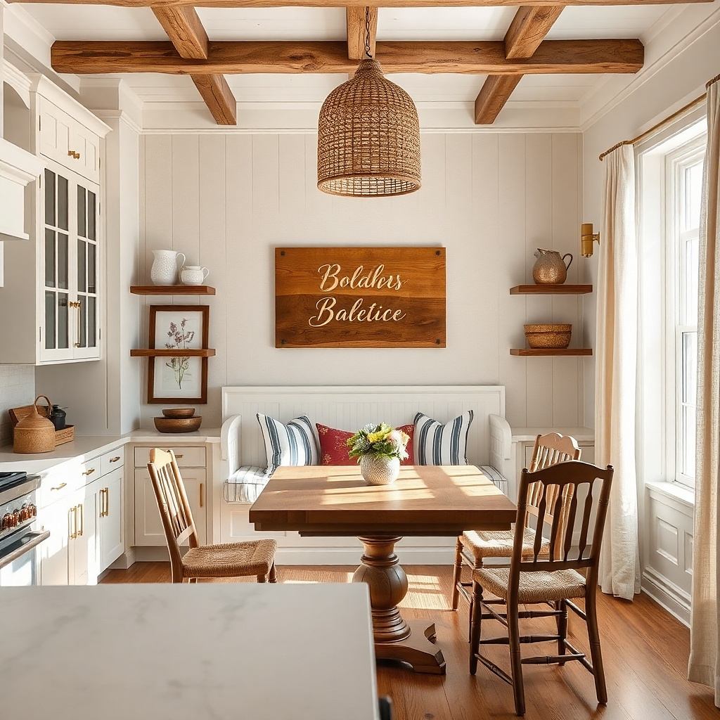
Typography can look country when it’s subtle and sized right. Choose two-line phrases in muted ink tones like warm brown or soft black, and keep the font simple with no glossy effects. Place it above a counter or breakfast area where it won’t fight with cabinets or shelves. The reason this works is restraint: two lines create a focal point without turning the wall into a collage. It also solves the common problem of decor that’s too small vinyl that’s properly scaled reads intentional and clean in photos.
Pick a phrase and size it so it spans about 60-70% of the counter width below. Apply the typography with a level and painter’s tape guides so the baseline stays straight. Use wall-safe vinyl decals or stencil paint if you’re comfortable with masking. Keep it within one color family and place it with the center around 57-60 inches from the floor for visual balance.
Add one small framed print near the typography to anchor it if the wall is otherwise empty.
Avoid multi-color typography; two colors max keeps it country and readable.
20. Large woven wall basket with a neutral runner beneath
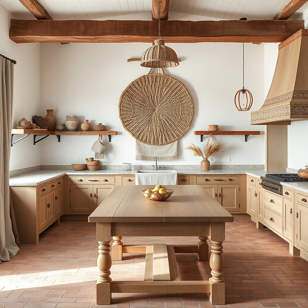
A single large woven basket is a strong country move because it creates texture without clutter. Mount it centered and let it take up enough visual space that it feels like the wall’s main feature. Pair it with a neutral runner or small linen panel below on a console or ledge so the wall and the surface talk to each other. Use basket tones like natural tan or oat, and keep the runner in cream or light beige linen-look fabric. This solves the blank-wall problem while adding warmth that reads well in daylight.
Select a basket with a diameter big enough to cover about 35-45% of the wall width in that section. Mount the basket so its center sits around 60 inches from the floor, then adjust based on how high the surface below sits. If you’re mounting to studs, use screws and a mounting plate; baskets need solid support. Place a neutral runner on the surface below, keeping it centered and about 12-18 inches longer than the basket width for a balanced look.
Try thisChoose a runner with a subtle weave, not a shiny finish, so it matches the basket texture.
Common mistakeAvoid tiny baskets on big walls; small scale reads like an afterthought.