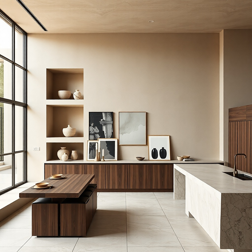
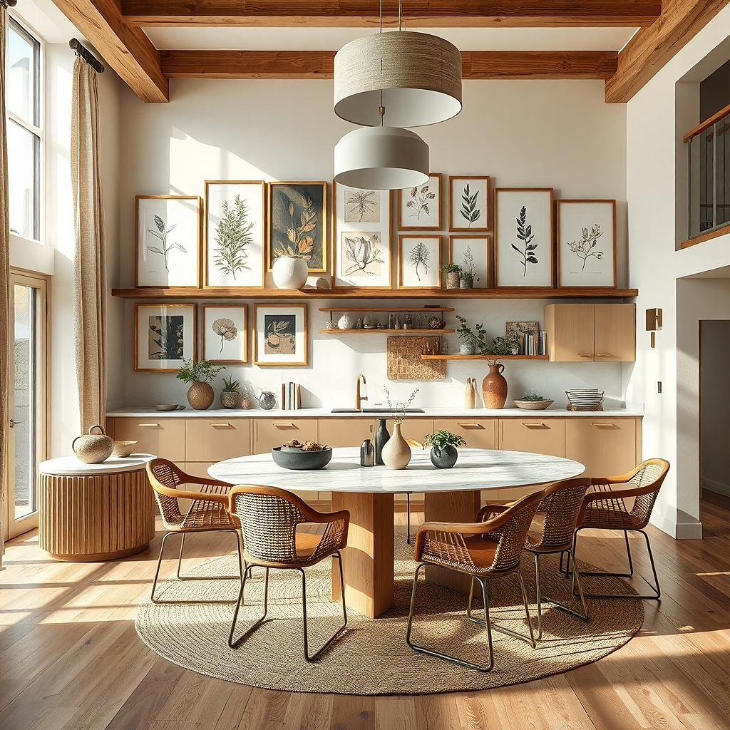
1. Black metal frames with mixed botanicals
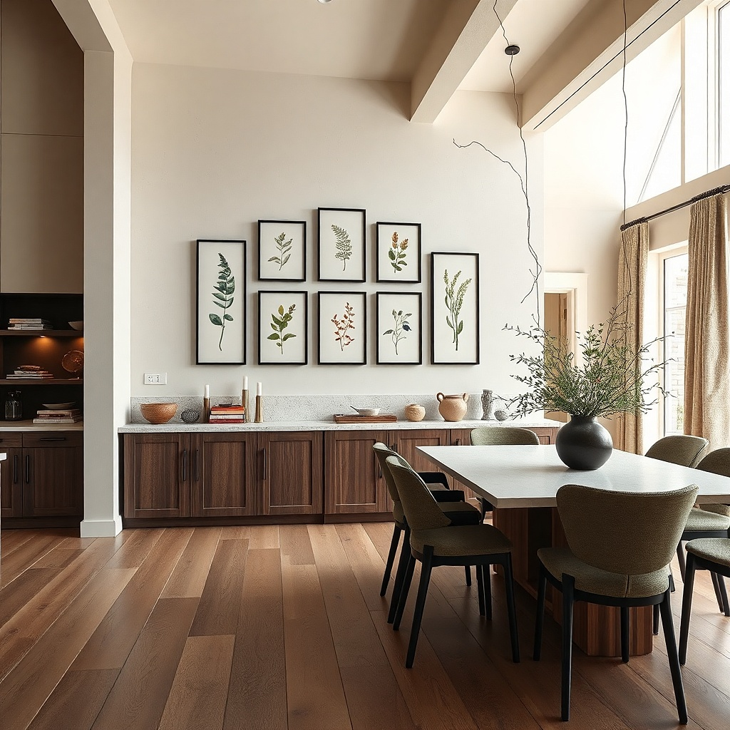
This layout looks collected because the frame finish is consistent while the art has variety. Use six to eight botanical prints in a tight range of sizes: two small (8x10) at the top, two medium (11x14) in the middle, and two larger (16x20) anchoring the bottom. Stick to a limited palette deep green leaves, muted terracotta stems, and off-white backgrounds so it doesn’t fight with cabinets. Black metal frames also handle kitchen glare better than glossy gold because the matte finish absorbs highlights rather than throwing them back at you.
Start by laying the frames on the floor in a rough rectangle that fits your wall width, leaving 2 to 3 inches between frame edges. Hang the center of the middle row at about 58 inches from the floor, then work outward using a level and painter’s tape marks. Use picture wire or D-rings so all frames sit flat; if you have mixed frame depths, keep them the same line by using shims behind the hanging points. Expect to spend about $200-450 depending on frame quality and print sizes.
Choose prints with white or cream paper margins so the wall stays airy even in a narrow dining corner.
Don’t mix black frames with shiny gold or chrome in the same grid — it reads like leftovers.
2. Warm wood frames with monochrome recipe cards
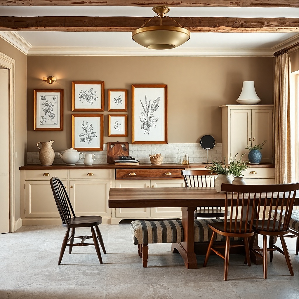
Recipe-card art feels naturally at home in kitchens, and monochrome keeps it from becoming clutter. Use warm wood frames (light oak or honey tone) with black-and-white prints so your cabinetry doesn’t compete. Go for five pieces total: one centered large (16x20), two medium (11x14) flanking it, and two small (8x10) at the corners. The “collected” look comes from different card formats and spacing, not random images, so keep the typography style consistent across the set.
Print or purchase monochrome recipe-card designs with generous margins so they don’t look cramped under glass. Arrange the frames so the large one sits at eye level and the smaller ones taper upward — it makes the wall feel intentional even in a tight breakfast nook. Measure the wall and leave 1.5 to 2 inches between frames; then mark holes with tape before drilling. Use mirror-matte spray only if your frames are glassless; otherwise choose low-glare picture glass from the start.
Try thisMatch the frame wood tone to your cutting boards or cabinet hardware even a small echo makes the set look designed.
Common mistakeSkip colorful recipe art with busy borders; it turns the wall into visual noise.
3. Two-row gallery with white mats and linen-toned prints
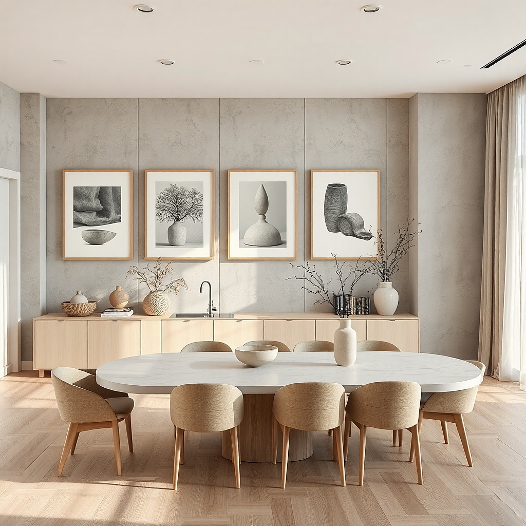
If your kitchen is small and bright, white mats make the wall feel crisp and curated. This idea uses two horizontal rows: four frames on top and three on bottom, with a clear visual rhythm. Choose linen-toned prints (oat, sand, taupe) with subtle texture think abstract brush strokes or minimal still-life shapes. White frames with thick mats create breathing room, which matters when the wall is near a door or a narrow walkway.
Use seven frames in consistent widths, like 1-inch or 1.25-inch frames, and keep mat openings the same size across the set. Hang the top row so the frame centers land around 61 inches, then hang the bottom row so their centers land around 50 inches. Maintain a 2-inch gap between frames and a uniform horizontal line by using a laser level or long straightedge. Budget $150-350 if you buy ready-made frames and custom prints.
Try thisPick prints that are mostly neutral and let the texture carry the interest; you’ll get a calmer look under harsh overhead lighting.
Common mistakeDon’t mix thin mats with thick mats across the same wall — it breaks the grid.
4. Oversized single statement print with a micro cluster
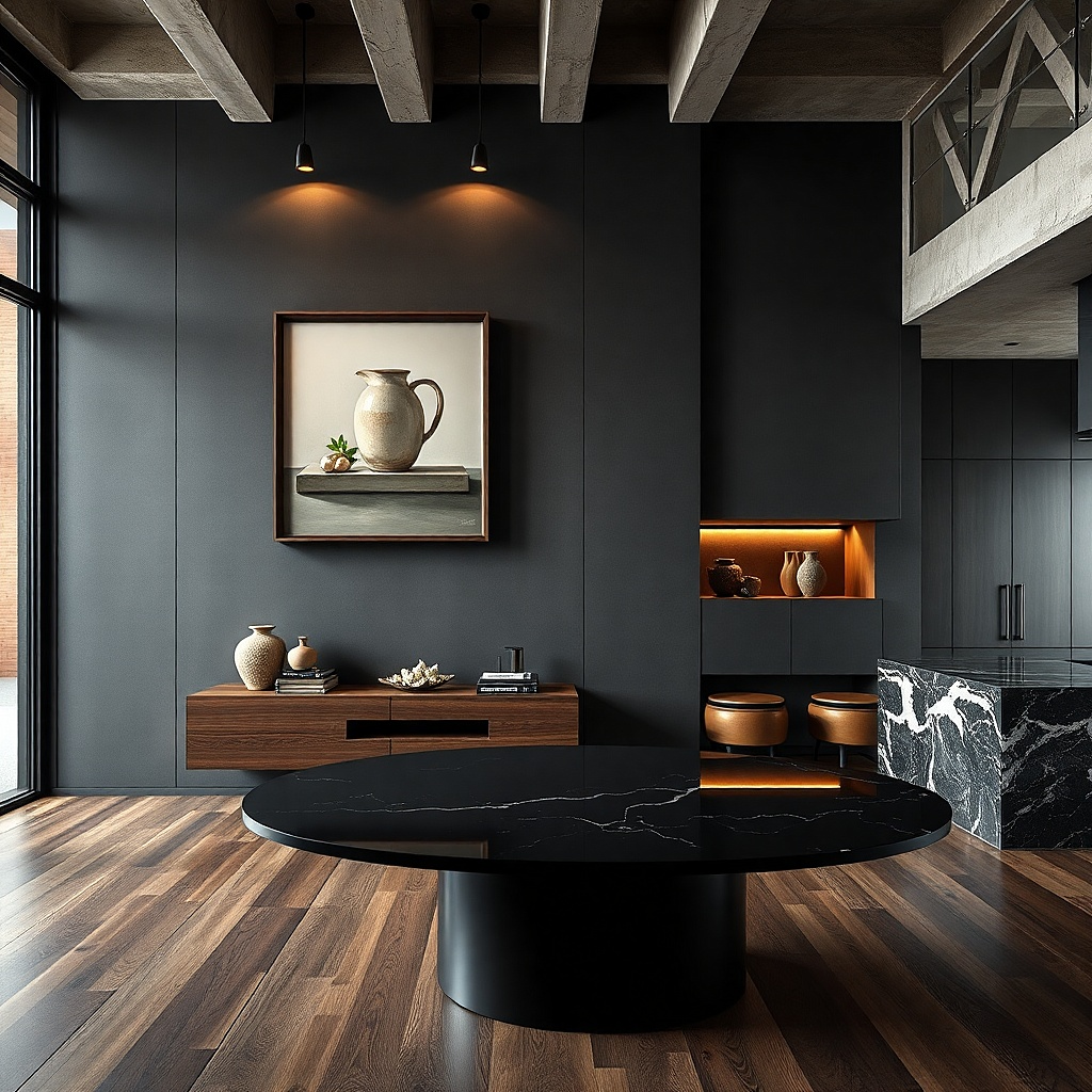
This is the easiest way to feel “collected” in a small kitchen because you anchor the wall with one clear focal point. Start with one oversized print (24x36 or 20x30) that has strong contrast and a simple subject like a single utensil illustration or a bold typography line. Then add a micro cluster of three smaller frames (8x10 each) to one side, staggered slightly for a lived-in feel. Keep all frames the same finish, like matte black, so the cluster looks intentional instead of accidental.
Choose a statement print with a clean border or mat so it doesn’t look like it’s floating. Center the big frame first at about 58 inches from the floor to the vertical center; then position the three smaller frames so their top edges align with the big frame’s top third. Leave 1.5 to 2 inches between the small frames and 2 inches between the cluster and the big frame. Use a template cut from paper for the full arrangement so you don’t waste holes.
Try thisUse a print with a broad off-white field so it doesn’t get washed out by under-cabinet lights.
Common mistakeDon’t add more than three supporting frames next to the big one — the wall will feel crowded.
5. Archival-style frames with muted museum-label prints
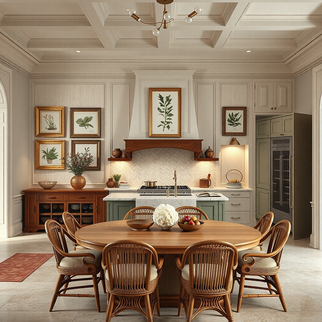
Museum-label style art looks collected because it has a built-in hierarchy. Use cream or off-white frames with a slightly aged finish, then swap in prints that include small captions at the bottom. Keep the images consistent in theme — kitchen ingredients, herbs, or cookware silhouettes — and keep the caption style similar. This works well in small kitchens because the art reads like a set, not a random mix of decor.
Pick six frames total and keep their sizes within one step: for example, two 10x12, two 11x14, and two 8x10. Choose prints with a consistent margin ratio so the captions sit at the same relative height inside each frame. Hang the whole group as a rectangle with 2 inches between frames; then adjust one corner frame up or down by 0.5 to 1 inch for that “collected” tilt. Plan for $180-500 depending on whether you print yourself or buy framed sets.
Use a warm white mat that matches your plate color or countertop edge so the captions don’t look harsh.
Avoid high-saturation images; captions become hard to read when the colors fight.
6. Grid of 12 minimalist monochrome prints
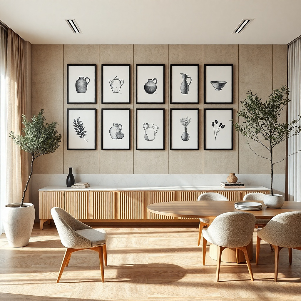
A tight grid looks “beautifully collected” because it’s orderly, not because it’s random. For small spaces, a 12-piece grid works when you keep frame sizes consistent and spacing predictable. Use monochrome prints with similar line weight — utensil line drawings, simple typography, or minimal food silhouettes. Black frames or white frames both work; black hides scuffs better around kitchens, while white brightens walls that already feel busy.
Choose identical frames (for example, 8x10 or 9x12) and identical mats so every unit looks the same. Lay them out in a rectangle that fits your wall width, aiming for 1.5 to 2 inches between frames. Mark the top-left corner point, then measure across and down with a ruler — don’t eyeball the grid. Hang using a stud finder and anchors if needed; a small grid like this usually needs 6-8 secure points.
Use low-glare glass or acrylic for prints with thin lines, so the lines stay crisp under overhead light.
Don’t mix frame sizes in a grid unless you’re ready to re-measure every gap.
7. Staggered vertical gallery above a narrow table
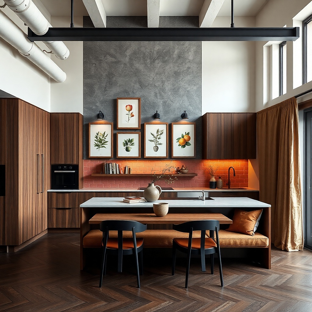
When your kitchen has a narrow table or island side, a vertical gallery stops the wall from feeling wide and empty. This setup uses five frames arranged in a loose vertical column with slight staggering, so it reads tall and intentional. Use one larger frame in the middle (16x20) and four smaller ones around it (8x10 and 11x14). Choose subject matter that repeats herbs, citrus, or cookware with a limited color palette so the set looks collected rather than decorative chaos.
Start by measuring the table width, then make your gallery width about 70-85% of that so it visually centers. Hang the largest frame first so its bottom edge sits about 10-12 inches above the tabletop. Place the smaller frames around it with 1.5 to 2.5 inches between edges, then keep the overall height under 72 inches so it doesn’t hit cabinet tops awkwardly. Use a template to keep the staggering symmetrical left-to-right.
If your kitchen has open shelving, match the art palette to one shelf item color so the wall and shelves feel like one story.
Don’t stack frames too close to the ceiling; high glare makes the top row look washed out.
8. Butcher-block wood frames with vintage fruit prints
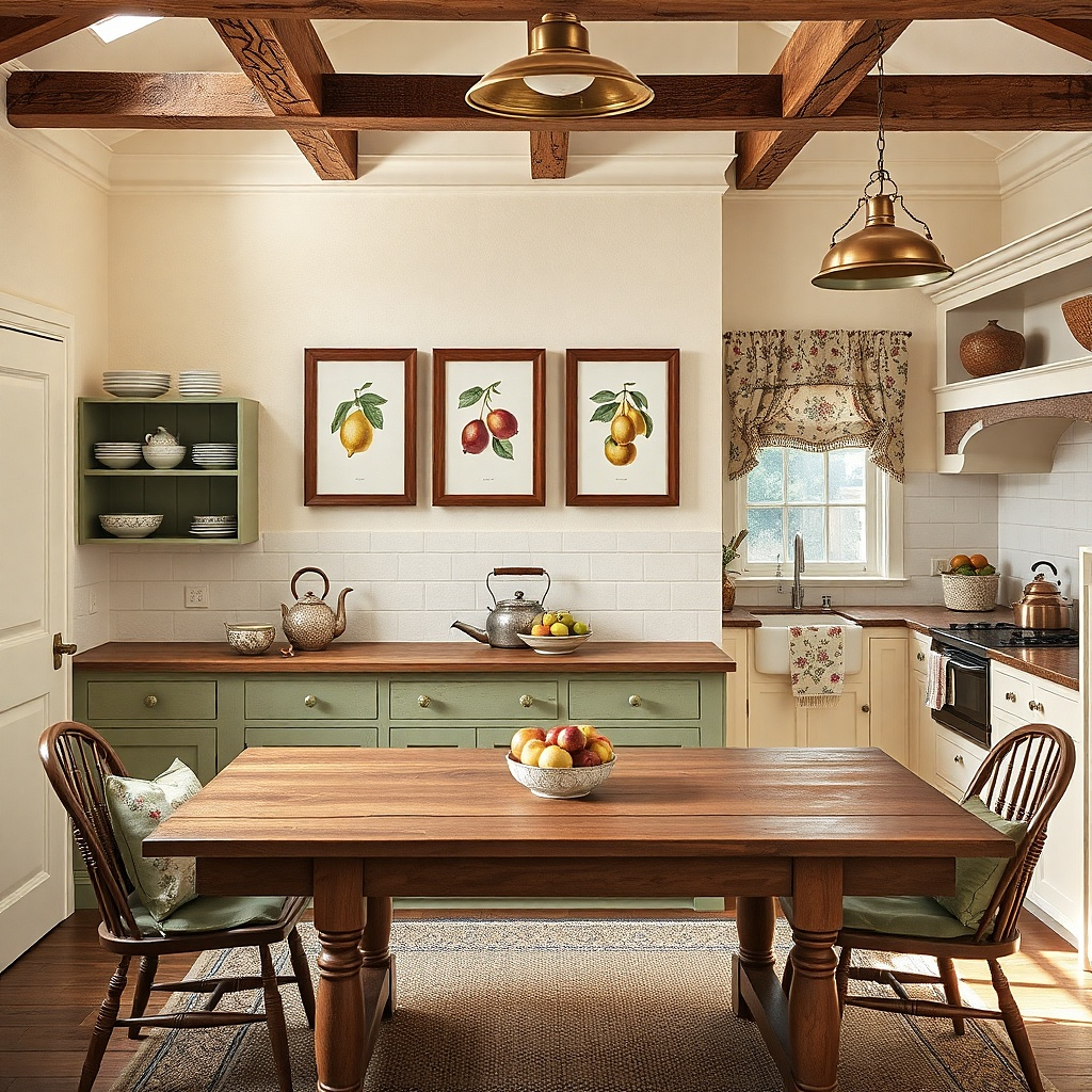
Vintage fruit prints look warm and kitchen-appropriate, and butcher-block wood frames make them feel grounded. This is a smaller set that still reads collected because the prints share the same vintage illustration style and the frames share the same wood tone. Use four frames arranged in a rectangle: one larger at center (16x20), two medium (11x14) beside it, and one small (8x10) at the top. Keep the print backgrounds creamy so the wall doesn’t look gray.
Pick fruit prints with similar contrast and avoid ones with heavy blue skies or neon colors. Choose frame dimensions that keep the rectangle balanced — for example, center at 16x20, sides at 11x14, top at 8x10. Hang the center of the rectangle at 58 inches from the floor, then keep 2 inches between the center and side frames and 1.5 inches between the top frame and the sides. Budget $120-300 if you print yourself and use pre-cut mats.
Try thisUse museum-style glass or acrylic with anti-reflective coating if your kitchen has bright overhead lights.
Common mistakeSkip glossy varnish frames; they show fingerprints and glare.
9. White-on-white frames with textured abstract prints
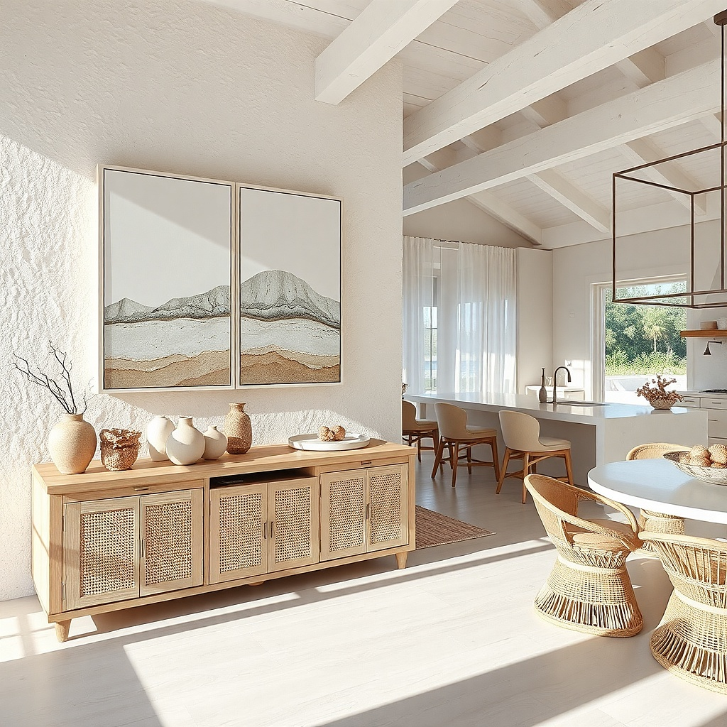
White-on-white sounds risky in a kitchen, but it works when you add texture and keep the contrast subtle. Use white frames with off-white mats, then choose abstract prints with visible texture — linen-like backgrounds, raised-looking brush effects, or grayscale gradients that don’t spike in color. The collected effect comes from repetition: same frame width, same mat tone, and varied print texture. This is ideal for small kitchens with light paint and white cabinets because it adds softness without adding color noise.
Choose six frames all in the same size group, like two 11x14, two 8x10, and two 16x20, but keep frame widths identical. Leave 2 inches between frames so the white doesn’t merge into a single block. Hang the center of the group at 59 inches from the floor and align edges with a laser level. If you have hard-to-hang walls, use French cleat or a rail system so the frames stay level as you adjust.
Pick prints with texture you can see from arm’s length; if the texture only shows up close, kitchen lighting will flatten it.
Avoid pure black prints in a white-on-white set; they overpower the calm effect.
10. Matte black frames with framed typographic measurements
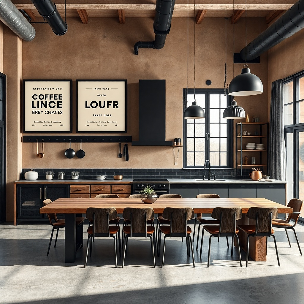
Measurement typography feels like a kitchen tool, not wall decor. Use matte black frames and prints that show measuring cups, weights, or simple cooking ratios in a minimal typographic style. The collected look comes from repetition of the same font family or the same layout structure across the four frames. Keep the prints black, warm gray, and cream with lots of margin. This works especially well in small kitchens that already have bold hardware or dark cabinets because the set stays graphic without adding more color.
Buy or print four typographic pieces sized 8x10, 11x14, 11x14, and 16x20. Arrange them in an L-shape rectangle so the largest one sits at the corner and the two medium ones form the next step. Use 2 inches between frames and keep all typography centered within the mats. Hang using a stud whenever possible; four frames usually need only four anchor points if you use heavier frames.
Try thisChoose prints with thick strokes; thin typography disappears under glare.
Common mistakeDon’t mix serif and handwritten styles in the same set; it reads like mixed signage.
11. Brass-toned frames with botanical line art and gold accents
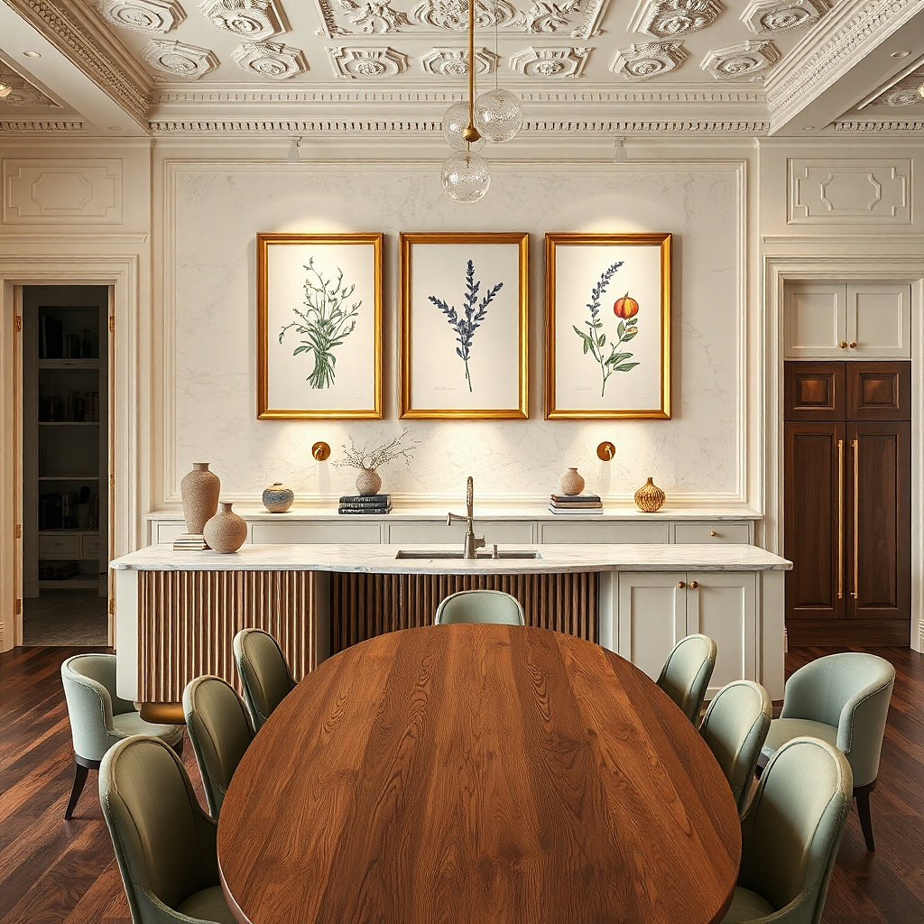
Brass-toned frames can look collected in a kitchen when the art has simple line work and small gold accents, not full-color scenes. Use five frames arranged in a staggered rectangle: one larger center (16x20) and four smaller around it. Choose botanical line art that includes tiny gold flecks or thin gold borders on the mat, so the brass doesn’t feel like a random metal. This also pairs well with kitchens that have brass faucet or cabinet pulls.
Pick frames with a consistent brass tone (light or medium, not mixed). Use low-glare glass and keep mat color warm white so the brass doesn’t look yellow-green. Hang the center frame first at 58 inches, then place the two side frames about 2 inches away and the two corner frames slightly higher by 0.5 inches to create the collected feel. Cost lands around $220-520 depending on brass frame pricing.
Use prints with lots of negative space so the brass reads intentional and not busy.
Avoid full-color botanical paintings; they compete with brass and kitchen lighting.
12. Gallery rail with evenly spaced 8x10s
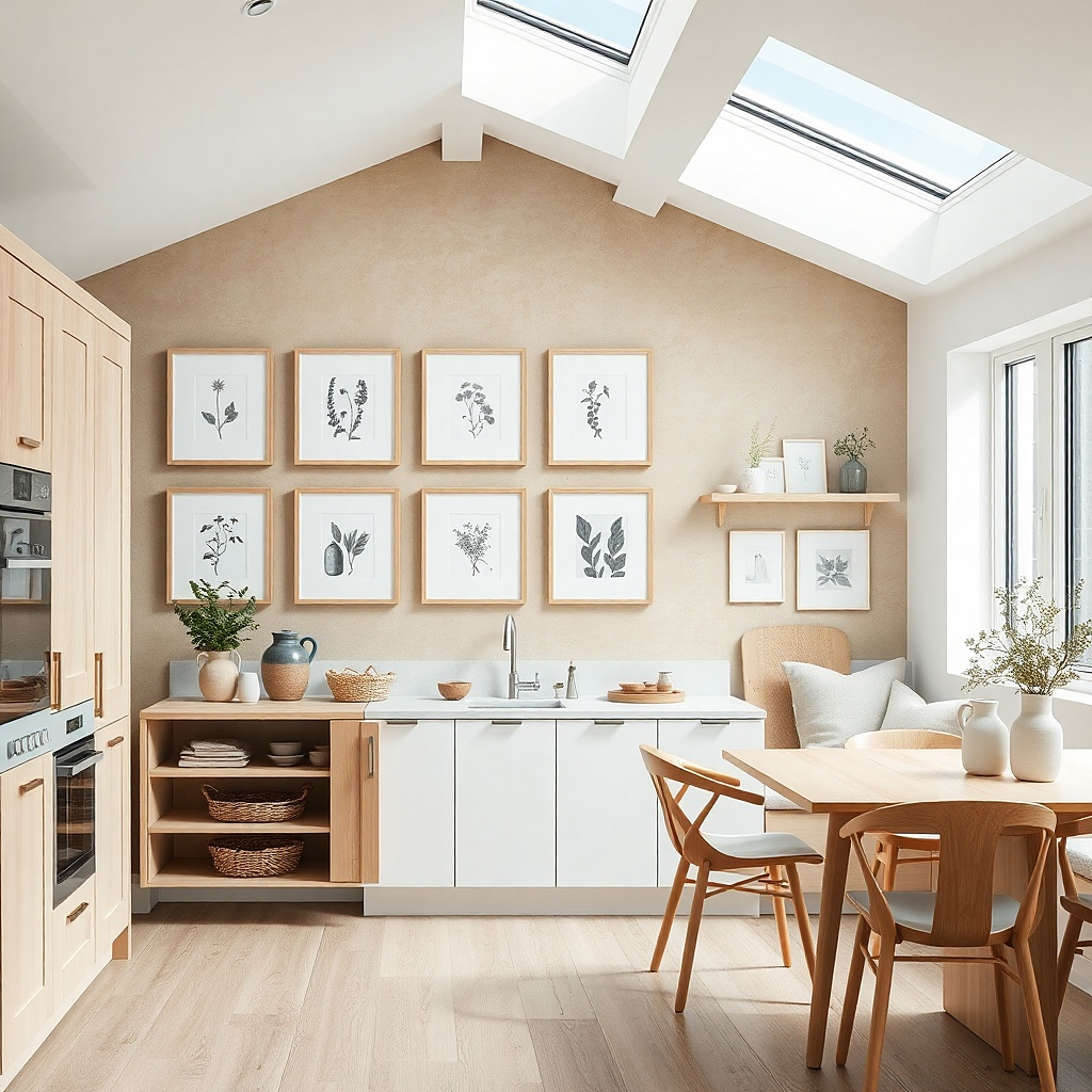
A gallery rail is the cleanest way to get a small-space gallery that always looks aligned. Use eight 8x10 frames with neutral prints grayscale herbs, minimal still-life, or simple kitchen ingredient illustrations. The rail keeps spacing perfect and makes it easy to swap prints seasonally without remeasuring every time. This look is photogenic because the frames line up like a curated set while the art variety gives it personality.
Install a picture rail level along the wall, positioned so the top row sits below any cabinets by at least 6 inches. Hang eight frames with the same mat size to keep the visual rhythm. Use 2-inch spacing between frame edges; with 8x10s this usually fits a wall span around 40-50 inches wide. A rail system costs about $20-60 for hardware plus frames and prints.
Try thisUse the same frame color for every piece even if the prints vary; the rail already does the organizing.
Common mistakeDon’t mix mat widths; a rail can keep alignment but it cannot fix mismatched mat edges.
13. Corner wrap gallery with two overlapping mini grids
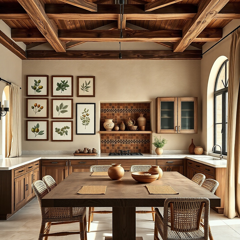
If you have a corner where the wall feels like it turns into dead space, a wrap gallery makes it feel designed. Create two mini grids: one on each wall side, with one or two frames overlapping visually at the corner. Use matching frames and mats so the two walls feel like one collected display. Choose art with a shared theme like coffee, tea, or herbs so the set reads coherent even when viewed from different angles.
Measure the corner and pick a width for each wall side, then decide on 3-4 frames per wall. Keep frame sizes consistent on each side — for example, two 11x14 and two 8x10. Leave 2 inches between frames on each wall, and keep the distance from the corner edge about 3-4 inches so the frames don’t look squeezed. Use a level on both walls and adjust one frame so the corner overlap feels intentional.
Try thisPick art that has a directionless composition so it still looks balanced when viewed from an angle.
Common mistakeDon’t place frames too close to the corner — they’ll look cut off in photos and in person.
14. Color-blocked mats in one shade family
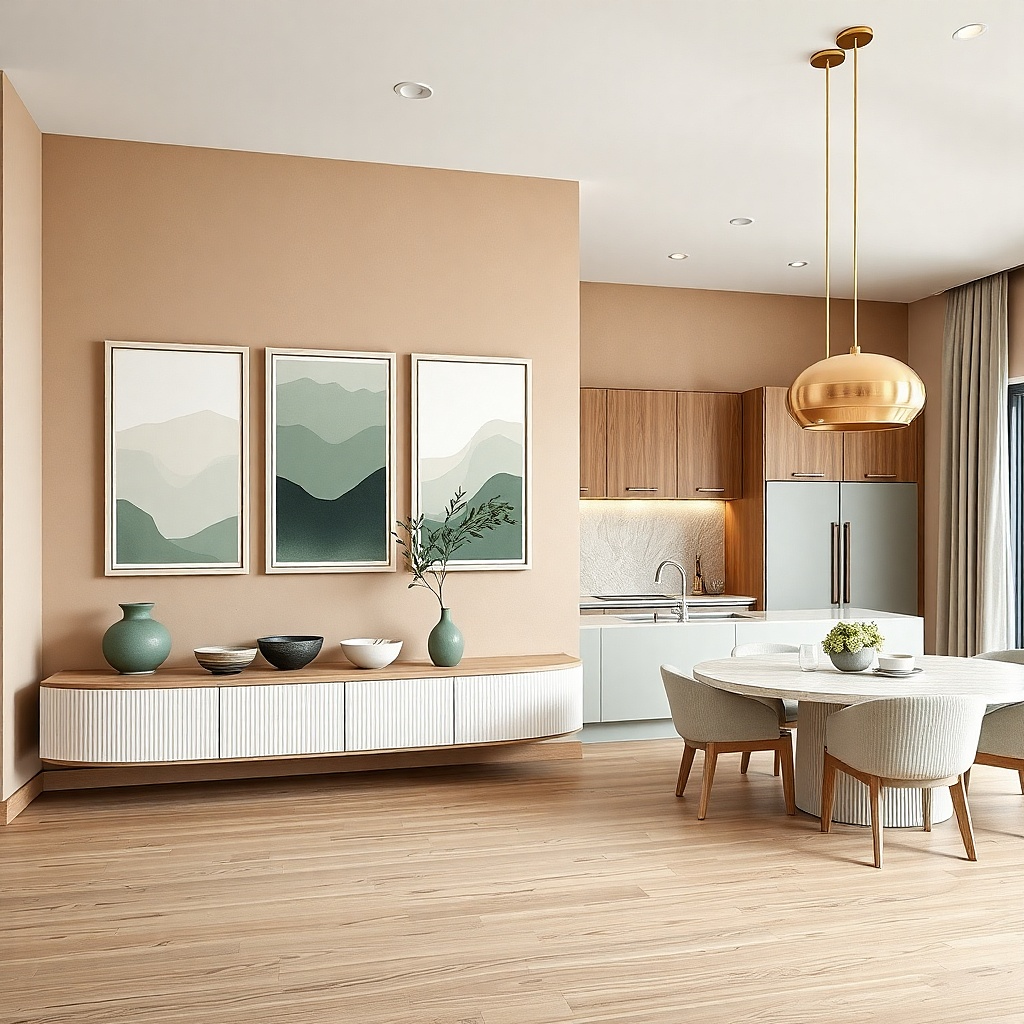
This is how you add color without turning the wall into a rainbow. Keep one frame finish (like white or natural wood) and vary only the mat color within one shade family — sage, cream, muted clay. Use prints that echo the same tones so the mats don’t feel separate from the art. Arrange five frames with one larger center and four smaller around it, but let the mats do the visual organizing. It looks collected because the color story repeats across pieces.
Choose five frames in the same size set and keep the frame widths identical. Order mats in one shade family and set print sizes so the mat openings are consistent across the wall. Hang the center frame first at 58-60 inches to the center, then place the smaller frames with 2-inch gaps and aligned edges. You’ll spend more on custom mats, but the result reads intentional and cohesive.
Try thisMatch the mat colors to actual kitchen materials backsplash grout, tile undertone, or a cabinet shadow not just paint swatches.
Common mistakeAvoid mixing multiple unrelated colors; the wall will look like a collage.
15. Oversized tray-style frames for vintage cookware prints
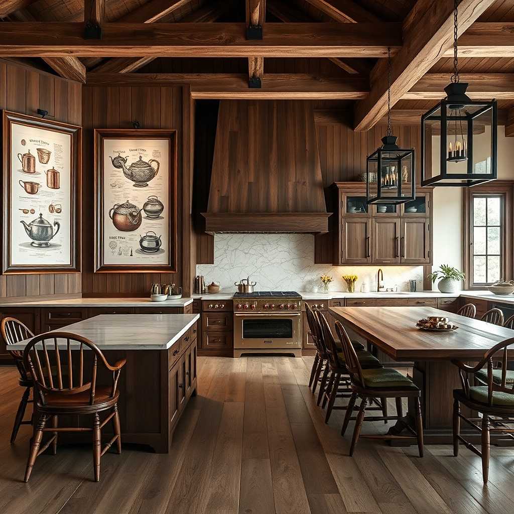
Tray-style or wide-moulding frames make cookware illustrations feel like kitchen artifacts. Use three large frames instead of many small ones: one centered (20x30), two smaller (16x20) flanking it. Choose vintage cookware prints with muted backgrounds and strong line work. The wide frame molding adds scale, so the wall looks styled even when the kitchen wall is short and the dining area is compact.
Pick frames with a wide inner lip or tray-like profile so the art feels grounded. Keep print sizes proportionate — don’t shrink the art too much inside the frame or it will look lost. Hang the center frame first at about 58 inches to the vertical center, then set the side frames so their inner edges are about 10-12 inches from the center frame edges. Use at least one stud per frame if your frames are heavy.
Choose prints with off-white or warm gray backgrounds so they don’t look stark next to tile or stainless appliances.
Don’t use thin, narrow frames with large prints; they look under-scaled in photos.
16. Ceramic-tile inspired prints with a white frame set
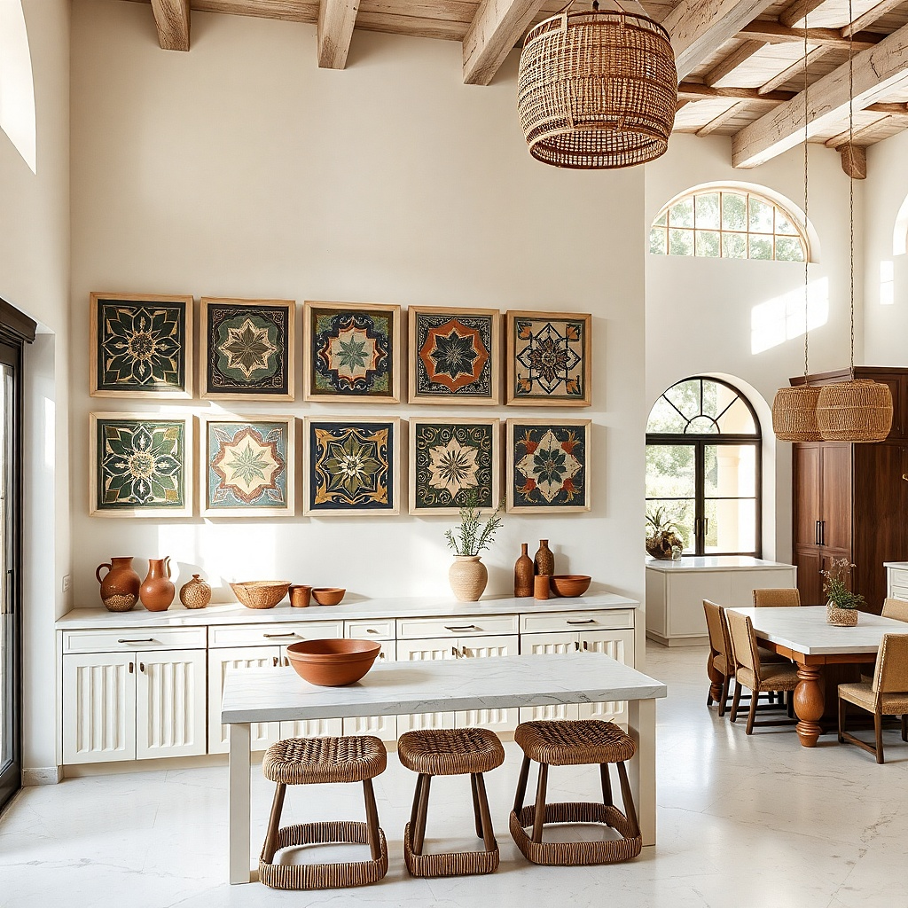
If your kitchen has tile backsplashes, you can echo that look without hanging actual tiles. Use prints that mimic ceramic tile geometry small repeats, simple borders, and soft colorways like slate gray and muted blue. Frame them in white frames with consistent mats so the pattern repetition feels collected rather than chaotic. This is great for small spaces because the art pattern fills the wall without requiring large scale.
Choose six frames with two sizes: three 8x10 and three 11x14. Keep the mat color white and use prints with similar border thickness so the edges align visually. Arrange them in a rectangle with 2 inches between frames and keep the overall group centered at 58-60 inches. Budget $140-350 depending on whether you print yourself and use standard mats.
Use prints with a matte finish or choose anti-reflective glass so tile patterns don’t flare under overhead lights.
Avoid high-contrast neon patterns; they look cheap next to real tile.
17. Monochrome food silhouette set with staggered horizontals
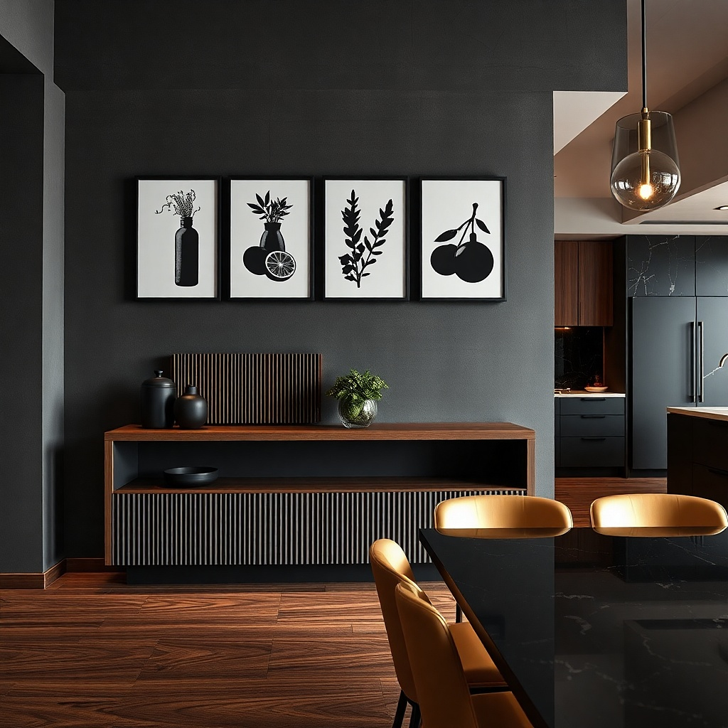
Silhouette art reads clean from across a kitchen, which is what you want when you’re cooking and glancing up. This layout uses seven frames in staggered horizontals: four on the bottom row, three on the top row, slightly offset. Use black silhouettes on off-white backgrounds and keep the frame finish consistent (matte black or dark walnut). The collected look comes from the repeating silhouette style and the staggered placement, not from random subjects.
Pick frames in two sizes: four 8x10 and three 11x14. Position the bottom row first so the row center sits around 52 inches from the floor, then place the top row so its center sits around 62 inches. Maintain 1.5 to 2 inches between frames in each row and 2 inches between rows. Use a pencil grid on the wall to keep the stagger even.
Try thisChoose silhouettes with thicker edges so they remain readable in kitchen lighting.
Common mistakeDon’t use thin, detailed photos; silhouettes look crisp and intentional instead.
18. Two-tone frames with a single repeated mat size
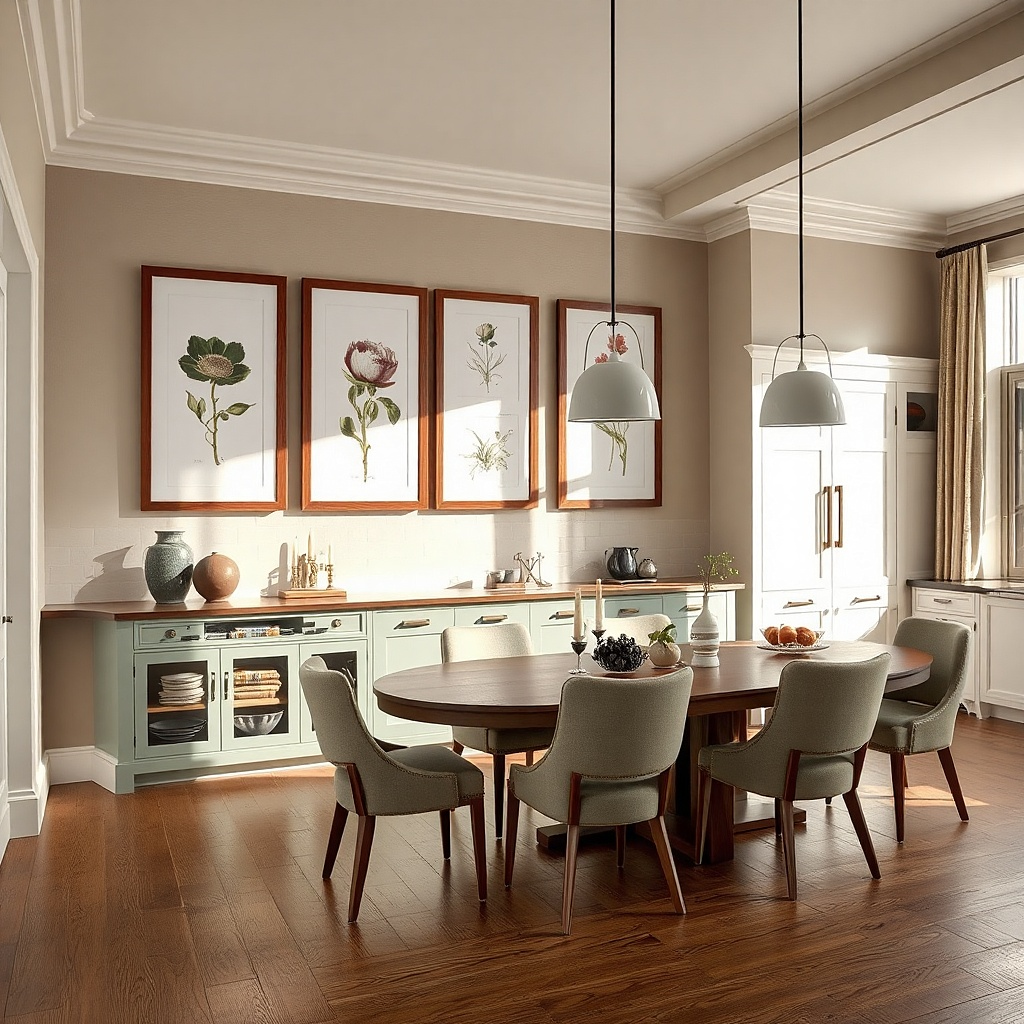
You can mix frame tones and still look collected if the mats are identical and the art palette stays tight. Use two frame tones dark walnut and light oak but keep the mat openings the same size on every frame. Choose prints in one palette, like olive green, cream, and charcoal. Arrange five frames in a compact rectangle with one larger center. This works in small kitchens because the repeated mat size creates visual unity even when frame tones vary.
Select five frames that have the same mat opening ratio, even if the frame colors differ. Buy or cut mats so each mat opening matches exactly, then mount prints with centered alignment. Hang the center frame at about 58 inches to the center, then place two frames to each side with 2-inch gaps and align the top edges. This costs more than matching frames, but it avoids the “random thrift mix” look.
Limit the frame tones to two anything beyond that reads messy in tight spaces.
Don’t mix mat colors too; identical mats are what makes the two-tone frames work.
19. Kitchen alphabet frames with one large letter
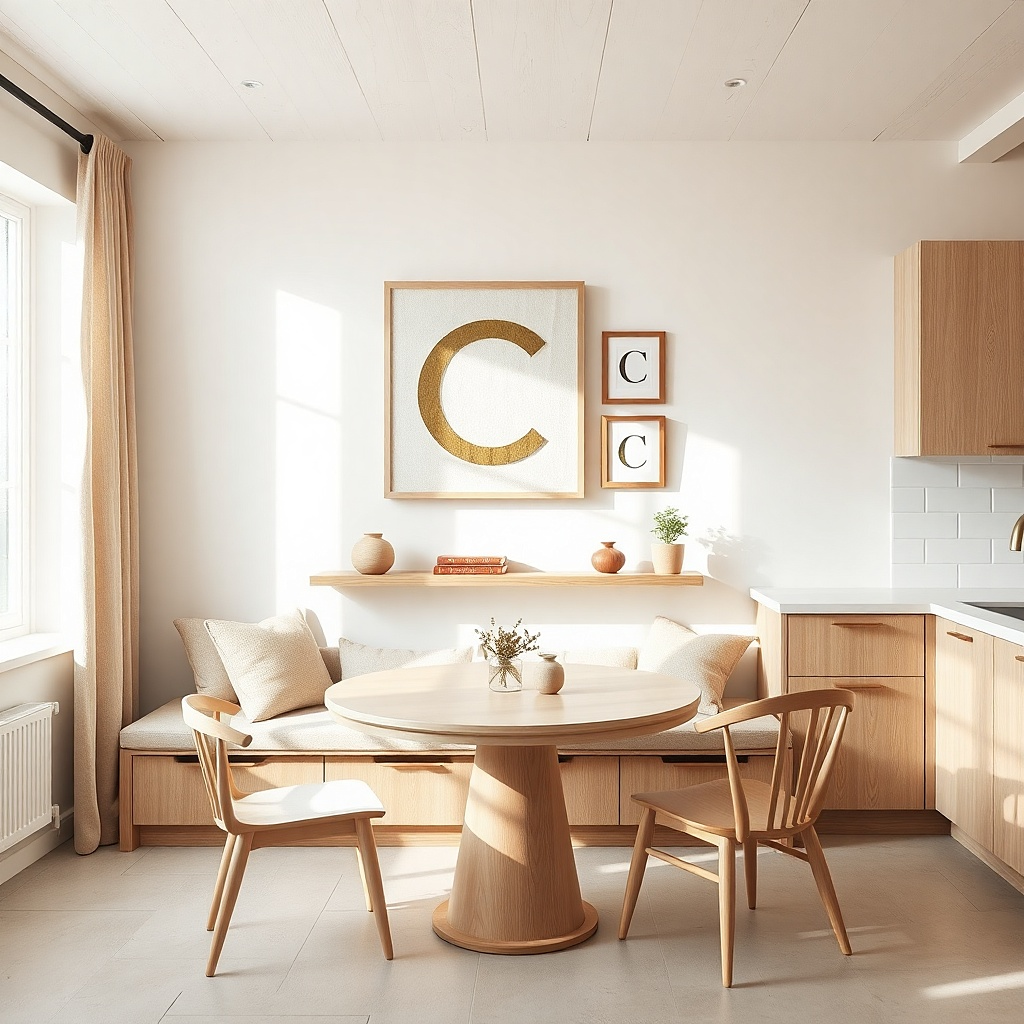
Alphabet art feels graphic and playful, and it photographs well in a kitchen because letters read instantly. Use five frames: one big letter (like “C” for cooking) in the center and four smaller letter prints around it, tied to kitchen words like “cup,” “citrus,” “coffee,” “chop.” Keep the font style consistent and limit colors to two — charcoal and cream, or navy and cream. The collected look comes from a single theme and consistent typography, not from mixing unrelated art.
Choose frame sizes that create a clear hierarchy: center 20x30, sides 11x14, and top and bottom 8x10. Hang the center at 58-60 inches to the vertical center, then keep 2 inches between frames. Use the same mat color for every letter so the letters feel like one set. Budget $120-320 depending on whether you buy letter prints or DIY them.
Try thisIf your kitchen has busy backsplash patterns, keep the letter art simple and leave lots of mat space.
Common mistakeAvoid multi-font alphabet prints; they look like sticker sheets.
20. Floating shelf gallery using frame ledges
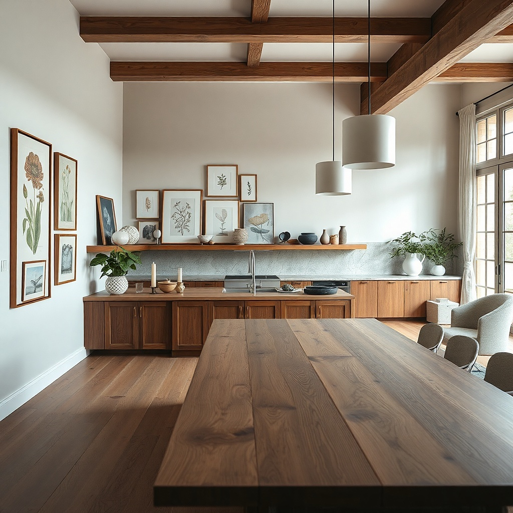
A floating shelf gallery is a smart option when your wall is hard to drill or you want a layered, collected look without exact grid perfection. Use two to three shallow frame ledges or one narrow shelf and place frames at different depths. Choose prints with consistent tones warm neutrals, black line art, and off-white backgrounds so the layered look still feels cohesive. This works in small kitchens because the shelf creates a visual line and reduces the need for many separate holes.
Install one shelf at about 56-58 inches from the floor to the shelf top, then place frames on the shelf with small stands or picture ledge rails. Add a couple of frames on the wall above the shelf if needed, keeping spacing at 2 inches from the shelf edge. Use uniform frame widths so the shelf doesn’t look like it’s holding random frames. Plan for $60-200 in shelf hardware plus frames.
Use frames with thick backing and lightweight glass so the shelf load stays manageable and the frames sit flat.
Don’t mix heavy framed art with light shelves; sag makes the layout look careless fast.