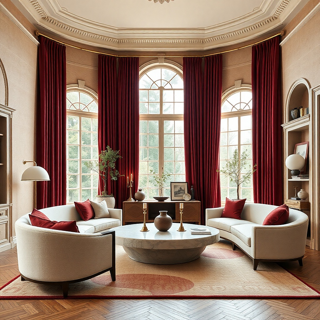
1. Oxblood velvet with cream walls and walnut wood
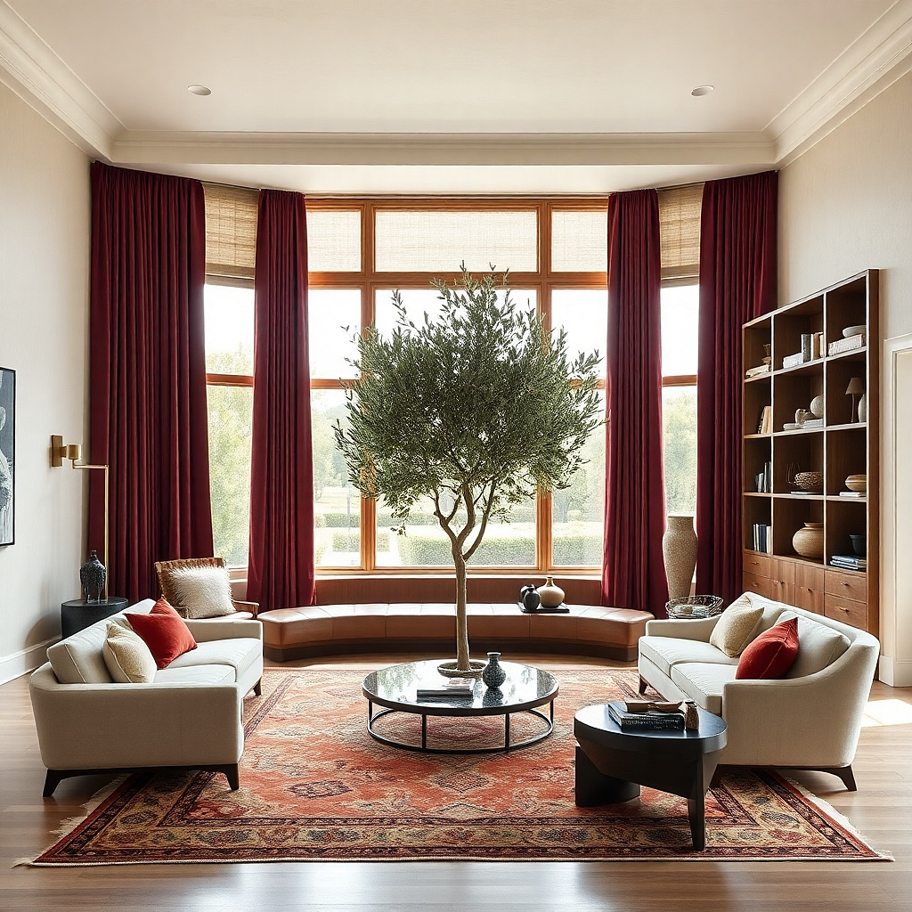
This is the safest bold option if you want red curtains that look expensive on sight. Oxblood has enough brown and black in it to feel moody instead of loud, and velvet gives it a dense surface that absorbs light rather than bouncing it back. Put it against creamy walls — not stark white — with walnut wood, a camel chair, and one black accent table. The room gets contrast, but the red stays grounded. This look suits formal living rooms, older homes with trim, and open-plan spaces that need one strong anchor near the windows.
Start by choosing lined velvet panels in an oxblood or dark wine tone with a matte finish, not crushed velvet and not anything with sheen. Mount a black or antique brass rod 10 inches above the window and extend it 8 to 12 inches past each side so the glass stays visible when the curtains are open. Then add walnut or dark brown wood within sight of the window — a coffee table, media unit, or side chair legs — and keep the rug cream with a low pattern. Expect to spend more here than on basic panels, but this is the version worth paying for because cheap red velvet looks flat fast.
Use ring clips or drapery rings and train the pleats by hand for a week so the folds fall in even columns.
Do not pair oxblood velvet with bright white walls and chrome furniture unless you want the room to feel cold and stagey.
2. Brick red linen with plaster walls and black accents
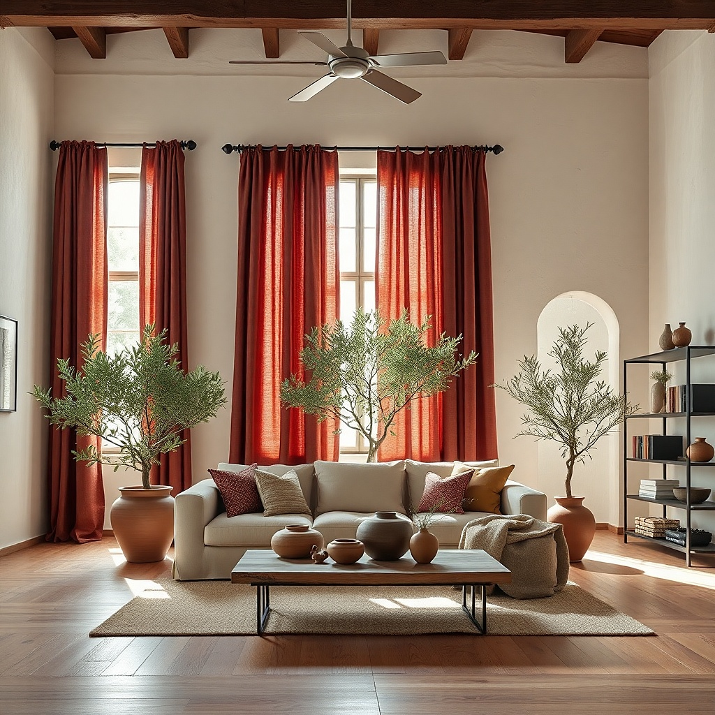
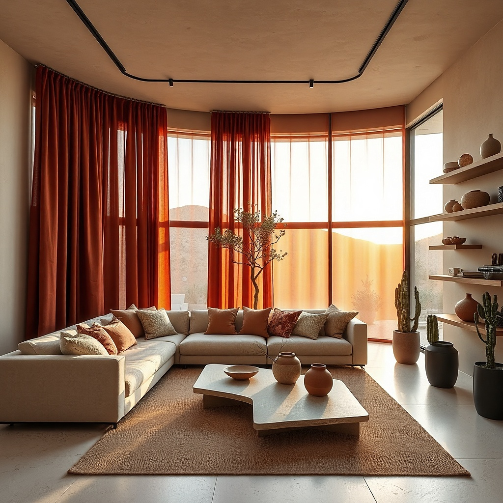
Brick red is the red for people who want warmth without drama. It has an earthy cast that works with off-white plaster walls, matte black metal, terracotta pots, and worn wood, so the room feels collected rather than decorated in one shot. Linen or a linen-cotton blend keeps the look airy and architectural. Light comes through with a soft ember tone instead of a hard red cast. This one is excellent in sunnier rooms, especially if the living room already has natural textures like jute, oak, clay, or boucle.
Start with brick red panels in a medium-weight linen blend and choose privacy lining if the room gets strong afternoon sun. Install a slim black rod close to the ceiling line, then let the curtains just kiss the floor or break by half an inch if you want a softer effect. Next, repeat the color in one terracotta planter and one rust-striped pillow, then stop there. This look is forgiving on a mid-range budget because matte woven fabric hides price differences better than shiny synthetic cloth.
Try thisIf the walls are builder beige, paint them a chalky off-white first. Brick red looks far better against a muted wall with a little gray in it.
Common mistakeSkip orange-red linen with honey oak trim unless you want the whole room to drift into pumpkin territory.
3. Garnet pinch-pleat drapes in a gray city living room
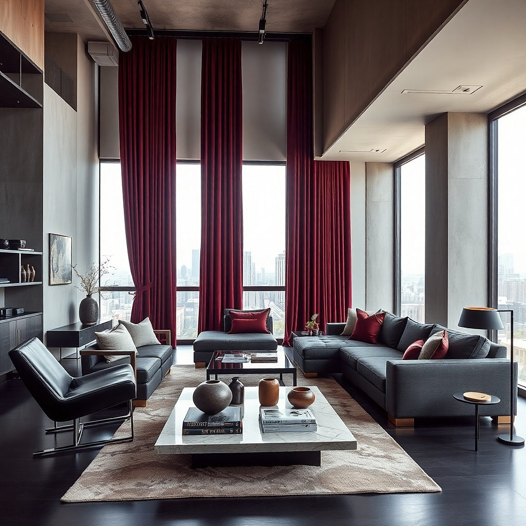
Gray rooms need a red with a cooler base or the curtains look pasted on. Garnet has enough blue in it to sit neatly with charcoal sofas, pale gray walls, black floor lamps, and smoked glass. Pinch pleats matter here because they give the top edge structure and make the whole window wall look cleaner. The result is polished and urban, not cozy-cottage. Use this in apartments, newer builds, or any living room with straight lines and cooler finishes that need one shot of color.
Start by measuring from the rod to the floor and order pinch-pleat panels with hooks already set, because this style looks wrong when improvised with clip rings. Choose a rod with a return if you want better light control, and keep the hardware black for a sharper line. Then layer in one soft element such as a gray mohair throw or a nubby ivory chair so the room does not go hard and slick. This takes more planning than tab-top panels, but the result reads custom from the door.
A rug with even a thin wine or plum thread in the pattern will tie garnet curtains into the room without adding more obvious red.
Do not use bright cherry red against cool gray walls. It clashes in seconds.
4. Rust red curtains with olive and cognac
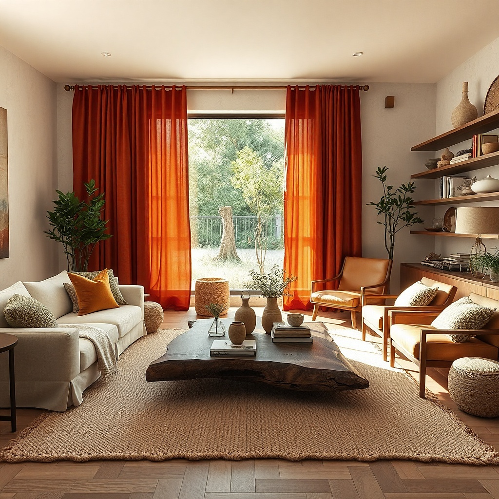
Rust red sits between red and burnt clay, which makes it one of the easiest reds to live with. In a room with olive pillows, a cognac leather chair, warm wood, and cream walls, it gives depth without stealing every glance. The palette feels grounded and a little old-world, but not fussy. This look is especially good in living rooms that get golden afternoon light because rust glows instead of glaring. It also handles pet hair and dust better than darker velvet reds if you choose a textured weave.
Start with rust panels in chenille, slub cotton, or a linen blend with visible texture. Hang them high and wide, then place olive in one textile and cognac in one larger piece such as an armchair, ottoman, or leather bench. Finish with a rug that has cream plus a small amount of faded terracotta or brown-red so the curtains do not feel isolated. This palette is easy to build in stages because the supporting colors are common and forgiving.
Try thisChoose a rust that looks slightly muted in daylight. If it reads orange on the sample card, it will look louder once the full panels are up.
Common mistakeAvoid pairing rust curtains with pink-beige walls. The room turns muddy fast.
5. Deep red silk-look drapes with antique brass
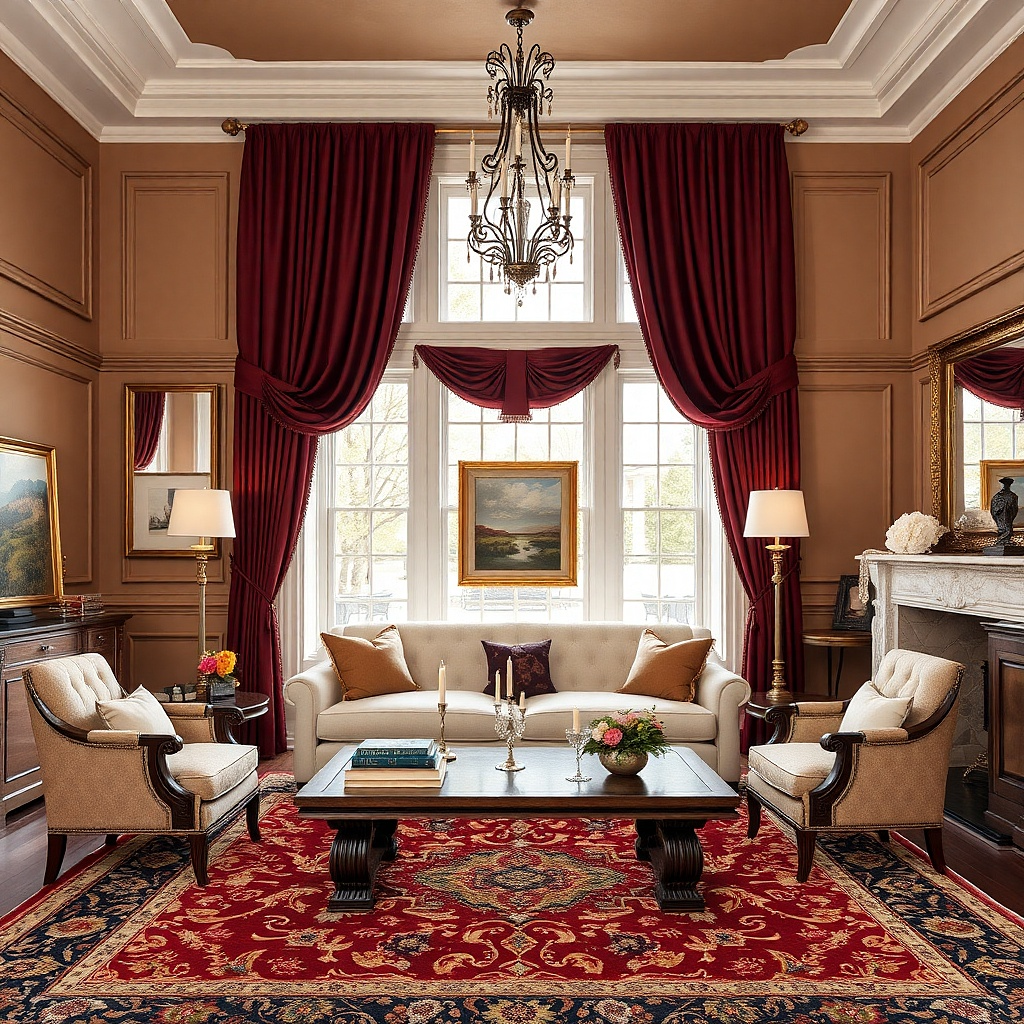
If you want an old-money look without going full period room, deep red drapes with a soft silk look and antique brass hardware do the job. The key is restraint. Use a dark red with brown depth, keep the walls pale mushroom or warm ivory, and bring in antique brass only at the rod, lamp base, or picture frame. The slight sheen catches evening lamplight and gives the room a formal edge. This fits best in living rooms with ceiling height, fireplaces, panel molding, or traditional furniture silhouettes.
Start by choosing faux silk or silk-blend drapes with a lining thick enough to prevent the color from glowing neon in daylight. Install a substantial antique brass rod with larger finials, then steam the panels so the sheen lies smooth instead of puckered. Add one more brass note near the curtains and keep the coffee table and sofa upholstery matte. This look needs discipline more than money because too much shine ruins it.
Try thisUse warm 2700K bulbs in nearby lamps. Cool bulbs make deep red silk look cheap and slightly purple.
Common mistakeDo not add mirrored furniture, crystal-heavy lamps, or glossy lacquer side tables. The room slips into hotel-lobby territory.
6. Cherry red as a single modern statement
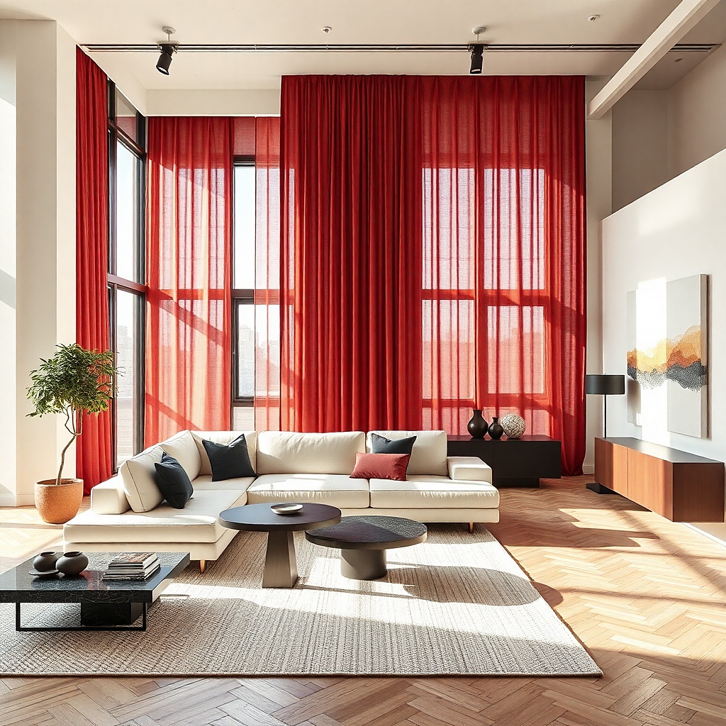
Cherry red is the hardest red to get right, but it works in one very specific setup: a crisp modern room with white walls, black accents, and almost no competing warm tones. In that setting, the red reads graphic and intentional. Keep the curtain shape simple — flat panels or wave pleats — and let the red be the only saturated color in the room. The look feels sharp, editorial, and photogenic from across the space. This is for people who want a bolder, cleaner style rather than softness.
Start with matte fabric, not satin and not anything translucent, because cherry red already has enough intensity. Mount a black track or slim rod near the ceiling, use floor-length panels, and keep furniture low and simple in white, black, or pale gray. Then add one small red repeat such as a single art print or one lacquer tray and stop. This approach is less about layering and more about strict editing.
Try thisA concrete, black, or pale oak coffee table keeps modern cherry red from feeling juvenile.
Common mistakeSkip cream, gold, and floral prints with cherry red curtains. That mix fights itself.
7. Burgundy curtains layered over woven shades
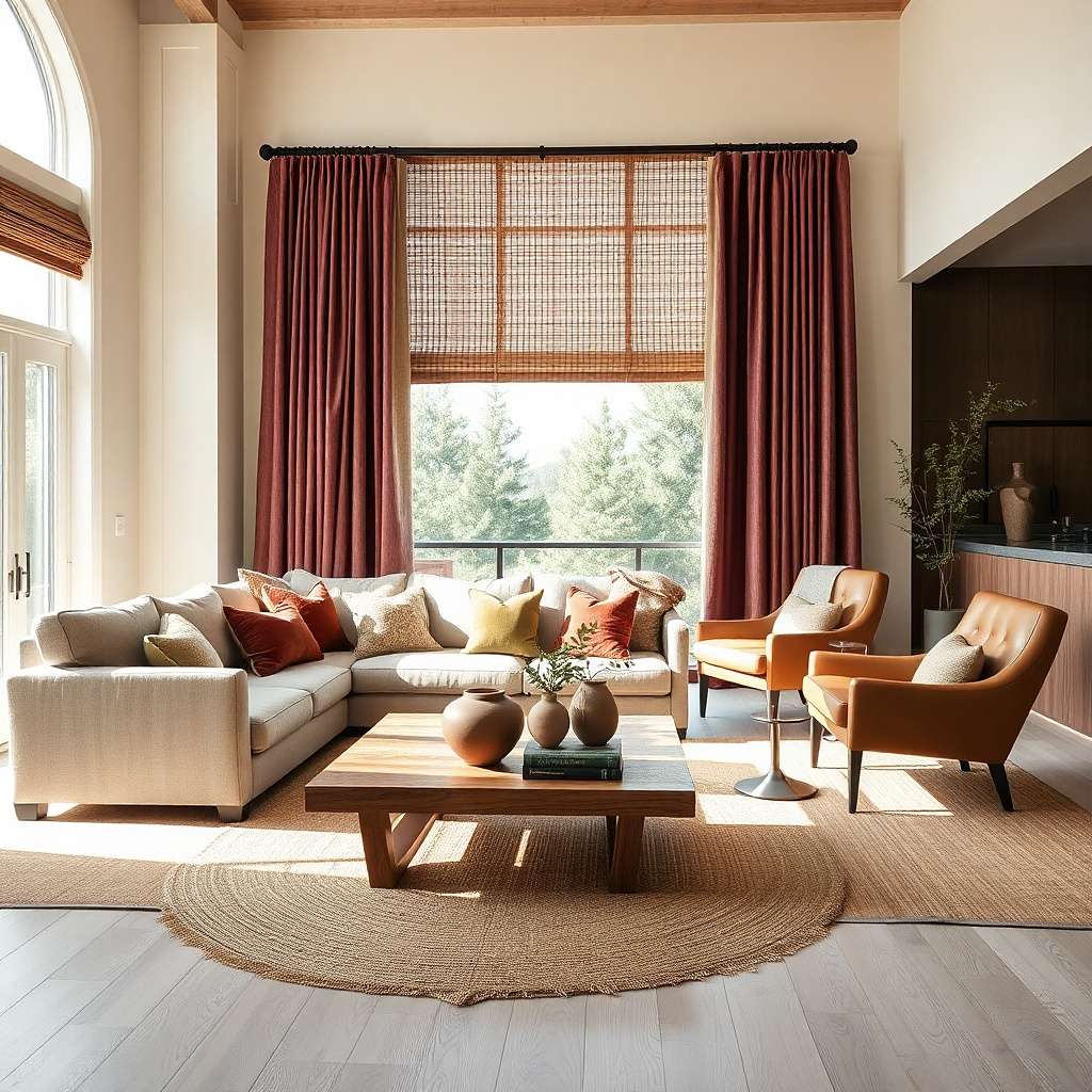
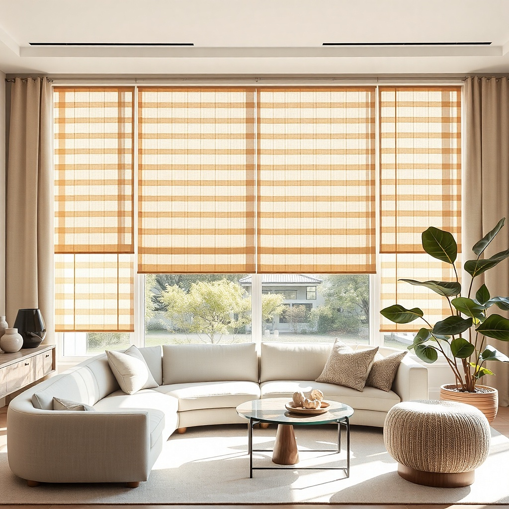
Layering burgundy curtains over woven wood shades gives you two good things at once: color depth and texture contrast. The woven shade breaks up the solid red and keeps the window from feeling too heavy, while burgundy adds seriousness and warmth. This pairing suits living rooms that need softness but still need privacy and sun control. It also works in homes where the red curtains would feel too formal on their own. The woven shade keeps the room grounded and slightly casual.
Start by mounting the woven shade inside the window frame if the trim is decent and the frame depth allows it. Then install burgundy drapes outside the frame, high and wide, with enough fullness that they still look generous when closed. Pick shades in medium walnut, teak, or natural brown rather than pale straw if you want the red to feel deeper. This setup costs more than one window treatment, but it solves both style and function in one pass.
Try thisAdd a thin black line somewhere nearby — a frame, lamp, or side table — so the layered textures still have definition.
Common mistakeDo not use very yellow woven shades with burgundy. The red turns dull beside them.
8. Red floral print curtains in a vintage-style room
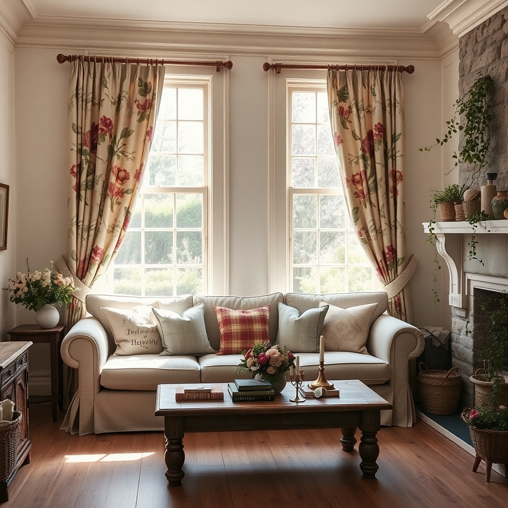
Print works better than solid red if your room already has antiques, painted furniture, or a softer cottage shape. A floral with faded red, sage, cream, and brown spreads the red across the fabric, so the color feels gentler and more layered. The room gets pattern, movement, and a little nostalgia without looking sugary. This is one of the smartest ways to use red in a smaller living room because the eye reads several colors at once instead of one solid wall of fabric. It suits English-country, collected vintage, and traditional spaces with bookshelves and mixed wood tones.
Start with a medium-scale print. Tiny ditsy florals can look busy from a distance, while oversized blooms swallow a small room. Hang the curtains from a simple rod and keep the sofa fabric plain cream, oatmeal, or muted green so the print has room to breathe. Then pull one red from the fabric into a pillow or lampshade trim, and use the green or brown elsewhere in the room. Printed curtains are forgiving if your room already has a lot going on, but they still need one calm surface nearby.
Look for a print with faded or browned red rather than candy red. Slightly aged color gives a far better result.
Avoid pairing red floral curtains with a busy patterned rug in the same scale. The room starts to buzz.
9. Wine red curtains with a beige sectional
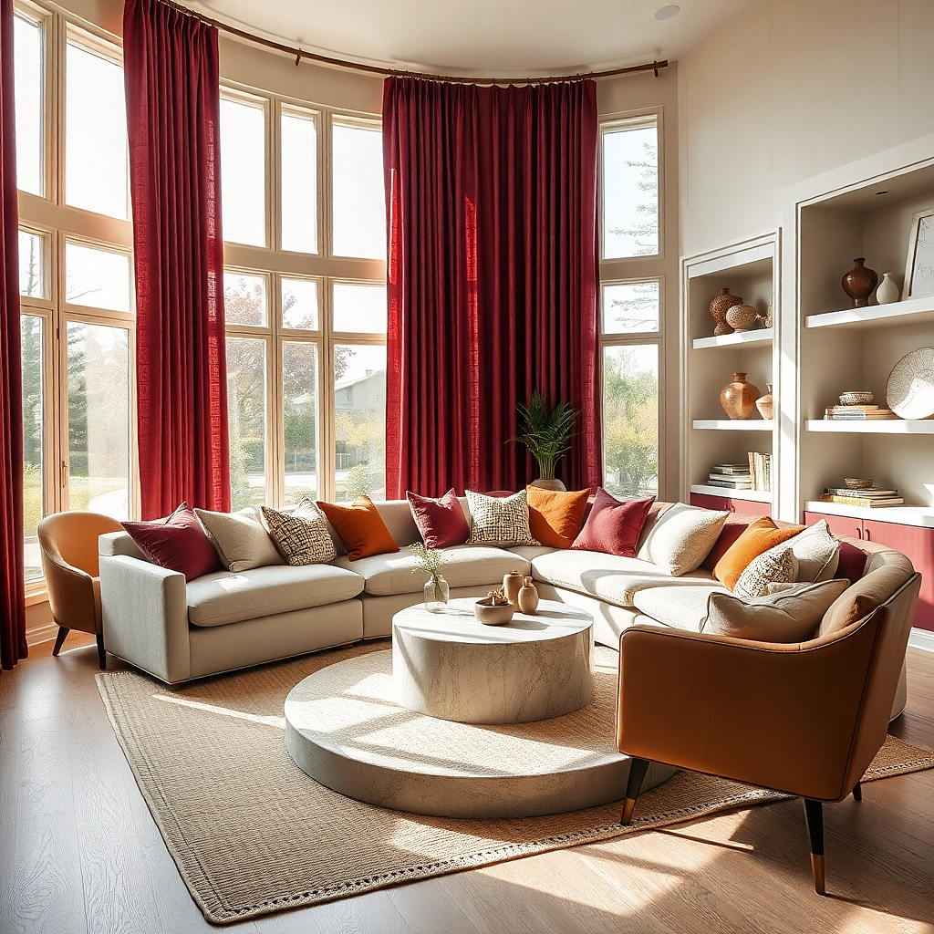
A plain beige sectional can look dead flat unless something nearby gives it contrast. Wine red curtains do that without forcing a full room makeover. The deep red sharpens the soft beige, adds evening warmth, and makes basic upholstery look more considered. Keep the rest of the room quiet with a cream rug, dark wood side table, and one black or bronze lamp. This is a strong fix for builder-grade living rooms that need one expensive-looking move on a realistic budget.
Start by checking the beige on your sofa. If it leans pink, choose a cooler wine red. If it leans yellow, choose a browner merlot or oxblood tone. Hang lined panels that just touch the floor, then add one dark wood piece near the curtains so the red has a visual partner. This setup is easy to stage because the curtain color does most of the work.
Swap bright white throw pillows for oatmeal, camel, or a subtle wine stripe. Pure white next to wine red can look too stark.
Do not use skimpy narrow panels on a big sectional wall. Thin curtains make the whole room feel underdressed.
10. Muted cranberry curtains in a small apartment living room
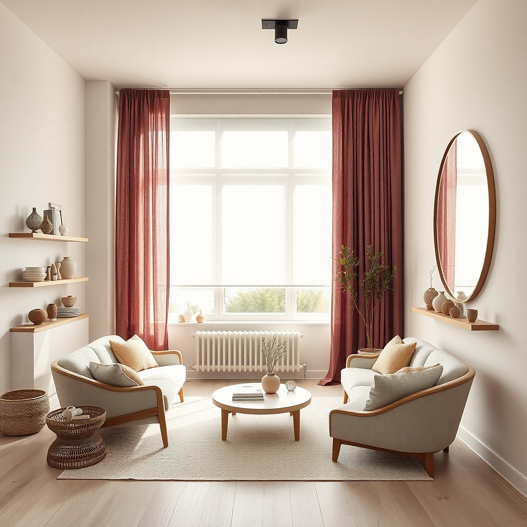
Small living rooms need red with restraint. Muted cranberry has enough gray in it to stay soft, and that matters when the curtains sit close to the sofa, TV, and entry. The color still reads warm and intentional in photos, but it does not dominate every wall reflection. Pair it with light greige walls, pale wood, and one black accent for shape. This is the apartment answer for people who want color but do not want the room to feel smaller.
Start with lightweight to medium-weight panels so the folds do not feel bulky in a tight room. Mount the rod close to the ceiling and use panels that stack back neatly, because every inch of visible glass matters in a compact space. Then keep the rug light and low-contrast so the eye travels upward toward the curtains. This is one of the easiest red looks to pull off with ready-made panels because the muted tone is forgiving.
Try thisIf the room has only one window, hang the curtain wall-to-wall instead of frame-to-frame. The extra width makes the room look larger.
Common mistakeSkip dark maroon in a tiny room with low ceilings. It drags the whole corner down.