1. Matte Black Wall Mirror with Arched Top
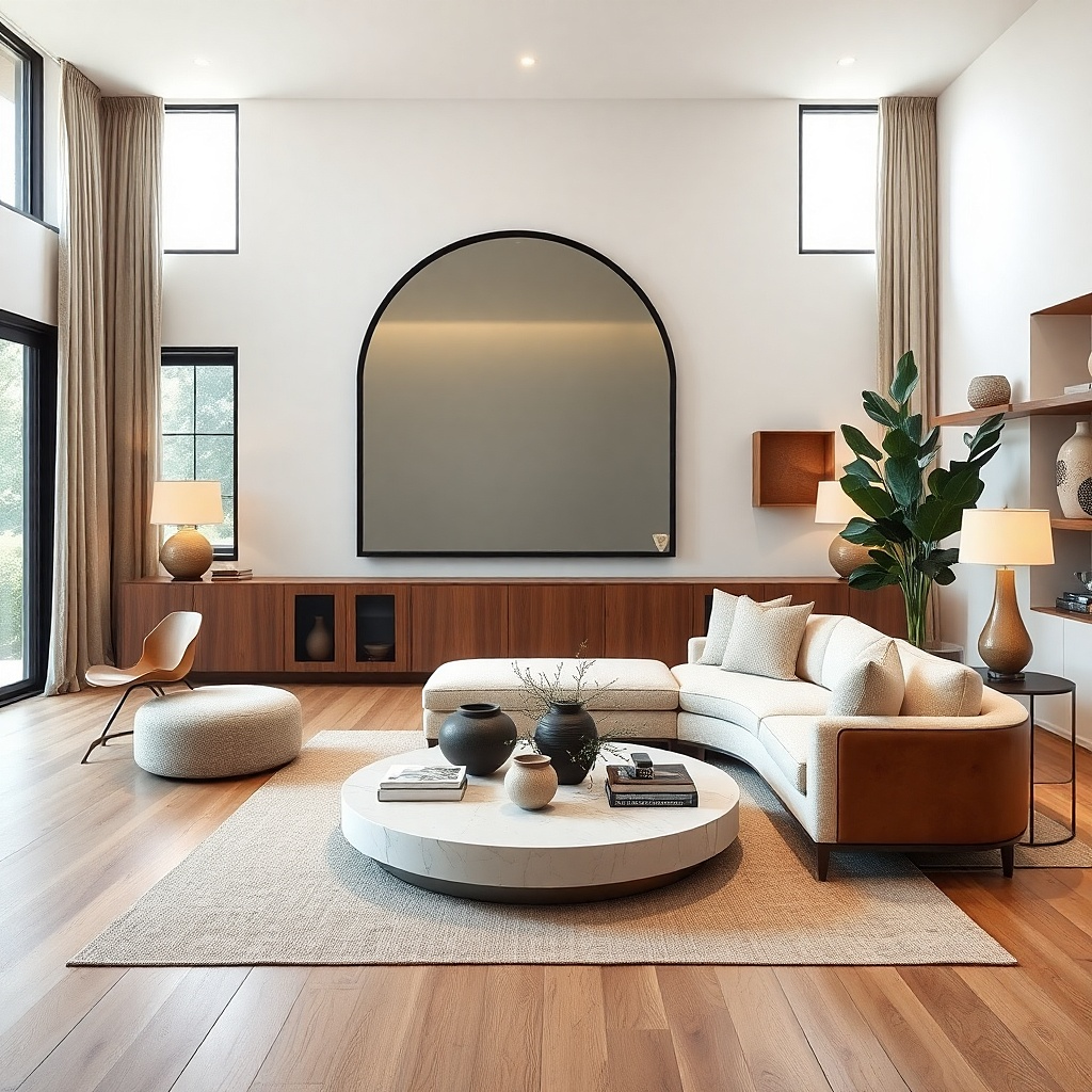
A matte black arched mirror gives you instant polish because it reads as architectural, not just decorative. The arch adds softness against straight lines in most living rooms, and matte black grounds lighter colors like cream walls and oak floors. Hang it centered over a sofa or console so it visually “completes” the seating area. This solves the blank-wall problem by creating one strong focal point that reflects light and makes the space feel larger.
Start by measuring the width of your sofa or console. Choose a mirror width that’s about 60-75% of that furniture width, then mark the center point on the wall. Hang the mirror so the bottom sits roughly 4-6 inches above the furniture top, or aim for the mirror center around eye level (about 57-60 inches from the floor). If the wall is bare, add only one supporting element on each side — like a slim wood frame or a small sconce — so the mirror stays the star.
Try thisPair the mirror with warm-toned decor (wood, cream, caramel) so the black doesn’t look harsh in daylight.
Common mistakeDon’t hang the mirror too low — it makes the room feel cramped and pulls attention off the seating.
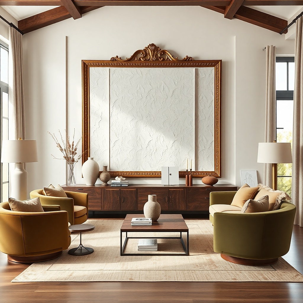
2. Oversized Framed Botanical Print in Linen-Color Mat
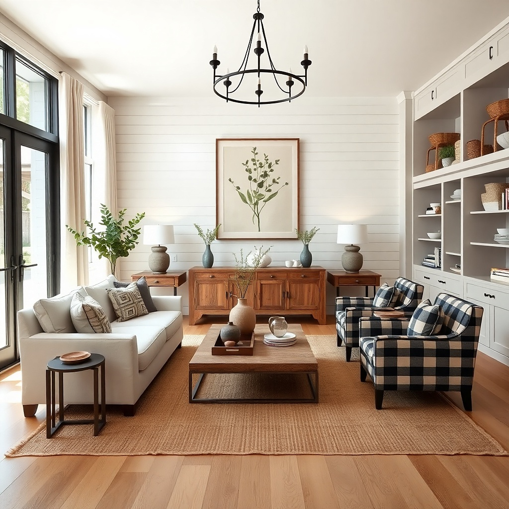
A botanical print with a linen-color mat looks finished because it adds softness and pattern without getting loud. The key is scale: oversized prints fill the wall and remove the need for five smaller pieces that never align. Choose a frame finish that matches your room warm wood if your furniture is honey-toned, or matte black if your hardware is black. This works especially well above a console, behind a sofa, or in a reading nook where you want calm color and a clear focal point.
Pick a frame that’s at least 24 inches wide for a typical living room wall. Set the print centered so it lines up with the middle of the sofa cushions or the console. Use painter’s tape to map the placement first, then hang using a level and wall anchors if you’re hitting drywall. If you want extra depth, add two smaller matching frames or small wall planters on the sides with equal height — keep the distance between frames about 6-8 inches.
Use a mat color close to your curtains or rug it makes the print look built into the room instead of pasted on.
Skip tiny prints — they look like filler and won’t fix an empty wall.
3. Three-Panel Wood Wall Art with Warm Grain
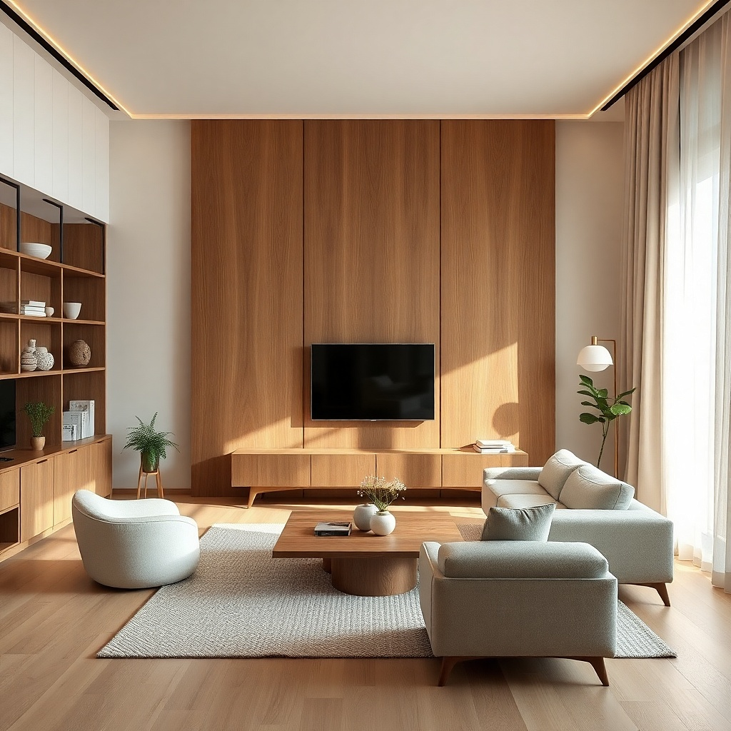
Three-panel wood wall art creates a designed look because it adds dimension and texture without needing a lot of styling. Warm wood grain pairs with almost any neutral palette and gives your wall visual warmth, especially in rooms with beige, cream, or off-white walls. The diptych/triptych layout also solves the blank-wall problem by filling space in a way single frames can’t. This is a strong choice for modern farmhouse, transitional, or Scandinavian-leaning living rooms where you want texture more than color.
Choose panels that together span about 50-70% of the sofa width. Hang the center panel first, with the top roughly 2-4 inches below the ceiling line or positioned to sit visually balanced behind the sofa. Then align the side panels so the gaps between panels are consistent, usually 1-2 inches. Use studs if possible; if not, use anchors rated for the weight and confirm the panels sit flat.
Try thisKeep the rest of your wall decor simple one small shelf or two small frames is enough.
Common mistakeDon’t mix glossy wood pieces with matte wood — finish mismatch makes the set look accidental.
4. Oversized Woven Wall Hanging in Natural Jute
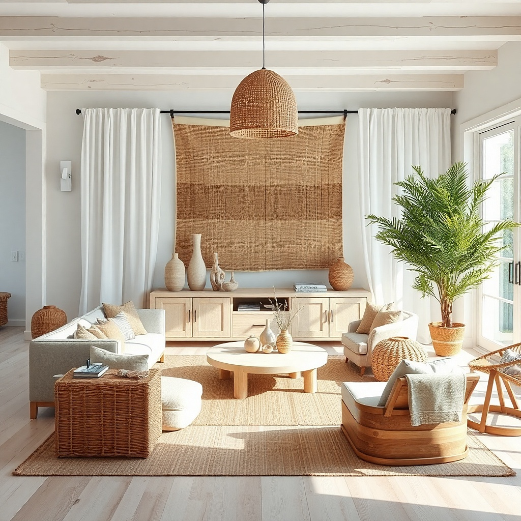
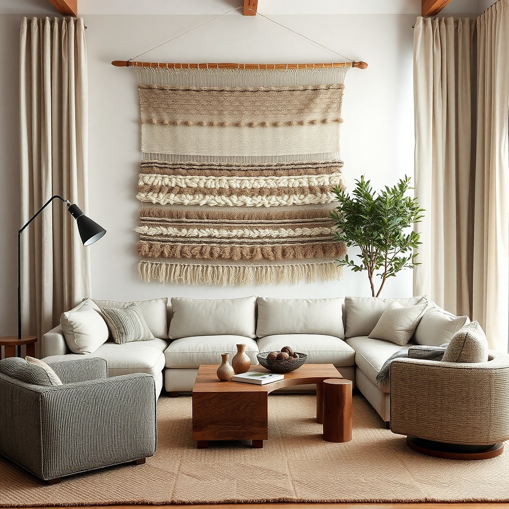
A large woven wall hanging in natural jute adds texture that reads instantly in photos and in person. Fringe gives movement and soft edges, which balances hard items like a sectional or coffee table. Keep the color neutral (natural, oat, sand) so it blends with your existing palette instead of competing. Hang it on a single wall section above a console or behind a chair where you want warmth and a calmer look than framed art.
Look for a width around 30-50 inches depending on your furniture. Center the hanging so the bottom edge lands around the same height as the top of a console or about 6-10 inches above the sofa back. If the hanging has a rod or dowel, use two wall hooks or a French cleat for a level hang. Pair it with one grounded element below, like a ceramic vase or a low tray, so the wall looks intentional.
Try thisChoose a hanging with a tight weave it looks more expensive and doesn’t sag as easily.
Common mistakeDon’t hang it too high — if it floats near the ceiling, the texture stops doing its job.
5. Sunburst Mirror with Antiqued Gold Finish
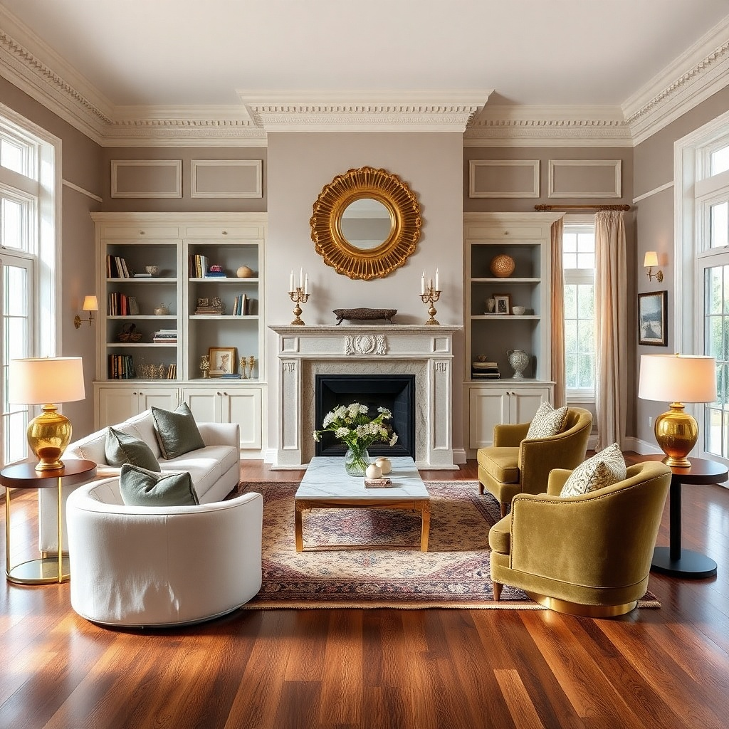
A sunburst mirror brings a “finished” vibe because the rays create a strong pattern that fills empty space. Antiqued gold keeps it warm and less flashy than bright brass, which matters in living rooms with muted colors. Place it where it can reflect natural light near a window or across from one. It also gives you a focal point when your wall is otherwise blank and your furniture is neutral.
Pick a sunburst mirror with a diameter or width around 24-30 inches for most living rooms. Center it over a console or sofa, then keep at least 3-6 inches of empty wall around it so the rays don’t look cramped. Use a stud if possible because sunbursts can be heavier than flat mirrors. If you’re styling around it, keep side decor minimal: one small plant stand or two slim frames spaced evenly.
Try thisLet the gold show up elsewhere by adding one warm-metal accent like a brass lamp base or a gold-toned candle holder.
Common mistakeDon’t pair it with too many other patterned wall items — the sunburst already does the work.
6. Gallery Wall with Black Frames and Cream Matting
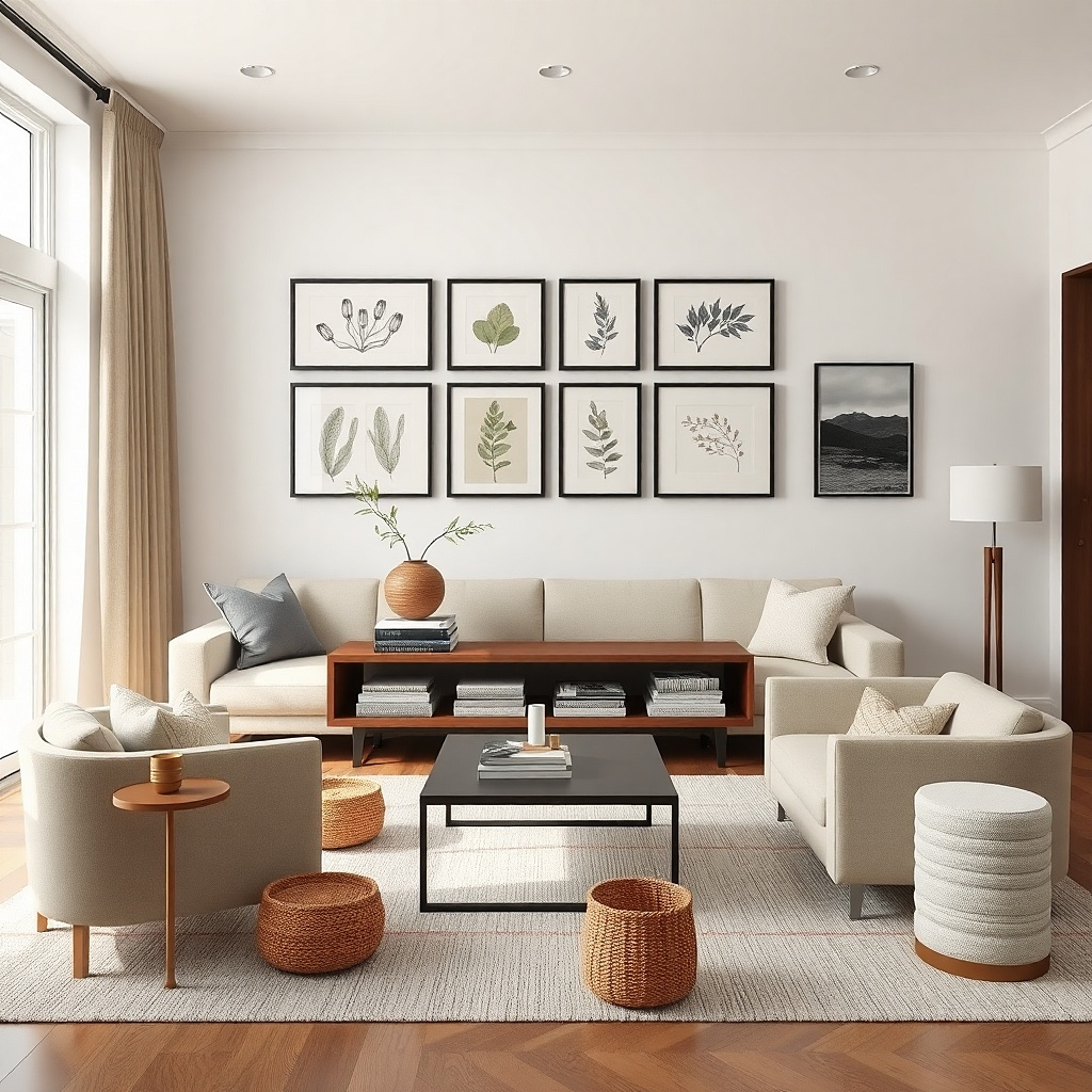
A black-and-cream gallery wall makes your living room look styled because it creates a grid-like structure even when the art varies. The trick is choosing a consistent mat color so every piece feels like it belongs to the same set. Black frames unify the look, and cream mats soften contrast so the wall doesn’t feel harsh. Use this when you want personality but still want a clean, finished wall rather than random holes in the drywall.
Select 5-9 frames with the same frame color and similar sizes; aim for 8x10, 11x14, and one slightly larger 16x20 in the center. Lay the frames out on the floor first, then measure the total width — target about 2/3 to 3/4 of the sofa width. Mark the top line with painter’s tape, then hang the center piece at eye level (about 57-60 inches to the center of the frame). Keep spacing consistent, usually 2-3 inches between frames.
Use only one print type botanical, line art, or photography so the wall looks cohesive even with different images.
Avoid mixing frame finishes like black and gold — it breaks the unified look.
7. Large Ceramic Wall Plaque in Terracotta Tones
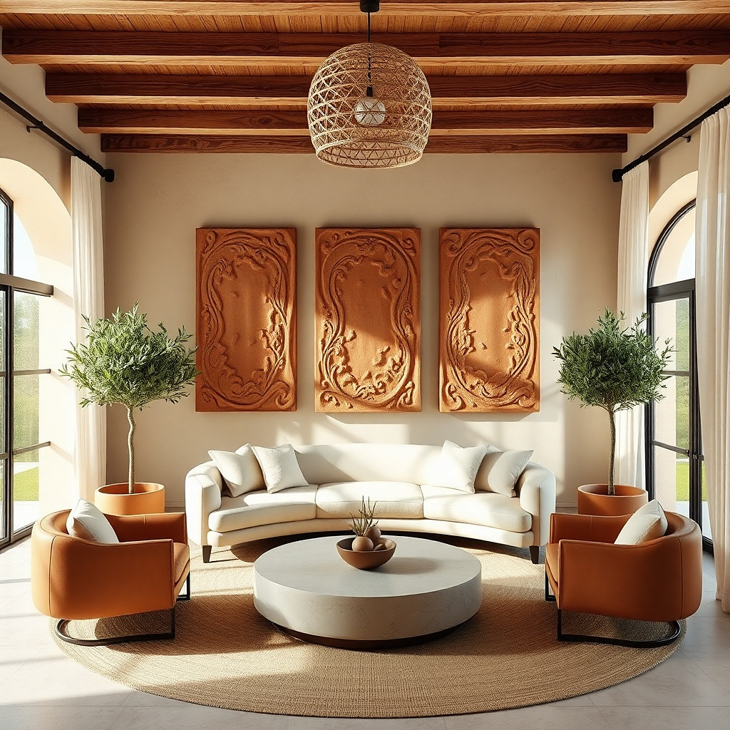
A ceramic wall plaque in terracotta tones brings warmth and depth, especially in rooms with cool grays or stark white walls. The sculpted surface catches light differently than flat prints, so it looks more expensive and more “finished” even with minimal styling. Terracotta also plays nicely with wood, linen, and neutral furniture. Hang it centered above a console, or use it as the anchor piece on a large empty wall where you want texture without clutter.
Choose a plaque roughly 12-18 inches wide for a small wall, or 20-28 inches wide for a bigger focal wall. Center it so the plaque is about 6-10 inches above a console top. Check the back for hanging hardware — many plaques use a sawtooth or a wire — then use the right fasteners for the weight. Style around it with one simple shelf below or two small matching ceramics on either side.
Match the terracotta with one textile element throw pillows or a rug accent so the wall tone looks intentional.
Don’t place it next to busy wall art — let the texture be the main event.
8. Matte White Framed 3D Wall Letters
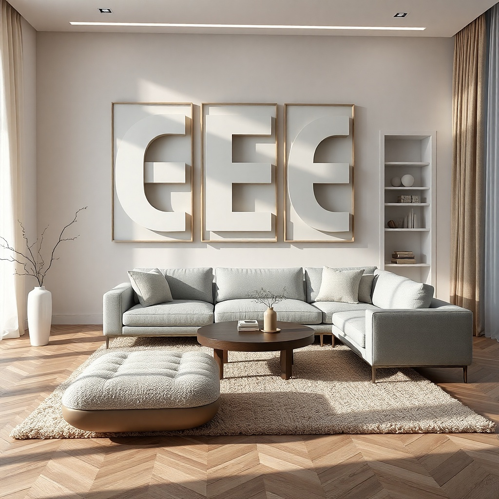
3D wall letters look finished because they add dimension without needing a complex gallery. Matte white keeps the look clean and modern, while the raised letters create shadow lines that read beautifully in daylight. Use a short word or monogram size that fits the wall the goal is to add character, not to turn the wall into a sign. This is ideal for living rooms with modern furniture, light walls, and a need for a subtle focal point.
Pick letters that fit the space: if your sofa is 72-84 inches wide, choose a word width around 30-44 inches. Center the letters on the wall above the sofa or on a feature wall behind a chair. Use a level and measure the centerline; mount each letter individually if the hardware requires it, or hang the full sign if it has a single mounting point. Keep surrounding wall decor minimal so the 3D shadow effect stays the focus.
Use matte frames, not glossy matte reads softer and looks more high-end in living rooms.
Avoid long phrases; they crowd the wall and make the look feel like signage.
9. Large Linen-Backed Fabric Wall Art in Neutral Tones
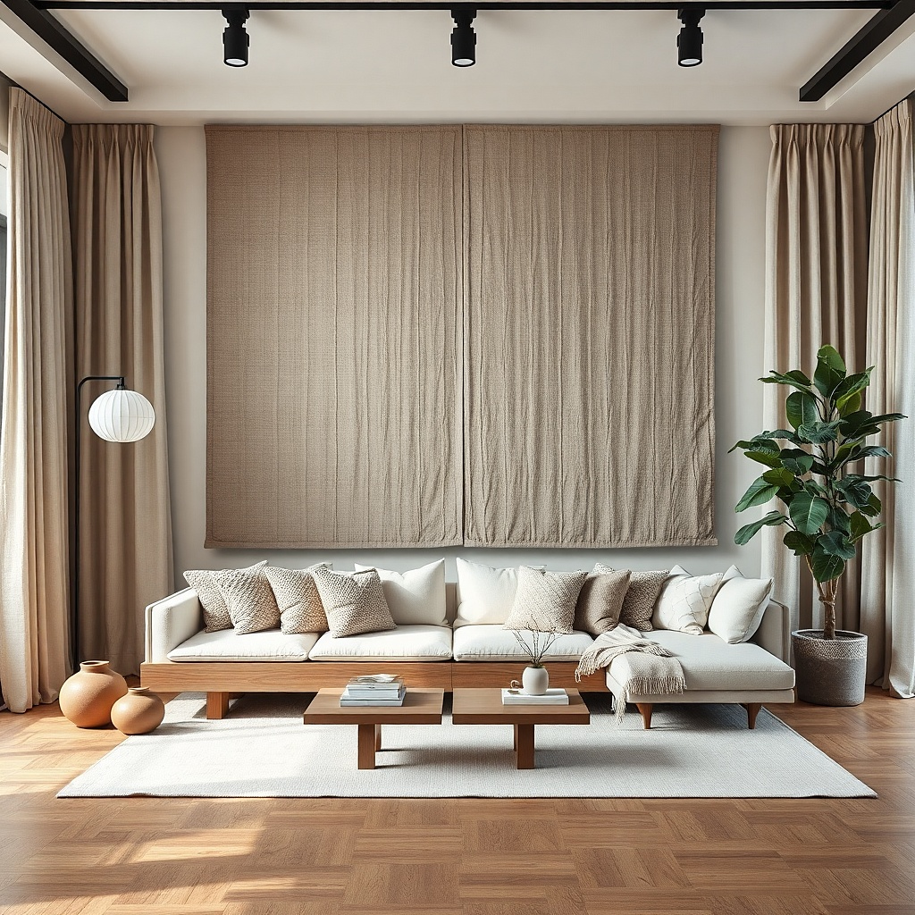
Fabric wall art gives you a softer, more tailored look than paper prints because the texture is visible. Linen backing (or linen-like fabric) makes the piece feel grounded and reduces glare, which is a big deal in bright living rooms. Choose neutral tones with subtle pattern — oatmeal, warm gray, sand — and let your furniture colors pull from it. This solves the problem of walls that feel too stark when you have hard surfaces like glass, metal, or dark wood.
Select a piece that’s about 24-36 inches wide for most living rooms. Mount it centered above a sofa or console, keeping the top edge aligned with the visual center of the furniture. Confirm the hanging method — many fabric pieces use a back hook or a French cleat — then mount securely. Add two small fabric-like elements nearby, like a woven basket on the floor or linen pillow accents, so the texture story continues.
Try thisIf your wall is white, choose a slightly warm fabric tone instead of pure cool gray it looks more natural.
Common mistakeDon’t pair fabric wall art with heavy glossy decor on the same wall.
10. Oversized Black-and-White Photo Print Set
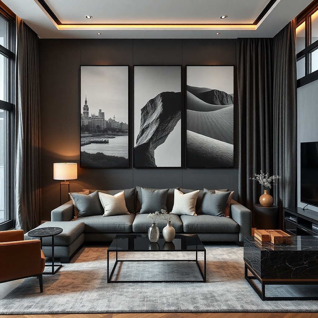
A set of black-and-white photo prints adds personality while staying easy to style. The high contrast reads clearly from across the room, and the monochrome palette keeps the look cohesive with existing decor. Use it when your living room already has color in pillows or a rug but your wall needs something with presence. Matching frame sizes make it look intentional, and the photos bring storytelling without visual noise.
Pick three or five prints in matching frame colors, usually black or dark walnut. Size matters: aim for each frame to be at least 10x12 inches, with one larger piece in the center around 16x20. Lay them out on the floor to decide the spacing, then measure total width — target 60-80% of the sofa width. Hang the center piece first at eye level, then build outward with consistent gaps of 2-3 inches.
Try thisChoose photos with similar tonal range (mostly light skies or mostly dark scenes) so the wall doesn’t look mixed.
Common mistakeDon’t mix frame thicknesses — it breaks the uniform, finished look.
11. Wood Shelf with Two Matching Ceramic Vases
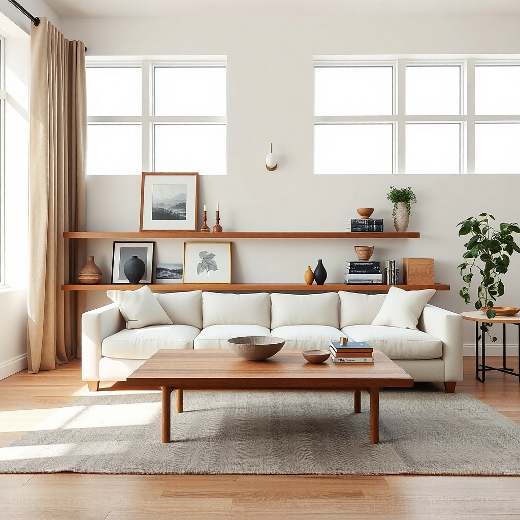
A wall shelf makes a room feel finished because it gives you a place to style without filling the whole wall with frames. Two matching ceramic vases on a wood shelf look balanced and intentional, especially when your living room has a lot of flat surfaces. Choose a shelf with a warm wood finish and keep the ceramics in one color family cream, ivory, or muted olive. This solves the problem of walls that feel flat even with art by adding vertical stacking and real objects.
Choose a shelf width about 1/3 to 1/2 of your furniture width. Place it so the shelf bottom is around 10-12 inches above the console top, or centered vertically if you’re mounting it between furniture pieces. Use a stud finder for secure mounting; shelves loaded with ceramics need real support. Style with two vases of slightly different heights (for example, one 9-10 inches tall and one 6-7 inches), add one textured element like a linen-wrapped book, then step back and confirm symmetry.
Keep the vase openings facing forward so the shapes read clearly from the couch.
Avoid overcrowding — two vases plus one small textural item looks more finished than five random objects.
12. Matte Black Floating Ledge with One Large Plant Wall Pot
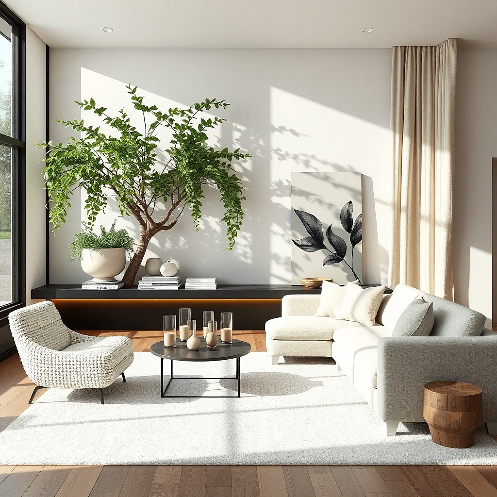
A matte black floating ledge is a clean way to add wall decor that still feels modern. One large plant pot on the shelf creates a living, vertical element that reads as decor without needing more frames. Matte black links to common living room hardware and keeps the shelf from looking like a random shelf. This works well in living rooms where you want a focal point but also want some breathing room on the wall.
Pick a shelf length around 18-28 inches. Mount it using the included bracket hardware and confirm it’s level — floating shelves look wrong fast when they’re even slightly off. Put the largest plant pot in the center, with a second smaller item on one side only, like a small ceramic bowl. Keep the shelf items within 10-12 inches of the center so the shelf doesn’t look empty on one side.
Try thisUse a pot in the same finish family as your frames (black, wood, or warm stone) to keep the wall story consistent.
Common mistakeDon’t mount the shelf too high — it should be visible when you’re seated, not just when you stand.
13. Wire and Wood Wall Basket Set in Natural Finish
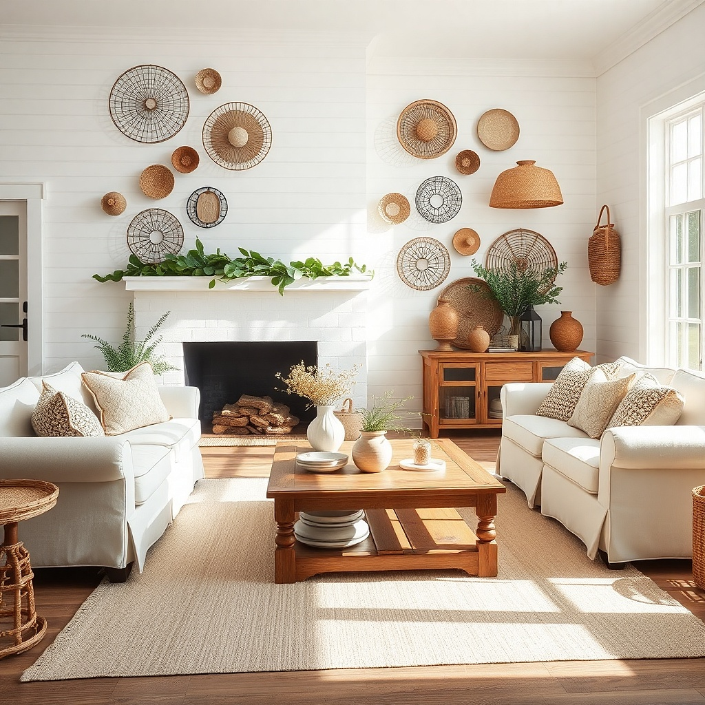
Wall baskets look finished because they add shape and texture while still feeling casual. A wire and wood basket set in natural tones works with both rustic and modern living rooms, especially if your other decor includes woven textures. Use baskets when your wall needs warmth but you don’t want another framed look. Hang them as a pair or small grouping so the wall has structure, not scattered storage.
Choose baskets that are roughly 10-14 inches wide each. Hang them 6-10 inches apart horizontally, or stack them vertically with equal spacing so the set looks intentional. Place the grouping centered over a console or above the back of a chair. Use the mounting hardware that comes with the baskets and check weight ratings if you’re adding liners or heavier items.
Add one liner in a neutral fabric it softens the wire look and makes the baskets look styled, not utilitarian.
Don’t use bright liners or loud patterns — it turns the baskets into the wrong kind of focal point.
14. Large Woven Wall Basket with Neutral Liner
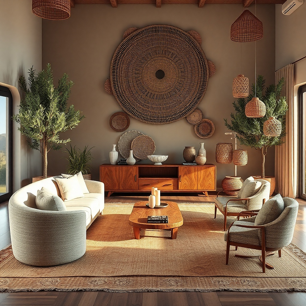
A large woven basket on the wall is a quick fix for walls that feel too plain. The basket’s open texture adds depth and shadow, so it looks good even when you don’t add lots of extra decor. Neutral liners keep it modern and prevent it from looking like farmhouse-only decor. Hang it as a single statement piece centered above a sofa or console it’s the simplest way to make the wall feel “done.”
Pick a basket that’s big enough to read from across the room, usually 16-24 inches wide. Center it and hang so the bottom edge sits around the same height as the top of the sofa back, or 6-10 inches above a console top. Use the wall mount method provided, and if it’s heavy, mount into studs. Add one small complementary item nearby, like a slim frame or a ceramic jar on a shelf, but don’t build a full gallery around it.
Use a liner that matches your curtains or rug — the basket looks integrated into the room’s palette.
Avoid hanging a basket that’s too small — it reads like a craft project instead of decor.
15. Textured Abstract Canvas in Warm Gray and Oat
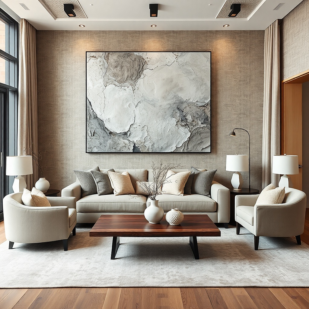
Textured abstract canvas looks finished because it brings movement and light-catching surface without needing recognizable imagery. Warm gray and oat tones work with most living room palettes and won’t clash with patterned rugs. The texture matters: look for canvas with visible brushwork or raised elements so it casts shadows and adds depth. This is the best option when your living room has a lot of visual detail elsewhere and the wall needs a calm anchor with character.
Choose a canvas width that’s at least 30 inches if you’re hanging it above a sofa. Center it so it aligns with the sofa midline, then position the top edge about 2-4 inches below the wall’s visual center line. Use a stud finder for secure mounting; textured canvases can be heavier than they look. If you want to style around it, add two small items on the floor level below the edges, not on the same wall plane as more frames.
Match the frame color to your furniture hardware — warm wood or matte black both work, but keep it consistent.
Don’t choose an abstract piece with bright primary colors unless your room already repeats those colors.
16. Mirrored Tray Wall Art with Distressed Frame
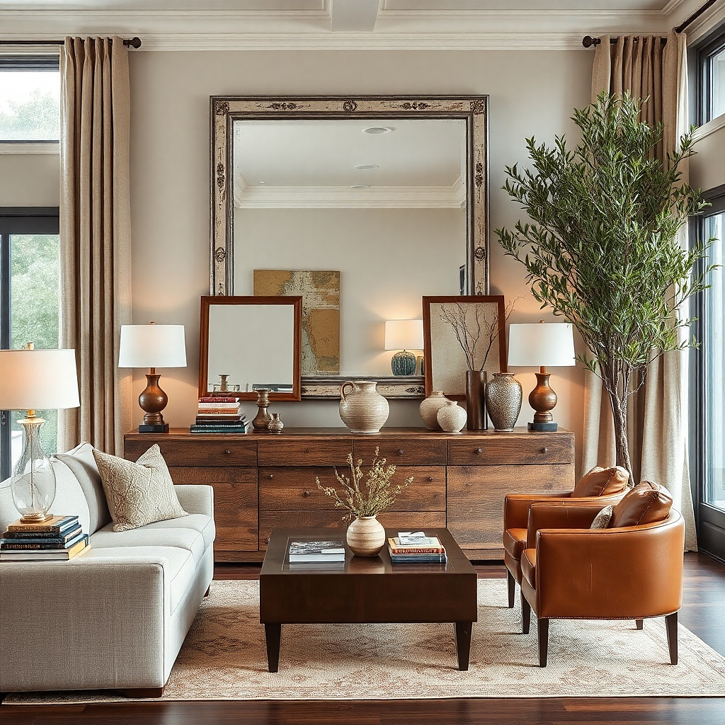
Mirrored wall decor instantly makes a living room feel finished because it bounces light and adds dimension. A mirrored tray style with a distressed frame looks aged-in and soft, which works better than a super-clean mirror in many homes. The distressed finish hides scuffs and looks intentional, even when your room is lived-in. Hang it near a window or across from a lamp so the reflections actually move and brighten the room.
Pick a mirrored tray wall piece around 14-20 inches wide for a side wall, or 22-30 inches if it’s the main focal point. Center it on the wall above a console or between two lamps, keeping it at eye level. Check the back for the mounting type — tray pieces often use a single hook or a wire — then mount with the correct fastener. Keep surrounding wall decor minimal so the reflection doesn’t compete with too many patterns.
Try thisUse warm bulbs in nearby lamps if your mirror is antique-toned the reflection looks softer.
Common mistakeAvoid placing it directly next to glossy gold accents; the glare can look messy.
17. Rattan Fan Wall Decor in Natural Color
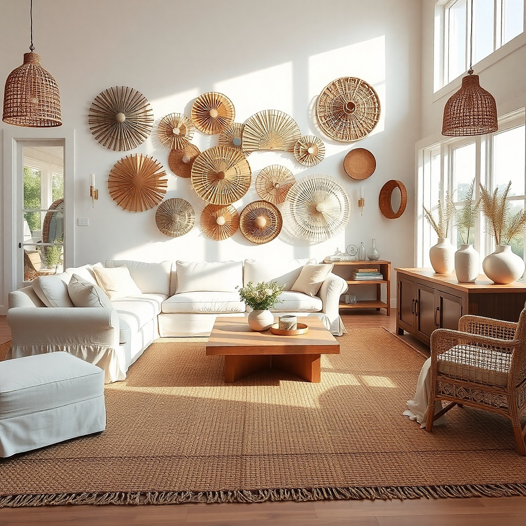
Rattan fan wall decor adds a sculptural, airy look that feels intentional without looking heavy. The fan shape creates a natural radial pattern that fills space and draws the eye upward. Natural rattan color blends with wood furniture and woven baskets, and it looks good with neutral walls because it adds texture rather than loud color. Use a single fan as an anchor on a blank wall behind a chair or in the corner of a seating area.
Choose a fan size around 18-26 inches wide so it reads clearly. Hang it centered on the wall with the bottom edge around 6-10 inches above the chair back or console top. Make sure the wall mount hardware is secure; rattan can be lighter, but the mounting point still needs proper attachment. If you want it to look styled, add one small framed print below or beside it at a different height, not directly aligned.
Try thisKeep the rest of the wall color neutral so the rattan texture becomes the focal point.
Common mistakeDon’t cluster multiple fans — the shapes overlap and look busy instead of designed.