1. Oversized framed print with a wide matte
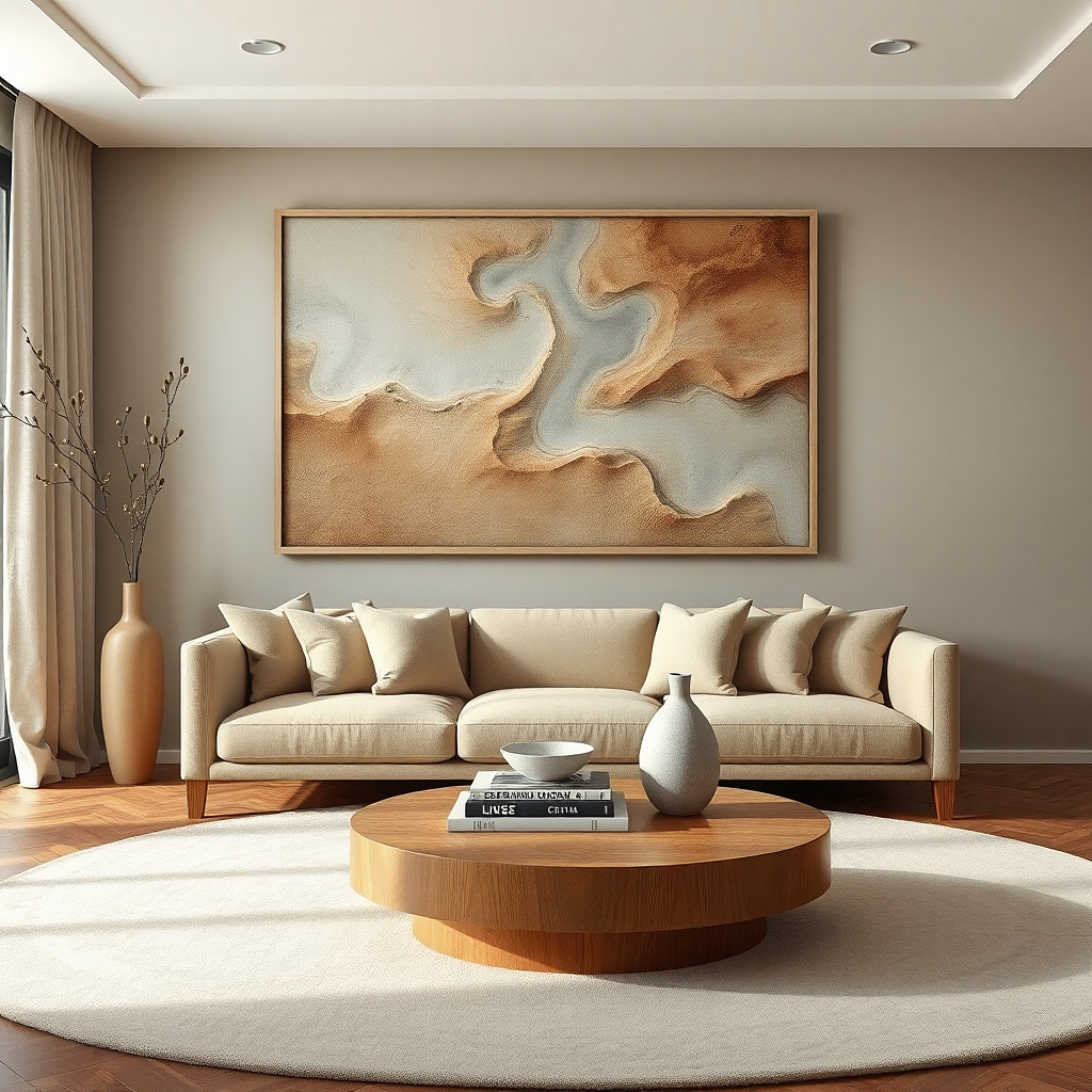
A single oversized framed print is the fastest way to make a giant empty wall look designed without turning it into a collage. Use a print that has one clear color family — think warm beige and charcoal, or soft sage and cream — so it harmonizes with your existing couch and rug. A wide matte (at least 2 to 3 inches) makes the image feel intentional and gives you that gallery look even when the print itself is budget. Pick a frame finish that matches your room hardware matte black for modern, light oak for warm and casual, or white for bright spaces. This works especially well when you want the wall to look calm from across the room, not busy up close.
Measure the space first: aim for a print width that’s roughly 60 to 75% of the sofa width. Choose a frame depth that sits flat and clean on the wall, then order a matte that creates a 2-3 inch border around the image. Hang with a level: mark two spots for the hardware, then set the center of the frame at about 57-60 inches from the floor. If you’re using a standard frame with hanging wire, test the height by holding the frame against the wall before you drill.
Use a matte finish print (not glossy) to reduce window glare and keep colors looking steady in daylight.
Don’t pick a tiny print and rely on a big frame — the wall will still look empty at distance.
2. Extra-wide horizontal mirror with thin black frame
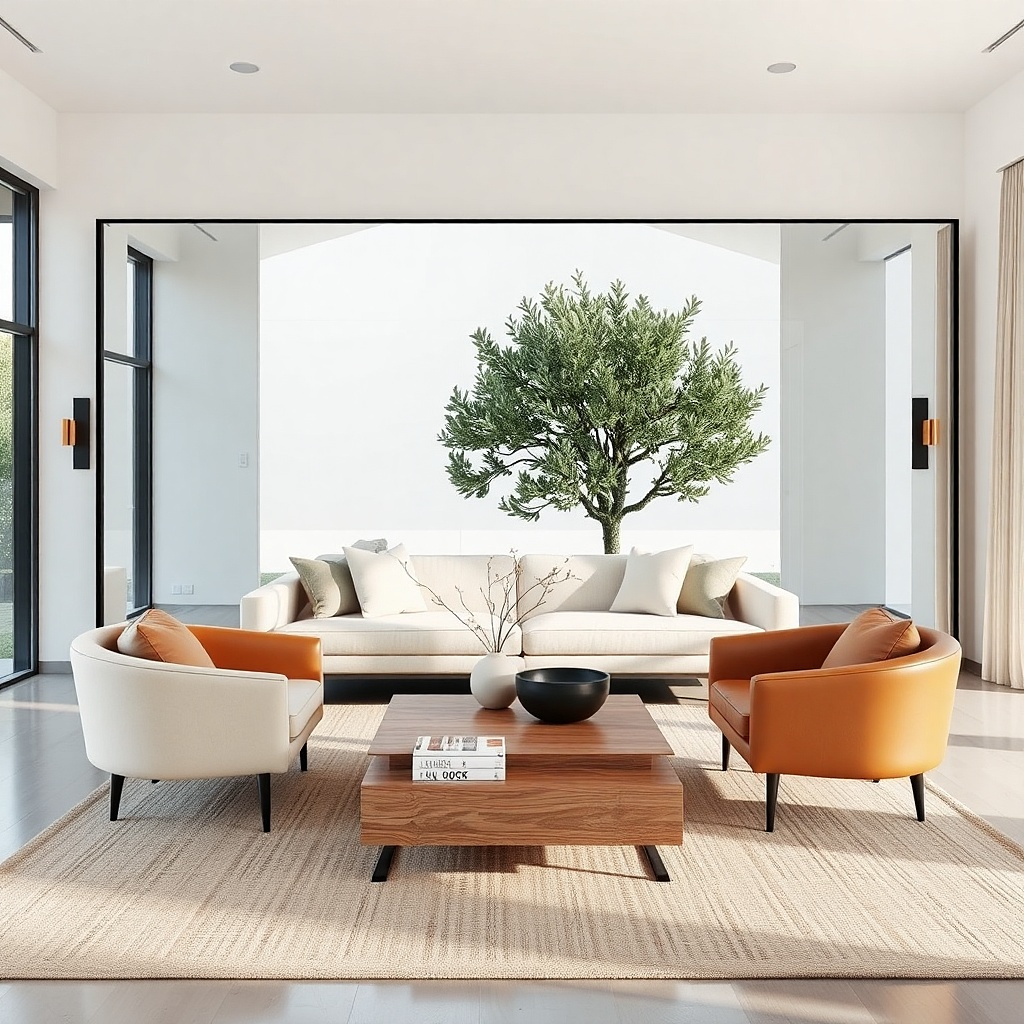
A wide horizontal mirror fills space while also making the room feel larger. Thin black frames look sharp against most wall colors and they don’t visually weigh down the wall like thick decorative frames. The mirror shape matters: choose a long rectangle that visually matches the sofa width, usually around 24 to 36 inches tall and 48 to 72 inches wide depending on your wall. Because mirrors reflect light, this is a strong option for rooms with limited daylight or a wall that feels flat. It also solves a common clutter problem you get one big “wow” element without adding lots of objects.
Try thisHang the mirror so it reflects either the window or a lamp, not a messy room corner.
Pick the mirror size by measuring your wall area: the mirror should cover about 50 to 70% of the sofa width. Choose a mounting method you can trust — use wall anchors rated for the wall type (drywall needs proper anchors). Mark the center height at 57-60 inches from the floor, then drill and mount so the mirror hangs level. Wipe the frame and glass with a microfiber cloth before final positioning to avoid streaks that show up in photos.
Common mistakeAvoid ornate frames with lots of gold scrollwork if your room has modern lighting or clean-lined furniture.
3. Two matching large canvases in a side-by-side grid
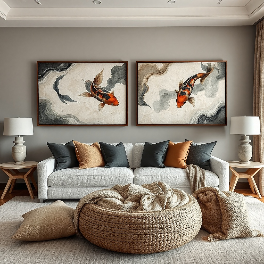
When a single piece feels too narrow, two matching canvases create a bigger, cleaner focal point without the chaos of a multi-frame gallery. Choose canvases with the same color story and finish matte paint or textured canvas so the pair reads like one composition. Leave a small gap between them, about 2 to 4 inches, so they don’t blend into a single messy rectangle. This look is great for living rooms that already have pattern elsewhere (pillows, rug) because the canvases can be simpler and still make the wall feel complete. It also photographs well since the edges create crisp lines.
Try thisPick art with a similar value range (light-to-dark balance) so the two canvases don’t look mismatched under different lighting.
Measure the total width you want the pair to occupy, aiming for 65 to 80% of the sofa width. Buy two pieces that match in size and orientation (both landscape or both portrait). Hang them on one level line: set the gap first (2-4 inches), then mark left and right top mounting points. Start with the center of the combined pair at 57-60 inches from the floor, and adjust up or down until the canvases sit comfortably above the sofa back.
Common mistakeDon’t mix canvas sizes or frame thickness — the pair stops reading as a single designed unit.
4. Built-in look: floating wood shelves with framed art behind
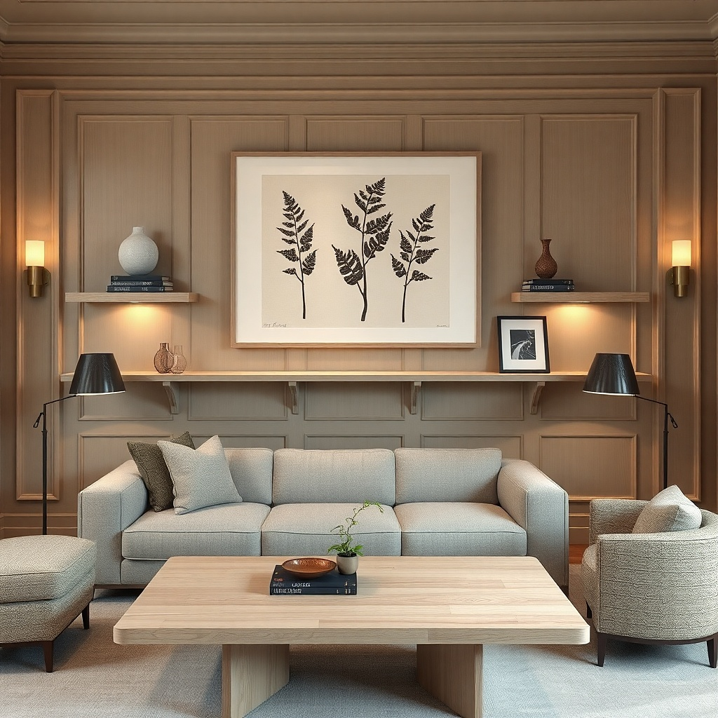
Floating shelves turn a blank wall into a styled backdrop without cluttering it. The smartest version uses a large framed print as the background anchor, then places shelves below it with only a few objects. Use light wood shelves (oak or walnut tone) and keep the styling minimal: one tall item, one medium item, and one small item per shelf. This gives you vertical dimension and makes the wall feel layered. It’s ideal for living rooms where you want storage for books or decorative ceramics, but you hate the look of crowded mantel-style walls. The result feels custom because the shelves create a built-in rhythm.
Choose shelf length that matches the anchor: usually 60 to 80% of sofa width, with two shelves spaced about 10 to 14 inches apart. Mount into studs when possible; if you’re using drywall anchors, use heavy-duty ones and keep the shelf load light. Place a large framed piece centered above the top shelf, then hang shelves level using a spirit level. Style after mounting: start with the back anchor, then add decor in height order so the silhouette looks intentional.
Use books standing upright only if their spines share colors; otherwise lay a few flat for a calmer look.
Avoid filling every inch with decor — shelves look best when they have breathing space.
5. Layered fabric wall panel behind a sofa
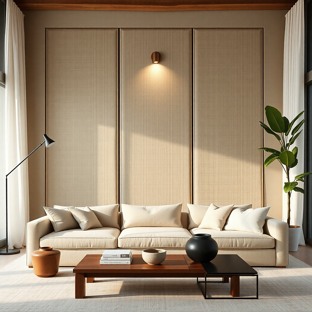
Textile wall decor adds warmth and absorbs noise, which is a practical win in living rooms. A fabric panel behind the sofa looks especially clean when you use a flat, tailored material like linen-look canvas or thick cotton. Hang it on a simple rod or tension system so it drapes smoothly without ripples. Choose an off-white, warm gray, or muted olive so it feels cohesive with your upholstery. This option fills a giant wall with softness and texture while avoiding visual clutter from lots of small objects. It also works well if you want art that doesn’t compete with patterned curtains.
Try thisUse a slightly darker fabric than your wall if you want the panel to read clearly in photos.
Measure the wall area you want covered: aim for a panel width around 70% of the sofa width and a height that reaches 6 to 10 inches above the sofa back. Pick fabric with enough weight to hang flat, and iron or steam it before installing. Mount a top rod or track at the correct height, then attach the fabric using clips or a sewn channel. Finally, press the bottom edge straight and step back to check for wrinkles under the room’s lighting.
Common mistakeAvoid thin, see-through fabric — it looks unfinished and shows wall texture.
6. Oversized triptych in matching frames
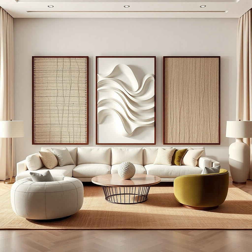
A triptych is the sweet spot between single-piece simplicity and multi-frame impact. Use three matching frames with consistent matting and spacing, and let the art repeat a color story across all three sections. Keep the center piece slightly larger or equal, and use clean gaps so it doesn’t look like a random collage. This works well when the wall is wide but you still want structure. The triptych shape gives your eye a path across the wall, which reads designer even when the decor is budget-friendly. It’s also a strong choice if you want an art look without hunting for one massive single frame.
Pick frame sizes so the combined width lands around 70 to 85% of the sofa width. Choose matching mats and keep the side margins consistent. Mark the center of the triptych at 57-60 inches from the floor, then measure the side gaps (about 2 to 4 inches) before you hang. Hang the center frame first, then use a level and spacer tool to set the left and right frames so the edges line up.
Use the same inner mat color on all three frames — it makes the set look intentional.
Don’t mix frame finishes or mat colors across the triptych.
7. Statement wallpaper or peel-and-stick mural strip framed by molding
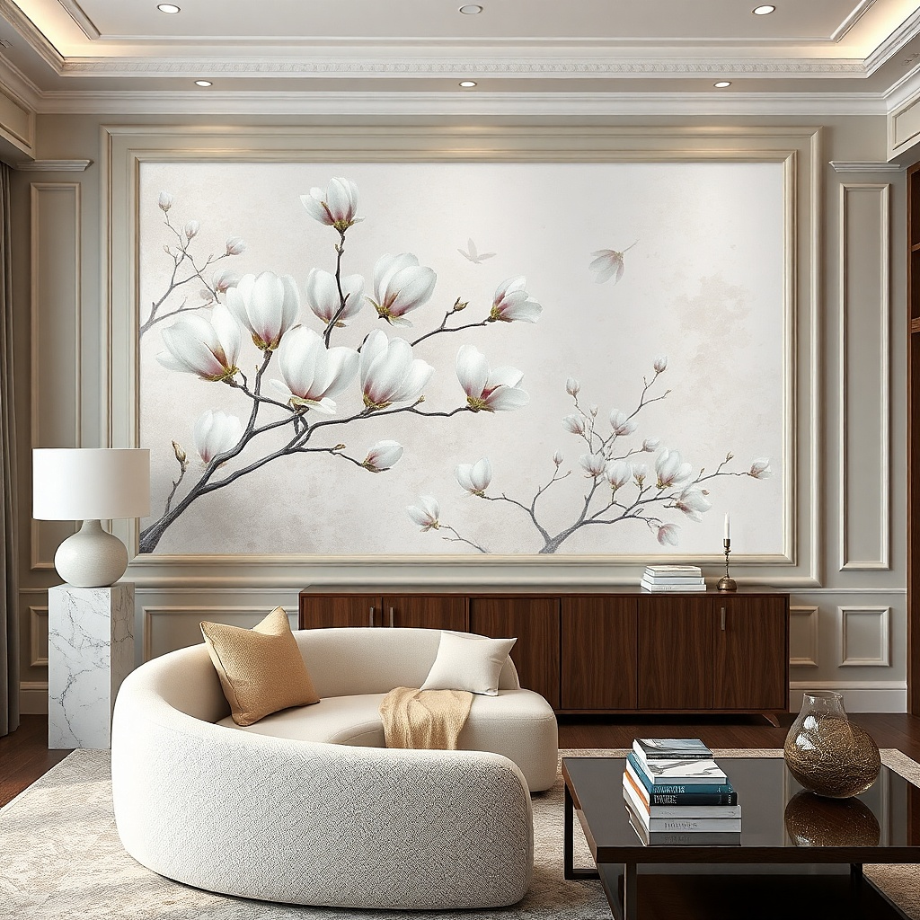
A peel-and-stick mural can look like a custom feature wall without committing to full wallpaper. The trick is to contain it so it reads like decor, not a DIY patch. Use a simple picture-frame border with trim or thin molding around the mural area. Choose a mural with a controlled palette botanical line art, abstract waves, or soft geometric shapes — so it doesn’t fight your furniture. This fills a big empty wall with pattern at the right scale, creating depth without clutter. It’s also a good option if your living room needs visual interest but you don’t want more objects to dust.
Try thisChoose a mural with matte texture so it doesn’t reflect window glare like glossy paint.
Measure the wall area and plan a rectangular box that covers about 55 to 70% of the sofa width. Apply the peel-and-stick mural flat and smooth, starting from the top center and working outward; use a plastic smoothing tool to avoid bubbles. Install thin trim or molding around the edges using a brad nailer or construction adhesive that matches your wall type. Hang the framed mural so the center sits at 57-60 inches from the floor and check alignment with a level.
Common mistakeAvoid overly busy murals — if the pattern has too many colors, the wall becomes clutter.
8. Large black-and-white photo print with linen mat
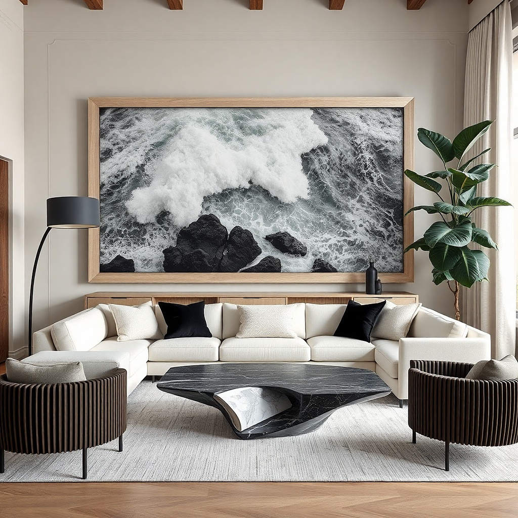
If you want something photogenic and timeless, a black-and-white photo in a linen-textured mat creates instant sophistication without adding extra items. The linen mat adds grain and warmth so the art doesn’t look like a cheap poster. Choose a single large frame instead of multiple sizes; it keeps the wall calm and lets your room’s furniture and textiles do the rest. This works especially well in living rooms with warm wood, neutral upholstery, or a modern light fixture, because the black-and-white contrast gives a clean focal point. It also helps when you have a lot of color already — monochrome art quiets the wall.
Try thisUse museum glass or an anti-glare finish if you get strong sunlight glare ruins the look fast.
Select a print aspect ratio that matches the wall: for a sofa wall, a horizontal piece usually looks best. Use a linen-textured mat at least 2 inches wide to create contrast and hide any print edges. Frame it in matte black or a warm wood depending on your room tones. Hang with the center at 57-60 inches from the floor, then step back and check that the bottom edge clears the sofa back by 6 to 10 inches.
Common mistakeAvoid glossy poster paper under bright windows.
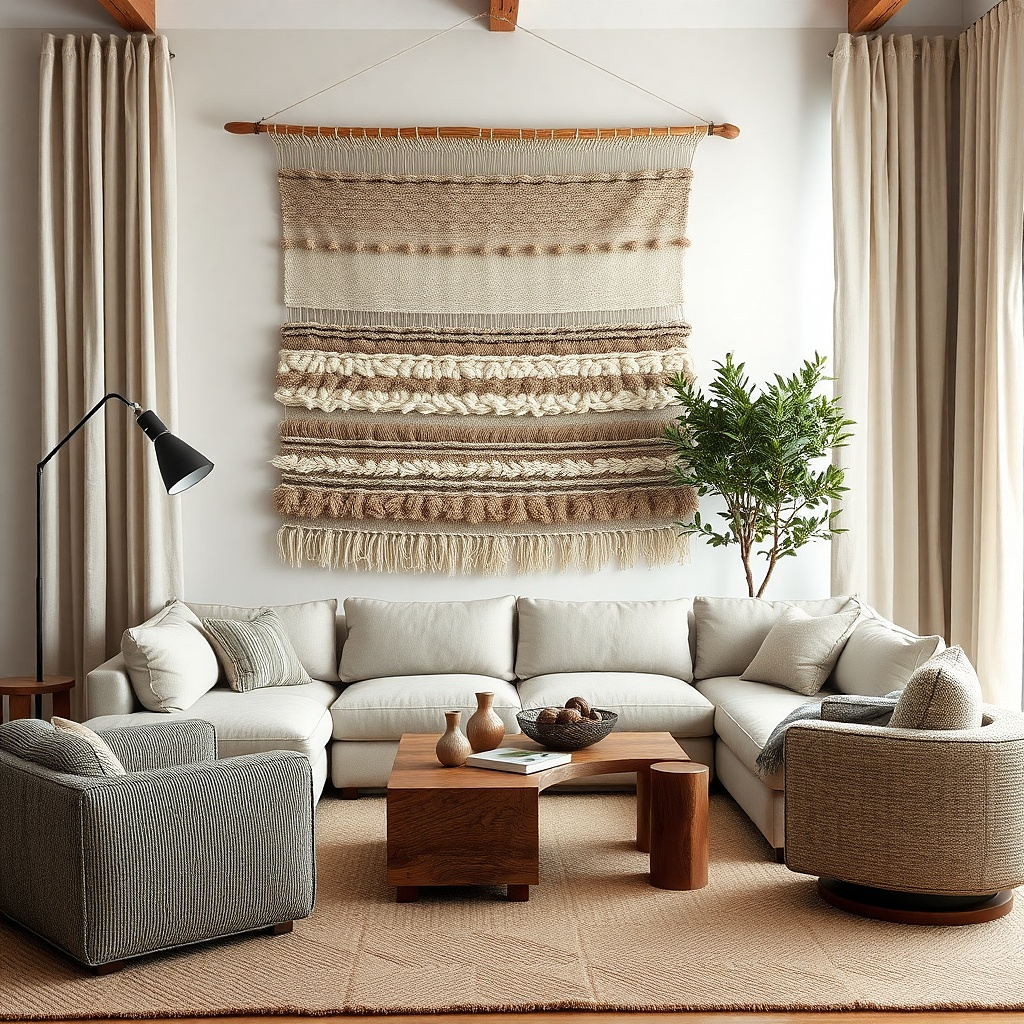
9. Oversized woven wall art with a simple rod
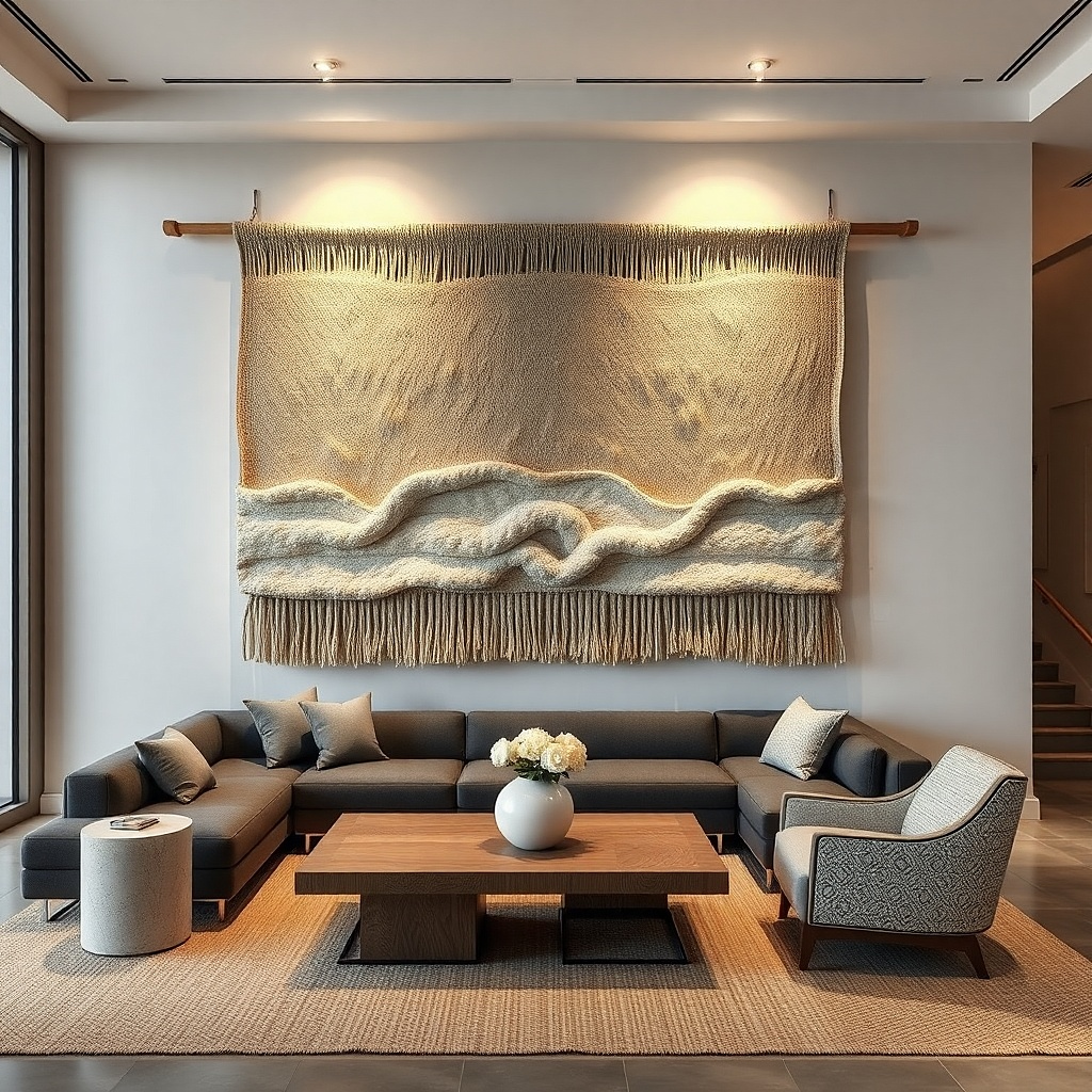
Woven wall art brings texture and shadow play, which makes a big wall feel dimensional. Choose a large piece with a tight weave so it looks crisp, not airy. Neutral tones — natural jute, oat, or a muted taupe — keep it cohesive with most living rooms. Hanging it high enough makes it feel like a designed focal point rather than a craft project. This is a strong option if your room is already heavy on hard surfaces and you want softness without adding more clutter. It also works when you don’t want to deal with matching frames or art sets.
Try thisPick a woven piece that has one dominant neutral color, not multiple loud threads.
Measure the wall and pick a woven piece that’s about 60 to 75% of the sofa width. Install a rod or two wall hooks with a concealed rail, then hang so the top edge sits 6 to 10 inches above the sofa back. Use a level to keep the weave straight — woven pieces can look crooked because of their patterns. If the piece has fringe, trim or tuck the fringe so it doesn’t hang unevenly.
Common mistakeAvoid very small weaves — they read decorative but won’t fill a giant blank wall.
10. Framed shadow box with dried grass or faux stems
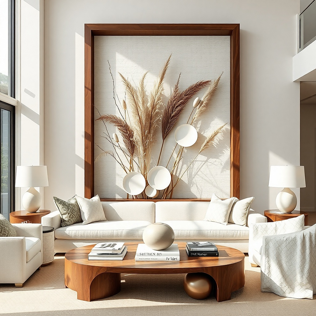
A shadow box creates depth on the wall and gives you a sculptural focal point without multiple items. Tall stems inside a large frame look intentional because the vertical lines fill height and lead the eye upward. Use dried grass or high-quality faux stems with a consistent color palette, wheat, oat, and soft tan — so it doesn’t look random. This option is great for living rooms with neutral furniture where you want warmth and movement but not bright color. It also solves clutter because the decor is contained behind glass or a clear panel.
Choose a shadow box frame that’s at least 24 inches tall and wide enough to cover about 50 to 70% of the sofa width. Plan the arrangement first: trim stems so they reach roughly the top third and leave negative space in the middle. Secure stems with floral wire or small clips to the back panel so they don’t shift. Hang at 57-60 inches from the floor for the center, and use spacers or backing to keep stems from touching the glass.
Use a mat backing color in warm gray or cream so the stems look richer.
Avoid mixing cool gray stems with warm wood tones — the wall can look off.
11. Gallery wall with strict spacing and one repeating frame color
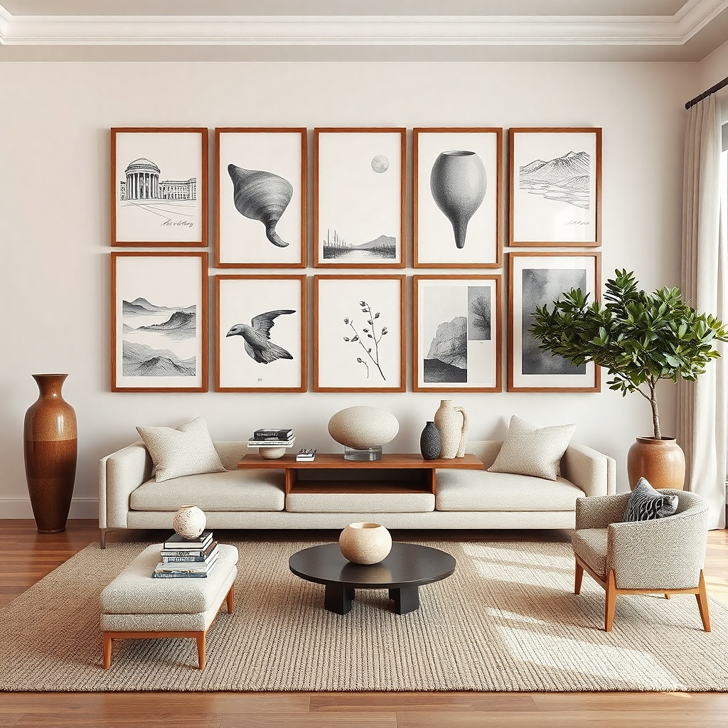
A gallery wall can look designer instead of cluttered when you control spacing and repetition. Pick one frame color (all matte black or all white) and use only one mat style across every piece. Then keep consistent gaps: about 2 inches between frame edges. This is the best “budget living room wall decor Ideas” choice if you already have prints or thrifted photos, because you can unify them into one system. It works well for long walls or awkward widths where a single oversized piece won’t fit nicely. The look is cohesive because the frames act like a grid, not scattered art.
Decide your total gallery size first: aim for 70 to 85% of the sofa width, then choose 5 to 9 frames depending on size. Layout on the floor with 2-inch spacing between frames, and make sure the top row and bottom row edges align. Measure the gallery’s combined height, then place the center of the whole arrangement at 57-60 inches from the floor. Use a template or painter’s tape grid to mark holes, then hang from the center outward.
Stick to one paper type: all matte prints or all photos with the same contrast level.
Avoid mixing frame colors and mat sizes — that’s what makes galleries look messy.
12. Large wall clock in a contrasting finish
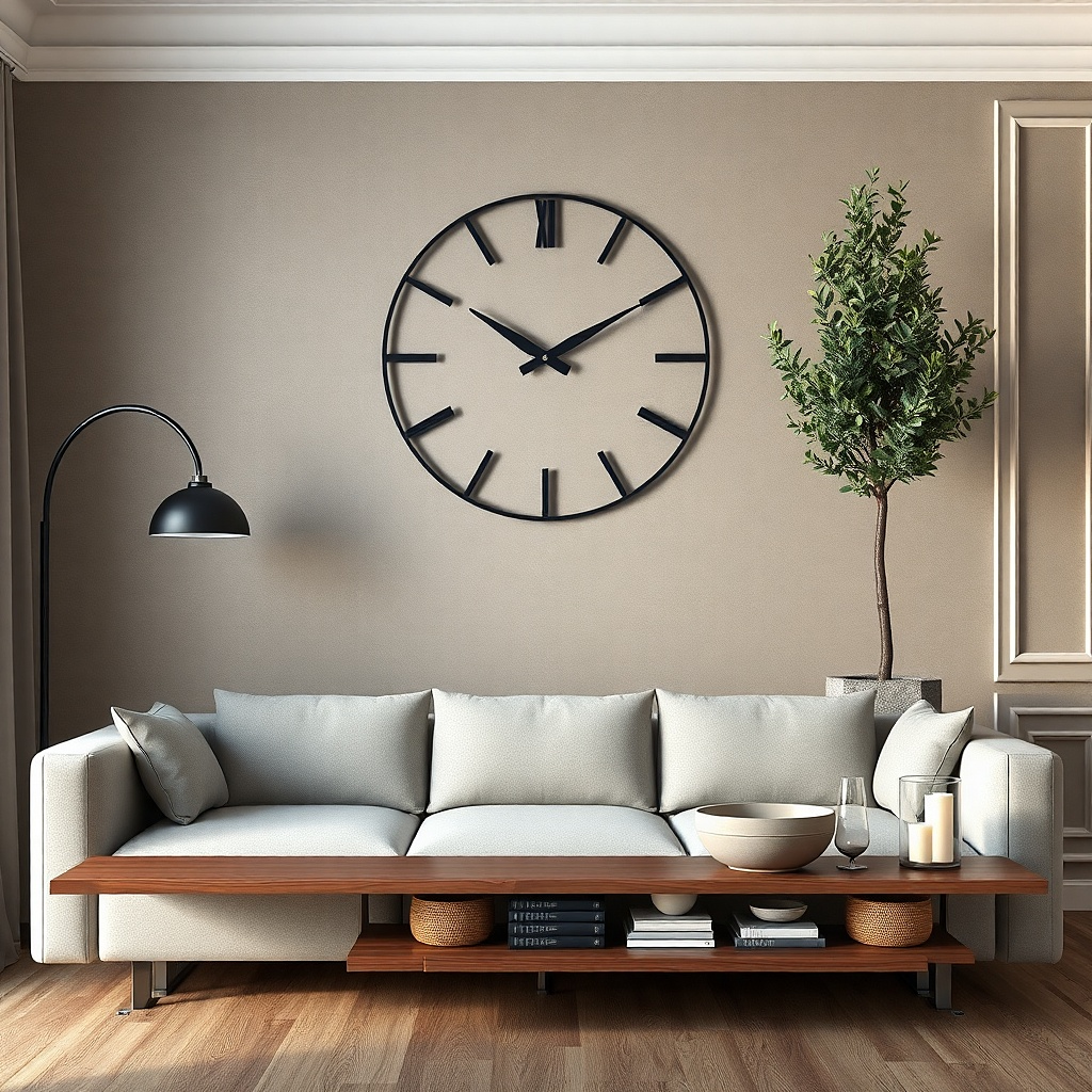
A big wall clock fills empty space while also serving a practical job. Choose a clock with a simple face: clean numbers, minimal hands, and a matte finish so it doesn’t glare. Black and white combos look best on neutral walls, while warm wood clocks work on cooler grays and whites. This is a strong option when your wall needs function and you don’t want more decorative objects. It also prevents clutter because the clock is one item with clear visual boundaries. Place it as the hero piece above the sofa or on a side wall where it balances the room.
Pick a clock diameter around 18 to 30 inches depending on wall size; for a giant empty wall, go bigger rather than smaller. Locate a spot where the clock center can land around 57-60 inches from the floor. Use the included wall template for mounting, then check the level before you tighten screws. If your wall has uneven paint or texture, use a flush mount ring or spacers so it sits flat.
Choose a clock with a matte face if you get direct window light.
Avoid clocks with shiny bezels — they reflect room lights and look messy on camera.
13. Oversized ceramic wall plates in a tight cluster
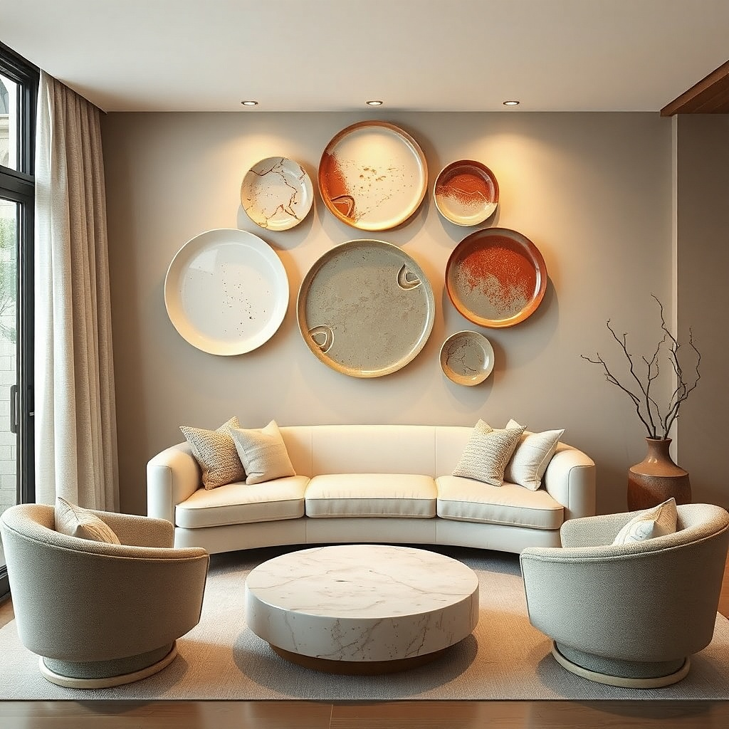
Ceramic plates add a hand-crafted look and they fill a wall without the visual noise of many small frames. Go for 3 plates with the same finish matte white, speckled cream, or warm terracotta and mount them in a tight triangular cluster or vertical stack. Plates work best when they’re large enough to be seen from across the room, and the spacing stays consistent so it looks like a set. This is a good choice for living rooms with earthy tones, woven textures, or a neutral rug where you want one more layer of warmth. It also photographs beautifully because plate edges catch light.
Try thisMatch plate tones to your rug or throw blanket, not to your wall color.
Choose plate sizes that start around 10 to 14 inches each; bigger is better for empty walls. Mount with plate hangers or small wall hooks designed for ceramics, not regular picture hooks that can slip. Lay out the cluster on the floor first, then mark the wall positions using painter’s tape. Hang so the cluster center sits at 57-60 inches from the floor, and keep the gap between plates about 2 to 4 inches.
Common mistakeAvoid tiny plates — they read decorative but won’t solve the empty-wall problem.
14. Long vertical art panel with two thin sconces
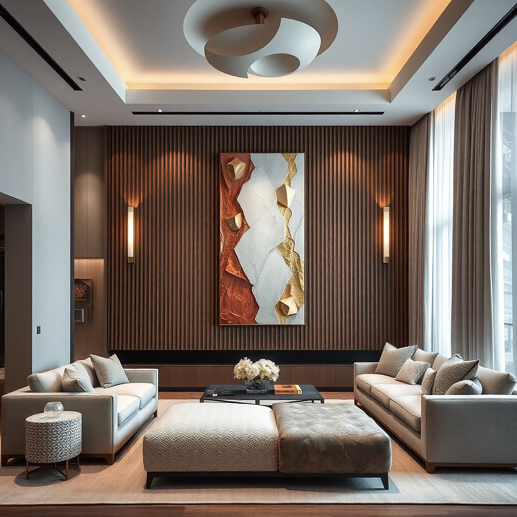
If your wall is tall and narrow, a tall panel plus lighting beats filling it with horizontal clutter. A long vertical artwork draws the eye up and makes the space feel taller. Pair it with two slim wall sconces (one on each side) so the wall has a light frame around the art. Choose sconces with warm bulbs (2700K) and matte shades to avoid harsh glare. This works especially well in living rooms where you already have a lamp but the wall feels dark at night. The result looks intentional because light and art align as one composition.
Select a vertical artwork height that lands roughly 80 to 90% of the wall height, and keep width around 20 to 30 inches. Install the sconces at a height that places the center of the light about 62 to 66 inches from the floor, then place the artwork so its center matches the sconces' visual midline. Use an electrician for wiring if needed; if you’re not comfortable, choose plug-in sconces. Finish the look by using warm bulbs and keeping the art matte to reduce reflective glare.
Use the same metal finish on both sconces and any nearby hardware so the wall reads cohesive.
Avoid placing sconces too low — the light hits the top of furniture and the art looks dim.
15. Large matte poster triplet in a single row
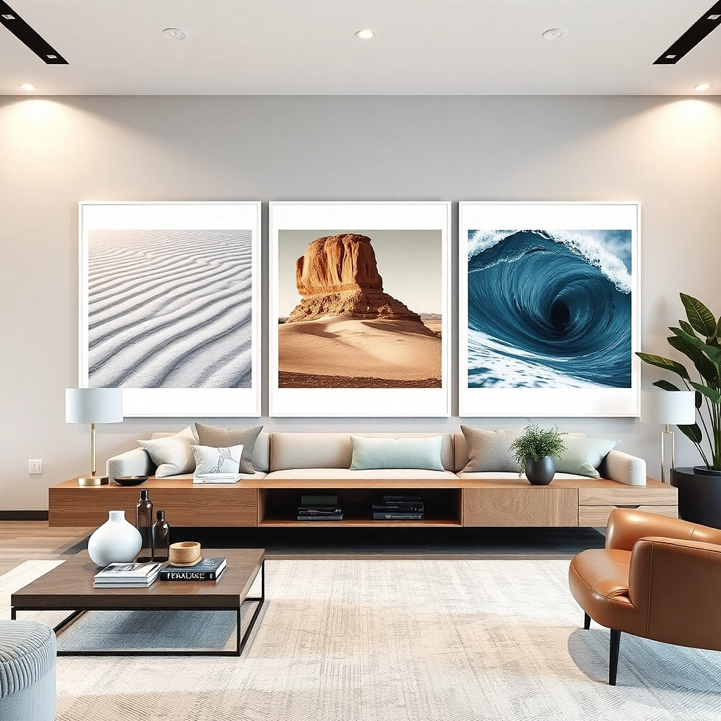
Posters can look expensive when you treat them like art prints and frame them properly. A row of three large matte posters gives you wide coverage without the clutter of a multi-row gallery. Keep all three frames the same color and use matching mat sizes so the row reads as one unit. Choose images that share a palette think muted blues, warm creams, and charcoal so the three pieces feel connected. This is a good option when you want bold color or graphic design on the wall but still want clean spacing. It’s also budget-friendly because you can print and frame affordably.
Try thisPick posters with lots of negative space; they look calmer and more designer than busy compositions.
Choose three prints with the same height and similar color balance, then frame them with identical mats. Size the total width to about 70 to 85% of the sofa width, and keep a 2-inch gap between frames. Hang the center of the middle frame at 57-60 inches from the floor, then align the other two using a level and measuring tape. Use matte frames and anti-glare glass so the posters don’t reflect light.
Common mistakeAvoid mixing glossy prints with matte frames — glare makes the wall look cheap.
16. Oversized macramé or rope wall hanging with chunky tassels
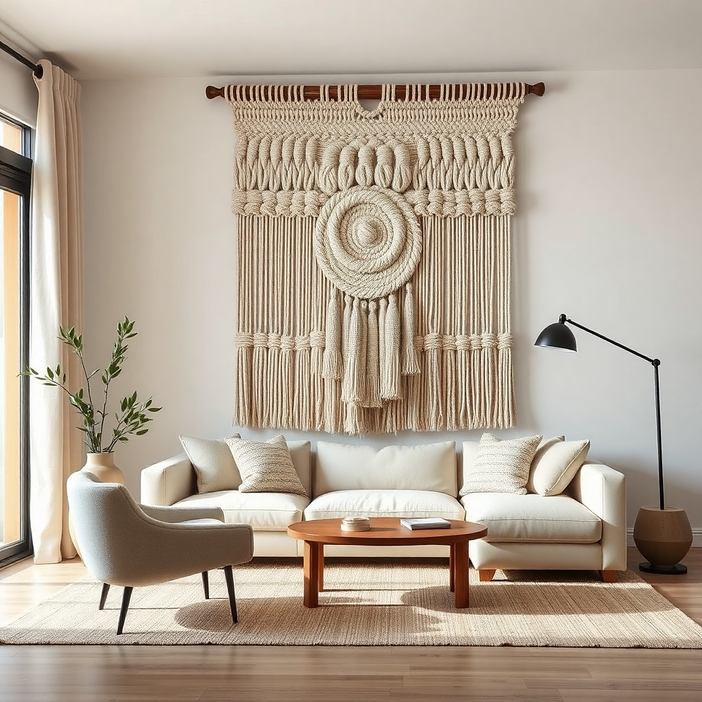
Macramé looks best when it’s big, bold, and tactile. A large rope wall hanging with chunky texture fills a giant wall quickly and adds depth through shadows. Choose a piece with a simple shape a single wave or a symmetrical panel so it doesn’t compete with furniture lines. Neutral rope colors work across most living rooms: natural cream, oat, or warm beige. This option is great for rooms that feel too flat or too hard, especially if you have a smooth leather couch or glossy tile. It also avoids clutter because the decor is one sculptural object, not many small ones.
Try thisPair it with one smooth, solid-texture element nearby like a ceramic vase to balance the rope texture.
Measure the wall and pick a hanging that’s at least 60% of the sofa width. Install a sturdy wall mount or beam bracket so the rope doesn’t stretch — use a stud when possible. Hang with the top edge about 6 to 10 inches above the sofa back, then straighten the cords so the pattern sits centered. If the hanging has adjustable knots, trim tassel length so both sides end at the same height.
Common mistakeAvoid tiny macramé — it looks decorative, not wall-filling.
17. Long floating ledge with a single sculptural vase and framed art above
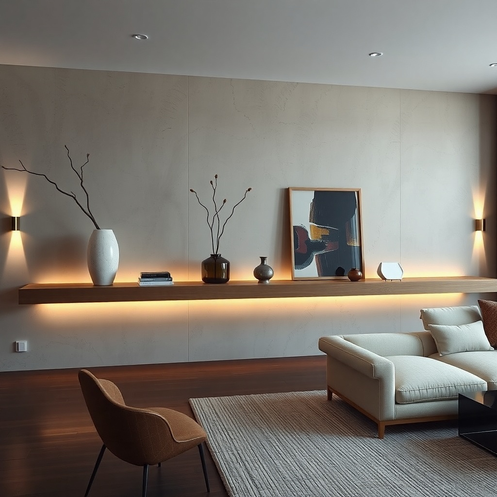
A long floating ledge creates a clean horizontal line that helps fill wide walls without turning them into a shelf explosion. Keep the styling strict: one large sculptural vase or ceramic pitcher, one small book stack, and one small object like a candle or bud vase. Put framed art above the ledge so you get a vertical hierarchy: art as the hero, ledge as the supporting stage. This is one of the best budget living room wall decor Ideas for people who love the look of styling but hate clutter. It’s also easy to change seasonally by swapping only one item.
Try thisChoose one matte ceramic and one matte wood element, not shiny mixed finishes.
Pick a ledge length around 60 to 80% of the sofa width, with a slim profile so it doesn’t look bulky. Mount into studs using a level and proper anchors if needed; keep the shelf load light. Hang framed art above with the center at 57-60 inches from the floor, then position the ledge so the top of the ledge sits 8 to 12 inches below the bottom of the frame. Style only after mounting: place the vase first, then add one supporting item on the opposite side for balance.
Common mistakeAvoid stacking lots of small decor — the ledge will look crowded fast.
18. Color-blocked wall panels using paint + removable trim
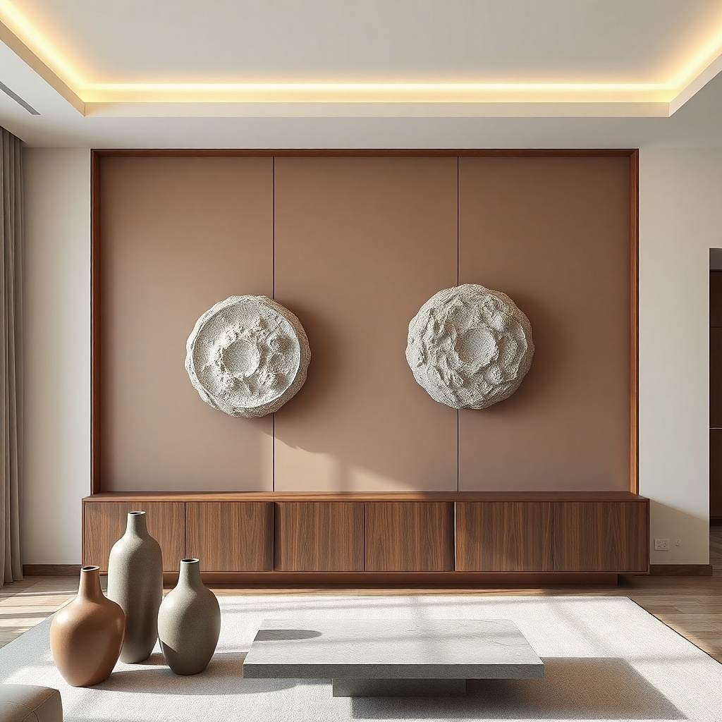
If you want the most designer look per dollar, paint a clean color-block panel and frame it with removable trim or painter’s tape edges. This gives you architecture on a wall without buying anything large. Use a soft, low-saturation accent like warm clay, muted sage, or dusty terracotta on top of a neutral wall, then keep the border crisp. The panel becomes your hero, and you can keep the rest of the wall bare. This solves the clutter problem because the color block does the “decor” job by itself. It also looks great in photos because edges are sharp and shadows define the shape.
Try thisUse the same sheen on the entire wall area you paint, usually satin, so it doesn’t look patchy.
Pick your panel size: cover about 50 to 65% of the sofa width and place it so the center lands at 57-60 inches from the floor. Use painter’s tape to map the border lines, then apply two thin coats of paint with a foam roller for smooth coverage. Let the paint cure enough to remove tape cleanly, then install removable trim if you want a more finished frame look. Touch up edges with a small angled brush so the border stays crisp.
Common mistakeAvoid high-gloss accents — they look patchy and reflect light harshly.