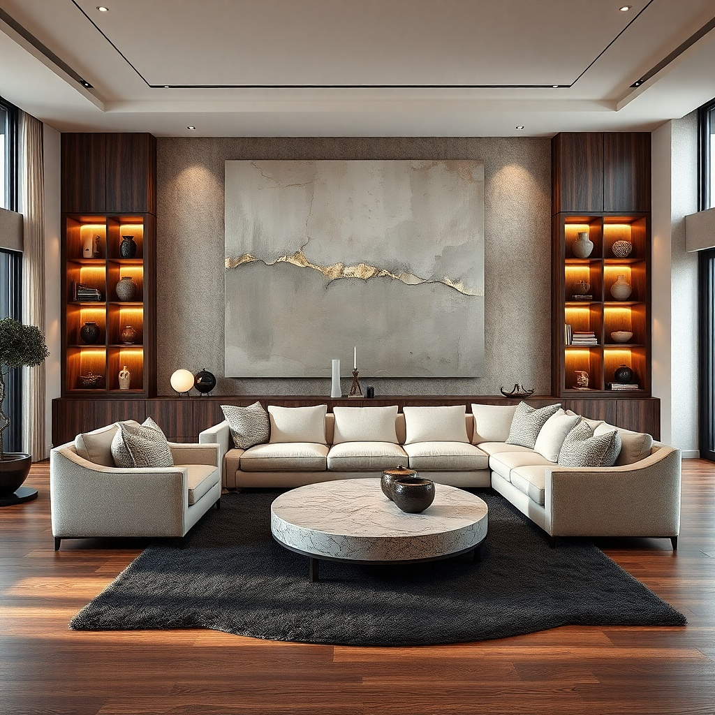
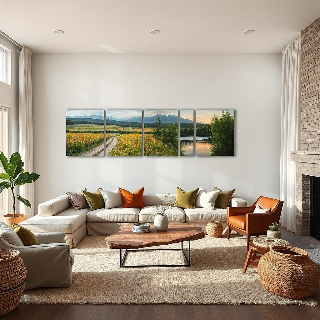
1. Oversized framed print with a calm matte border
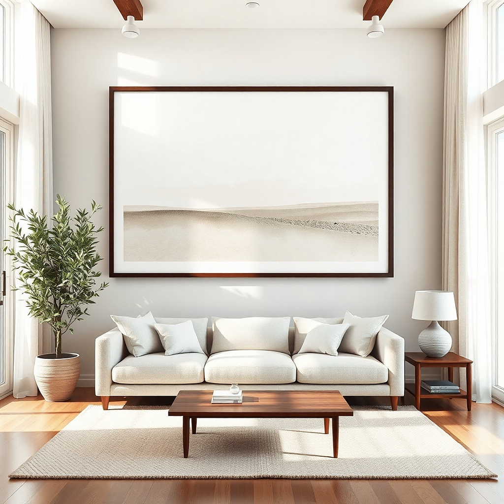
This is the quickest fix for the too empty sofa wall. A single oversized framed print gives you one clear focal point, and the matte border keeps it from looking like a random picture hung too small. Choose a frame in black, dark walnut, or natural oak these tones read crisp against most wall colors. For the print, pick a palette that matches your room’s largest fabric pieces: the rug’s dominant color or the curtain tone. It works best when your wall has no other strong focal point and you want the sofa area to feel intentionally finished.
Start by measuring your sofa width and target the framed piece to cover about 60-75% of it. Hang with the bottom edge about 8-10 inches above the sofa cushion, then use painter’s tape to mark the rectangle on the wall before drilling. Pick a screw-in wall anchor rated for your wall type (drywall needs a proper anchor; masonry needs a masonry bit and plug). Finally, check the alignment from two angles: standing and seated, because sofa walls trick your eye.
If your room has strong glare from a window, choose a print with a matte finish or use UV-protective matte glass.
Don’t hang a small frame higher just because it looks okay up close — the sofa will still feel unfinished.
2. Two matching tall prints in a tight vertical pair
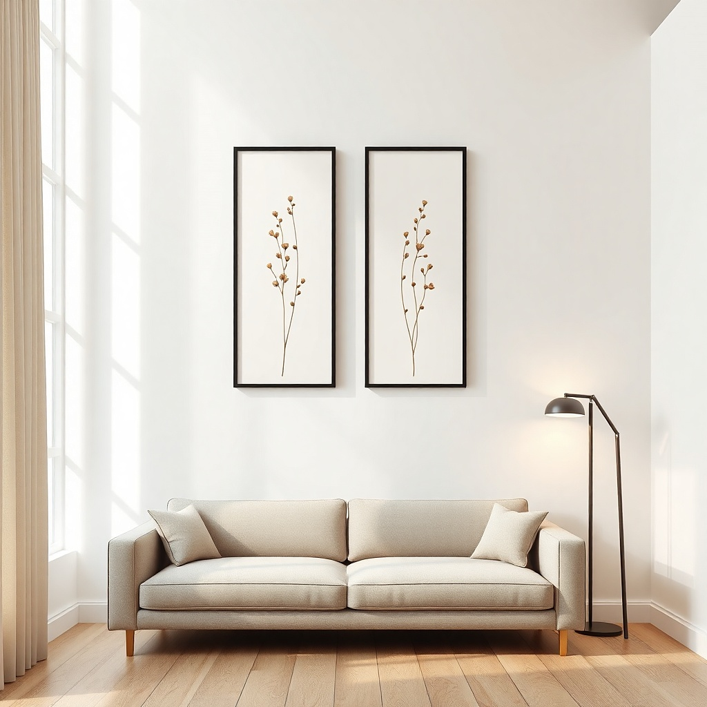
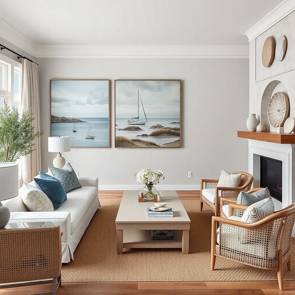
When your sofa wall feels wide but you don’t want a single huge frame, a matched pair gives you height without making the wall look cluttered. Tall prints also balance the vertical lines of many sofas and room corners, especially in living rooms with high ceilings or tall curtains. Matching frames look designer even if the prints are different images, as long as the color story stays consistent. Keep the frames slim and the spacing tight so it reads as one composition. This works especially well if your wall is painted a warm off-white or greige and you want a clean, gallery-like look.
Pick two frames that match in width and finish, and keep their combined width around 60-70% of the sofa width. Center the pair as a unit: the gap between frames should be about 2-4 inches for most living rooms. Hang the bottom of both frames so they line up, using painter’s tape to test the height before you drill. Use a level and measure from the sofa cushion top to hit the 8-10 inch bottom-edge rule.
Use prints with one shared dominant color so the pair looks cohesive from across the room.
Skip mismatched frame thicknesses — the pair will look like separate photos instead of a planned layout.
3. Symmetrical gallery of three with a centered anchor
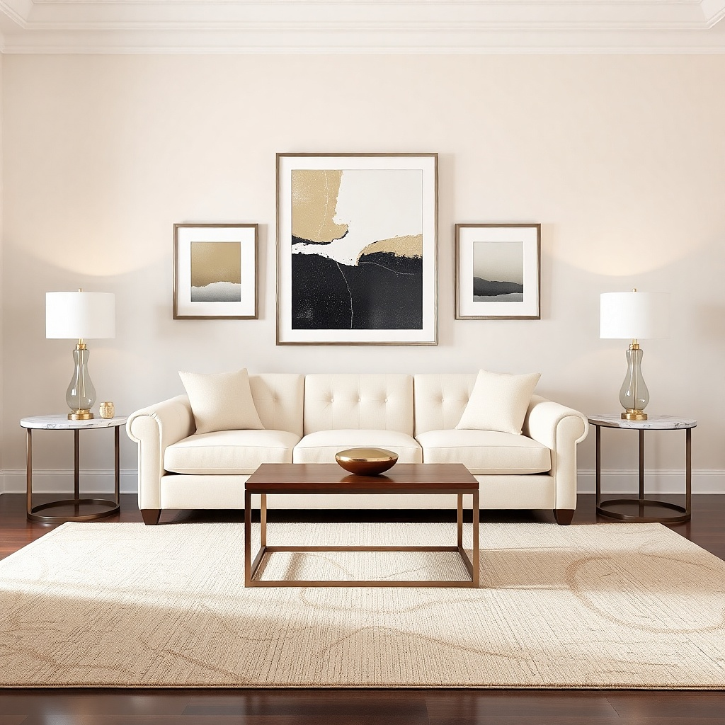
A three-piece gallery is forgiving and looks intentional even for beginners. The key is the centered anchor: one larger piece in the middle, flanked by two smaller pieces at equal heights or equal visual weight. This solves the problem because it creates a stable focal point that doesn’t feel like a random cluster. Choose frame finishes that match your room hardware: matte black if your TV stand and lamps are dark, or light oak if your room leans warm. This works when you have an average-width sofa and want more character than a single print.
Choose a center frame that’s about 45-55% of the sofa width, then set each side frame so the total gallery width hits 65-75% of the sofa width. Keep the top edges of the frames aligned if the frames are similar height, or align the center points if the heights vary. Measure and mark the centerline of the wall, then tape the frames in place and step back to confirm the spacing. Once it looks right, install using two hang points per frame (or one if the frame has a strong hanging rail), and use wall anchors appropriate to your drywall.
If you’re using prints, pick one with bolder contrast for the center and quieter tones for the side frames.
Don’t let the side frames sit too low — it makes the sofa look like it’s floating above the wall.
4. Grid of five small frames with equal spacing
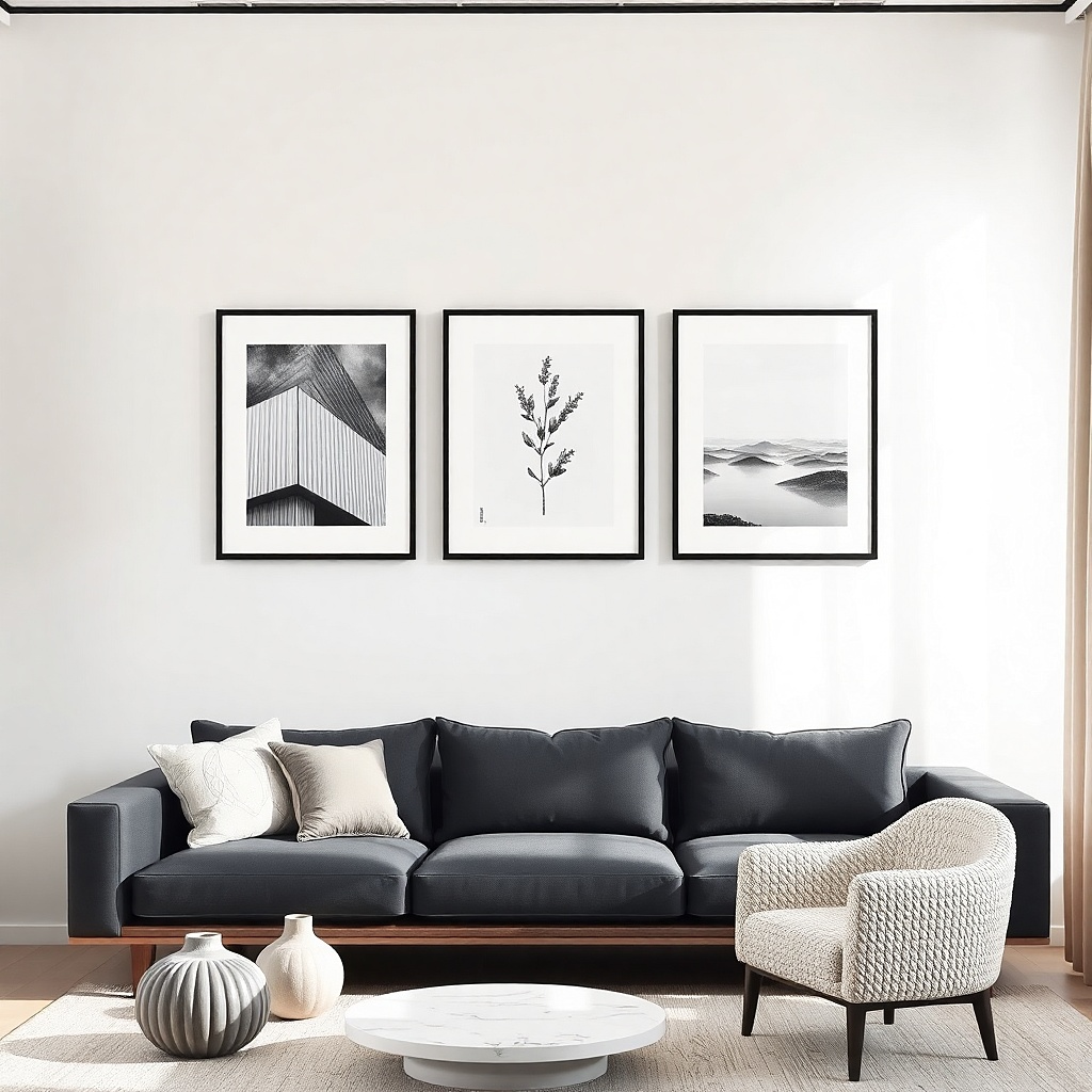
A five-frame grid looks modern and controlled, which is exactly what a “blank above the sofa” wall needs. The equal spacing creates order, so you don’t have to nail perfect placement like you would with a freeform gallery. This idea is photogenic because it reads like one graphic block, especially when frame finishes match and mat colors are the same. Use a mix of art types if you want interest — line drawings, simple typography, or monochrome photos — but keep the palette tight. It’s best for walls that are already busy, because the grid brings structure instead of adding chaos.
Pick frames with the same outer dimensions if you want the easiest install, then aim for the grid to span about 60-75% of the sofa width. Use painter’s tape to map a rectangle on the wall: decide the spacing between frames first (usually 2-3 inches between frame edges). Hang the middle frame first at the correct height, then place the other four around it using the tape marks. Use a laser level or a phone level to keep the rows straight.
Choose frames with white or warm gray mats — they reduce glare and unify different artworks.
Don’t mix frame sizes wildly — the grid stops reading as a block.
5. Oversized wall mirror with a thin black frame
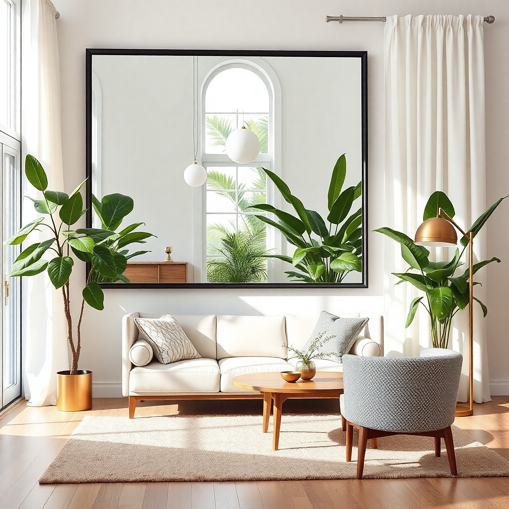
A mirror is the fastest way to make an above-sofa wall feel finished because it adds light and depth. A thin black frame looks sharp and modern, and it won’t overpower most living rooms. Go for a mirror width that hits about 50-70% of your sofa width so it doesn’t feel like a small accessory. This solves the problem in rooms that already feel dim, because the reflective surface brightens the wall area and makes the sofa look more grounded. It also looks great in photos because the frame gives a clean border for the composition.
Choose a mirror with a vertical or horizontal orientation that matches your wall width; for most sofa walls, a horizontal mirror feels balanced. Aim for the mirror’s width to cover 55-70% of the sofa width, then center it on the wall. Hang so the bottom edge is about 8-10 inches above the sofa cushion. Use the wall’s stud locations if possible, or use heavy-duty anchors rated for the mirror’s weight.
Skip high-gloss frames if your sofa wall gets direct afternoon sun — glare can make the mirror look washed out.
Don’t place the mirror too high — it will reflect ceiling and make the sofa feel cut off.
6. Layered floating shelves with two art pieces
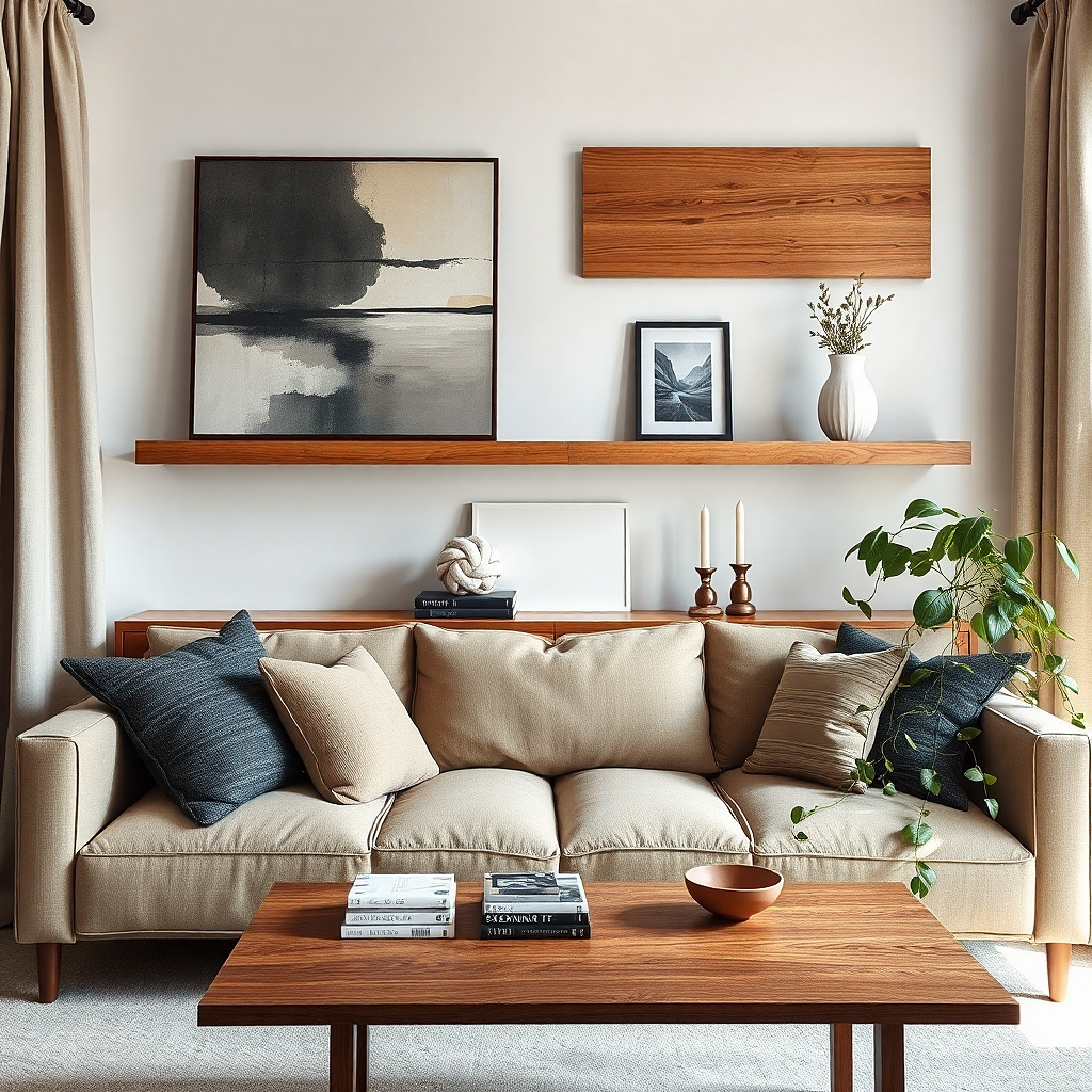
Plan for two shelves or one longer shelf plus a smaller upper shelf. Keep the shelf span around 60-75% of the sofa width, and leave at least 12 inches between shelf and the top of the sofa back if your sofa is tall. Mount shelves into studs when possible, and use the shelf’s bracket template for clean leveling. Then place two framed pieces above or between shelf lines, keeping frame edges aligned with the shelf ends.
If your wall needs both function and decoration, shelves fix the blank space while giving you styling control. The trick is layering: install shelves high enough to keep the sofa wall from feeling crowded, then add two framed pieces at the ends or center to anchor the look. Floating shelves keep the wall from looking heavy, and wood tones add warmth against cool paint colors. Style with low clutter: a single ceramic vase, a small stack of books, and one framed print per shelf section. This works best when you want to hide visual clutter and still keep the wall looking intentional from across the room.
Common mistakeDon’t fill the shelves — five small items look messy faster than one larger piece.
Try thisUse books with similar spine colors (cream, black, warm gray) so the shelf looks designed, not gathered.
7. Textural fabric wall panel behind a sofa runner
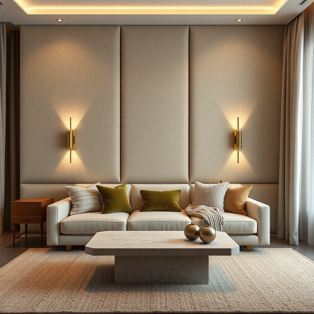
Fabric texture gives you a designer look without needing prints that match perfectly. A wall panel in linen, boucle, or woven cotton adds softness and hides minor wall imperfections, which matters when your wall is older or has patchy paint. This idea solves the blank-shelf problem because the texture reads as the art. Choose a panel color that matches your upholstery undertone: warm beige for warm creams, cool gray-beige for cooler walls. It looks best in living rooms that have hard surfaces like stone or glossy floors, because the fabric breaks up shine.
Pick a panel size that spans about 50-70% of the sofa width and sits centered. Install a simple backing board or use a pre-framed panel system so it hangs straight; mark the centerline first. Mount so the bottom of the panel is about 10-12 inches above the sofa cushion top, then add a low-profile art piece or sconce if you want extra interest. Use strong wall anchors or studs depending on weight.
Choose a neutral fabric and let the texture do the work; busy patterns make placement mistakes obvious.
Skip thin, shiny fabrics — they show wrinkles and look cheap in side lighting.
8. Large framed textile or vintage quilt square
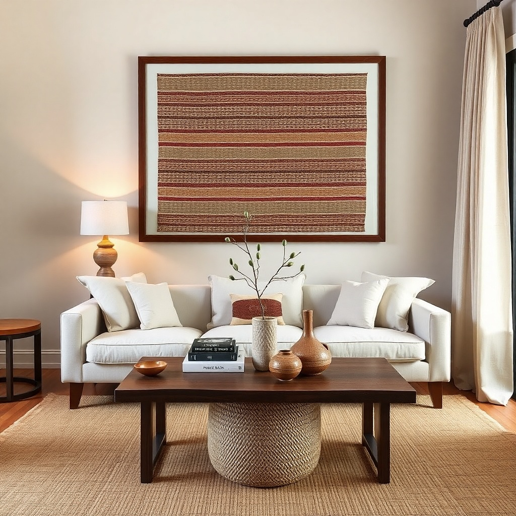
Center the framed textile above the sofa and aim for it to cover 60-75% of the sofa width. Hang with the bottom edge about 8-10 inches above the cushion top. Use a sturdy frame with real backing and hang hardware rated for the weight. If the textile is heavy, install into studs with two points for stability.
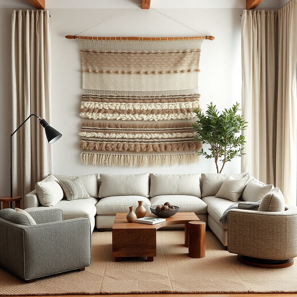
A framed textile feels warm, personal, and high-end, and it’s also beginner-friendly because it hides uneven wall lighting. Choose a piece with a clear color story and flat weave so it photographs cleanly. A vintage quilt square works well when you want softness without clutter, and the frame makes it look intentional instead of like decor leaned on a wall. Match the frame to your room: dark wood for warm interiors, black for modern rooms. This solves the blank wall problem when you don’t want to commit to a print you’ll tire of quickly.
Common mistakeDon’t use a glossy frame finish — it reflects light and fights the textile’s softness.
Try thisAdd one matching throw pillow in the textile’s dominant color so the whole sofa wall reads as one set.
9. Oversized abstract diptych with matching frames
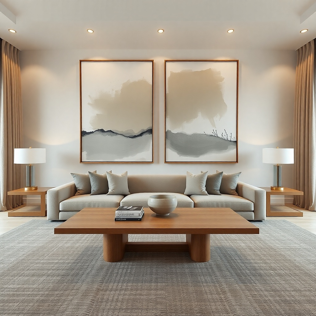
A diptych gives you more impact than a single print but still feels structured. Matching frames keep it cohesive, and the two panels create a wider visual footprint that helps the sofa wall feel finished. Choose abstract art that includes one color from your sofa, one from your rug, and a neutral like cream or charcoal so it ties into the room. This is a strong choice for modern living rooms where you want a clean look without a busy gallery. It’s also forgiving if you’re not sure about exact placement — the two-panel composition hides small alignment issues.
Select two canvases or framed prints that together span 65-80% of the sofa width. Keep the gap between panels around 1-3 inches for a tight diptych look. Mark the centerline and tape both panels in place, then hang so the bottom edges land about 8-10 inches above the sofa cushion. Use a level for the top edges and wall anchors for each panel.
If your art is bold, keep the rest of the wall area empty — one diptych beats three small pieces for impact.
Avoid random color chaos — if the art has no neutral tie-in, the wall looks disconnected.
10. Floating ledge + large statement sculpture or vase
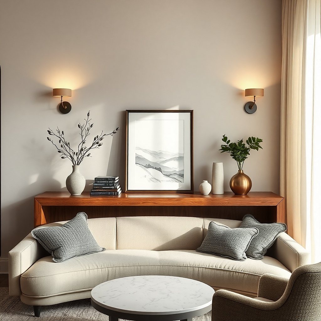
Pick a ledge length around 60-75% of the sofa width, then mount it level. Place the ledge so the top of the object sits roughly 4-6 inches above the sofa back if your sofa is low, or a bit lower if your sofa is tall. Use heavy-duty mounting hardware and install into studs whenever you can. Then add one framed print small enough to balance the ledge, not compete with the sculpture.
This is a good option when you want the wall to look like a design feature, not a picture wall. A floating ledge with one large sculptural object creates a strong silhouette and adds depth through shadow. Choose a ledge in the same tone as your wood furniture — oak, walnut, or painted matte white. The object should be tall enough to read from across the room, but not so tall it crowds the sofa back. This solves the blank wall problem for people who don’t love art prints or who have a room with clean lines and want a single strong focal point.
Common mistakeDon’t add multiple small objects — the look turns cluttered fast.
Try thisUse a matte object finish like ceramic or stone so it doesn’t glare under lamp light.
11. Vertical slat wall art in warm wood
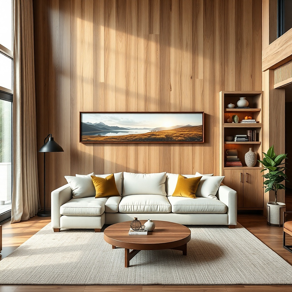
Choose a slat panel size around 50-70% of the sofa width and center it. Hang so the bottom edge sits 8-10 inches above the cushion top. Mount with the manufacturer’s hardware or use wall anchors rated for the panel’s weight. If you’re installing multiple pieces, keep gaps consistent and align edges using painter’s tape first.
Warm wood slats bring structure and texture without needing a print that matches everything. The vertical lines add height and make the sofa wall feel composed, especially if your room has low-profile furniture. This works beautifully in living rooms with beige, cream, or light gray walls because the slats add a natural contrast. Keep the slat panel wide enough to matter — around half to two-thirds of the sofa width. The look is modern, but it also feels cozy because wood reads warmer than metal or plastic.
Common mistakeSkip glossy varnished slats if your wall gets direct sunlight — glare makes the texture look flat.
Try thisMatch your slat tone to at least one other element in the room — side table, coffee table, or frame color.
12. Framed black-and-white photo strip
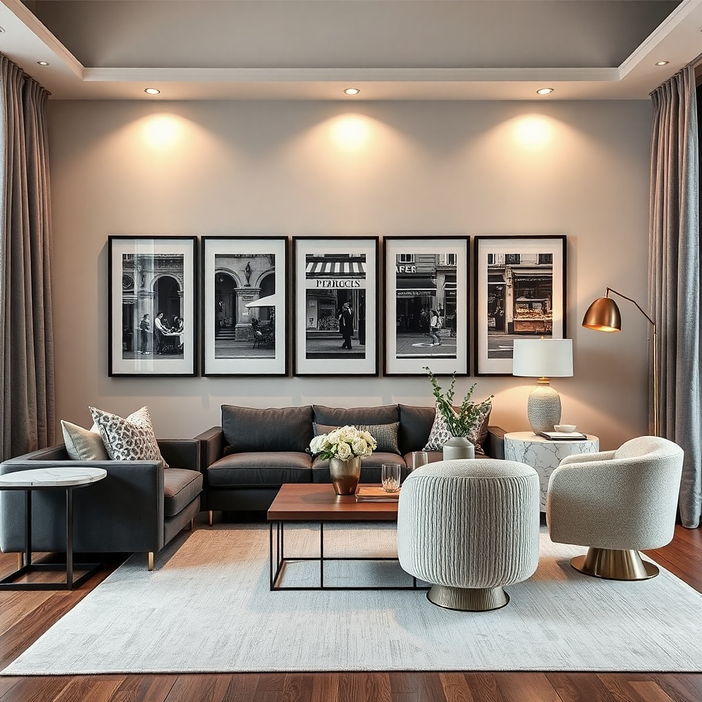
Pick 3-5 frames with identical dimensions and mat colors. Arrange them into a single horizontal strip spanning 65-75% of the sofa width, then center the strip above the sofa. Hang with the bottom edge around 8-10 inches above the cushion top, then use a level to keep the row straight. Use studs when possible, especially if the frames are heavy.
A photo strip gives you personality while staying visually clean. Black-and-white images work because they don’t fight your existing colors; they also photograph well under mixed lighting. Use a row layout that spans 60-75% of the sofa width, with consistent frame sizes. This solves the blank wall issue by adding pattern without adding color noise. It’s a strong choice for apartments where you want decor that feels personal but doesn’t overwhelm the room.
Common mistakeDon’t mix frame finishes — it makes the strip look like a collage.
Try thisLeave the photos with a consistent border or mat thickness so the strip looks planned, not assembled.
13. Corner-to-corner wallpaper stripe behind the sofa
Choose a wallpaper stripe width that sits behind the sofa and art area, typically about 50-70% of the sofa width. Apply carefully using a smoothing tool and level marks for the first strip — the first line determines everything. After it cures, hang a single piece centered on the stripe, using the 8-10 inch bottom-edge rule. If you’re renting, use removable wallpaper and test a small section first.
If your wall is plain and the area above the sofa looks dead, wallpaper stripe creates instant depth. Pick a stripe pattern that matches the room’s style: subtle geometric for modern rooms, soft botanical for traditional spaces, or a textured stripe that reads like fabric. Keep it centered behind the sofa so the whole wall area feels designed. Then add a simpler art piece or light fixture above it — the wallpaper does the heavy lifting. This solves the problem because the blank wall stops being blank; it becomes a backdrop that makes art look intentional.
Common mistakeDon’t add a busy multi-frame gallery on top of busy wallpaper. One focal layer is enough.
Try thisUse a matte wallpaper finish if you have sunlight glare — it keeps the pattern calm in photos.
14. Oversized typography sign with generous negative space
Choose a sign that covers 60-75% of the sofa width and centers above it. Hang with the bottom edge about 8-10 inches above the cushion top. Use a frame with a matte finish and thick enough border to keep the text crisp. Drill and anchor based on frame weight; if it’s light, you can use two anchors spaced evenly to avoid sag.
Typography can look designer when the layout is clean and the negative space is real. A large framed sign with a single line or two words creates a modern focal point that fills the sofa wall without feeling crowded. Keep the typography color simple: black on warm white, charcoal on cream, or a single accent like terracotta. This solves the blank wall problem for people who don’t want pictures of people or landscapes on their walls. It also works well in open-plan living rooms where you need a strong visual anchor.
Common mistakeAvoid tiny text and thin frames — it reads small and doesn’t fix the scale problem.
Try thisPick one font style and stick to it — mixing fonts turns the look into a craft project.
15. Two-tone wall art with a color-block frame
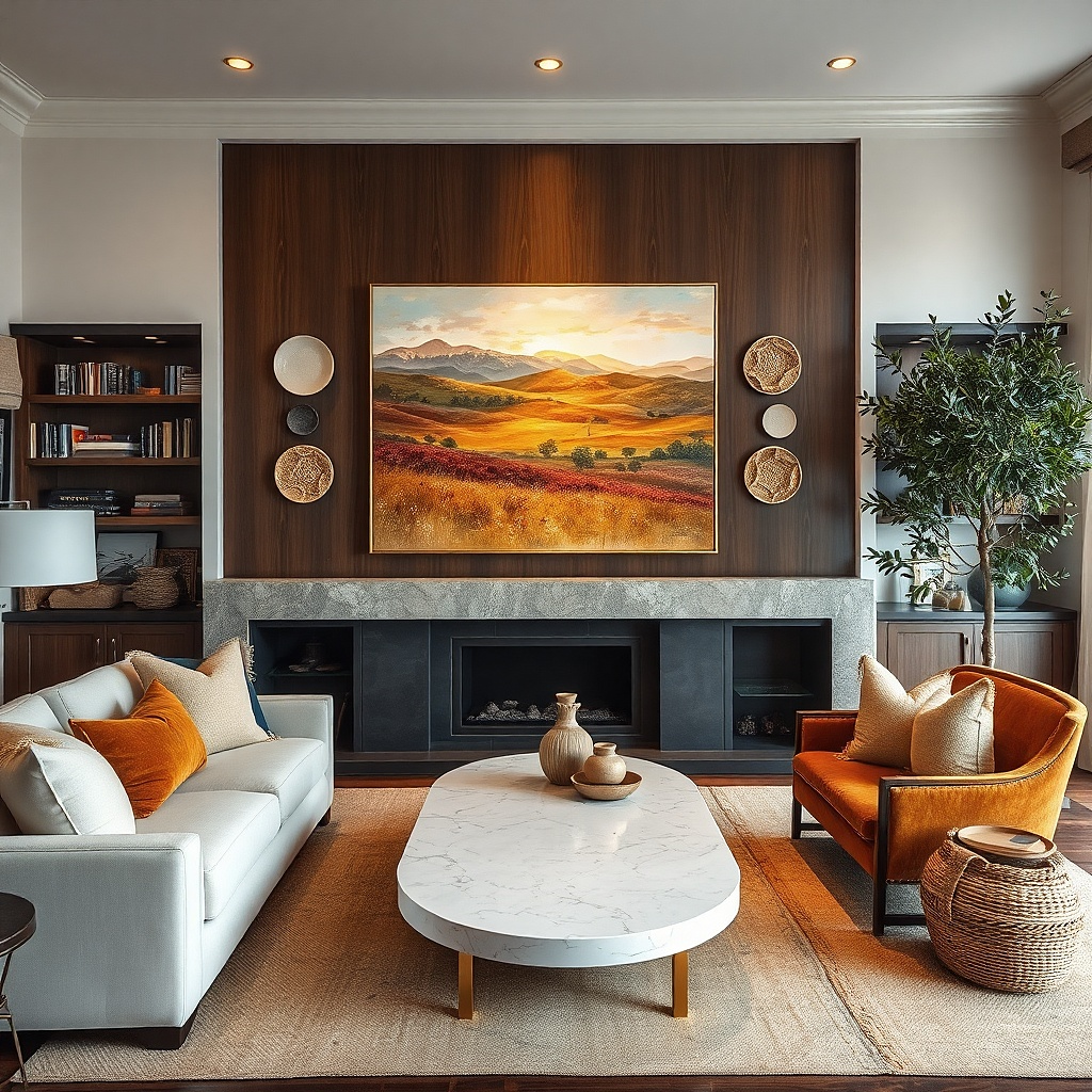
Color-block art looks polished because it’s graphic and controlled. Pick two tones that echo your room: one from the sofa fabric (or a cushion) and one from your rug or curtains. A frame with a thin border makes the colors feel intentional instead of like a craft poster. This idea solves the blank wall issue because the bold color fields read like design elements even from a distance. It’s especially good for beginners who want something modern without building a multi-piece gallery.
Choose an art piece with two dominant blocks and a frame that matches your room hardware. Size it to cover 60-75% of the sofa width. Center it above the sofa and hang the bottom edge 8-10 inches above the cushion top. Use painter’s tape to check symmetry, then install with wall anchors rated for the frame weight.
If your wall is off-white, choose art with a slightly deeper neutral so it doesn’t blend into the background.
Don’t pick colors that only exist in tiny accessories. The wall art needs to match the big fabrics.
16. Minimalist sculptural wall clock above the sofa
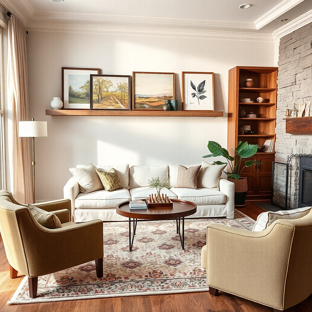
A large minimalist clock can replace wall art when your sofa wall needs function and style. The look works best when the clock has a clean face, slim hands, and a solid frame — no busy numbers. Hang it centered above the sofa so it reads as a single focal point. This solves the blank wall problem because the clock face fills space and adds structure to the wall. It’s also a smart choice in living rooms where you want less clutter and more practicality.
Choose a clock width around 45-65% of the sofa width for a balanced look. Hang it with the bottom edge about 8-10 inches above the cushion top, centered on the wall. Install using the clock’s hardware and a stud when possible, since clocks can be heavier than they look. Keep the clock frame color consistent with other dark elements like TV stand trim or lamp bases.
Use a clock with a matte face if you have overhead lighting — it reduces glare and keeps the hands readable.
Skip clocks with thick, decorative motifs — they compete with the sofa instead of supporting it.
17. Staggered picture ledge with three medium frames
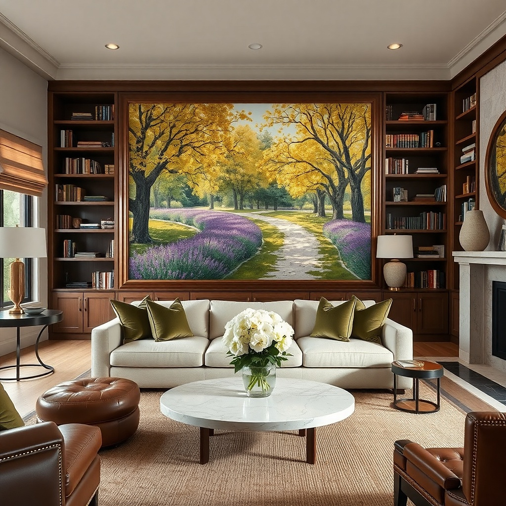
A picture ledge is a cheat code when you want an art display that looks curated but stays flexible. Three medium frames on a ledge create a layered effect without needing perfect nail placement for a gallery grid. The staggered heights add dimension and make the wall feel designed, especially if your living room has shallow wall depth or you want shadows for texture. Choose frames with consistent finishes and mats in the same tone. This solves the blank wall problem because the ledge gives the wall a built-in platform for the composition.
Select a ledge length around 60-75% of the sofa width and mount it level. Place the three frames so the outer two are slightly higher than the center, usually a 1-2 inch difference. Hang the ledge so the bottom of the lowest frame ends up around 8-10 inches above the sofa cushion top. Use a stud for the ledge brackets; then secure frames with the ledge lip or frame hang backs as designed.
Keep the mat color consistent across all frames so the stagger looks intentional, not random.
Don’t mix frame sizes without a plan — the ledge display can look like you ran out of space.
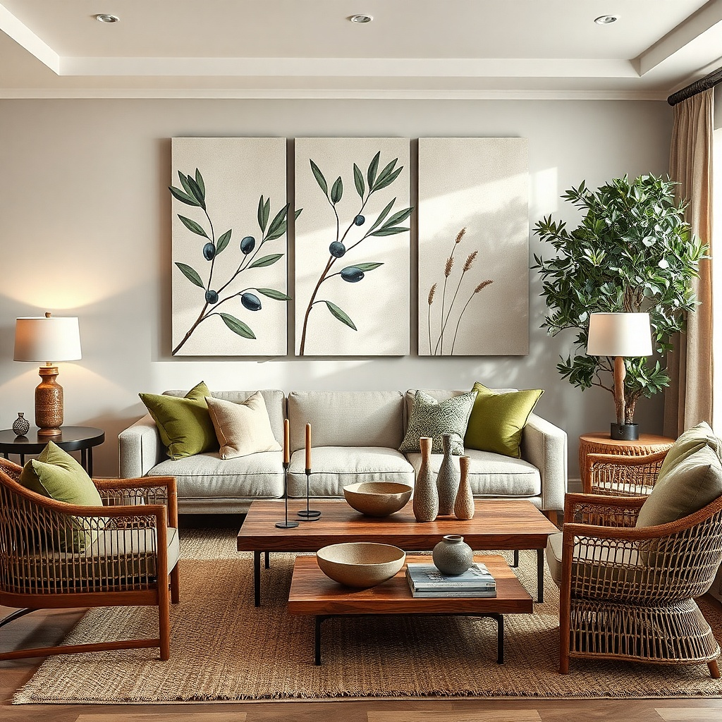
18. Large botanical diptych with muted greens and creams
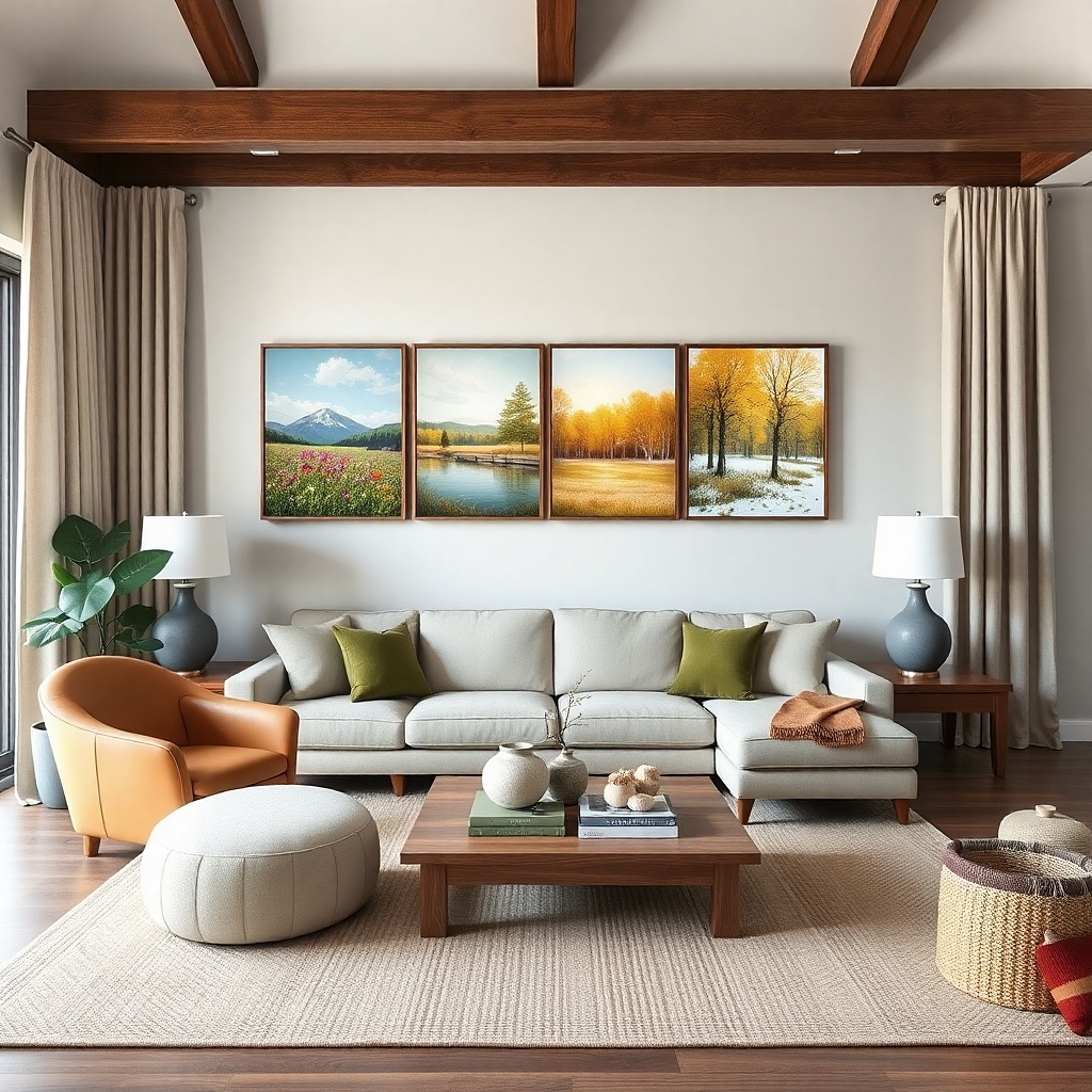
Muted botanical art adds softness and movement without feeling loud. A diptych format keeps it structured, and muted greens work with beige, cream, and light wood interiors. This idea solves the blank wall problem by giving you a larger-than-life focal point that still feels calm and “livable.” Choose prints with plenty of cream or warm white negative space, so the sofa wall doesn’t feel heavy. It’s best for living rooms with neutral furniture and you want a touch of color that doesn’t scream.
Pick two matching frames that together span 65-80% of the sofa width. Keep the gap between panels about 1-3 inches, then center the diptych above the sofa. Hang so the bottom edge sits 8-10 inches above the cushion top. Use painter’s tape for the spacing first, then mount with anchors or studs for each frame.
If your room has green in any form, align one of the print greens with that exact undertone for a calmer look.
Avoid bright neon greens — they fight the cozy effect and make the wall look harsh.
19. Mirrors in a symmetrical pair to widen a narrow wall
Choose two mirrors with the same size and frame finish. Set the pair so their combined width hits about 60-75% of the sofa width, with a gap of 3-5 inches between mirrors. Center the whole pair above the sofa and hang the bottom edges 8-10 inches above the cushion top. Mount into studs if possible; mirrors need secure mounting for safety.
Two matching mirrors can solve a narrow or dark sofa wall because they bounce light and visually widen the space. The symmetrical layout keeps it from looking like two random accessories. Thin frames in black or brushed brass add definition, but keep them simple so the mirrors read as “architecture.” This works especially well if your living room has a window off to the side — the mirrors reflect that light across the wall. It’s a strong beginner-friendly move because mirror placement is easier when you use matching pieces.
Common mistakeDon’t use one mirror large and one small — the asymmetry usually looks accidental above a sofa.
Try thisClean the mirror glass before you hang them; fingerprints show up instantly under warm lamps.
20. Oversized framed map or grid artwork for an airy look
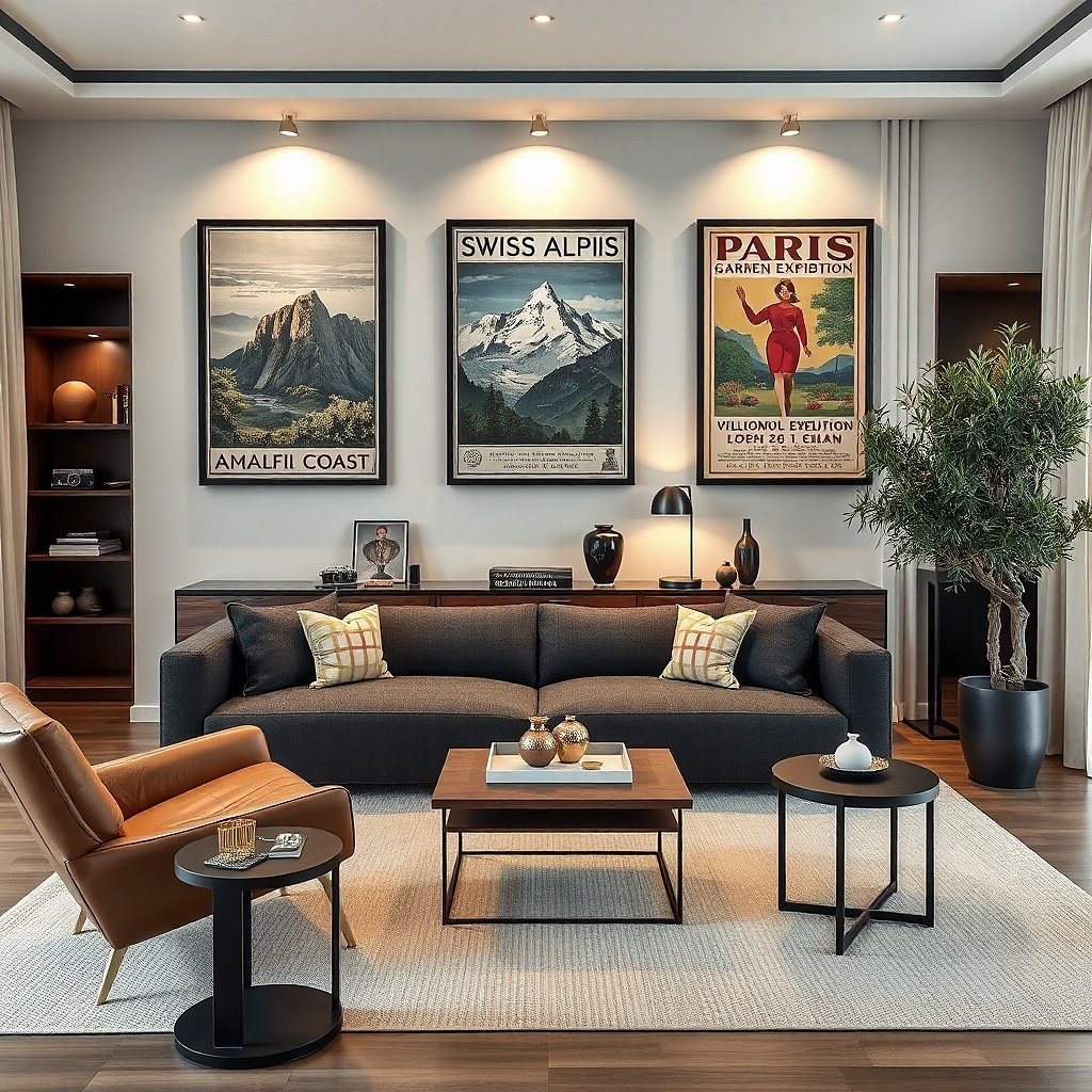
A map-style or grid-style artwork fills the wall with pattern while staying light visually. It’s a great option for people who want “something interesting” above the sofa but don’t want a bold abstract. Choose a muted map palette — parchment browns, soft grays, and faded blues — so it doesn’t look dated or overly themed. A large frame gives it a finished, gallery feel. This works best in living rooms with warm wood tones and neutral textiles where you want visual texture without heavy color.
Pick artwork that spans 60-75% of the sofa width and use a frame with a matte finish. Hang with the bottom edge about 8-10 inches above the cushion top, centered to the sofa. If the map has fine details, use a glass or acrylic cover to keep it protected and clean. Install using wall anchors rated for the frame weight, and verify level from both sides.
Match the frame color to your floor or wood furniture tone for a calmer, more expensive look.
Avoid tiny detailed maps — they don’t read from the sofa and make the wall look like a small decoration.