1. Warm white walls with flax linen curtains
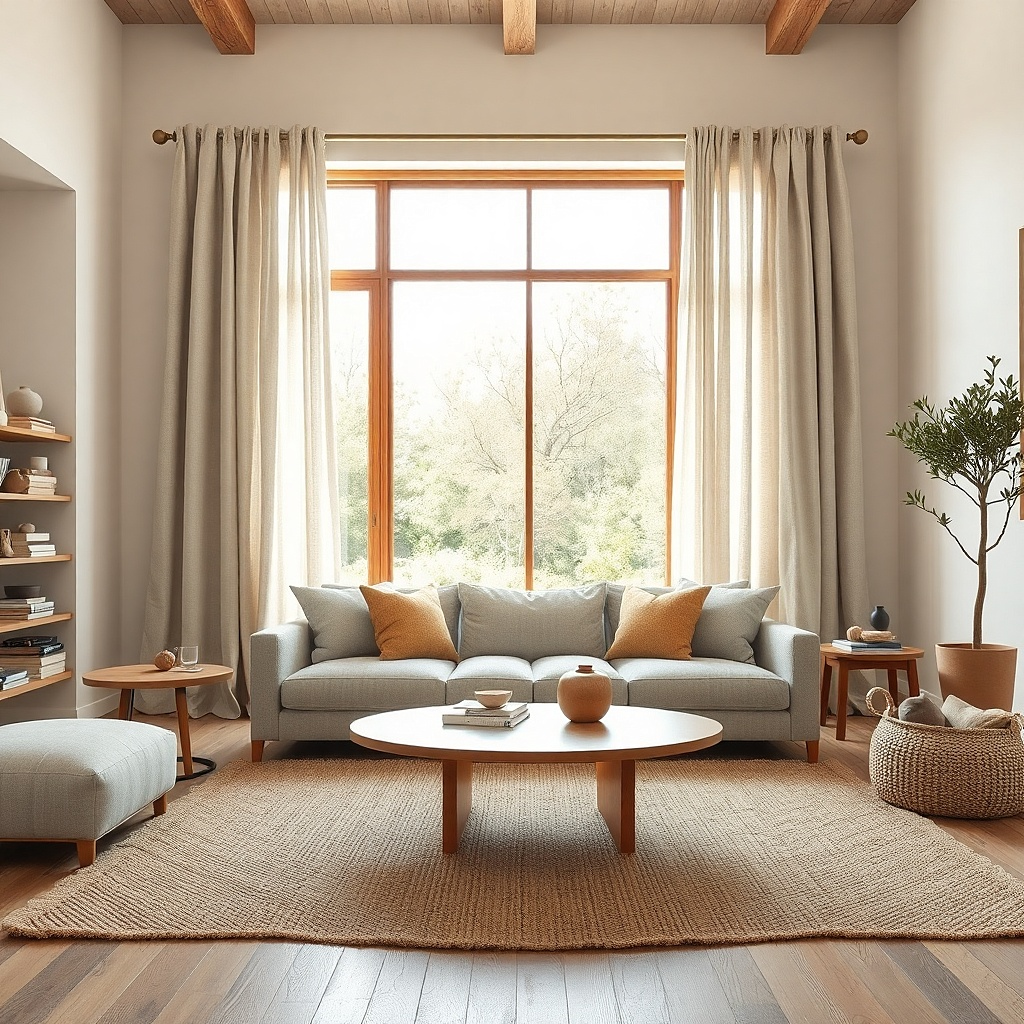
This is the safest good-looking pairing for a living room that already has warm whites, oak, walnut, jute, or cream upholstery. Flax linen sits in that quiet space between beige and oatmeal, so it has more body than plain ivory but does not drag the room into yellow. The weave matters here. Open, slubby linen catches light in a soft matte way, which keeps the windows relaxed instead of stiff. This pairing solves the common mistake of using bright white curtains against creamy walls, which makes the walls look dirty by comparison.
Start by checking the wall color against a sheet of printer paper. If the wall looks creamier than the paper, skip optic white curtains and choose flax, oat, or natural linen instead. Then hang lined linen panels with a finished width that is 2 to 2.5 times the window width so the fabric still looks full when open. Expect to spend more on linen than polyester, but this is one place where the texture earns the price because the color reads better in daylight.
Try thisUse a light cotton lining instead of blackout lining if the room gets decent privacy. Blackout backing can make flax linen hang too stiffly.
Common mistakeDo not pair creamy walls with blue-white curtains unless you want the walls to look dingy.
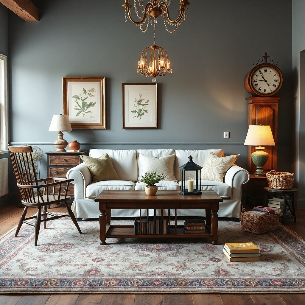
2. Greige walls with soft ivory curtains
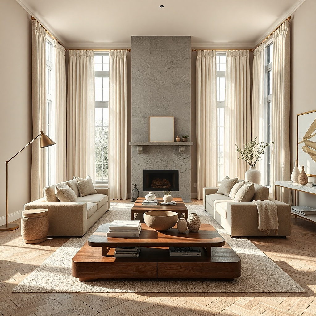
Greige walls need relief. Soft ivory curtains lift the perimeter of the room and keep the wall color from turning muddy, especially in low light. The key is soft ivory, not bright white. A slightly warmed ivory has enough contrast to define the windows without making the wall paint look drab, and it works especially well with taupe sofas, brushed brass, and medium wood tones.
Start with the wall undertone test — compare the paint to a true gray sample and a cream sample. If your wall sits between them, choose curtains that lean cream rather than gray. Then pick a fabric with a little weight, such as cotton-linen or lined cotton twill, because thin shiny ivory fabric reads cheap against greige. Keep the curtain hem just skimming the floor or breaking by half an inch if you want a softer look.
Add one more ivory note in the room, such as a lampshade or throw pillow, so the curtains feel repeated instead of random.
Skip stone-gray curtains with greige walls unless the room has a lot of cool black metal to support them.
3. Crisp white walls with light gray curtains
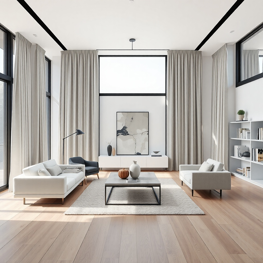
Light gray curtains give crisp white living rooms shape without darkening them. This pairing works best in rooms with black frames, charcoal details, marble, or cooler flooring because the gray picks up those notes and keeps the white from looking stark. Choose a true light gray or a pale dove gray with no purple cast. The effect is clean and architectural, especially in modern rooms where the windows need definition but not heaviness.
Start by checking the room in evening lamplight. Some pale grays turn mauve after sunset, so test the fabric both day and night before buying panels. Then use a smooth weave like cotton sateen, brushed twill, or a tight linen blend if you want the gray to read evenly from top to bottom. Mount the rod high and use simple rings or a hidden track so the lines stay clean.
If the room already has a black coffee table or black picture frames, gray curtains will feel grounded instead of chilly.
Do not choose a gray with a violet cast unless you want the whole room to read colder.
4. Pale sage walls with creamy stone curtains
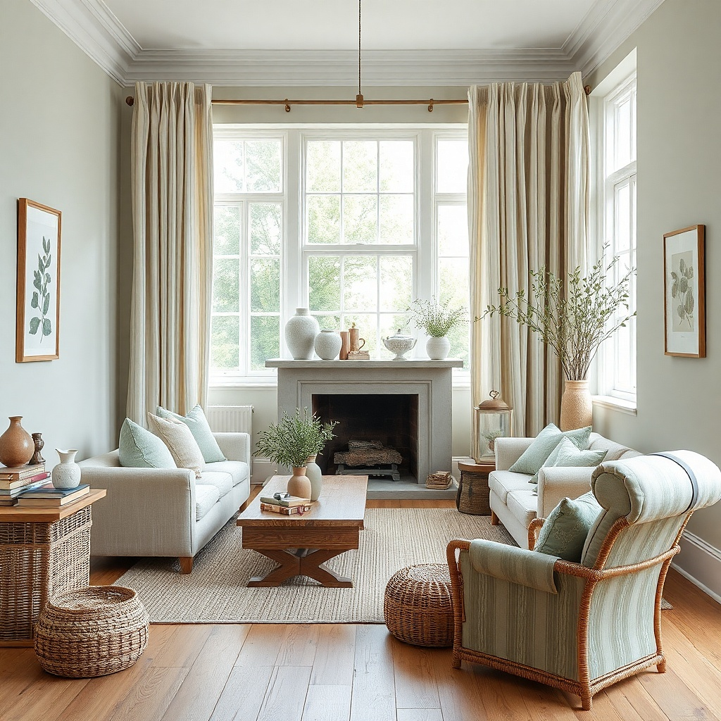
Sage walls are easy to get wrong with curtains because green paint shifts hard through the day. Creamy stone curtains keep the room soft and natural without competing with the wall color. Stone has enough gray-beige depth to sit beside green, while plain white can look too sharp and khaki can push the room toward murky. This pairing suits living rooms with cane, oak, linen upholstery, and old brass.
Start with a curtain sample that sits between oatmeal and putty rather than yellow beige. Hold it against the wall beside a wood leg or floorboard, because sage and wood together will tell you fast whether the curtain reads fresh or muddy. Then pick a textured fabric such as washed linen, cotton slub, or a linen-viscose blend if you want a fuller drape. Keep hardware in antique brass, soft black, or wood tones rather than polished chrome.
Try thisA small stripe in cream and stone works beautifully here if the room needs more pattern but the wall color already carries enough weight.
Common mistakeSkip olive-beige curtains with sage walls because the whole edge of the room will look flat.
5. Navy sofa with warm white curtains
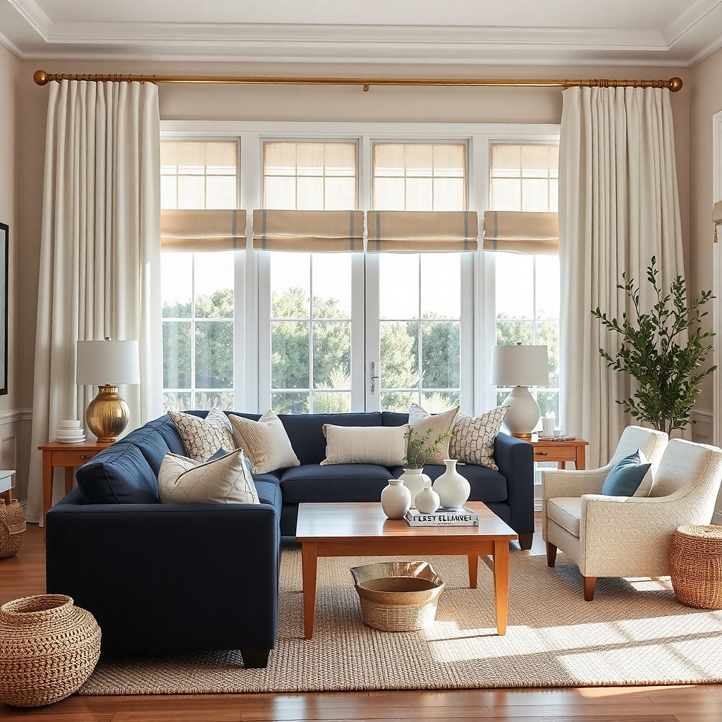
A navy sofa can dominate a living room fast. Warm white curtains keep the room bright and stop the navy from pulling every other color cooler. This pairing works because the curtains act like breathing room around a heavy anchor piece, especially if the walls are white, cream, or pale gray. The result is sharp but not harsh, and it photographs far better than trying to match the curtains to the sofa in the same dark blue.
Start by checking whether the navy leans inky, smoky, or slightly teal. If it is a clean deep navy, choose curtains in warm white or soft ivory rather than cool white. Then repeat the navy in two smaller spots — a pillow edge, art mat, or patterned rug line — so the sofa feels integrated and the curtains still stay light. Use full-length lined panels because short curtains beside a dark sofa make the room look chopped up.
Try thisA brass rod warms this pairing instantly and keeps the white from feeling too stark next to navy.
Common mistakeDo not use matching navy curtains unless the room has very high ceilings and a lot of natural light.
6. Charcoal walls with mushroom taupe curtains
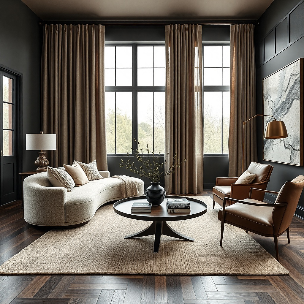
Dark walls need softness somewhere, and mushroom taupe curtains do that better than white. Against charcoal, taupe looks smoky, calm, and expensive without the glare that white creates. This pairing is especially strong in living rooms with walnut furniture, cognac leather, or plaster-like textures because it keeps the palette moody but still readable. It solves the mistake of pairing every dark wall with bright contrast, which can make the windows jump out too hard.
Start with a taupe sample that has both brown and gray in it. If the sample reads pink, put it back. Then choose a heavier fabric such as lined linen blend, wool-look drapery, or brushed cotton so the curtain has enough density to stand beside the dark wall. Keep the rod and rings dark bronze or black so the hardware disappears and the fabric carries the look.
Try thisUse a slightly lighter rug than the curtains so the room keeps depth from floor to wall.
Common mistakeSkip cool silver-gray curtains here because they flatten charcoal walls and fight warm wood.
7. Beige walls with olive drapes
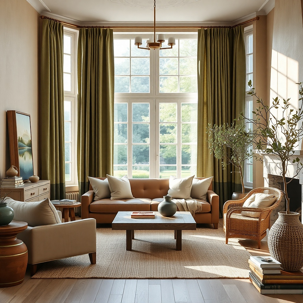
Olive curtains give beige rooms backbone. Beige-on-beige can look sleepy, but olive brings in enough earthiness to sharpen the room without feeling loud. This pairing shines with tan leather, black iron, sisal rugs, and warm woods because all of those materials already live in the same earthy range. Olive also hides dust and sun fade better than lighter neutrals, which matters on large windows.
Start with a muted olive rather than a military green or bright moss. The right olive has a little brown in it and looks grounded next to beige paint. Then use a matte fabric — cotton duck, linen blend, or brushed canvas — because sheen pushes olive into a dressier direction that rarely suits a relaxed living room. Keep curtain fullness generous so the color reads as a strong vertical block when open.
Repeat the olive in one botanical print pillow or a ceramic lamp base so the drapes look intentional.
Do not mix beige walls with yellow-green curtains unless you want the room to look sour.
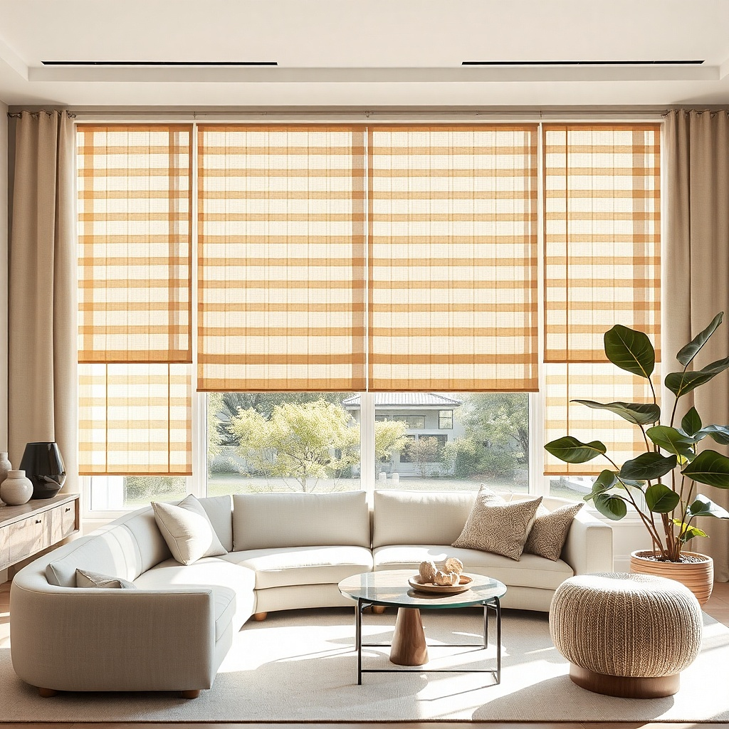
8. Light blue-gray walls with sandy beige curtains
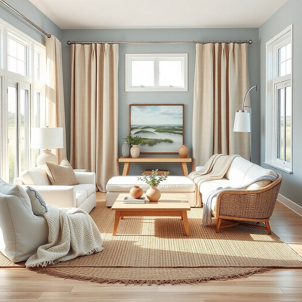
Blue-gray walls can get cold fast, especially in shaded rooms. Sandy beige curtains warm the perimeter and keep the paint from reading icy. This pairing works because the beige has enough softness to balance the blue cast without turning the room coastal in a themed way. It suits living rooms with light oak, cream upholstery, woven shades, and soft brass.
Start by choosing a beige with a dry sand tone, not a peachy tan. Hold the swatch beside the wall and a piece of white paper — if the beige looks orange, it is too warm. Then layer the curtains over woven wood shades if the room needs more texture and privacy, because blue-gray walls benefit from something tactile. Use lining so the beige keeps its true color in strong daylight.
A sandy beige curtain with a subtle herringbone weave looks more finished than a flat plain weave in this color family.
Skip pure gray curtains with blue-gray walls unless you want the room to feel cooler and more severe.
9. Terracotta accents with oatmeal curtains
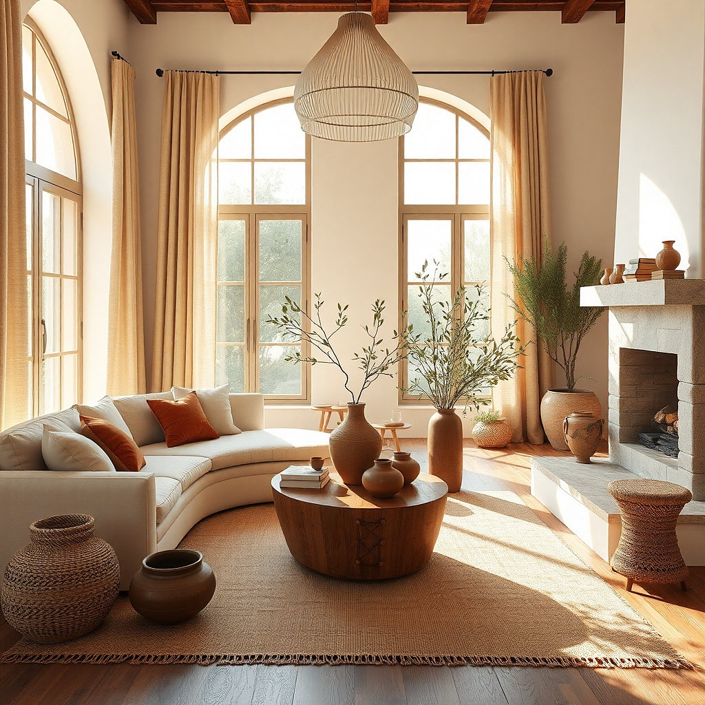
If your living room has terracotta pillows, rust art, or clay-toned decor, oatmeal curtains are the smart bridge color. They soften the heat of terracotta and stop the room from drifting into a heavy orange-brown block. Oatmeal has tiny flecks and tonal variation that pair well with handmade-looking pieces, plaster walls, and natural wood. This is a strong fix for rooms where a bolder curtain color would fight the accessories.
Start by checking your terracotta accents in daylight. If they lean red, choose a cooler oatmeal; if they lean clay-brown, choose a warmer oat. Then buy curtain fabric with visible texture so the neutral still has presence beside stronger accents. Keep the rod simple and let the fabric be the soft backdrop while the terracotta appears in smaller doses around the room.
Use a black or dark bronze rod if the room needs a little edge. It keeps oatmeal from reading too sweet.
Do not choose rust curtains just because you have rust pillows. That much warm color on the perimeter can feel heavy.
10. Cream walls with dusty blue curtains
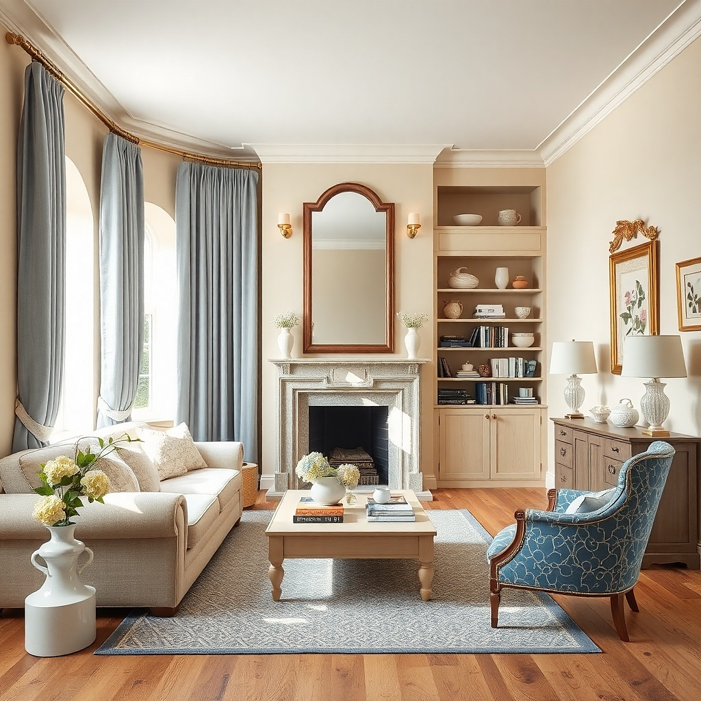
Dusty blue curtains bring calm contrast to cream walls without the hard edge of navy. The blue is softened with gray, so it feels settled and grown-up rather than beachy. This pairing is especially good in traditional, cottage, or transitional living rooms where you want color but still need the room to feel easy. It also flatters light woods and antique brass in a way sharper blues do not.
Start with a blue that looks slightly weathered, not bright sky blue. Test it next to the cream wall and any brass or wood in the room, because dusty blue should look muted, not sugary. Then choose a fabric with some body, such as cotton-linen, brushed cotton, or a soft basketweave, so the color stays substantial from floor to rod. Add one patterned pillow with cream and dusty blue to tie the windows back to the seating.
Pinch-pleat headers suit this pairing well because the room already leans classic and the pleats keep the blue looking tailored.
Skip bright cobalt on cream walls unless the rest of the room is very modern and intentionally high contrast.
11. Taupe sofa with soft moss curtains
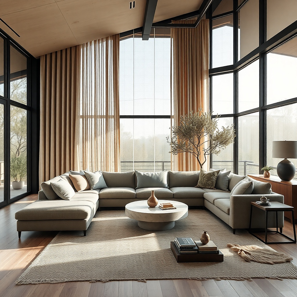
Taupe upholstery can look flat if every surrounding color stays neutral. Soft moss curtains give the room life while still staying quiet. Moss has enough gray in it to pair with taupe, and it works beautifully with stone, oak, unlacquered brass, and off-white walls. The effect is calm and layered instead of matchy, which is exactly what a lot of beige-heavy living rooms need.
Start with a moss that reads muted, not botanical bright. A good test is to place the sample against the taupe sofa — if the green jumps out first, it is too loud. Then use a linen blend or matte cotton so the moss keeps that soft chalky quality. Keep the rest of the room edited and repeat the green once in artwork or a plant pot.
This pairing looks especially good with Roman shades in a natural woven material under the curtains.
Do not pair taupe seating with emerald curtains unless you want a much dressier, sharper room.
12. Black window frames with greige curtains
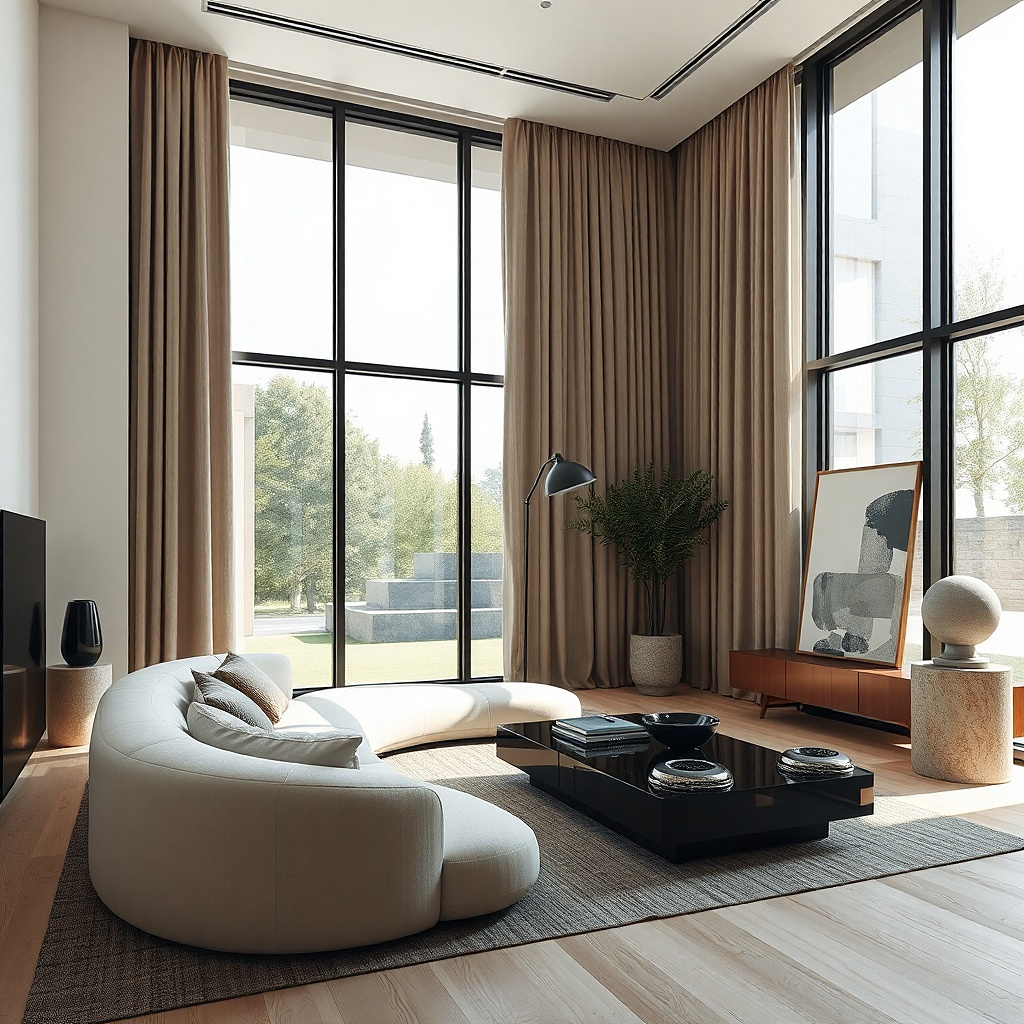
Black-framed windows already bring strong contrast, so the curtain color should soften the edge, not compete with it. Greige curtains do that well because they connect black metal to warmer furniture and wall tones. This pairing works in modern farmhouse, organic modern, and plain contemporary rooms where black frames are common but all-black drapes would feel too severe. Greige keeps the windows graphic without making them look boxed in.
Start by reading the room’s other warm elements — floor stain, wood furniture, leather, baskets. If those pieces lean warm, choose a greige curtain with a beige cast rather than a cool gray. Then mount the rod slightly above the top trim and extend it beyond the frame so the curtain stack softens the black edges from the side. Use lined fabric so the color stays even instead of going patchy with backlight.
If the frames are very bold, a curtain with a tiny woven texture looks better than a perfectly flat plain panel.
Skip black curtains with black frames unless the room is large and drenched in light.
13. Walnut furniture with ivory and camel stripe curtains
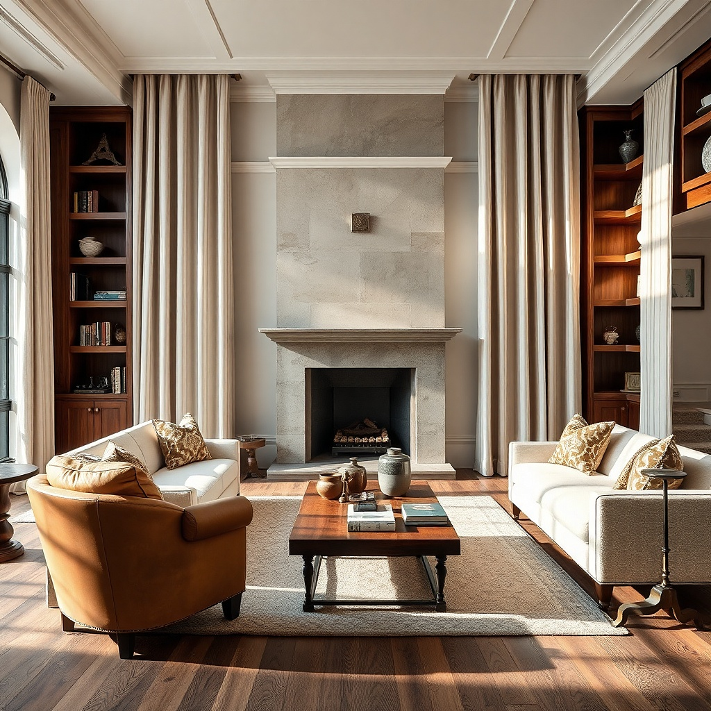
Walnut furniture has depth and warmth, and plain white curtains can feel disconnected beside it. Ivory and camel stripe curtains pick up that warmth while adding movement to the wall. The stripe needs restraint — think narrow vertical bands or a soft ticking stripe, not bold cabana lines. This pairing suits living rooms that need pattern but do not have room for another busy rug or wallpaper.
Start with the wood tone. Medium to dark walnut looks best with camel that has a little tan and no orange. Then choose stripes with low contrast so the curtains still read mostly neutral from across the room. Hang them full and long because stripes look cheapest when the panels are skimpy or too short by even an inch.
Try thisVertical stripes make low ceilings feel taller, especially if the rod sits close to the ceiling line.
Common mistakeDo not choose high-contrast navy-and-white stripes unless you want the windows to become the loudest thing in the room.
14. Soft blush walls with putty curtains
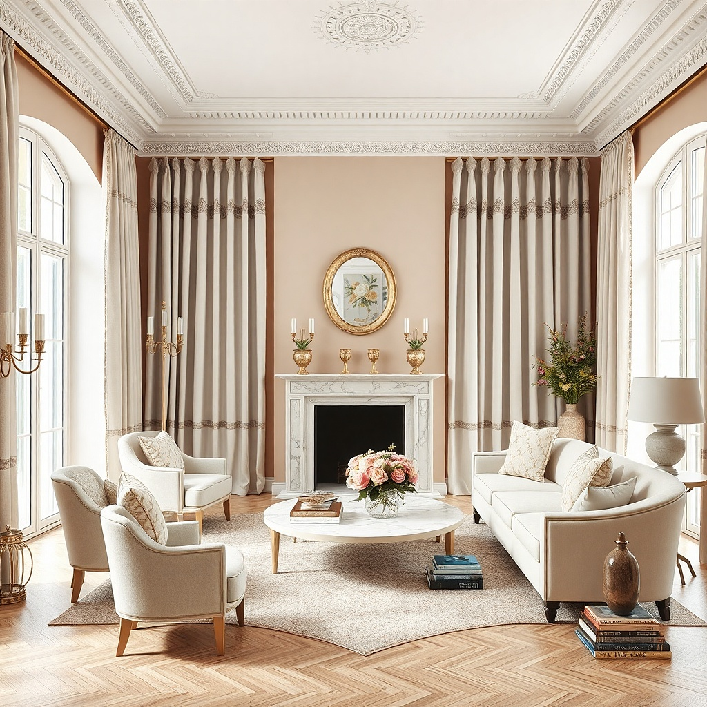
Blush walls need restraint. Putty curtains take down the sweetness and keep the room from drifting into a powdery, overly styled look. Putty sits between gray, beige, and a whisper of taupe, so it grounds pink without fighting it. This pairing is especially good with plaster finishes, boucle chairs, pale oak, and matte black accents.
Start by checking the blush paint against a true pink sample. If your wall is muted and dusty, putty will look calm beside it; if the wall is candy pink, repainting is the smarter move than trying to fix it with curtains. Then choose a fabric with substance, such as linen blend or cotton twill, because flimsy putty fabric reads lifeless. Add black or dark bronze hardware to sharpen the palette.
Try thisA putty curtain with a slight brown cast looks stronger than one that leans lavender next to blush.
Common mistakeSkip white sheer-only curtains here because they make blush walls look sweeter and less grounded.
15. Moody green walls with natural linen curtains
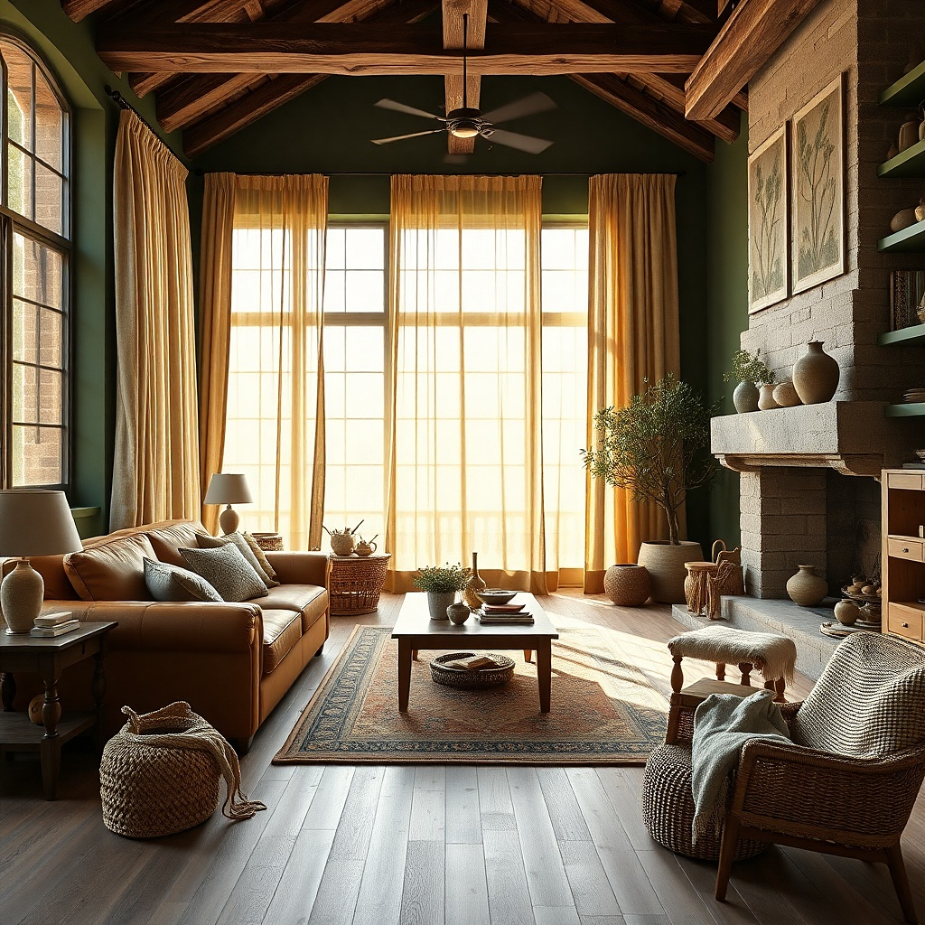
Dark green walls already carry enough color, so the curtains should bring texture and light. Natural linen does that better than white because it feels organic and keeps the palette earthy. The slight beige cast in natural linen sits beautifully against forest, juniper, or deep olive paint, especially with wood floors and leather seating. This pairing gives dark rooms relief without breaking the mood.
Start with unbleached or natural flax tones rather than cream. Hold the sample against the wall and any trim to make sure it reads soft tan, not yellow. Then use lined linen panels so the drape has enough weight to hang in clean folds beside a dark wall. Keep the rod dark and simple, and let the texture do the work.
Try thisThis pairing looks best with warm bulbs around 2700K. Cooler bulbs make the linen look flat and the green look harsh.
Common mistakeDo not pair moody green walls with bright white grommet curtains. The contrast is too abrupt and the hardware looks cheap.
16. Stone fireplace with charcoal curtains

A pale stone fireplace can make a living room feel washed out if every surrounding textile is light. Charcoal curtains add needed weight and sharpen the architecture without introducing a new color family. This pairing works best in larger rooms with decent daylight, where the dark panels frame the windows and echo the depth of the fireplace shadows. It is especially strong with cream walls, black accents, and medium-tone wood.
Start by checking the stone undertone. If the fireplace has cool gray notes, choose a true charcoal; if it has tan or greige notes, choose a sootier warm charcoal. Then use a dense weave like cotton velvet, wool blend, or lined twill so the dark color looks saturated instead of thin. Keep the curtain stack mostly off the glass by extending the rod wide enough.
Try thisCharcoal curtains look more expensive with a blind hem and a little floor break than with a sharp high-water hem.
Common mistakeSkip this pairing in a dim room with small windows because it will pull too much light from the perimeter.
17. Ivory boucle seating with tobacco brown curtains

Ivory boucle has a lot of texture but very little visual weight. Tobacco brown curtains balance that softness and make the room feel grounded. The brown should be warm and dry, more saddle or cigar than chocolate, so it pairs cleanly with cream, boucle, travertine, and walnut. This is a strong choice for living rooms that feel too pale and need contrast that still looks warm.
Start by pulling one brown from the room already — wood stain, leather binding on books, a frame, or a rug border. Match the curtain to that family so the brown feels repeated. Then choose a matte fabric, because glossy brown drapery can look dated fast. Keep wall color light and let the curtains be the deepest note in the room.
Try thisA thin brass ring or brass rod adds just enough warmth to keep brown curtains from reading heavy.
Common mistakeDo not use espresso curtains with ivory boucle unless the room has other very dark pieces to balance them.
18. Warm gray walls with dusty rose curtains
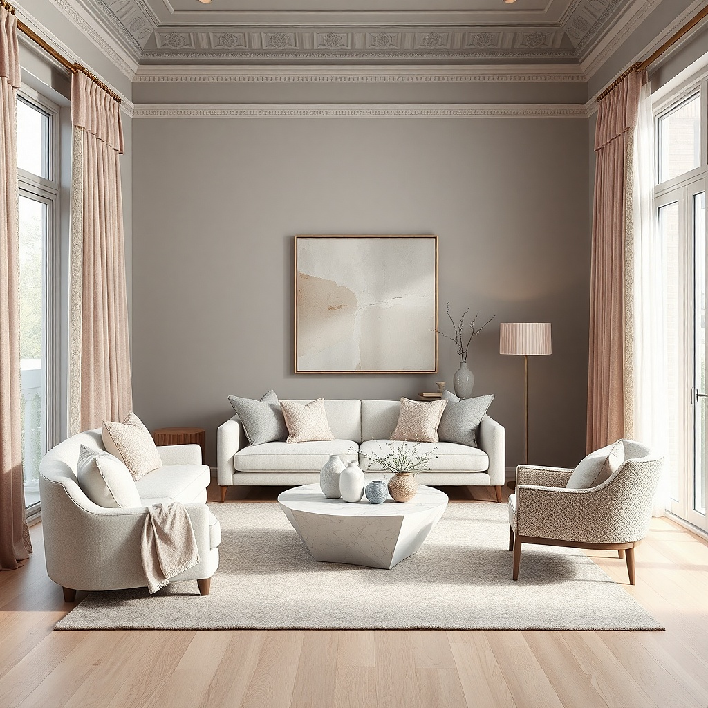
Dusty rose is one of the few color curtains that soften gray without looking childish. Against warm gray walls, it adds warmth, skin-flattering color, and a little depth that plain beige does not. The shade matters. You want a muted rose with brown or gray in it, not a pastel pink. This pairing suits living rooms with brass, walnut, cream, and traditional shapes that need color but not drama.
Start by confirming the wall is a warm gray rather than a blue-gray. Dusty rose beside a cool wall can look disconnected. Then choose a heavier weave and a lined panel so the rose reads dense and velvety rather than thin and sugary. Keep surrounding accessories restrained and repeat the tone once in art or one lumbar pillow.
Try thisThis color looks far better in matte linen or velvet than in shiny polyester, which pushes it into a dated mauve effect.
Common mistakeSkip bright blush-pink curtains with gray walls because they flatten the room and read juvenile.
19. Cream sectional with slate blue curtains
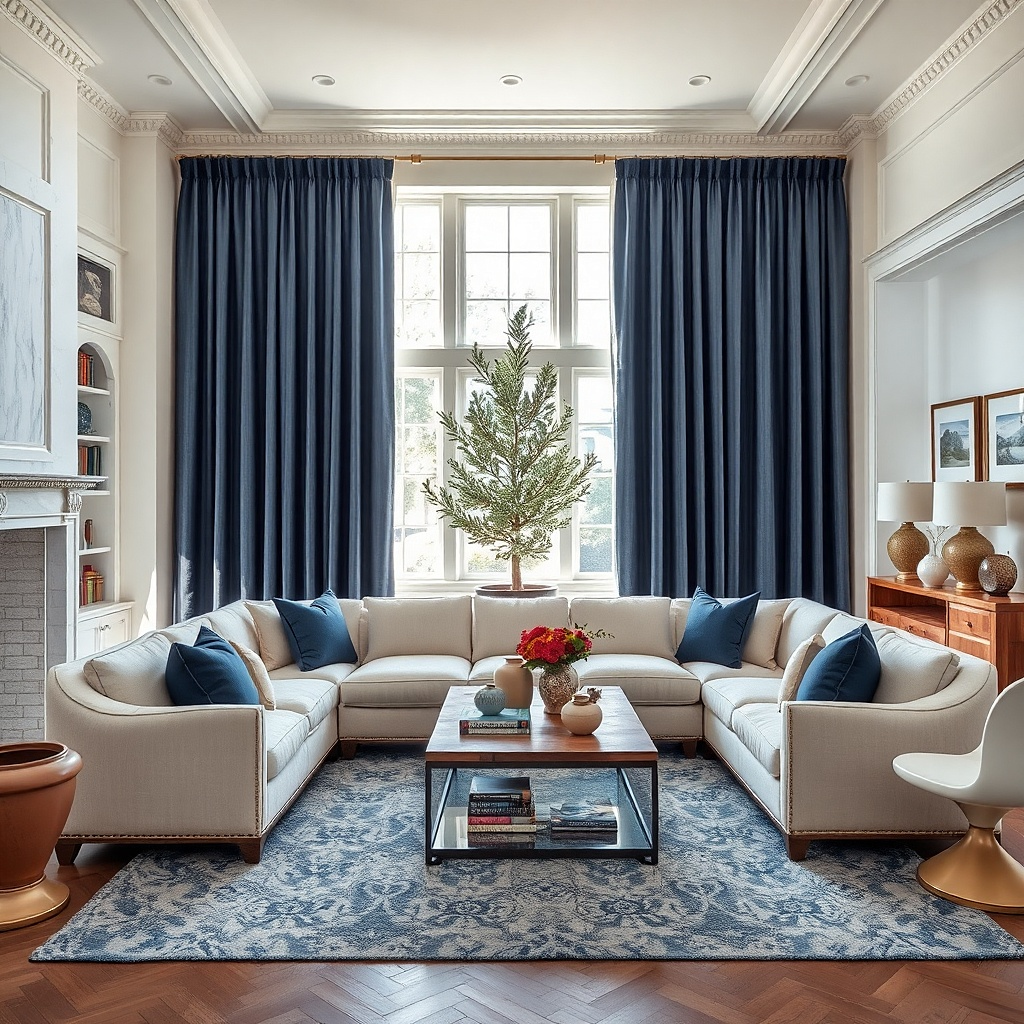
A cream sectional leaves room for stronger curtains, and slate blue is one of the best choices. Slate has gray in it, so it feels grounded and architectural instead of cheerful. Against cream upholstery and pale walls, it frames the room and gives the eye a place to land. This pairing works especially well in larger open-plan living rooms where neutral furniture needs definition.
Start by checking the room’s metal finishes. Slate blue likes black, aged brass, and pewter more than shiny chrome. Then choose a fabric with enough weight to hold pleats, such as cotton velvet, lined linen blend, or twill, because slate reads best in a solid uninterrupted field. Keep the curtain length exact — just touching the floor or breaking slightly — so the dark color looks deliberate.
Try thisUse a rug with even a tiny slate thread or border if you want the curtains to feel built into the room.
Common mistakeDo not pair slate blue curtains with yellow-beige walls. The undertones fight and the room looks unsettled.
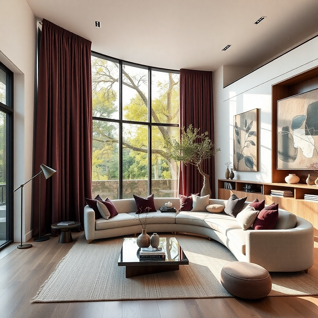
20. Pale tan walls with rust velvet curtains
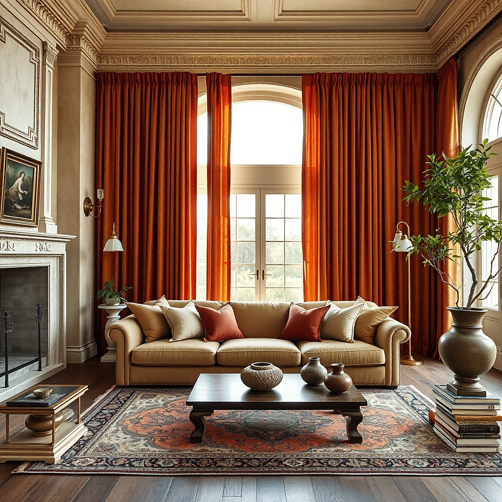
Rust velvet curtains are bold, but on pale tan walls they look warm, moody, and surprisingly grounded. Velvet deepens the rust so it catches light in darker and lighter bands, which gives the windows a strong photogenic presence. This pairing suits living rooms with plaster walls, dark wood, vintage rugs, and low warm lighting. It is a smart move if the room feels flat and needs one dramatic note.
Start with a rust that has brown in it rather than orange. Hold the sample against the wall in full daylight and under lamplight, because velvet shifts a lot. Then use full-length lined panels and substantial hardware because velvet needs support and skimpy rods sag fast. Keep the rest of the palette restrained — cream, tan, walnut, black — so the curtains stay intentional.
Try thisVelvet looks best with wider panels and deeper folds. Thin flat panels lose the whole point of the fabric.
Common mistakeSkip rust curtains in a room that already has a strong red rug and red-toned wood. The warmth piles up too hard.
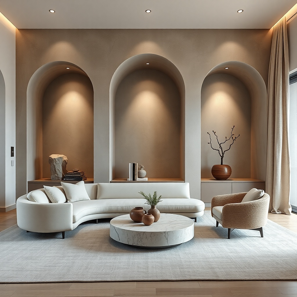
21. Soft white room with pale mushroom curtains
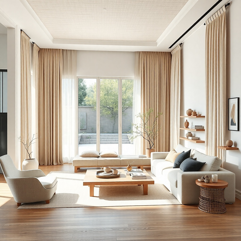
Pale mushroom curtains are the answer for living rooms that are all soft white but still feel unfinished. Mushroom is deeper than ivory and less yellow than beige, so it adds just enough contour around the windows. This pairing is excellent in minimal rooms where a stronger color would interrupt the calm. It also hides dust and floor splash better than white, which matters in busy family spaces.
Start by checking whether the white room leans warm or cool. Choose mushroom with a warm taupe cast for creamy whites and a grayer mushroom for cleaner whites. Then use a textured fabric so the subtle color change still reads from across the room. Install the rod close to the ceiling to give the room more height and let the quiet color create a tall soft frame.
Try thisIf the room feels too flat, pair pale mushroom curtains with a slightly darker woven shade underneath.
Common mistakeDo not choose mushroom that leans pink. Against white walls it will look dusty in the wrong way.