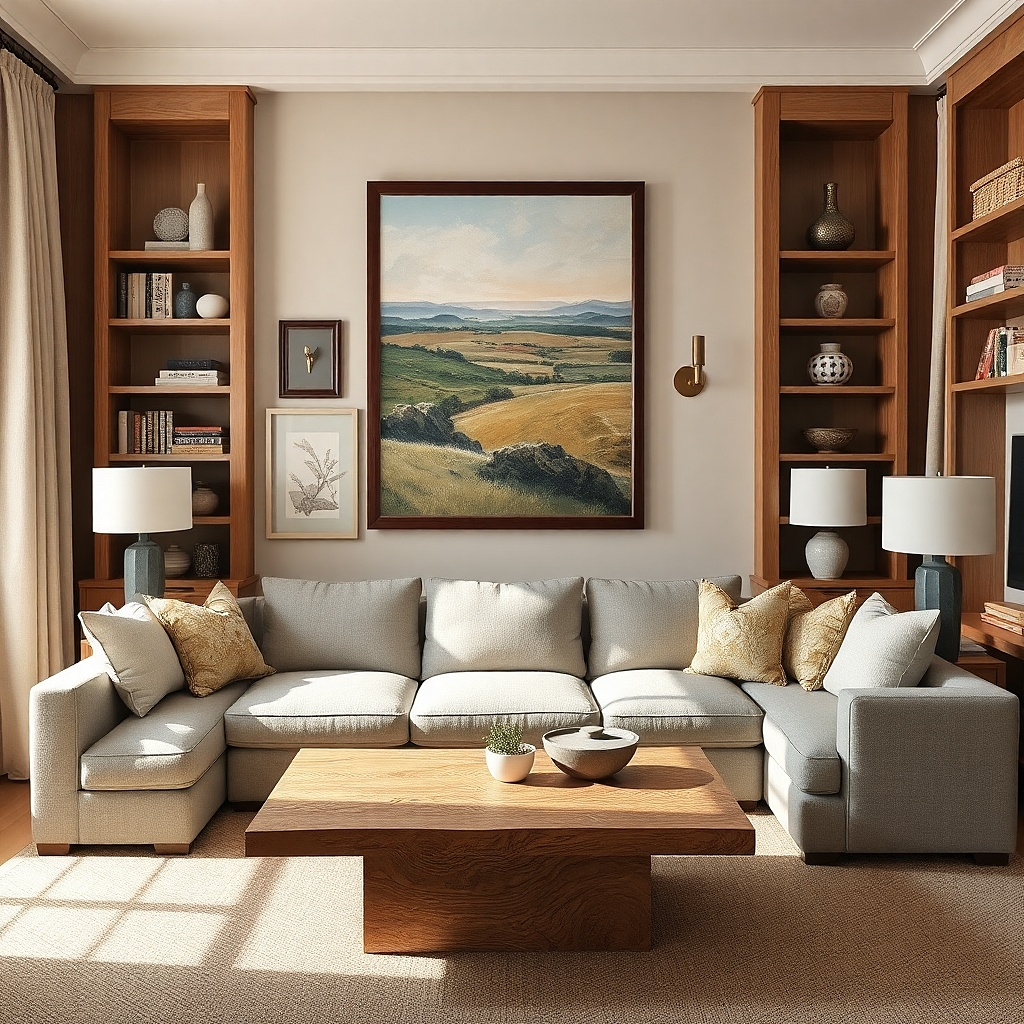
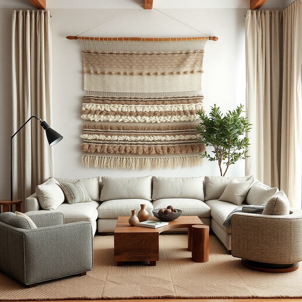
1. Oversized framed linen print above the sofa
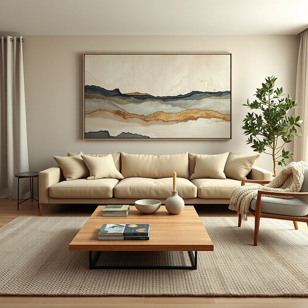
A big linen-texture print looks expensive and stays calm in a small living room. The key is oversizing: choose a frame width about 70% of your sofa width, so it feels like the wall has a single anchor. Linen-like paper with a soft matte finish hides minor wall bumps, which matters more in small spaces where imperfections show. Go for a muted base color like warm greige or chalky ivory, then add one darker element charcoal, ink blue, or deep olive for contrast. This solves the most common issue: tiny art that looks lost and makes the wall feel empty instead of styled.
Measure your sofa width first. Buy or frame a piece that lands at 60-80% of that width; for example, a 72-inch sofa pairs well with a 44-58 inch wide artwork. Hang it so the center is 57-60 inches from the floor, and keep the bottom edge about 6-10 inches above the sofa back. Use wall anchors rated for your frame weight, and level the frame before tightening the second hook.
Choose a frame in blackened wood or warm oak with a thin profile it looks intentional without eating visual space.
Don’t pick a thin print with tons of white space if your wall is already light and blank — it can disappear.
2. Two-panel abstract triptych with matching widths
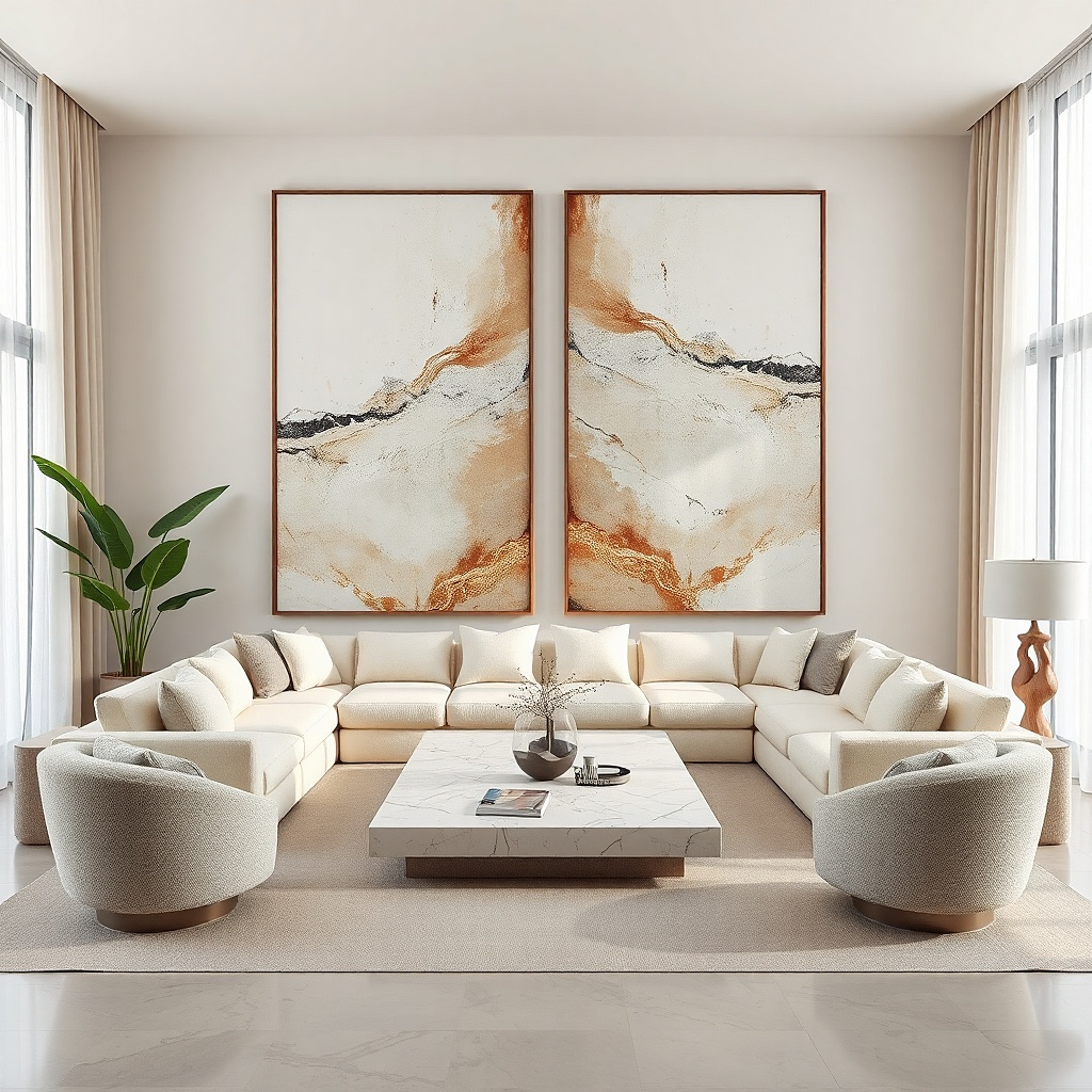
Pick three panels where the total width matches 60-80% of your sofa width. Example: for a 68-inch sofa, aim for about 41-54 inches total across all three panels. Measure and mark the centerline over the sofa, then place the middle panel first. Set the side panels so the gaps between frames are 2-3 inches, and keep the top edges aligned. Hang with the same height points for each panel using a level and a tape measure.
A triptych is one of the easiest ways to get scale right without one huge frame. The trick in small spaces is to keep each panel the same width and let the combined width hit 60-80% of your sofa width. Use abstract art with a strong color block a wide band of terracotta, muted teal, or dusty rose so it reads clearly from across the room. Matte paint-like finishes reduce glare and make brush texture look richer at close range. This gives you a designer look that doesn’t require a massive single frame.
Common mistakeAvoid uneven gaps or mismatched frame heights — it makes the wall look busy and smaller than it is.
Try thisUse one dominant color across all three panels so it feels like one artwork, not three separate prints.
3. Tall botanical print pair stacked vertically
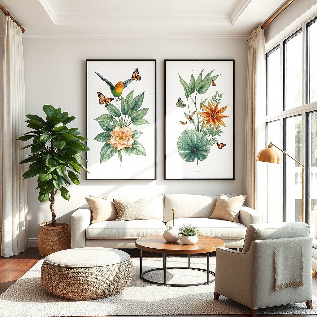
If your living room feels low or boxed in, tall wall art fixes it fast. Two botanical prints stacked vertically add height without crowding the wall horizontally. Choose prints that are about 18-24 inches wide and 30-40 inches tall each, then stack them so the total height is around 65-85 inches. Use a restrained palette like sage, olive, and warm cream so the room stays airy. This solves the scale problem by giving the wall a strong vertical statement that still fits narrow widths.
Start by measuring the wall space above the sofa or near a tall lamp or bookshelf. Choose two prints that together land in the 65-85 inch height range. Mark a centerline, then hang the top print first so its top edge is about 8-10 inches below the ceiling line you’re working with. Add 2-4 inches of spacing between the two prints, then hang the bottom print with the same centerline. Use template paper for each frame to keep spacing consistent.
Pick botanical art with thin linework and matte paper so it stays crisp without shining in window light.
Don’t go too wide with tall prints — in small rooms, width steals breathing room.
4. Framed fabric wall art in a single colorway
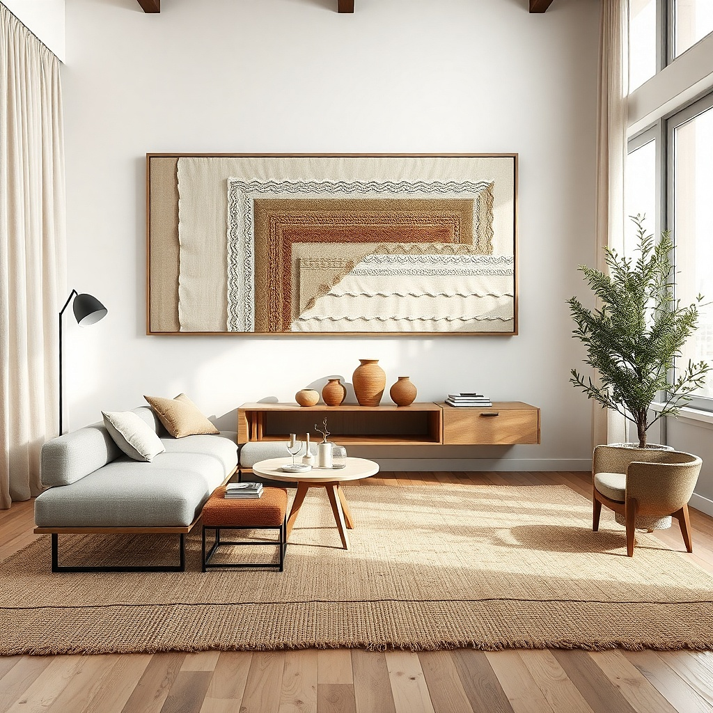
Fabric wall art looks soft and high-end, and it hides wall texture issues better than glossy prints. Use a single bold fabric design a block pattern, a subtle ikat, or a tonal weave then frame it with a simple mat. For small-space scale, keep the framed width around 50-70% of your sofa width if it’s a single piece, or use two matching fabrics side-by-side to reach 60-80% total width. Choose colors that match your upholstery or rug undertones, then add one contrasting thread color for interest. This works because fabric has depth even when the pattern stays simple.
Pick fabric with a clear pattern repeat that reads from 8-10 feet away. Frame it with a mat so the fabric sits 1-2 inches inside the frame edge. For size, measure your sofa width and target 50-70% for one piece or 60-80% total for two pieces. Hang using two points on the frame or a French cleat for stability. Keep the fabric taut and square before you mount it, or it will look sloppy up close.
Use a white or warm oatmeal mat it makes the fabric look more tailored than a bare frame.
Avoid busy multi-color fabrics; in small living rooms they read as clutter instead of art.
5. Oversized black-and-white photo with wide mat
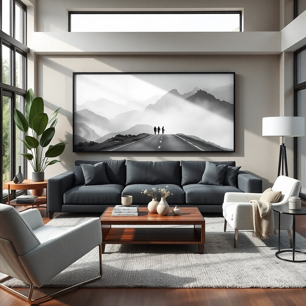
Select a photo print that, with the frame, lands at 60-80% of sofa width. Add a mat that is 2-3 inches wide on all sides for a small-room-friendly look. Hang with the center around 57-60 inches from the floor. Use a level and mark anchor points at least 1 inch apart for stability. If your wall has a slight texture, use foam mounting tape for the print backing so it sits flat.
A single oversized black-and-white photo gives you contrast and clarity without adding color noise. The wide mat is doing real work here: it creates breathing room around the image and makes the frame look bigger without needing more wall space. Choose a photo with strong shapes architecture, street lines, or landscape horizon because it stays readable from the sofa. Keep the frame matte or satin, not glossy, so window glare doesn’t wash out the image. This solves the too-small-art problem by giving you scale and high contrast in one clean rectangle.
Common mistakeDon’t pick a low-contrast photo; it will look gray and underwhelming in daylight.
Try thisChoose a frame in black metal or matte black wood it sharpens the whole room without looking heavy.
6. Large framed map in warm paper tones
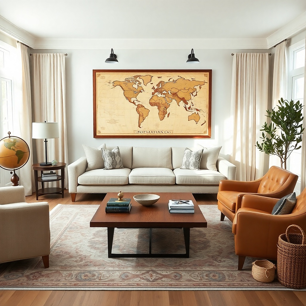
Choose a map print with high legibility from a distance; preview it at your intended viewing distance if you can. Target overall framed width at 60-80% of your sofa width. Add a mat to soften the edges and keep the map from feeling too sharp against a small wall. Hang centered above the sofa with the center at 57-60 inches from the floor. For hardware, use two anchors for frames over 24 inches tall.
A map works when it’s big enough to be a design, not a novelty. Look for warm paper tones like sepia, parchment, and faded ink lines, then frame it in medium oak or walnut so it feels grounded. In small spaces, a map’s detail can overwhelm, so choose one with limited color mostly beige and black and crisp typography. Size it to 60-80% of sofa width for a single piece, or use two matching maps to extend the width. This gives you visual interest without the clutter of multiple small frames.
Common mistakeAvoid multi-color maps; they compete with pillows, rugs, and throws in tight rooms.
Try thisPick a map with a single bold title area it gives the eye a focal point.
7. Mirrored wall panel with thin metal frame
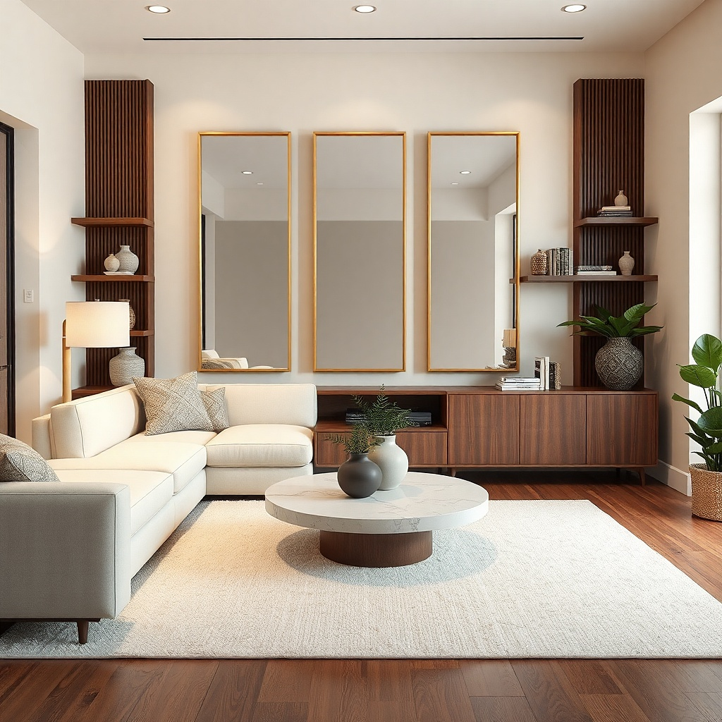
If your small living room feels dim, a mirror panel is wall decor that actually changes the room. Use a thin metal-framed mirror with a simple rectangle shape, then size it like art 60-70% of sofa width is a good target. The reflective surface bounces light and makes walls feel farther away without adding objects. For a clean look, choose a mirror with minimal edging and no decorative bevel. This solves a different version of the scale problem: blank walls that make rooms feel smaller.
Measure the wall space and pick a mirror width at roughly 60-70% of sofa width. Keep the height around 24-36 inches if it’s over a sofa, or taller if you’re placing it next to a floor lamp. Mark the centerline and mount so the mirror’s center sits at 57-60 inches from the floor. Use the manufacturer’s mounting method; for heavier mirrors, use proper anchors and avoid picture hooks alone. Clean with a streak-free glass cleaner right after hanging.
Place the mirror across from a window or light source so it reflects something bright, not clutter.
Don’t choose a heavily beveled mirror; it looks dated and can make the room feel busier.
8. Oversized wall clock with matte dial
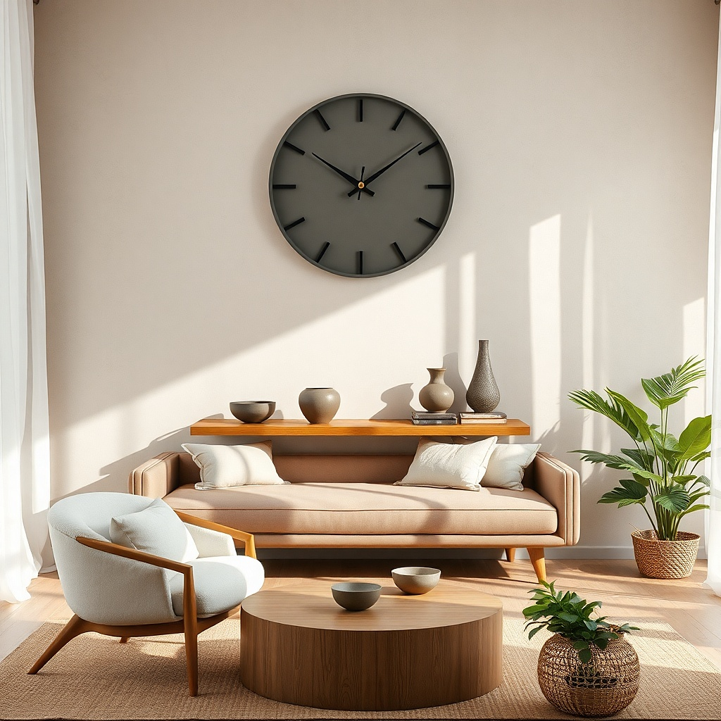
A large wall clock is wall decor that does two jobs in a small room: it fills space and adds structure. Choose a clock with a matte dial in black, warm gray, or deep forest, and keep the diameter around 18-26 inches. The matte finish prevents glare and keeps the clock readable without looking shiny. Hang it centered above the sofa so it becomes the focal anchor, not a random accessory. This solves the scale issue by giving you a bold, single object sized like artwork.
Pick a clock diameter that hits 40-60% of your sofa width for a single focal piece. Measure the wall above the sofa and set the clock so its center is 57-60 inches from the floor. Use a level, mark anchor points, then install with the included template or hardware. If the clock has pendulum parts or a heavy frame, use wall anchors rated for the weight. Step back and check sightline from the main seating — it should feel centered and balanced.
Go for simple hands, not thick numbers; the clean dial reads more modern in small spaces.
Avoid tiny clocks — they look like an afterthought and shrink the wall.
9. Large framed ceramic tile print
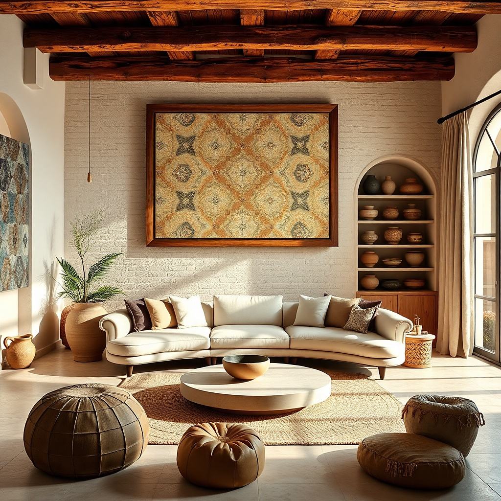
Geometric tile-style prints look crisp, structured, and great in small living rooms because they add pattern without lots of visual clutter. Choose a design that mimics hand-painted tiles with a limited palette navy and ivory, terracotta and cream, or charcoal and white. The frame should be simple and thin so the pattern stays the focus. Size it to 60-80% of sofa width if it’s one piece, or use two mirrored halves to reach that combined width. This delivers an architectural look that makes the wall feel designed, not empty.
Select a tile print with bold shapes that read from across the room. Order the print or frame so the total width hits 60-80% of your sofa width. Use a mat if the print is busy — a 1.5-2.5 inch mat edge keeps it from feeling crowded. Hang centered above the sofa, center at 57-60 inches from floor. Use two anchors for stability and check that the frame sits flat against the wall.
Match one tile color to a throw pillow or rug accent so it looks like it belongs.
Avoid ultra-thin line patterns; they disappear at small-room distances.
10. Gallery wall with 5 frames in one grid
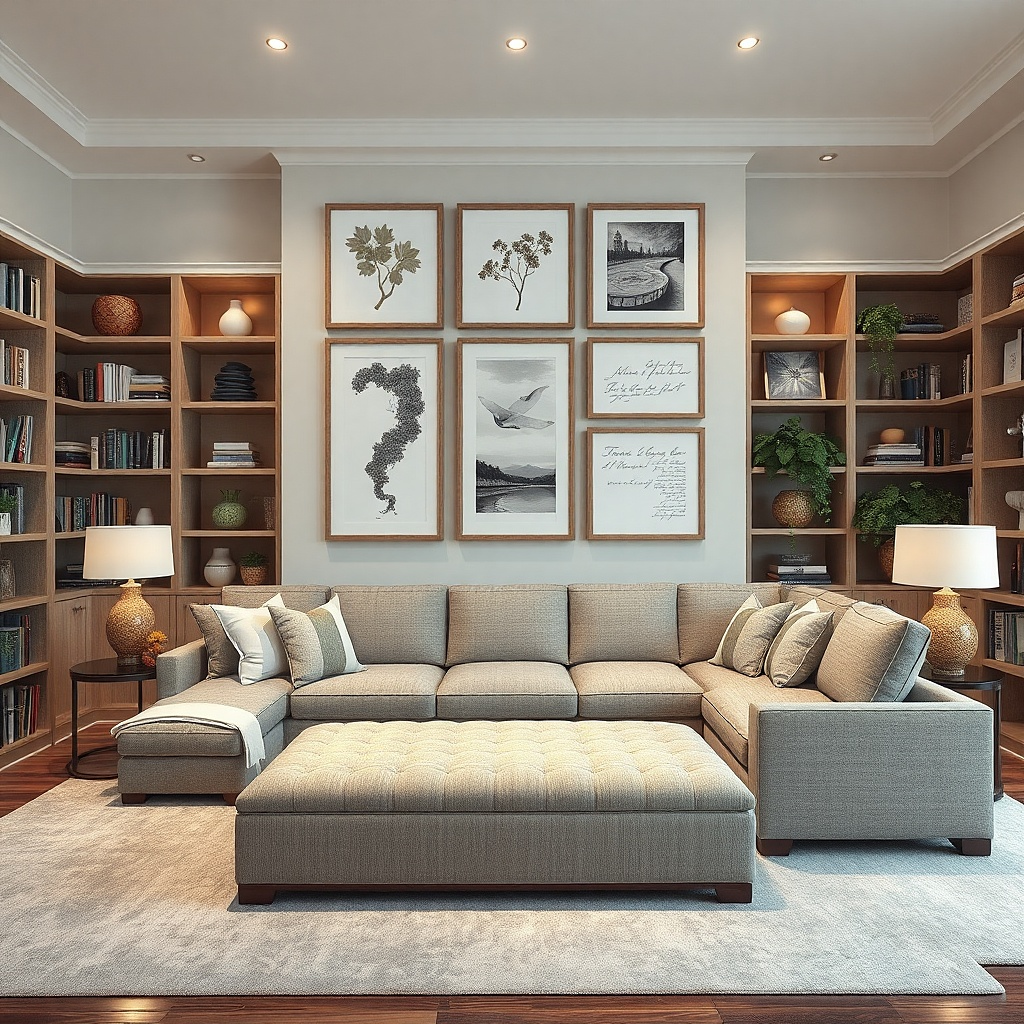
A gallery wall can look airy when it’s actually a grid. Use five frames with the same frame width and consistent mat color, then keep the overall grid width at 60-80% of your sofa width. Choose artwork that shares one theme botanical line drawings, monochrome textures, or simple abstract shapes so the wall reads cohesive. Matting is important: it creates spacing and makes small frames feel intentional. This solves the scale issue by making multiple pieces act like one large artwork.
Choose five frames in the same size or in two sizes that still align edges cleanly. Build the total grid width to 60-80% of sofa width, not the individual frames. Lay them on the floor first and set spacing between frames at about 2 inches. Transfer the layout to the wall with painter’s tape, then hang one frame at a time using a level. Use matching hardware so the frames sit on the same plane.
Use mat colors that match your wall trim or rug consistency makes the gallery look designed.
Don’t mix frame finishes like black, brass, and wood in one group; it makes small walls feel messy.
11. Lean-in art shelf with 3 small framed pieces
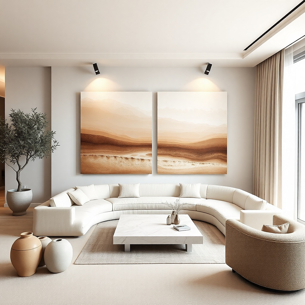
Pick a shelf depth around 2.5-3 inches so frames don’t protrude too far. Arrange three frames so the combined width sits between 40-60% of sofa width, then adjust spacing so you have 2-3 inches between frames. Mount the shelf so the top of the highest frame sits below eye level by about 2-4 inches. Use shelf brackets rated for the shelf length and frame weight. Style only three pieces — adding more turns it into clutter quickly.
In small spaces, a wall shelf can replace multiple hanging frames while keeping the wall looking clean. Use a slim ledge and display three small framed works at staggered heights, but keep them within a total width of 40-60% of sofa width so it doesn’t crowd. Choose frames with consistent color and keep the art sizes close think 8x10 or 10x12 inches. Lean-in art also creates depth, which helps the wall feel fuller without needing a massive surface. This solves the problem of I want art but I don’t want more holes and keeps the look photogenic.
Common mistakeAvoid mixing shelf styling items with the frames; the shelf should look like a deliberate art moment.
Try thisUse one frame orientation only either all landscape or all portrait for a cleaner photo look.
12. Large canvas diptych with a soft gradient
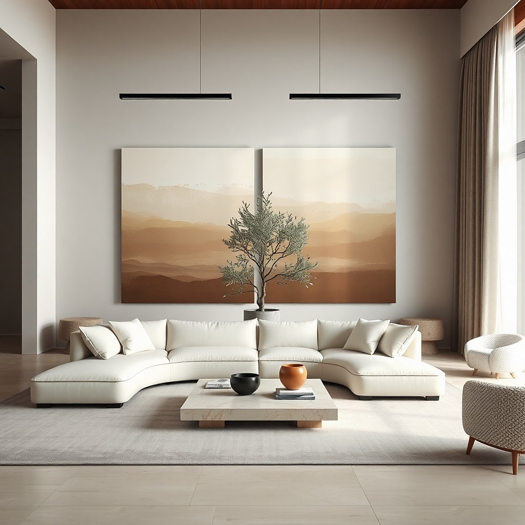
Measure the sofa width and target diptych total width at 60-80%. Choose two canvases with matched heights so the seam sits at the centerline over the sofa. Place canvases with a 1-2 inch gap between them so the seam reads intentional. Hang by finding the center of each canvas and using a level to keep the top edge aligned. For canvas weight, use two anchors per canvas if the canvas is over 30 inches wide.
A diptych is a great middle ground between one big frame and a gallery wall. Choose a soft gradient or layered abstract that spans across both canvases so the combined width hits 60-80% of sofa width. Canvas texture adds depth even when the design is simple, which matters in small rooms where details are seen up close. Keep colors in a tight palette: sand to stone, sage to gray, or navy to charcoal. The result is calm, modern wall decor that fills space without feeling busy.
Common mistakeAvoid high-contrast multi-color abstract diptychs in tight rooms; they can feel loud.
Try thisMatch the gradient direction to your room: horizontal gradients calm the room; vertical gradients make ceilings feel higher.
13. Textured wood panel art in a single tone
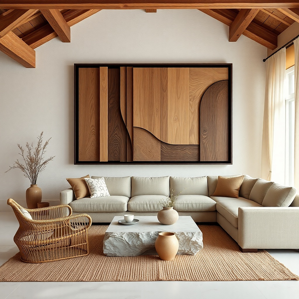
Select a panel with a simple shape — rectangle or rounded rectangle — and a thickness that looks substantial. Target overall width at 50-70% of sofa width and hang centered above the sofa. Keep the panel height proportional so it doesn’t feel like a narrow strip; aim for about 1.2-1.6 times the panel width ratio for a balanced look. Install with proper anchors, then check how the texture catches light from your main lamp or window. Wipe dust regularly so the texture stays crisp.
Textured wood panel art brings warmth and dimension without adding color clutter. In small spaces, a single tone walnut, smoked oak, or light ash — looks cohesive with furniture and helps walls feel richer. Choose a panel size that hits about 50-70% of sofa width so it reads as one statement. The texture catches light in a gentle way, making the wall look styled even when you’re not staring at it. This solves the scale problem and makes blank walls feel intentional.
Common mistakeAvoid mixed-tone wood panels (walnut plus birch plus painted accents) in small rooms; it reads chaotic.
Try thisPair it with plain solid pillows so the wood texture is the star.
14. Large framed typography print with one line
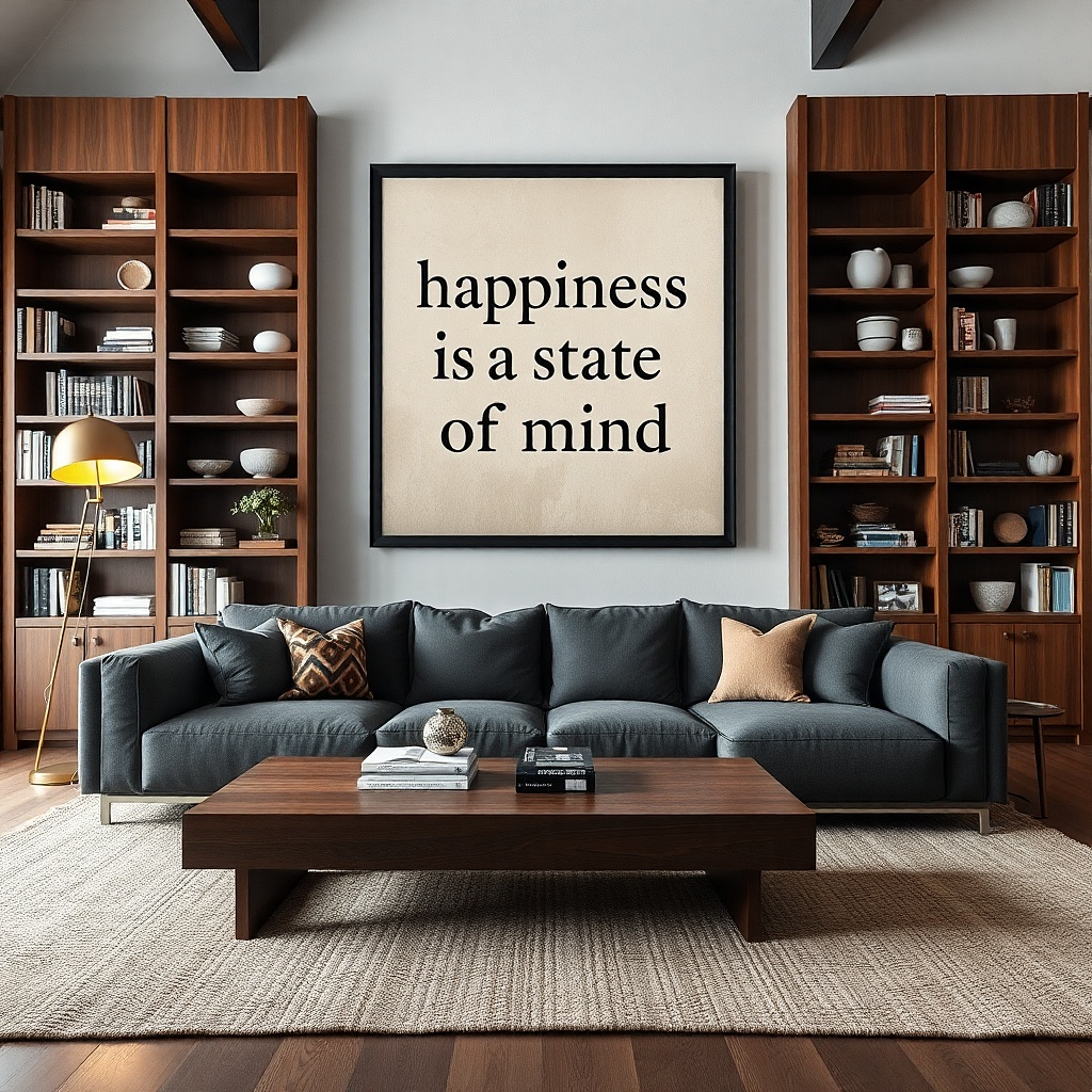
Pick a typography print sized so the framed width is 60-80% of sofa width. Use a mat that adds 2-3 inches around the text area. Hang centered above the sofa with the center around 57-60 inches from the floor. Choose a frame with a thin profile in black, oak, or white to keep the look sleek. Use two anchors for stability if the frame is wider than 24 inches.
Typography art works when it’s oversized and minimal. Choose one strong line a single word or short phrase set in a clean font, and keep the composition centered so it looks designed. Frame it so the width hits 60-80% of sofa width, and use a mat to prevent the text from looking cramped. Stick to black ink on warm paper, or deep navy on off-white. This solves the scale issue because the wall gets a bold, legible shape that reads clearly from the seating distance.
Common mistakeAvoid multi-line typography; it makes small walls feel busy and hard to read.
Try thisUse typography art that matches the room’s undertone warm paper for warm walls, cool paper for cool walls.
15. Framed shadow box with dried florals in muted tones
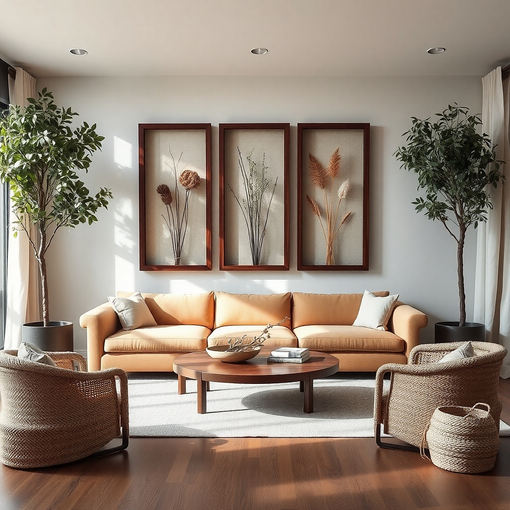
Choose a shadow box width that hits 40-60% of sofa width for a single piece. Position the florals so the tallest stems sit near the back center and the composition stays balanced. Hang it centered above the sofa with the center at 57-60 inches from the floor. Use anchors rated for glass-front frames and check level before fully tightening. Clean the glass with a microfiber cloth so it stays clear and glare-free.
A shadow box lets you add depth without clutter. Use a single large shadow box about 24-32 inches wide with dried florals or grasses in muted tones like wheat, sage, and dusty rose. The glass front keeps the look clean, and the depth makes it feel more substantial than a flat print. This works in small living rooms because it adds dimension while still being one object. It also solves the “flat wall” problem by giving the eye something to catch even in low light.
Common mistakeAvoid tiny shadow boxes; they look like decorative clutter instead of art.
Try thisPick florals that match your room’s palette and skip anything bright or neon small rooms amplify color.
16. Oversized oval mirror with framed edge
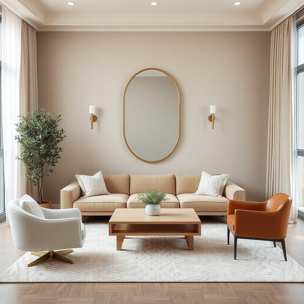
Measure the wall height and target a mirror that sits with its center around 57-60 inches from the floor. Choose a width around half of your sofa width for a balanced look. Hang using the manufacturer’s mounting points; for larger mirrors, use wall anchors and a stud if possible. Keep the mirror edges clean and avoid decorative glare by choosing a satin or matte frame. Step back and confirm the reflection shows light or a neutral background.
An oval mirror softens the geometry of a small room and adds visual length. The oval shape looks more forgiving than a rectangle, especially if your room has rounded furniture or a soft rug. Size it like art: 45-65% of sofa width if it’s a single focal piece, with enough height to reflect at eye level. Choose a frame in matte black, warm brass with a brushed finish, or light oak. This gives you a photogenic wall moment and makes the room feel bigger through reflection.
Common mistakeAvoid extremely ornate frames; details compete in small rooms.
Try thisPlace it so it reflects a window or lamp, not the TV screen or a messy doorway.
17. Large botanical line art in a thin black grid frame
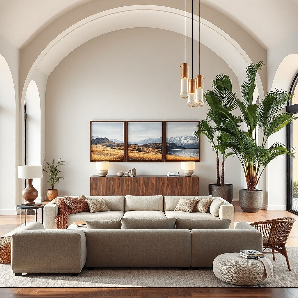
Pick a grid frame or plan a layout where the total width hits 60-80% of sofa width. Use consistent mat colors and keep frame thickness similar across pieces. Arrange the prints so they sit in a rectangle with aligned edges, leaving 2 inches between frames. Hang centered above the sofa with the center at 57-60 inches from the floor. Use a template to drill straight holes because small misalignment shows up fast in a grid.
Thin-line botanical art looks light and airy, which is exactly what small living rooms need. Use a grid-style frame or multiple prints arranged in a neat rectangle that totals 60-80% of sofa width. Keep the line art black or very dark gray on off-white paper so it stays high-contrast without adding color clutter. The thin black frame gives structure and makes the wall look modern, not fussy. This solves the scale issue by creating a large, cohesive block of art from smaller elements.
Common mistakeDon’t use thick, heavy frames with line art; it can feel bulky and shrink the wall.
Try thisChoose plants with varied leaf shapes but a consistent line weight for a clean look.
18. Large abstract in a simple wood frame with thick mat
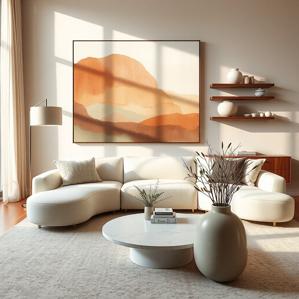
Thick matting is a small-room cheat code. It makes the art feel bigger and more intentional even when the room has limited wall space. Choose a large abstract with one dominant shape or color field, then frame it in warm wood to add softness. The thick mat 2.5 to 3.5 inches creates a border that anchors the piece against the wall. This works because it reduces visual sharpness and keeps the composition from feeling like a sticker. It also helps you avoid the “too small” look by visually expanding the artwork.
Target the framed width at 60-80% of sofa width. Select a mat that is at least 2.5 inches wide to create that intentional border. Hang centered above the sofa with the centerline at 57-60 inches from the floor. Use a level and two anchors, especially if the frame is heavier with thick mat. If your wall is textured, keep the mat and backing clean so the frame sits flush.
Pick mat color near your wall trim, not bright white, for a smoother look.
Avoid thin mats with large abstracts; the art can look like it’s floating.
19. Horizontal landscape print with wide frame
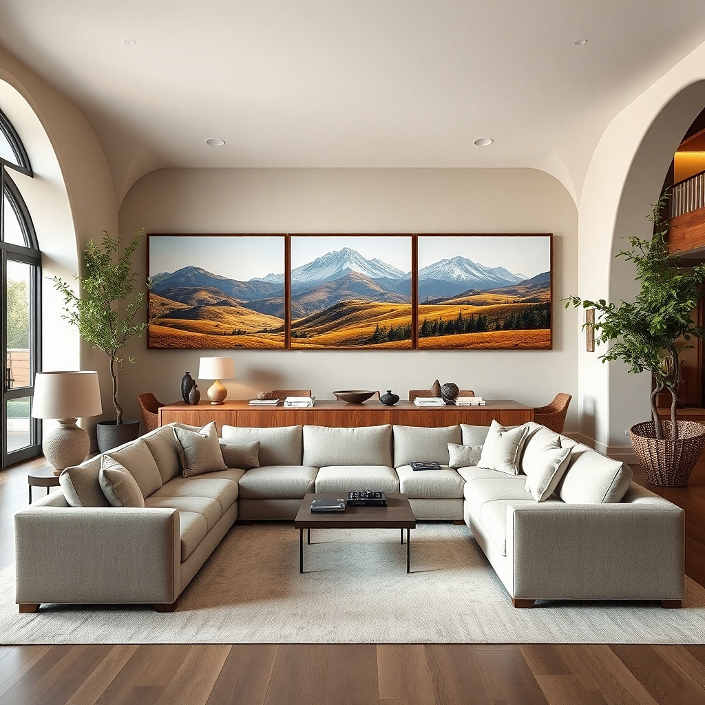
Measure sofa width and choose a print with framed width 70-90% of that measurement. Keep the height moderate so it doesn’t feel like a narrow strip; aim for about 18-30 inches tall depending on your sofa height. Center it above the sofa with the center at 57-60 inches from the floor. Use a level and mark anchor points before drilling. For glare control, choose matte paper or a low-sheen finish behind the glass.
Horizontal landscapes expand your room visually, which is perfect when your living room feels narrow. Choose a wide print with a strong horizon line and a matte finish. The frame should be wide and simple, ideally in black, espresso, or deep walnut, so it doesn’t compete with the image. Size the artwork so its width is 70-90% of your sofa width for a true horizontal anchor. This solves the scale problem by using width as design the wall looks dressed, not dotted.
Common mistakeAvoid tiny landscape prints; horizontal art needs width to work.
Try thisIf your rug has a horizon or border, match the landscape’s color temperature to it.
20. Large framed abstract with visible brush texture
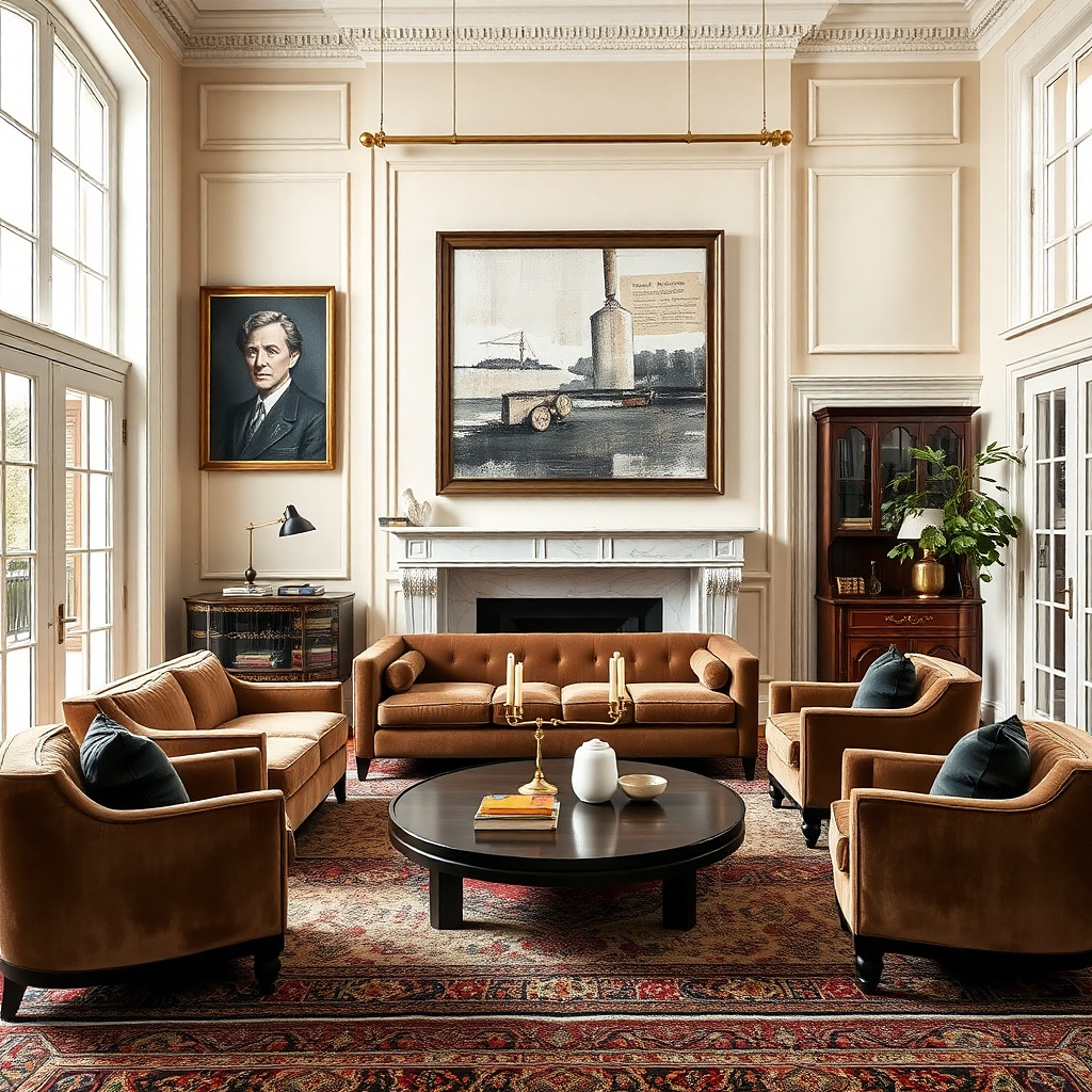
Brush-texture abstracts look dimensional and photograph well because they create light-and-shadow even without color variety. In small living rooms, you need texture that reads from a few feet away, not micro-detail. Choose a large piece with a limited palette charcoal, cream, and one muted accent like terracotta or dusty blue. Frame it in a matte finish to keep the texture from turning shiny. This gives you a statement wall without clutter and fixes the under-sized-art problem by taking up proper width.
Pick an artwork width at 60-80% of sofa width. Select a canvas or giclée print with visible texture and a matte protective finish if it’s behind glass. Hang centered above the sofa with the center at 57-60 inches from the floor. Use anchors sized for the frame weight and confirm the frame is level before tightening. Step back from your seating and confirm the texture still reads as shapes, not random specks.
Use one accent color from your throw blanket or cushion to tie the abstract to the room.
Avoid highly glossy abstracts; glare makes texture look flat.
21. Two framed prints side-by-side with a shared theme
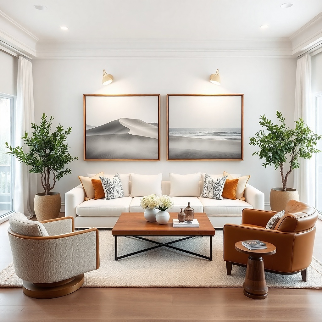
Choose two prints with identical frame styles. Calculate total width and target 60-80% of sofa width combined. Mark a centerline, then measure out half the total width plus half the gap so both frames sit evenly around center. Hang the left frame first, then level the right frame to match the top edge. Use two anchors per frame if the frames are over 20 inches tall.
Two matching prints can look bigger than one piece if you treat them as a single composition. Hang them side-by-side with the combined width landing at 60-80% of your sofa width. Choose matching frame colors and mats, then pick art that shares one theme silhouettes, architectural lines, or a repeated motif. Keep the spacing between frames at 2-3 inches so it reads cohesive. This solves the scale issue by building a wide anchor without committing to one oversized frame.
Common mistakeAvoid mismatched frame depths; it creates shadows that look uneven in photos.
Try thisKeep both prints the same height so the seam line feels intentional.
22. Oversized framed line art in a white frame for bright rooms
Pick a line art print with thick lines so it reads from seating distance. Frame it so the overall width is 60-80% of sofa width. Hang centered above the sofa with the center at 57-60 inches from the floor. Use a low-sheen backing and avoid glossy glass if you have window glare. Anchor securely with two points for frames wider than 24 inches.
For small living rooms with light walls, a white frame can still work as long as the artwork is big enough and the line art is high contrast. Go for black ink line art or deep charcoal shapes on warm paper. The white frame adds brightness without making the piece disappear, and the simplicity keeps the wall from looking busy. Size it to 60-80% of sofa width and keep the mat minimal or in a warm off-white. This solves the problem of art that blends into pale walls.
Common mistakeAvoid thin, gray line art on white paper; it disappears and makes the wall feel empty.
Try thisUse warm white frames, not icy white — icy white can look harsh in small rooms.
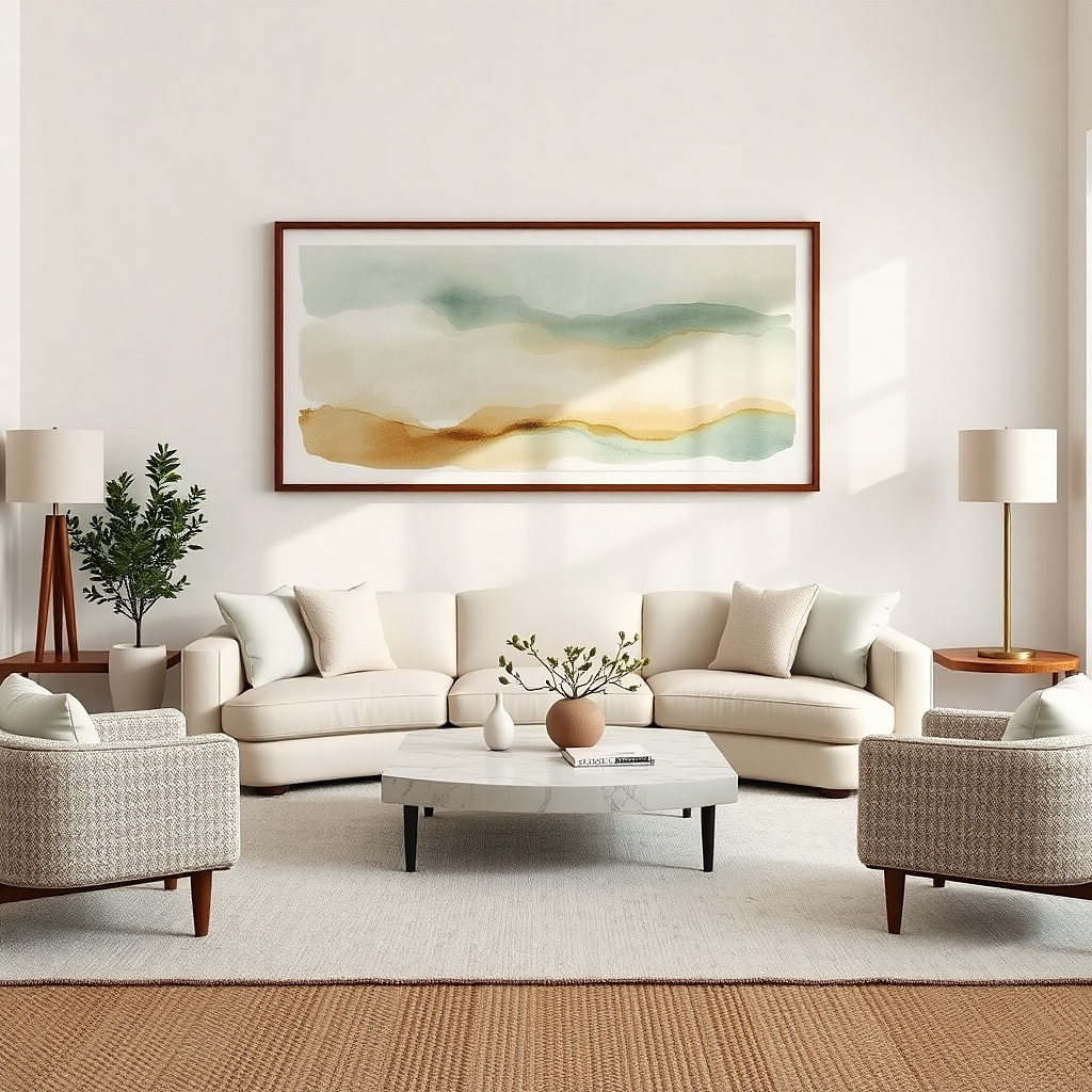
23. Large framed abstract watercolor in soft washes
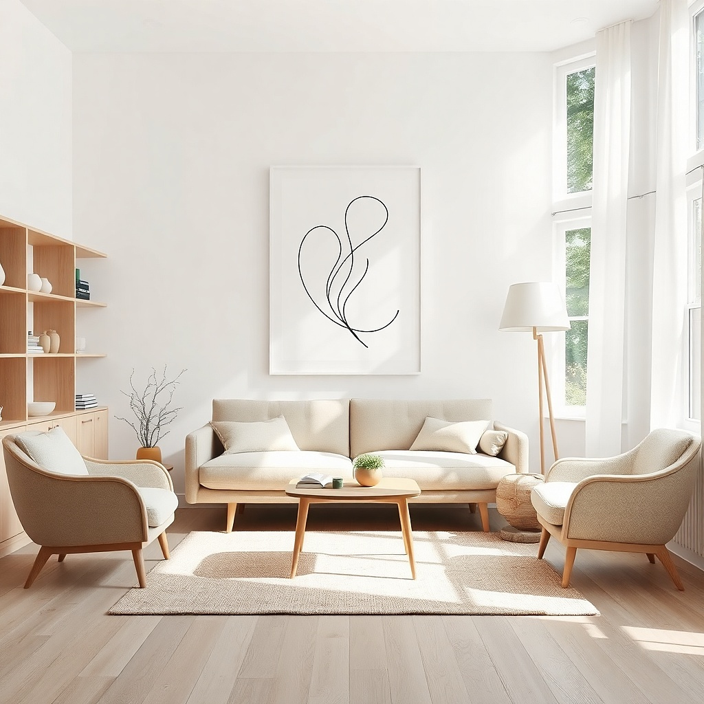
Select an abstract print with enough color separation that it reads at a distance. Target overall framed width at 60-80% of sofa width. Use matting if the colors are very light so it doesn’t blend into the wall. Hang centered above the sofa with the center at 57-60 inches from the floor. Use museum glass or matte acrylic if you have glare from windows.
Soft watercolor washes look airy, but only when the piece is large enough to anchor the room. Choose a watercolor-style abstract with gentle gradients and a limited palette that matches your room’s neutrals. The paper texture adds subtle depth and makes the art look handmade without the clutter of many colors. Frame it in a simple thin wood or matte black, and keep the overall width at 60-80% of sofa width. This solves the scale issue by making the softness feel intentional rather than small and timid.
Common mistakeAvoid tiny watercolor prints; they look like decorative stationery and shrink the wall.
Try thisPair watercolor tones with matte ceramics or textured pillows so the softness feels consistent.
24. Large circular wall art in a slim frame
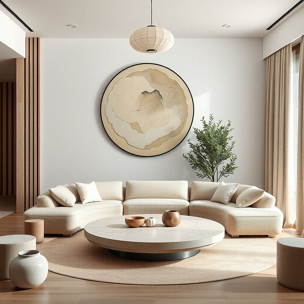
A large circle adds a clear focal shape that’s easy to photograph and easy to place. In small living rooms, circles can feel friendlier than rectangles, especially if you have round coffee tables or rounded lighting. Choose a circular piece about 20-30 inches wide and frame it in a slim black or oak edge. Hang it centered above the sofa so it becomes the anchor. The circle solves the scale issue by taking up space with a strong silhouette, even if your wall isn’t wide.
Pick a circle diameter that lands at 30-50% of sofa width for a balanced look. Center it above the sofa and set the center at 57-60 inches from the floor. Use a level and wall anchors rated for the frame weight. If the circle has a hanging wire, measure the wire drop so the artwork sits perfectly flat. Keep the surrounding wall empty — one circle looks intentional; too many small accents around it look cluttered.
Match the circle’s frame color to a visible metal in the room, like lamp bases or TV stand legs.
Avoid small circles; they read like decor pieces, not wall art.
25. Large framed architectural drawing with thin lines
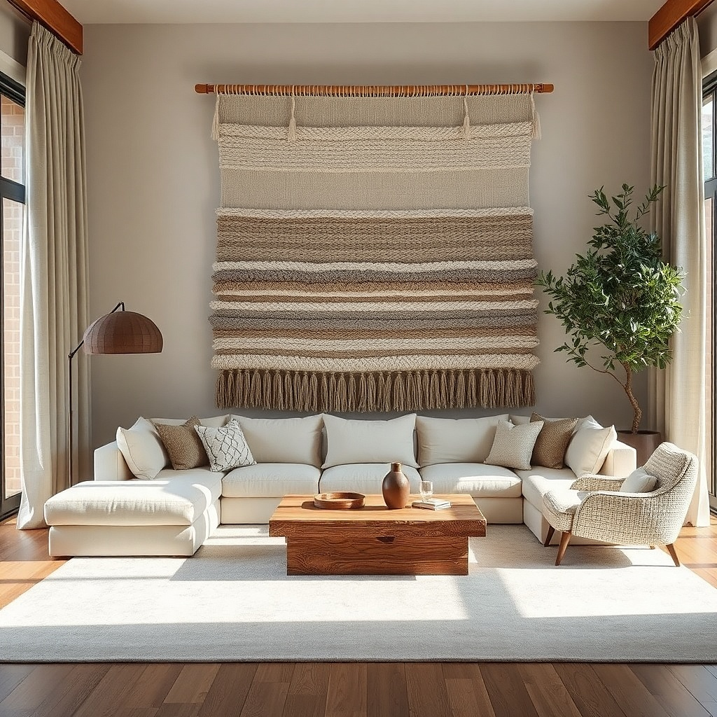
Choose a print where the line thickness is visible from 6-10 feet away. Target framed width 60-80% of sofa width. Hang centered above the sofa with the center at 57-60 inches from the floor. Use matting if the paper is very light so the drawing doesn’t blend into the wall. Anchor with two points and double-check level because line art shows crookedness fast.
Architectural line drawings add structure and make a small living room feel more designed. Choose a drawing with thick enough lines to read clearly from the sofa, and keep the palette limited to black ink on warm paper or off-white. Frame it in a thin black or warm oak frame so it stays modern. Size it to 60-80% of sofa width for a single statement, or use a vertical version if the room feels low. This solves the scale problem with a clean, graphic look that still feels soft.
Common mistakeAvoid ultra-fine blueprint-style prints; they lose detail and read like noise.
Try thisUse architectural art that echoes your room’s style clean modern lines for modern furniture, sketchier lines for traditional pieces.
26. Large woven wall hanging with an off-center composition
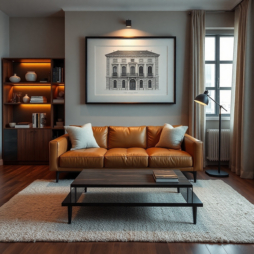
Measure sofa width and pick a woven hanging that lands at 50-70% of that width. Find the hanging’s weight and use the right mount — a wall hook rated for the weight or a French cleat if it’s heavy. Hang it so the top edge is about 6-10 inches above the sofa back height line, then set the center slightly left or right of the sofa center by about 2-4 inches. Use a level and check straightness from your main seating angle. Dust with a soft brush so fibers don’t look dull.
Woven wall hangings add texture and warmth, and they look great in small rooms when they’re big and not overly patterned. Choose a woven piece with a simple pattern — stripes, subtle chevrons, or tonal geometry — and keep the color palette limited to 2-3 shades. Size it so the hanging width is around 50-70% of sofa width, then hang it slightly off-center to add movement. The woven fibers catch light softly, reducing glare compared to glass. This solves the “blank wall” issue while keeping the room cozy rather than cluttered.
Common mistakeAvoid tiny woven hangings; they look like craft decor and don’t anchor the wall.
Try thisPair the woven texture with matte wood or linen curtains so the materials feel intentional together.