
1. Ivory linen pinch pleats on a black rod
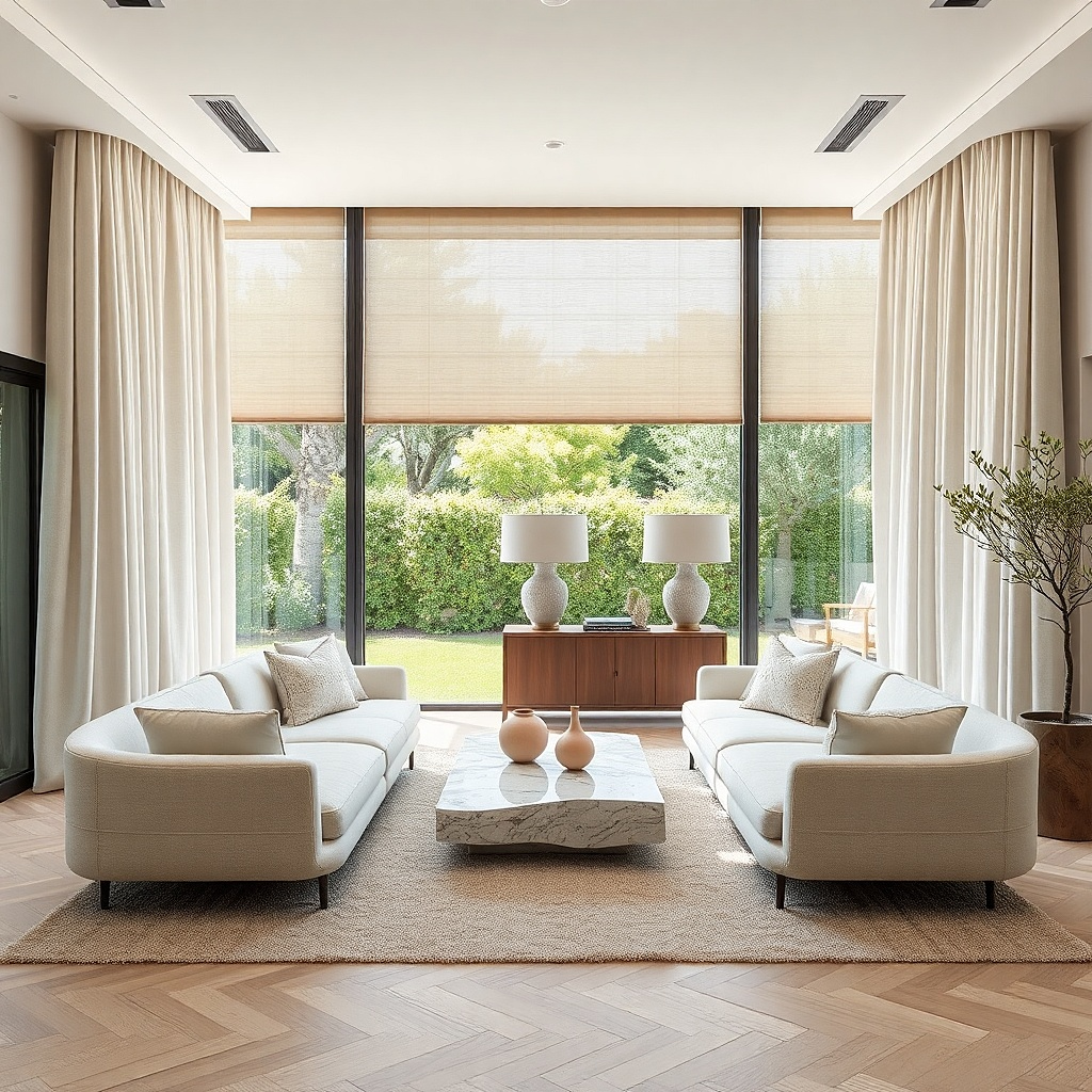
This is the safest good-looking choice for almost any living room, and safe is not a bad word here. Ivory linen blend panels with a pinch pleat top fall in clean vertical lines, so the room looks taller the second they go up. The matte black rod gives the pale fabric a sharp edge and keeps the window from disappearing into a white wall. This setup filters daylight without turning it gray, and it works especially well in rooms with oak, walnut, warm white paint, or plaster walls. If you want one curtain idea that still looks right in January, July, and everything between, start here.
Start by choosing lined linen blend panels in an ivory or oatmeal tone, not bright optic white, because stark white can look blue against warm walls. Then mount a 1 inch matte black rod 8 inches above the window trim and 10 inches wider than the frame on each side. Use pinch pleat hooks or buy ready-made pinch pleat panels, and make sure the total panel width is at least double the window width. Finally, hem the curtains to just graze the floor. Expect to spend more on this look than grommet panels, but the shape is far better.
Try thisUse rings even with pinch pleats if you want the folds to train faster and slide more smoothly.
Common mistakeSkip thin unlined linen that goes limp and wrinkled by noon.
2. Double layer sheers and flax drapes
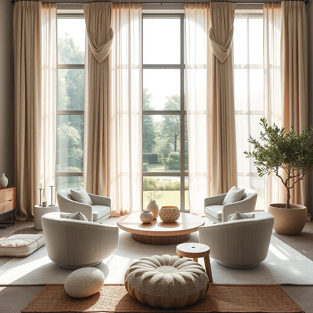
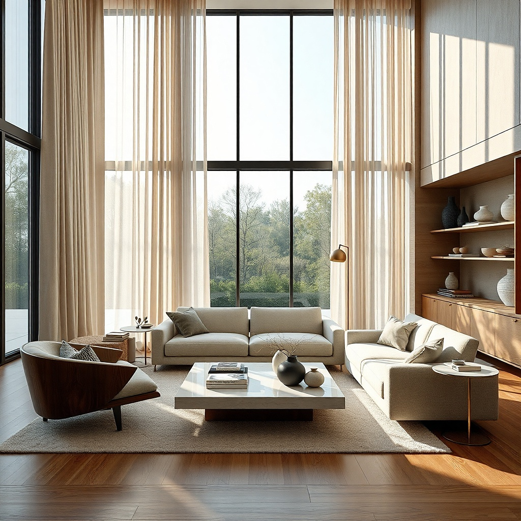
A double rod solves the biggest curtain problem in living rooms: you want daylight in the afternoon and privacy after dark. Put a white sheer on the back rod and a flax-colored drape on the front, and the window gets depth instead of looking like a flat sheet of fabric. The sheer softens hard sun and takes the edge off street views in daytime. The front drape closes at night and gives the room a finished frame all day even when left open. This setup looks especially good in living rooms with layered neutrals, boucle, jute, pale wood, or stone.
Start with a slim back rod for the sheers and a stronger front rod for the drapes, mounted at the same height so the top line stays clean. Then choose a sheer with a little texture, such as voile, gauze, or a slub weave, and pair it with lined flax or oatmeal drapes that have enough body to stack neatly. Keep both layers floor length, and extend the rods 8 to 12 inches beyond the frame so the heavier panels clear the glass when open. Budget hardware matters here because cheap double rods sag fast under lined panels.
Match the undertone of the sheer to the drape — creamy with creamy, crisp white with cooler taupe — or the layers fight each other.
Do not pair bright white sheers with yellow-beige drapes unless the contrast is deliberate elsewhere in the room.
3. Soft gray ripple fold for a modern room
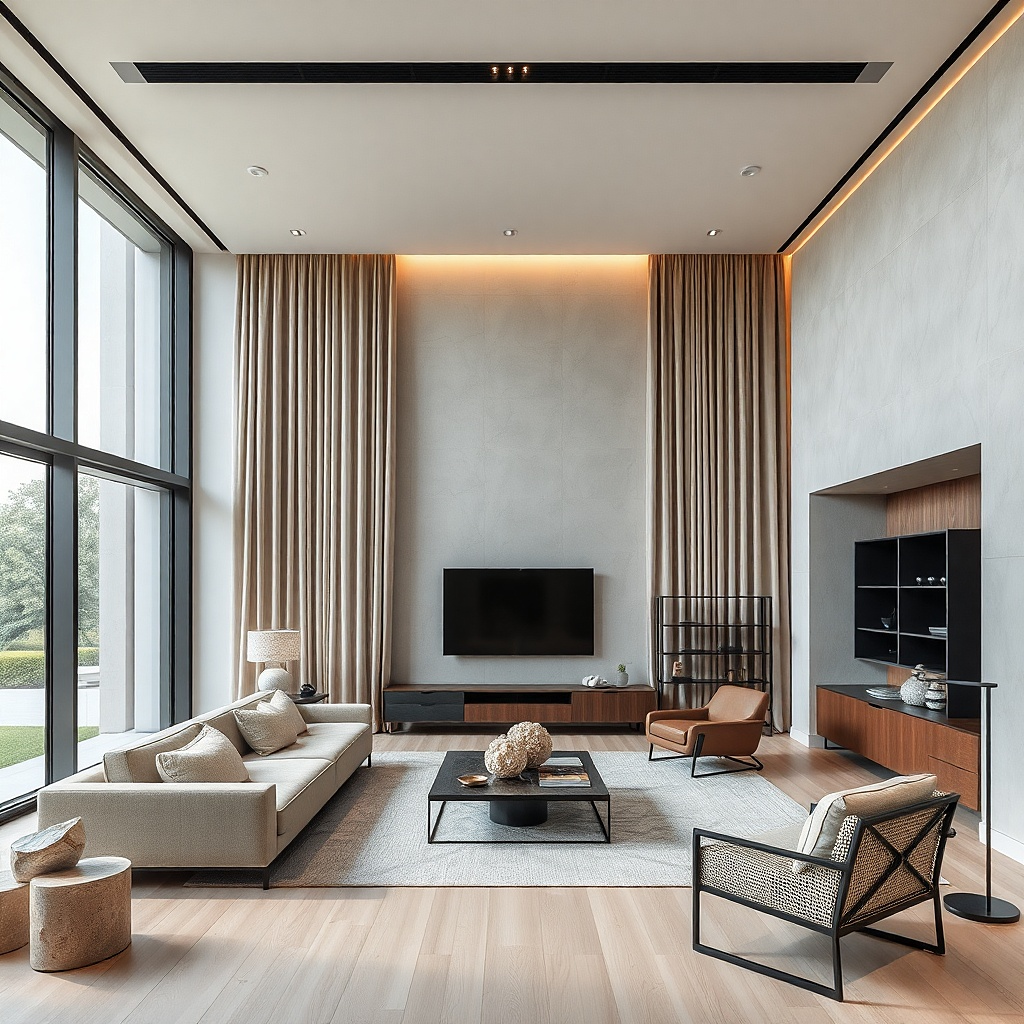
Ripple fold curtains have a calm, architectural look that suits modern living rooms far better than fussy headers. The wave stays even from end to end, so the whole wall looks orderly whether the curtains are open or closed. In a soft gray, greige, or putty tone, the fabric catches light in a subtle way and gives plain drywall more depth. This is a strong choice for large windows, sliders, and rooms with low-profile sofas, black accents, or wide-plank floors. It also stacks tightly, which means you keep more glass exposed during the day.
Start by measuring the full track width, not just the glass, because ripple fold systems are planned around the finished wave spacing. Then install a ceiling-mounted track or a rod-mounted ripple system as close to the ceiling as you can manage for a cleaner line. Pick a medium-weight fabric with lining if the room gets strong afternoon sun, and order enough fullness for a proper wave rather than a flat panel. This setup costs more than off-the-shelf curtains, but it looks custom because the spacing is exact.
Ceiling mounting works best with ripple fold because it keeps the top line clean and the waves uninterrupted.
Skip stiff blackout fabric here unless the room truly needs it, because the wave turns chunky and heavy.
4. Warm taupe velvet for glare and echo control
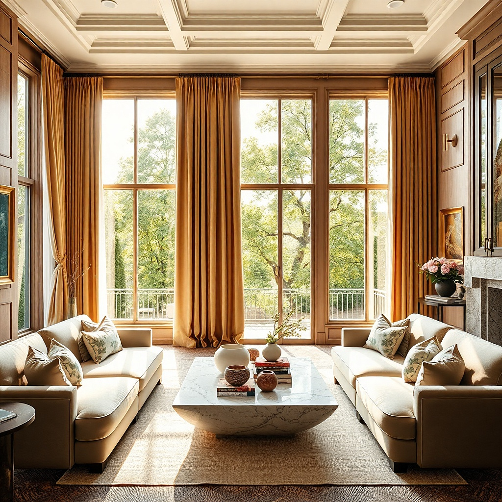
Velvet is the answer for living rooms that feel echoey, exposed, or washed out by strong light. A warm taupe or mushroom velvet panel absorbs more sound than a thin fabric and cuts TV glare in a way sheers never will. The pile catches light across the folds, so the window wall looks lush instead of flat, especially in evening lamp light. This works best in larger rooms, older homes with drafty windows, and spaces that need visual weight to balance a big sofa or fireplace. Use it if you want the room to feel denser and more cocooning without going dark.
Start with velvet panels that are lined and heavy enough to hang straight, then mount a sturdy rod with center support brackets if the span is wide. Place the rod high, and plan for generous stack-back because velvet takes up more space when open than linen does. Keep the hem just touching the floor and steam the folds after hanging so the pile settles. This is one of the pricier options, and it is worth reserving for a room that really needs softness, glare control, or drama.
Try thisChoose cotton-look or matte velvet over shiny crushed velvet for a living room. The matte finish looks calmer in daylight.
Common mistakeDo not use short velvet panels that stop above the floor. They look abruptly cut off.
5. Cream café curtains with full-length side panels
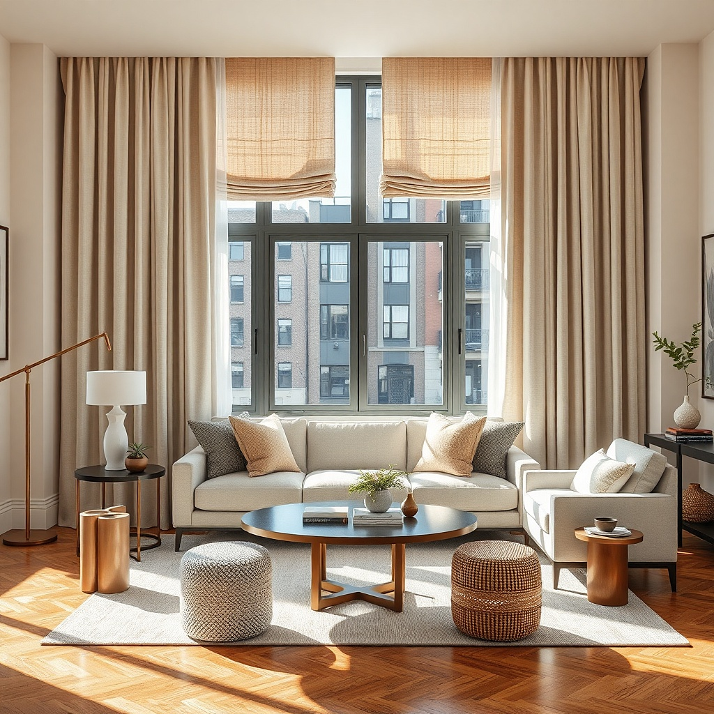
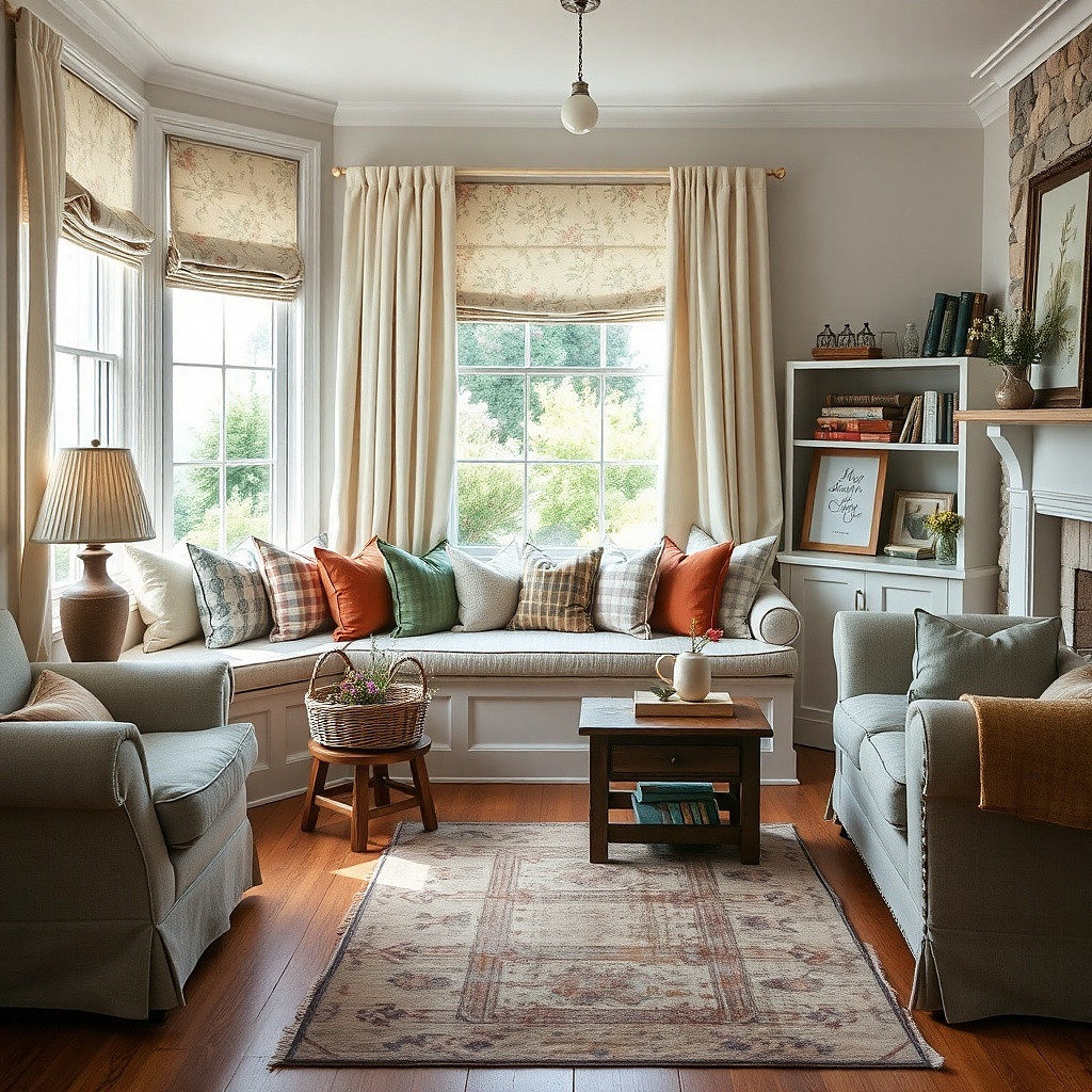
This is the smart fix for street-level living rooms that need privacy all day but still want natural light. A café curtain covers the lower half of the window, while full-length side panels frame the whole opening and make it look dressed rather than improvised. In cream cotton-linen, the lower panel glows softly in daylight and hides the direct sightline from the sidewalk. The long side drapes add height and shape, which a café curtain alone cannot do. This setup looks especially good in older homes, cottage rooms, and city apartments with large lower sashes.
Start by mounting a slim café rod at the midpoint of the lower sash or just above it, depending on where privacy matters most when seated. Then add a standard full-length rod near the ceiling for side panels in the same fabric family so the layers belong together. Keep the café portion lightly gathered, not packed, so daylight still comes through. This takes more measuring than a single rod, but the payoff is privacy without the shut-in feeling of full blackout drapes.
Try thisUse a slightly denser weave on the café panel than on the side drapes so the lower half gives real coverage.
Common mistakeSkip café curtains on tiny windows. They chop the glass into awkward pieces.
6. Natural woven shade under off-white drapes
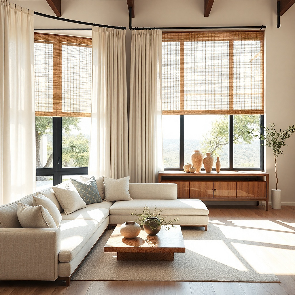
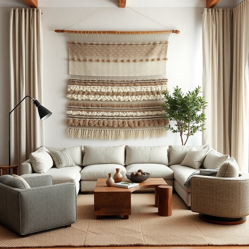
A woven wood shade under drapes gives you texture at the window even when the curtains stay open all week. The shade brings in a dry, natural surface that feels grounded next to painted walls and upholstered furniture, while the off-white drapes keep the edges soft. This is one of the best year-round combinations because the shade handles daytime privacy and sun control, and the drapes finish the room visually. It suits coastal, California casual, updated traditional, and plain builder-grade living rooms that need more material contrast. The result looks designed because you see more than one texture from across the room.
Start by choosing a woven shade in a medium natural tone, not orange honey bamboo, and decide whether you need privacy lining. Then mount the shade inside the frame if the trim is pretty, or outside the frame if the window is small and needs visual width. Add off-white drapes on a rod set high and wide, with enough fullness to hold a soft fold when open. Mid-range woven shades are not cheap, but this pairing gives a custom look faster than repainting or replacing furniture.
Match the shade tone to one wood note already in the room, such as the floor, coffee table, or frames.
Avoid pairing a busy woven pattern with heavily slubbed drapes. Too much texture muddies the window.
7. Deep olive panels in a room with pale walls
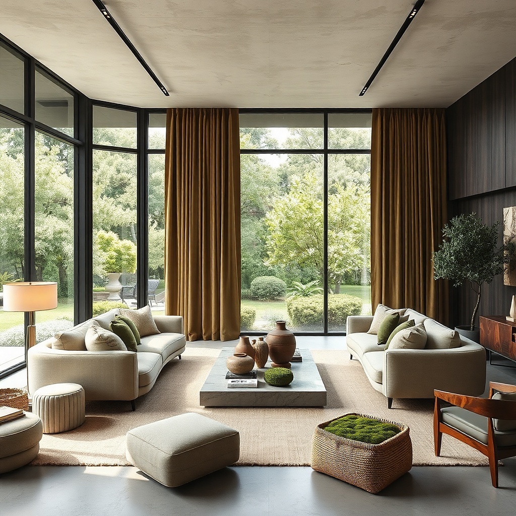
Most living rooms play it too safe at the windows. Deep olive curtains fix that without feeling loud. Against pale warm white, light beige, or soft greige walls, olive reads grounded and grown-up, and it changes beautifully from daylight to lamplight. It also hides dust and daily wear better than cream, which matters in a room that gets used. This is a strong choice if your living room has black metal, walnut, leather, antique brass, or a lot of plants.
Start with a fabric that has some weight, such as cotton-linen or matte polyester blend, so the color reads solid instead of flimsy. Then repeat the olive somewhere else in the room - one pillow, a print, a ceramic lamp base - so the curtains do not feel pasted on. Mount the rod high and use simple pleats or rings rather than grommets, which cheapen dark fabric fast. If the room is small, keep the wall color light so the olive feels framed instead of oppressive.
Try thisOlive looks best with warm metals and wood. Chrome makes it feel colder and flatter.
Common mistakeDo not choose yellow-olive against pink-beige walls. The undertones fight and the whole room looks off.
8. Dusty blue lined drapes for cooler light
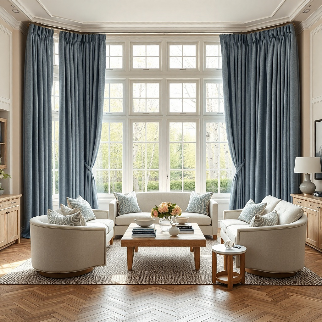
North-facing living rooms can look flat and chilly, but the wrong warm beige curtain turns muddy in that light. Dusty blue is the better move. It works with the cool daylight instead of resisting it, and lined fabric keeps the color steady from morning to night. In rooms with white trim, ash wood, charcoal, or faded rugs, dusty blue reads calm and intentional. It gives color without the sugariness of pastel curtains.
Start by testing blue against the wall at two times of day, because north light pushes some blues gray and others purple. Then choose a lined panel with a matte surface and enough width to form deep folds, not skinny strips. Hang the rod wider than the frame so the color sits mostly on the wall when open and does not darken the glass area. This is an easy update if the room already has cool tones and just needs more shape at the window.
Try thisPick a blue with a little gray in it. Pure baby blue looks juvenile fast.
Common mistakeSkip dusty blue if your sofa, rug, and art already lean icy gray. The room will feel colder, not calmer.
9. Ceiling-track sheers across the whole wall
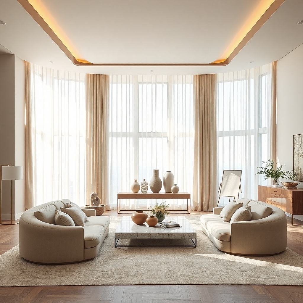
If you have several windows on one wall, stop treating them as separate holes. Running sheers wall to wall on a ceiling track turns the whole side of the room into one soft plane. The effect is clean, expensive-looking, and especially photogenic because the fabric diffuses light across a broad surface instead of breaking it into little vertical strips. This works in apartments with ugly window spacing, contemporary homes, and any room where the architecture needs help. It also hides mismatched trim and awkward mullions.
Start by measuring the full wall width and install a ceiling track that spans nearly all of it, stopping just short of corners if needed. Then choose a washable sheer with enough opacity to blur the view but still pass daylight, and order at least double fullness so the fabric reads soft even when closed. Keep the hem exactly level across the floor because any wobble shows immediately on a long run. Installation takes care and a second pair of hands, but the visual payoff is far bigger than the effort.
Try thisPaint the track the same color as the ceiling if it is visible. That small detail makes the line disappear.
Common mistakeDo not use short ready-made sheers pieced together for a wall-wide run. The seams ruin the effect.
10. Stripe trim on plain panels
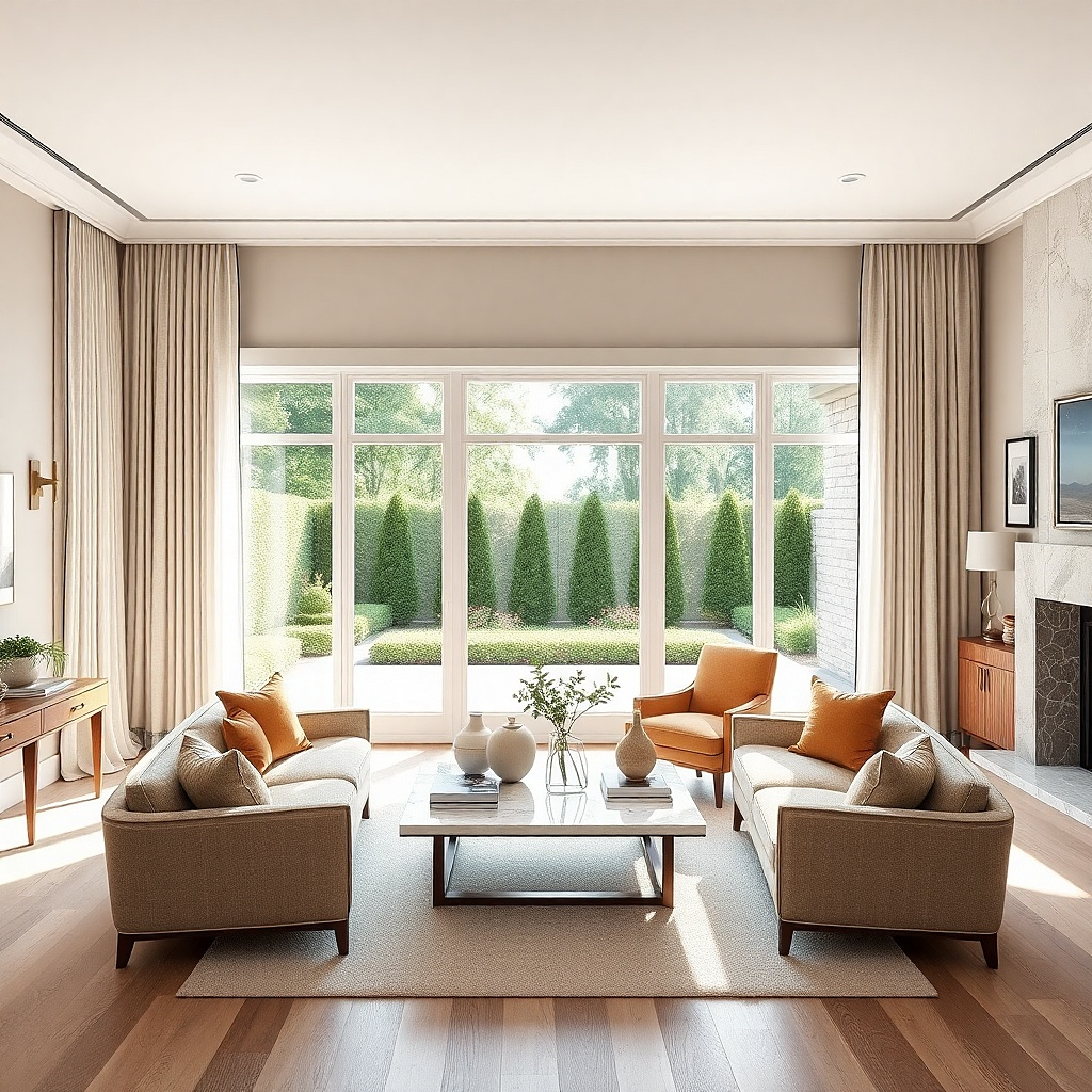
Plain curtains can look unfinished in a living room with personality. A narrow leading-edge trim fixes that without committing you to a full print. Add a 1 to 2 inch stripe, tape, or contrast band on the inside front edge of each panel, and the drapes gain a crisp outline that reads custom from across the room. This works especially well with off-white, flax, or pale gray fabric and a trim in black, olive, rust, or navy. The result is polished and graphic, but still easy to live with all year.
Start with simple panels in a solid fabric that hangs well, then choose trim that repeats a color already in the room. Have the trim sewn onto the leading edge and, if you want more structure, along the bottom hem too. Hang the curtains so the trimmed edge sits visible when the panels are open. This is one of the easiest ways to make basic ready-made curtains look less generic without paying for full custom drapery.
Try thisKeep the trim narrow. A slim band looks tailored, while a wide contrast border can feel heavy and dated.
Common mistakeSkip novelty pom-pom or tassel trim in a living room unless the whole room already leans playful.
11. Tone-on-tone beige for a quiet layered room
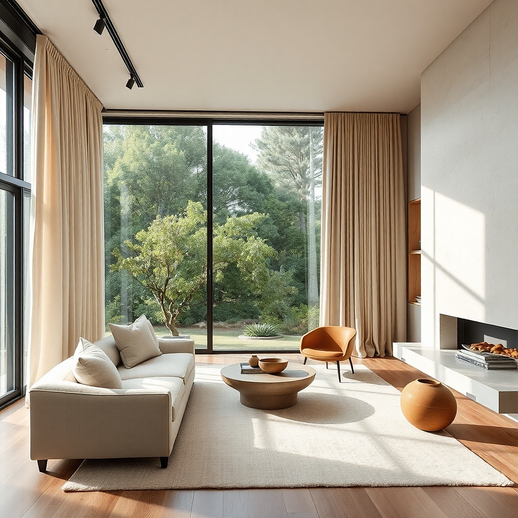
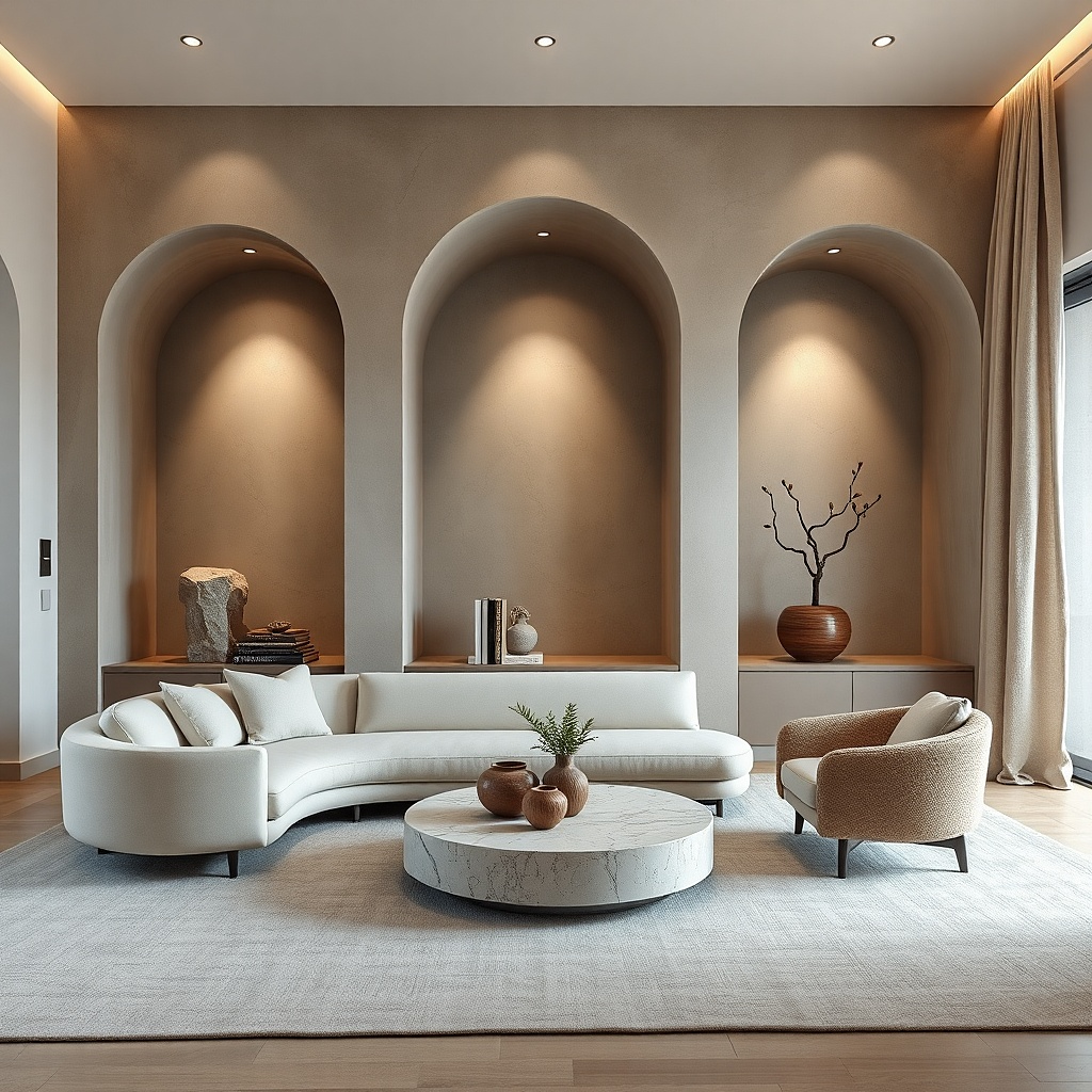
A beige room only looks dull when every beige is the same. Tone-on-tone curtains fix that by introducing a second or third beige with a different undertone and texture. Think mushroom walls with oat curtains, or warm putty walls with sandy drapes in a dry linen weave. The window still feels calm, but the folds catch light differently from the wall, which gives the room shape. This is ideal for minimalist rooms, plaster-heavy spaces, and living rooms where art, wood, or lighting already does the loud work.
Start by comparing your wall paint to fabric swatches in daylight and at night under the lamps you actually use. Then choose curtains that are one shade lighter or darker than the wall, not an exact match, and make sure the fabric has visible texture so the difference reads from a distance. Use a rod finish that blends in, such as warm brass on warm neutrals or painted wood on softer schemes. This route is less about contrast and more about controlled layering, so take undertones seriously.
Try thisIf the walls are warm beige, a slightly cooler taupe curtain adds relief without looking disconnected.
Common mistakeDo not match wall and curtain color exactly in a flat fabric. The room loses depth.
12. Small print drapes for a plain rental living room
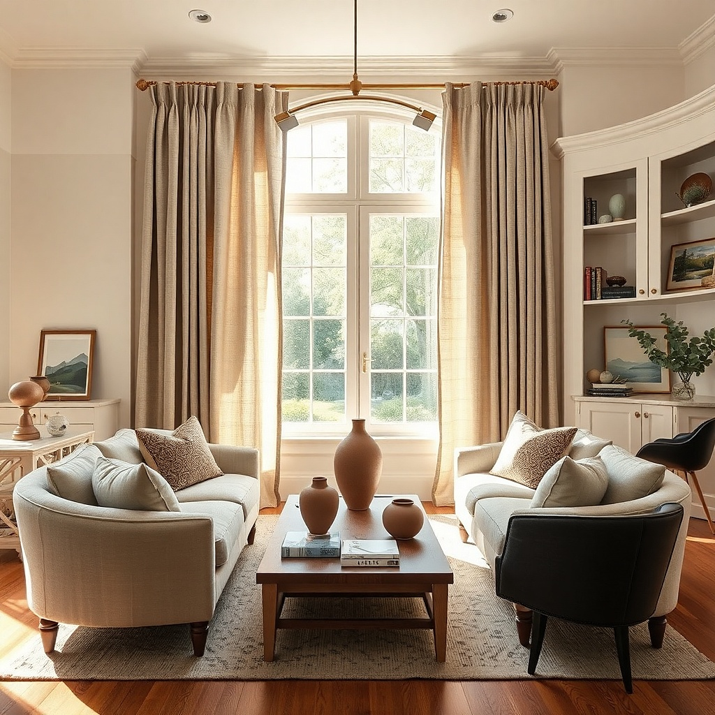
A plain rental living room with white walls and basic blinds needs pattern somewhere, and curtains are the cleanest place to add it. A small print such as ticking stripe, block print, fine check, or scattered botanical gives the room movement without swallowing it. Because the pattern repeats down a long panel, the window becomes a major design element instead of dead space. This works best when the rest of the room has solid upholstery and a restrained palette. It brings style to the room without paint, wallpaper, or drilling into every wall.
Start by choosing a print with two or three colors max, and make one of those colors tie to the rug or sofa. Then keep the header simple — pinch pleat, back tab, or rings — so the pattern stays the focus. Hang the rod high and wide, and let the curtains be the largest pattern in the room if everything else is plain. Ready-made printed panels vary wildly in quality, so inspect repeat alignment and hem level before committing.
Try thisA vertical stripe is the easiest pattern if your ceilings are low. It lengthens the room without trying too hard.
Common mistakeSkip oversized tropical or abstract prints in a small living room unless the rest of the room is extremely restrained.
13. Blackout lining hidden inside light-colored drapes
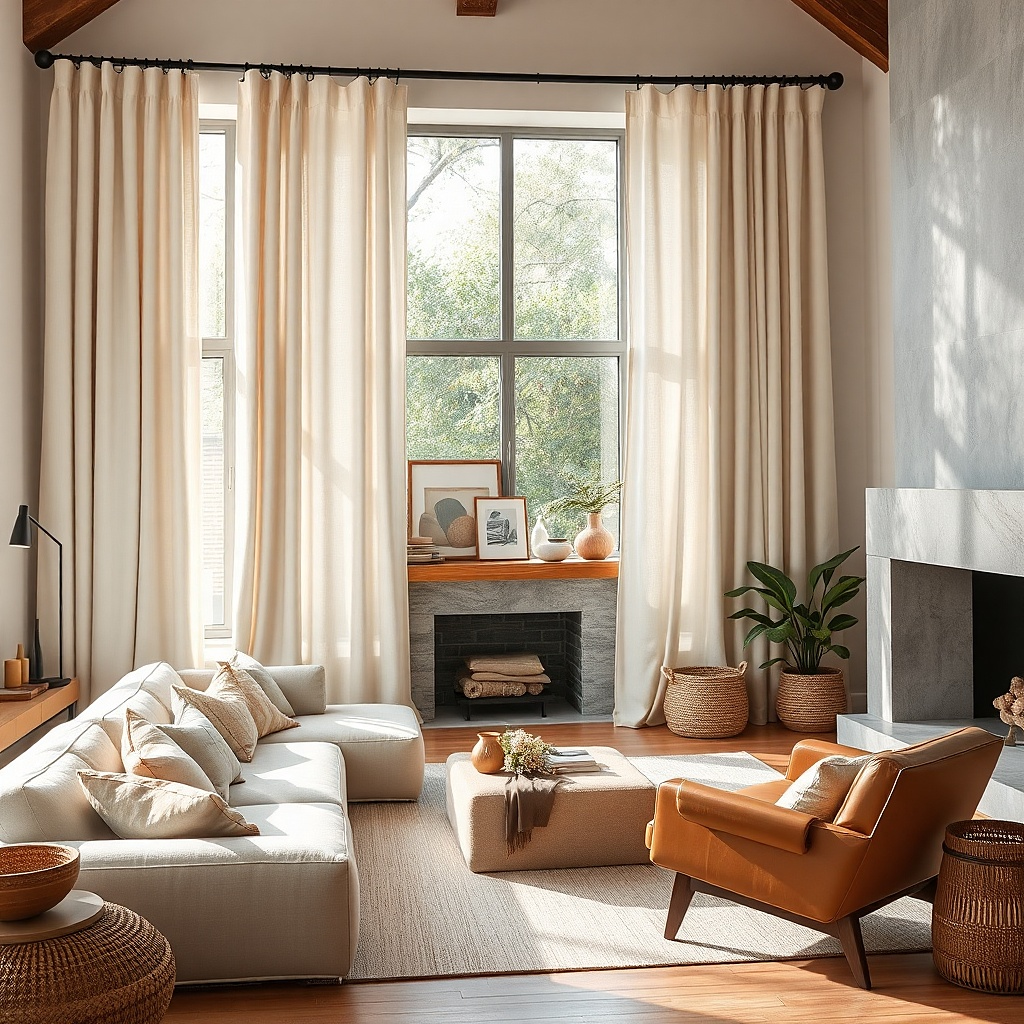
People hear blackout and picture thick dark curtains. That is not necessary. A light beige, soft gray, or ivory drape with hidden blackout lining gives you a bright-looking window treatment that still handles movie glare, summer heat, and nosy neighbors. From the room side, the curtains stay soft and airy-looking. From a practical angle, they do the hard work. This is the right move for media-heavy living rooms, west-facing windows, and homes where the sofa faces the TV.
Start with a face fabric you actually want to see every day, then add blackout lining behind it instead of buying one-piece blackout curtains with a rubbery back. Mount the rod wide enough for the panels to stack off the glass because lined curtains are thicker and need room. If heat is a problem, choose thermal blackout lining and seal light gaps by bringing the rod a bit farther past the frame. This costs more than basic panels, but it solves a real daily annoyance.
Try thisUse a return rod or wraparound brackets if you want better side light control without adding a second layer.
Common mistakeDo not buy bright white blackout curtains for a warm room. They read stark and cheap next to softer finishes.
14. Warm brass rod with simple white cotton panels
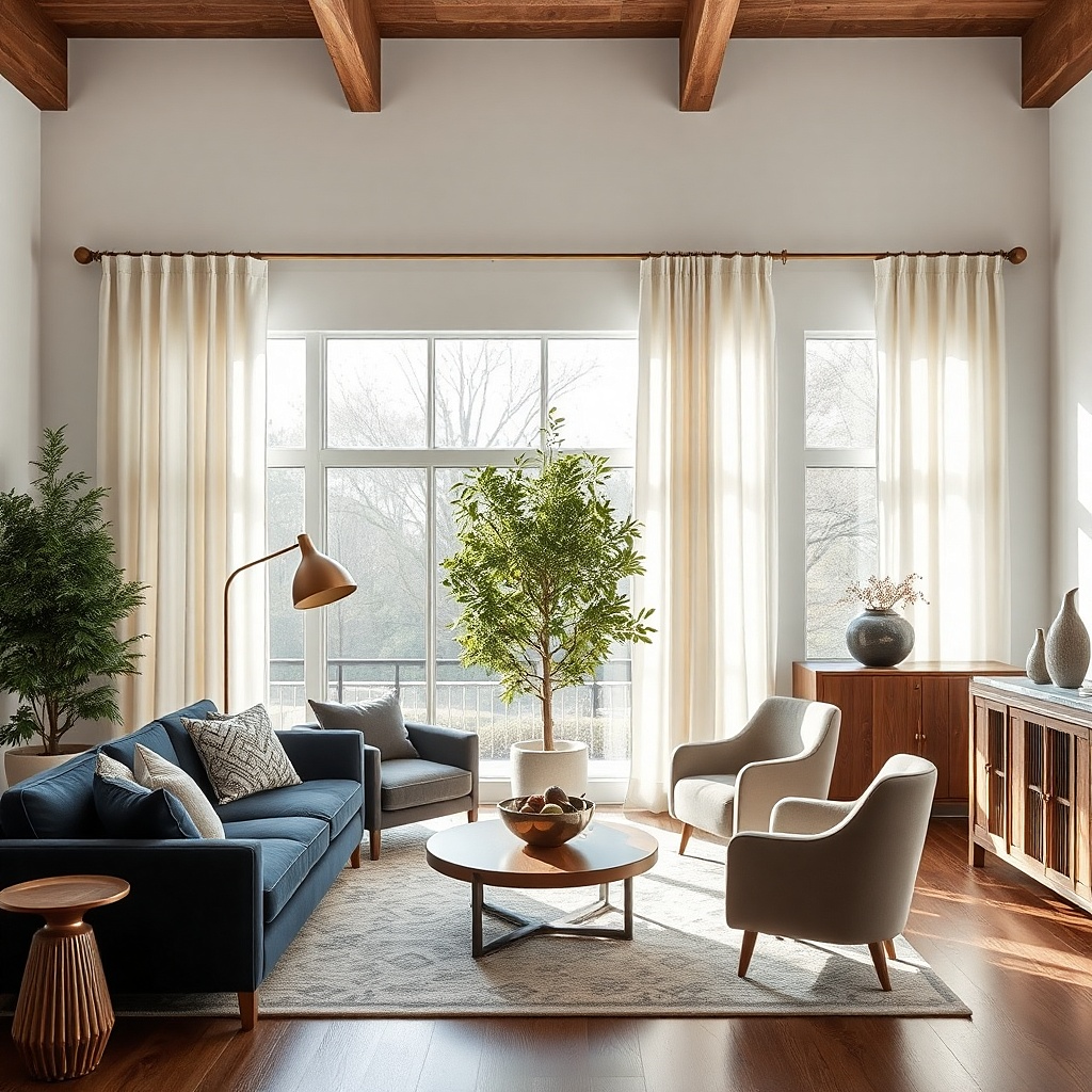
Sometimes the hardware should do more of the visual work. A warm brass rod paired with simple white cotton panels gives a living room a cleaner, more classic look than decorative finials and fussy fabric ever will. The brass catches light in a small but noticeable way, and the plain cotton keeps the whole window from feeling overdressed. This setup suits traditional rooms that need freshening, transitional spaces, and apartments where you want a little polish without a heavy fabric statement. It is bright, neat, and easy to keep consistent through the seasons.
Start with a real warm brass finish or a convincing brushed brass, not shiny yellow metal that looks fake under daylight. Then choose white cotton panels with lining if privacy matters, and use rings so the metal stays visible instead of getting buried under rod-pocket fabric. Mount the rod high and let the curtain width be generous enough to form soft folds even when open. This is one of the easiest combinations to source from mainstream home retailers and still get a refined result.
Keep the finials small and simple. The rod color is enough ornament on its own.
Skip cool polished nickel if the room already has warm woods and cream walls. It breaks the mood.
15. Charcoal drapes in a bright white room
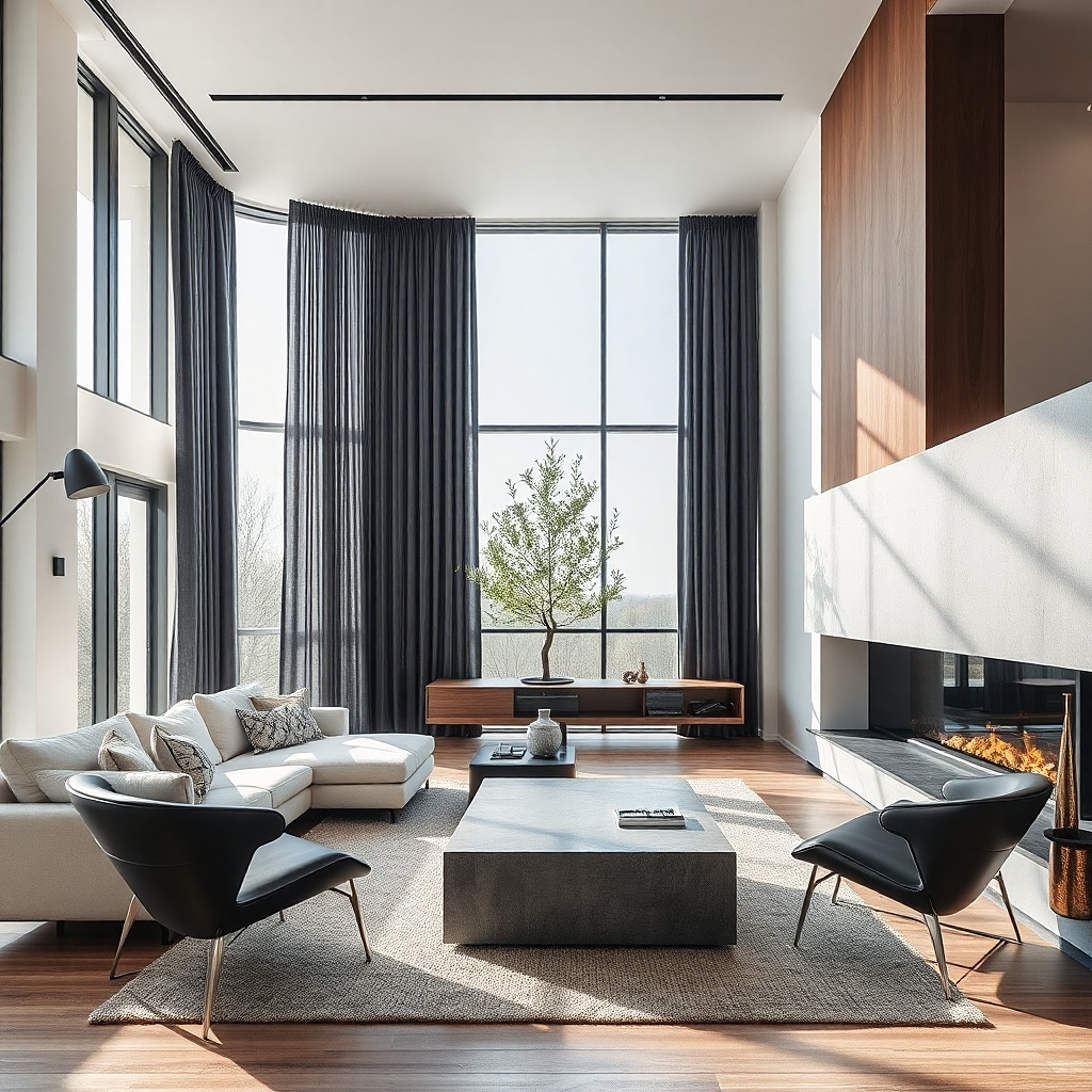
A very white living room can feel unfinished, almost temporary, until the windows get some weight. Charcoal drapes add that anchor fast. The dark vertical panels frame the light, sharpen the architecture, and stop the room from floating away into blankness. This choice works best in bright spaces with black frames, concrete, pale oak, or monochrome art. It is especially good if you want a crisp editorial look instead of a soft layered one.
Start with a matte charcoal fabric rather than anything shiny, and line it so the color stays even when sun hits the panel. Then repeat the charcoal in two small places — a lamp, picture frame, side table, or rug line — so the curtains feel integrated. Keep the wall color clean and the hardware simple, preferably black or dark bronze. This look is less forgiving than beige, so the hems and rod height need to be exact.
Try thisUse charcoal in rooms with enough natural light. In a dim room it can feel flat and severe.
Common mistakeDo not pair charcoal curtains with tiny scattered black accents and nothing else substantial. The window will feel isolated.