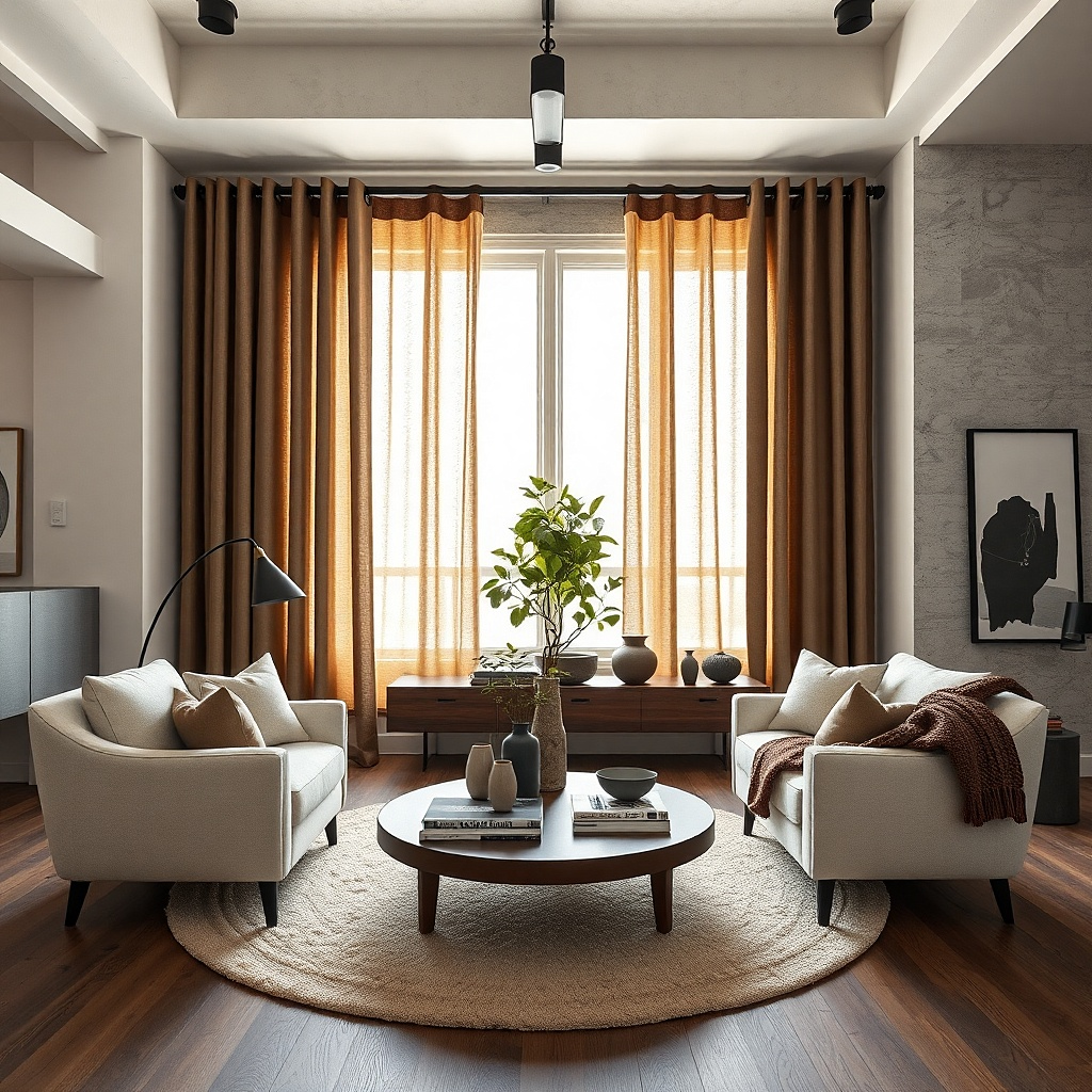
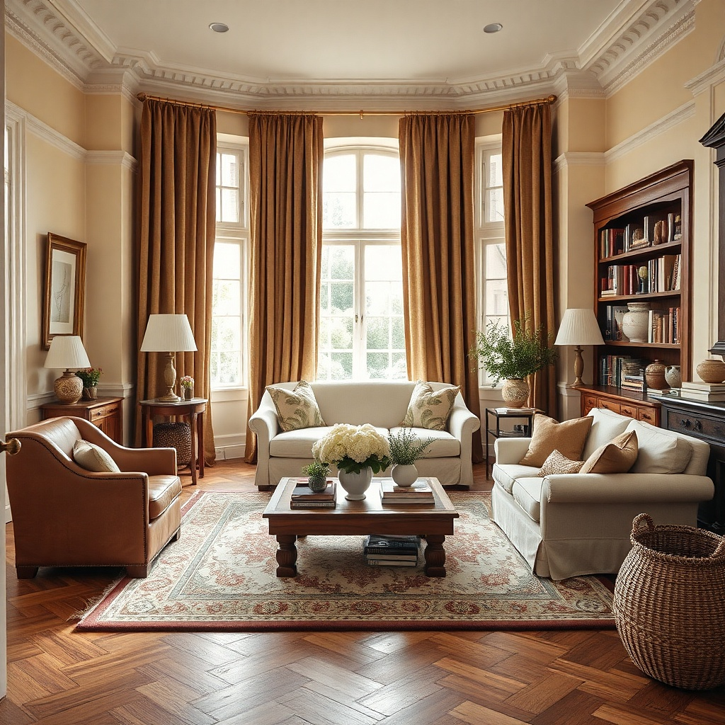
1. Camel linen panels with a black rod
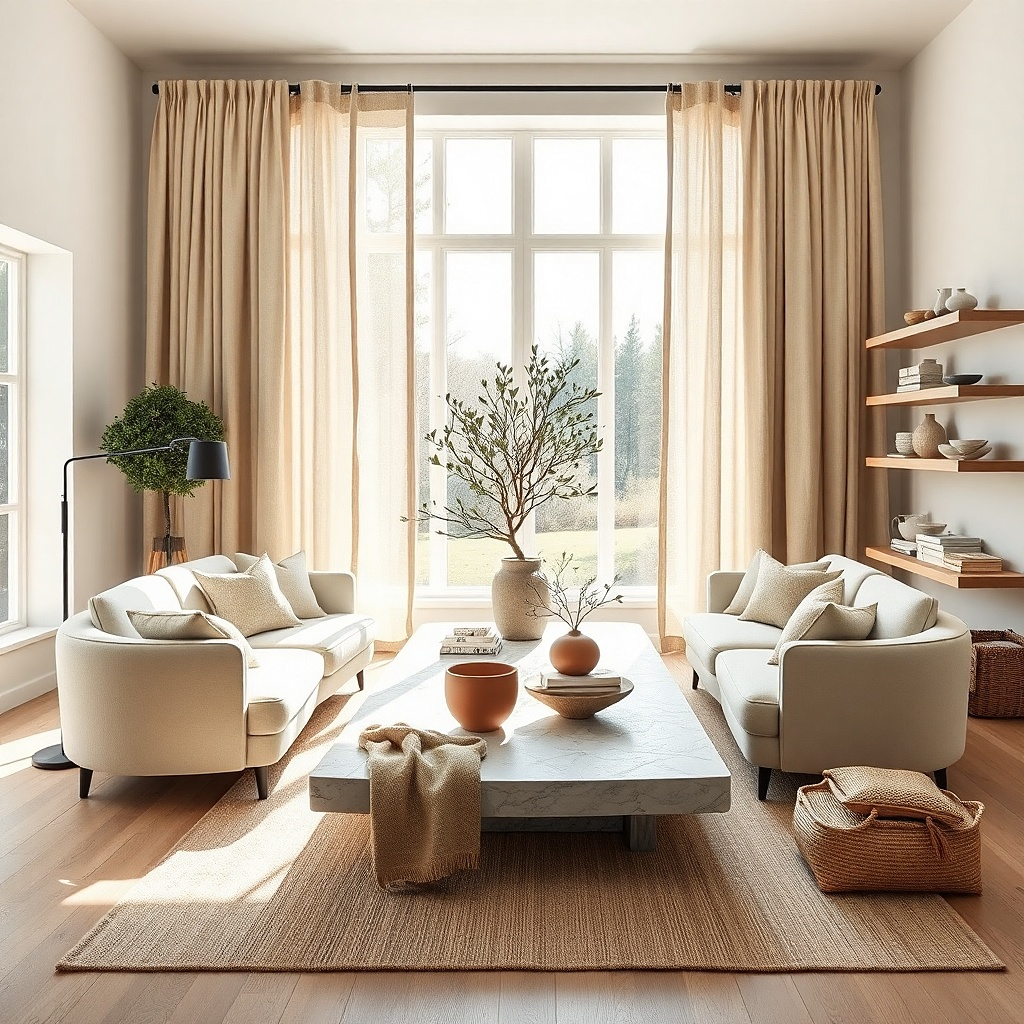
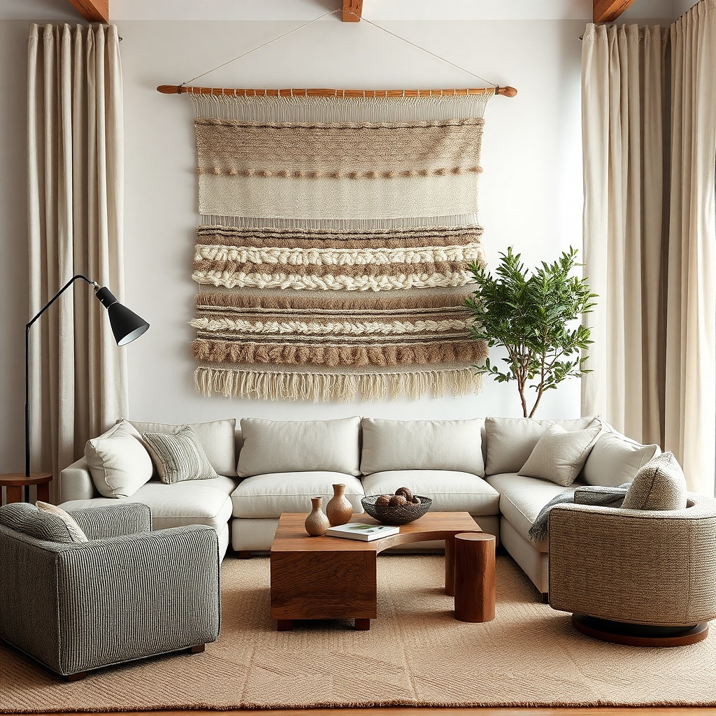
Camel linen-blend curtains are the fastest fix for a living room that feels pale, echoey, or slightly sterile. The color has enough warmth to soften white and greige walls, but it stays light enough to keep the room airy during the day. A matte black rod gives the setup a crisp outline, which stops the look from turning washed out. This pairing suits Scandinavian, modern farmhouse, and quiet contemporary rooms where you want warmth without heaviness. The best version has visible weave and a slightly slubby texture so the panels catch light in a soft, uneven way instead of reading flat.
Start by measuring from the rod to the floor and order panels that either float 1/4 inch above the floor or break by 1/2 inch. Then mount a matte black rod 8 inches above the window frame and 10 inches wider on each side so the stack-back does not cover the glass. Pick linen-blend panels in the 180 to 250 gsm range if you want filtered light and some body without full blackout weight. Finally, steam the folds and train the pleats by loosely tying the panels in three places for two or three days. Expect a mid-range cost around $60 to $140 per pair plus $25 to $60 for the rod.
Try thisUse rings with clips only if the fabric is casual and slubby. For a cleaner line, choose back tabs or pleat hooks.
Common mistakeSkip shiny faux-silk camel because it turns yellow under warm bulbs and looks cheaper than the rest of the room.
2. Chocolate velvet for a cocooned evening look

Chocolate brown velvet changes the room most dramatically after sunset. It absorbs glare, deepens the corners, and makes lamp light look warmer against the pile of the fabric. In a living room with beige upholstery, walnut wood, or brass accents, this reads grounded and expensive without trying too hard. It is especially good in rooms with tall ceilings or too much glass, where thinner curtains feel flimsy. Pick a brown with red undertones rather than gray undertones so the room feels warm instead of severe.
Start with full panels — at least 2 to 2.5 times the width of the window — because velvet needs volume to look right. Then use a sturdy rod and proper brackets every 36 to 48 inches since velvet is heavy, especially if the panels are blackout lined. Mount the rod high, steam the nap carefully from the back side, and brush the pile downward so both panels catch light the same way. For a standard 72-inch-wide window, two 52-inch panels work, but four narrower panels look fuller and more custom. Budget roughly $120 to $300 for decent velvet panels and more if you add lining.
Pair chocolate velvet with warm white bulbs around 2700K. Cooler bulbs flatten the color and make the fabric look dusty.
Do not puddle heavy velvet in a busy family room if pets or kids drag things across the floor.
3. Tobacco brown with sheer ivory behind it
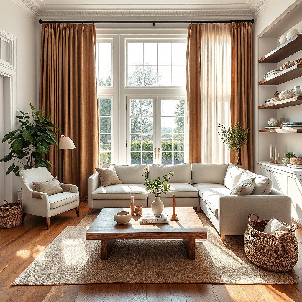
Layering tobacco brown drapes over ivory sheers gives you warmth in the evening and soft light during the day. The ivory keeps the window bright, while the tobacco frame adds weight and color around the edges. This is the move for living rooms that face the street or get harsh afternoon sun but still need privacy before dusk. Visually, the contrast between creamy sheer fabric and medium brown outer panels makes the window look finished instead of bare. It also photographs well because the layers create depth instead of one flat block of color.
Start with a double rod or a slim track for sheers behind a standard rod for the brown panels. Then hang the ivory sheers almost wall to wall and set the tobacco drapes on the outer rod, extending them 10 to 12 inches past the frame on each side. Choose sheers with a little opacity — not net curtain thinness — and brown panels in cotton, linen-blend, or light velvet depending on how much structure you want. Keep both layers floor length so the stack looks deliberate. This setup takes an hour or two to install and usually costs more in hardware than people expect.
Match the ivory sheer to your trim or wall paint, not to a bright white ceiling, so the layering looks calm.
Avoid pairing warm brown drapes with icy white sheers because the contrast looks sharp instead of inviting.
4. Espresso panels in a room with pale walls
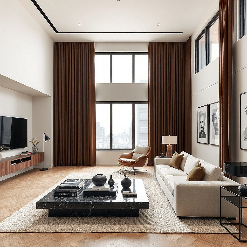
Espresso curtains are the right call if the room has pale walls, a light rug, and not enough contrast. The near-black brown anchors the perimeter of the room and gives the eye a place to land. Unlike true black curtains, espresso still reads warm under lamplight, especially next to oak, cognac leather, or cream upholstery. This works best in living rooms with decent natural light because the darkness looks intentional rather than gloomy. It also sharpens a room with simple furniture and clean lines.
Start by checking the floor and major furniture. If the room already has dark flooring and a dark sofa, espresso curtains may overdo it, so keep at least one large surface light. Then choose panels with a matte finish and enough fullness to soften the depth of the color. Hang them high and wide, and keep the hem just skimming the floor so the dark line looks tailored. Add one or two warm elements nearby — a walnut side table, tan pillow, or brass lamp base — so the curtains connect to the rest of the room. This is a strong look, so sample the fabric in daylight and at night before buying full sets.
Try thisPick espresso with a brown base, not a charcoal base. In shadow, charcoal-brown reads flat and cold.
Common mistakeDo not pair espresso curtains with stark blue-gray walls unless you want the room to feel much cooler.
5. Cinnamon brown in a small apartment living room
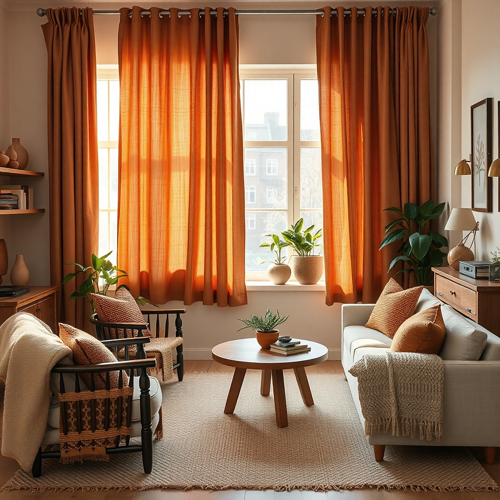
Cinnamon brown has a baked, reddish warmth that wakes up a small living room without making it feel boxed in. It is brighter than chocolate and more cheerful than taupe, so it works well where space is tight and daylight is limited. Against off-white walls, the color reads cozy and a little unexpected. It also flatters warm woods, terracotta pots, woven shades, and cream boucle furniture. If your apartment living room feels beige in a dull way, cinnamon is the fix.
Start with lightweight panels so the color stays lively rather than heavy. Then mount the rod close to the ceiling line if your apartment has low ceilings, even if that means 3 to 4 inches below crown molding or the drywall seam. Choose two wide panels instead of four narrow ones to reduce visual clutter around the window. Add one small repeat of the tone elsewhere — a rust pillow, clay vase, or framed print with brown-red notes. Affordable polyester-linen blends work fine here as long as the texture is matte and the weave is visible.
Try thisUse warm white walls instead of pure white. Cinnamon looks stronger and better against cream, ivory, or soft putty.
Common mistakeSkip cinnamon if your sofa fabric already pulls pink. The room will start to look peachy.
6. Greige room fixed with chestnut pinch-pleat drapes
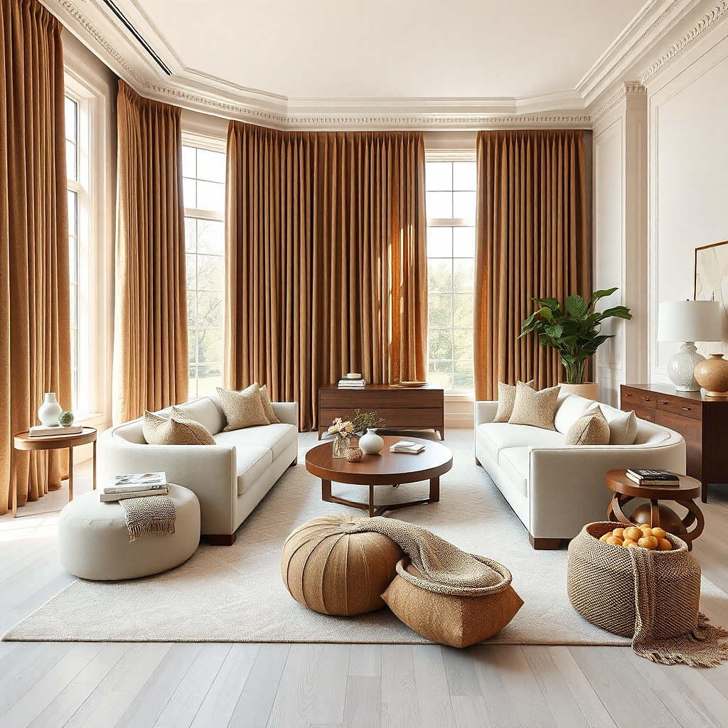
Greige living rooms fall flat fast. Chestnut pinch-pleat drapes solve that by adding warmth and shape at the same time. Chestnut has enough red and amber in it to wake up cool wall paint, while pinch pleats give the fabric a built-in rhythm that reads neater than plain rod-pocket panels. This look suits transitional rooms, tailored traditional rooms, and newer builds that need some depth. The pleats also keep the panels hanging in clean vertical lines instead of bunching awkwardly.
Start by choosing drapery hooks and rings instead of sliding the fabric directly on the rod. Then space the hooks evenly so the pleats stay consistent from top to bottom and the stack-back folds properly. Use a rod diameter that matches the scale of the room — 7/8 inch for modest windows, 1 1/4 inch for larger ones. Chestnut works best in medium-weight fabric because the pleats need enough body to hold their shape. This takes a little more setup than casual panels, but the result looks far more finished.
Try thisIf your trim is bright white, add a chestnut frame or wood lamp nearby so the drapes do not feel isolated.
Common mistakeDo not use weak, shallow pleats with stiff cheap fabric. They buckle and look limp at the same time.
7. Walnut-brown panels with brass hardware
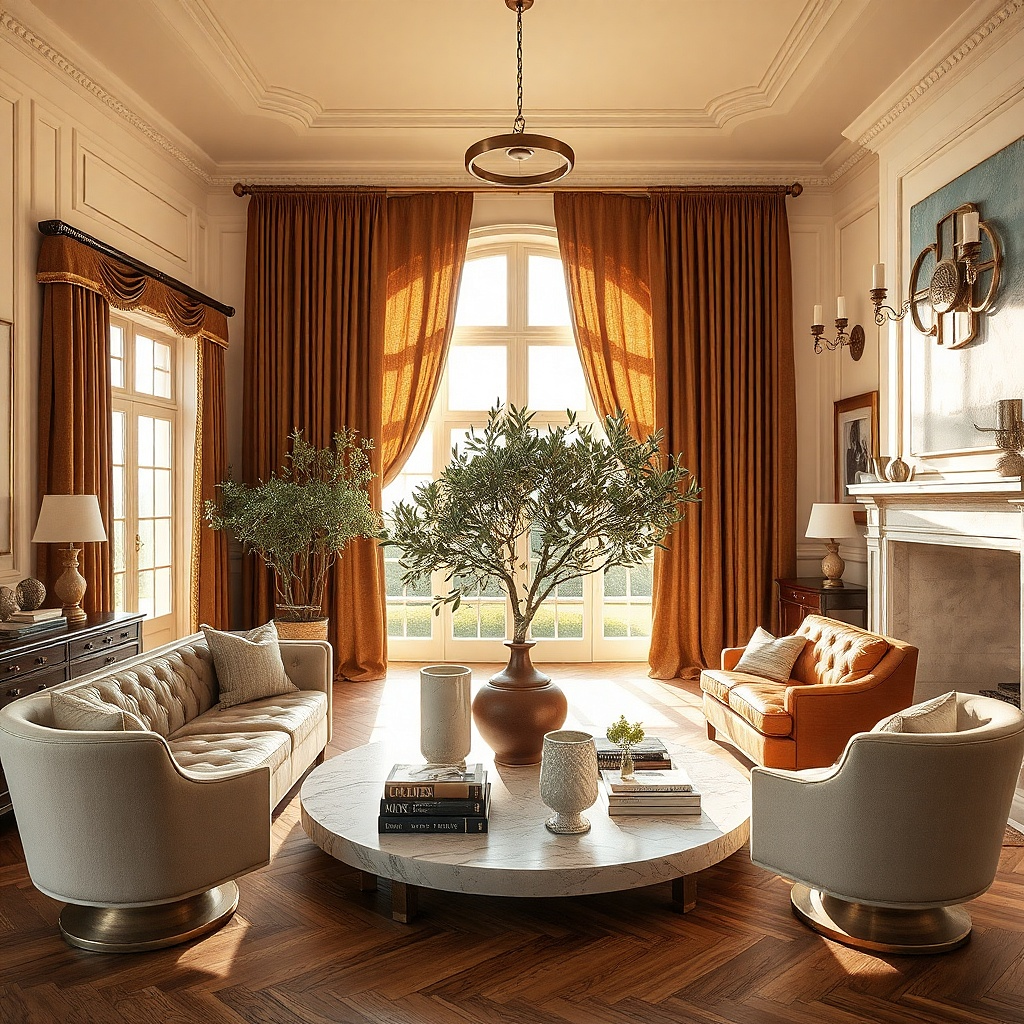
Walnut-brown curtains with an aged brass rod give a living room a warm glow even before you switch on lamps. The brass catches light in small flashes, while the walnut fabric ties into wood furniture and leather tones. This is a strong choice for rooms with antique pieces, mid-century shapes, or creamy plaster-like paint. The effect is warm but still crisp because the metal line at the top keeps the window from looking heavy. Choose brushed or antiqued brass, not bright yellow polished brass, which reads too flashy against brown fabric.
Start by checking the other metals in the room. If you already have black floor lamps and chrome tables, pick one metal family to repeat and do not crowd the room with all three. Then install a brass rod with simple round finials and hang walnut panels with rings so the metal stays visible. Keep the curtain heading neat — pinch pleat or back tab works better than grommets here. Add one more brass note nearby, such as a lamp, picture light, or tray, so the hardware feels intentional. This setup looks expensive, but hardware quality matters more than fabric price.
Aged brass with slight dullness is the sweet spot. It reflects light softly and keeps the room from looking theme-y.
Avoid shiny gold rods with matte brown curtains. The contrast looks forced.
8. Mocha blackout curtains for TV rooms
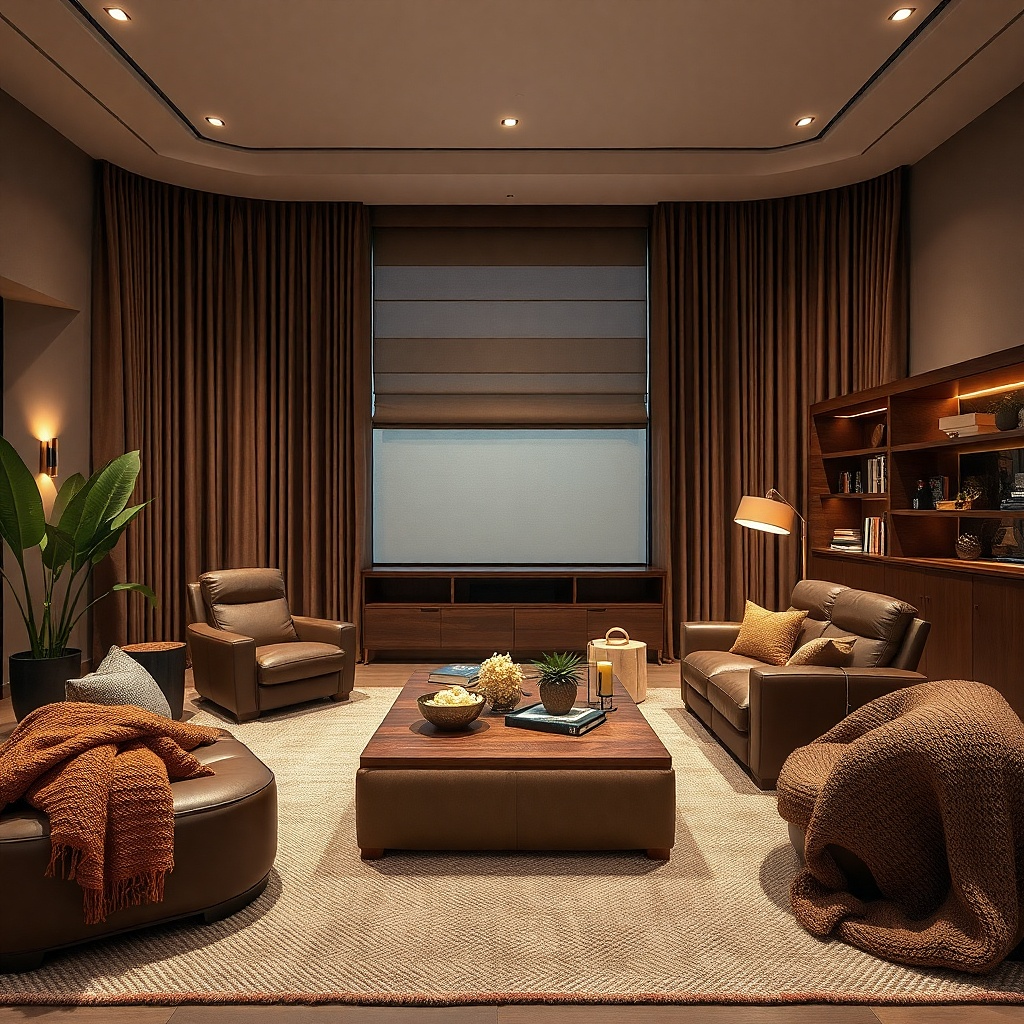
If the living room doubles as the TV room, mocha blackout curtains are the practical answer that still looks warm. Mocha sits between beige and chocolate, so it darkens the room without turning the window into a black rectangle. During the day, blackout lining cuts screen glare. At night, the color still feels soft under table lamps. This is the right pick for west-facing rooms where late sun blasts the sofa and washes out the television.
Start with a true blackout lining sewn into the panel, not a flimsy removable backing. Then size the curtains generously and mount the rod wide so more fabric can cover the wall edges and block side light. If glare is severe, wrap the rod slightly around the corners with French return hardware or add side returns. Keep the visible fabric matte and textured so the blackout function does not scream 'media room.' Expect more weight and a stiffer drape than unlined curtains, so use solid brackets and anchors.
Choose mocha instead of dark gray for blackout curtains if your room has oak, camel leather, or cream walls. It blends better and feels warmer at 7 p.m.
Do not buy thin brown curtains and expect them to block glare. You need actual blackout lining.
9. Brown-and-cream stripe panels that widen the window
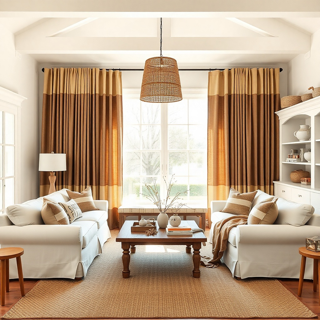
A vertical brown-and-cream stripe brings warmth and a little architecture to a plain living room. The cream keeps the window bright, while the brown stripe adds the cozy tone you want without a full solid panel. Stripes also help a narrow window look taller and more substantial. This works best in rooms with simple upholstery and not much pattern elsewhere. Pick stripes that are 1 to 2 inches wide for a calm look; skinny ticking stripes feel too country in most living rooms.
Start by treating the striped panel like a strong pattern even if the colors are neutral. Then keep nearby pillows, rugs, and throws quieter so the window gets room to read clearly. Mount the rod high and use enough panel width so the stripes do not stretch flat when the curtains are closed. If the room has low ceilings, vertical stripes help, but only if the panels run full length to the floor. Mid-priced cotton blends work well here because the stripe stays crisp.
Try thisRepeat the cream from the stripe in the sofa or rug so the curtains tie into the room from both colors, not just the brown.
Common mistakeAvoid bold brown stripes with a busy patterned rug. The room will feel chopped up.
10. Soft taupe-brown for a calm layered neutral room
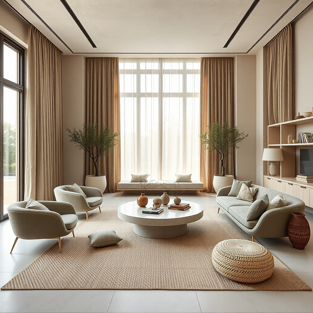
Soft taupe-brown is the answer if you want warmth but hate anything that feels dark or heavy. It sits between mushroom and cocoa, which means it blends with stone, oatmeal, flax, and warm gray without disappearing. In a neutral living room, this color adds a gentle frame around the window and makes the room feel settled. It is especially good with textured pieces like boucle, wool rugs, limewash-style paint, and pale oak. The look is quiet, but not bland, because the brown note keeps the palette from washing out.
Start with fabric texture first and color second. In this pale range, texture does most of the work, so pick a linen-cotton blend, brushed cotton, or lightly nubby weave. Then hang the curtains so they barely kiss the floor and keep the rod close to the wall for a tailored line. Add contrast somewhere low in the room — a medium wood coffee table or darker basket — so the window treatment does not float off on its own. This is one of the easiest brown directions to get right because it blends with so many neutral finishes.
Try thisBring home a paint chip that matches the curtain and compare it next to the wall in daylight. Taupe-brown shifts a lot between morning and evening.
Common mistakeDo not choose taupe-brown curtains and a taupe wall in the exact same depth. The window disappears.
11. Rust-brown panels with woven wood shades
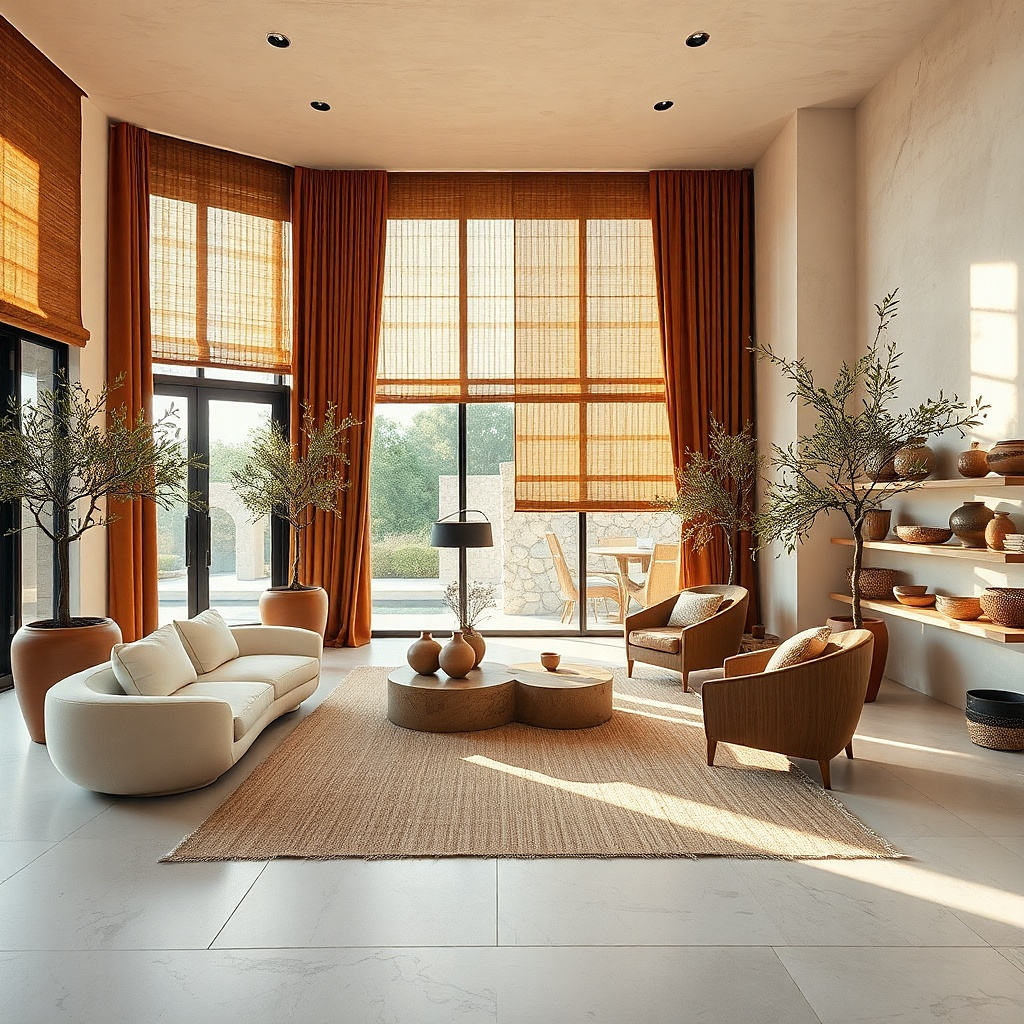
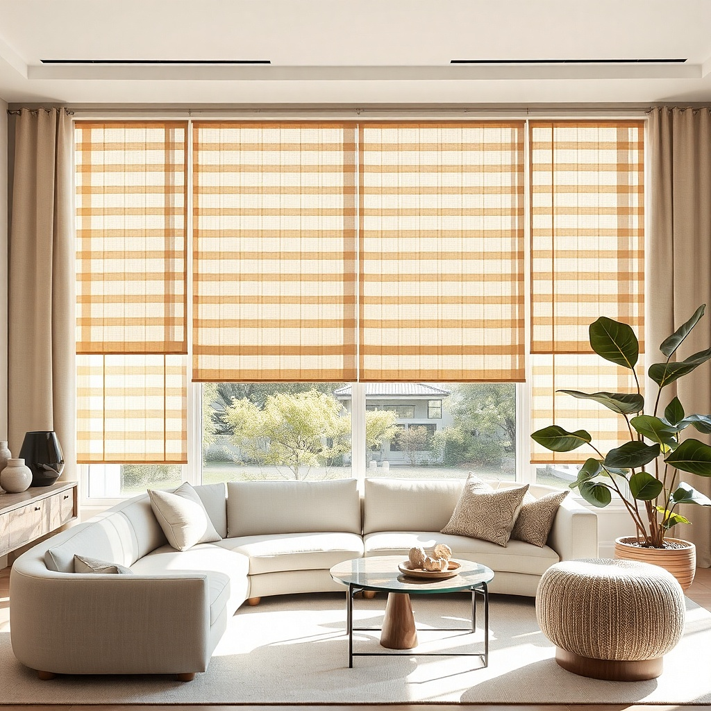
Rust-brown curtains layered with woven wood shades give a living room real texture, which is what makes warm rooms look good instead of merely brown. The woven shade adds a dry, natural surface at the glass, and the rust-brown panel adds softness at the sides. This pairing suits earthy rooms with plaster tones, olive accents, vintage rugs, or lots of plants. It also fixes windows that feel too bare with shades alone. The result has more depth than plain neutral curtains and reads especially well in afternoon light.
Start by installing the woven wood shade inside the frame if possible so the window stays tidy. Then mount the curtain rod above it, high enough that the drapes clear the shade hardware and still skim the floor. Pick rust-brown fabric with a matte finish and enough weight to hang straight beside the textured shade. Keep the shade tone close to medium honey or walnut so it relates to the curtain instead of fighting it. This takes more planning than a single-layer setup, but the room looks far more finished.
Try thisUse privacy lining on the drapes if the woven shade has visible gaps and the room faces neighbors.
Common mistakeAvoid orange-heavy rust next to yellow bamboo shades. The mix turns loud fast.
12. Dark brown curtains on a wall-to-wall rod
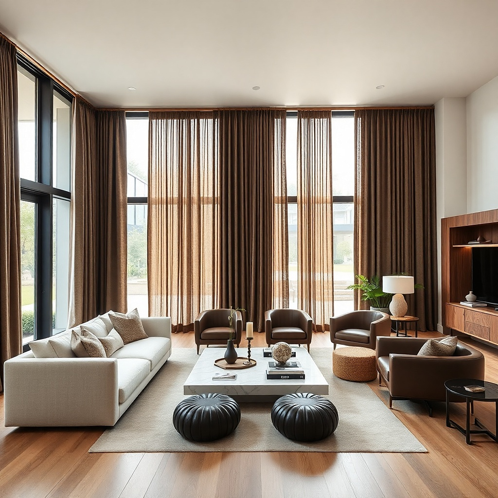
A wall-to-wall rod with dark brown curtains is the smart move for one small window on a big blank wall. Instead of treating the window as a little hole, you turn the whole wall into a soft backdrop. The room feels larger because the eye reads the drapery span first and the window second. This works especially well behind a sofa or in a living room with awkward off-center windows. Brown keeps the treatment warm and grounded so the enlarged scale feels cozy rather than theatrical.
Start by measuring the entire wall and stopping the rod 4 to 8 inches from each corner. Then use enough panels to cover that width with real fullness, even if the actual window is much smaller. Keep the fabric simple — solid dark brown, matte, and medium weight — because the scale already makes a statement. Mount extra brackets so the rod does not sag, especially over spans wider than 8 feet. This uses more fabric, but it solves awkward architecture better than trying to disguise it with tiny panels.
Try thisCenter the curtain composition on the wall, not only on the window, if the furniture layout also centers there.
Common mistakeDo not use a skinny rod across a long span. It will bow in the middle.
13. Brown curtains with a narrow puddle for a formal room
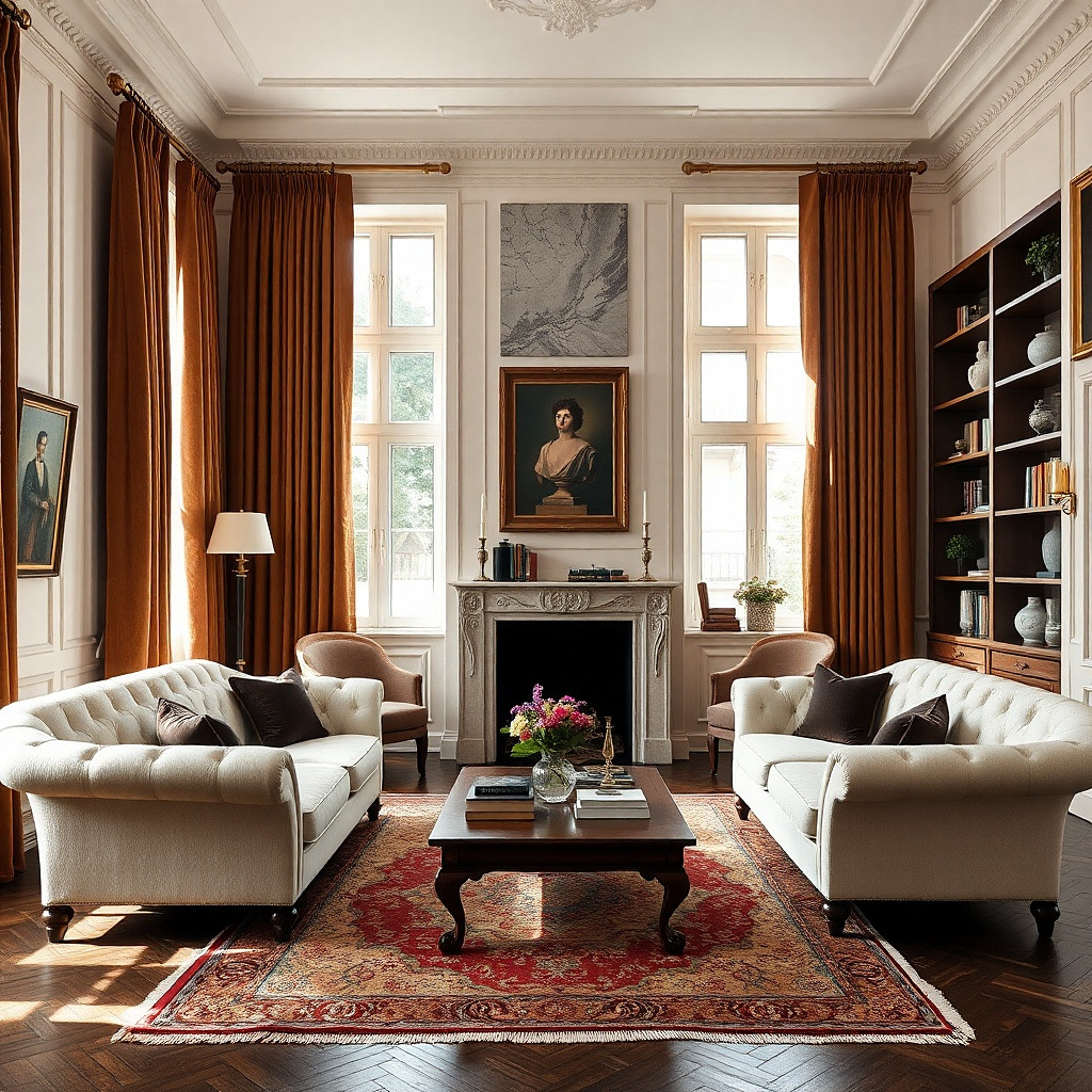
A narrow puddle — about 1 to 2 inches of extra length — gives brown curtains a softer, more dressed look in a formal living room. The extra fabric relaxes the line just enough to feel inviting, especially with velvet, brushed cotton, or lined linen. Brown is a good color for this because the folds create shadow and depth that lighter colors do not show as well. Use this in a room that stays fairly tidy and does not have constant foot traffic across the window wall. It suits traditional rooms, old houses, and any space with a little more ornament.
Start by measuring carefully from the installed rod to the floor in three places because old floors are rarely level. Then order the panels 1 to 2 inches longer than the longest point so the puddle looks intentional instead of accidental. Steam the lower section and arrange the fabric in two or three broad folds, not a messy heap. Keep the top structured with pleats or rings so the softness stays controlled. This is a style choice, so commit to it rather than landing in the awkward almost-too-long zone.
Use this only with fabric that has some drape. Stiff polyester makes a bad puddle.
Avoid puddled curtains in a room where robot vacuums, pets, or kids constantly hit the window area.
14. Milk-chocolate cotton drapes with matching brown trim
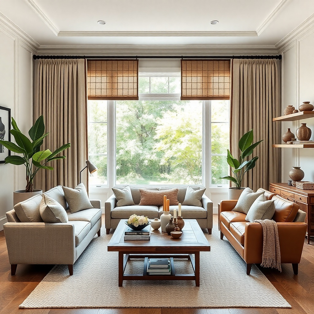
Milk-chocolate cotton drapes with a slim brown tape trim look custom without custom workroom prices. The body of the curtain stays soft and warm, while the trim gives the edges a clean border that sharpens the whole window. This is a strong fix for living rooms that feel plain but do not need a loud pattern. A 1-inch contrast tape in deeper brown, black, or cream adds enough detail to make basic panels look deliberate. The result is polished and photogenic because the eye catches the border first.
Start with simple cotton or cotton-blend panels in a medium milk-chocolate tone. Then add iron-on or sewn grosgrain tape along the leading edges and, if you want, across the bottom hem. Keep the trim narrow. Wide tape turns fussy fast in a living room. Hang the panels with enough fullness that the trim still shows when the curtains are open. This is one of the cheapest ways to fake a custom treatment in a rental or starter home.
Use a darker brown trim if the wall is light. The edge reads cleaner from across the room.
Do not add trim to flimsy sheer panels. The border will pull and ripple.
15. Cocoa brown curtains against olive accents
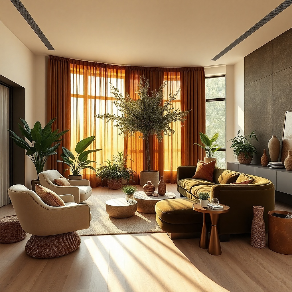
Cocoa brown curtains next to olive accents create a warm, grounded palette that feels natural without leaning rustic. The brown handles the window, and the olive elsewhere in the room keeps the warmth from turning flat. This pairing works especially well with cream walls, medium wood, black iron, and old brass. Visually, cocoa has enough depth to frame the room, while olive adds low-key color that still feels calm. If your living room already has plants, this combination looks connected instead of random.
Start by keeping the curtain solid and letting olive show up in two or three smaller places such as pillows, a throw, or artwork. Then choose cocoa fabric with a matte surface so it sits well next to olive, which already has enough depth. Hang the curtains high and add one wood tone close by — walnut, smoked oak, or medium oak all work. Keep the wall paint warm, not icy, so the palette stays soft. This approach suits renters because you can build the whole look with textiles and accessories.
Try thisStick to muted olive, not bright sage-green with a mint cast. Cocoa needs a dirtier green beside it.
Common mistakeAvoid pairing cocoa curtains with cool emerald velvet accents unless you want a heavier, more formal room.