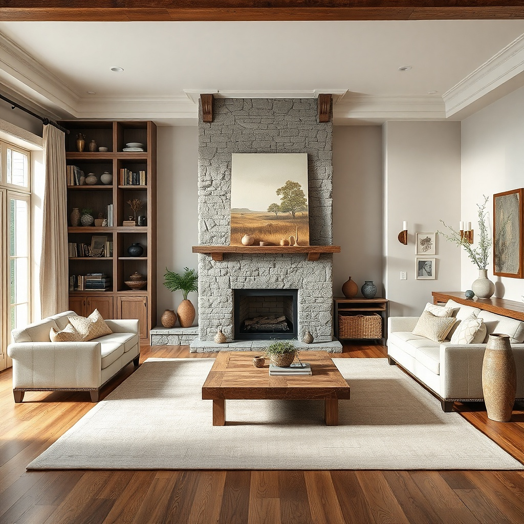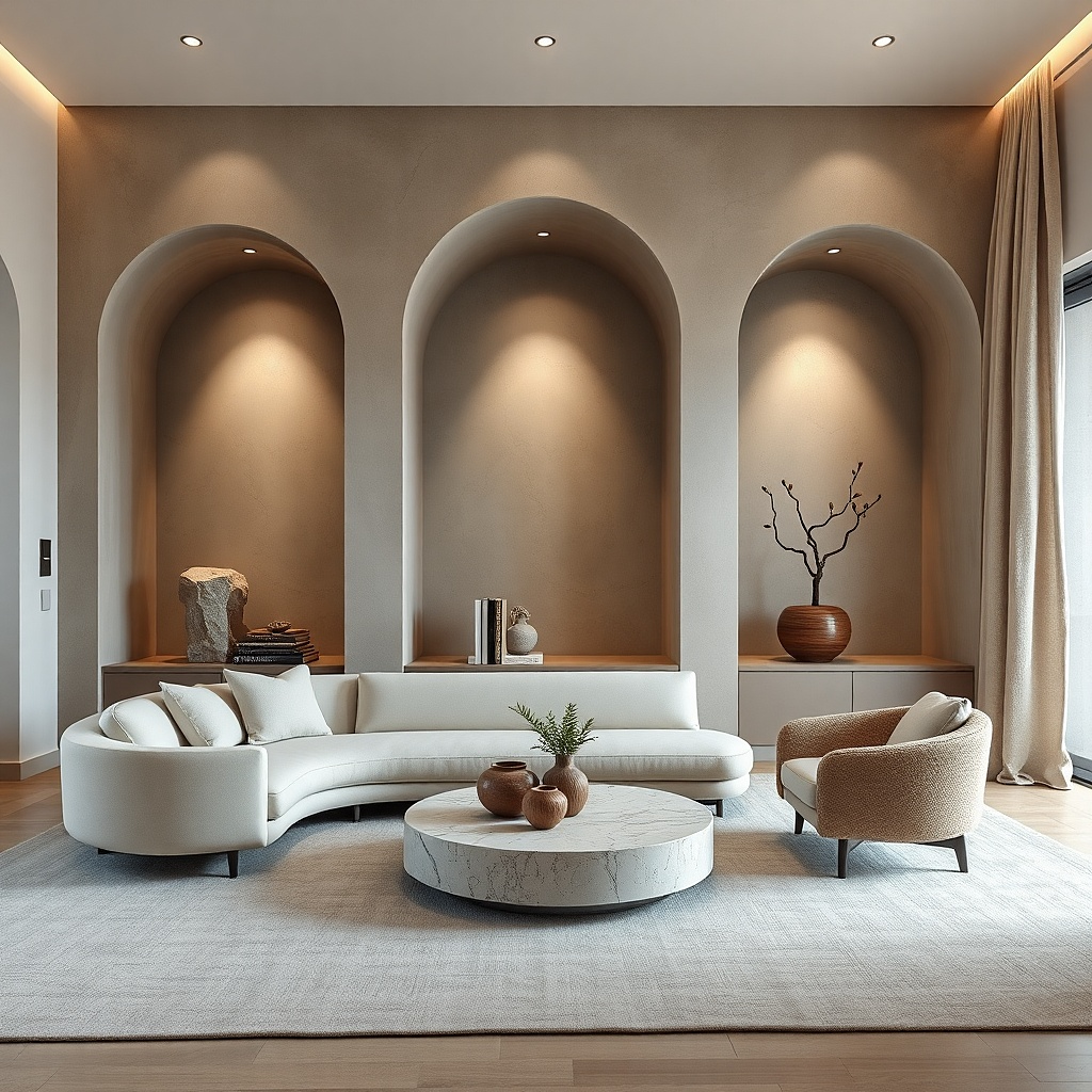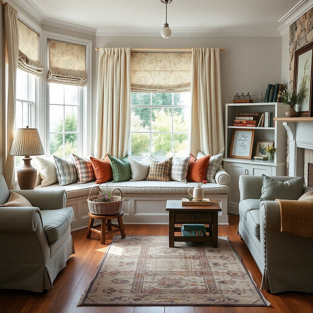
1. Oversized single art that actually fits the sofa
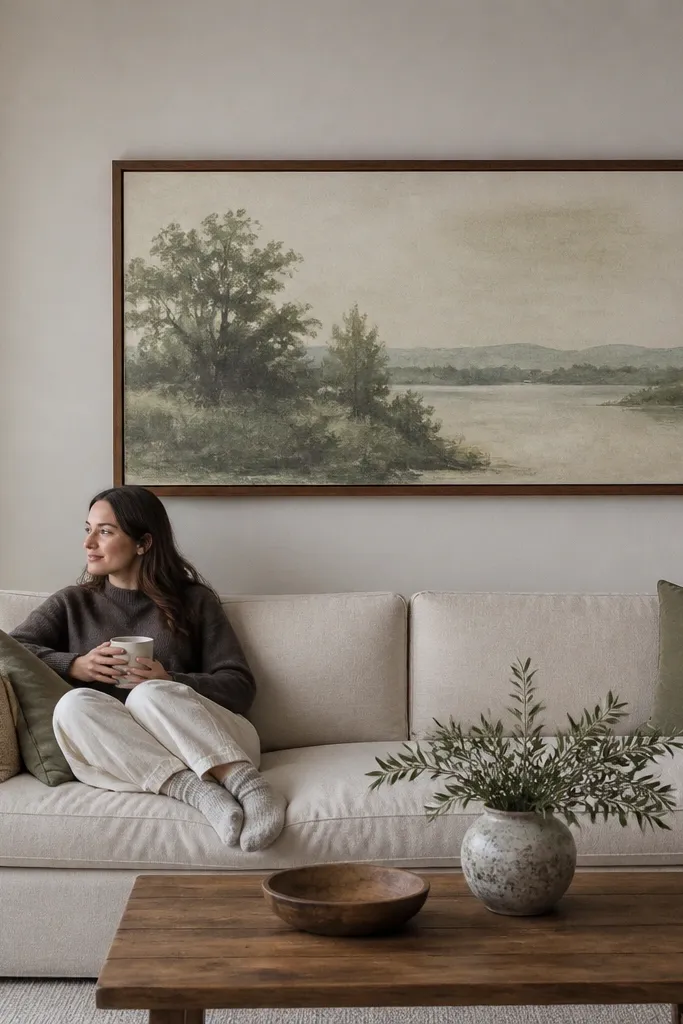
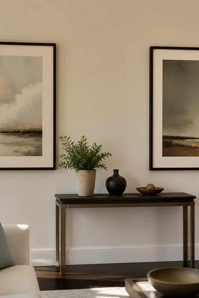
This is the cleanest antidote to “off” walls because it removes most of the spacing math. Choose one large piece instead of three small ones when your wall width is in the 72 to 96 inch range. A framed print with a matte surface and a simple frame color (black, warm wood, or oil-rubbed bronze) reads intentional from across the room. Keep the artwork’s width close to about two-thirds of the sofa width, and you’ll avoid the common mistake of hanging something that looks swallowed by the wall.
Measure the sofa width first, then pick art width at about 60-70% of that number. Find the wall height you need by marking where the center of the artwork should land: roughly 57 to 60 inches from the floor for most living rooms with standard seating. Use painter’s tape to outline the frame on the wall, step back, and confirm you’re not too high. Finally, hang with wall anchors rated for the frame weight; don’t guess on drywall.
Try thisIf your print is glossy, swap it for a matte print or add a matte anti-glare sleeve so daylight doesn’t turn the artwork into a glare patch.
Common mistakeAvoid hanging a small print centered over a large sofa — it makes the wall look unfinished.
2. Gallery wall with a real grid and consistent gaps
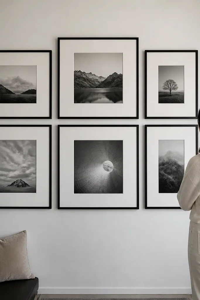
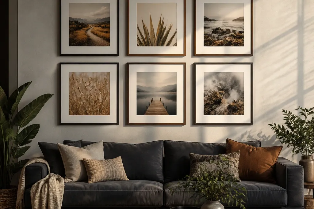
Gallery walls go wrong when every frame looks like it has its own plan. The fix is a grid method: align frame edges or align centers, then keep the spacing consistent so the wall reads as one composition. Use frames in one color family and vary sizes by 1.5 to 2x, not 3x, or the wall starts to look top-heavy. Matte paper prints and non-gloss frames reduce glare so the arrangement stays crisp.
Lay your frames on the floor first and decide the pattern: 2x3, 3x3, or a 4-piece “L” layout for narrow walls. Measure the outside edges of your largest frame and build from there using 2 to 3 inches of gap between frames. Mark a centerline on the wall with a level, then measure from the centerline to each frame’s center point. Tape everything in place, step back in daylight, then mount starting from the largest piece.
Try thisUse the same frame depth across all pieces. Different depths catch light differently and make the “grid” feel uneven.
Common mistakeAvoid mixing random frame sizes with random gaps — it turns into a collage instead of wall decor.
3. Triptych with matching margins for a clean look
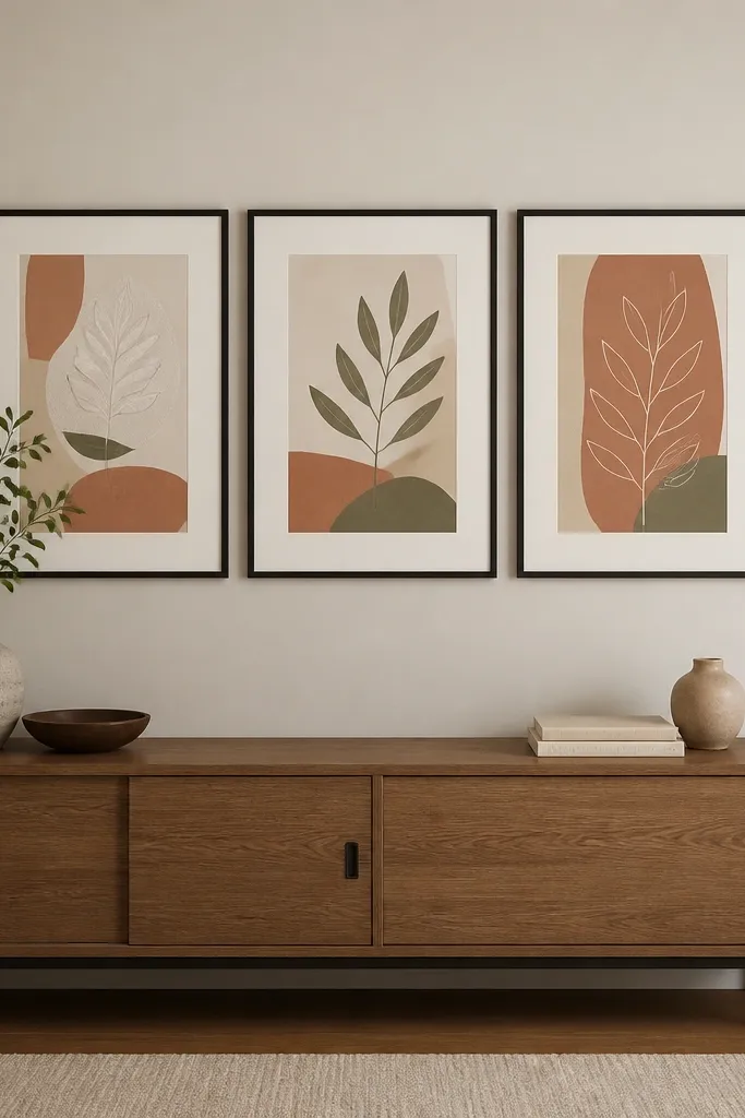
A triptych is one of the easiest ways to get structured wall decor without the workload of a full gallery. The mistake is hanging each panel at different heights or letting the gaps vary. Choose prints that share the same subject palette or line weight so the three panels feel like one story. With a matte finish and a consistent frame color, the triptych avoids the floating pieces look.
Pick a total triptych width that’s about 60-75% of the furniture width below it. Mark the center height for the middle panel, then keep the top edges aligned at the same height for the left and right panels. Set gaps between panels to about 2 inches for standard frames, and keep that gap identical on both sides. Use a template cut from cardboard for spacing, then mount the middle panel first.
Try thisIf your triptych has a glossy print, swap to matte or add a non-glare cover sheet so the panels don’t reflect light at different angles.
Common mistakeAvoid uneven panel spacing — asymmetry in a triptych usually looks like an installation error.
4. Wall mirror placed for light, not just decoration
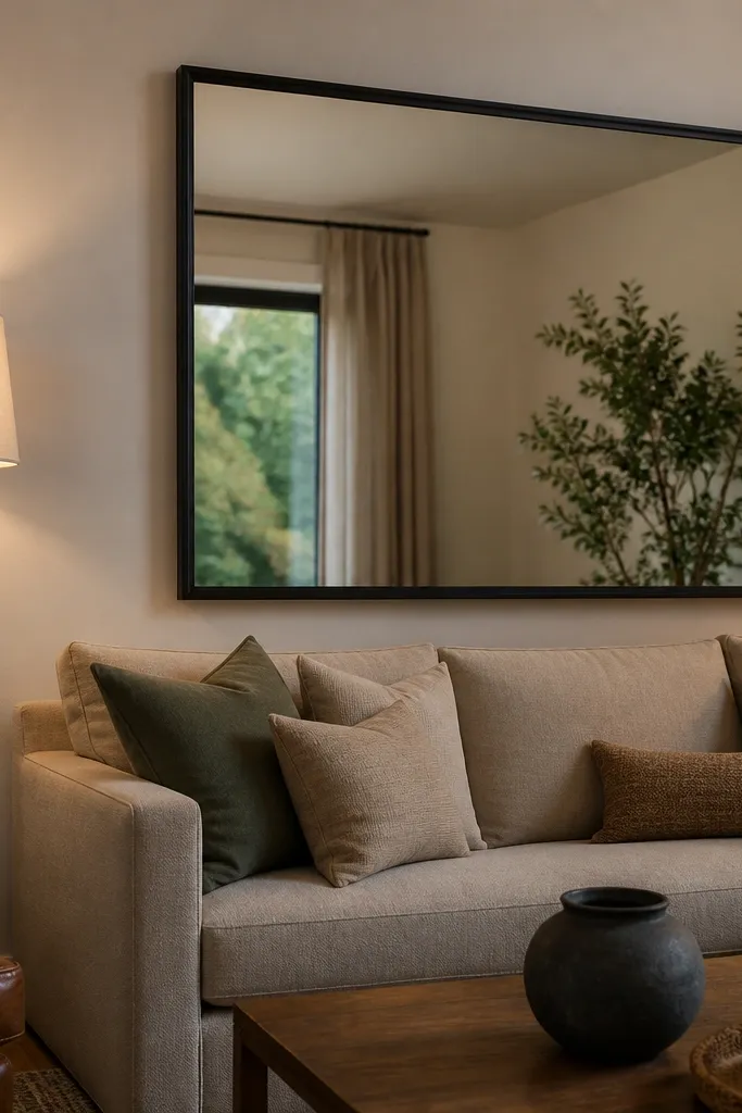
Mirrors fail when they’re decorative only, placed without thinking about what they reflect. A well-placed mirror brightens the wall area and makes the room feel larger, which helps when your living room feels dim or cluttered. Choose a frame that repeats a finish already in the room: black metal with black lamps, warm wood with wood tones, or brushed nickel with similar hardware. Keep the mirror’s height so its center lands near eye level for seated viewing.
Start by standing where you sit and looking at the wall. Place painter’s tape on the wall where the mirror’s frame would sit, then check what it reflects — aim for a window, a lamp, or open space, not a TV screen or clutter. Measure the mirror width so it’s about the same width as the console or slightly narrower, around 70-90% of that width. Hang so the center of the mirror is roughly 58 inches from the floor, then use a stud finder if the mirror is heavy.
Try thisUse a mirror with an anti-fog backing if your living room gets humid near a kitchen or bathroom hallway it keeps the surface clear.
Common mistakeAvoid placing a mirror too high — it reflects ceiling and makes the wall feel top-heavy.
5. Two-tone wall shelves with art above, not cluttered by default
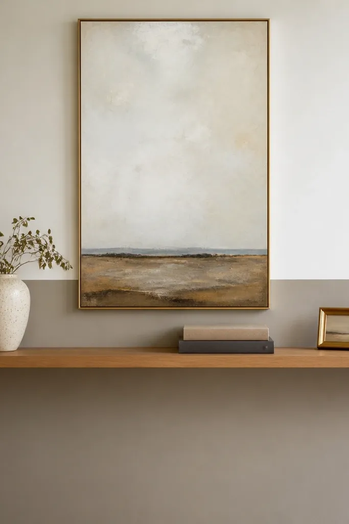
Shelves make walls feel off when they turn into a catch-all. The fix is spacing and visual grouping: keep shelves as one or two curated lines, then balance them with a single piece of wall art above or a mirror to anchor the height. Use shelves with a consistent finish and keep decor objects in a tight palette think ceramic in off-white, a black frame, and one natural wood piece. This keeps the shelf from competing with the wall art.
Choose shelf height so the bottom shelf sits around 12 to 18 inches above the decor surface below (like a console), then keep the top shelf under the art’s centerline. Use floating shelves with hidden brackets and mount into studs for anything longer than 30 inches. Group items in odd counts: 3 objects per shelf group, with one taller piece to break the line. Leave at least 2 inches of empty space between the object group and the ends of the shelf.
Try thisPick one repeating material. If you use black metal frames, choose black metal shelf brackets or brackets that match nearby lighting.
Common mistakeAvoid filling every inch of shelf space — it makes the wall look busy instead of styled.
6. Vertical wall art that fixes low ceilings
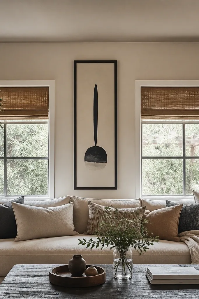
Horizontal art can make low ceilings feel even lower, especially on walls with a short distance from sofa to ceiling. Vertical wall decor adds height without needing extra pieces. Use a tall frame with a matte finish and keep it centered over the sofa or centered between two windows. This approach also solves the common mistake of cramming a gallery on a ceiling-restricted wall — the wall gets crowded fast.
Choose a vertical frame height that’s about 60-70% of the wall height, not the furniture height. Hang it with the center of the artwork around 60 inches from the floor if you want it to read naturally from the couch. If the wall is split by a doorway or window, use a centerline between those architectural elements. Keep the frame width moderate — too wide with a vertical piece can feel heavy.
Use a frame color that matches your trim or ceiling edge if you want the art to feel built-in rather than pasted on.
Avoid stacking multiple small horizontal prints on a low-ceiling wall — it compresses the space.
7. Oversized clock with a calm, matte finish
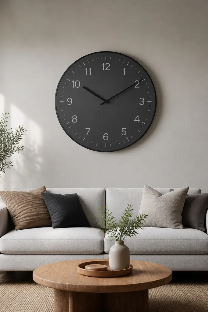
A clock can look awkward when it’s too small or when the hands and numbers fight each other visually. The fix is scale and legibility: pick a clock large enough that the face reads from the seating area, and choose a matte finish to avoid glare. Center it over the sofa like a single art piece, not off to the side next to other decor. This keeps your wall from looking like you decorated it twice.
Pick a clock face diameter around 18-24 inches for most living rooms with a 72-84 inch sofa width. Mark the center height around 57-60 inches from the floor, then confirm it doesn’t collide with light fixtures or ceiling fans. Use the template that comes with the clock for hole placement, and mount into a stud if the clock is heavy. Step back and check legibility in daylight — if the numbers disappear, the finish or color contrast is wrong.
Match the clock frame color to your TV bezel or lamp base metal tone so it doesn’t feel random.
Avoid mixing a clock with a cluttered gallery on the same wall — it competes for attention.
8. Textured wall art using fabric or relief for depth
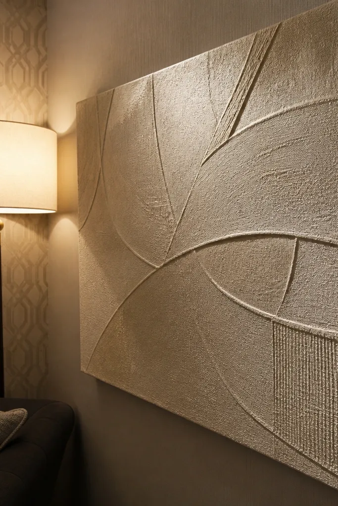
Flat prints can look “off” when they compete with patterned walls, busy rugs, or strong light. Textured wall art creates depth and hides minor alignment issues because the surface catches light softly. Choose materials like woven fabric, relief panels, or canvas with a matte varnish. Keep the color tied to your room’s base palette warm whites, greiges, charcoal, and one accent color. This is a good move when you want wall decor that doesn’t look like it’s fighting the rest of the room.
Pick a piece that’s wide enough to cover about half the width of the sofa if it’s a single anchor, or about 1/3 if you’re pairing it with one smaller piece. Hang it using a French cleat or sturdy wall hooks if it’s light; fabric hangings often need two-point support to stay level. Keep the surface matte and avoid high-gloss coatings that reflect overhead lights. Step back and check from two angles — if the texture disappears from the couch, the color contrast is too low.
Use textured art to calm a wall with lots of pattern elsewhere. If your rug has a busy motif, keep the wall art mostly solid or lightly patterned.
Avoid glossy textured pieces under direct lamps — glare makes the texture look messy.
9. Layered frame trick that prevents floating art
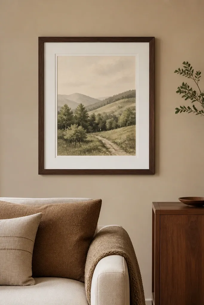
Walls look off when the artwork feels too close to other elements or when the frame is the wrong proportion to the print. A layered frame setup matting plus a slightly different outer frame color creates a buffer that makes the piece read crisp. This works especially well when the wall has a similar color to the frame, which can make the art blend in. Choose a mat color that matches your room’s wall tone (often a warm off-white) and use a frame that contrasts mildly, not wildly.
Choose art first, then order or select a frame with a mat. Use a mat border that’s about 1.5 to 2.5 inches depending on the print size; small prints need thicker mats to avoid feeling cramped. Keep the outer frame color consistent with your existing metal tones. Hang the framed piece so its center aligns with the furniture’s centerline, then use painter’s tape to check clearance from nearby shelves or lights.
If the wall paint is cool (gray-blue), pick a mat with a warm undertone to prevent the whole piece from looking washed out.
Avoid thin mats with thick frames on small prints — it makes the artwork look pinched.