1. Magnetic Knife Strip with Matte Black Rail
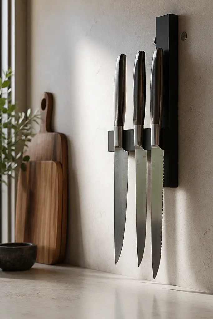
Start by measuring the space between your stove and backsplash outlets, then place the rail so the longest knife sits at least 2 inches below the cabinet bottom. Wipe the backsplash with rubbing alcohol, then mount using the screws provided (don’t rely on adhesive alone). Hang only knives you actually use — five max looks crisp. Finally, add one small canister for frequently grabbed tools and keep the rest of the counter empty.
This works because knives on a magnetic rail turn a messy counter habit into a clean vertical display. The matte black rail adds contrast against a light backsplash without looking heavy. I’ve used this setup in narrow kitchens where counter space is tight, and it immediately reduces clutter because you stop leaving knives out on towels. It also flatters warm-toned wood handles and makes stainless steel look intentional, not random. Keep the rail height so knife tips don’t crowd your eye line while you cook.
Common mistakeDon’t mount the rail too low — if your eye hits the knife line while cooking, the room feels busier.
Try thisAdd a tiny strip of painter’s tape where you plan to mount, then stand back for 30 seconds and check sight lines from the doorway.
2. Under-Cabinet LED Tape in Warm 2700K
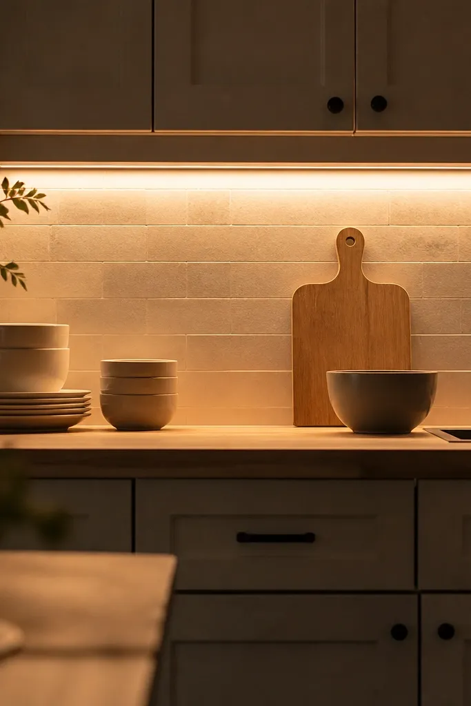
Start by cleaning the cabinet underside with alcohol and planning a straight LED run that reaches both ends of your work zone. Place the tape with the diffuser channel if you can — it prevents bright dots and looks more “built-in.” Connect to a plug-in transformer or hardwire kit, then turn it on and check for dark gaps near corners. Finally, place one reflective surface near the sink — a white tray or a glossy ceramic dish — so the light bounces around.
Small kitchens look bigger when the light hits the counters, not just the ceiling. I installed warm 2700K LED tape under the cabinets in a rental kitchen, and the difference was immediate — it made the room feel like it had daylight even in the evening. Warm light flatters wood cutting boards, cream dishware, and matte finishes like stoneware. It also makes stains and shadows less harsh than cool blue LEDs, which can make tiny rooms feel gloomy. The key is even coverage along the cabinet underside so the backsplash and countertop read continuous.
Common mistakeDon’t choose 6500K daylight bulbs for a small kitchen — the color shift makes walls look dingy.
Try thisUse a dimmer if your LEDs feel too bright at first — even a small dim setting makes the room feel more cozy.
3. One-Layer Open Shelving with Matching Baskets
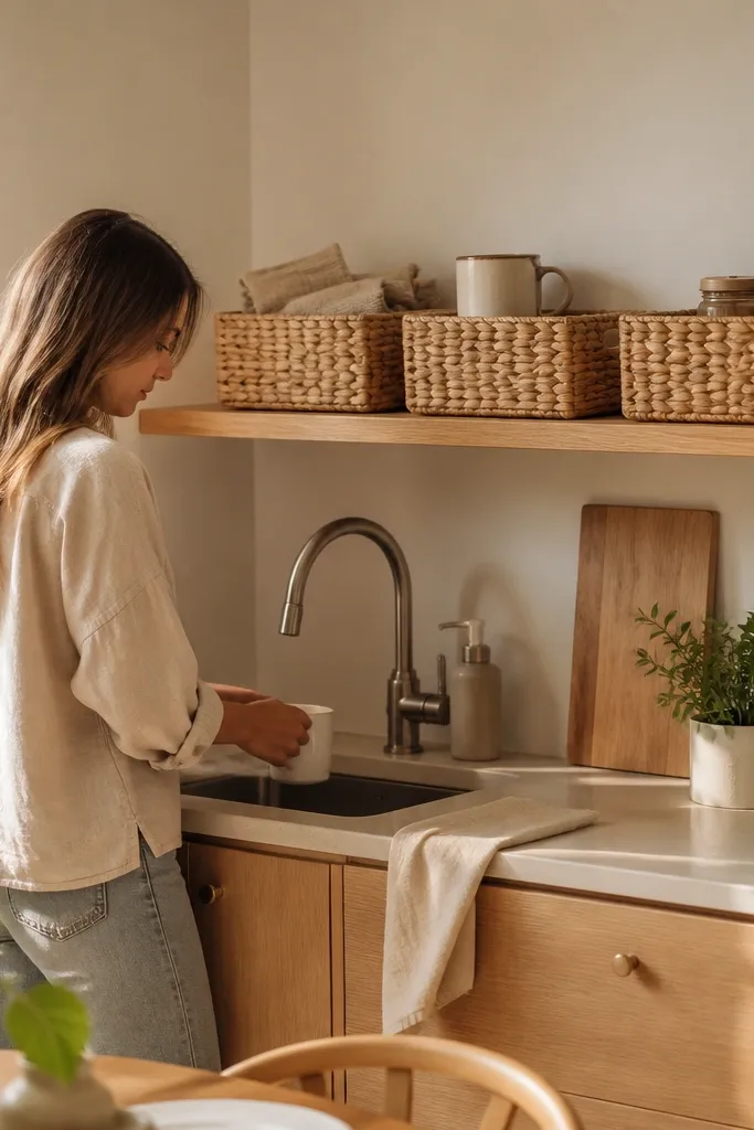
Start by installing a single shelf run at a comfortable reach height — about 18-60 inches from the floor depending on your height. Add a mug rack or hooks so mugs line up, then place baskets with the same height under the shelf line. Keep only daily-use items on the open shelf; everything else goes in closed cabinets. Finally, style with a repeat pattern: for example, 6 mugs all facing one direction and one small plant or ceramic canister at the end.
Open shelving can work in a small kitchen if you keep it to one layer of visual clutter. Matching baskets create a tidy “container” look, so your eyes read order instead of a random grab bag. I like natural woven baskets because they soften the room without adding another color. This also flatters kitchens with warm wood floors or light counters, since the woven texture ties the space together. When you use the same basket size, the shelves look designed even when the contents change.
Common mistakeDon’t stack open shelves with mixed heights and random containers — it turns into visual clutter fast.
Try thisPick baskets that are short enough to avoid blocking sight when you cook — if you bump your shoulder, they’re too tall.
4. Drawer-Front Contact Paper Upgrade in Linen White
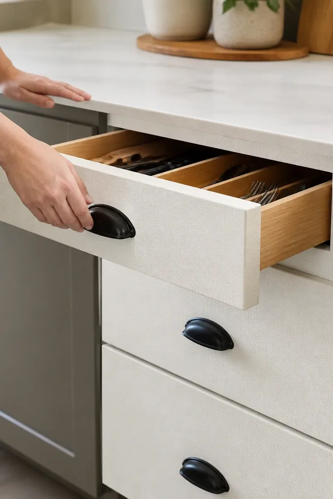
This is the cheapest “face lift” that still looks intentional. Linen-white contact paper with a subtle texture hides minor scratches and makes the hardware stand out. In small kitchens, you see your drawers constantly, so a clean surface makes the whole room feel refreshed. It flatters both warm and cool paint colors because the texture reads neutral, not glossy. I’ve used this on older apartments where cabinets were dated, and it instantly made the kitchen feel cared for.
Start by removing one drawer and cleaning the surface with degreaser, then dry thoroughly. Measure the drawer front width and cut contact paper slightly oversized so you can trim after smoothing. Apply with a plastic squeegee, pushing from the center outward and trimming around the pulls. Finally, reattach hardware and step back to check the edges — crisp corners look expensive.
Use a hair dryer on low heat to help the paper conform near corners and around pull cutouts.
Don’t install contact paper over greasy residue — it will lift at the edges within weeks.
5. Wallpaper Panel Behind the Sink (Peel-and-Stick, 12-Inch Strip)
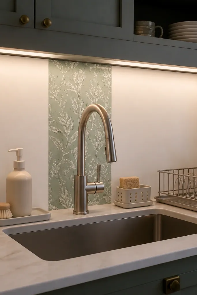
A small wallpaper panel behind the sink adds personality where the eye already lands, without turning the whole kitchen into a busy pattern. A 12-inch strip keeps it controlled, and sage tones look calming while you wash dishes. I’ve done this in tight galley kitchens and it makes the sink area feel like a styled moment instead of just plumbing. The pattern also helps hide minor backsplash discoloration. Brass or matte black hardware looks extra good against sage and cream.
Start by cleaning the backsplash area and measuring a strip that fits between the faucet and the edges of your sink zone — around 12 inches tall is the sweet spot. Apply the peel-and-stick panel straight, using a level so the top line doesn’t drift. Seal the edges with clear caulk if your backsplash gets splashed often, then style the counter with one matching item like a sage soap dispenser. Finally, keep the rest of the decor simple so the panel stays the focal point.
Choose a pattern with large motifs, not tiny busy repeats it reads cleaner from standing height.
Don’t cover the entire backsplash — in small kitchens it makes walls feel closer.
6. Tall Corner Plant Shelf with a Single Trailing Vining Plant
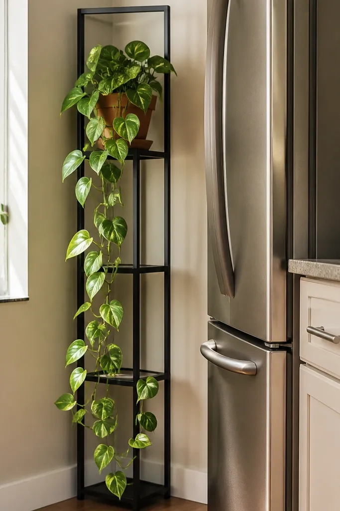
A corner plant shelf uses dead space and adds height, which makes small rooms feel taller. I stick to one plant and one pot style because too many plants look cluttered in kitchens where air and cooking steam are constant. Trailing pothos is forgiving, and the green softens harsh lines from cabinets and appliances. This also flatters warm skin tones in photos because green adds contrast without looking cold. The shelf color matters — matching it to the wall makes the plant feel like it’s floating.
Start by choosing a corner that gets indirect light for at least a few hours a day, then place the shelf so the plant trail doesn’t hit cabinet doors. Use a pot with a saucer or a drip tray, and set the plant slightly back from the shelf edge. Style the area with one extra item only — like a small wooden utensil stand — so the shelf stays airy. Finally, wipe the leaves weekly to remove cooking dust, and rotate the pot every couple of weeks for even growth.
If your kitchen is dry, use a pebble tray and keep water in the tray, not in the pot base.
Don’t put a plant right above a vent — leaf burn makes it look sad fast.
7. Countertop Spice Rack with Chalk-Label Lids
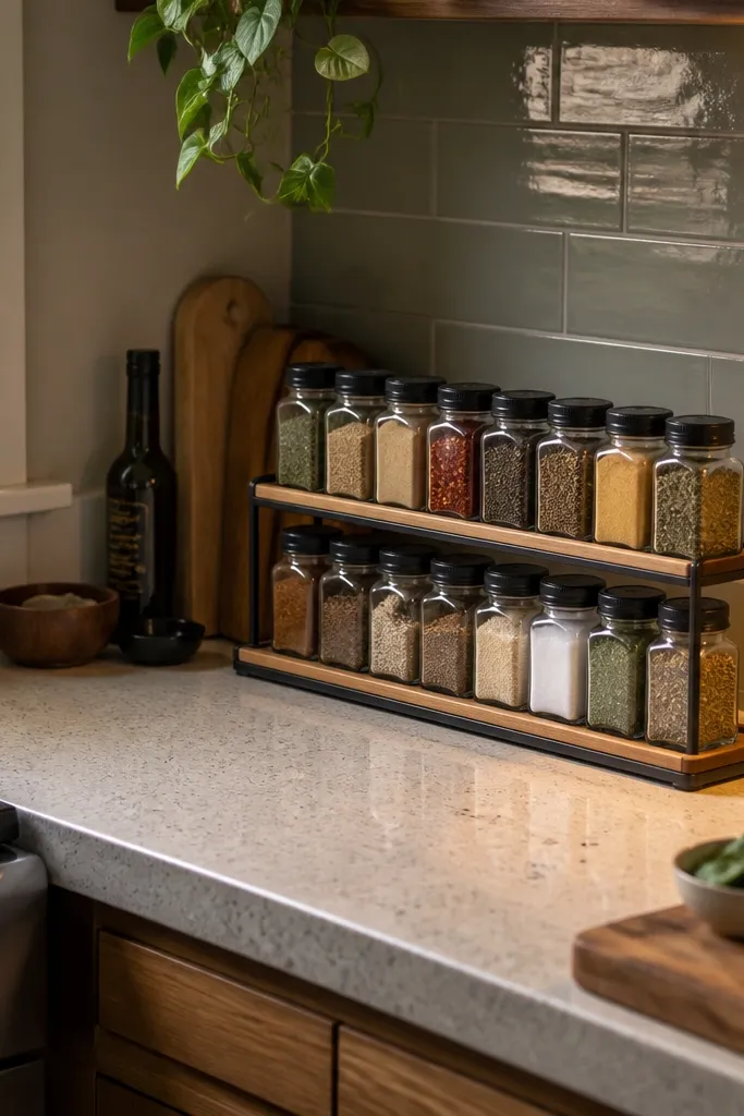
Start by choosing jars that are the same size and finish, then group them by how often you use them. Place the rack on a white tray to protect the counter and to keep the visual line straight. Label lids with chalk marker — write the spice name and a small icon if you want quick sorting. Finally, keep the tray in one spot only and return jars to it every time you cook so the decor stays controlled.
Spice organization is decor when you keep the jar shapes consistent and the labels readable. A slim rack on a tray makes the whole thing look styled, not like storage that spilled out. I’ve used this in small kitchens because spices are one of the first things that multiply when space is limited. Chalk labels look soft and handmade, and white labels pop against darker lids like matte black. It also flatters kitchens with neutral counters because the jars create a tidy vertical rhythm.
Common mistakeDon’t mix jar sizes — it looks like a collection instead of a system.
Try thisUse a scrap piece of paper to write your labels first; once it’s on the lid, erase mistakes quickly with a damp cloth.
8. Plate Wall on One Side Only (3 Plates, One Color Theme)
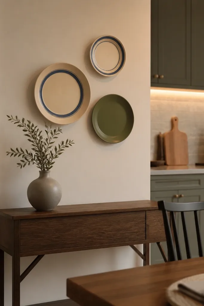
A plate wall makes a small kitchen feel curated without taking up floor space. I use a strict rule: three plates max, hung on one side of the room, and all from one color story. Cream and blue rings look crisp and fresh, while one matte olive plate adds that “grown-up” contrast. This works well for anyone who wants personality but hates clutter. It also flatters small dining areas because the wall becomes the backdrop for meal photos and everyday meals.
Start by picking a wall that’s visible from the doorway or from the dining seat. Measure spacing so the plates form a gentle arc — typically 6-8 inches between plate centers. Mount plates using wire plate hangers or adhesive hooks rated for the plate weight. Finally, style the dining table with one matching element, like blue napkins or an olive runner, so the plate wall doesn’t feel random.
Use painter’s tape to outline plate sizes on the wall before you mount anything.
Don’t hang plates across multiple walls — it makes the kitchen feel boxed in.
9. Dining Nook Runner in One Long Stripe (Fits 12-18 Inches of Space)
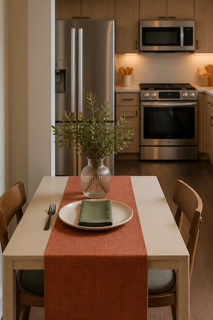
A runner gives you instant dining polish, but in a small kitchen you need restraint. One long stripe reads clean and elongates the space visually, especially on narrow tables. I’ve used muted terracotta on cream because it warms up stainless appliances and doesn’t scream orange. It flatters people’s outfits too — terracotta looks good against most skin tones in kitchen lighting. The runner also hides minor table scratches and keeps the tabletop from feeling bare.
Start by measuring your table top width and choose a runner that leaves 2-3 inches of space on each side. Center it so the stripe runs straight with the table edges. Add one small centerpiece only — a ceramic bowl with lemons or a single stem vase — and keep height under 8 inches so you can see across the table. Finally, match napkins or placemats with one color from the runner, not multiple patterns.
If your kitchen sees spills, choose a cotton-linen blend with a tight weave and wash it cold.
Don’t use a short placemat collage — it interrupts the line and makes the table look smaller.
10. Two-Tier Serving Cart with Only Everyday Items
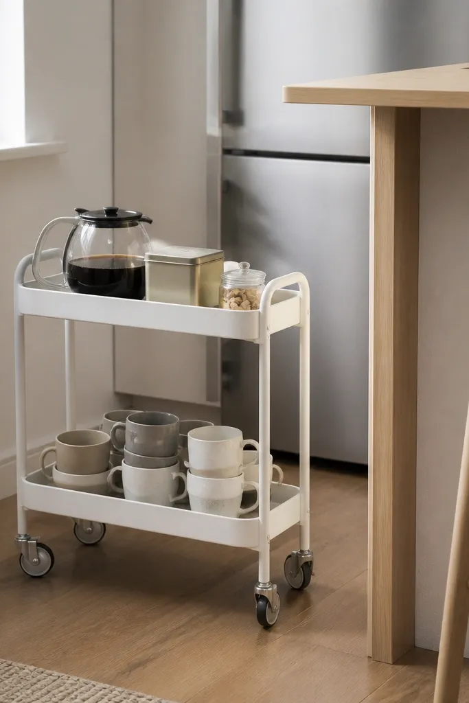
A serving cart is one of the best ways to create “extra surfaces” in a small kitchen. The trick is to keep it to everyday items — coffee, tea, and one snack jar — so it doesn’t turn into storage. I like white carts with simple metal shelves because they reflect light and don’t look heavy. This also flatters compact kitchens because the cart looks like decor even when it’s functional. When you roll it out for guests and push it back, the kitchen stays flexible.
Start by placing the cart where you can access it without blocking a walkway, usually between dining and counter zones. Load the top shelf with the items you grab daily and keep them in one tray so the visual line stays tidy. Put heavier items on the bottom shelf, like a sugar jar or cereal container. Then style the front edge of the cart with one small object — a spoon rest or a mini plant — so it reads intentional.
Use wheel locks if you have tile floors; a slightly unstable cart makes everything feel chaotic.
Don’t stack loose items on the lower shelf — it turns into a clutter basket.
11. Under-Sink Pull-Out Bins in Clear + White
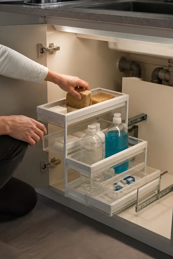
Start by measuring the cabinet opening width and depth, then buy bins that slide without scraping the plumbing. Install pull-out rails if your cabinet is basic wood — it upgrades the experience a lot. Label each bin with a small tag and keep only two categories per bin. Finally, store the least-used items at the very back, and keep daily-used bottles at the front for quick access.
This is decor that you don’t see all day, but you feel it immediately because the kitchen looks cleaner when everything has a home. Clear bins show contents without making the cabinet look chaotic, and white frames blend into most under-sink spaces. I use this setup in small kitchens because under-sink clutter spreads quickly — it ends up on counters. When you keep cleaning supplies contained, your counter stays photo-ready. It also works for older homes where pipes make the space ugly; bins hide the mess.
Common mistakeDon’t overfill bins; if they bulge, you’ll stop using them and clutter returns.
Try thisUse a waterproof liner under the bins if your sink ever leaks — it saves you from panic cleanups.
12. Slim Rattan Utensil Holder with Wooden Spoon Set
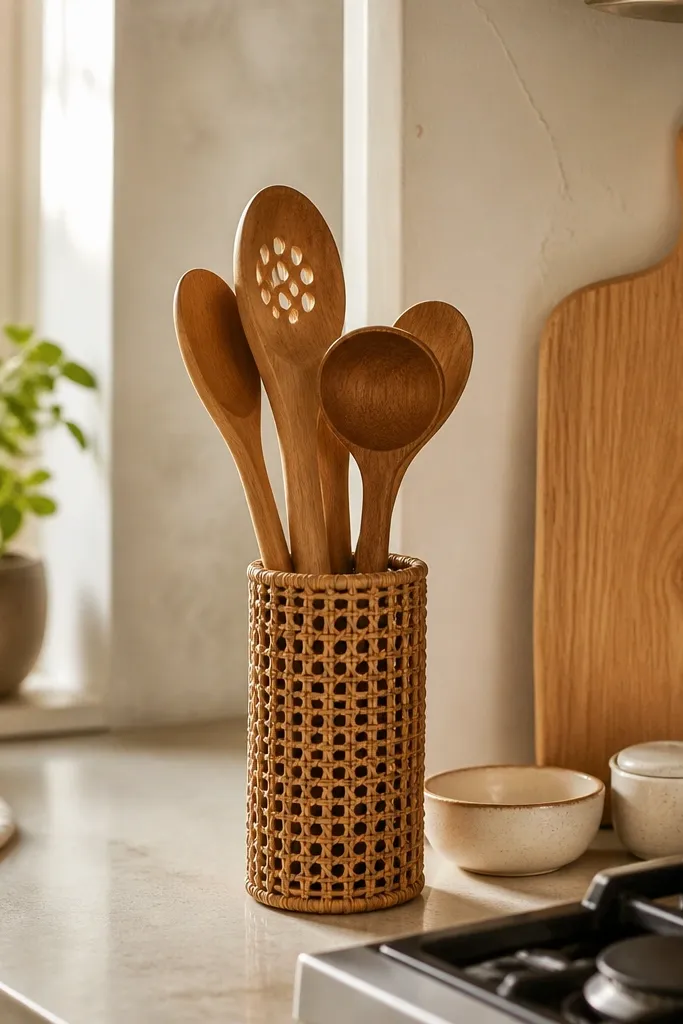
Start by picking a utensil holder that’s narrow enough to leave space for a cutting board. Add only tools you use weekly, like spoons, a spatula, and a ladle — no junk drawer extras. Place the holder near your stove but not on the path you walk between sink and fridge. Then set one small ceramic dish for a spatula so it looks styled instead of randomly leaning.
This is small-kitchen decor that makes cooking feel warmer. Rattan has texture without adding a lot of color, and it looks right next to wood boards and ceramic dishes. I’ve seen wooden spoon sets make kitchens feel lived-in — like someone actually cooks there — without adding clutter. The slim holder matters: in tiny kitchens, a wide ceramic crock eats counter space fast. This works for most people because wood tones match a range of skin tones and warm lighting makes it look cozy.
Common mistakeDon’t mix metal and wood in the same holder; it looks messy unless the pieces match.
Try thisWipe wooden utensils after use and let them dry upright — it keeps the wood looking clean and prevents odor.
13. Cabinet Door Chalkboard Labels (Simple White + Black)
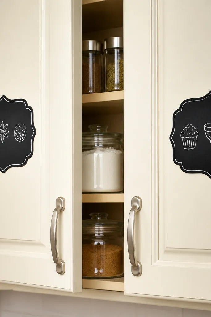
Labeling cabinet doors turns storage into a design feature. In a small kitchen, you open cabinets constantly, so legibility matters and it reduces rummaging mess. I like black chalkboard labels on cream doors because it creates crisp contrast without extra color. Chalk lettering looks hand-done and softens the kitchen’s hard edges. This also helps households with kids or roommates because everyone finds things faster, which keeps counters from accumulating stray items.
Start by cleaning the cabinet door surface and placing labels where you can read them without bending. Write the label text in white chalk and keep the words short: one to two lines max. Use a straight edge to keep lettering aligned and let it set. Finally, match the label style with one other black element in the kitchen, like matte black pulls or a black tray, so it feels intentional.
Take a photo after you apply labels so you can spot uneven spacing before the chalk smudges.
Don’t label everything — too many signs make the kitchen feel like a pantry poster.
14. Hanging Pot Rack with Two Pots Max (Stove-Side Placement)
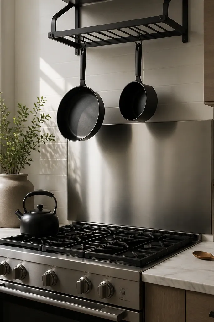
A pot rack can look great in a small kitchen when you keep it to two pots. More than that turns into a heavy visual cluster above your work zone. I mount racks on the stove side because it draws the eye upward and gives the cooking area a focal point. Matching pot finishes — like matte black or brushed stainless — make the rack look designed. This works for anyone who has a lot of pots but hates counter clutter because hanging them frees cabinet space and keeps daily cooking gear visible.
Start by checking ceiling clearance above the stove and measuring the pot handles so they don’t hit cabinets or lights. Hang two pots only and space them so there’s a gap of about 3-4 inches between handles. Use hooks rated for the pot weight and install into studs. Finally, clear the adjacent counter so the hanging pots become the only “metal display” up top.
Hang your most-used pot closest to the front so you don’t reach across the stove every time.
Don’t hang lids too — lid stacks look messy and block the clean lines.
15. Clear Glass Canisters with One Shared Lid Color
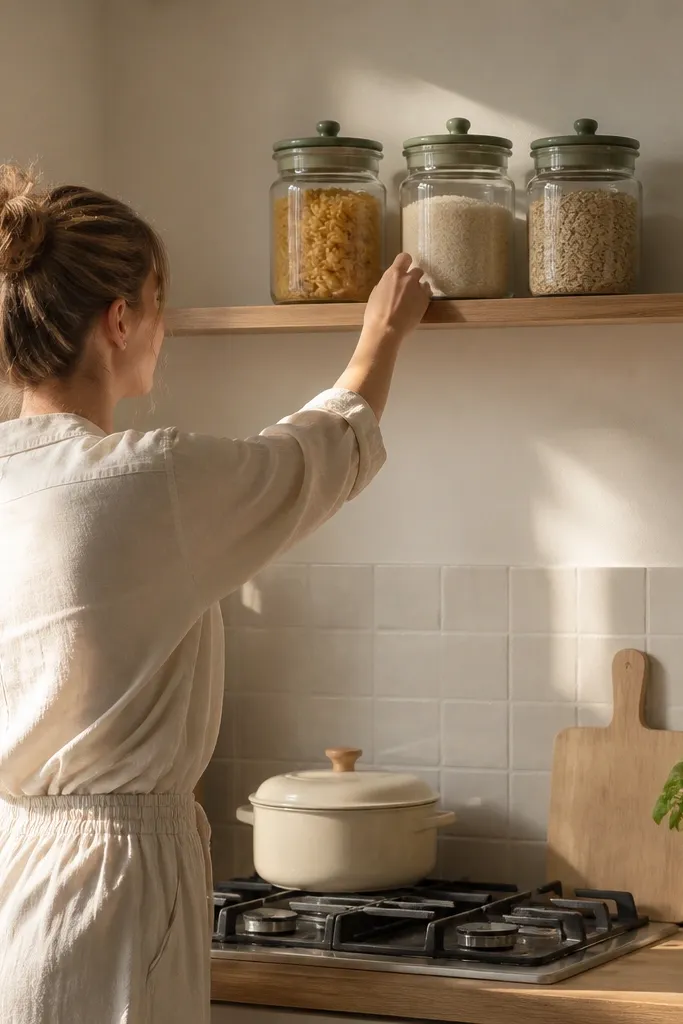
Clear canisters create order because they show what’s inside while keeping the color palette controlled. When all lids match, the shelf looks cohesive even if the contents change. I’ve used this on small shelves where you can’t hide pantry items, and it looks neat instead of messy. Glass also catches light, which helps brighten kitchens that don’t get much sun. This setup flatters kitchens with light walls and any hardware finish because the lids unify everything.
Start by choosing canisters that fit your shelf depth and leave 1 inch between the back wall and the canister. Pour dry goods into canisters and wipe the glass so it’s streak-free. Add labels on the front at eye level and keep font consistent. Finally, keep only three canisters on the shelf — more makes a small kitchen feel crowded.
Use a damp microfiber cloth with a tiny bit of vinegar on the glass for clean shine.
Don’t use colored canisters with mixed lid colors; it turns into a rainbow pantry.
16. Heat-Proof Counter Mat in Cream with Black Dots
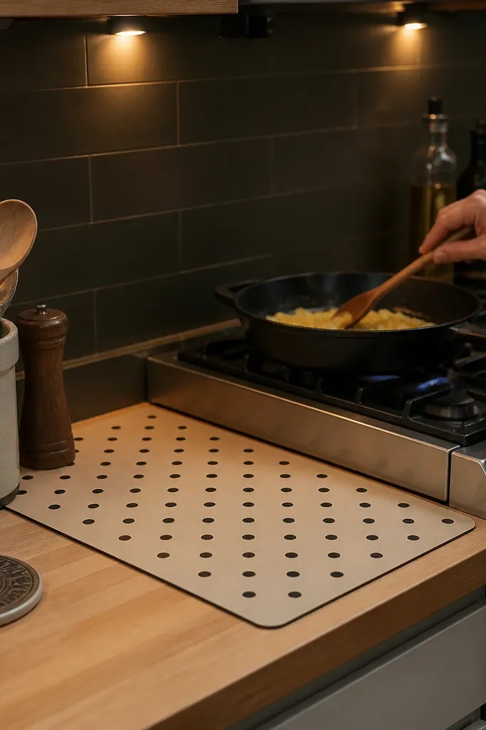
Start by measuring the space next to your stove where you place hot pans, then choose a mat that fits that area with about 2 inches of breathing room. Place it on the counter and keep it in the same spot so it becomes part of your routine. Add one matching element nearby like a black spoon rest or black-lidded canisters. Finally, clean the mat with mild soap and let it dry flat so it stays smooth and doesn’t curl.
This is decor that earns its keep because it solves a real problem — hot pans and counter stains — while looking intentional. Cream with black dots hides small spills and looks graphic without being loud. I’ve used these mats in small kitchens because they protect the counter edge and create a designated “hot zone” while cooking. It also flatters matte black hardware and stainless appliances, since the dots echo that contrast. The result is a kitchen that looks styled even on busy weekdays.
Common mistakeDon’t put a large mat that covers your entire prep zone; it steals working space.
Try thisIf your mat curls, weigh it under a cutting board for a day after washing.
17. Corner Floating Shelf with Slim Cutting Board Display
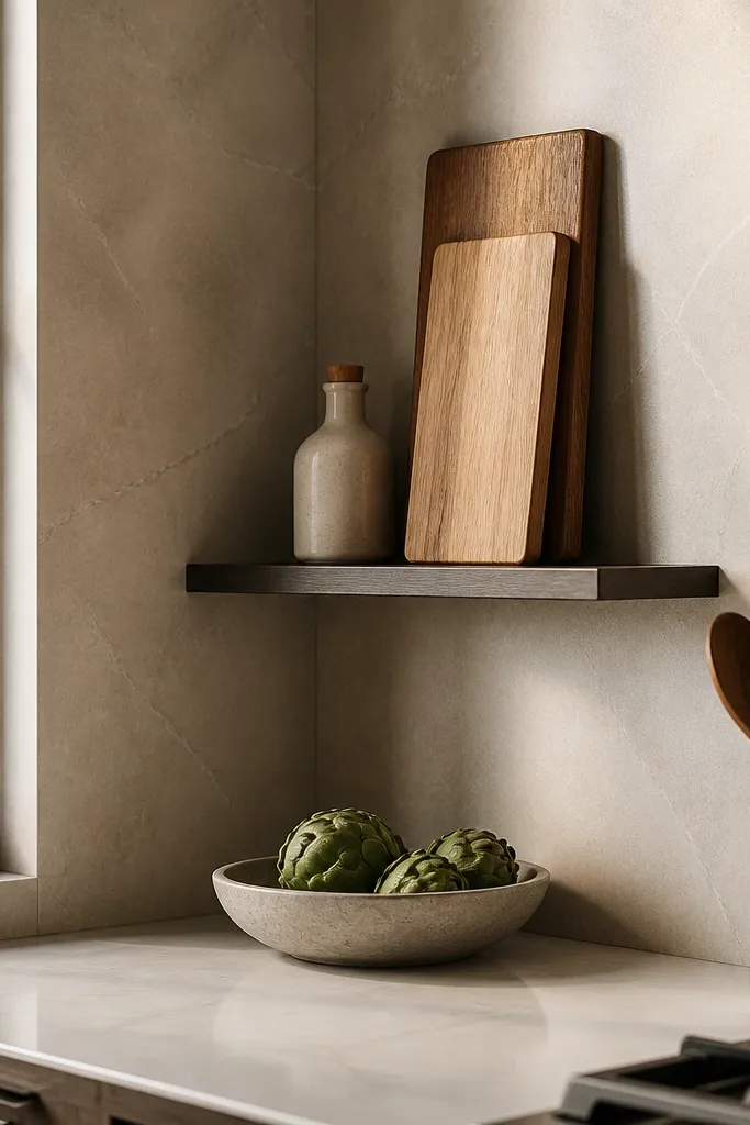
Start by choosing boards that match in thickness and finish, then measure the corner shelf depth so boards don’t stick out. Install the shelf with level — corners look off fast if one side is higher. Lean the boards with the shorter edges visible, and leave a small gap between them. Add one small object only, like a white vase with one stem, then keep the shelf uncluttered so it looks like decor, not storage.
Cutting boards look better when you display them intentionally instead of stacking them in a drawer. A corner floating shelf uses awkward space that’s hard to reach, and it adds height without taking counter room. I like slim boards because they read refined and don’t look bulky. This setup works especially well in kitchens with narrow counters because the boards become wall decor. It also flatters warm woods and brings warmth to cool tile backsplashes.
Common mistakeDon’t display wet boards; they warp and stain the wood finish.
Try thisUse felt pads where boards touch the shelf to prevent scuffs.
18. Dining Table Place Setting with One Color Napkin Roll
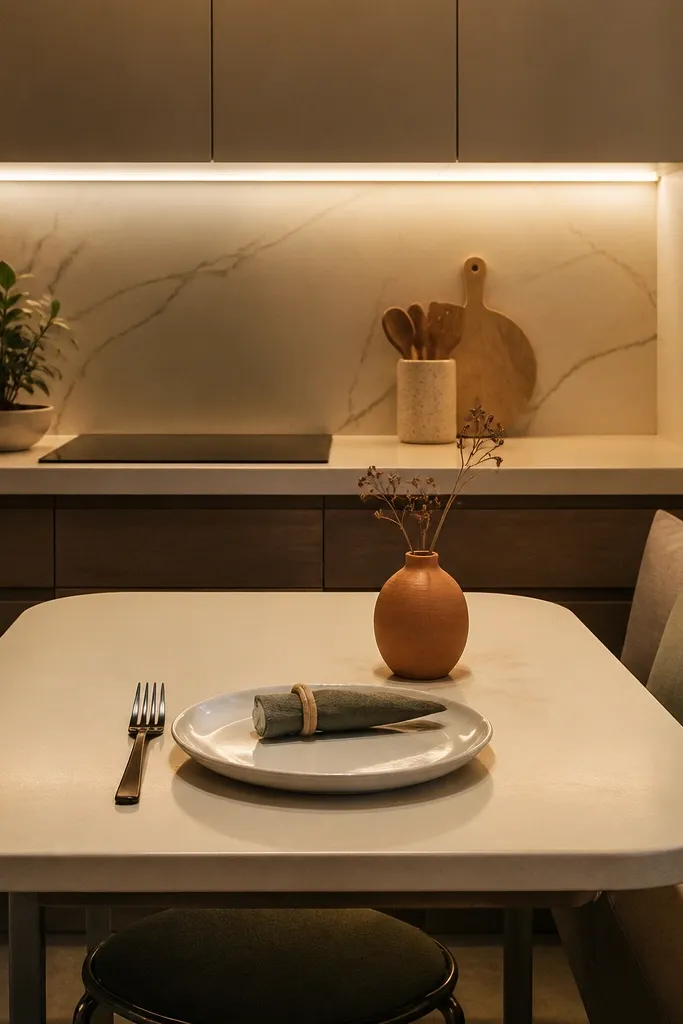
A place setting looks expensive because it’s structured, not because it has lots of items. In a small kitchen dining nook, you can create that structured look with one fabric color and one plate style. I like cream-and-sage because it pairs well with matte black forks and warm lighting from under-cabinet LEDs. This works well for anyone hosting casually because it makes the table feel ready without changing your whole kitchen. It also flatters the space visually by keeping the table surface clean and repeating the same shapes.
Start by choosing plate style — simple white or off-white works best for small rooms because it reflects light. Fold napkins into a tight roll and keep them the same size for both seats. Place a small salt or condiment box in the center and keep any extra decor off the table. Finally, add one runner or placemat only if it doesn’t crowd the surface; roll the napkins so they sit above the plate rims.
Iron napkins lightly and store them flat so the roll holds its shape.
Don’t pile centerpieces and candles on a tiny table; you lose the structured look.
19. Stove Shelf for a Single Stack of Cookbooks
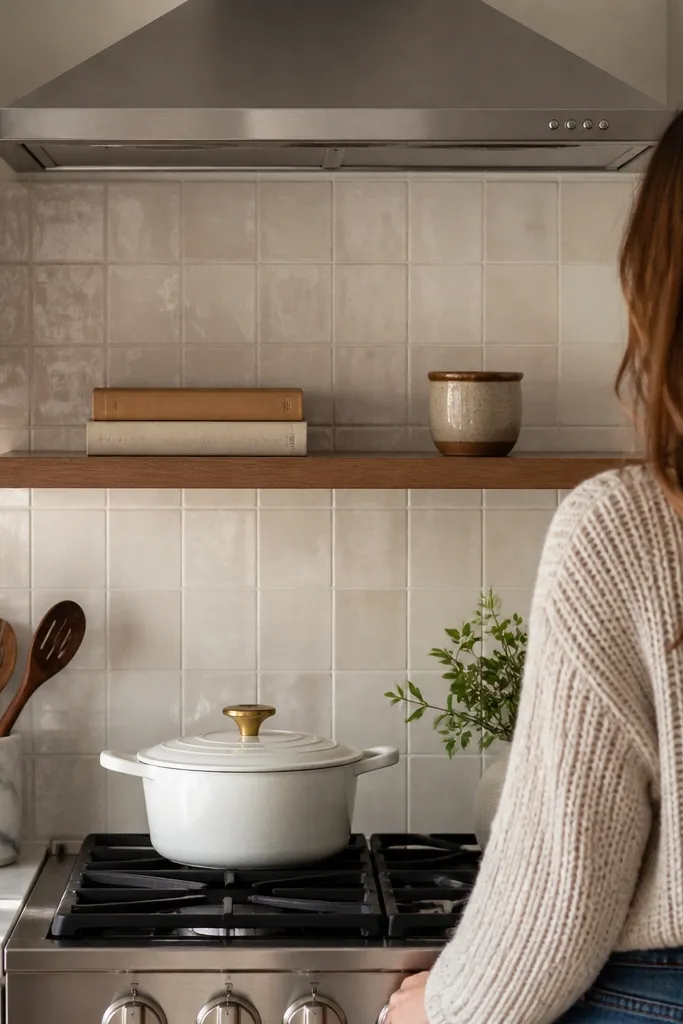
Start by measuring the space above the stove and selecting shelf brackets that fit under your cabinet line. Place the cookbooks with the same bottom alignment so the stack looks straight. Add one object in front that matches your accent color — like a matte black timer or cream ceramic dish. Finally, step back and check that the shelf doesn’t block the range hood or light fixtures.
If you love cooking, a small shelf above the stove can feel personal without looking cluttered. The trick is to limit it to a stack of two cookbooks and one small object, then keep the shelf surface otherwise empty. I’ve done this in small kitchens where the wall above the stove is blank, and it creates a homey focal point. Choose cookbooks with calm spines — cream, black, or muted green — so the shelf doesn’t fight your cabinets. This also flatters people who like a lived-in look but hate decorative clutter.
Common mistakeDon’t add a row of random items; shelves above stoves look messy fast.
Try thisUse a small museum putty under the timer so it doesn’t slide when you bump the shelf.
20. Pegboard Wall with Hooks for Everyday Tools
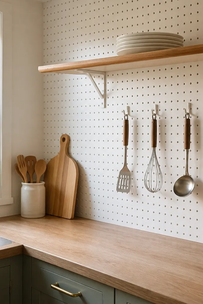
Pegboard makes small kitchens feel organized because it turns loose tools into a system. I like white pegboard because it doesn’t steal attention the way raw wood can. Hanging your most-used tools keeps your counters clear and makes the kitchen look “set up” even when you’re mid-cook. This works for warm and cool palettes because the pegboard is neutral, and you can repeat your accent color in bins or labels. It also flatters busy households where tools multiply quickly — hooks keep them visible and easy to return.
Start by marking your pegboard spacing and placing hooks where your hands reach naturally from the counter. Hang only daily tools first, then add one towel rod using clips or a small dowel. Add two small bins below for essentials like tea bags or spare filters, keeping them the same color. Finally, remove any duplicate tools from drawers so pegboard becomes the default storage.
Hang frequently used tools at mid-chest height so you don’t keep reaching up and knocking items.
Don’t fill every hole; pegboard looks best when there’s breathing room between hooks.
21. Roll-Up Dish Towel on a Vertical Bar (No More Hanging Clutter)
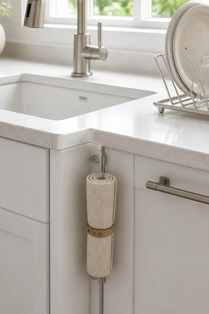
Towels look better when they’re rolled and stored vertically. In small kitchens, hanging towels from cabinet handles creates a visual tangle, especially when you also have dish racks and jars. I use a vertical bar next to the sink because it keeps the towel within reach while leaving cabinet hardware clean. Cream linen looks good in bright light and also hides minor stains better than bright white. It flatters almost every kitchen palette because linen reads neutral and textured.
Start by installing a slim vertical bar or using a tension bar that fits your cabinet side. Roll your dish towel tight so it doesn’t droop, then secure it with a small clip or elastic loop. Place your sponge in a matching ceramic cup so the sink zone looks styled. Finally, keep the dish rack area minimal — one tray or one utensil cup — so the towel bar becomes the main visual in that corner.
Roll towels the same direction every time; consistency makes the sink area look calmer.
Don’t drape towels over the faucet — it looks messy and blocks water flow.
22. Matte Ceramic Soap Dispenser + Matching Toothbrush Cup
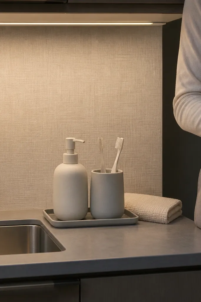
Start by wiping the sink ledge and placing the soap dispenser slightly to the side of the faucet so it doesn’t block your hand. Add the matching cup next to it with only scrub tools you actually use. Choose a color that matches one element in the kitchen, like the drawer label text or the runner stripe. Finally, keep the rest of the counter empty — no extra candles or clutter — so the matching set stays the focal point.
This is the simplest way I know to make a sink counter look finished. When the soap dispenser and cup match in material and color, your brain reads the area as designed instead of random. I choose matte ceramic because it doesn’t glare under LED lighting and hides minor water spots. Off-white and soft gray work well with most cabinet colors, and matte finishes look expensive even when they’re budget-friendly. It also helps you keep the sink zone tidy because you have fewer items to place.
Common mistakeDon’t mix glossy plastic dispensers with matte ceramics — it looks mismatched in small spaces.
Try thisRefill with a funnel and wipe the rim after pouring; soap drips make matte ceramics look grimy fast.
23. Small Galley Tabletop Extension with Folded Legs
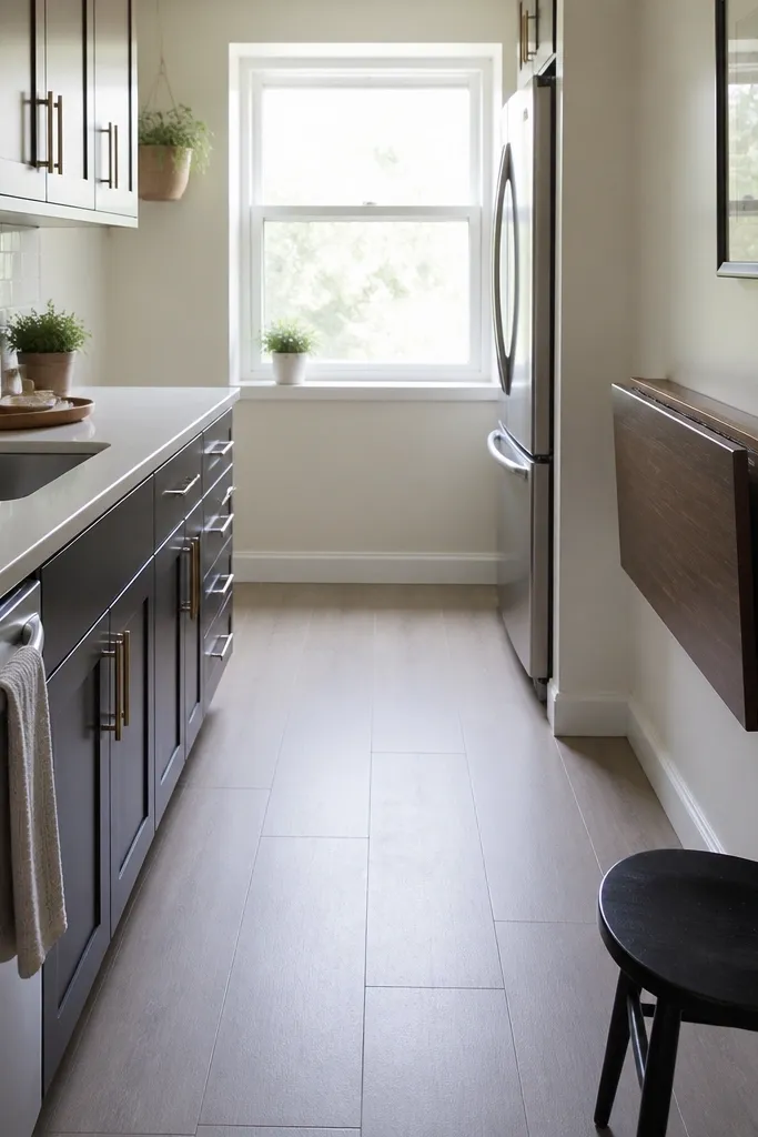
Start by measuring the available walkway when the table is extended — keep that 30-inch clearance as your non-negotiable. Choose a table surface width that seats two comfortably, then add a runner that fits only the extended section. Place chairs tucked in under the tabletop when not in use. Finally, store dining items in a nearby cabinet or cart so you don’t leave them out and crowd the room.
If you’re working with a tiny kitchen eating area, a fold-out or extension tabletop changes everything because it gives you space only when you need it. I’ve used a compact extension in a narrow kitchen where the dining table used to block the walkway. When the legs fold in, the room feels open; when it’s out, you get a real place to eat. Styling is simple: one runner, two place settings, and nothing else. This approach works for small homes with limited storage and makes the kitchen feel functional without permanent clutter.
Common mistakeDon’t style the table when it’s folded away — keep everything stored so the kitchen stays open.
Try thisUse felt pads on chair legs so moving them doesn’t scratch or snag on the floor.
24. Rail-Track Pantry Makeover Using 1-Inch Bins and a Ceiling Shelf
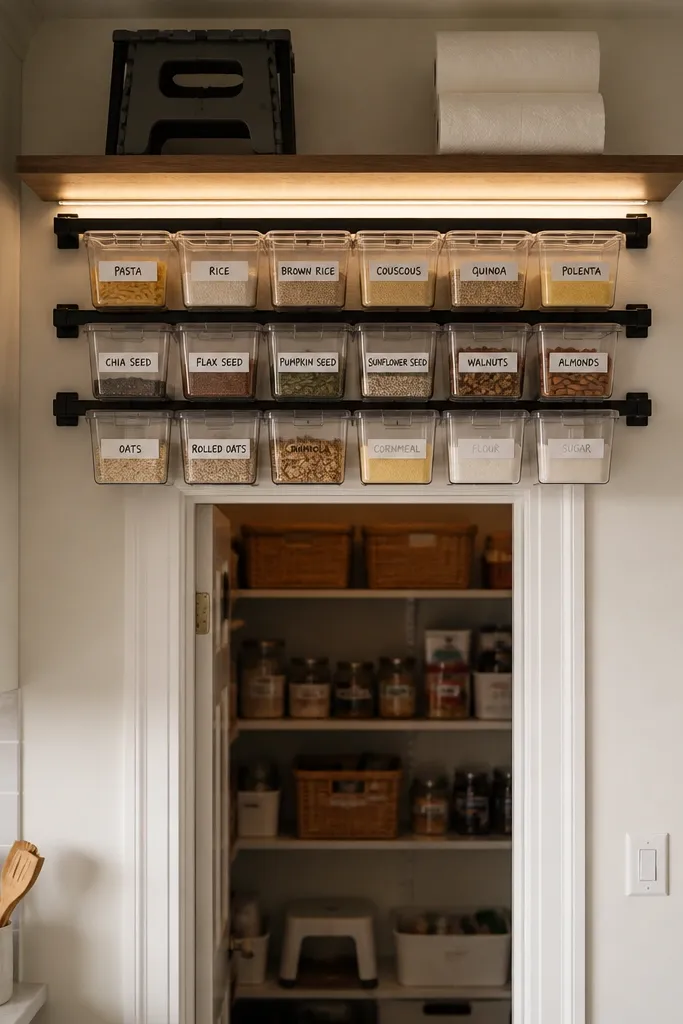
Step one is choosing your rail height and your bin size. I mount the rail 78-80 inches from the floor so the top row is reachable with a step stool, then I use 1-inch bins for spices, packets, and snack bags. Step two is making the rail level and secure — I mark studs or use heavy-duty anchors where studs are missing, then screw the rail every 16 inches. Step three is adding a narrow ceiling shelf above the rail and keeping it for supplies you don’t touch daily, like paper towels and extra trash bags. Step four is labeling with white painter’s tape and black marker, one bin per item category so you can reshelve fast.
I did this in a kitchen where the pantry was basically a closet shelf with dead space above it. A ceiling rail track lets you pull items forward without digging, and the bins keep small stuff from migrating into corners. I like the look because it reads clean from the doorway — everything is in the same visual system, not a mix of random containers. It also works for budget small kitchen decor ideas because you’re buying one rail and standard bins, not redoing cabinets. When you install it high enough, you gain storage without stealing counter space.
Common mistakeDon’t mount the rail using only drywall anchors — it will loosen after you slide full bins in and out.
Try thisUse clear bins for the first pass, then switch to matching colored bins only after you know your most-used items. Label the bin lids too if the bins stack.
25. Magnetic Spice Drawer Inserts That Slide Out Like a Mini Tool Chest
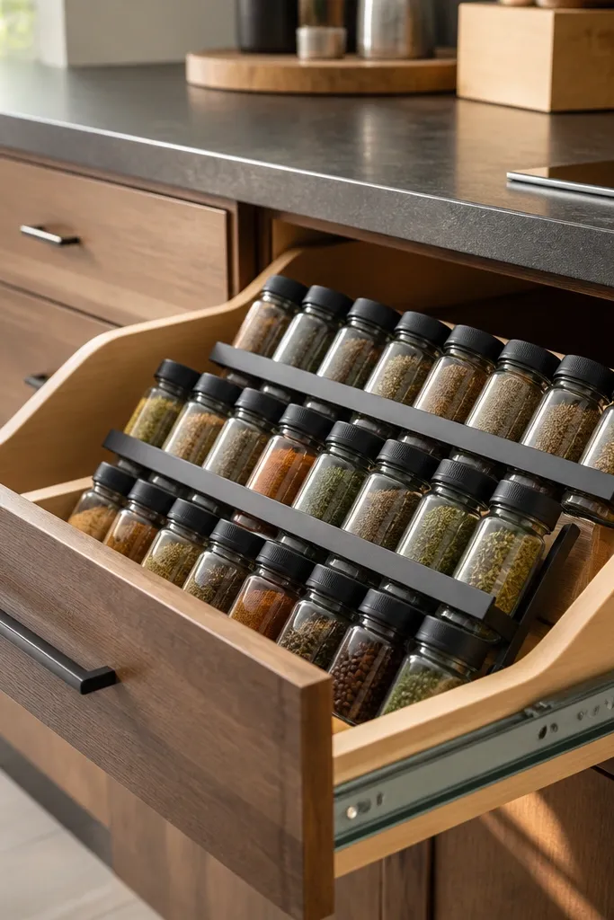
This is the storage fix I use when spice bottles clutter the counter or roll around in a deep drawer. You build one insert that holds everything upright, then the whole insert slides out so you can grab and close without dumping jars. Magnetic strips keep the containers from tipping when the drawer gets bumped, which happens constantly in small kitchens. It looks tidy because the containers sit in the same plane and height. It is budget-friendly because you’re using common drawer materials plus magnets, not buying a new cabinet system.
Step one is measuring your drawer and deciding how many slots you need. I aim for containers that are 2-3 inches wide each, then I plan 5-8 slots depending on drawer width, leaving 1/2 inch gaps so bottles don’t scrape. Step two is building the insert base from melamine or plywood and adding a front pull — I attach a small aluminum pull so it doesn’t flex. Step three is installing magnetic strips: I cut thin strips to match each slot and glue them to the insert with construction adhesive, then test container pull strength before final assembly. Step four is fitting small labels to the front of each slot so you can restock by slot number instead of by memory.
Buy containers with flat metal lids or add magnetic lid rings — magnets won’t hold well on glass-only lids.
Don’t use super-strong magnets without testing first — you can crack thin lids when you pull the container out.