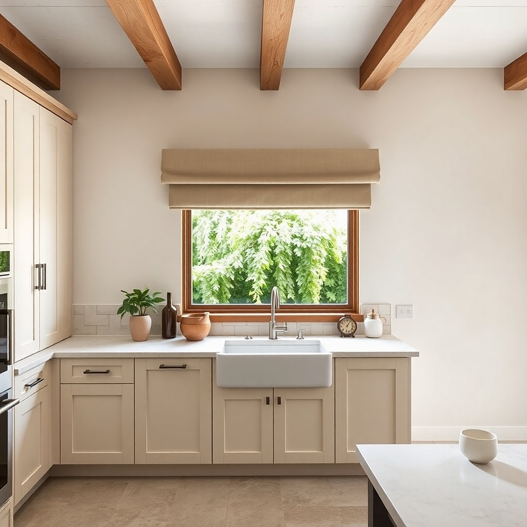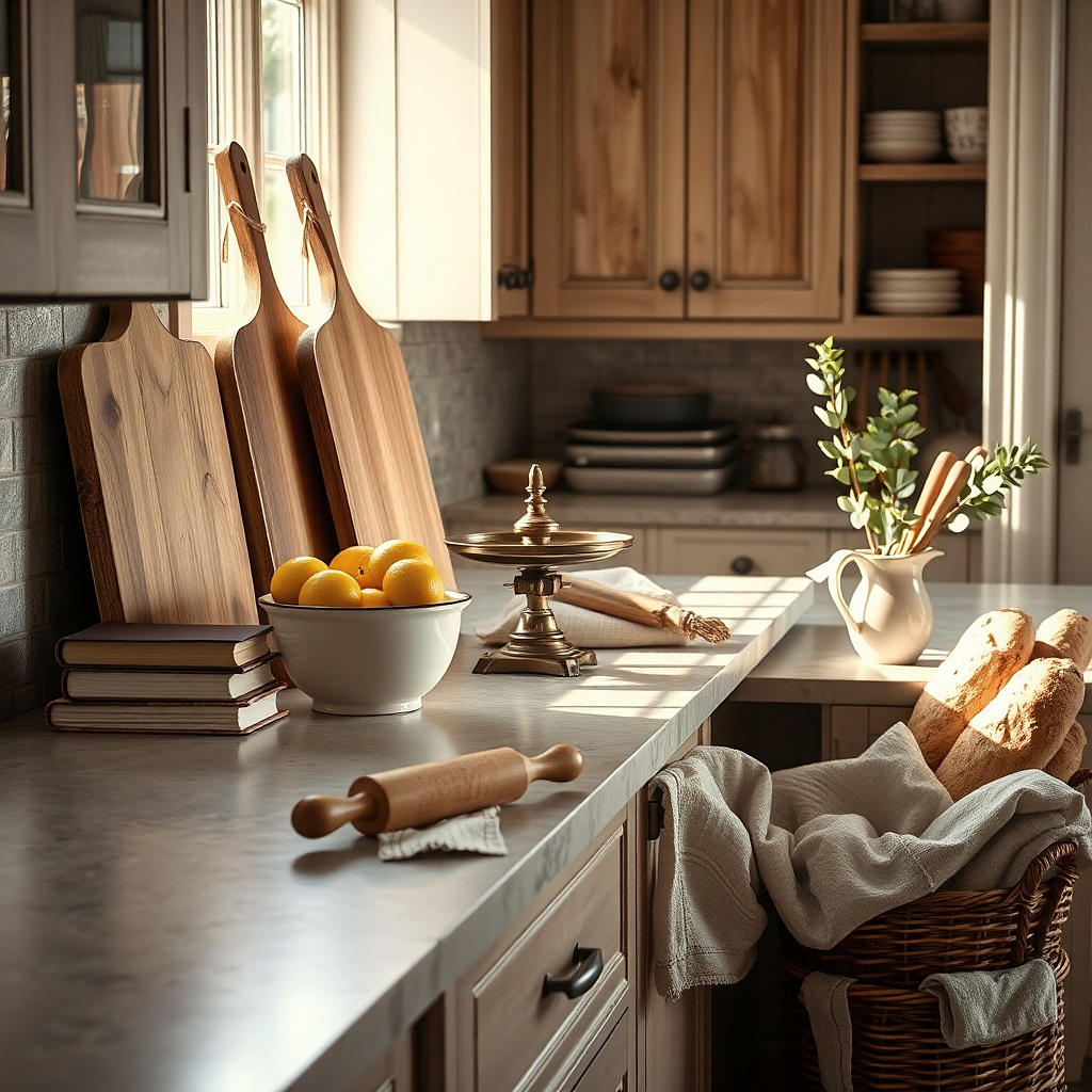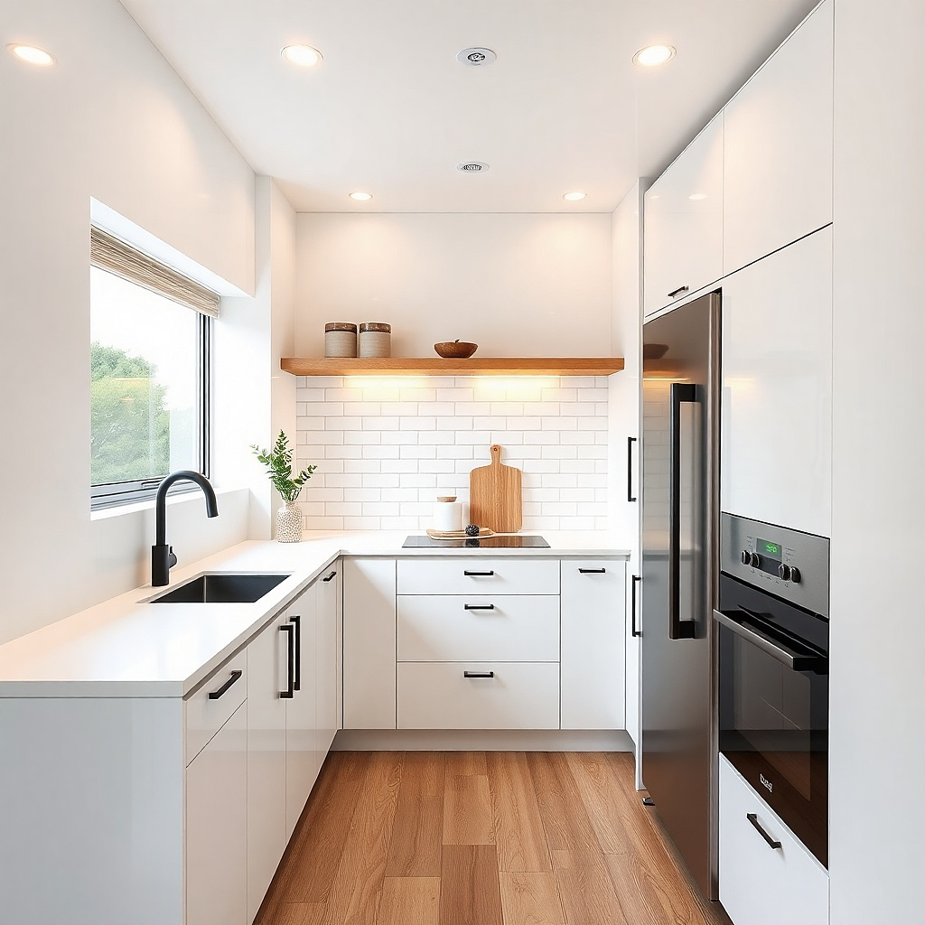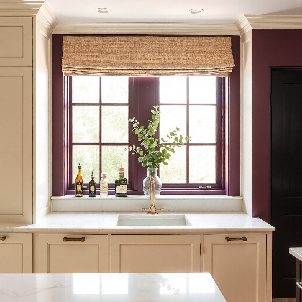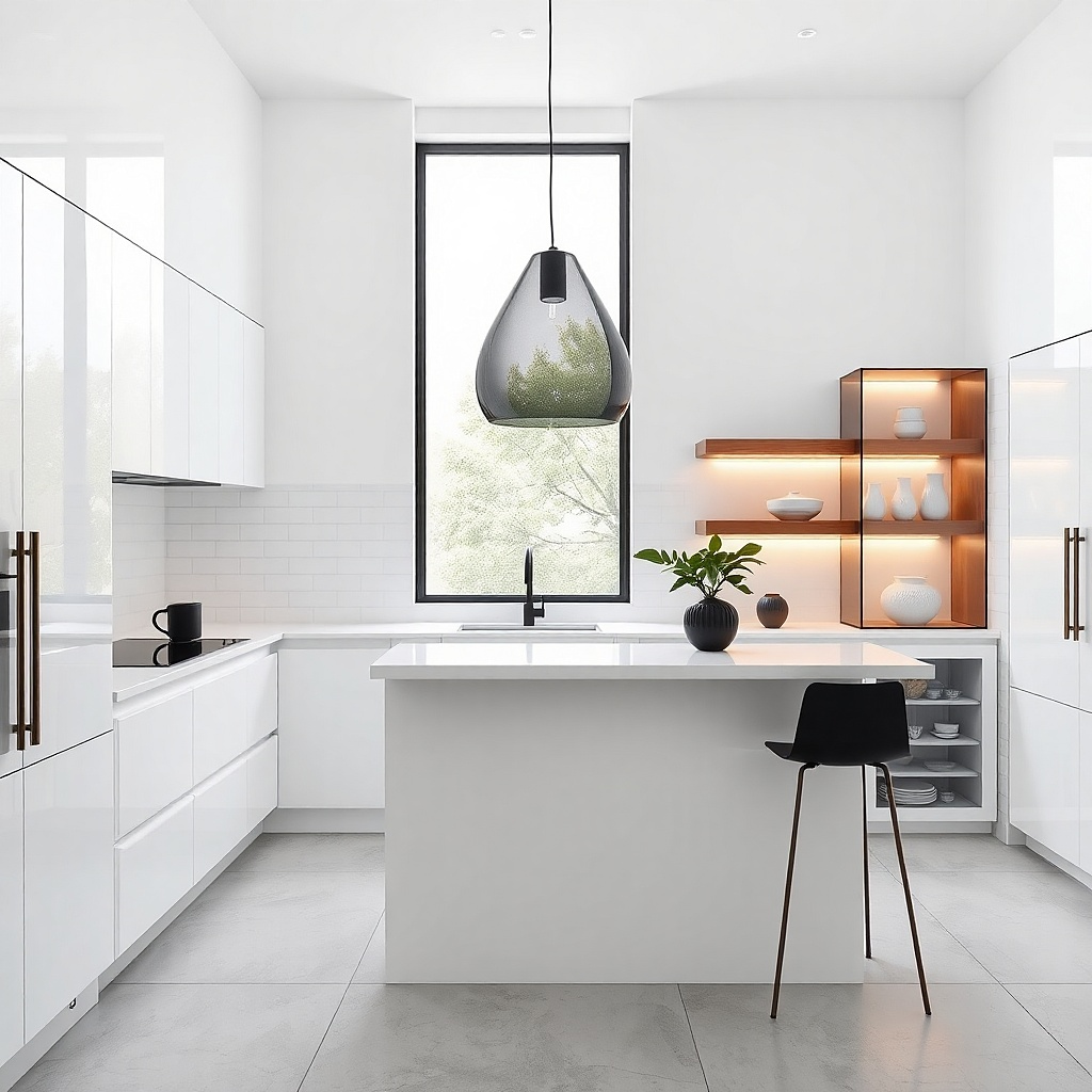
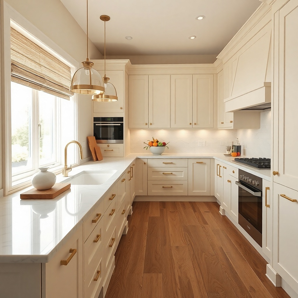
1. Matte-White + Glass Shelf Edge for Instant Brightness
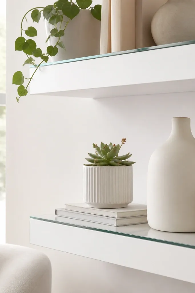
If your kitchen feels dim, I start by giving the light a clear path. A white base works, but matte finishes swallow brightness. Adding a clear glass or acrylic shelf edge makes the area look “deeper” because you see through it — the eye keeps moving instead of stopping at a flat surface. This setup looks best in kitchens with beige or gray floors because the glass brings contrast without adding color. It also flatters small spaces where the counter is narrow since it doesn’t take up extra footprint.
Start by cleaning the backsplash area with a degreasing cleaner and drying it completely. Apply a strip of white contact paper or removable wallpaper to create a clean backdrop, then place a clear acrylic ledge or glass tray along the front edge of the counter or shelf. Add two or three matching white containers so the glass edge frames them. Finally, hang one towel from a tension rod so the vertical line breaks up the white without adding clutter.
Choose clear acrylic with rounded edges so it doesn’t look sharp or cheap under kitchen lighting.
Don’t cover a textured backsplash with contact paper — the bumps show and the edges curl.
2. White Linen Curtain Panels on a Tension Rod
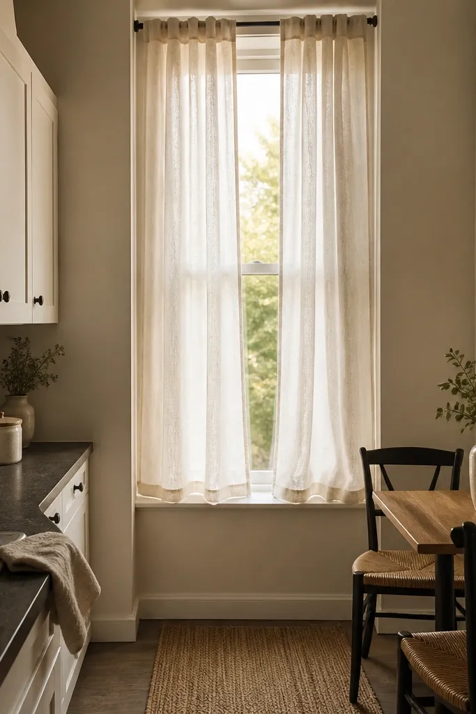
Curtains are the fastest renter trick for making a small kitchen feel finished. Linen reads soft, and white linen makes the window area feel taller and brighter. I like it because it adds texture without busy pattern — your eye gets a gentle contrast against cabinets. If your kitchen has dark countertops, white linen balances the heaviness and keeps the room from looking like a black box. It works for any household style, from farmhouse to modern, because linen is the neutral bridge.
Measure the window width and add 6-8 inches for rod coverage so the panels don’t look skimpy. Install a black tension rod at least 2 inches above the window trim so the space feels higher. Hang two panels of white linen so they meet at the center with slight overlap. Steam the panels lightly so they fall in soft folds, then tie a simple white ribbon or leave them loose.
Pick linen with a visible weave; ultra-smooth “sheers” look plasticky in kitchens with overhead glare.
Avoid hanging curtains too low — the puddled fabric makes the window read smaller.
3. Peel-and-Stick Backsplash in One Clean Vertical Strip
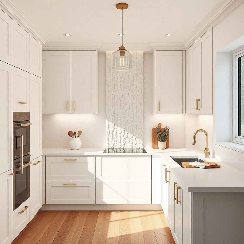
In a small kitchen, full backsplash coverage can look busy, especially if your cabinets are already detailed. I prefer a single vertical strip behind the sink or stove because it creates a focal “frame” where your eyes naturally land. White subway-style tile contact paper adds crisp lines without demanding grout work. This looks especially good if you have a window or a light fixture above the sink, since the strip turns that zone into a styled vignette. It also helps kitchens with imperfect painted walls because it hides scuffs in one area.
Clean the wall with soap and water, then wipe with rubbing alcohol and let it dry fully. Plan the strip so it centers under the light source or window — I aim for a width around 12-18 inches depending on your sink. Apply from the top down, smoothing with a plastic card to prevent bubbles. Use a sharp craft blade to trim edges around outlets if needed, then seal only the top edge with a removable tape strip if your wall is slightly uneven.
Try thisUse a hair dryer on low heat while applying to help it lay flat on minor wall texture.
Common mistakeDon’t apply over grease stains — the adhesive releases and you’ll see lifting within weeks.
4. White Counter Runner with a Black Grid Border
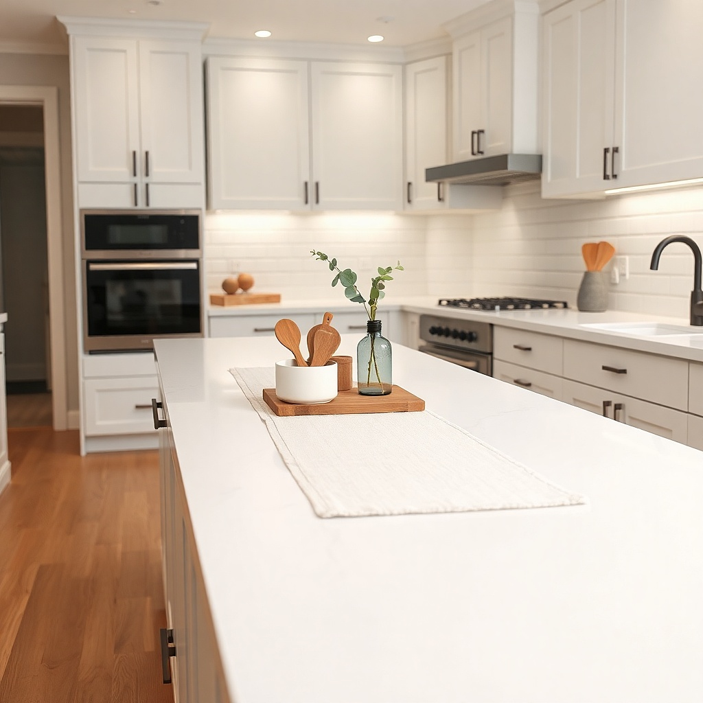
A counter runner is my go-to for making a small kitchen look styled without adding more objects. White fabric makes the counter feel lighter, and a black grid border gives just enough structure to prevent the scene from looking washed out. I like this approach for renters because you can remove it at move-out and toss it in the wash. It’s also forgiving if your countertop has scratches — the runner visually smooths the surface. The black border flatters warm wood tones and makes stainless appliances look intentional.
Measure your counter length and choose a runner that covers about two-thirds of the space, leaving 3-5 inches bare at the ends. Pick cotton or linen blend that holds its shape; avoid stretchy fabrics. Place the runner centered, then layer a wooden cutting board on one side and two small white jars on the other. Keep items to odd numbers — three pieces max on the runner — so it doesn’t feel crowded.
Try thisAdd small silicone cup pads under jars so the fabric doesn’t get rubbed shiny over time.
Common mistakeAvoid thick bulky runners — they bunch on narrow counters and look like a tablecloth.
5. Magnetic Whiteboard for Labels and Menu Notes
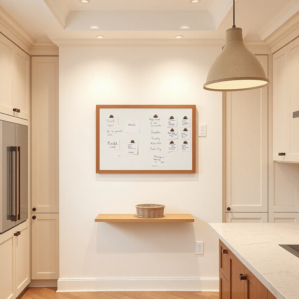
This is decor that also fixes a real problem: countertop clutter from loose notes and sticky labels. A small magnetic whiteboard in white with black writing keeps your kitchen looking organized even when life gets messy. It also adds contrast to stainless appliances and white cabinets, so the room looks designed rather than accidental. I’ve used this in kitchens where the fridge is the only “blank wall” — it turns that space into a clean visual anchor. It flatters anyone who likes minimal styling but still needs to track groceries, because the board replaces piles of paper.
Choose a board size around 12x16 inches for small kitchens so it doesn’t overwhelm the fridge. Wipe the fridge surface, then attach the board using the magnetic backing — no tape needed. Use one marker color and one font style — I stick to block letters in fine black dry-erase marker. Add removable magnets for key items like a calendar date or grocery list bullets, then keep the board content to three sections.
Use a small eraser sponge and wipe weekly — dried ink stains make whiteboards look dingy fast.
Don’t mix marker colors — multiple inks turn it into a scrapbook and the kitchen looks busy.
6. Milk-Glass Pendant Bulb Accent
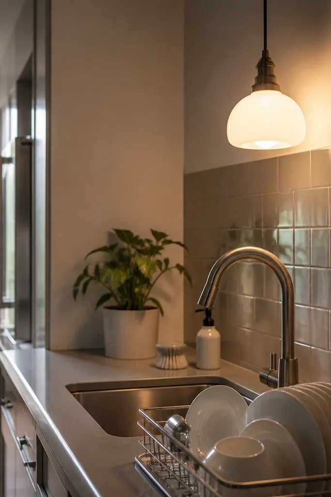
Lighting changes how white your kitchen looks, and milk-glass does something specific: it diffuses the bulb so it doesn’t create hard hotspots on countertops. In rentals, you often can’t change fixtures, but you can swap a shade or bulb cover if the base fits. Milk glass gives a warm glow that makes white dishes look crisp and skin tones in the dining area look better too. This works well with small kitchens because overhead glare makes tight spaces feel harsher. If your kitchen has bright overhead LEDs, milk glass reduces that clinical look.
Check your existing pendant or fixture base type, then buy a milk-glass shade that matches the diameter. Turn off power, remove the old shade, and install the milk glass using the same mounting ring. Use a warm bulb around 2700K if you have a choice; it makes white feel creamy, not gray. After installing, test from standing height and adjust the shade position so it hangs centered over the work zone.
Pick shade glass that has a subtle texture perfectly clear glass throws sharper glare.
Avoid very bright cool bulbs (5000K) under a white kitchen — the whole room shifts to gray.
7. White Open Shelving with Wicker Baskets
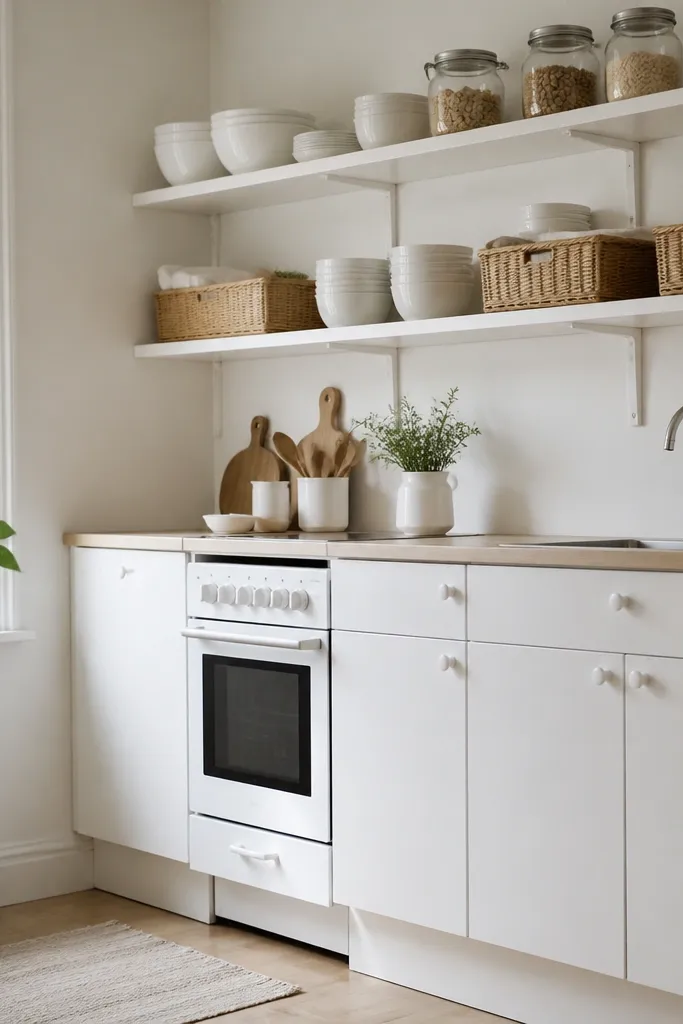
Open shelving in a small kitchen sounds risky, but it works when you use baskets to hide what shouldn’t be visible. White shelves keep the look airy, and wicker adds warmth and texture without adding loud color. I like wicker in kitchens because it reads natural and it hides dish towels, backups, and small bags that would otherwise clutter countertops. This idea flatters compact layouts where you need storage but don’t want tall cabinets. It also makes the kitchen feel lived-in without looking messy.
Choose a shelf unit or floating shelves in a white finish with a depth around 6-8 inches. Style the top layer with plates and bowls — keep to three stacks max so the lines stay clean. Place wicker baskets on the lower shelf so they cover storage gaps, then add a small white label tag on each basket. Keep dishware color consistent: white ceramic or off-white stoneware with matching rims.
Try thisLine baskets with a removable white liner so crumbs don’t stain the wicker.
Common mistakeAvoid stacking too many different dish patterns on open shelves — it looks like a store when you want it to feel calm.
8. Removable Peel-and-Stick Floor Mat in Front of Sink
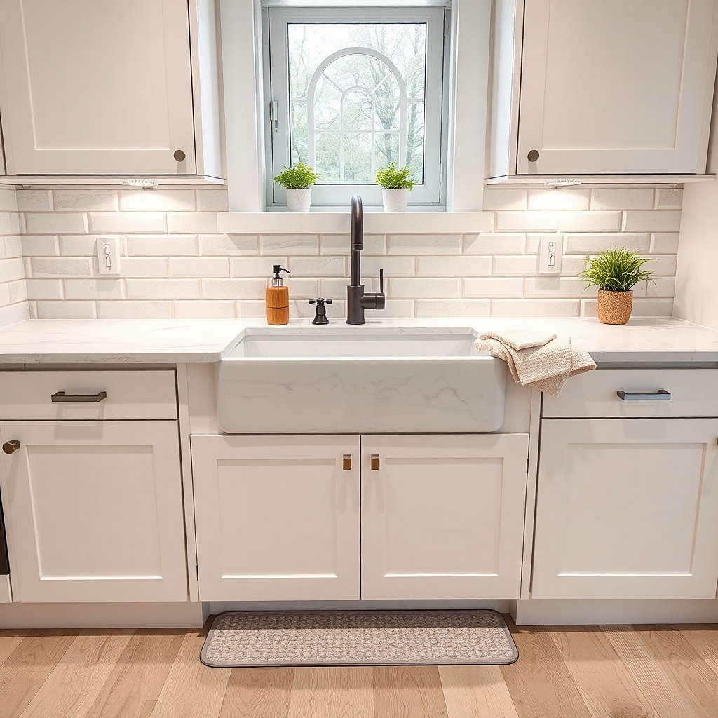
Floor changes are the sneaky way to improve a small kitchen. In rentals, I focus on the highest-traffic zone usually in front of the sink and dishwasher. A removable floor mat creates a crisp boundary so the kitchen feels more “designed” and less like an empty room. The white-and-gray pattern keeps it neutral, and the geometry adds visual movement without heavy color. It also helps hide worn spots on vinyl or laminate floors.
Clean the floor thoroughly and let it dry completely. Cut the mat to fit the sink area with a 1-2 inch gap from edges so it doesn’t curl. Apply starting from the center outward, pressing firmly with a roller or the back of a spoon. Place a small white rug pad underneath if the mat slides. After installation, place a small tray on the counter to tie the floor pattern to the rest of the kitchen.
Try thisChoose a mat with a low pile or flat surface so it won’t snag shoes or mop heads.
Common mistakeAvoid mats that have a strong black border — they shrink the visual space in tight kitchens.
9. White Dish Drying Rack with a Wooden Tray Base
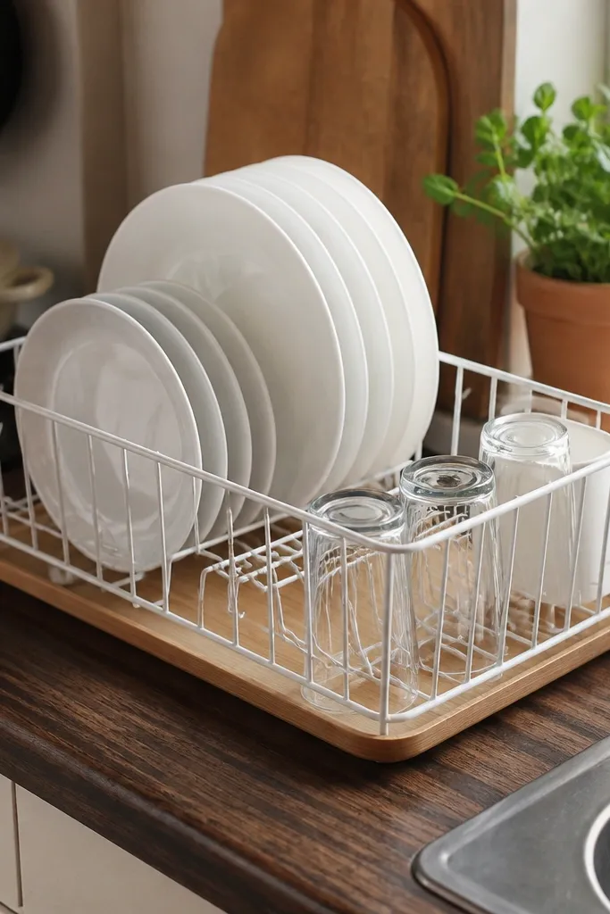
A dish rack is daily decor, whether you like it or not. White racks look cleaner than metal ones, and the wooden tray base makes the kitchen feel warmer instead of sterile. I’ve found this combo works best when your counter is a darker laminate because it lightens the scene right away. It also flatters small kitchens because it keeps items in vertical order, so your counter doesn’t turn into a wet plate pile. If you entertain, it looks neat even mid-day.
Select a white rack with adjustable tines so it fits your plate sizes. Place it on a wooden tray or on a removable cork mat to protect laminate. Arrange plates upright with rims aligned, then add just one small bowl rack section. Keep utensils in a separate container so they don’t spill into the drying space. Finish by adding a small roll of paper towels or a folded microfiber cloth in white nearby.
Try thisUse a microfiber cloth under the rack it reduces water rings on counters.
Common mistakeDon’t leave the rack crowded; if everything touches, it looks messy even when it’s clean.
10. Stacked White Canisters with One Black Label Style
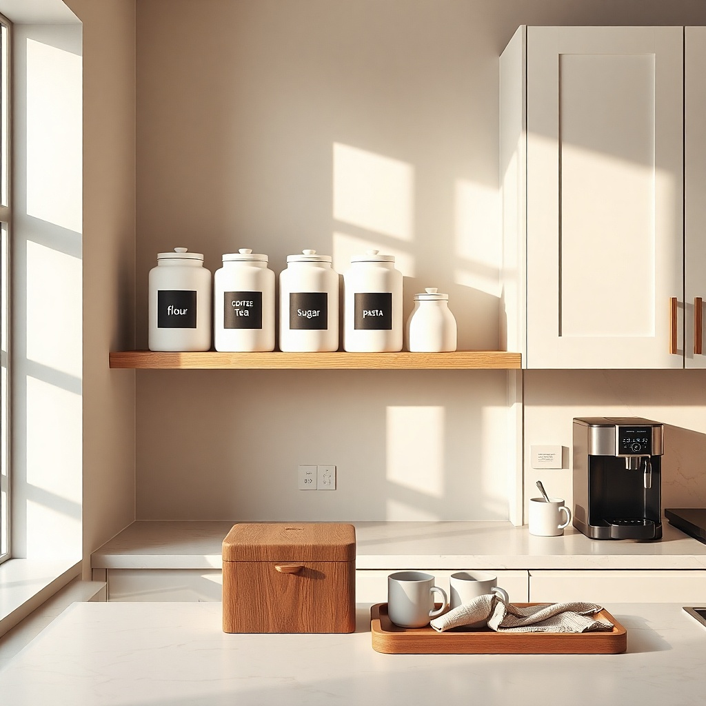
Canisters turn a messy pantry into a styled display, and the trick is consistency. White canisters create a calm base, while black lids or black labels give you a single accent point. In small kitchens, this matters because countertops are where visual clutter happens first. I like using one label style because it makes your kitchen look like it has a system. This also helps if you have mixed packaging in your pantry; you can transfer staples into matching containers and stop buying extra storage bins.
Choose three to five canisters in the same shape family, even if sizes differ. Stack by height — tallest in back, shortest in front — so the display stays readable. Use black labels only, with the same label type across every jar. Place canisters on the counter or on a shelf where they face the room, not behind the toaster. Leave a little empty space between canisters so the labels stay crisp.
Wipe jar lids with a dry cloth before labeling — fingerprints make black labels look smudged.
Avoid mixing label sizes and fonts; it turns into a collage instead of a clean set.
11. White + Sage Spice Drawer with Removable Organizers
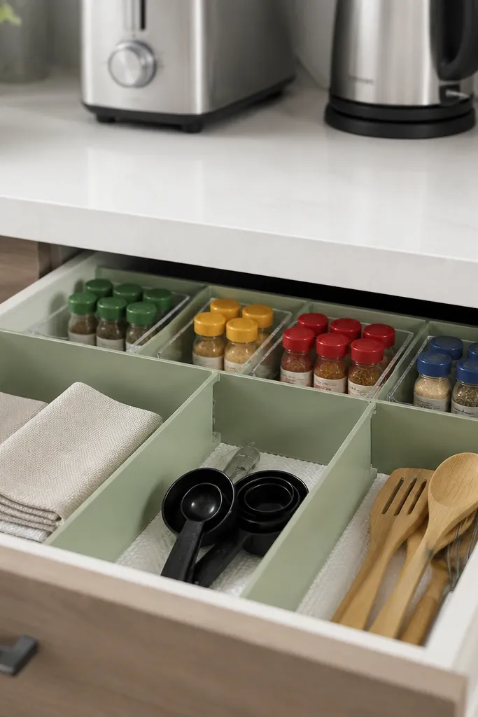
A small kitchen looks expensive when drawers look intentional. You can’t see your drawer from across the room, but you feel it every time you cook, and that changes how you style the rest of the space. I use a white liner so the drawer stays bright, then I add sage dividers for a soft accent that pairs with white and wood. This is ideal for renters because removable organizers slide out cleanly. It also works for people with tiny spice collections since you can expand later without redoing everything.
Measure your drawer interior width and choose a liner cut to fit with minimal overlaps. Lay the white liner down first, then add adjustable dividers so jars stand upright with minimal empty space. Label jars using a simple black label system so the drawer looks consistent. Keep the most-used spices in the front row and store backups in a separate bin. When you close the drawer, the dividers should create straight lines — that’s the visual win.
Try thisUse small jar labels that fit the jar face without wrapping around — it keeps the text readable and neat.
Common mistakeDon’t let jars tip or overlap; leaning jars make drawers look chaotic fast.
12. White Plate Wall with Removable Adhesive Hooks
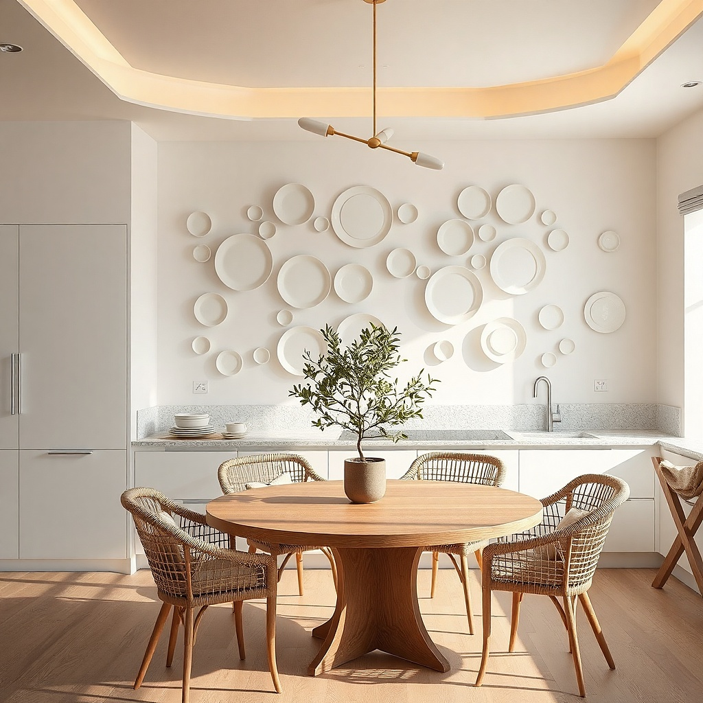
Wall decor is where small kitchens get their personality without taking counter space. A small plate wall works because plates create circles and gentle curves that soften the straight lines of cabinets. White plates keep it bright, and mixing slight shapes (one scalloped edge, one flat rim) adds depth without adding color. This is perfect for rentals because you can use removable adhesive hooks and take it down at move-out. It also flatters kitchens with narrow layouts because the wall pulls attention upward.
Pick a spot near the dining area, not inside the kitchen work triangle, so it doesn’t feel like clutter. Clean the wall, then place removable hooks according to plate weight — start with the heaviest plate at the center. Hang three plates in a small cluster: one at eye level, two slightly above and below. Add a small black frame or a white print under the cluster to tie it into the kitchen palette. Step back and adjust spacing so the circles don’t touch.
Use picture-hanging templates to keep hooks aligned before you commit to sticking anything.
Avoid heavy ceramic plates if your wall is textured or painted with matte — the hooks won’t hold cleanly.
13. Tension-Rod Pot Rack with White Enamel Hooks
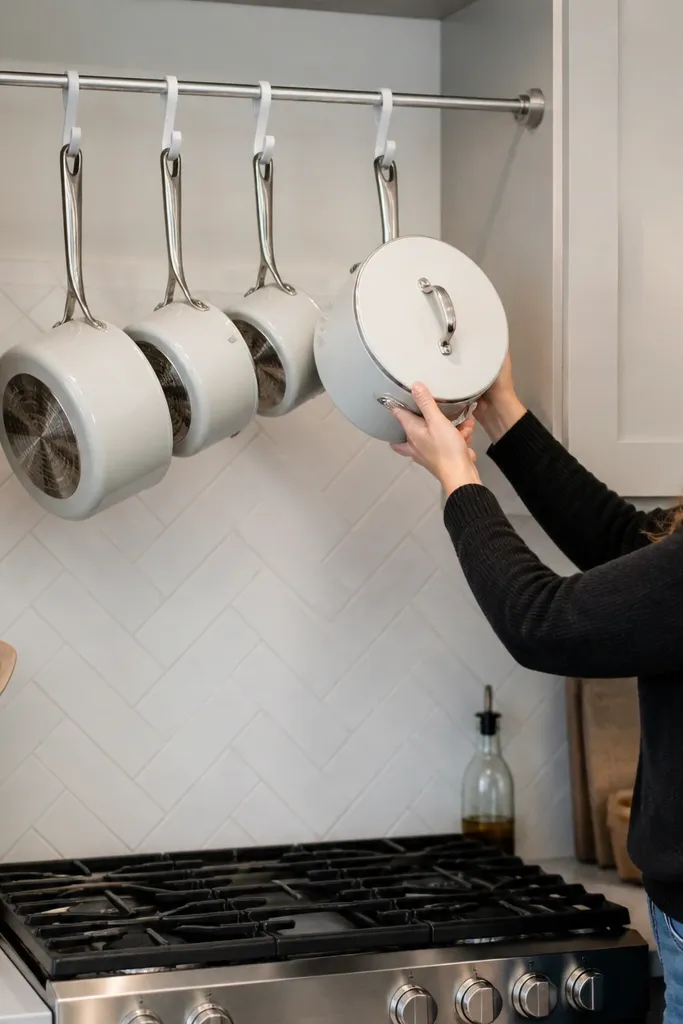
This is the renter version of a pot rack, and it looks good when the pieces match. White enamel hooks tie the hanging items into the kitchen’s bright palette, while the hanging pots add vertical storage that frees cabinet space. It also makes the kitchen feel functional because you can see what you use. In small kitchens, visible storage can look messy, but matching tones and limited quantity fix that. This works especially well for kitchens where cabinets are already packed and your counter is the only place to stage cooking tools.
Measure the span above the sink or counter and buy a heavy-duty tension rod rated for kitchen weight. Install the rod with end caps that grip firmly to trim or wall molding. Hang three pots and two mugs maximum at first, with the heaviest pot closest to the center. Add one white dish towel clipped to a hook so the rack looks styled, not utilitarian. Keep handles facing the same direction so the rack looks orderly.
Try thisIf your rod slides, wrap the contact points with a thin grip pad made for tension rods — it fixes the wobble.
Common mistakeDon’t hang mismatched colors and sizes; it turns into a clutter net.
14. Black and White Tile-Pattern Floor Mat Under a Small Table
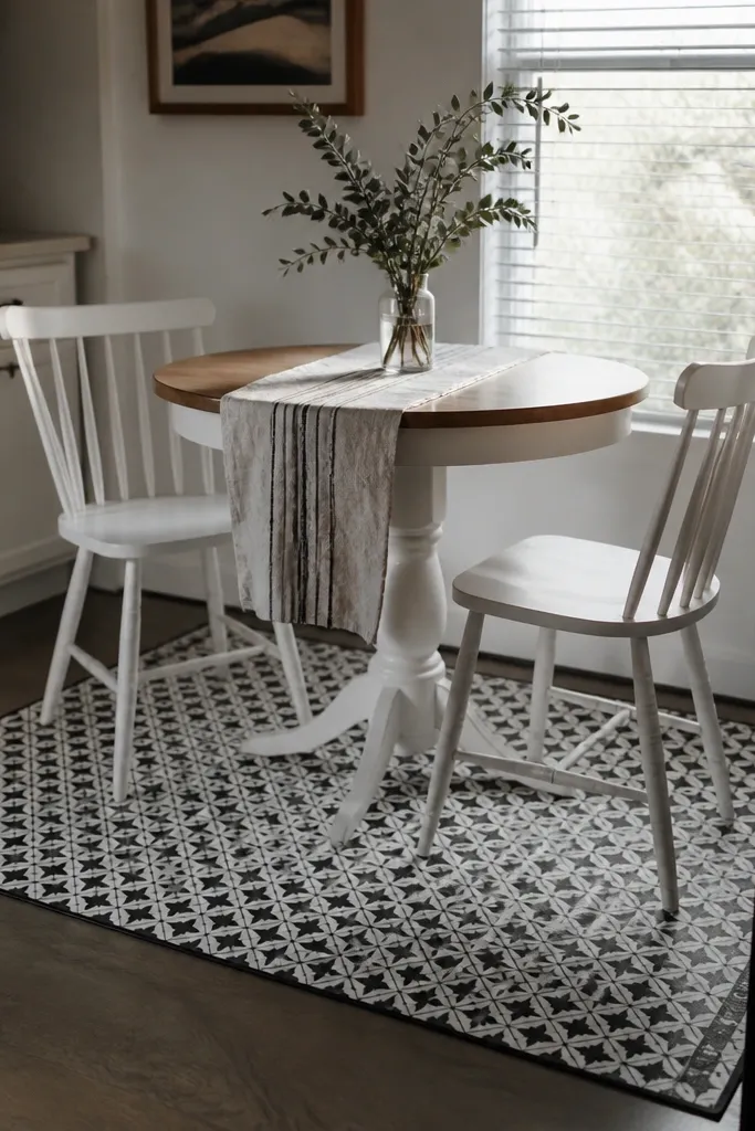
When a kitchen has a small dining spot, the table area needs an anchor. A tile-pattern mat gives that anchor and helps the table feel grounded, even if the rest of the kitchen is plain. I prefer black-and-white because it creates crisp contrast with white chairs and makes the dining zone look intentional. It also hides floor scuffs in high-traffic spots. This idea works best when your table is small and you want the space to feel like one cohesive nook rather than two separate areas.
Measure the table footprint including chair pull-out space, then cut a mat to fit with 2 inches clearance around edges. Apply on a clean, dry floor and press along seams so it lays flat. Place the table centered over the mat so the pattern peeks out evenly. Add a white tabletop runner or a small white placemat set to repeat the white theme. Keep centerpiece items minimal — one small vase or a single tray.
Try thisChoose a mat with a matte finish so it doesn’t reflect overhead light into your eyes.
Common mistakeAvoid patterns with lots of tiny details; they blur in small rooms and look messy.
15. White Cutting Board Stack as a Counter Centerpiece
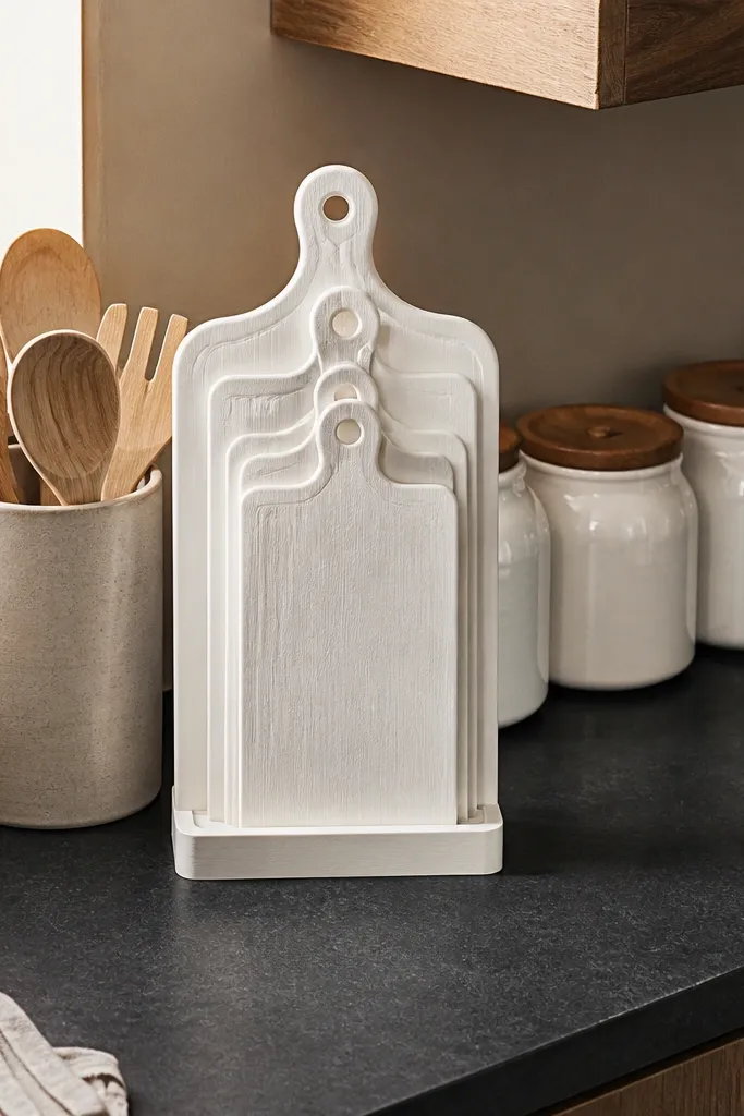
A centerpiece doesn’t need to be decorative. A stack of cutting boards reads like preparation and makes the counter feel purposeful. If you keep them in light wood against white jars, the warmth looks intentional instead of random. This works in small kitchens where you want to style without adding “stuff” that you don’t use. It also flatters kitchens with white appliances because the wood adds warmth without competing with the bright palette. The best part is you can use the boards daily, so it never looks like clutter.
Pick two cutting boards in the same tone family, one slightly larger than the other. Place them upright or stacked at a slight angle so they create a vertical shape behind smaller items. Add one folded white or off-white linen towel next to the boards, then place three white canisters in a tight row. Keep the rest of the counter clear — no more than a knife block or one utensil crock. If you have a corner, tuck a small tray under the boards to keep crumbs contained.
Try thisRub boards with a tiny bit of mineral oil if they look dry — the shine makes the setup look fresh.
Common mistakeAvoid mixing wildly different wood tones; it makes the centerpiece look accidental.
16. White Utensil Crock with a Removable Liner
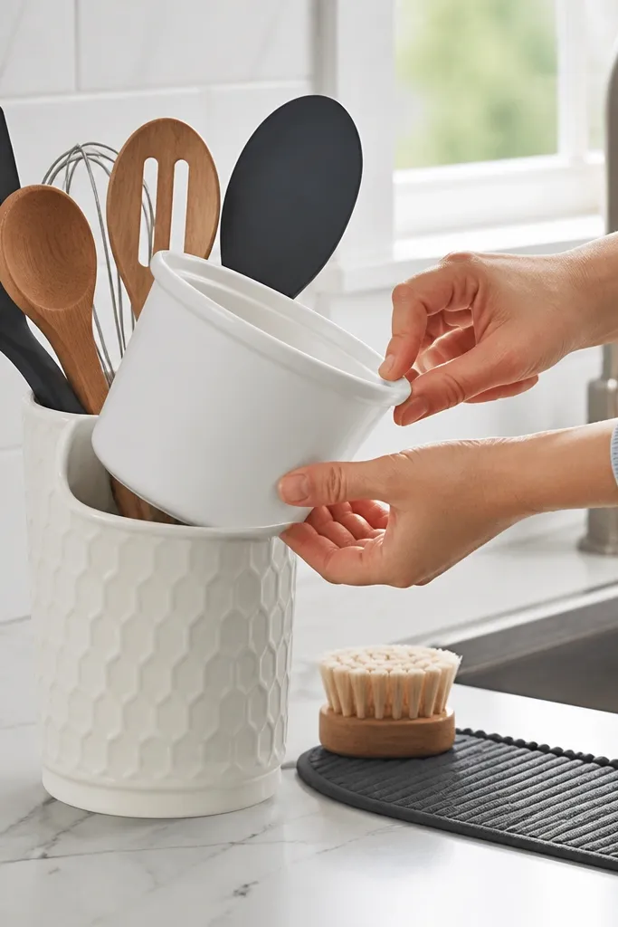
Utensil crocks look fine until they don’t. The inside gets messy, water pools, and the whole counter starts to look dirty even when you cleaned yesterday. A white crock with a removable liner keeps it visually clean and makes it easier to wipe fast. I like this idea because it’s both decor and a maintenance plan, and renters need that. It also works well in small kitchens where you don’t have room for separate utensil storage. White makes stainless utensils look crisp and keeps the color palette tight.
Choose a crock in glossy white or smooth ceramic so it wipes easily. Insert a removable liner — silicone or a wipeable fabric sleeve — and tuck it snugly against the sides. Dry utensils before placing them in so the liner stays clean longer. Position the crock near your cooking zone but not directly under a cabinet hinge where it catches drips. Pair it with one matching towel and keep utensil height consistent by cutting back the “random pile.”
Try thisUse a second liner in a zip bag so you can swap it in seconds during busy weeks.
Common mistakeAvoid fabric liners that absorb water; they stain and smell in a kitchen.
17. White Table Styling with a Narrow Runner and One Tray
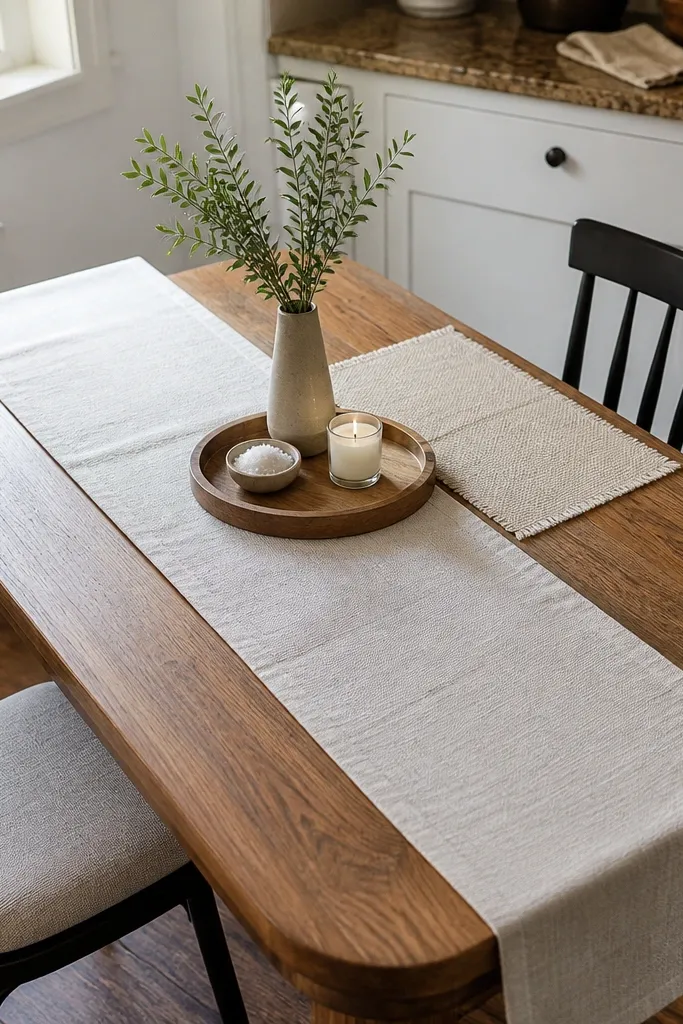
If you only style one surface, style the table. In small kitchens, the table becomes the visual “center” because you see it from the doorway and while cooking. A narrow runner keeps the look light, and one tray stops items from scattering across the tabletop. I like off-white placemats and a white runner together because it looks layered without looking busy. This setup works for renters because it’s all removable and washable. It also flatters small dining spaces by creating a straight line that makes the table look longer.
Pick a runner width around 12-14 inches so it doesn’t swallow the tabletop. Center it lengthwise, then place one white tray on the runner with a small bowl and a plant or candle. Use four placemats that match in tone, then keep the center styling to one height level — no tall vases that crowd chairs. Add one set of cutlery rests if you host; otherwise, keep it clean. When you swap seasons, change only the bowl contents, not the base styling.
Try thisChoose runner fabric with a slight texture like cotton-linen so it doesn’t show every wrinkle.
Common mistakeAvoid layering three different decor pieces on the table — it makes small dining zones feel cramped.
18. White Plates in a Glass Cabinet with Black Handles
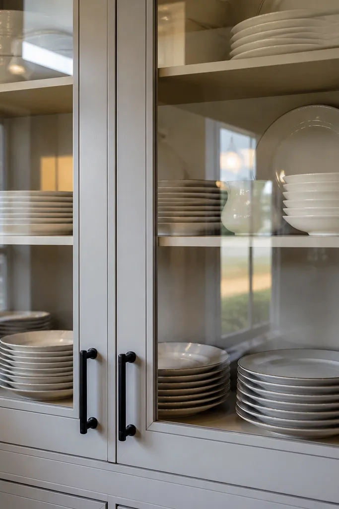
A glass-front cabinet is a gift in a small kitchen, because it turns storage into display. White plates look clean through glass, and the arrangement makes the cabinet feel curated even without fancy decor. If your cabinet hardware is black or you add black labels, the whole look tightens. I’ve used this trick in rentals where cabinets were already fixed — you can’t change the structure, but you can change what’s inside. It looks best in kitchens with warm undertones because white through glass reads softer than solid white. It also helps you stop hiding mismatched dishes in drawers.
Sort dishes by shape and rim — keep to one collection so the rows look uniform. Wipe the cabinet glass and shelves so fingerprints don’t show. Arrange plates flat on one shelf and bowls stacked beneath, then add canisters or jars on the top shelf. If you can’t change hardware, add black-and-white labels on jars to mimic the hardware finish. Keep the cabinet to three shelves maximum for a neat look.
Try thisLine shelves with a thin white shelf liner so dishes sit on a bright base and reflections look even.
Common mistakeAvoid mixing tall cups with flat plates in the same shelf — it creates visual chaos behind glass.
19. Open Corner Shelf with White Ceramic Planter and Twine Detail
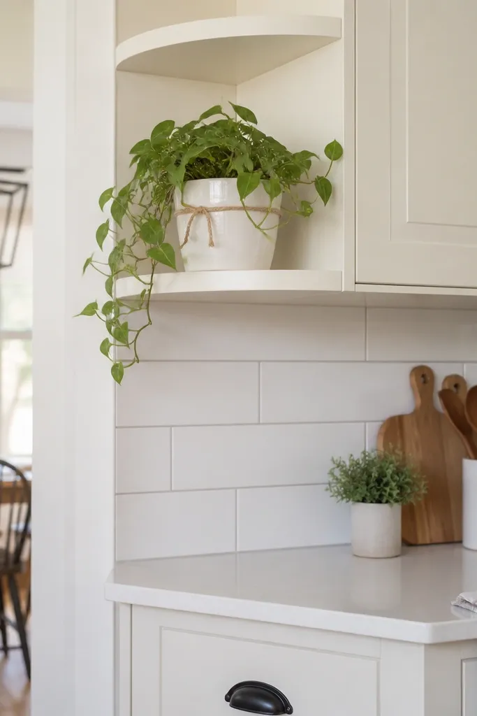
A small kitchen corner usually goes unused, but corners are where you can add life without adding clutter. A white ceramic planter keeps the plant styling clean and bright, and it pairs well with white counters. I like trailing plants because they create gentle movement and soften hard angles, which makes the kitchen feel less boxy. If your rental allows shelves, a corner shelf adds vertical interest without taking much floor space. This idea flatters kitchens with limited wall space because corners give you a built-in “stage” for one or two items.
Install a small corner shelf using renter-safe methods if possible; otherwise, choose a lightweight shelf with minimal wall contact and use proper anchors if your landlord allows. Place a white planter on the top level and keep the plant pot snug so it doesn’t look oversized. Add a small tray or book on the lower level in light wood to balance the white. Tie a small piece of twine around the pot rim or use a simple white tag so the styling looks intentional. Keep the rest of the corner empty so the plant reads as the focal point.
Use a cachepot with drainage so you don’t stain the shelf — small leaks look bigger in corners.
Avoid large plants in a tiny kitchen — a big pot blocks sight lines and makes the corner feel crowded.
20. White Canister + Black Measuring Spoons in a Small Wall Frame
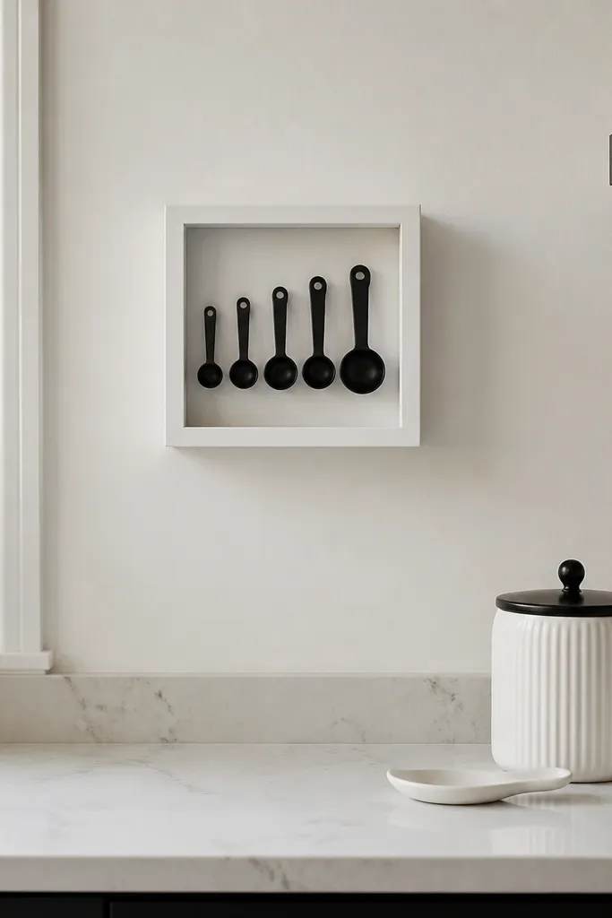
This is my favorite trick for adding personality without adding clutter to a counter. A small shadow box or frame with black measuring spoons creates a graphic look against a white wall. It turns everyday tools into decor, and because it’s flat on the wall, it keeps your workspace clear. The black spoons repeat the black accent you see in many kitchens (hardware, appliance trims, or towel hooks). This works best when you already have white cabinets or white-painted walls because the contrast is clean. It also suits renters because it’s removable and doesn’t require changing cabinets.
Choose a small shadow box frame in white or thin black metal, depending on your existing accents. Arrange black measuring spoons in a neat fan or straight row, spacing them so the handles align. Secure them with removable adhesive museum putty or a small backing grid if the frame has one. Hang the frame with a removable hook placed on painted drywall, then place one matching white canister on the counter directly below. Keep the canister label style consistent with the rest of your kitchen.
Use museum putty instead of tape so removal doesn’t peel the wall paint.
Avoid heavy frames on weak drywall — they sag and look crooked fast.
21. Single Statement Pendant in White Over the Sink Zone
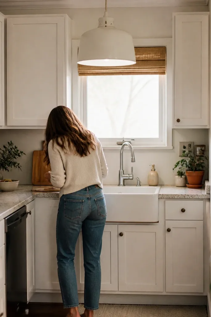
If you can change one fixture element in a rental, change the shade. A white pendant shade over the sink makes the “work zone” look intentional and bright, which is where most people feel the kitchen is either clean or chaotic. I’ve used white drum shades because they spread light evenly and reduce glare on the faucet. This idea works best when your sink is the visual center of your kitchen common in small apartments. It also flatters both warm and cool palettes because white is the neutral that doesn’t fight your cabinets.
Measure the current fixture’s socket and choose a shade that matches the diameter — typically 6-10 inches for small spaces. Swap the shade if the fixture allows it, or replace the bulb cover with a white shade attachment. Use a warm bulb around 2700K if you have the option. Place a matching white soap dispenser and a white tray on the sink ledge so the light and decor align. Keep the sink area to three items: soap, sponge, and one small tray.
Use a tray under the sponge so the sink ledge doesn’t get water rings.
Avoid oversized shades — too big over a small sink makes the ceiling feel lower.