1. Oversized framed herb prints in a tight 2x1 layout
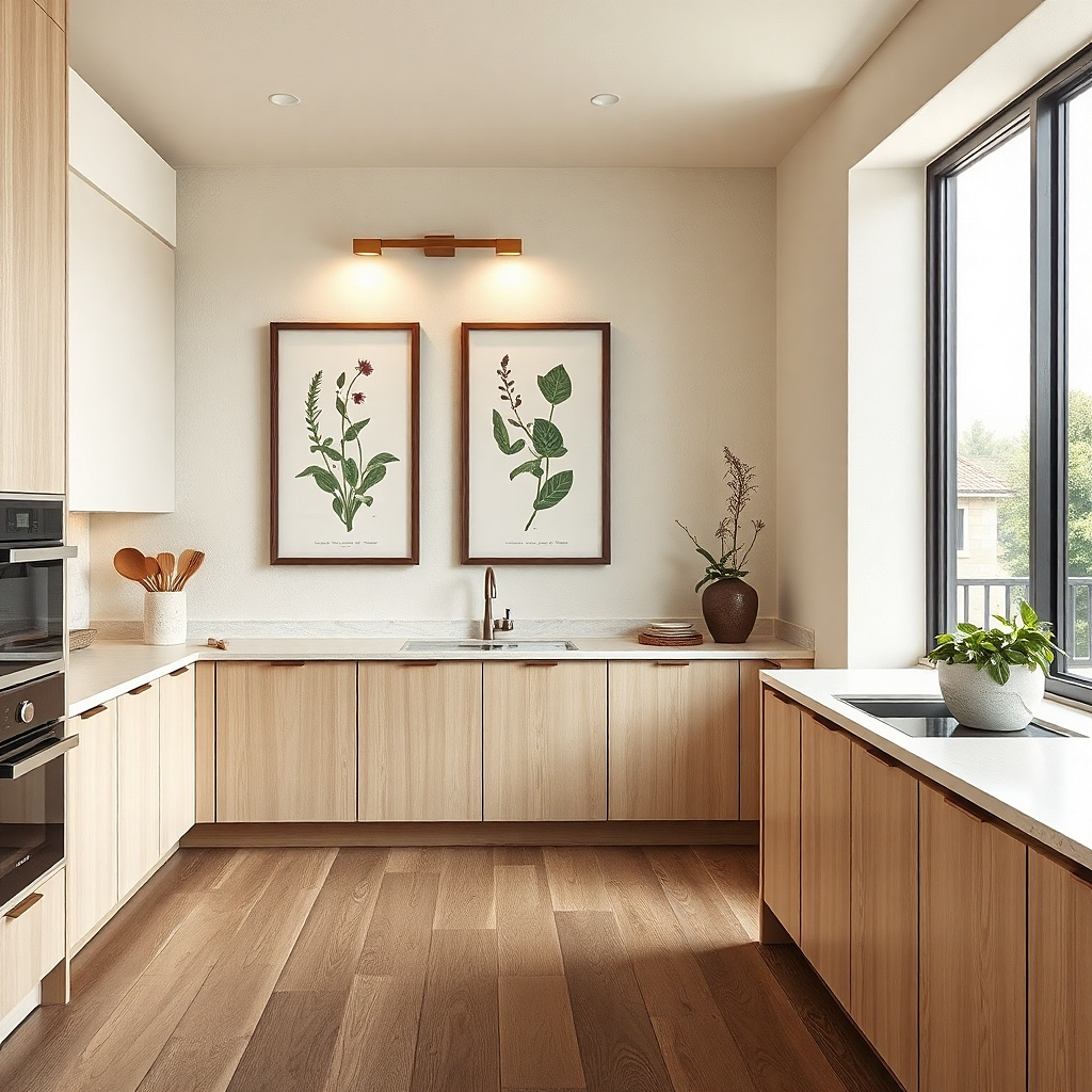
This works because herb illustrations give kitchen walls instant food context without taking up counter space. Choose two prints that are the same width and mount them as a clean 2x1 layout so the wall reads as one block, not two separate purchases. Go for matte paper protected by glass or acrylic so you can wipe steam and cooking splatter. A black or deep espresso frame looks sharp against light walls and doesn’t fight the rest of the kitchen’s hardware.
Start by measuring the wall and reserving a rectangle about 30-44 inches wide and 16-22 inches tall for the pair. Buy matching frames in the same size and remove the backing so you can check the paper actually sits centered. Use removable picture hanging strips rated for the frame weight, and place the top edge roughly 60 inches from the floor. Finish by leveling both frames first, then press the strips firmly for the full recommended time.
Pick print colors that echo something already in the room — olive green, warm brown, or muted cream.
Don’t mix frame sizes or mat colors; the wall will look like a collection instead of a layout.
2. Floating shelf with three matching ceramic canisters
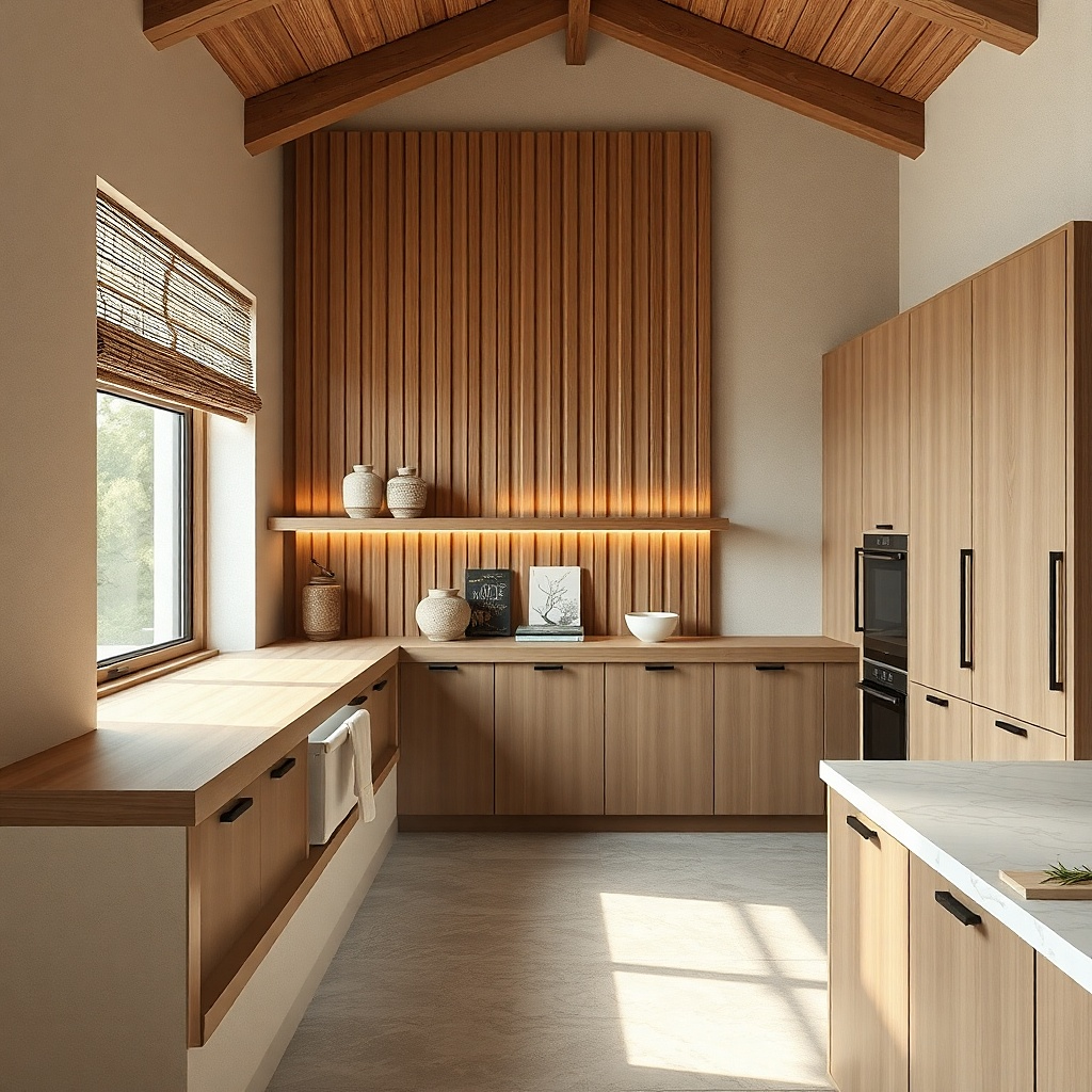
A short shelf looks styled because it turns functional storage into wall decor. Ceramic canisters add texture and shine, and the shelf gives your eye a horizontal anchor that balances tall cabinets. Keep the shelf narrow (about 18-24 inches) so it doesn’t overpower the wall, especially in small kitchens. Stick to one canister color family like white on cream with subtle speckle or all-terra-cotta for a cohesive, photogenic look.
Choose an adhesive shelf bracket system or renter-safe mounting hardware that matches your wall type. Install the shelf first using painter’s tape to mark level — aim for the shelf line around 62-66 inches from the floor. Place three canisters with at least 1 inch between them so labels aren’t cramped. Use a sealed shelf liner or wipeable backing so the wall behind the shelf stays clean.
Add one small wood utensil crock or a folded linen napkin at the end for a “finished” styling moment.
Avoid overcrowding; three canisters spaced cleanly looks better than five jammed together.
3. Vinyl wall decals in a single color strip
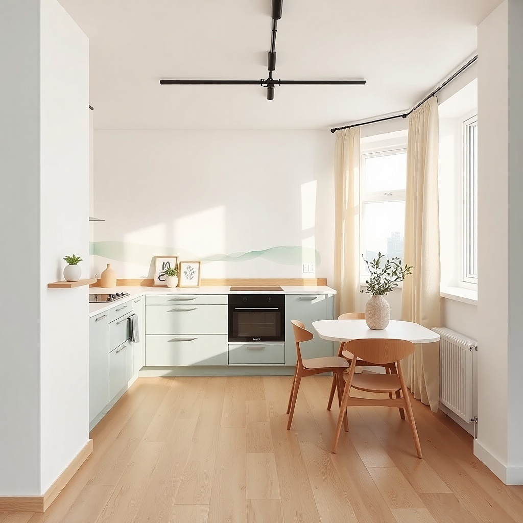
Clean the wall with a degreasing wipe so cooking residue doesn’t prevent adhesion. Measure the length of your planned strip and tape guide lines on the wall first. Apply from one end using a transfer tool or backing slowly peeled to prevent bubbles. Press along edges with a plastic card, and leave it undisturbed for 24 hours if the adhesive instructions say so.
Decals are a smart renter move because they add pattern without heavy hardware. The trick is to use one color and one continuous motif so the wall looks designed. A horizontal vine strip or thin utensil line works well in kitchens because it visually widens the space and ties into the dining area. Choose a semi-matte finish color like sage, charcoal, or burnt umber so it doesn’t look shiny or “sticker-like.”
Common mistakeDon’t stack multiple decal styles; mixed motifs read busy fast in kitchens.
Try thisMatch the decal color to a cabinet handle finish or a rug tone for a more intentional look.
4. Magnetic photo frames with black-and-white recipe cards
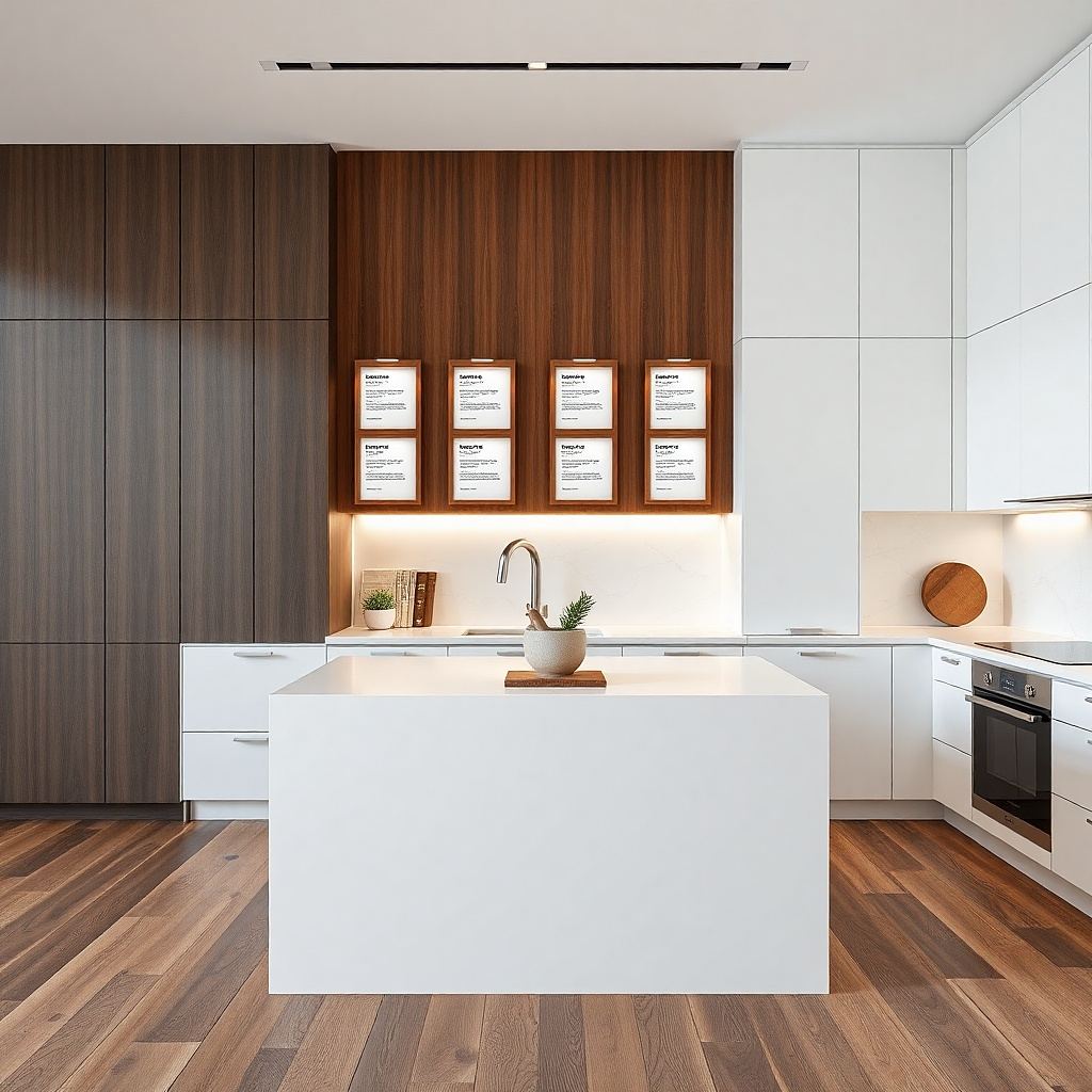
If your wall isn’t magnetic, mount a thin magnetic sheet panel with removable adhesive pads in a rectangle about 24x18 inches. Place two to four magnetic frames on top of that panel, spaced evenly 3-4 inches apart. Use recipe cards printed on heavier paper so they don’t curl. Hang at eye level for a table — center of the set around 58-60 inches from the floor.
Magnetic frames look clean and modern, and they’re renter-friendly when your wall has a magnetic surface or you add a magnetic sheet to the area. Black-and-white recipe cards add personality without bright color noise, and the card borders create a gallery feel. Keep the frames in a matched set so the kitchen looks curated. This is especially good above a small dining table where you want something that reads from across the room.
Common mistakeAvoid glossy photo paper; it catches kitchen light and can look cheap.
Try thisUse consistent card margins so the typography lines up visually across frames.
5. Scalloped metal wall tray collection
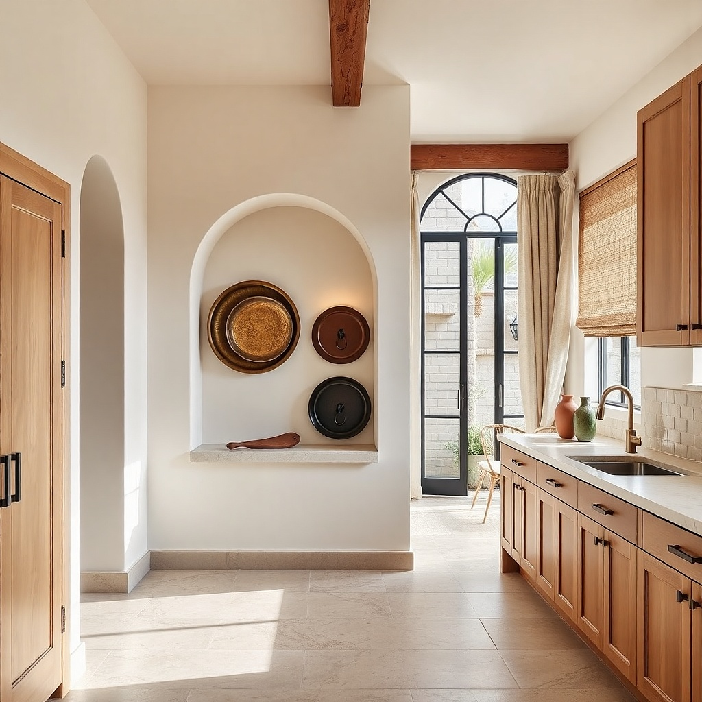
Metal trays add movement and shine, and they look great in kitchens because they echo cookware finishes. A scalloped shape is instantly decorative without being theme-y, and the repeated curves create a rhythmic pattern. Keep the set to three trays so it stays simple and photogenic. Choose brushed brass, aged bronze, or matte black so it doesn’t clash with your faucet and cabinet hardware.
Pick three trays with similar sizes: one about 10-12 inches wide, one 8-10 inches, one 6-8 inches. Use removable adhesive hooks or picture-hanging strips rated for metal weight; attach to the tray backs or use small command-style hooks. Layout a triangle: larger tray centered higher, smaller trays below at equal distances. Maintain about 4-6 inches between trays so the shapes don’t merge visually.
Wipe trays with a microfiber cloth before mounting so fingerprints don’t show under light.
Don’t hang them too close to the stove if steam is heavy; metal will spot.
6. One oversized wall clock with a removable mount
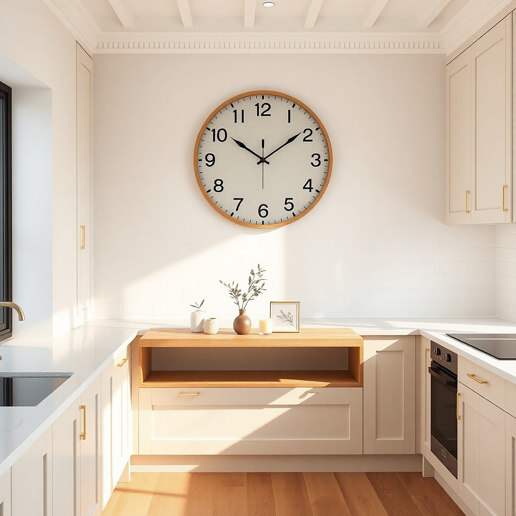
Choose a clock 14-20 inches wide for most apartments. Use removable adhesive mounting plates made for clocks or a renter-safe hook that matches the clock’s mounting points. Position the clock so its center lands about 63 inches from the floor, then step back to confirm it doesn’t collide with cabinet doors when opened. Replace batteries and test the sweep before fully committing to the final placement.
A single oversized clock is a strong focal point and solves the “blank wall” problem fast. Kitchens already have a lot of function, so the clock’s clean design keeps the wall looking purposeful. Choose a clock with a clear frame — light wood, matte black, or brushed metal and keep the face simple so it reads well in photos. It also helps with visual balance if your kitchen has long cabinet runs.
Common mistakeAvoid super tiny clocks; they read like clutter when the wall is otherwise empty.
Try thisMatch clock finish to your cabinet hardware or light fixture one connection makes it look designed.
7. Tension rod + linen dish towel gallery
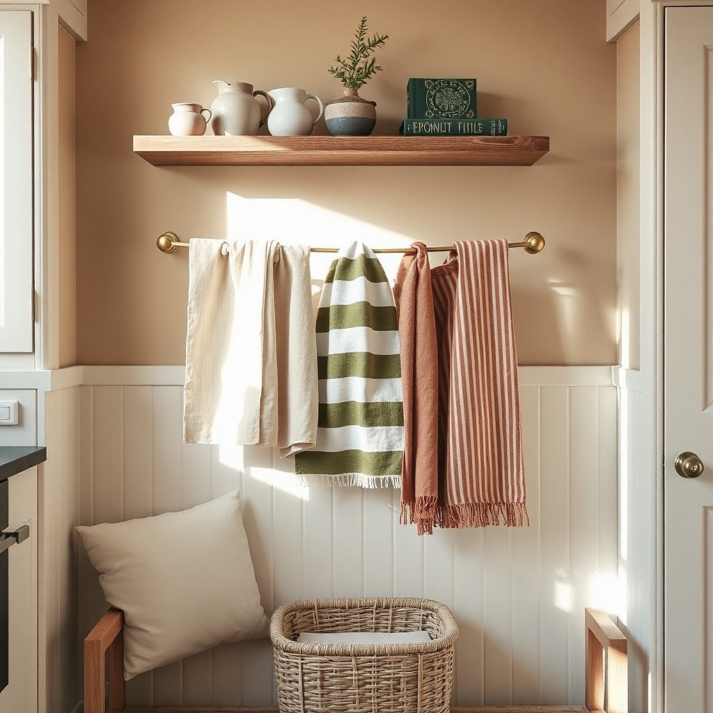
Measure the width of the window or the space between two stable surfaces for rod placement. Install a tension rod with end caps so it grips firmly without slipping. Hang two towels and fold them so the top edge is consistent, then secure with small clips if needed. Keep the rod height so towels sit around 10-14 inches below the top trim, not right against the ceiling.
A towel gallery looks layered and cozy without drilling. Linen has a natural texture that photographs well, and towels add color you can swap seasonally. Use a tension rod inside a window frame or between two fixed points so it stays renter-friendly. Keep the towels in one palette like cream with muted olive and tan stripes so it looks intentional rather than random laundry.
Common mistakeDon’t use thin paper-like towels; they sag and look messy.
Try thisUse one towel as a solid color and one as a stripe or subtle pattern; the contrast looks styled.
8. Adhesive picture rail with small framed quotes and menus
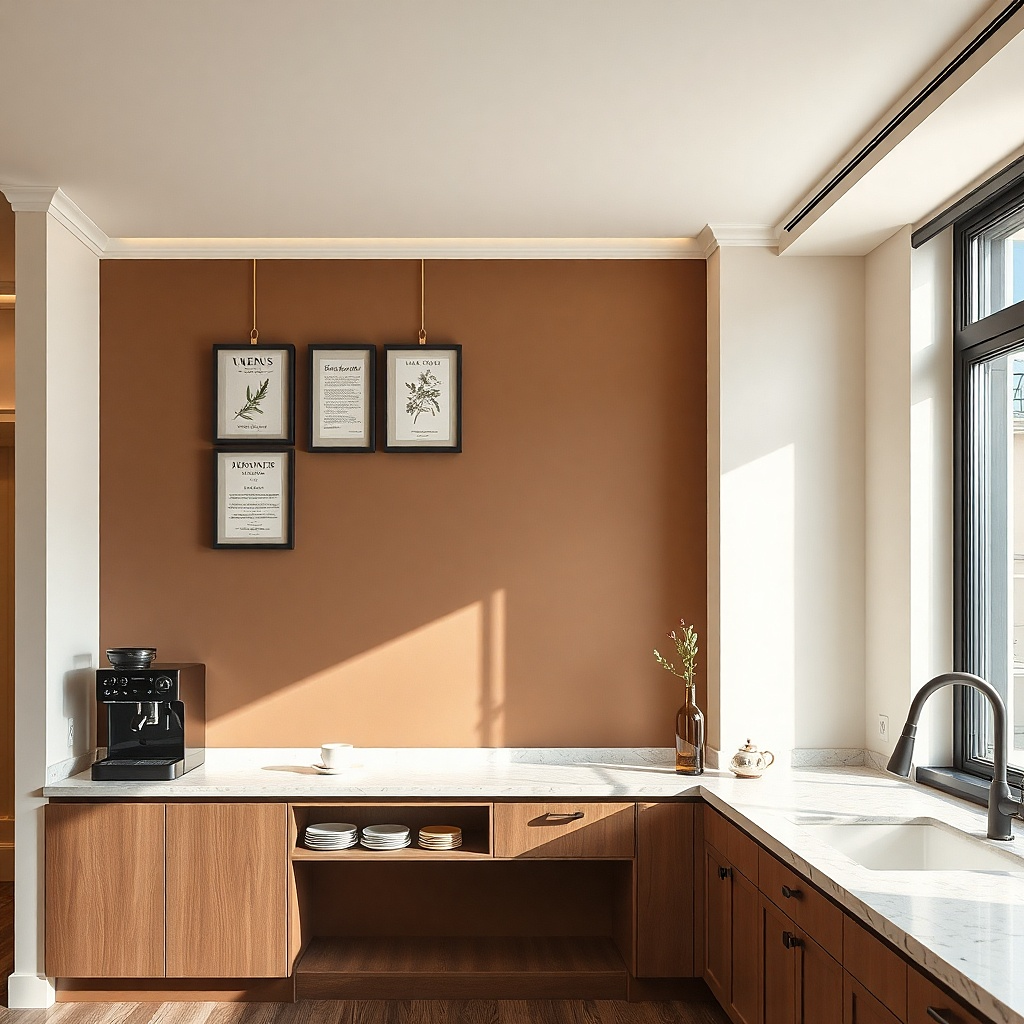
Buy a removable adhesive picture rail system and install it level across a span about 36-50 inches wide. Hang two to five frames with the same top clearance so they line up under the rail. Use lightweight frames and avoid heavy glass if your adhesive rail has a lower weight rating. Place the rail so the frames sit around 60 inches from the floor at center.
A picture rail makes rearranging easy, and it keeps your wall from looking like a grid of mismatched nail holes. Because you’re hanging small art, the rail’s clean line becomes the structure that makes everything look curated. For kitchens, use menu-style prints, ingredient typography, or short phrases on warm cream paper. Keep the frames consistent in finish black, white, or natural wood so the wall stays cohesive.
Common mistakeDon’t mix frame colors; the rail will highlight inconsistency.
Try thisLeave 2-3 inches between frames so the wall breathes and the photos don’t look crowded.
9. Oversized woven wall basket as a single statement
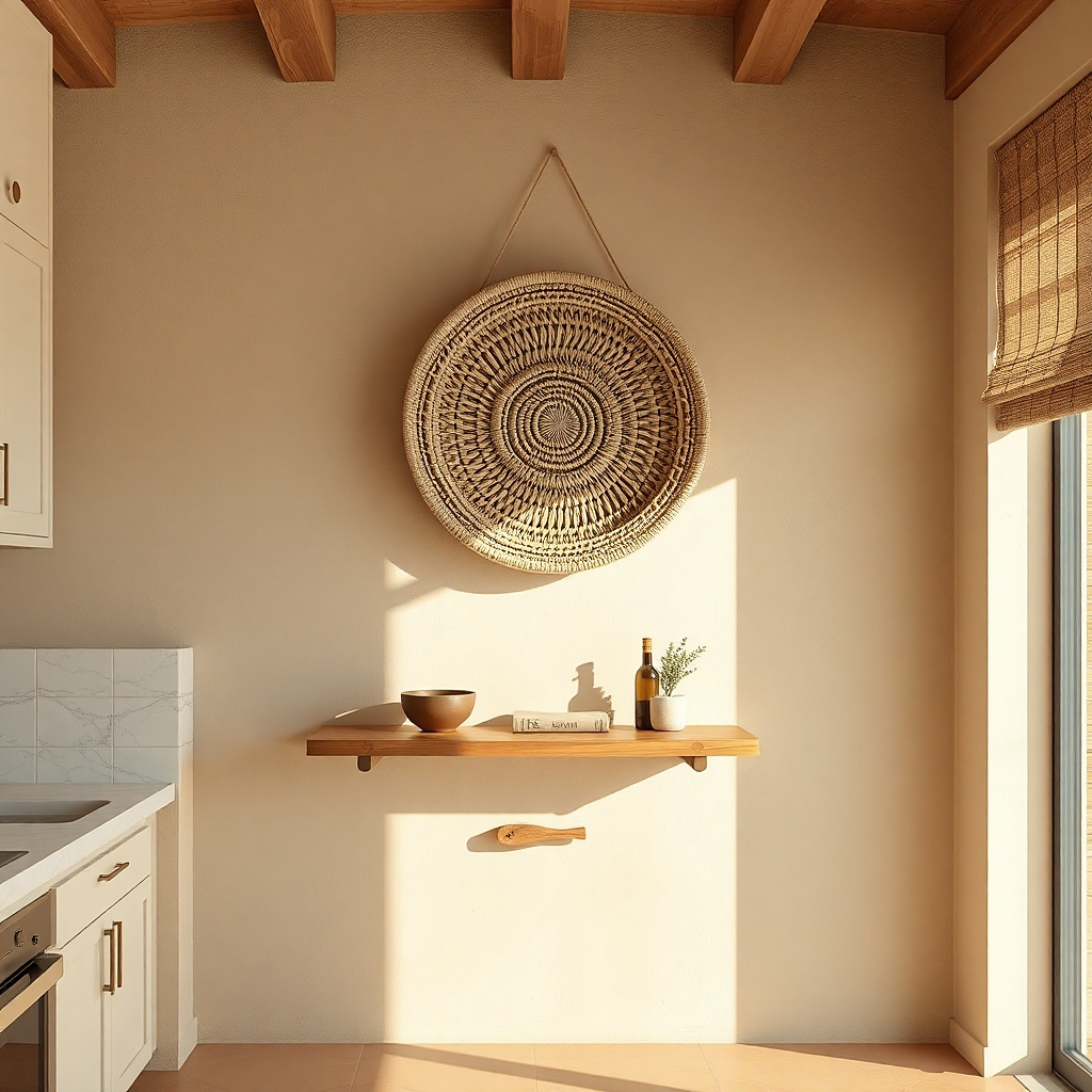
Pick a basket about 16-22 inches wide for most kitchens. Use a removable hook designed for heavier decor or a hook-plus-strap method if the basket has a loop — test weight rating first. Mark the mounting point with painter’s tape, then use a level to confirm the basket hangs straight. Add a simple liner inside if you want it to look tidy from angles where the weave might show the wall behind.
A large woven basket gives instant texture, and one big piece is easier to style than a bunch of small baskets. It also softens hard kitchen surfaces like tile and metal, which makes the wall feel warmer in photos. Choose a basket with tight weaving and a clean rim, ideally in natural jute, seagrass, or dyed olive. Mount it high enough that it doesn’t get hit by cabinet doors, but not so high it becomes a ceiling decoration.
Common mistakeAvoid baskets with loose, floppy rims; they sag and look unfinished.
Try thisPair the basket with one matching woven element elsewhere like a placemat or light fixture shade.
10. Plate rack look using adhesive rails and display plates
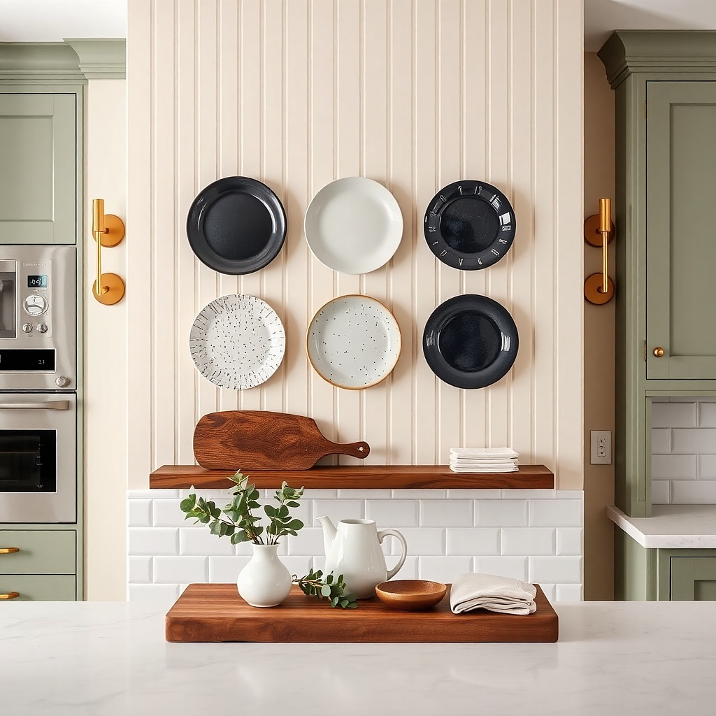
You can get the plate-rack aesthetic without a real rack. Decorative plates look great on kitchen walls because they echo dinnerware and add color that ties into table settings. Use one horizontal rail row or two staggered rails, then display plates with consistent size so it looks intentional. Choose glazed ceramic plates in deep blue, terracotta, or muted green the shine reads well under overhead lighting.
Choose two to four plates and measure their diameter so you can plan spacing. Install removable adhesive rail hooks or adhesive rails on the wall, keeping the top rail around 65-70 inches from the floor. Hang plates using removable plate hangers or small clips that attach to the rail. Dry-fit the arrangement first with painter’s tape outlines, then mount one piece at a time to keep alignment.
Use plates with similar sheen (matte vs glossy) so reflections don’t make the set look mismatched.
Don’t mix radically different plate sizes; the wall turns into a clutter pile.
11. Kitchen wall monogram using peel-and-stick vinyl letters
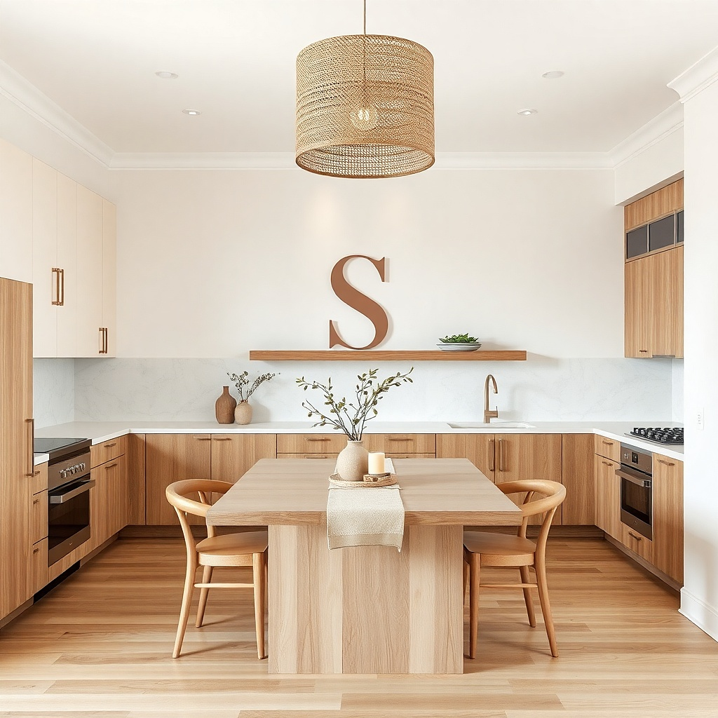
A single monogram or initial gives you that “done” look with almost no items. It’s renter-friendly and easy to remove, and it photographs well because it creates clean negative space. Pick a bold letter style and a matte vinyl that doesn’t glare. Sage, clay, or warm black letters look great in kitchens because they sit comfortably next to wood tones and stainless finishes.
Measure the wall and decide where the letter should sit — center it above a dining table or along a blank stretch near the fridge. Use painter’s tape to mark the letter’s footprint, then apply vinyl letters using a straight edge so edges don’t drift. Press firmly and rub with a plastic card to seal edges. If your vinyl is thin, apply slowly to avoid stretching; keep the letter about 12-18 inches tall for strong readability.
Add a small secondary element like a tiny framed print or a single small utensil print so the monogram doesn’t feel lonely.
Avoid glossy vinyl; it highlights wall imperfections and looks like a temporary label.
12. Adhesive-mounted heat-safe art tiles with a grid of 6
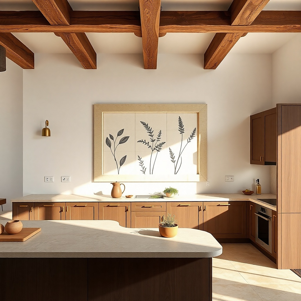
This is for renters who want a pattern wall without paint. Art tiles with sealed surfaces handle cleaning better than paper prints, and a 2x3 grid looks graphic and modern. Choose designs that relate to kitchens — botanical line work, small spice illustrations, or simple fruit silhouettes. Keep the color palette tight: one background color plus one or two accent colors. The grid reads clearly even when the kitchen is busy with cabinets.
Buy a set of six matching sealed tiles on a single backing or individual tiles with adhesive corners. Measure your grid space and mark a rectangle with painter’s tape. Apply tiles one at a time, starting from the top-left, pressing each tile edge to edge with consistent spacing. Use a level and a ruler so the grid doesn’t drift; finish by wiping the surface with a dry cloth to remove smudges.
Pick a background color that matches your backsplash grout shade for a calmer look.
Don’t use tiles with heavy glare if your kitchen has strong overhead lighting.
13. Oversized framed fabric panel in a matching color palette
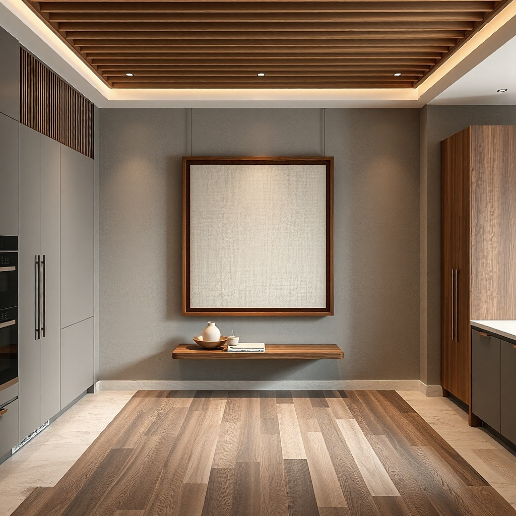
Choose a frame size around 24-36 inches wide to create a real impact. Stretch the fabric tightly over a backing board and secure it neatly at the back so it stays smooth. Use removable picture hanging strips rated for the frame weight, and mount with the top edge around 60 inches from the floor. Step back and check the panel sits clear of cabinets and handles when doors open.
Fabric art gives softness and color without needing a lot of pieces. A single framed linen or cotton panel works like a textile “painting,” and it hides wall imperfections because the texture absorbs light. Choose a fabric with a subtle pattern or a solid color olive, warm sand, or muted terracotta so it doesn’t compete with dishware. This is a great option for renters who want warmth but hate clutter.
Common mistakeAvoid stretchy knit fabrics; they ripple under tension and look wrinkled.
Try thisMatch the fabric undertone to your countertop — cool quartz pairs better with cooler greens; warm stone pairs better with clay tones.
14. Three vertical wood slats with removable wall clips
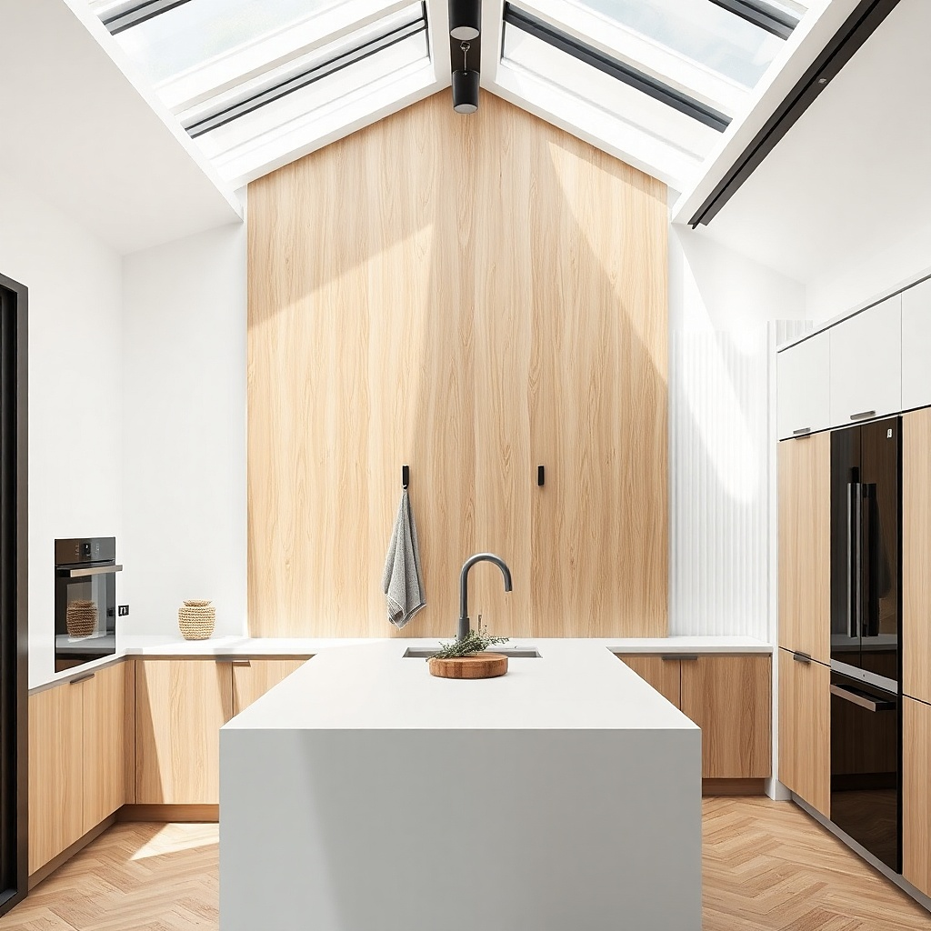
Vertical slats add height and structure, which is exactly what a blank kitchen wall needs when the room feels short or cramped. Wood slats also connect visually to cabinets, cutting boards, and flooring. Keep the slats narrow and spaced with small gaps so the wall doesn’t look like a solid plank. This idea looks especially good in kitchens with modern hardware because the lines feel clean and graphic.
Buy three slats with the same width, ideally 2-3 inches wide each, and about 24-36 inches tall. Use removable wall clips or adhesive-backed standoffs designed for wood decor so you’re not relying on one strip. Mark a center line, then place the middle slat first and measure equal gaps for the other two. Mount so the slat bottom sits around 10-12 inches above the counter or table line.
Use a light stain or natural finish so the slats brighten the wall instead of darkening it.
Avoid wide slats with thick depth; they can look heavy and make a small kitchen feel smaller.
15. Backlit LED acrylic menu sign with removable power
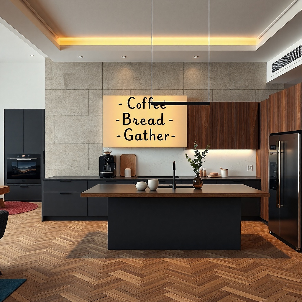
Pick a sign size around 12-18 inches wide so it’s noticeable but not dominating. Mount with removable adhesive pads or a removable bracket system, then route the thin power cable along the wall edge using stick-on cable clips. Plug into a wall outlet with a concealed extension if needed. Position the sign so its center lands around 62-66 inches from the floor, then test lighting before leaving the cable clips permanently pressed.
A backlit sign is one of the few wall decor options that looks good in both daylight and evening. It gives your kitchen a styled “cafe” feel, and the glow adds warmth without needing more objects. Choose an acrylic sign in clear or frosted white with simple black text, not busy illustrations. Mount it high enough to avoid splashes, and keep the cable hidden along a corner using removable clips.
Common mistakeAvoid bright multicolor LEDs; they make kitchens look like a party room.
Try thisUse short lines of text with one accent word for readability from across the room.
16. Chalkboard panel with removable frame and clean borders
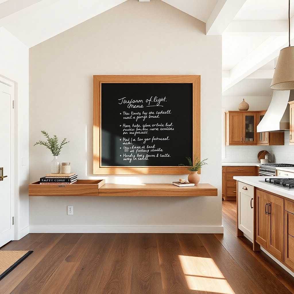
A chalkboard panel gives you a practical decor function: you can change the message with seasons, grocery lists, or menu items. The key for “less can be more” is keeping it small and framed so it looks like design, not a school project. Choose a matte chalkboard surface inside a simple wood or black metal frame. Keep the writing minimal one line of text so the wall stays photogenic rather than cluttered.
Select a chalkboard panel about 16-24 inches wide and install it with a removable frame bracket system. Use painter’s tape to mark placement, then mount so the writing line sits around 60-62 inches from the floor. Use chalk or a chalk marker designed for smooth matte boards. If the wall gets splashed, place it slightly off the main splash zone and wipe with a dry cloth, not wet scrubbing.
Write in one color (white chalk on black or light cream chalk on dark) for consistent visuals.
Don’t use huge boards; they dominate small kitchens and look messy when you update them.
17. Large framed mirror with a removable hanging method
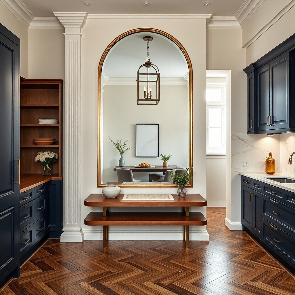
Choose a mirror about 20-30 inches wide so it’s noticeable without overwhelming the room. Use removable wall mounting anchors rated for the mirror’s weight or a removable bracket kit that spreads load. Mount at a height where the center is around 60 inches from the floor, then check it doesn’t reflect the sink mess back at you. Clean the mirror with glass cleaner and a lint-free cloth so it reads crisp in photos.
A mirror is decor that also fixes the “kitchen feels small” problem. When you hang one mirror on a blank wall, you add light and depth, and it makes the space look styled because it reflects your existing design. Go for a simple frame in black, brushed brass, or warm wood so it matches kitchen finishes. The mirror also helps photography because it brightens the scene and makes the wall look intentional.
Common mistakeAvoid ornate frames; they fight cabinet hardware and make small kitchens look busy.
Try thisPlace it so it reflects a tidy area like a table setting or pendant light, not countertops.
18. Rattan or bamboo wall hanging with a simple hook cluster
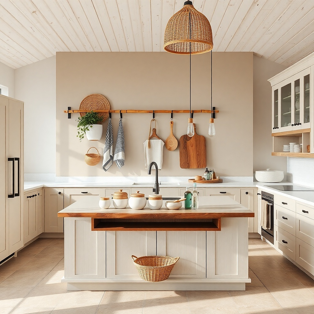
A rattan/bamboo wall hanging adds texture and warmth, and it’s a strong renter choice because it’s usually light enough for removable hooks. The look is airy, which matters in kitchens where heavy decor can feel visually heavy. Pick a hanging with a clean silhouette — a fan shape, a semicircle, or a layered oval and keep the palette natural. It pairs well with white walls, light wood floors, and woven baskets.
Choose a hanging around 18-26 inches wide so it’s readable without crowding. Use two or three removable hooks depending on the hanger’s support points, keeping them at equal spacing so the piece hangs straight. Mark hook positions with painter’s tape and press hooks per the instructions before hanging. Place the bottom edge around 8-12 inches above the counter or table to keep it in the “decor zone” rather than the splash zone.
Add one small woven piece below it, like a placemat or tray, so the texture repeats.
Avoid very large wall hangings; they can block light and make the kitchen feel cramped.