1. Oversized framed linen map in warm cream
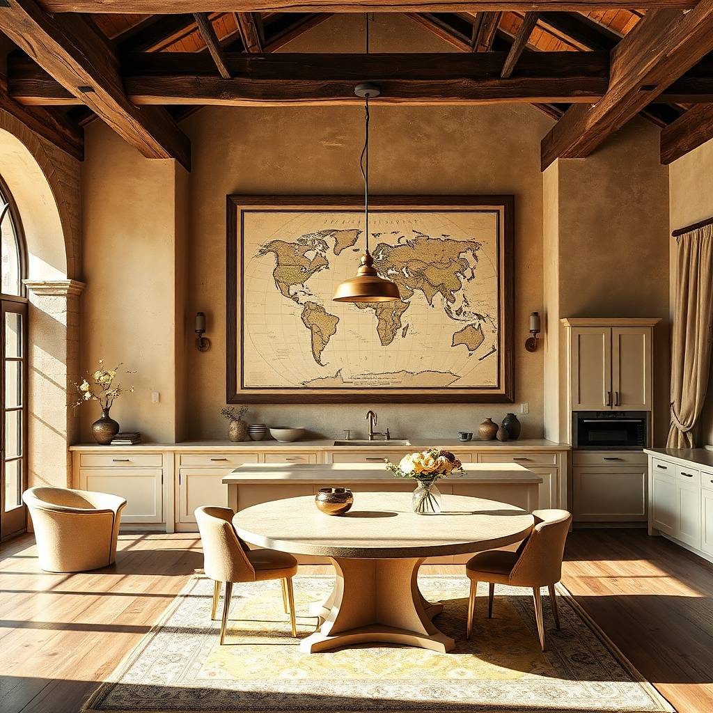
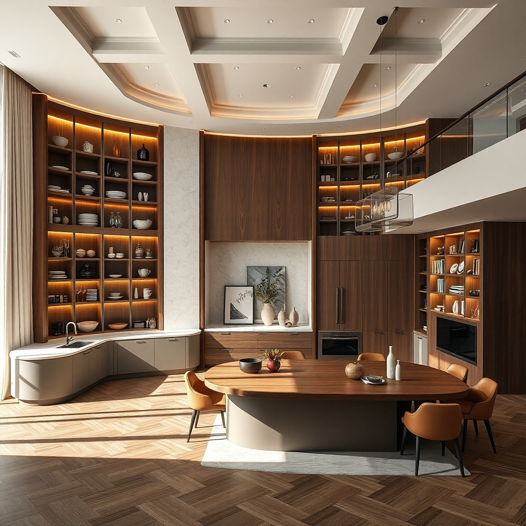
A large framed linen map reads bold without shouting, because the texture looks soft at a distance. Choose a warm cream ground and subtle ink lines so it doesn’t fight a busy backsplash or cabinetry. The frame should be wide about 3-4 inches in blackened steel, espresso wood, or antique brass to give the wall a clean edge. Hang it centered on the main blank stretch where your eye naturally lands when you enter the kitchen. This works particularly well in kitchens with modern cabinets because the linen adds a calm, tactile layer.
Start by measuring the wall width and choosing a frame that takes up roughly 60-70% of it, leaving 6-10 inches on both sides. Mount with a French cleat or heavy-duty wire so the frame stays level; use a stud finder and aim for at least two mounting points. Keep the center of the map at 57-60 inches from the floor. Budget $120-350 depending on frame width and linen quality, and plan for a glass-free or low-glare glazing option if you have overhead lighting glare.
Match the frame finish to a hardware detail you already have cabinet pulls, faucet, or a black light fixture.
Avoid bright white ink maps and thin, narrow frames; they read unfinished at large scale.
2. Three-panel ceramic tile triptych in deep green
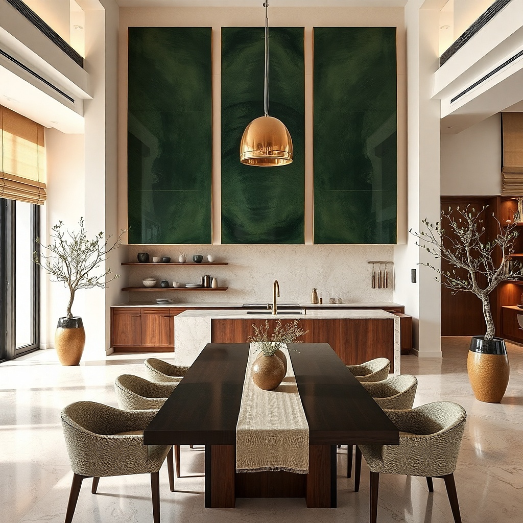
Pick tiles in a consistent size range, then assemble as three equal panels; a common look is each panel around 12x24 inches for a medium wall. Use a backing board or a pre-made triptych frame system so the panels align straight; dry-fit before attaching. Hang with the center panel at 58 inches from the floor, and keep 1-2 inches of gap between panels. Expect $200-600 for custom or higher-end tile sets, with extra cost if you need a pro installer for a precise level mount.
A three-panel ceramic tile triptych gives you a real statement surface with built-in pattern control. Deep green looks rich next to most kitchen finishes white paint, light oak, walnut, and even black cabinetry and ceramic tile holds light beautifully without looking glossy-cheap. Choose panels with subtle variation in glaze, not loud geometric prints, so the piece stays elegant from across the room. This is also a practical choice above a dining nook because it cleans more easily than fabric artwork. The triptych format keeps it from overpowering like a single huge tile mural can.
Common mistakeSkip tiny, high-contrast tile patterns; at distance they turn into visual noise.
Try thisRepeat deep green once elsewhere a vase, runner, or curtain tieback so the wall feels intentional.
3. Sunburst mirror with black metal rays
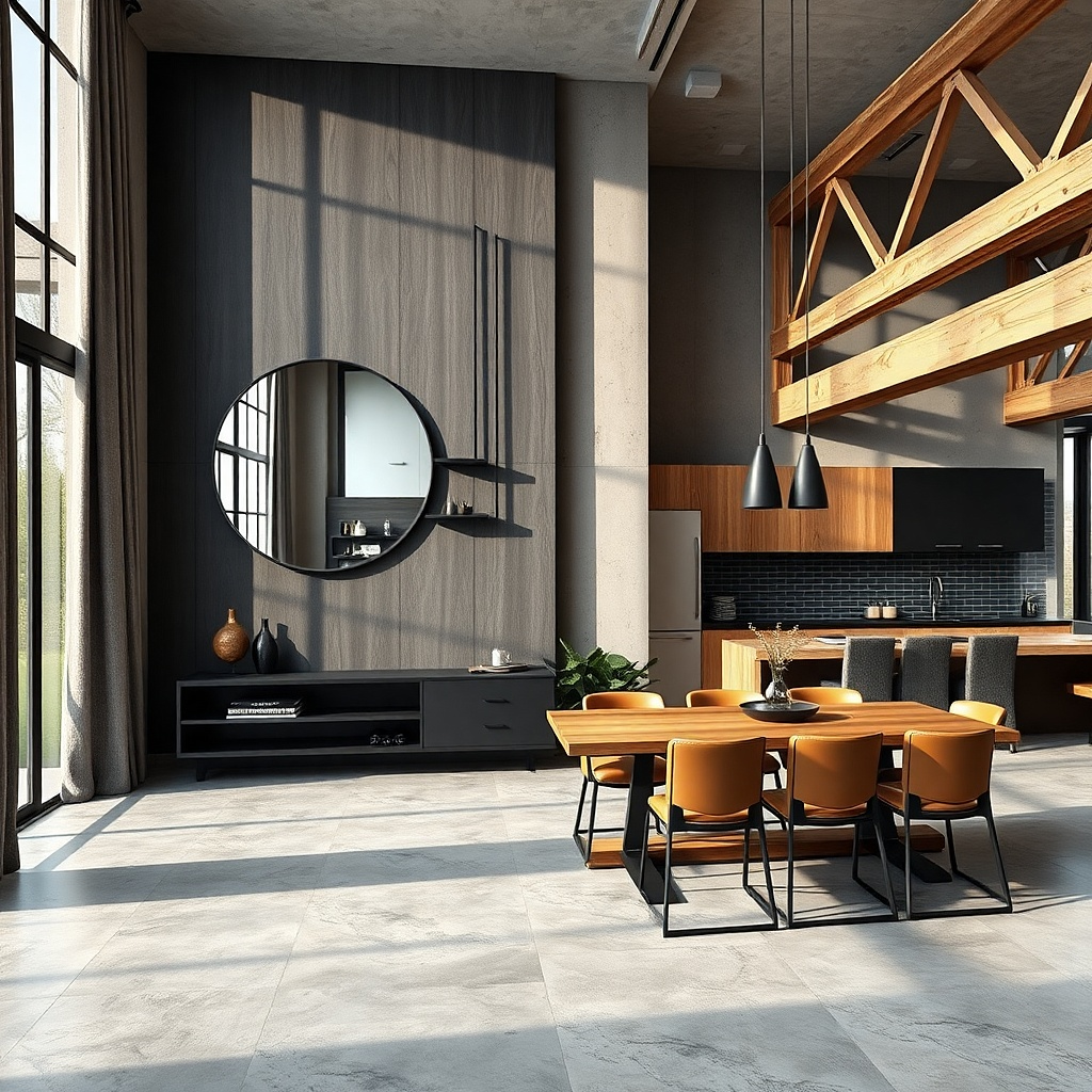
Measure your wall and pick a mirror that covers about half to two-thirds of the wall span. Hang it so the mirror center sits at 58-60 inches from the floor; if there’s a light fixture below, keep at least 8 inches of clearance. Use the included mounting hardware and confirm it hits a stud; if not, use heavy-duty wall anchors rated for the mirror’s weight. Plan $150-450 depending on ray size and mirror glass quality.
A sunburst mirror brings light into the room and makes a blank wall feel styled immediately. Black metal rays create a crisp silhouette that looks good against warm wood, white walls, and light stone countertops. The mirror also solves a common kitchen issue: low natural light and flat-looking walls. Choose a mirror diameter around 24-30 inches so it’s large enough to anchor the wall but not so big it overwhelms the dining area. This idea is especially strong when your kitchen has open shelving nearby the mirror adds a focal point above the visual clutter.
Common mistakeDon’t choose a mirror with tiny rays; small details disappear and the effect looks decorative instead of architectural.
Try thisPlace a small tray or vase on the counter directly below the mirror line; the reflection makes the styling look layered.
4. Large macramé wall hanging with natural cotton
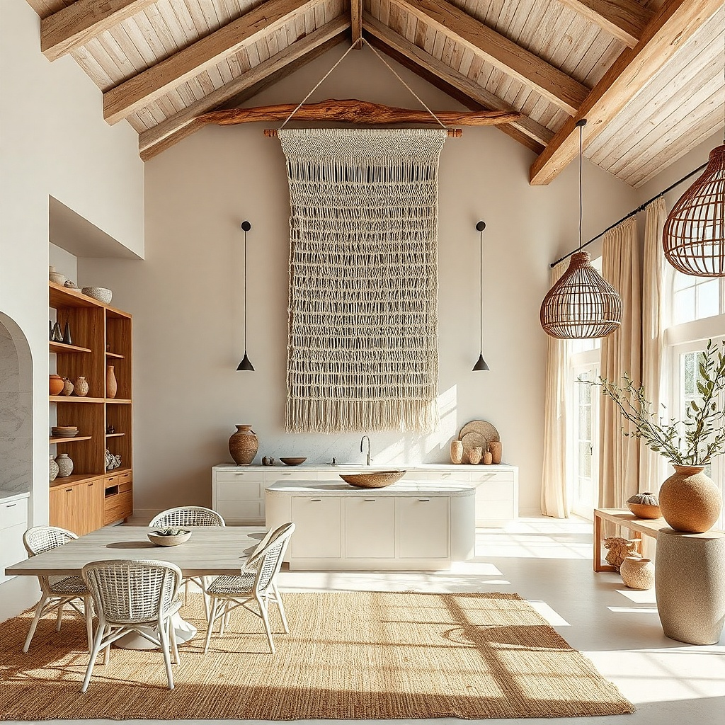
Macramé is one of the few large wall decor types that adds softness without visual weight. Natural cotton in an oat or sand tone gives warmth and texture, and the open knots let light pass through so the wall doesn’t feel heavy. Go for a substantial size around 24-30 inches wide and 30-40 inches long so it reads as a statement rather than a craft piece. Keep the design focused: a rounded top section with fewer, larger knot patterns looks cleaner than dense fringe everywhere. This works great in kitchens with modern lines because it introduces a human, handmade texture.
Choose a hanging designed for wall mounting with a top rod or hanging bar; avoid pieces that only come with thin string. Install a sturdy wall hook or small wood bracket anchored to a stud, then hang the bar so the piece sits straight. Start with the top about 68-72 inches from the floor for a balanced look, then adjust after you step back. Expect $80-250 for quality cotton pieces; thicker rope costs more but looks more sculptural.
Pair with one smooth element nearby a ceramic vase or a matte black frame so the macramé texture is the star.
Skip dyed bright colors; they overpower kitchens where you already have backsplash and cookware color.
5. Oversized botanical print in a thick oak frame
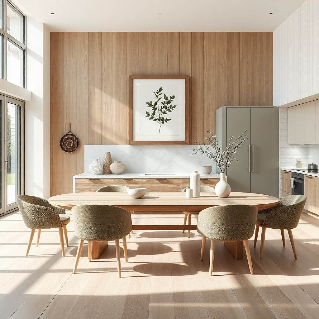
A botanical print looks expensive when it’s oversized and framed in thick wood. Choose an illustration style with simple linework and muted greens, not neon leaves. An oak frame about 2-3 inches thick makes the print feel architectural, not like a poster. This idea works especially well above a dining table where you want a calming focal point that pairs with place settings and natural textures. If your kitchen already has warm wood flooring or open shelving, botanical art makes the whole space look cohesive.
Select a print sized to fill 55-70% of the wall width; for many kitchens that lands around 24x36 inches or larger. Use archival paper and glass with low glare if you have bright overhead lights. Hang the frame center at 58-60 inches from the floor, and keep the print edges parallel to cabinet doors. Budget $100-400 depending on frame thickness and whether it’s a custom mat.
Use a mat that matches your wall paint tone, not white; the off-white mat makes the colors look more natural.
Don’t use thin black poster frames; at this scale they read flimsy.
6. Gallery wall grid of oversized black-and-white photos
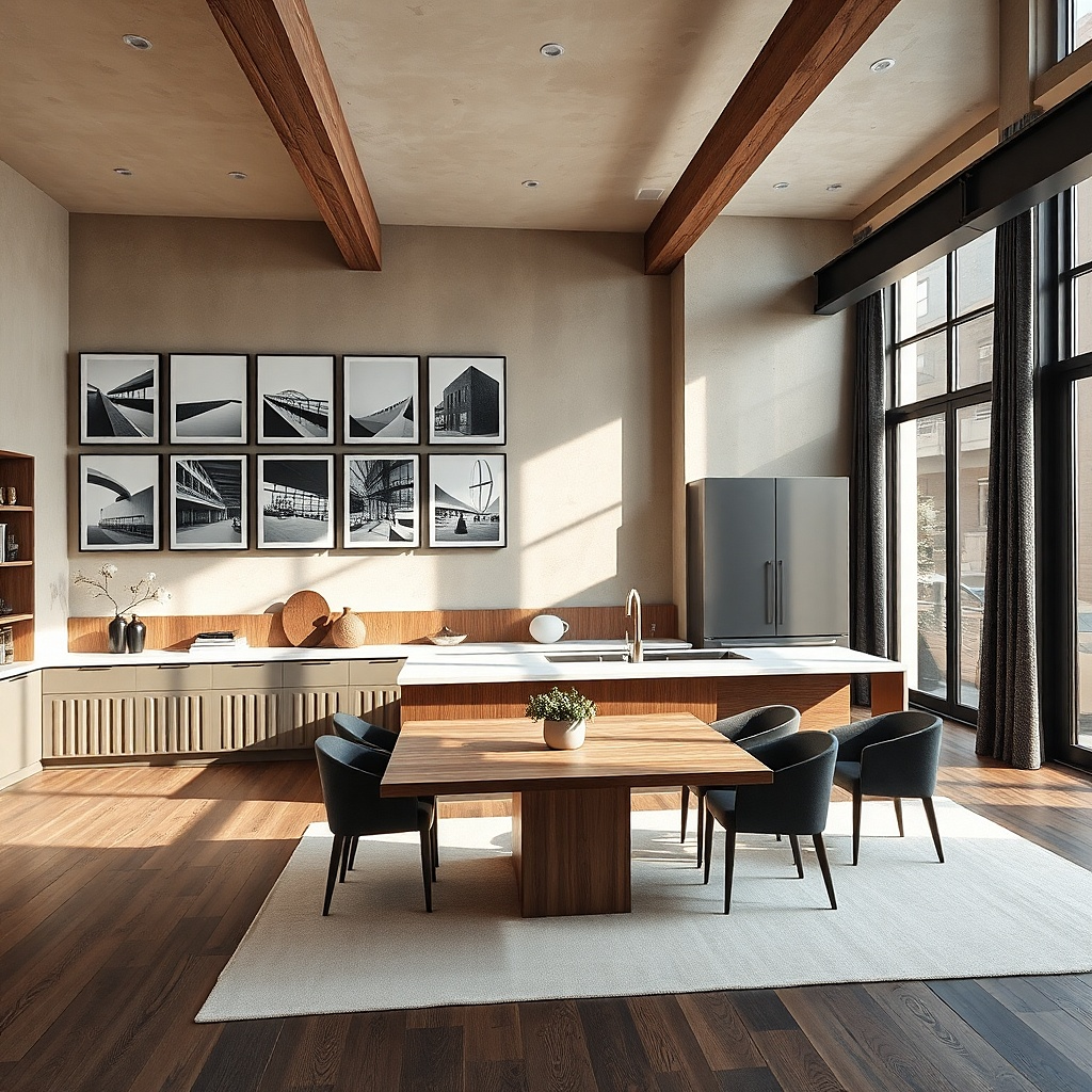
A grid gallery wall is one of the safest ways to make a large wall look designed without overpowering. The key is oversized frames with consistent spacing, so it reads intentional and clean rather than random. Black-and-white photos keep the palette calm, which matters in kitchens where you already have color from food, glassware, and backsplash. Choose simple subjects like architectural lines, still-life plates, or nature silhouettes so it doesn’t compete with your daily clutter. This approach is also good if you want personal warmth but don’t want bright colors.
Pick 6-9 frames and arrange them in a grid; a strong layout is 3 columns by 2 rows with frames around 10x14 or 12x16 inches. Use identical frames and mat colors, then measure the gap between frames — 2-3 inches is a good range. Lay everything out on the floor first, then transfer measurements to the wall using painter’s tape. Hang the top row so the overall grid center lands at 58 inches; use a level and stud mounting for the heavy frames.
Keep mats a consistent width, ideally 1.5-2 inches, so the grid looks crisp from across the room.
Avoid mixing frame finishes; mismatched metals make kitchens feel messy fast.
7. Large metal wall sculpture with utensil silhouettes
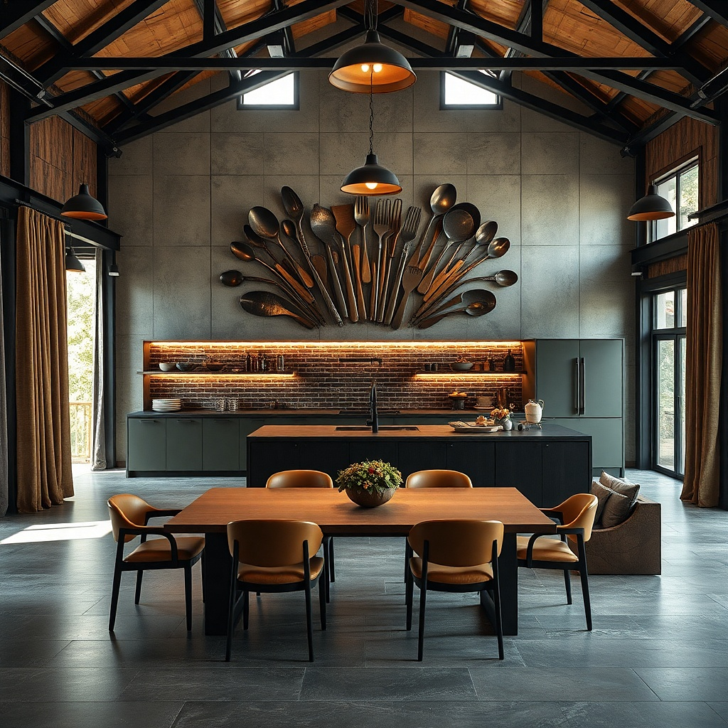
Choose a sculpture width that hits about 50-70% of the wall span; many look good around 24-36 inches wide. Check mounting points and verify you can anchor to studs; heavy metal should not rely on drywall alone. Place the center of the sculpture at 58-60 inches from the floor, and keep it at least 8 inches away from the nearest cabinet edge. Budget $90-300 depending on size and finish, and plan for a quick level adjustment after the first mount point.
Metal utensil silhouettes give you a statement that looks graphic and modern, especially when you keep the color limited. Black, dark bronze, or brushed stainless silhouettes work best because they echo kitchen hardware and cookware. Choose a piece with a clear outline and enough negative space so it doesn’t look like clutter. This is a strong choice for open-concept kitchens where you want the wall to feel like it belongs to the kitchen, not a generic living room. Pair it with minimal styling below one tray or a simple runner so the metal piece remains the hero.
Common mistakeSkip pieces with tiny, dense cutouts; they look like a jumble up close and a blob from far away.
Try thisUse a warm bulb temperature on nearby lights (2700K) so the metal reads more golden instead of bluish.
8. Oversized chalkboard menu board framed in black
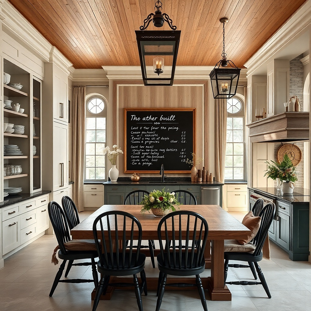
Pick a chalkboard frame sized to cover roughly half the wall width, then mount with two screws into studs. Hang with the center at 58-60 inches from the floor so it’s readable without craning. Use a chalk tray or magnet accessories only if they fit the frame — keep the board visually calm. Budget $80-250 for quality framed boards, and plan for a few weeks of practice with chalk lettering thickness before you commit to the look.
A large framed chalkboard gives you a statement that changes with your life, and it also fills wall space without permanent clutter. The trick is size and typography: choose a board at least 24 inches wide, with a thick black frame that matches kitchen lighting or hardware. Use it for a rotating menu, a grocery list, or a short seasonal message. Because chalk has a matte finish, it doesn’t compete with glossy backsplash or glass cabinet doors. It’s particularly useful in kitchens where you already have lots of functional wall items and you want one clean, attractive home for them.
Common mistakeAvoid tiny chalkboards; small ones feel like an afterthought and don’t anchor the wall.
Try thisWrite with 2-3 line weights only: thick headings and thin sub-lines; it keeps the board from looking messy.
9. Large woven wall basket cluster with three sizes
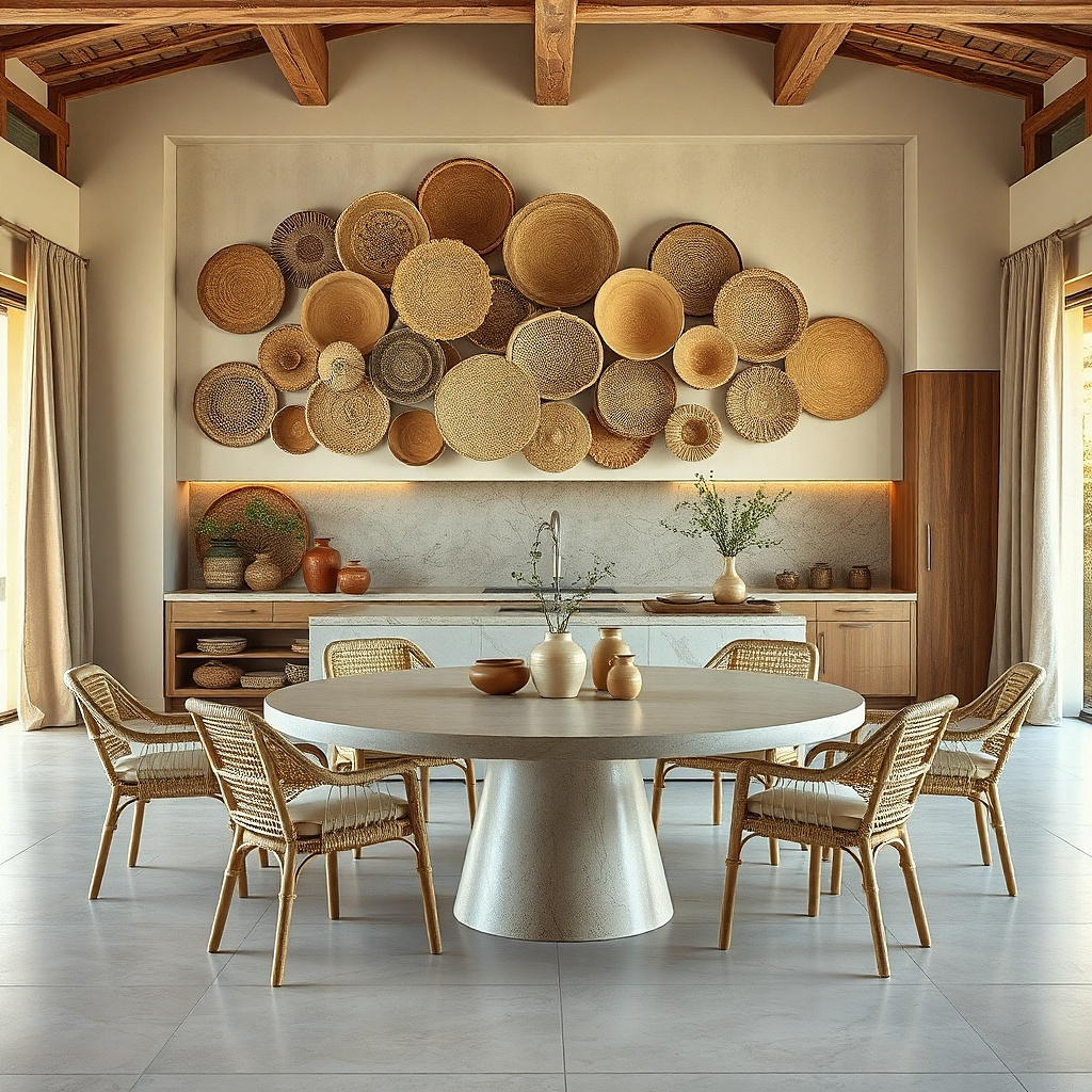
Woven baskets look great on kitchen walls because they bring texture and warmth that matches wood, rattan, and natural stone finishes. A cluster of three baskets one larger center basket and two smaller flank pieces creates a balanced statement without needing a single huge object. Choose baskets in matching natural tones like camel, oat, or light tan so the cluster looks curated. This works well in kitchens with neutral counters where you want a warmer, handmade focal point. The open weave also softens harsh overhead lighting and makes the wall look layered.
Pick baskets with three distinct sizes; a common trio is one 16-20 inches wide and two around 10-14 inches. Mount the center basket first at 58 inches from the floor, then place the smaller baskets so their centers align vertically with the center basket. Use sturdy picture hooks or basket-specific wall mounts, anchored to studs; woven baskets can still be heavy when full of air-dried texture. Expect $60-220 depending on basket size and material quality.
Keep the basket rims at a similar height so the cluster reads as one composition.
Don’t mix extreme colors like bright red or dark espresso with light walls; it looks accidental.
10. Oversized framed plate display with 12-inch chargers
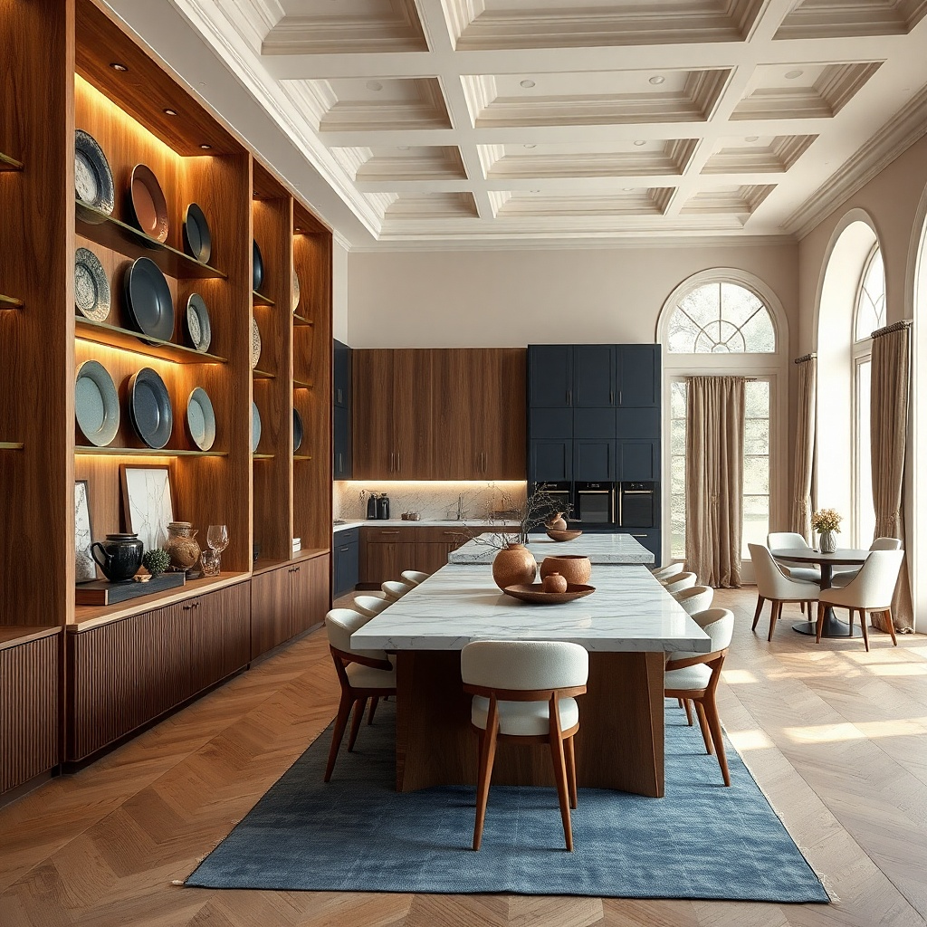
Select three to five plates and confirm they fit within the frame dimensions; a typical framed set might be 24x30 inches. Use a plate-hanging system or a frame with plate supports so the plates sit flat and don’t stress the edges. Mount the frame center at 58-60 inches from the floor, and keep 2-4 inches of gap between the plate surfaces and the frame edges. Budget $150-450 depending on plate quality and frame size.
A framed plate display makes big wall decor feel like part of the dining setup. Use 12-inch chargers or large plates so the shapes are readable from across the room. Choose a consistent style — all matte ceramic, or all glossy with a similar color family — so the wall doesn’t look like mismatched thrift finds. This idea is especially effective for kitchens that already have a plate rail or open shelving nearby because it adds a more formal, gallery-like presentation. Keep the background neutral and let the plate colors do the work.
Common mistakeSkip tiny plates; they get lost and make the wall feel under-scaled.
Try thisPick one repeating color detail across plates all have a thin gold line, or all use the same sage glaze for a polished look.
11. Large vertical wood slat panel in walnut stain
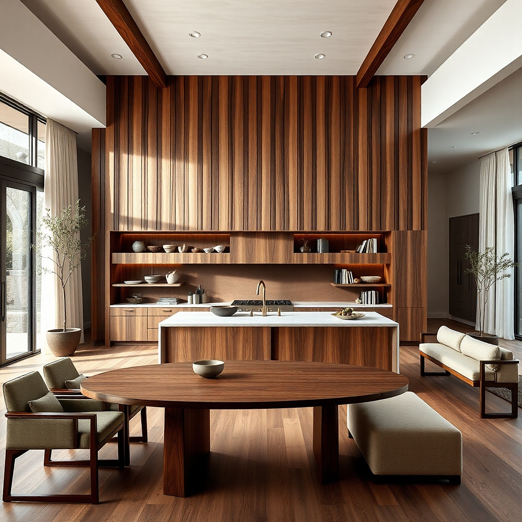
A vertical wood slat panel gives you a statement wall without any pattern chaos. Walnut-stained slats add warmth and depth, and the vertical lines make the wall feel taller. Choose a panel width around 30-40 inches and a height that hits most of the available blank space. This works well when your kitchen has modern cabinets or a simple backsplash because the slats add interest while staying calm. It also looks great under pendant lights because the shadows between slats create a natural, changing highlight.
Buy a prefabricated slat panel or build one with 1x2 or 1x3 slats; keep spacing between slats around 1/4 to 1/2 inch. Sand and stain for a smooth finish if you’re building, then seal with matte clear coat so it doesn’t look shiny. Mount using a French cleat or multiple anchors into studs; a panel this size needs solid support. Hang with the center at 58 inches from the floor, then step back to confirm the slats align straight with cabinet lines.
Match the slat color to a warm wood element you already have, like flooring or a butcher block edge.
Avoid glossy finishes; they can look plasticky next to matte cabinets.
12. Oversized framed fabric panel with block-printed pattern
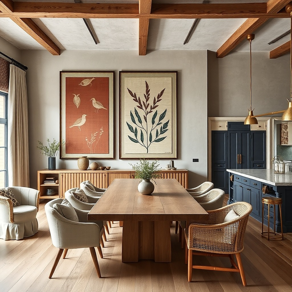
Select a fabric panel large enough to cover about half the wall width; 24x36 inches is a common sweet spot. Use a frame with a tight backing and a mat or spacer so the fabric doesn’t sag; stretch it evenly before mounting. Hang the frame center at 58-60 inches from the floor, and ensure it’s level with the cabinet doors. Cost is usually $120-300 for a framed custom panel depending on fabric and frame material.
Fabric wall art looks great in kitchens when it’s framed properly and the pattern is controlled. Choose block-printed style with a limited color palette — think indigo on cream, or terracotta on sand — so it doesn’t fight your kitchen’s existing textures. A wide frame in light oak or black metal makes the fabric look intentional. This idea works well if your kitchen has busy tile or patterned curtains because the fabric can sit between visual elements with a softer texture. Size matters: go large enough that the pattern reads as a design, not a small detail.
Common mistakeSkip thin, flimsy fabrics without backing; they ripple and look sloppy at large scale.
Try thisPick a fabric with a matte finish; it reads calmer under kitchen lighting than shiny textiles.
13. Large monochrome typography sign above dining
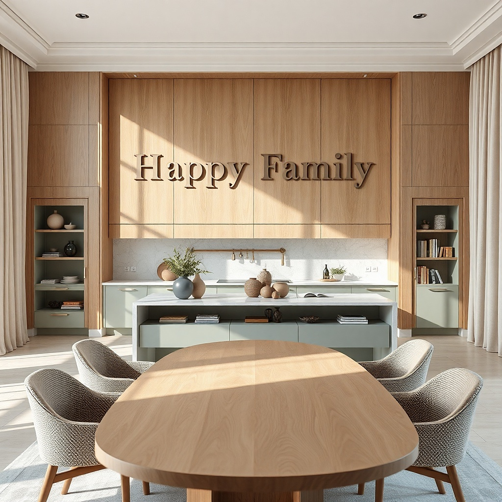
A typography sign is a statement that stays clean when you keep it monochrome and oversized. Choose black lettering on a warm off-white board, or white lettering on matte black acrylic for a modern look. The best designs use one short line — a word or two — not paragraphs. Place it above the dining table or the main open wall where you want a focal point that doesn’t add visual clutter. Typography works especially well in kitchens with neutral backsplashes and sleek hardware because it adds structure and readability.
Choose lettering artwork that’s at least 20-28 inches wide so it reads from the doorway. Mount centered with the sign’s baseline about 62 inches from the floor if you want it to feel slightly higher, or center it at 58-60 inches if you prefer balanced. Use a level and anchor screws into studs; thin boards still need real support. Budget $60-200 for ready-made signs or $90-250 for custom lettering.
Keep font style simple and bold; thin script looks elegant up close but disappears from the dining area.
Avoid multi-color typography; it competes with every other color in the kitchen.
14. Oversized framed abstract glaze art in beige and espresso
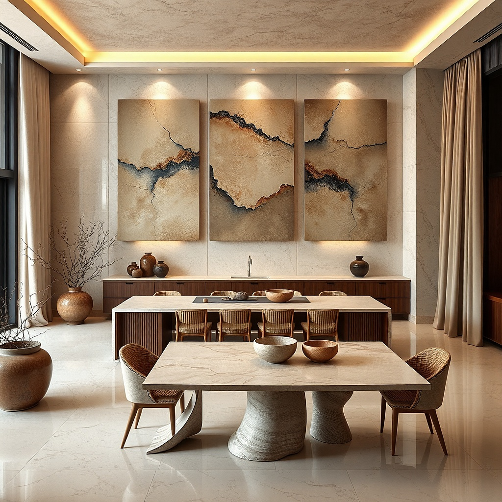
Abstract glaze-style art looks striking because it mimics the finish of stoneware soft, layered, and slightly imperfect. Beige and espresso tones keep it grounded in kitchen neutrals while still reading as a statement. Choose a frame that’s darker than the artwork by at least one shade so the piece pops against the wall. This works when you want visual interest but you don’t want the wall to look themed to a specific style. It also pairs well with dining chairs that have texture linen, bouclé, or woven cane because the art echoes that softness.
Select a piece around 24x36 inches or larger, then check that the artwork’s main colors match your cabinetry or countertop tones. Use a thick frame around 2-3 inches wide, and hang with the center at 58-60 inches from the floor. Keep it away from direct glare; if you have a bright fixture overhead, position the art so the reflection doesn’t wash it out. Cost is usually $150-500 depending on whether it’s print or original-style work.
Add one small ceramic item on the counter below that repeats the espresso tone from the frame.
Skip artwork with neon colors; abstract loses its calm and starts looking chaotic.
15. Large hanging plate rail with five plates
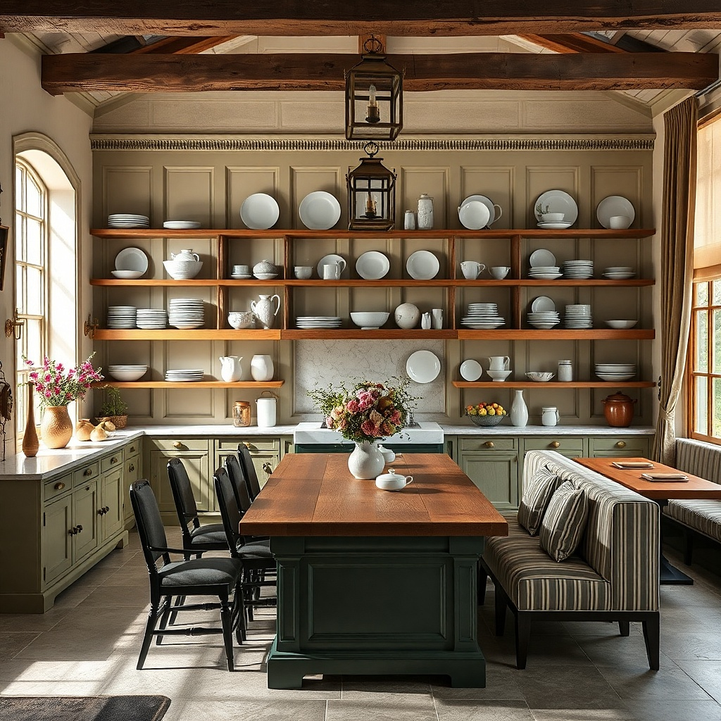
Pick a rail length that spans about 60-75% of your blank wall width. Mount the rail into studs with the top of the rail around 62-65 inches from the floor, then hang plates so their centers sit evenly; keep 2-3 inches between plate edges. Use plate hooks or a proper rail bracket so the plates sit securely and don’t stress. Expect $60-180 for the rail and hooks, plus $60-250 for plates depending on quality.
A hanging plate rail is classic, but the statement comes from scale and spacing. Use a rail long enough to hold five plates, with each plate around 10-12 inches wide. Coordinate the plates in one color family sage, cream with speckles, or glossy black and repeat a finish like matte ceramic. This setup gives you a clean, structured look that still feels warm and lived-in. It’s perfect for kitchens where you want the wall decor to connect to everyday dining without looking like a museum display.
Common mistakeDon’t use random plate sizes; mixed sizes create a busy wall instead of a composed statement.
Try thisStagger plate heights by just 1-2 inches for a less rigid look while keeping the overall line level.
16. Oversized 3D wall clock with matte black dial
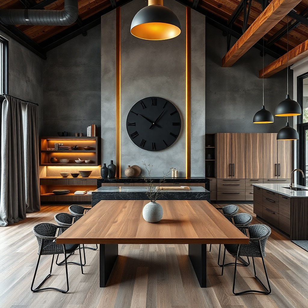
Select a clock size that covers about half the wall width; 18-20 inches is a common sweet spot. Mount it at 58-60 inches from the floor to center, and use stud mounting if the clock is heavier than a typical decorative piece. Check the depth and clearances around nearby cabinets or shelves before you buy. Budget $70-250 depending on size and mechanism quality.
A large 3D wall clock can look like modern sculpture on a kitchen wall. Matte black dials with minimal numerals create strong contrast against light walls and don’t compete with cabinets the way ornate clocks do. Choose a clock diameter around 18-24 inches so it reads as the main focal point. This is a smart option when your wall needs both function and style, especially in kitchens that already have dining furniture but no strong wall anchor. The best clocks have a thin profile so they don’t cast heavy shadows or look bulky.
Common mistakeSkip clocks with bright white hands and glossy domes; the glare ruins the clean look.
Try thisIf you have stainless appliances, choose a clock with a brushed metal detail to tie the finishes together.
17. Large framed botanical mirror with arched top
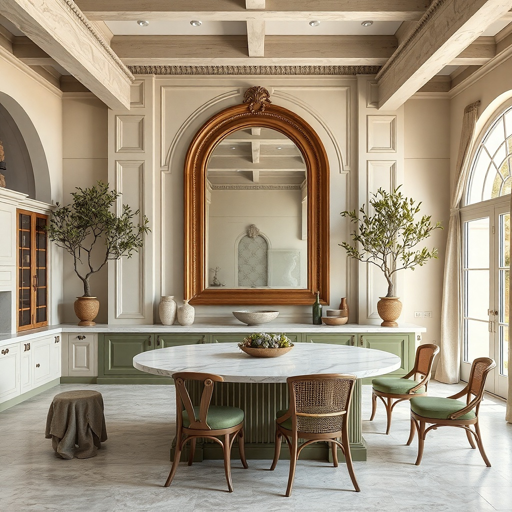
An arched mirror with subtle botanical detailing gives you both brightness and softness. The mirror expands the perceived space and helps the wall feel less flat, while the botanical frame adds visual interest without loud pattern. Choose an arched top so it visually lifts the wall and pairs nicely with pendant lighting. Keep the frame finish in antique brass, warm gold, or blackened metal depending on your kitchen hardware. This works best when you want a statement but your backsplash or shelves already carry pattern the mirror keeps everything light and organized.
Pick a mirror width that’s 24-34 inches depending on your wall span; aim for 60-70% of the wall width. Mount with the top third of the mirror around 75-80 inches from the floor, and keep the mirror center around 58-60 inches for balance. Use wall anchors into studs and check the weight rating. Budget $160-500 depending on frame finish and mirror thickness.
Place the mirror so it reflects a light source or open shelving; you want the reflection to add brightness, not reflect clutter.
Avoid heavily distressed frames; they can look too old against clean kitchen lines.
18. Oversized shadowbox with linen backing and ceramic accents
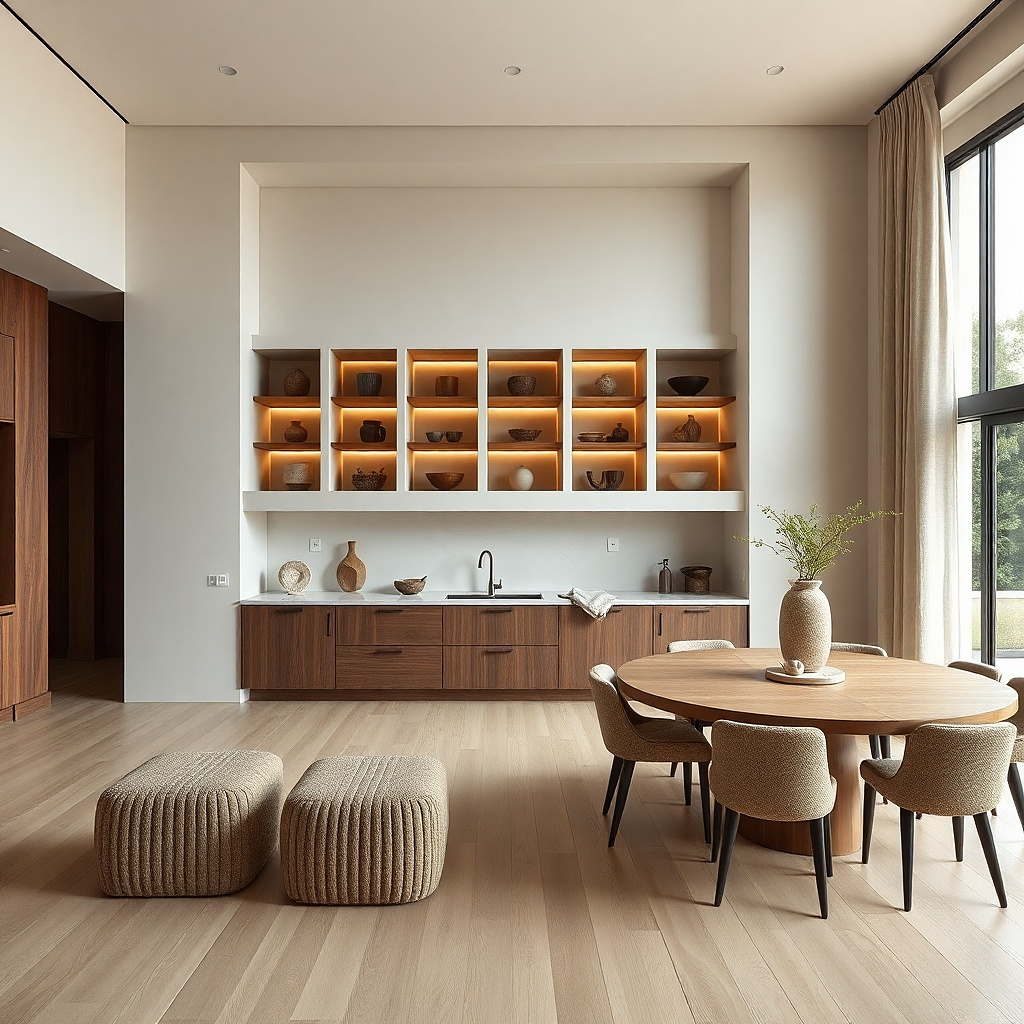
A large shadowbox turns small kitchen objects into a gallery-grade wall moment. Use a linen backing in oat or cream, then arrange a few ceramic pieces like small bowls, a spoon rest, or a single tall vase. The key is restraint: 3-6 objects max so it reads clean at distance. This solves a common problem — you have pretty ceramics but nowhere to put them that doesn’t look cluttered on shelves. Shadowboxes also protect delicate ceramics from dust and keep the composition consistent.
Choose a shadowbox frame around 20x30 inches or larger with a deep enough interior to prevent items from bumping the glass. Attach a linen backing securely, then plan the layout on the floor before mounting anything; keep the tallest piece slightly off-center. Use museum wax or non-damaging adhesive points for small items, and anchor the frame into studs. Cost usually lands at $150-400 depending on depth and whether you need custom sizing.
Use matte ceramic pieces rather than shiny ones; matte reads more upscale behind glass.
Skip too many tiny objects; the shadowbox becomes a clutter box fast.