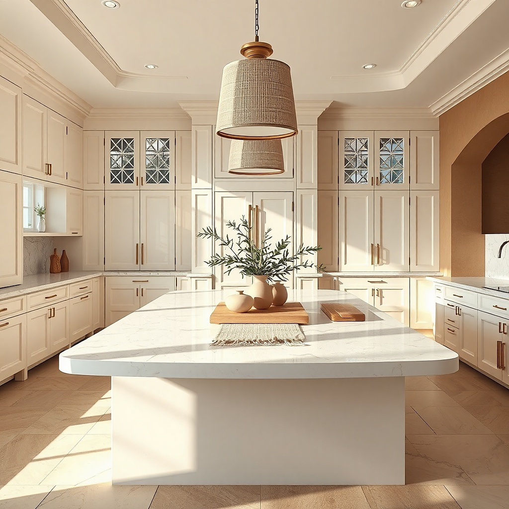
1. Warm white cabinets with soft ivory quartz
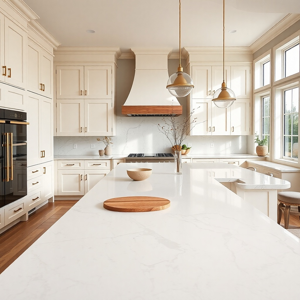
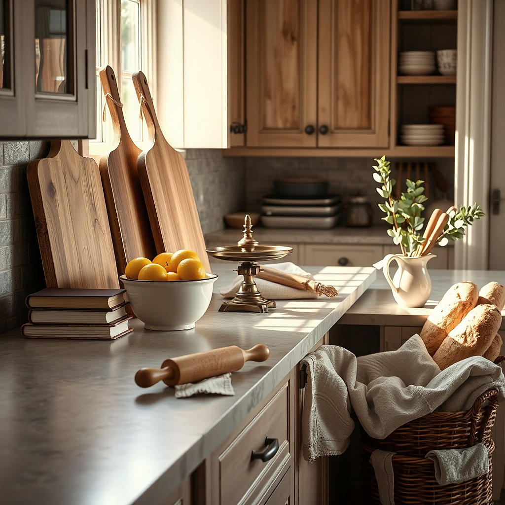
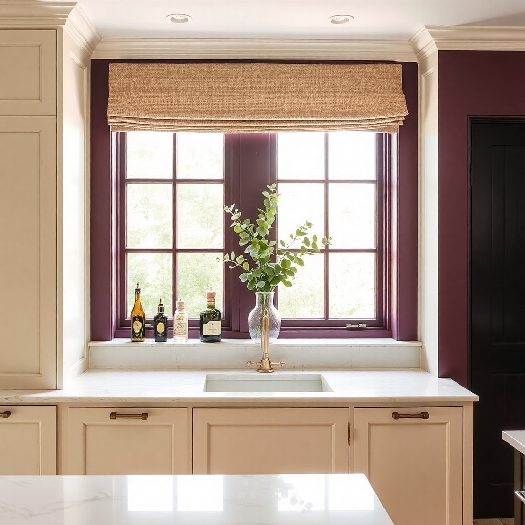
This is the best answer for readers who want a kitchen that feels bright without the harsh, blue-white showroom look. The cabinets and counters are close, but not identical, so the room stays soft instead of flat. Use cabinets in a creamy white like Swiss Coffee or White Dove, then pair them with ivory quartz that has faint beige or oatmeal veining. The result is calm and expensive-looking because the surfaces blend from a distance while still reading as separate materials up close. This pairing suits north-facing kitchens, older homes with warmer trim, and spaces with unlacquered brass or oak flooring.
Try thisUse a satin or matte cabinet finish instead of high gloss. The softer sheen keeps the near-match palette from looking builder-basic.
Start by identifying the cabinet undertone with a painted door sample in daylight. Then bring home two or three large quartz samples and reject any that look stark paper-white next to the cabinet. Choose a 2 or 3 cm quartz with low movement, then repeat the same stone on a 4 inch backsplash or full-height slab if the wall area is small. Expect about $60 to $100 per square foot installed for the quartz in most mid-range lines.
Common mistakeSkip bright white subway tile with this pairing if the cabinet and counter both run warm, because the backsplash will look cold and disconnected.
2. Crisp white cabinets with pale gray marble-look quartz
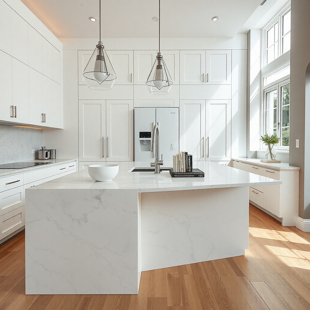
If your cabinets are a clean white, the smart move is to avoid matching them with plain white counters unless the kitchen has strong black accents elsewhere. A pale gray marble-look quartz gives the room outline and depth without making it dark. Look for a white base with thin, cool gray veining rather than thick dramatic swirls. That small amount of movement keeps the kitchen from looking sterile and gives island photos more shape. This works especially well with polished nickel, chrome, and cooler white paint colors.
Try thisAsk for a mitered 2.5 inch island edge if the kitchen has plain shaker cabinets. That thicker profile gives a stronger focal point without changing the color plan.
Start with the cabinet paint card and confirm it reads clean rather than creamy. Then choose a quartz sample with restrained veining and lay it flat under your kitchen lights, because overhead LEDs can make gray veins read blue. Keep the perimeter counters simple and let the island carry the prettiest section of the slab if your fabricator allows slab placement review. Good marble-look quartz usually lands around $70 to $120 per square foot installed.
Common mistakeAvoid faux marble with muddy tan and gray mixed together unless your cabinet white also leans warm, because that mix reads dirty against crisp paint.
3. Navy cabinets with bright white quartz
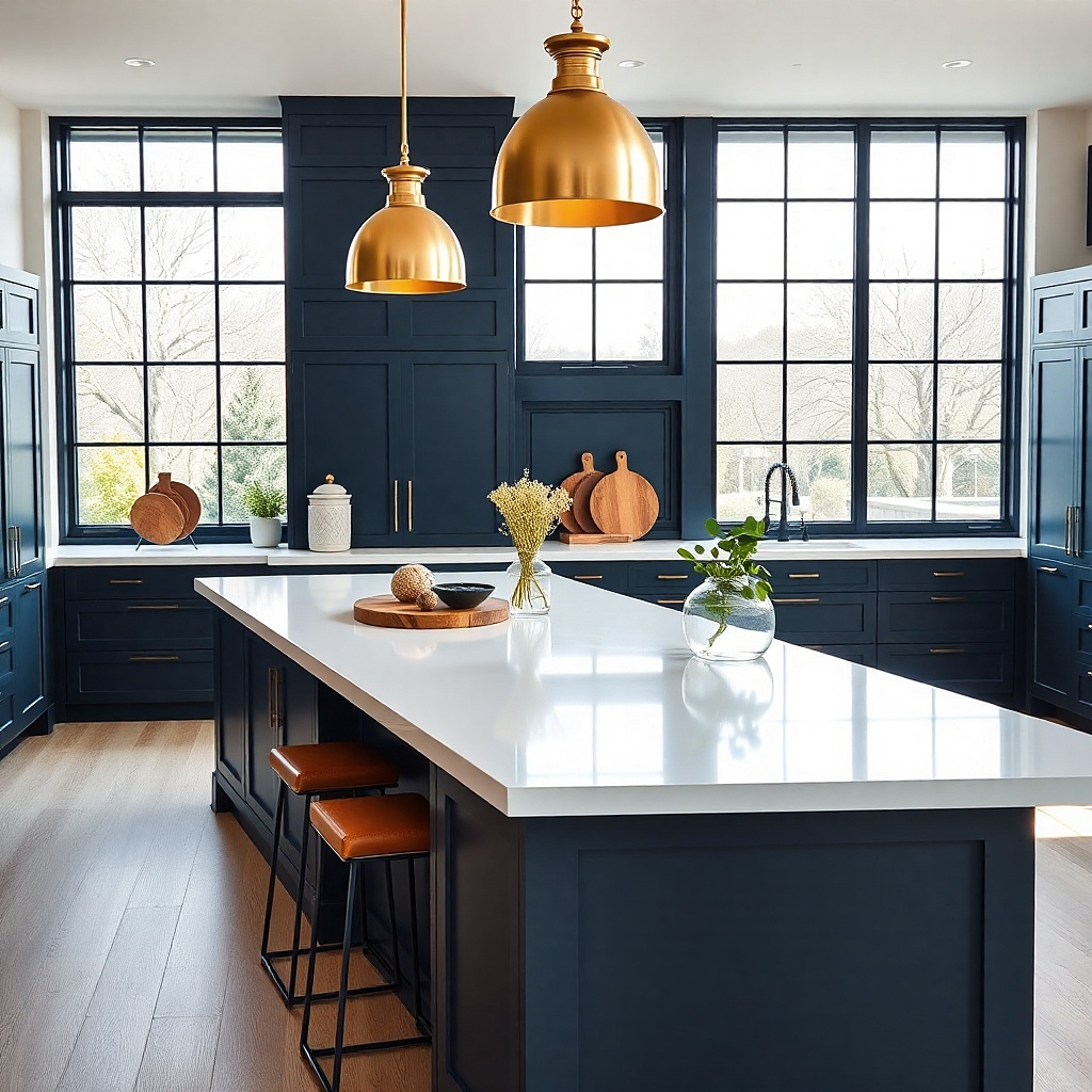
This is one of the clearest cases where matching is the wrong choice. Dark cabinets need a clean counter above them or the whole lower half of the kitchen gets visually heavy. Bright white quartz on navy cabinets gives sharp contrast, and the navy reads deeper and cleaner because the white next to it is so plain. Use this in kitchens with limited natural light, galley layouts, or lower cabinets painted a blue-black shade. The look is graphic, polished, and easy to photograph because the cabinet lines stay crisp.
Start with a navy cabinet sample and choose a quartz that is truly white with little to no veining. Then repeat that white in the backsplash grout or wall paint so the contrast looks planned instead of random. Keep the upper cabinets white or very light if the room is modest in size, and use under-cabinet lighting at 2700K to stop the navy from looking flat at night. Plain white quartz starts around $55 per square foot installed and climbs with thicker edges and premium brands.
Pair this look with a light oak floor or warm leather stools so the kitchen does not turn into a blue-and-white block.
Do not add a busy granite here. The cabinet color already has enough presence.
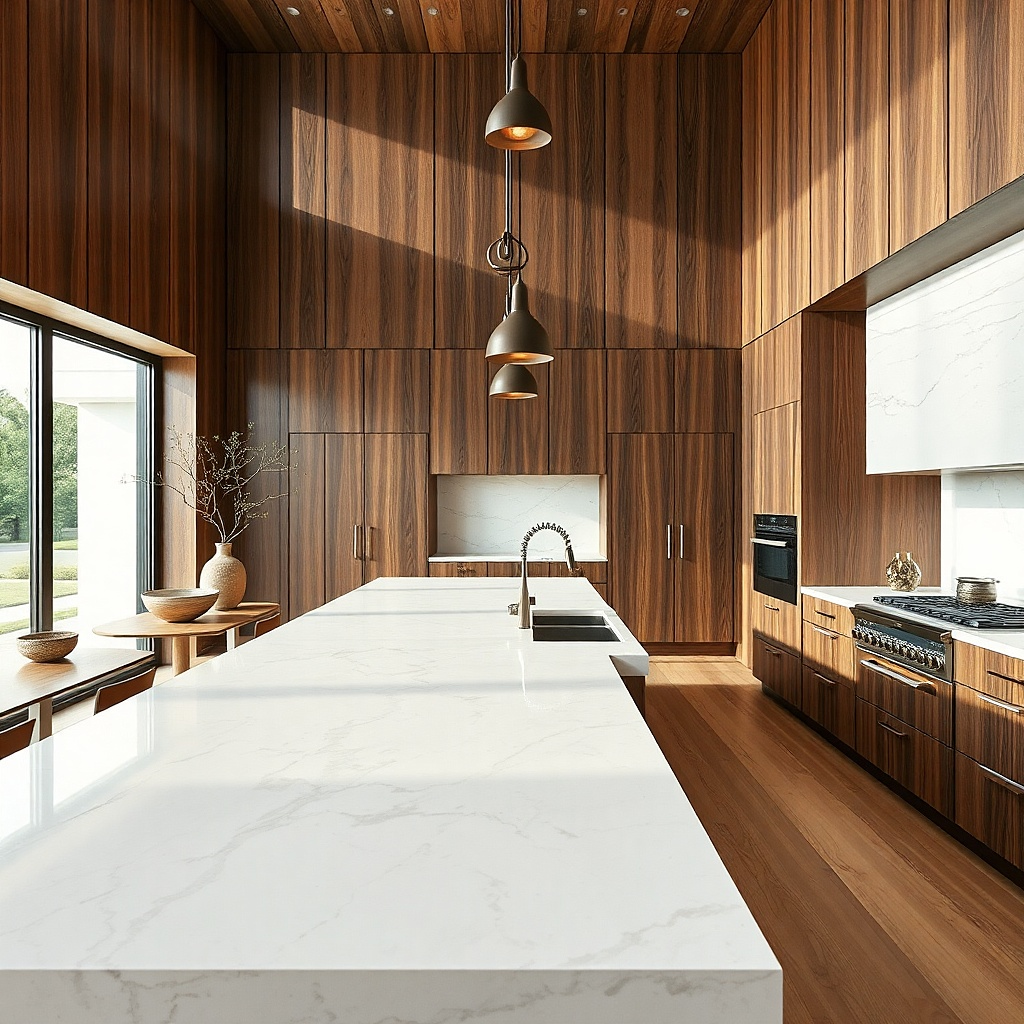
4. Walnut cabinets with creamy travertine-look porcelain
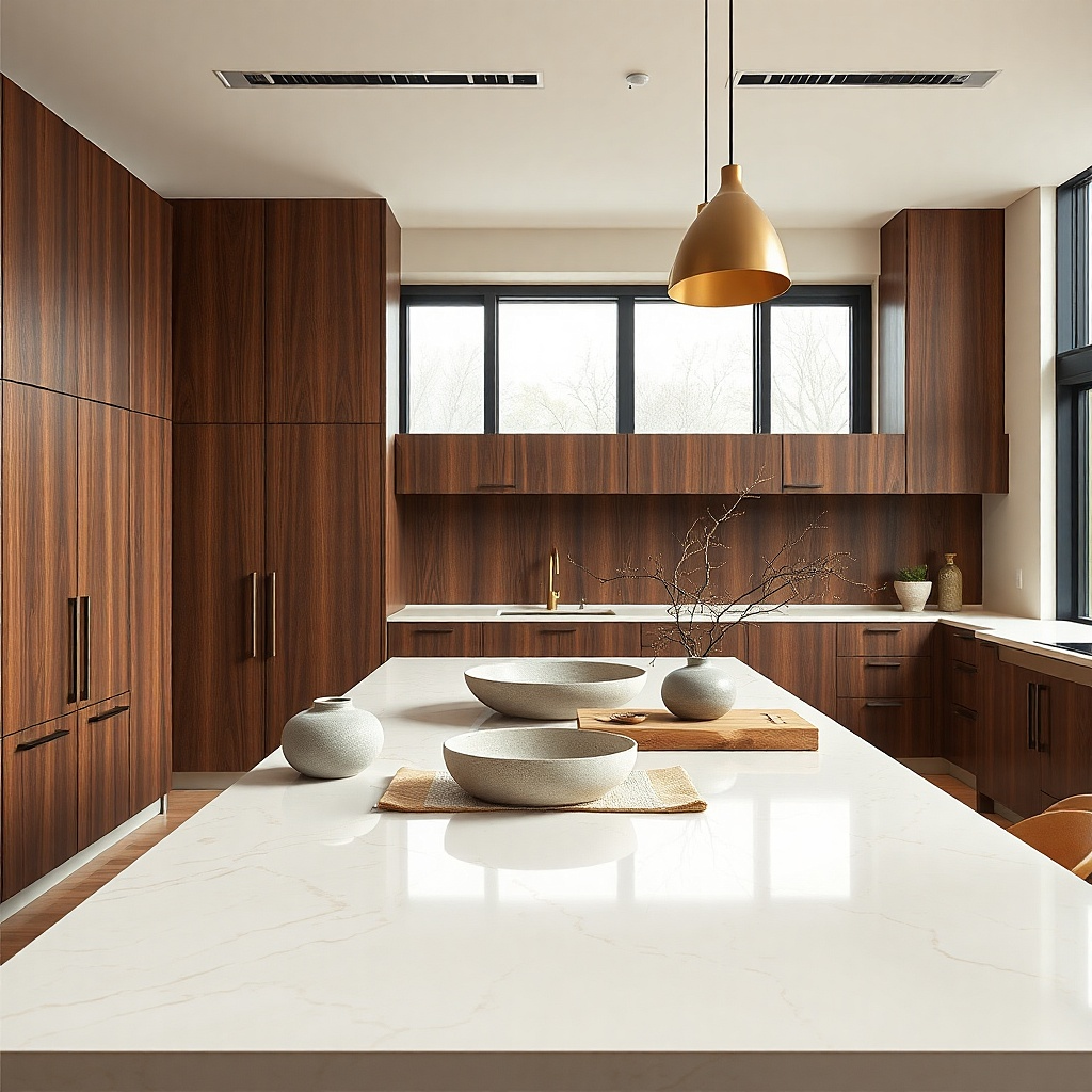
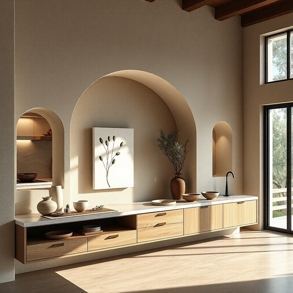
Wood cabinets already bring pattern through grain, so the countertop should calm the scene instead of competing with it. Walnut with creamy travertine-look porcelain is especially good-looking because the stone has warmth without heavy contrast. The cabinets stay the star, while the countertop softens the edges and bounces more light than a dark stone would. This pairing suits slab-front walnut, integrated pulls, and kitchens that lean modern but still want warmth. It also hides crumbs and water marks better than plain black or pure white surfaces.
Start by checking the walnut tone — medium chocolate walnut works best with creamy beige stone, while very red walnut needs a more neutral counter. Then choose porcelain slabs with gentle linear movement, not spotted patterns that fight the wood grain. Use a square edge and a matching full-height backsplash behind the range if you want the room to feel cleaner and less broken up. Porcelain slab counters usually run about $80 to $150 per square foot installed because fabrication takes more specialized tools.
Keep hardware either very minimal or skip visible hardware entirely. Walnut plus creamy stone already has enough texture.
Avoid orange-beige counters with walnut. They drag the whole kitchen toward a dated 1990s tone.
5. Light oak cabinets with honed black soapstone
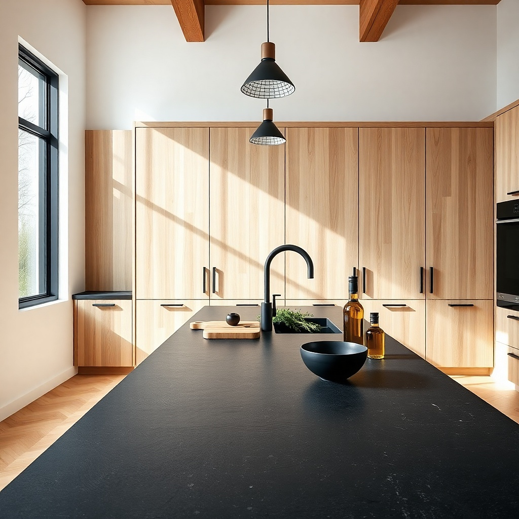
This pairing proves that cabinets and counters do not need to match to look balanced. Pale oak has airiness, while honed black soapstone gives weight and a matte finish that feels grounded rather than glossy. The contrast is strong, but the natural look of both materials keeps it from feeling harsh. This is a strong choice for Scandinavian, Belgian, and quiet modern kitchens where you want shape without shiny surfaces. The black top also makes pale oak grain look cleaner and more intentional.
Try thisUse black window frames, black stools, or a black faucet in one or two more spots so the countertop color feels repeated, not isolated.
Start with white oak or rift-cut oak cabinets in a matte finish. Then choose a soapstone slab with soft white veining and keep the finish honed so the top absorbs light instead of throwing glare. Use a 1.25 inch straight edge and continue the stone up the wall in one section, such as behind the range, if the budget allows. Real soapstone usually costs about $70 to $120 per square foot installed, and it needs periodic oiling if you want the darkest look.
Common mistakeSkip high-contrast cathedral oak grain with this look. It gets too busy against veined dark stone.
6. Greige cabinets with taupe quartz
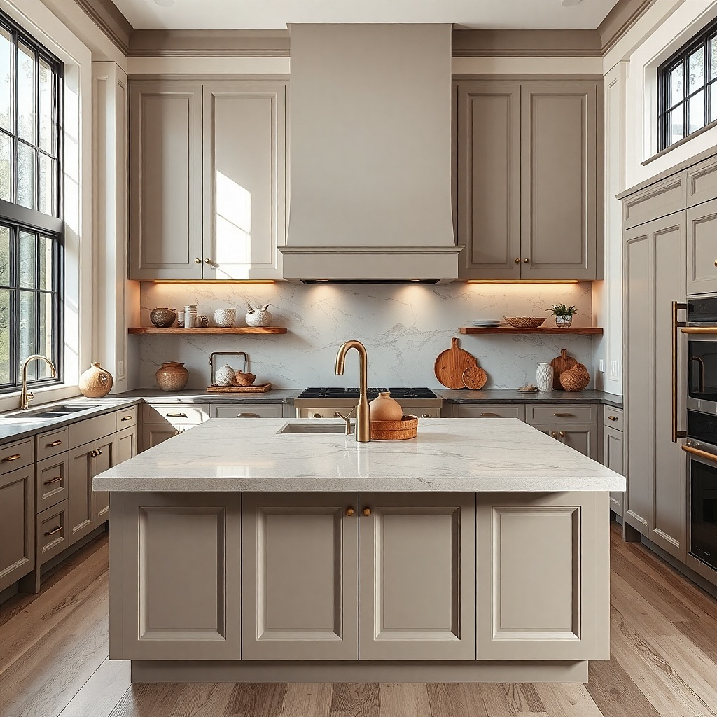
Greige cabinets are hard to pair because they sit between gray and beige, and the wrong countertop makes them look muddy. A taupe quartz with a soft gray-beige cast solves that problem better than bright white or charcoal. The colors sit close together, but the counter has enough shift to define the work surface. This gives a kitchen a quiet, tonal look that photographs beautifully in natural light and does not scream for attention. It suits inset cabinets, traditional kitchens, and rooms with limestone floors or warm white walls.
Start by checking whether the cabinet reads more gray or more beige at noon daylight. Then pick a quartz sample that leans the same direction but is one step lighter or darker than the cabinet. Keep the backsplash simple — zellige, handmade-look tile, and busy mosaics distract from the subtle color story. Mid-range taupe quartz falls around $65 to $110 per square foot installed.
Use aged brass or bronze hardware here. Chrome pushes greige toward cold and flat.
Do not pair greige cabinets with icy white counters unless the room gets a huge amount of warm sun, because the cabinets will look dirty.
7. Black cabinets with warm marble or quartzite
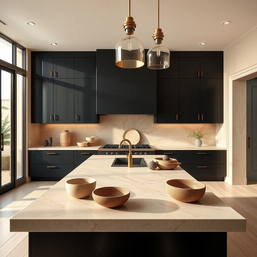
Black cabinets need relief, and the prettiest relief is a warm stone rather than a stark white one. Creamy marble or quartzite with beige, honey, or soft gray veining keeps black cabinets from looking severe. The contrast still reads strong, but the warmth gives the room depth and a more collected look. This is a strong fit for kitchens with brass, antique mirrors, plaster walls, or old-house architecture. It looks especially good on islands where the black paint can read velvety instead of heavy.
Start with a true black or soft black cabinet sample and compare it against both cool white and warm stone samples. Then choose the warmer slab if the room has wood floors, brass hardware, or warm paint on nearby walls. Keep the cabinet sheen low — around 10 to 20 percent sheen — so the stone gets the light play instead of the paint. Natural marble and quartzite span a big range, but many installed jobs land around $90 to $180 per square foot.
Use under-cabinet lights with a warm color temperature. Cool LEDs turn black cabinets flat and blue.
Avoid pairing black cabinets with black counters in a standard-height room unless the kitchen has a wall of windows.
8. Sage green cabinets with off-white counters
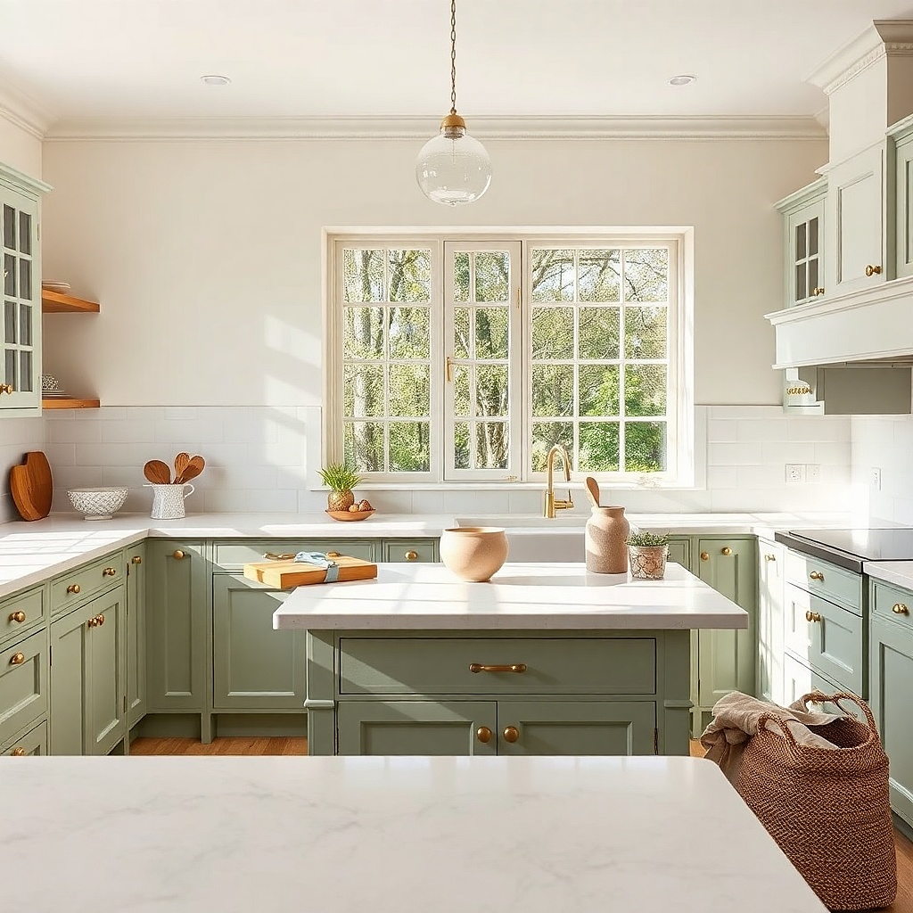
Sage green already has softness built in, so the countertop should keep that mood instead of pushing it into sharp contrast. Off-white counters with a hint of warmth make sage look calmer and more architectural. Pure white can look clinical next to green, especially if the paint has a gray base. This pairing works in cottage kitchens, English-style spaces, and kitchens with beadboard details or antique brass latches. The room ends up fresh but not sugary.
Start by checking whether the sage reads dusty gray-green or yellow-green. Then choose an off-white quartz or marble with undertones that agree — warmer for yellow-green, cooler for gray-green. Use a simple edge and a backsplash tile that stays in the same family, such as off-white square tile or pale green handmade tile with quiet variation. Expect about $60 to $130 per square foot installed depending on whether you choose quartz or natural stone.
A butcher-block island or oak shelves pair very well with this scheme and keep the green from feeling too painted.
Skip bright Carrara-style blue-gray veining if the sage leans warm. The temperature clash is obvious.
9. Medium gray cabinets with white counters and black veining
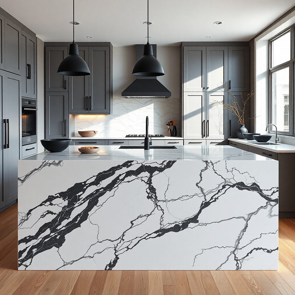
Gray cabinets can go dull fast, so the countertop has to add structure. White counters with black or charcoal veining sharpen the whole kitchen and keep the gray from fading into the background. The contrast gives clear definition without forcing you into a full black-and-white scheme. This is a smart option for transitional kitchens where the cabinet color is fixed and needs a stronger partner. It also ties in well with matte black pendants, iron stools, or dark window muntins.
Try thisRepeat the veining color in one or two details, such as a black faucet or iron sconces, so the slab does not feel like a one-off.
Start by checking the cabinet undertone. Blue-gray cabinets need cleaner white stone, while warm gray cabinets look better with a softer white base. Then choose a slab where the dark veining is spaced out rather than packed tight, so the pattern reads deliberate instead of busy. Keep the backsplash quiet and let the counter carry the pattern. Quartz in this style usually sits around $70 to $125 per square foot installed.
Common mistakeDo not add gray floor tile with heavy movement. Gray cabinets plus patterned gray floor plus veined counter is too much in one room.
10. Two-tone cabinets with one unifying countertop
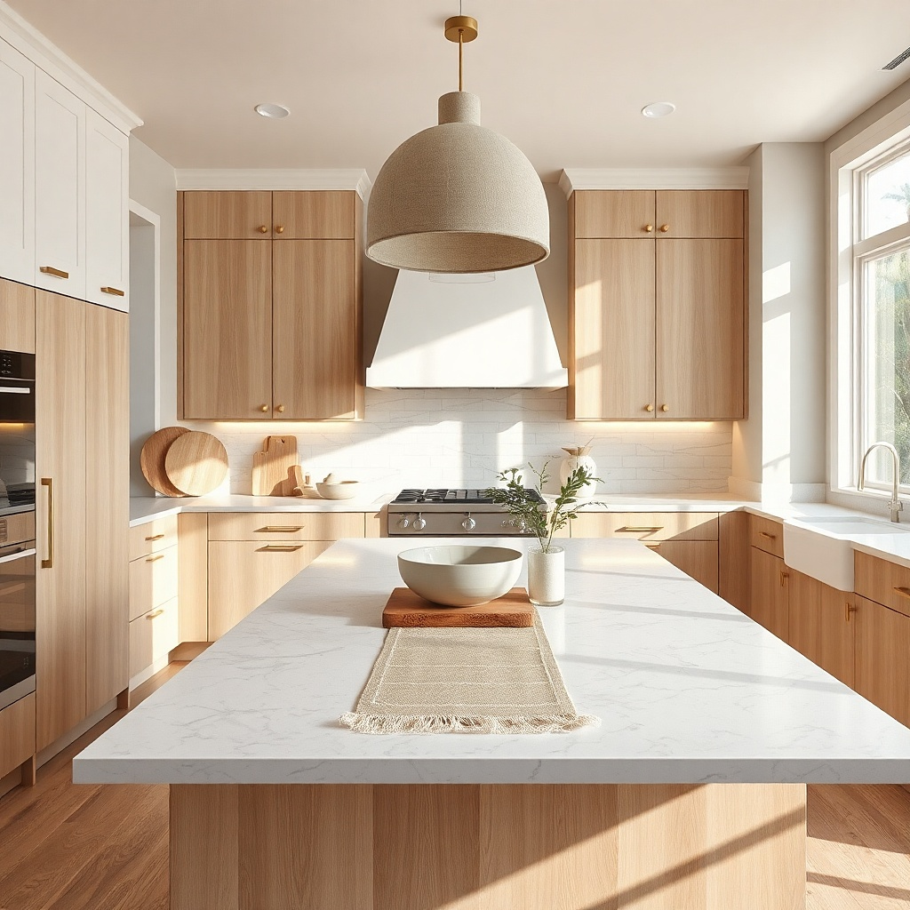
If the kitchen has white uppers and colored or wood lowers, the countertop should not try to match both. It should bridge them. A mid-light neutral stone — warm white, soft greige, or pale taupe — keeps the color split from turning choppy. This is one of the best-looking answers for kitchens that already have visual contrast because the counter calms the transition line. It suits islands painted a darker color than the perimeter, as well as classic two-tone layouts with upper and lower cabinet changes.
Try thisIf the lower cabinets are dark, choose a counter with a light base. If the lower cabinets are wood, choose a counter that echoes the floor warmth without matching it exactly.
Start by placing both cabinet samples side by side, then test countertop samples between them. Choose the stone that belongs to both colors rather than perfectly matching one. Then run the same countertop material across all work surfaces unless the island is large enough to justify a separate statement slab. Keeping one counter across the room costs less than splitting materials and gives a cleaner visual line.
Common mistakeAvoid using one countertop on the perimeter and a second unrelated countertop on a small island. It looks pieced together.
11. Small kitchen with near-match cabinets and counters
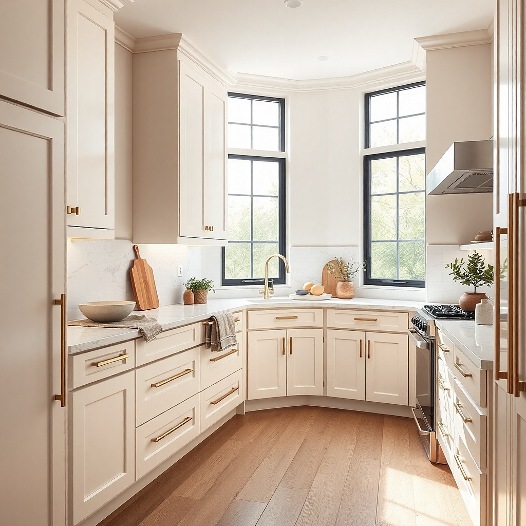
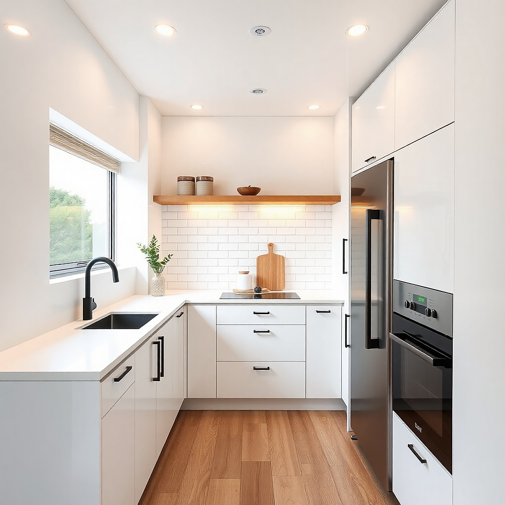
In a tight kitchen, fewer color jumps make the room look larger. That is where a near match works best. Pale cabinets and a countertop in the same family, separated by a slight shift in depth or undertone, create one calm block of color that lets the eye move across the room without stopping. This works especially well in apartment kitchens, narrow U-shapes, and spaces with low ceilings. The look is clean and photogenic because clutter stands out less against a restrained base palette.
Try thisPaint the walls close to the cabinet color if the kitchen is very small. A low-contrast envelope makes the room feel wider.
Start with the lightest cabinet color you can live with long term — warm white, pale greige, or light mushroom. Then choose a countertop that is half a step darker or lighter and keep the backsplash close as well. Use integrated pulls or small knobs, and avoid strong black accents that chop up the room. This approach does not cost more than a contrast scheme, but it does require stricter sample testing so the tones do not collapse into one flat color.
Common mistakeDo not use a near-match if both surfaces have busy pattern. The room shrinks instead of opening up.