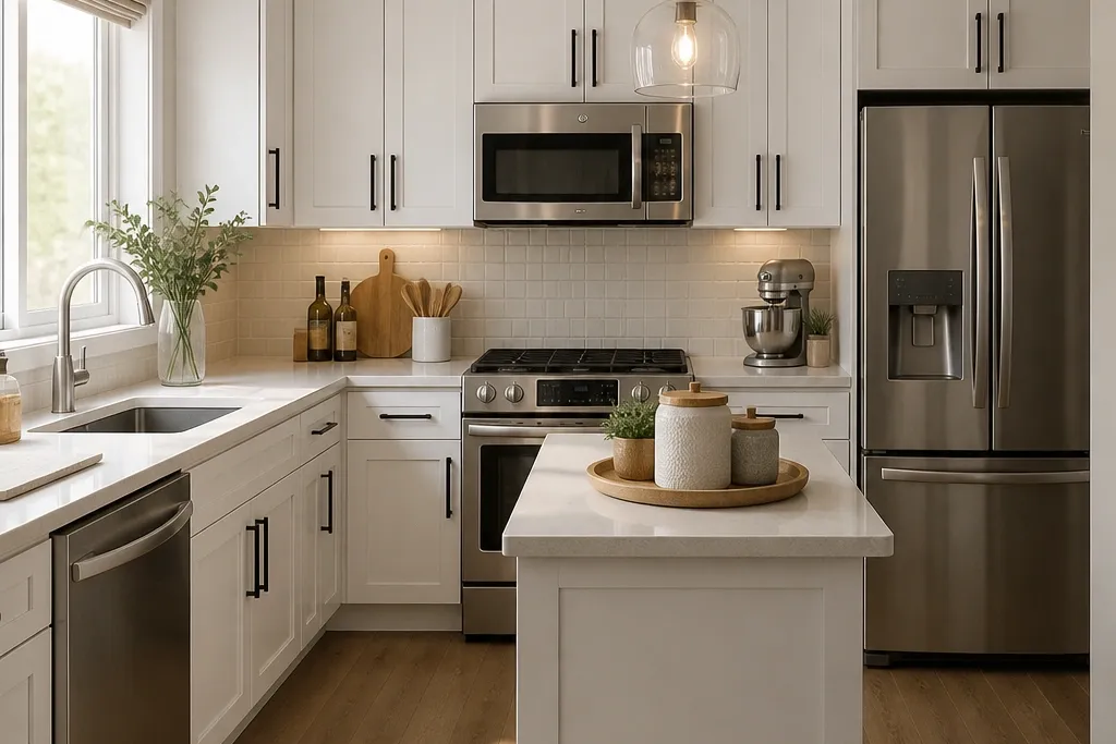
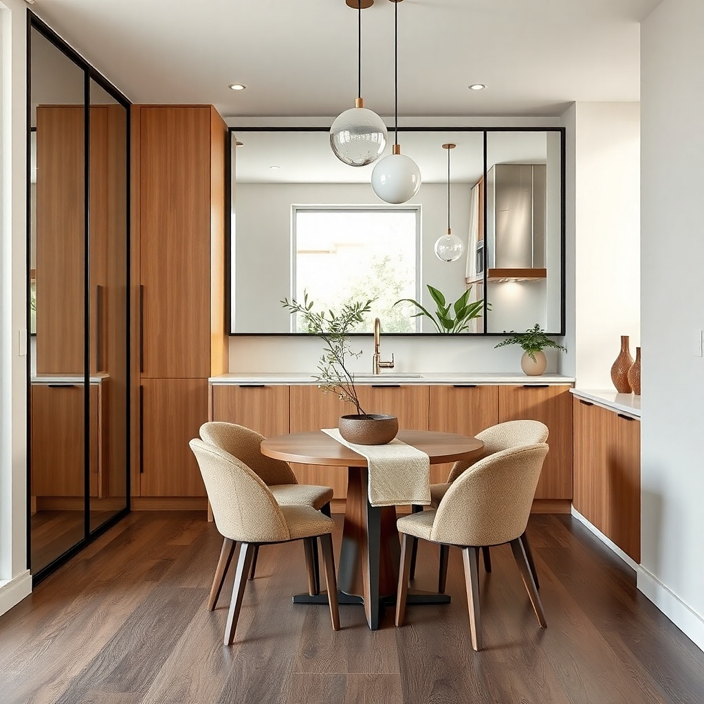
1. Matte White Canisters on a One-Shelf Pantry Wall
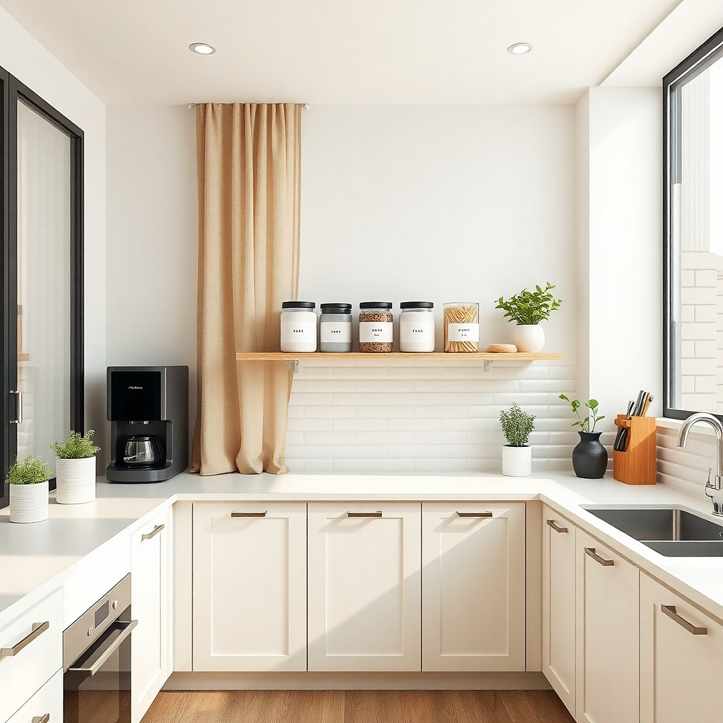
I put matte white canisters on a single shelf when the kitchen has one good vertical spot and the rest of the counters get used hard. Matte ceramic looks soft in daylight, and it hides tiny fingerprints from frequent handling. Use one lid color — black, charcoal, or brushed steel — so the shelf reads intentional instead of like a collection. This setup flatters small spaces because it creates a “display line” your eyes can rest on, even when you’re storing flour, rice, and snacks. It works especially well in kitchens with cool undertones because warm white ceramics add balance without turning the room yellow.
Start by choosing one shelf width that holds only 3 to 5 containers. I like 24 to 30 inches long and 7 to 9 inches deep so the shelf doesn’t jut out visually. Place the largest canister in the center, then mirror the other two around it. Add labels only on the front-facing containers; keep the rest blank or use small stickers on the side so you don’t get label clutter. Finally, keep the shelf background empty — no extra decor — because the canisters already create the design.
If your canisters don’t match height, stack a slim cutting board under the shortest one so the line stays level.
Don’t mix lid finishes like chrome, brass, and black on the same shelf — it looks random fast.
2. Black Rail + Matching Hooks for Everyday Pots
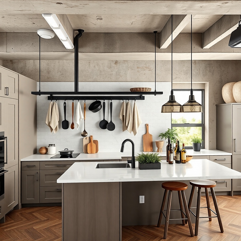
A black rail with matching hooks is the fastest way I’ve found to make a small kitchen look styled while actually being functional. The rail creates a vertical “home” for utensils, which reduces counter clutter and makes the space feel organized even when you leave a spoon out. Matte black also ties together common apartment finishes like faucet hardware and range knobs. This works best when the rail is placed close to where you cook, so your arm doesn’t travel across the room. It flatters compact layouts because it replaces scattered utensil storage with one clean line.
Start by mounting the rail 2 to 4 inches above your backsplash height so the utensils don’t block light or cabinet doors. Use a level and mark studs or anchors — one side alone will sag after months of weight. Hang only your daily tools: one ladle, one turner, one spatula, and one small pan or whisk. Keep the rest in drawers so the rail stays visually calm. Finish by placing a single utensil crock on the counter for overflow, but keep it empty most days so the rail does the heavy lifting.
Hang lightweight tools on the ends and heavier ones closer to the wall so the hooks sit straight.
Don’t overload the rail with every tool you own — it turns into clutter with a different label.
3. Under-Cabinet LED Strip in Warm 2700K
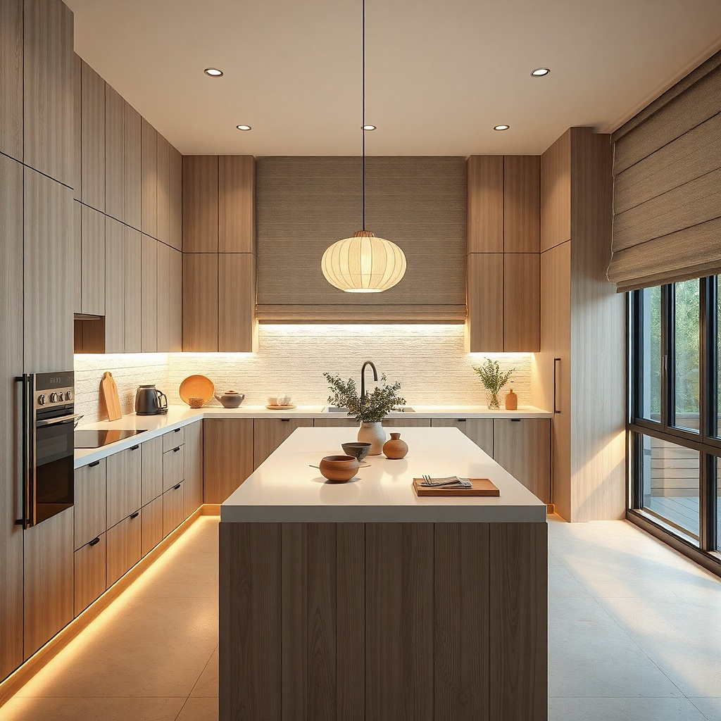
Start by choosing a dimmable 2700K strip and a driver that matches your cabinet length. Measure the underside of your cabinets and cut the strip only where the manufacturer allows it. Mount with the included clips and keep the diffuser channel straight so you don’t see bright dots. Then run the cord along the cabinet side and hide it behind the cabinet return panel if you have one. Finally, test with the cabinet doors closed and open so you confirm the light doesn’t glare into your eyes.
If your small kitchen looks flat at night, the fix is usually lighting color, not more decor. I install warm 2700K LED strips under cabinets because they make counters and backsplash look cleaner and less bluish. Warm light also makes metal finishes like brushed nickel read more uniform. You’ll notice the difference in how food prep areas look — less shadow under the cabinets and better visibility around the sink. It flatters everyone because it reduces harsh contrast, especially if you cook after work when the room is already dim.
Common mistakeAvoid cool white 4000K strips — they make beige counters look dirty.
Try thisAdd a small dimmer switch so you can lower brightness during dinner and keep the room from feeling like a workshop.
4. Two-Tone Backsplash with a Single Accent Tile Row
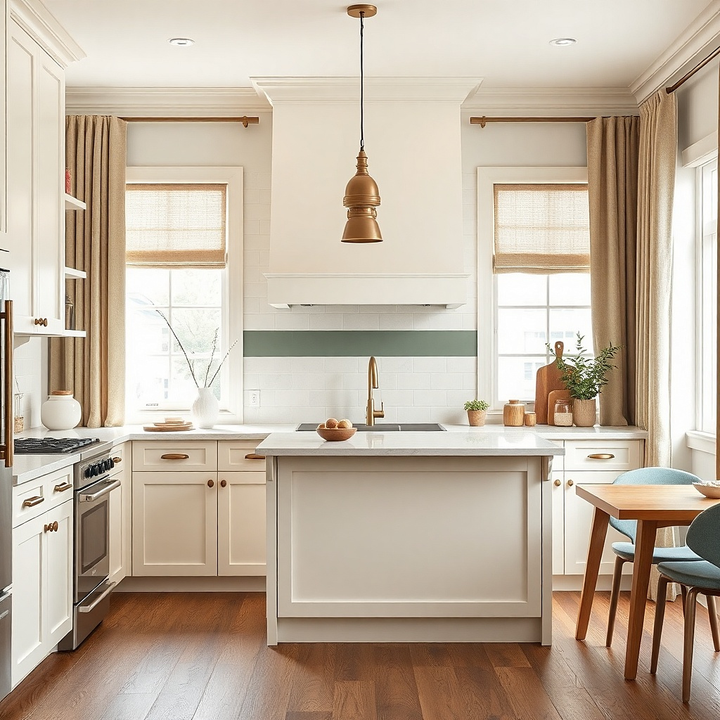
Start by selecting tile sizes that match your existing surface — 3x6 subway tiles are the easiest fit in narrow spaces. Plan the accent row placement by measuring from the counter top and keeping it level across the wall. Dry-lay a few tiles on the counter to confirm the row looks balanced near outlets. Use light gray grout for the base tiles and keep the accent row grout consistent so it reads crisp. Seal the grout after curing if your tile is porous.
A two-tone backsplash gives you that designer look without covering your whole kitchen in pattern. I like white subway tiles for the base because they’re forgiving and easy to clean. Then I add one thin accent row — about 2 inches tall — in a muted sage or soft terracotta so the room has warmth. The accent row creates a visual “line” that makes the counter feel intentional, especially in small kitchens where the backsplash is the biggest backdrop. It flatters apartments because it doesn’t fight with rental paint colors or hardware finishes.
Common mistakeDon’t add multiple accent patterns — one row is enough in a small kitchen.
Try thisIf you can’t re-tile, use peel-and-stick backsplash panels for the accent row only — it’s cheaper and less risky.
5. Glass Pendant Over the Sink with a Brass Canopy
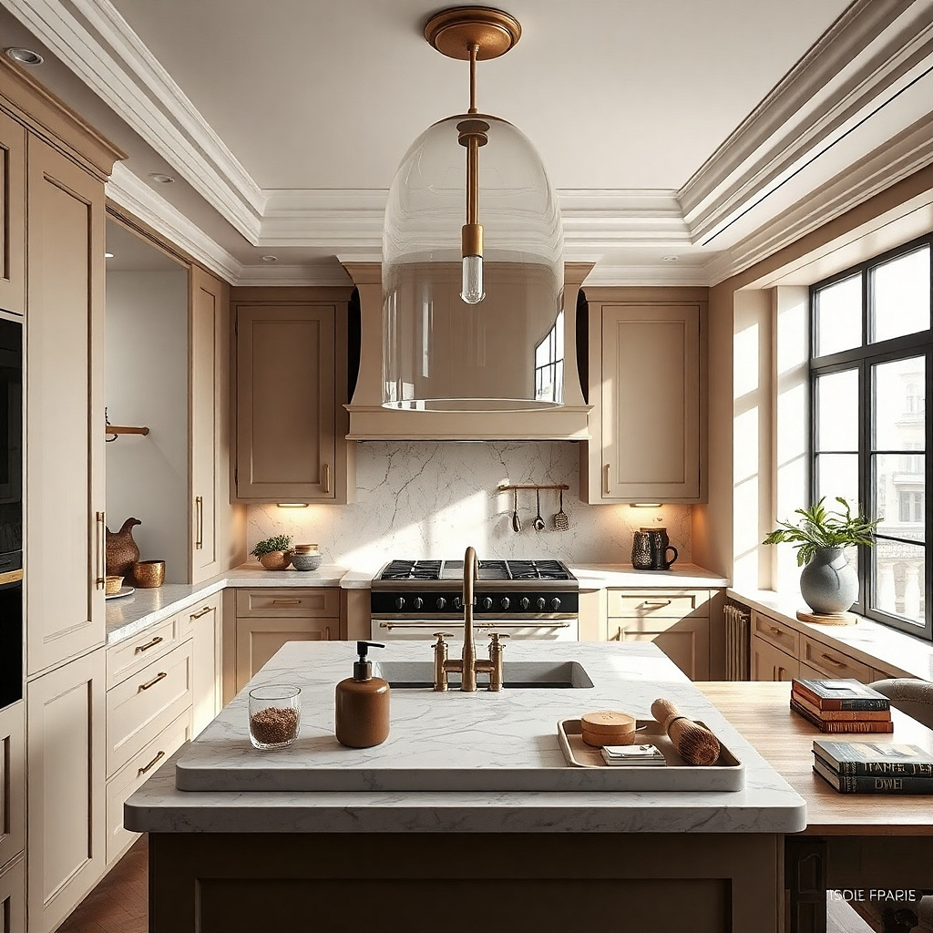
Start by measuring the sink width and choosing a pendant that’s about 10 to 14 inches wide for a small kitchen. Hang the bottom of the shade about 28 to 32 inches above the counter surface so it doesn’t feel low. Shorten the cord or chain — you want clean vertical lines. Use a 60W-equivalent LED bulb in warm tone so the glass doesn’t look yellow. Finally, adjust the pendant so it’s centered over the sink or dish rack, not drifting toward one side.
When you hang a pendant over the sink, you give the kitchen a focal point that feels designed, not improvised. I choose a clear or lightly smoked glass pendant because it lets light pass without making the space feel heavy. A brass canopy ties in with many faucet finishes and cabinet pulls, and it warms up stainless steel. This works especially well for small apartments because the sink area is where you spend time — washing, prepping, and dealing with dishes. The focused light also makes the backsplash look brighter and cleaner.
Common mistakeAvoid oversized pendants — they crowd the backsplash and make the room feel smaller.
Try thisIf your ceiling box is off-center, use a small ceiling medallion to cover it and keep the pendant placement looking intentional.
6. Stainless Steel Shelf Ledge for Spices and Oils
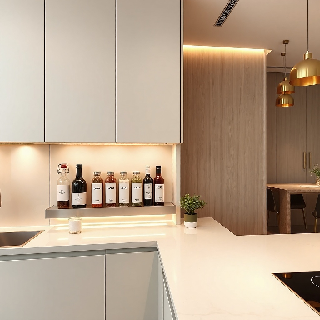
Start by choosing a ledge shelf width that fits between cabinet supports, usually around 10 to 14 inches. Mount it so the jar lids don’t hit the cabinet doors when opened. Use matching spice jars in similar heights and keep the front row to 6 to 10 jars max. Place oils on the back edge so labels face out. Add one small tray under the shelf if you spill — it saves you from staining the cabinet surface.
A ledge-style shelf under a cabinet gives you a place for “grab and go” ingredients without eating counter space. Stainless steel looks clean and modern, and it reflects light in narrow kitchens. I like it for spices because you can see what you have, which stops the constant re-buying that happens when jars live in drawers. This setup flatters small kitchens because it turns the wall into storage while keeping the main counter surface open. It’s especially handy if you cook frequently and need seasoning within arm’s reach.
Common mistakeDon’t stack jars too tall — if lids reach the cabinet door, the whole thing looks messy.
Try thisUse a label maker with consistent font size and spacing so your spice wall reads uniform.
7. Magnetic Knife Strip with a Narrow Chef's Knife
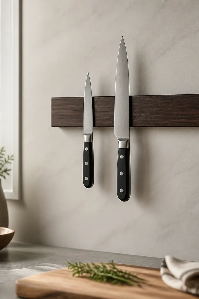
In small kitchens, knives take up drawer space and visually clutter counters. A magnetic strip keeps one or two knives visible and ready, and it makes the kitchen look intentional. I use a narrow chef’s knife because it sits neatly and doesn’t crowd the line of sight. Keep the strip minimal — two knives maximum — so it doesn’t look like a restaurant. This works well for apartments where you want a modern look without adding bulky storage units. It also helps if your cutting board storage is messy, because you’ll prep in one spot.
Start by measuring the space between outlets and mounting points so the strip doesn’t hit anything when you reach. Mount the strip on a stud when possible, or use anchors rated for the weight. Place the chef’s knife centered and hang the paring knife to the side, leaving at least 2 inches between handles. Position the strip so knives aren’t above the sink spray line if you can avoid it. Finish by adding a small cutting board vertically against the cabinet door or storing it in a dedicated slot so the prep zone stays tidy.
Wipe the strip and knife handles once a week with a dry cloth to keep fingerprints off the metal.
Don’t hang every knife you own — too many blades makes the wall feel chaotic.
8. White Runner Rug with Non-Slip Grips and a Short Pile
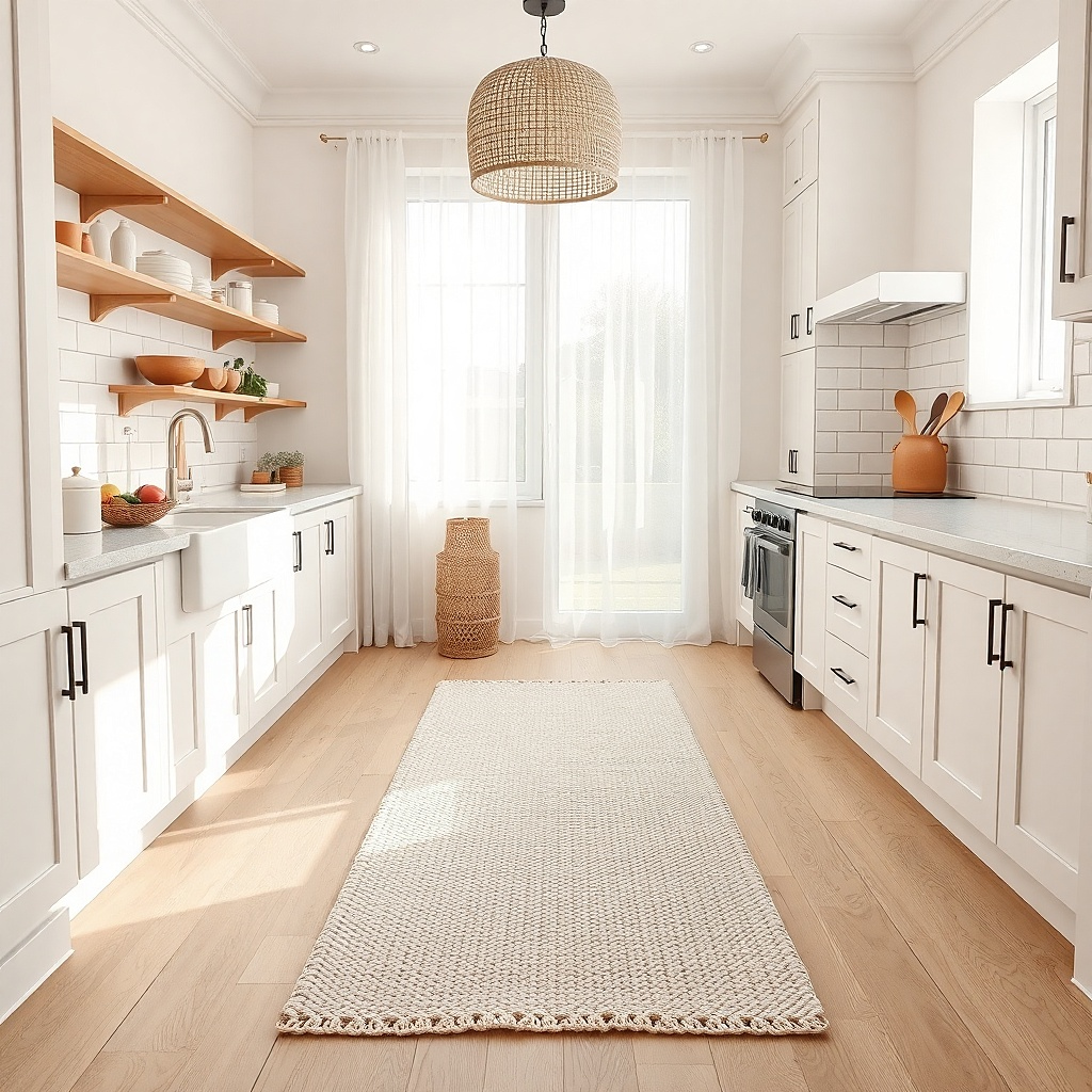
Start by measuring the clear walkway path and leaving 2 to 3 inches of space from cabinet edges or door swings. Choose a runner around 2.5 to 3 feet wide for most small kitchens. Use a rug pad or grippy non-slip backing so it stays put when you step in and out. Vacuum with a brush attachment weekly and spot clean with a mixture of warm water and a few drops of dish soap. Let it dry fully before placing back under heavy foot traffic.
A runner rug changes how a small kitchen feels underfoot. I choose a short-pile white or cream rug because it wipes clean and doesn’t trap crumbs like long shag. The non-slip backing matters in apartments where the floor can be smooth — you don’t want the rug creeping toward the stove. White works when you use a washable rug and keep it sized properly, because too large a rug eats the floor space visually. This flatters kitchens with dark floors or stainless appliances by brightening the work zone without adding color chaos.
Common mistakeAvoid long-pile rugs in cooking zones — they turn into crumb collectors.
Try thisKeep a small stain spray bottle by the sink and treat spills within 10 minutes for less permanent marks.
9. Open Shelving with Matching Wood Brackets and One Color Set
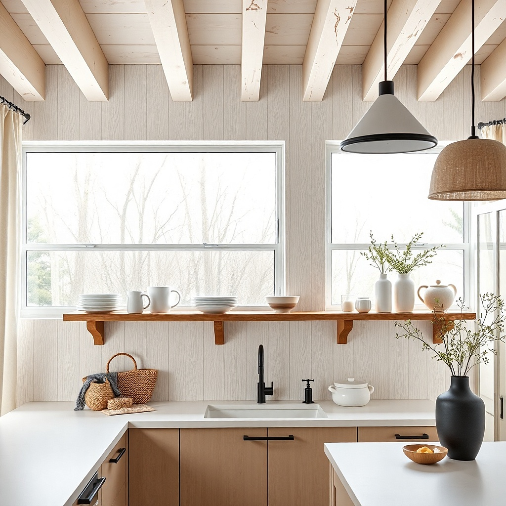
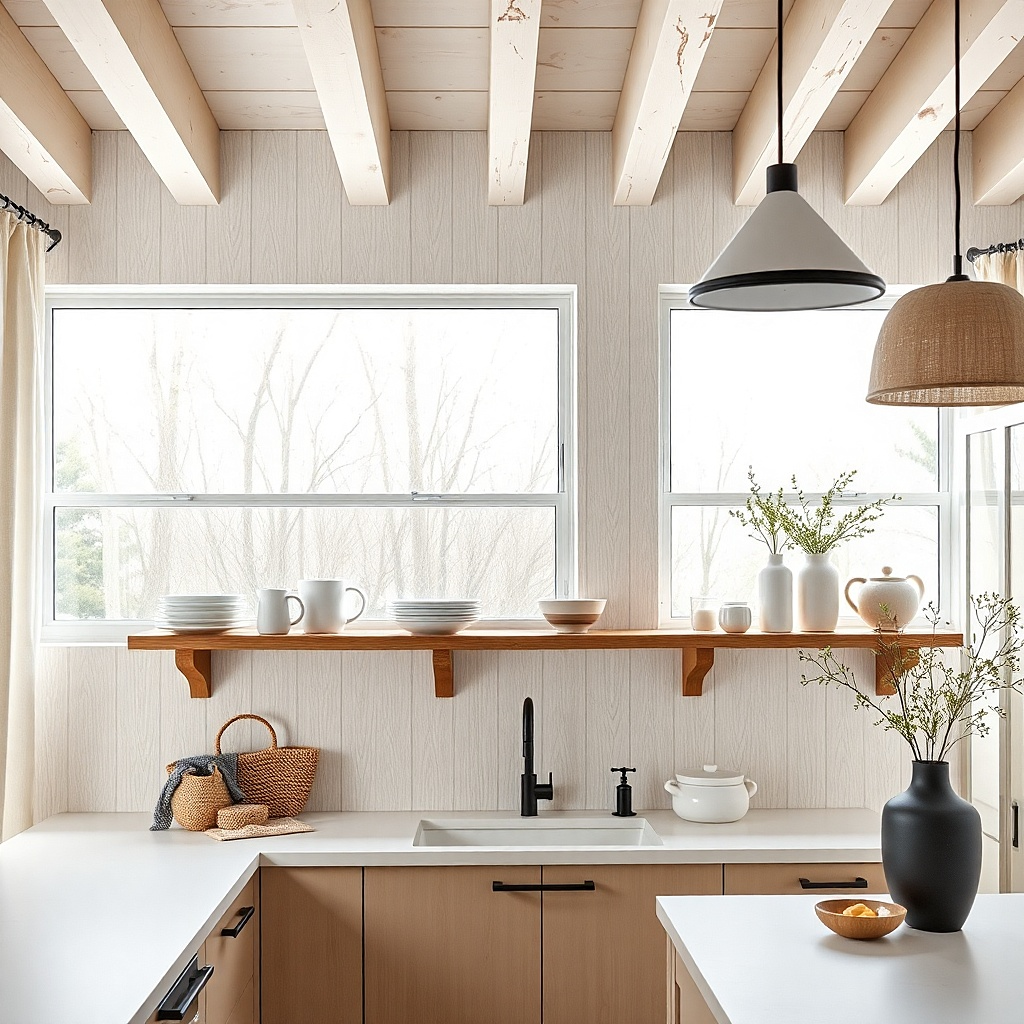
Start by choosing shelves that are shallow — about 8 to 10 inches deep — so plates don’t protrude. Install brackets at equal height and confirm the shelf line is level across the wall. Place the largest items at the back, then stack plates vertically so you don’t create a visual wall of flat dishes. Add 2 to 4 mugs only, spaced evenly, and keep any extra decor off the shelves. Finish by storing rarely used items in a cabinet or drawer so the shelves stay styled.
Open shelving is risky in small kitchens unless you control the color set. I use matching wood brackets and keep everything on the shelves in one family of whites and creams. That way, the shelves add warmth without looking messy. The trick is to leave empty space between items — I aim for a gap you can see, not a tightly packed stack. This flatters small apartments because it makes the room feel lighter than closed cabinets and gives you a modern, airy look. It also works well if you like cooking and use your dishes daily.
Common mistakeDon’t put random mismatched dishware on open shelves — it reads like storage.
Try thisUse a single plate size for the front row so the shelf looks designed even when you unload the dishwasher.
10. Linen Blend Curtain Panels for a Small Window
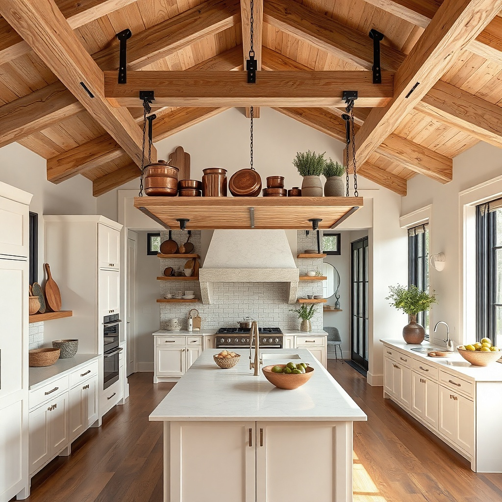
Start by measuring from the rod to where you want the hem — I like 1 to 2 inches above the sill in kitchens. Choose panels wide enough to gather slightly, usually 1.5 times the window width. Hang them on a simple rod with rings or small clips so the fabric moves smoothly. Steam or iron lightly so the folds hang evenly. Then keep the rest of the kitchen textiles minimal — one runner or one towel set — so the curtains don’t compete.
Curtains sound like a living room thing, but they make a small kitchen look finished. I use linen blend panels because they drape without looking wrinkled in a lazy way. Warm white keeps the window bright, and the soft texture hides minor wall imperfections around the frame. In apartments, a kitchen window often becomes a visual anchor, so the fabric choice matters. This works for people with small kitchens because it adds softness without adding color or clutter.
Common mistakeAvoid heavy blackout curtains in a small kitchen — they shrink the window visually.
Try thisIf privacy is a concern, add a thin white roller shade behind the curtain and keep the look airy.
11. Countertop Tray for the "Daily Reset"
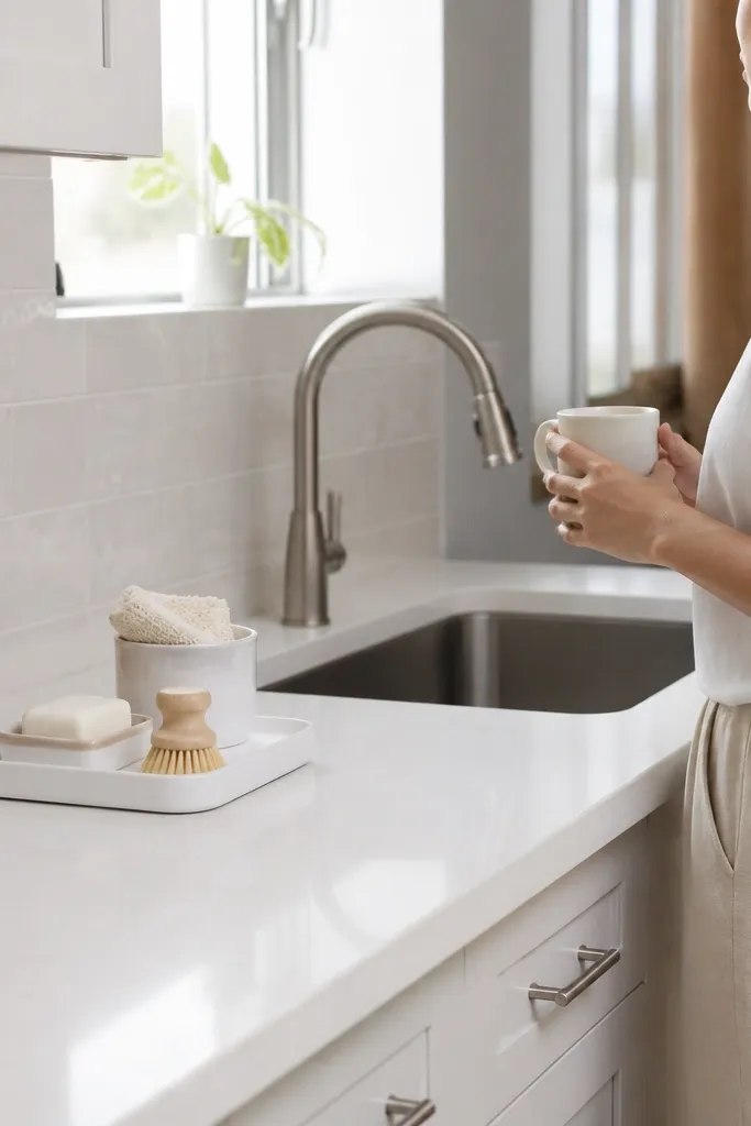
A tray is the easiest way I’ve found to keep a modern small kitchen looking styled on a normal day. I use it as a daily reset zone for items that always migrate across the counter — soap, a scrub brush, or a small bowl. Ceramic trays look clean and modern, especially in matte white or light stone colors. This works because it creates a boundary: everything you drop gets placed back into the tray, so the counter doesn’t become a junk surface. It flatters small kitchens by reducing visual noise without hiding things in cabinets.
Start by picking a tray size that covers the area where your items naturally collect. In a small kitchen, 10x14 inches is a sweet spot. Place the tray near the sink or near the area where you set your phone and keys while cooking. Put only 3 items on it — soap, one small dish, and one optional scent item like a candle jar. When you’re done cooking, clear the rest of the counter and return the tray items to their spots. Use felt pads or a silicone liner under the tray if your countertop scratches easily.
Choose a tray with a lip so bowls and bottles don’t slide when you wipe the counter.
Don’t turn the tray into a catch-all for mail and random tools — it ruins the clean line.
12. Sage Green Dish Set with One Matching Towel
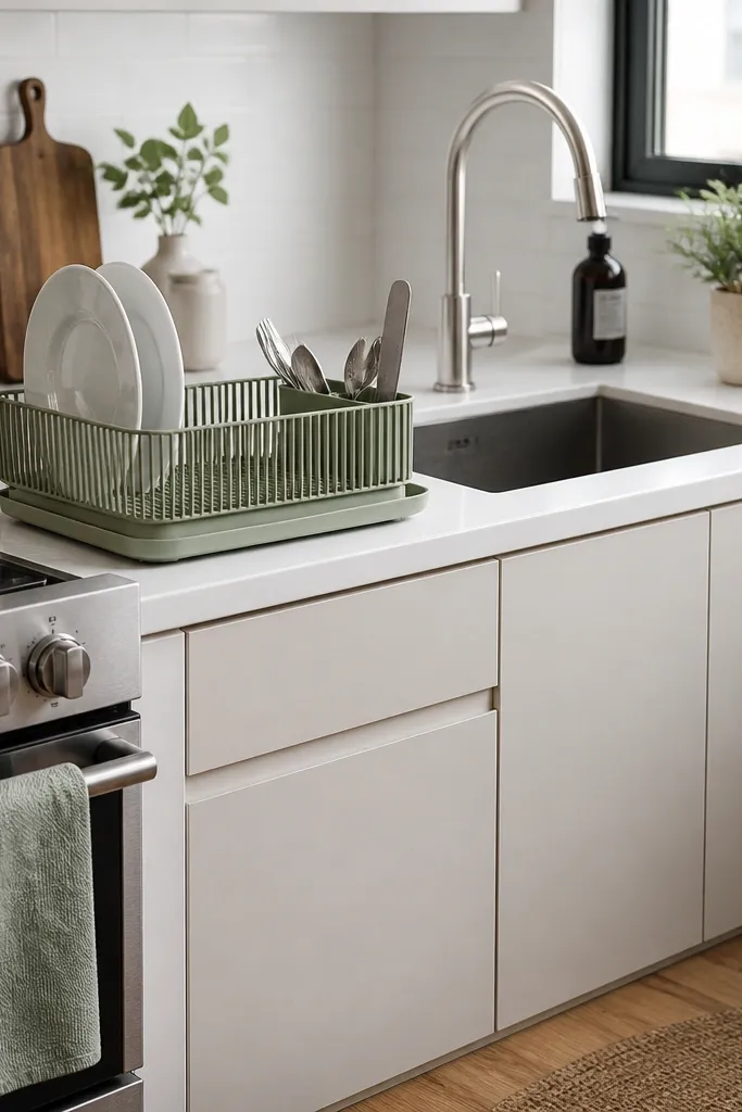
Start by choosing an accent color that matches something already in the kitchen, like flooring undertones or grout. Put the dish rack closest to the sink so it becomes a functional focal point. Then fold one kitchen towel in thirds and place it on the counter edge or drape it over a rail hook. Keep the rest of the dishware neutral — white plates, clear glass jars, stainless utensils. If you use a sponge holder, match it to the dish rack color or keep it neutral so the accent stays consistent.
Color accents make a small kitchen feel alive, but you need to control where the color lands. I pick one accent color — like sage green — and repeat it in only two places: the dish rack and the towel. Sage works because it’s muted, so it doesn’t clash with stainless appliances or warm wood floors. This creates a modern, calm look that still feels personal. It flatters kitchens with white cabinets and gray counters because sage adds warmth without turning the room into a pastel theme.
Common mistakeAvoid multiple accent colors like sage plus bright orange plus navy — the kitchen looks busy.
Try thisWash and iron the towel so the color reads crisp — a wrinkled towel makes the accent look cheap.
13. Black-and-White Tile Stickers at the Appliance Corners
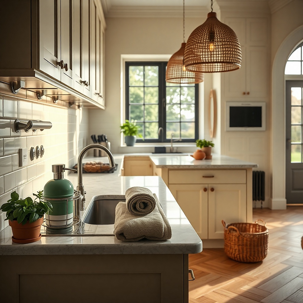
Start by cleaning the surface with isopropyl alcohol and letting it fully dry. Measure the corner height and cut sticker sheets to fit, keeping the pattern aligned with the cabinet edges. Apply slowly from the top, smoothing with a plastic card to avoid bubbles. Seal edges with a clear adhesive if the surface is textured or prone to lifting. Add only one sticker area — pick either the stove corner or the sink corner, not both. Step back and check alignment under daylight and at night with the under-cabinet lights on.
If you can’t change your backsplash, you can still add a modern pattern using small, controlled sticker zones. I apply black-and-white geometric tile stickers only at the corners around the stove or microwave, where the eye already pauses. The contrast gives the kitchen a designed look without covering large areas that would be hard to clean or remove. This works in small kitchens because pattern in tiny spots feels intentional rather than overwhelming. It also helps if your landlord won’t approve major changes.
Common mistakeDon’t apply stickers over grease splatter or dusty walls — they lift quickly.
Try thisUse a craft knife and a metal ruler — straight cuts make the sticker look like tile.
14. Matte Black Faucet + Matching Soap Dispenser for a Clean Line
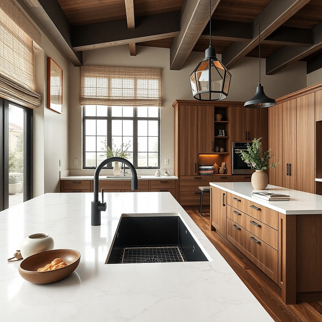
Start by choosing one finish you can commit to for the sink area. If you already have matte black hardware, buy accessories in matte black. Place the soap dispenser to the side of the sink where your hand naturally reaches, usually near the faucet handle. Keep the brush holder compact and hide extra scrub pads in a drawer or under-sink bin. Wipe the sink daily so the matte finish doesn’t show water spots as much.
When your faucet finish matches your countertop accessories, the kitchen reads more cohesive even if the rest is simple. I aim for one dark metal finish, usually matte black, and repeat it in two items: the soap dispenser and the dish brush holder. This makes the sink area look designed and reduces visual fragmentation. It also helps in small kitchens where the sink is always in view when you enter. This works for people who want modern decor but don’t want to change paint or cabinets — it’s a low-effort upgrade with high visual payoff.
Common mistakeAvoid mixing glossy black with matte black next to each other — it looks like mismatched hardware.
Try thisBuy a soap dispenser with a pump that matches the faucet knob shape — it looks more intentional than random cylinders.
15. Compact Corner Lazy Susan for Pots and Baking Sheets
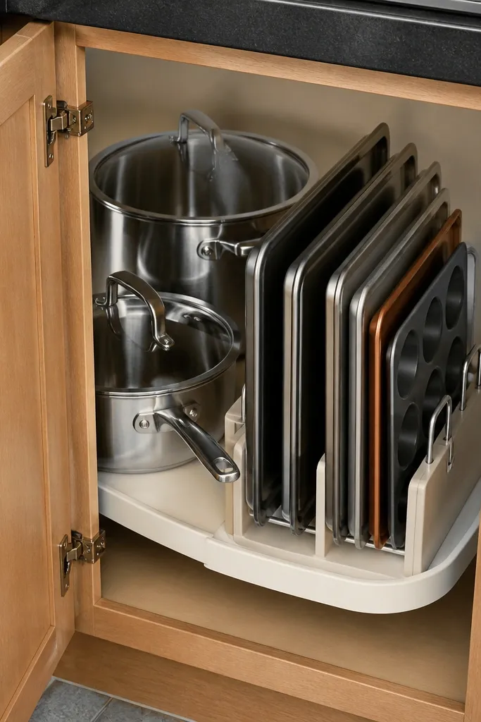
Start by measuring the cabinet corner and picking a lazy Susan diameter that fits with clearance for doors. Remove one shelf and test-fit the turntable so it doesn’t bind. Arrange items by height: tallest pot in the center, baking sheets along one arc, and small containers around the edge. Use labels on the lids so you don’t dig. When you load it, keep all handles facing the same direction — it makes the cabinet look orderly every time.
A lazy Susan is decor-adjacent because it changes how your kitchen looks when you open the cabinet. In small kitchens, the inside of cabinets shows more than you think, especially in apartments with open shelving or glass-front cabinets. I use a compact lazy Susan to store baking sheets and one or two pots so the cabinet stays neat. The modern look comes from consistent stacking and the clean visibility of the items on turn. This works best for people who cook and need quick access without dumping everything on the counter.
Common mistakeDon’t overfill the lazy Susan — if items press against the door, everything looks cramped.
Try thisUse felt under baking sheets so they slide quietly and don’t scrape cabinet surfaces.
16. Slim Wall Shelf for a 3-Color Plate Stack
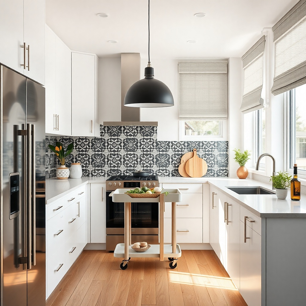
A slim shelf for a plate stack gives you height without taking over the wall. I do a 3-color stack: two neutrals plus one muted accent plate. The subtle color pop reads modern, and the stacking trick keeps the shelf from becoming a cluttered display. It flatters small kitchens because it adds vertical interest but doesn’t add many items. This is ideal for people with limited wall space who still want decor that feels intentional.
Start by finding a wall spot above the counter but not above the stove or where steam hits. Choose a shelf depth of 6 to 8 inches so plates sit flush. Center the plate stack and place the largest plate at the bottom, with the smaller plates stacked directly on top. Keep the shelf empty around the stack — no extra knickknacks — so the plate colors do the work. If you can, use a shelf with a slight lip to stop plates from shifting.
Use plate stands only if the plates are heavy; otherwise stack directly for a cleaner look.
Don’t add multiple small items on the shelf — a plate stack should be the whole point.
17. Black Frame Mirror Backdrop for a Dining Nook
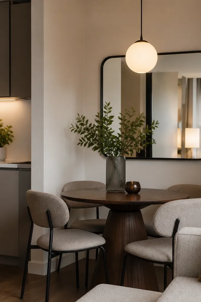
A mirror can make a small kitchen feel bigger, but the way you place it matters. I mount a black frame mirror across from the dining nook so it reflects the light source and makes the room look deeper. The black frame ties into modern hardware and keeps the mirror from feeling like a bathroom piece. This works best when the mirror reflects something bright, like a window or pendant, not a cluttered counter. It flatters small apartments because it adds depth without taking floor space.
Start by standing where you spend time at the dining table and check what the mirror would reflect. Choose a mirror size that covers the wall area between outlets — usually 24 to 32 inches tall. Mount with the top about 68 inches from the floor for a comfortable viewing angle. Use black or dark bronze hardware to match your faucet or light. Then clear the reflected area so the mirror doesn’t broadcast clutter — put a covered bin under the counter items you can’t hide.
Add a small LED puck light behind the mirror if your wall has no natural light — the reflection looks warmer.
Don’t place a mirror facing a messy corner — the reflection multiplies it.
18. Dining Table Runner in a Narrow Width for Small Seats
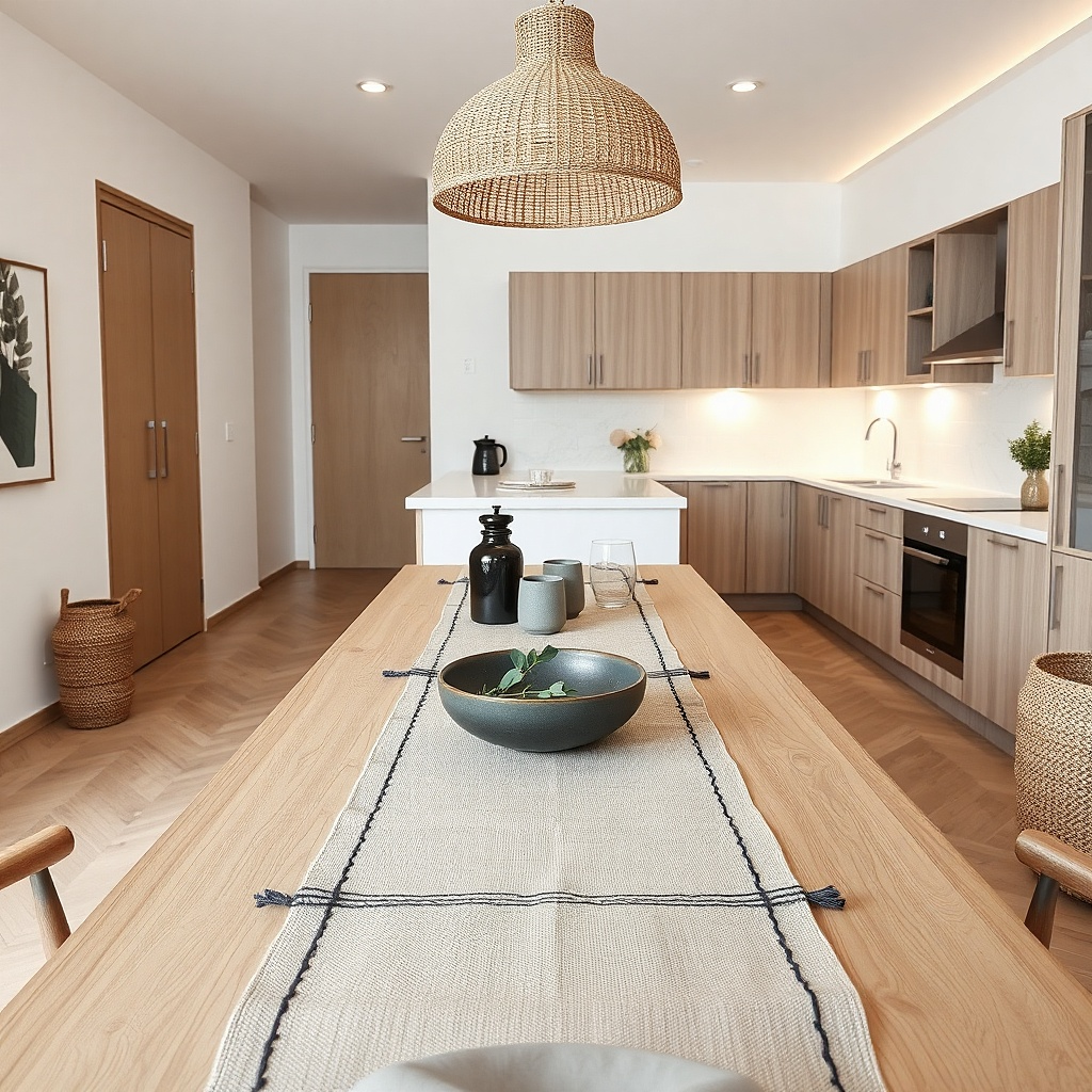
Start by measuring the table width and picking a runner that leaves 4 to 6 inches of table visible on each side. Place the runner centered, then add two placemats only if you seat two — extra placemats look crowded. Choose a runner with a simple weave so it doesn’t snag on chair legs. After you eat, wipe with a damp cloth and let it dry flat. If your runner slips, add a thin non-slip liner under the center strip.
In small apartment dining areas, the table setup can look either intentional or cramped. I use a narrow runner and keep the placemats centered, which gives the table a defined middle without covering the edges where people sit. Textured gray hides everyday spills better than bright white, and it pairs with wood chairs and stainless appliances. This works for everyday living because you can set it down for breakfast and still wipe it quickly after dinner. It flatters small seating layouts because it reduces visual clutter compared to full tablecloths.
Common mistakeAvoid long runners that hang past chair legs — they drag and catch crumbs.
Try thisUse the same placemat color family as your dish towels so the kitchen and dining area feel linked.
19. Drawer Dividers for Foil, Wrap, and Everyday Bags
Start by pulling everything out and measuring the drawer inside dimensions. Choose dividers that match your drawer depth so they don’t bow. Stand foil and wrap upright in one divider slot, with plastic wrap in front of foil so you grab it faster. Put sandwich bags in a shallow compartment and keep scissors and tape in a small corner bin. Finally, label dividers with small tape markers so you can put everything back without thinking.
A clean kitchen look comes from how your drawers behave, not just what sits on top. When foil, wrap, and bags are loose, they turn into a mess that spills onto counters. I use drawer dividers that keep these items upright and separated by type. The modern look is the uniform lines and visible organization inside the drawer — it makes the whole kitchen feel planned. This works for people who live in small apartments and need quick cleanup after cooking. It also flatters kitchens with minimal counter space because drawers become the hidden storage hero.
Common mistakeDon’t leave one random gap — loose items slide into the gap and ruin the neat lines.
Try thisUse a thin elastic strap around a roll of wrap so it doesn’t fall over when you open the drawer quickly.
20. Monochrome Dishware with One Patterned Bowl
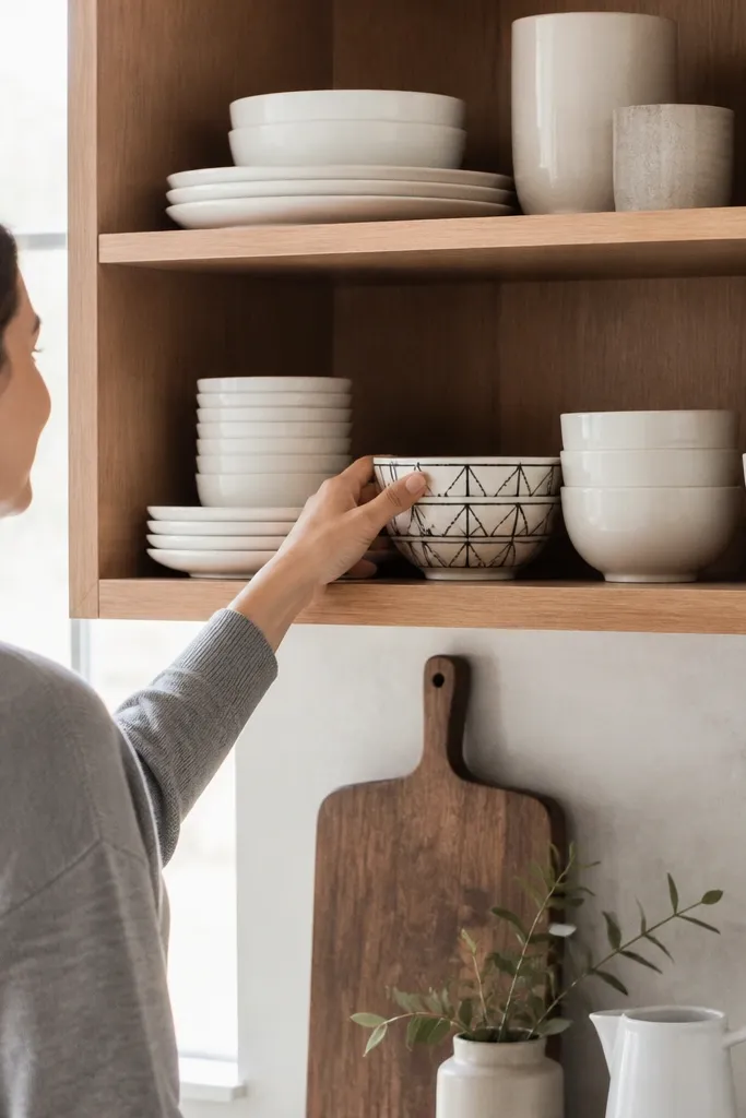
Start by choosing one base color for plates and mugs, then pick one accent pattern that matches your accent color elsewhere (like sage or blue). Arrange plates stacked and bowls grouped so the patterned bowl sits near the front, centered. Keep mugs facing the same direction so handles align. If the shelf has jars, choose clear glass jars with neutral contents so they don’t compete with the pattern. Store mismatched or extra pieces in a cabinet so the open display stays consistent.
This is the decor move I use when someone wants modern style but doesn’t want to commit to painting or replacing cabinets. Keep dishware monochrome — white or off-white — and let one patterned bowl bring personality. The shelf looks cohesive because most pieces share the same tone and shape, and the one pattern becomes a focal point instead of clutter. It’s especially effective in small kitchens because shelves are always in your peripheral vision. It flatters almost any finish combination because neutral dishware works with both warm wood and cool metal.
Common mistakeAvoid mixing multiple patterns on the same shelf — it reads like you ran out of time, not like style.
Try thisIf you have a lot of dishes, display only what you use weekly — the rest stays hidden and the shelf stays calm.
21. Floating Shelf Spice Ladder with Vertical Labels
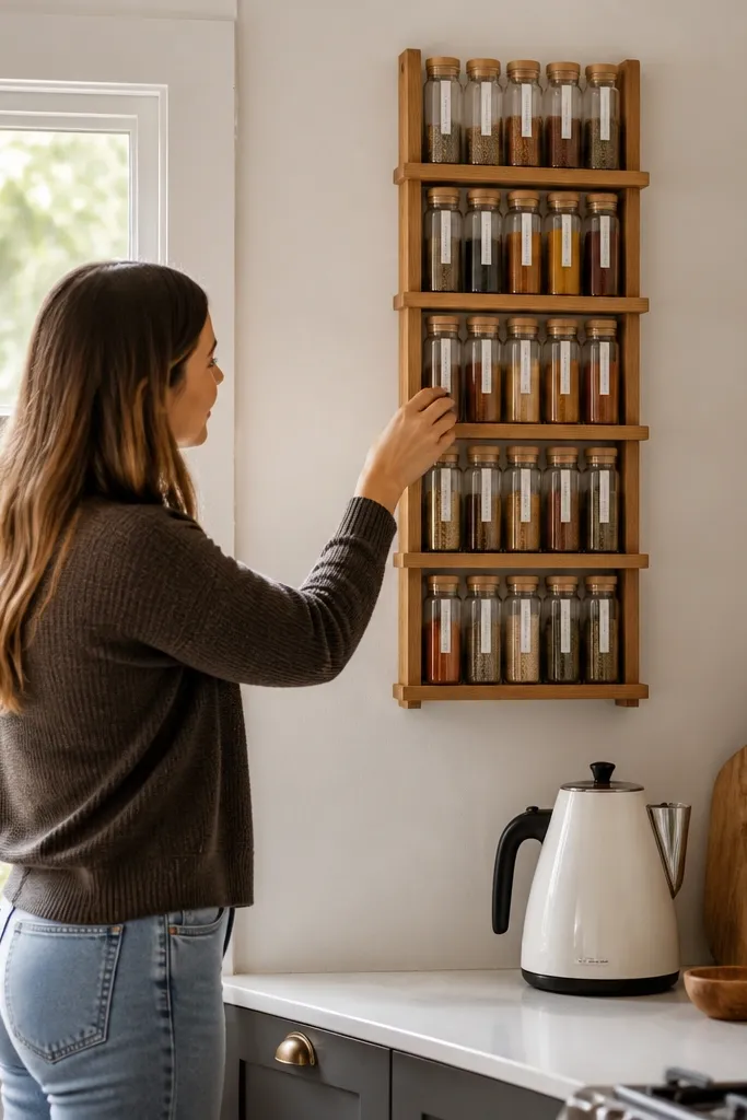
Start by installing one narrow floating shelf or a two-shelf vertical system, depending on your wall space. Keep the jar sizes consistent so the ladder line stays even. Arrange jars from most-used at the bottom to less-used at the top, with labels all facing forward. Place a larger bottle like olive oil on the bottom shelf so you don’t reach over tiny jars. Use a label template and keep font size consistent so the shelf looks designed rather than improvised.
A spice ladder layout is a modern way to store seasonings when your counter is too small for a spice rack. Vertical labeling keeps everything scannable, and the shelf design adds height without adding bulk. I like jars with consistent shapes and a label layout that lines up — it looks clean from across the room. This works best for apartments because it uses wall space you already have and keeps your countertop ready for cooking. It flatters small kitchens because the eye reads structure, not clutter.
Common mistakeDon’t mix jar heights randomly — the ladder look collapses into a messy tower.
Try thisWipe jar fronts with a dry microfiber cloth before styling so the glass looks clear under lighting.
22. Matte Stone Countertop Contact Paper in a Real Pattern Scale
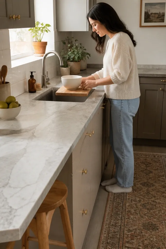
Start by cleaning and degreasing the counter thoroughly, then let it dry completely. Measure the counter sections and cut the paper slightly oversized so you can trim at the end. Apply slowly, using a plastic squeegee to push out bubbles as you go. Wrap the edges around the sink cutout and trim with a sharp blade for a clean line. Seal seam areas with a thin clear edge sealer if the paper lifts near heat exposure. Finally, wait a full day before placing hot items on the surface.
If your counters are worn or the color looks outdated, contact paper is the fastest visual upgrade I’ve done in rentals. I choose matte stone-pattern paper because glossy finishes make small kitchens look smeary and show every fingerprint. The key is pattern scale — too busy a pattern makes the room look smaller, too tiny looks blurry. When you match the paper alignment to cabinet edges, the counter reads intentional. This works for people who want modern small kitchen decor ideas without replacing counters. It also flatters kitchens with white cabinets because matte stone gives warmth without going dark.
Common mistakeAvoid rushing the trimming — jagged edges around the sink look cheap immediately.
Try thisUse a small foam roller over the paper seams to improve adhesion and reduce lifting edges.