1. Using fake marble film with loud gray veining
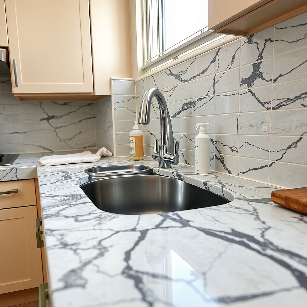
This is the mistake I would cut first. Cheap marble film with thick charcoal veining against builder-grade cabinets almost always reads like a quick cover-up from a decade ago. Real stone patterns have variation, soft edges, and scale changes, while bargain film repeats the same vein every 10 or 12 inches and catches light with a plastic shine. On a rental countertop, that contrast is obvious at the sink cutout and front edge. If you want the room to look newer, a plain warm white, soft greige, or light concrete effect looks far more believable than dramatic fake Carrara.
Start by checking the counter’s undertone in daylight. If the cabinets lean yellow or the floor has tan or honey notes, pick a film in cream, putty, or pale taupe instead of stark white with blue-gray veins. Then order a sample or one short roll first and lay it on the counter for a full day before committing, because overhead bulbs can turn cool tones harsh fast. Finally, if you do use film, choose a matte finish and trim it with a fresh snap-off blade, a metal ruler, and a plastic smoothing card; expect to spend about $25 to $60 for a small kitchen done decently.
Try thisA soft concrete-look film with tiny speckling hides crumbs and seams better than faux marble. It also looks more convincing next to standard apartment cabinets.
Common mistakeSkip any pattern with high-contrast veining thicker than a pencil line.
2. Leaving every daily appliance on display
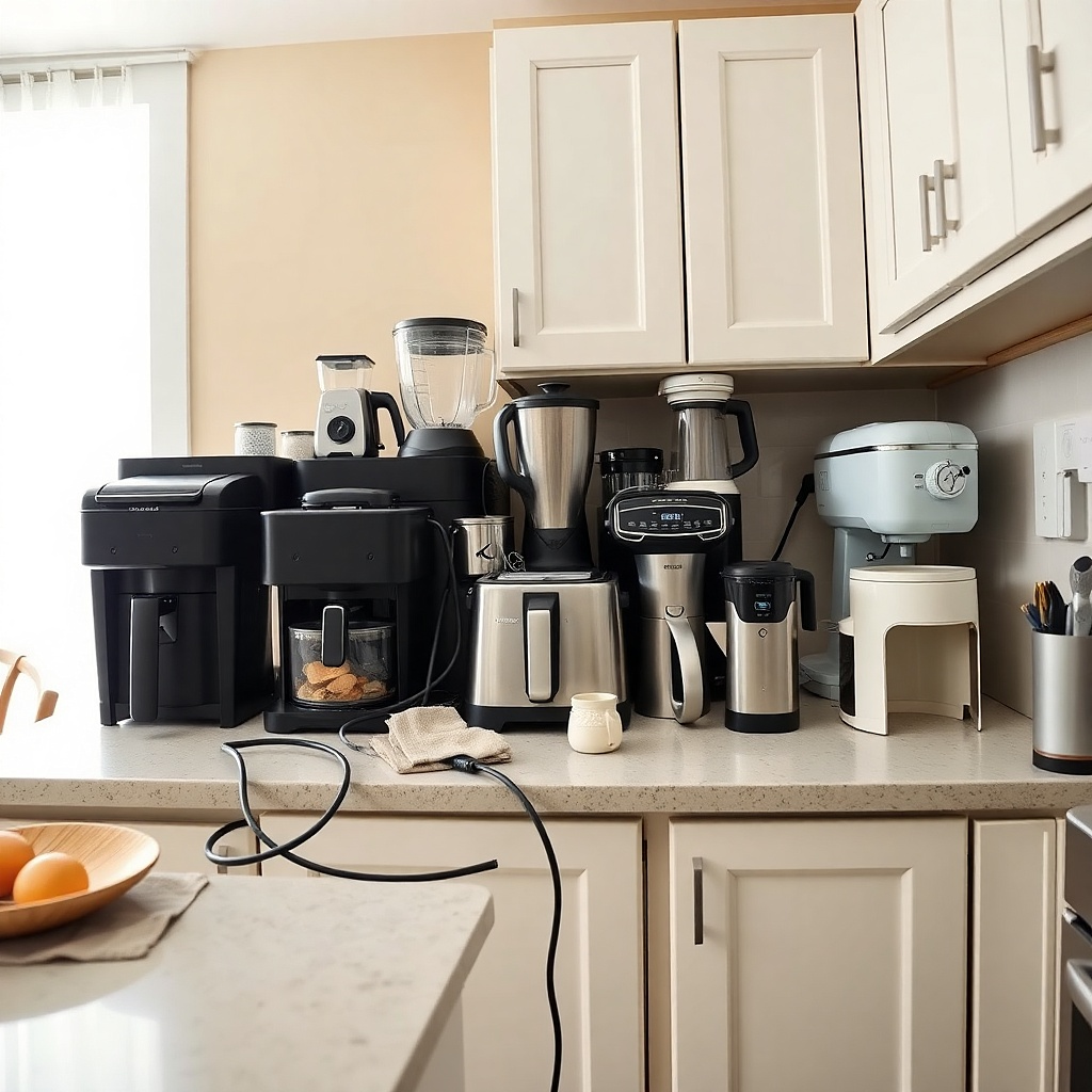
Counters look dated when they become appliance parking lots. A toaster, coffee maker, blender, air fryer, and stand mixer lined up wall to wall create a heavy visual band that shrinks the room and makes even decent counters look tired. The problem gets worse when the finishes do not match — brushed steel next to shiny black plastic next to cream retro shapes. A current-looking rental kitchen has breathing room. Keep one anchor appliance out, maybe two if the kitchen is large, and store the rest in a lower cabinet or on a rolling cart.
Start by measuring the uninterrupted counter runs and identify your main prep zone. You want at least 24 inches of clear work surface, and 30 inches is better, between the sink and stove or beside one of them. Then choose which appliance earns permanent counter space based on daily use, not price or size, and group any second appliance on the same side of the kitchen so the room has one visual cluster instead of three. Finally, use felt pads or a sliding appliance tray under heavier pieces so you can pull them out from a cabinet shelf without a wrestling match; a decent tray runs about $20 to $35.
Try thisIf your coffee maker stays out, let that be the only permanent station and keep mugs, pods, and sugar off the open counter.
Common mistakeDo not line appliances along the backsplash like a showroom shelf.
3. Mixing cold white accessories with warm beige counters
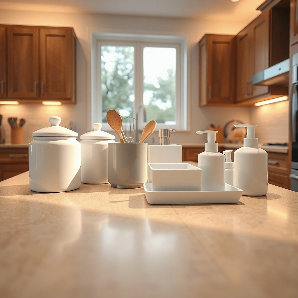
Undertone mismatch dates a kitchen fast because it makes every surface look accidental. Beige laminate with peach, gold, or biscuit notes turns dingy when you set bright blue-white canisters and icy gray organizers on top of it. The counter suddenly looks older than it is. Warm counters need friends in cream, mushroom, sand, camel, walnut, or muted olive. Even black works better when it is matte and paired with wood, because the warmth balances the beige instead of fighting it.
Start by holding a sheet of printer paper on the counter in daylight. If the counter looks yellow, tan, or pink beside true white, treat it as a warm surface and shop from the warm side of the paint strip. Then replace the most visible accessories first — soap bottle, utensil crock, tray, kettle — because four mismatched pieces create more dated noise than a whole shelf hidden behind doors. Finally, repeat one warm material twice, such as oak and cream ceramic, so the counter setup looks chosen on purpose; this switch can cost as little as $30 if you change only the top layer.
Try thisA smoked glass soap dispenser with a black pump works on both warm and cool counters and avoids that chalky bright-white clash.
Common mistakeSkip optic white accessories unless the counter itself is a true cool white.
4. Using glossy plastic organizers that catch every light
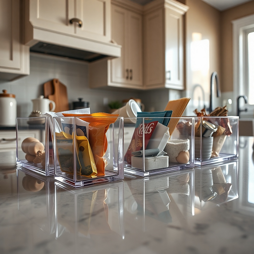
Shiny acrylic bins and clear molded organizers read more dorm room than updated kitchen once they sit on the counter full time. They reflect under-cabinet bulbs, show dust, and turn everyday items into visual clutter because every wrapper and twist tie stays visible. That glare also exaggerates older laminate patterns. A better move is matte ceramic, powder-coated metal, ribbed glass, or unfinished wood with a simple shape. Those finishes absorb light instead of bouncing it around, so the countertop looks calmer and newer.
Start by pulling every organizer off the counter and sorting them into 'must stay out' and 'can live in a drawer.' Then replace only the visible pieces with one material family — for example, black metal plus oak, or cream ceramic plus amber glass — and keep the heights staggered under 10 inches so the setup does not block the backsplash. Finally, decant only what you use daily, such as dish soap and cooking utensils, and leave pantry goods in cabinets; a full counter decanting system is expensive and rarely worth it in a rental.
Try thisRibbed amber or smoke glass hides water spots better than clear glass and feels less fussy on a working counter.
Common mistakeDo not keep clear plastic bins full of packets, clips, and random snacks on the counter.
5. Letting the paper towel roll become the focal point
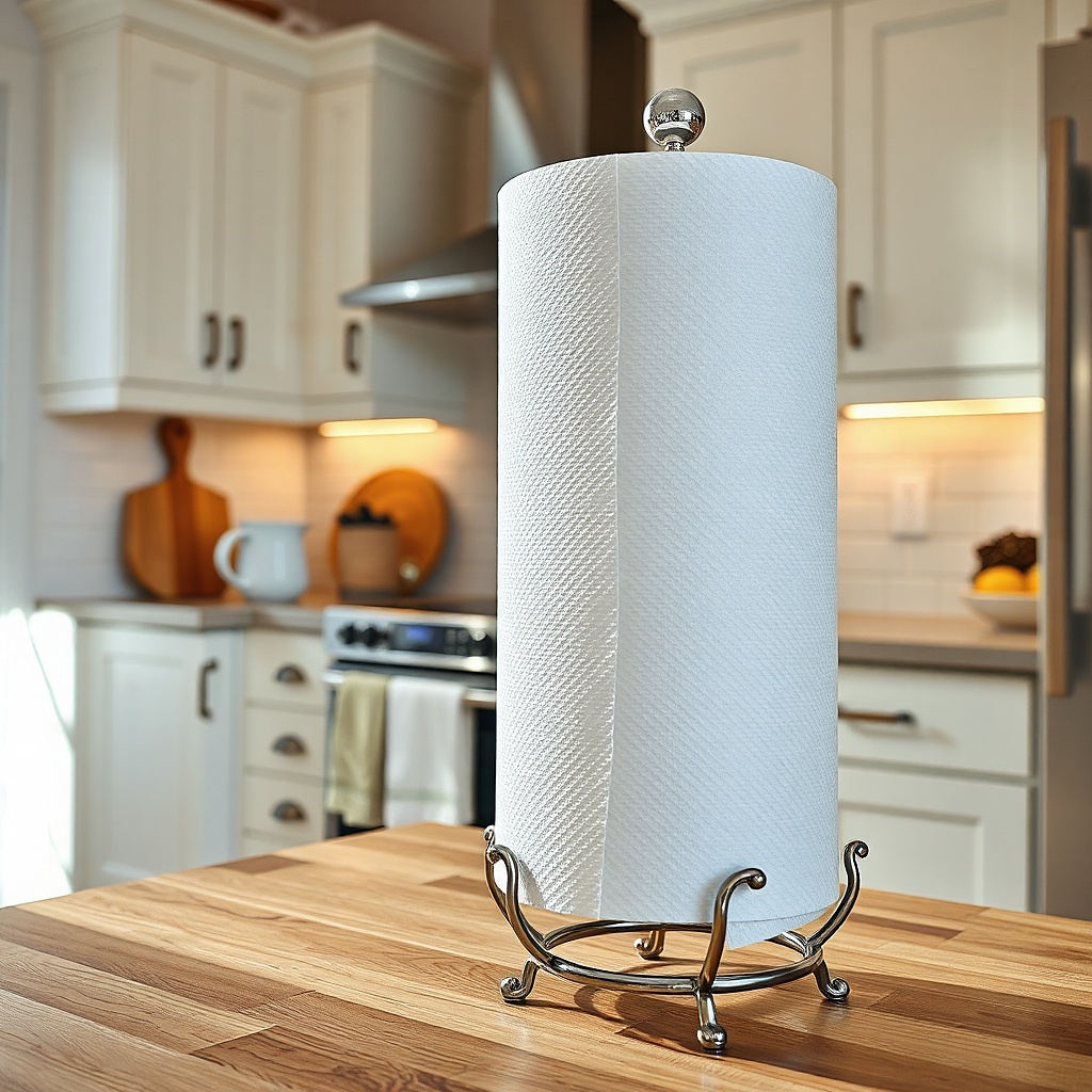
A jumbo paper towel roll planted in the center of a small counter is a quiet way to make the kitchen look older and more cramped. The roll is bulky, bright, and disposable-looking, so it steals attention from everything around it. Traditional decorative holders with scrollwork or heavy chrome bases make it worse. In a rental kitchen, the smartest setup is to push paper towels to the least visible edge, mount them under a cabinet if the lease allows removable hardware, or use a very plain upright holder in black, wood, or brushed steel.
Start by standing in the doorway and noting where your eye lands first. If the paper towel roll is one of the first three things you notice, move it. Then test two better spots — beside the fridge wall, tucked near the sink corner, or under the upper cabinet with removable adhesive brackets rated for the weight. Finally, choose a holder with a narrow base under 6 inches wide and no decorative top finial; expect around $12 to $30 for one that looks clean instead of clunky.
Try thisA black metal under-cabinet holder disappears best against shadow lines and frees a surprising amount of prep space.
Common mistakeSkip ornate holders with beads, curls, or fake farmhouse distressing.
6. Crowding the back corner with a decorative tray that is too big
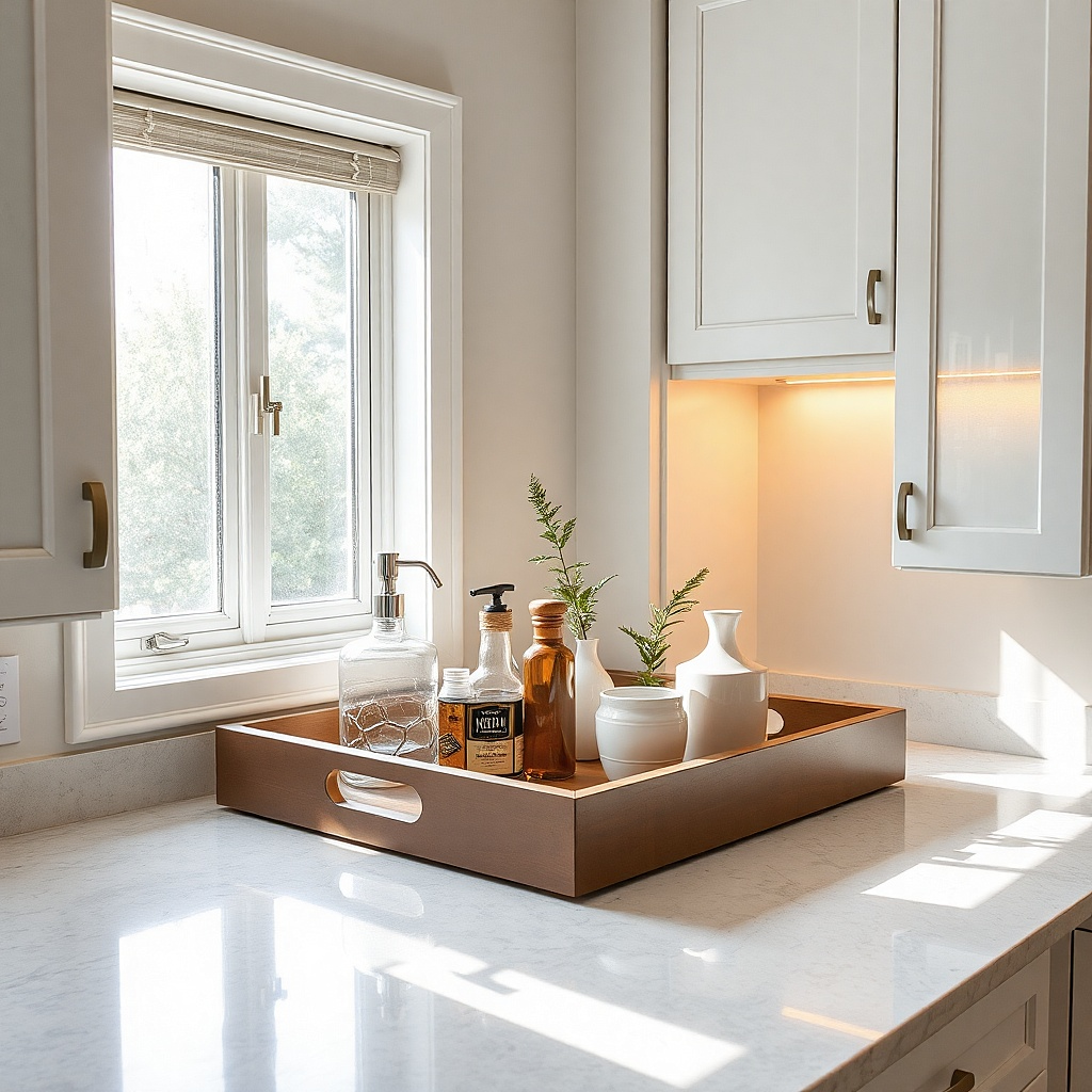
The tray itself is not the problem. The oversized tray stuffed with soap, oil bottles, a candle, a plant, and two grinders is the problem. In a rental kitchen, that kind of corner styling reads stale because it looks copied from old catalog setups rather than built around actual use. It also traps grease near the stove and makes wiping the counter annoying. A smaller tray with two or three daily items keeps the counter styled without turning it into a display shelf.
Start by choosing one zone that deserves containment — the sink side or the coffee side, not both in a tiny kitchen. Then use a tray around 10 by 14 inches or 12 by 16 inches and limit it to the items you reach for every day, such as soap, sponge dish, and hand lotion by the sink, or sugar jar and mugs by the coffee maker. Finally, leave at least 3 inches of bare counter around the tray so it reads like a deliberate station instead of overflow storage; thrifted wood trays and plain metal trays both work if the finish is matte.
Try thisRound trays waste corner space on small counters. A slim rectangle fits tighter and looks sharper.
Common mistakeDo not build a tray vignette with fake greenery, signs, and filler objects.
7. Ignoring the countertop edge and sink seam
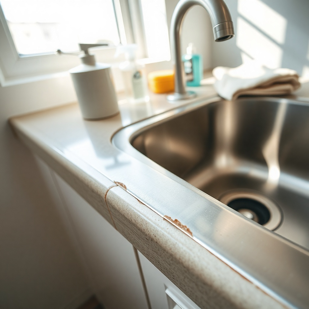
Nothing dates a rental counter faster than a dingy sink seam or chipped laminate edge. People focus on decor and forget the line where the counter meets the sink, even though that is one of the most visible spots in the room. Old beige caulk, dark mildew specks, and peeling edge banding read neglected right away. A clean seam and a tidy front edge make even cheap laminate look more current because the surface reads maintained instead of worn out.
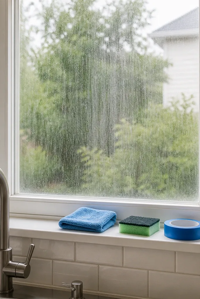
Start by scrubbing the sink seam with a paste of baking soda and a few drops of dish soap, plus a soft toothbrush for the tight line. If the caulk is cracked or stained through, remove it with a plastic scraper and apply fresh kitchen-and-bath silicone in white or clear, depending on the sink color; one tube is about $8 to $12. Then check the front counter edge for lifting laminate or rough spots and use a matching laminate seam adhesive or edge repair marker for minor damage. Finally, let repairs cure fully before setting anything back near the sink.
Try thisUse painter’s tape on both sides of the caulk line before applying new silicone. The finished seam looks straighter and much less DIY.
Common mistakeDo not smear fresh caulk over old dirty caulk and call it fixed.
8. Choosing a dish rack that sits too tall and too wide
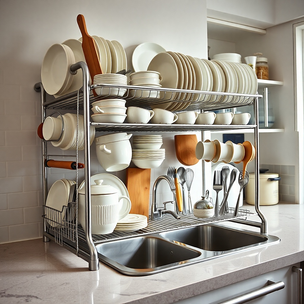
A giant chrome dish rack can make a whole kitchen feel stuck in another era. It blocks the backsplash, crowds the sink, and creates a permanent pile-up zone for plates, cups, and water spots. In a rental, the better choice is a low-profile rack, a folding over-sink style if the sink shape allows it, or a compact drain mat that can be put away. The goal is simple. The counter should look like a work surface, not a dish storage area.
Start by measuring the open space beside your sink and cap the rack width at about two-thirds of that span so it does not consume the whole run. Then pick a model under 7 inches tall in black wire, brushed steel, or neutral silicone, and avoid bright chrome if your kitchen already has a lot of reflection. Finally, pair it with a washable microfiber mat or integrated drainboard and empty it every night so the rack does not become permanent scenery; good compact options sit around $18 to $40.
Try thisA roll-up over-sink rack is the smartest move for a very small rental because it disappears into a drawer after use.
Common mistakeSkip two-tier racks unless you have a large kitchen with long uninterrupted counters.
9. Using tiny decor pieces that create visual static
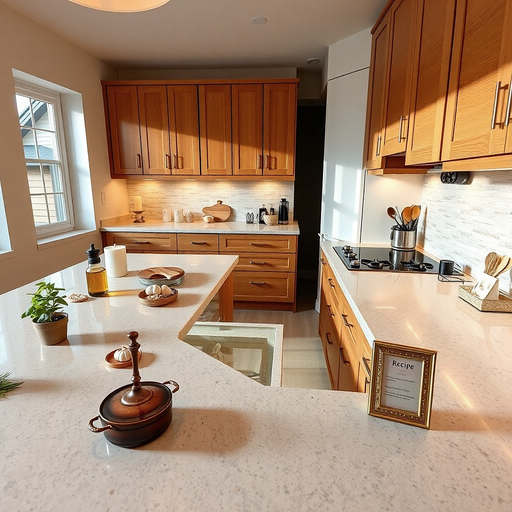
A cluster of little things makes a countertop look dated faster than one strong object. Mini signs, tiny plants, salt shakers shaped like fruit, tea light holders, and seasonal knickknacks create visual static across the whole work surface. The eye has nowhere to rest. Older laminate patterns already have enough movement, so adding more small-scale detail makes the counter feel busier and cheaper. One medium cutting board, one ceramic bowl, or one substantial utensil crock has a cleaner, newer effect.
Start by clearing every non-working object off the counter and putting back only one decorative item per zone. Then choose decor with some visual weight — a 12 to 16 inch wood board, a stoneware bowl around 8 to 10 inches wide, or a lidded crock — instead of several objects under 5 inches tall. Finally, keep any decorative piece useful if possible, such as a fruit bowl or board that can hold hot pans, so it earns its place on limited rental counter space.
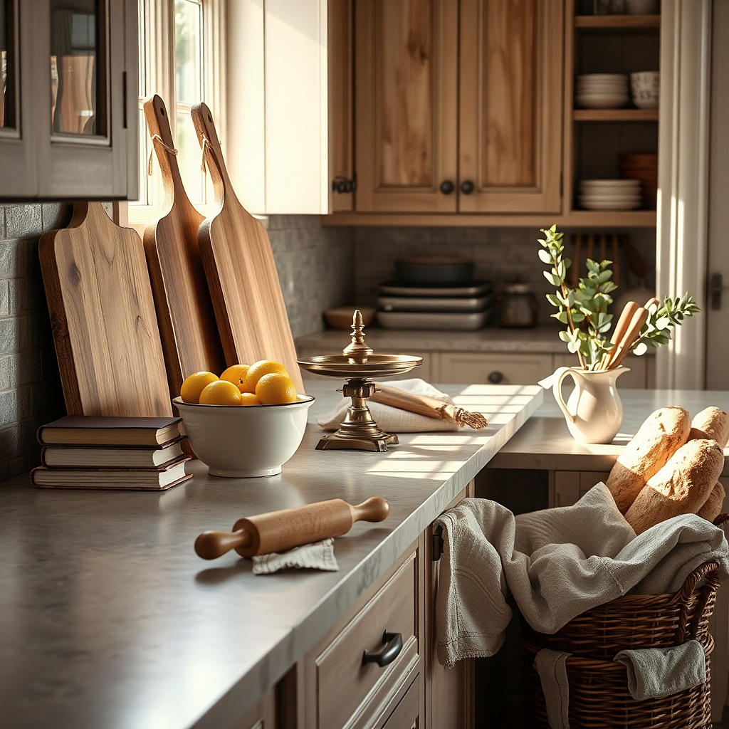
Lean one larger cutting board against the backsplash to add height without scattering small pieces everywhere.
Do not sprinkle mini decor across every empty patch of counter.
10. Pairing busy counters with a busy backsplash setup
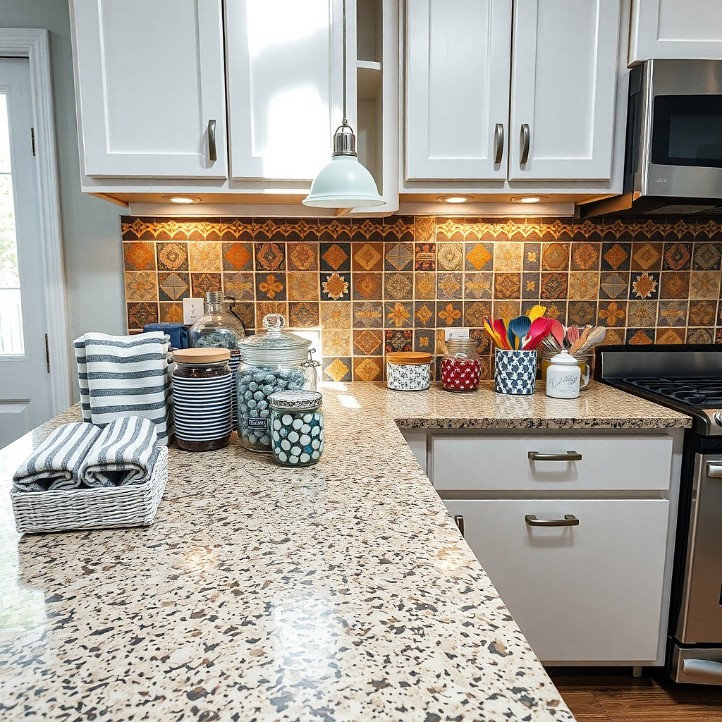
If the countertop already has mottling, speckling, or a faux-granite print, the backsplash area above it needs restraint. People date the room by stacking pattern on pattern — speckled counters, a printed peel-and-stick tile, striped towels, and labeled jars all in the same sightline. The result feels noisy and old because every surface competes for attention. A better rental fix is to let the counter be the busiest plane and keep the backsplash zone plain with one quiet material or color repeated.
Start by identifying whether your counter pattern is low, medium, or high movement. If you can see more than three colors or obvious speckles from 6 feet away, treat it as high movement and skip patterned tile decals above it. Then simplify the backsplash line with a single large board, one soap dispenser, and one towel in a solid color rather than multiple containers and prints. Finally, if you want a removable backsplash update, choose a plain zellige-look tile sticker in one soft tone with minimal contrast grout lines and test one sheet first.
Try thisBusy counters look better next to soft white, warm greige, or pale putty than bright patterned accessories.
Common mistakeSkip peel-and-stick backsplash tiles with bold geometric prints over speckled laminate.
11. Leaving stained cutting boards and worn mats in full view
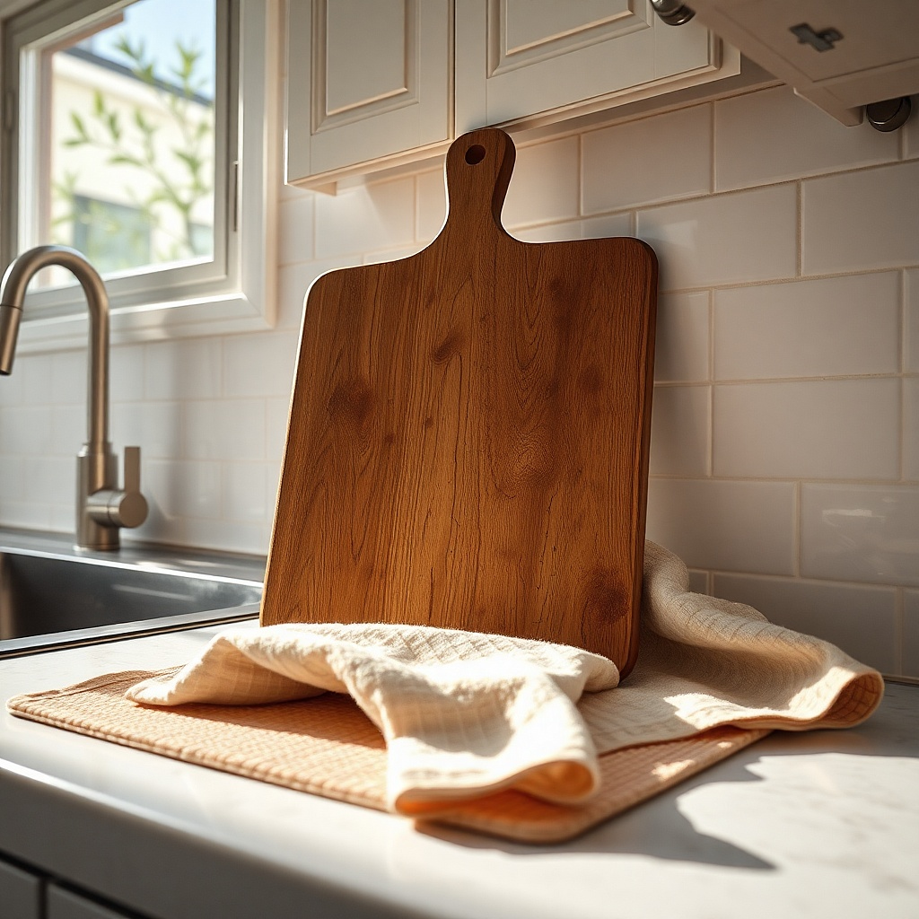
A countertop can be decent, but stained boards and curled mats drag the whole kitchen backward. Plastic boards with knife scars, bamboo boards gone orange from oil buildup, and faded drying mats with dark edges all read old and tired. Because these pieces sit directly on the counter, they influence how clean and current the surface feels. Replacing one grimy board and one sad mat does more for the look of a rental kitchen than buying decorative canisters.
Start by checking every board and mat under bright light. If a board has deep grooves, permanent discoloration, or a warped edge, replace it with one wood or composite board in a simple rectangle around 12 by 18 inches for daily use. Then swap stained fabric mats for a slim silicone or microfiber mat in charcoal, sand, or muted green that can fold away after dishes are done; expect about $15 to $35 for both updates if you shop carefully. Finally, store extra boards vertically in a cabinet so only the best-looking one stays visible.
Try thisA walnut-toned board flatters beige counters more than pale bamboo, which can look yellow against them.
Common mistakeDo not lean three mismatched cutting boards against the wall just because you own them.