1. Oversized checkerboard mural in two paint tones
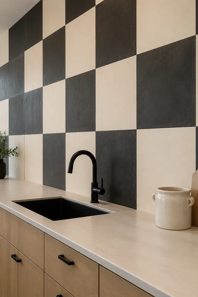
A checkerboard mural gives you instant structure because it creates a clear rhythm across the wall. Choose only two tones — a deep charcoal and a warm cream — and keep the squares large enough to read from across the room. This works especially well above a long counter where you want the wall to feel intentional without adding clutter. Matte paint keeps the pattern from reflecting overhead lights. If your cabinets are glossy or your backsplash is shiny, the matte mural will calm the whole area down.
Try thisAdd one matching accent in the kitchen, like a charcoal canister or cream dish towel, so the mural doesn’t feel like a standalone experiment.
Start by measuring the wall span above the counter and divide it into whole squares, aiming for squares that are 6-10 inches wide. Tape the grid with painter’s tape, then paint the base tone first and let it cure before masking for the second color. Use a small foam roller for crisp edges, and finish with a matte wall sealer so the pattern stays even. Effort is moderate and costs mostly in paint and tape, usually $60-150 depending on wall size.
Common mistakeDon’t use more than two colors or tiny squares — it turns into visual noise fast.
2. Vertical stripe panel wall with wood slats
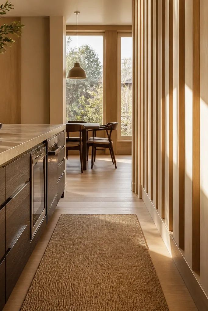
Vertical stripes make kitchens feel taller and cleaner, which is why this works when your wall feels too low or cramped. Wood slats add texture and warmth without turning the space into a theme park. Use light oak or pale birch slats with narrow white gaps (about 1-1.5 inches) to keep the look airy. This is a great choice if your backsplash is busy because the slat texture absorbs visual chaos. It also photographs well because the shadows between slats create depth.
Try thisChoose slats that are all the same thickness and sand them the same grit so the shadows line up cleanly.
Mark a level starting line at your chosen height band, then install a simple grid of mounting strips so each slat stays straight. Space slats evenly (commonly 2-3 inches per slat when you want a bold stripe look) and keep gaps consistent. Finish by filling small edge gaps with wood filler and painting or sealing the white parts matte. The build is straightforward carpentry with basic tools, and material cost is typically $120-250 for most mid-size walls.
Common mistakeAvoid wide random gaps — uneven spacing makes the wall look DIY instead of designed.
3. Framed botanical wallpaper panels in a tight row
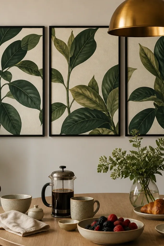
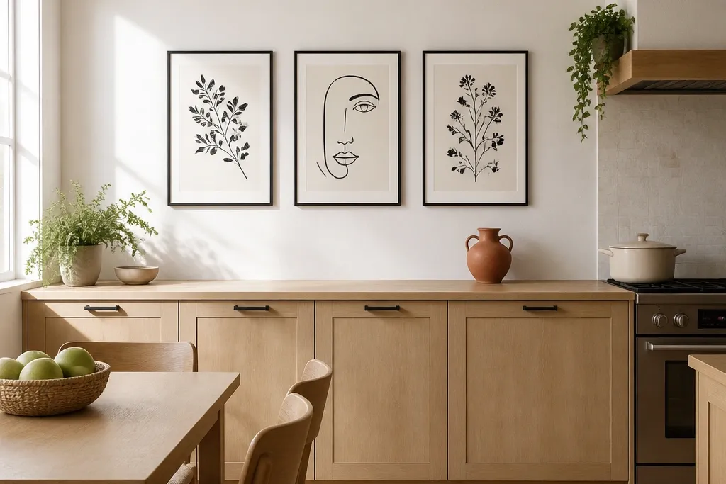
Botanical patterns look beautiful in kitchens because they soften hard surfaces while still reading as a pattern. Instead of wallpapering the whole wall, use wallpaper inside frames so you can control scale and keep it easy to change later. Pick a print with thick leaves and a cream background, then use three frames in a horizontal line. This works best above a dining table or in the narrow wall between cabinets where you want a “gallery” feel. The frames create clean edges that keep the pattern from feeling overwhelming.
Try thisUse the same leaf color in your kitchen accessories, like green glass bottles or a leaf-print runner, to tie it together.
Buy frames with the same width and depth, then cut wallpaper to fit the inner opening with a 1-2 inch overlap for trimming. Mount the frames so the centerline sits around 60-66 inches from the floor. Use a consistent mat color, like warm white, to reduce glare and make the greens look deeper. Expect $80-200 depending on frame size and whether you already own mats.
Common mistakeSkip thin, delicate prints if your kitchen has bright overhead lighting — they disappear into glare.
4. Ceramic tile-look peel-and-stick pattern strip
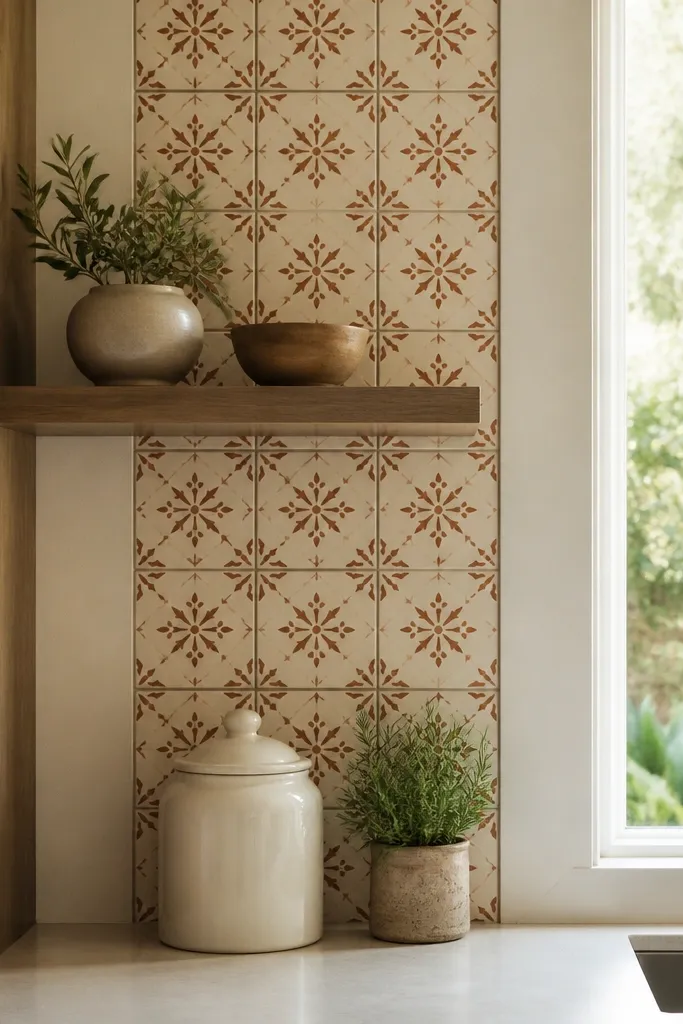
A tile-look strip gives you the “designed backsplash” effect without doing full tiling. Choose a pattern that repeats clearly, like a small terracotta-and-cream tile with subtle gray grout lines. Keep the strip height around 10-16 inches so it reads as a wall accent, not a second backsplash. This is ideal for kitchens that already have a backsplash and need something above cabinets or on a blank side wall. The ceramic texture look also hides minor wall imperfections better than flat paint patterns.
Clean and degrease the wall, then test one strip section to confirm adhesion on your paint finish. Measure the cabinet top line and center the strip so it’s level across. Apply in short sections, smoothing with a plastic squeegee to avoid bubbles, then trim edges with a sharp utility blade. Cost is usually $25-80 for a roll or sheet set, depending on width and brand.
If your wall has outlets, plan the strip to stop cleanly before the outlet and continue on the other side for a crisp finish.
Don’t stretch the material while applying — stretching makes patterns warp.
5. Kitchen typographic word art in a single-line layout
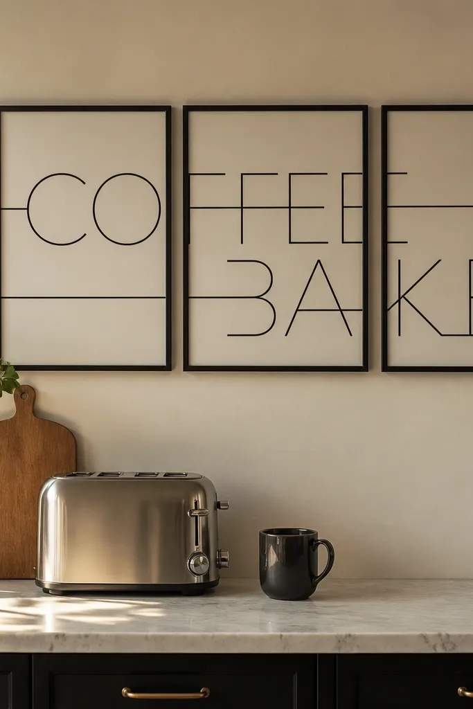
Typography patterns look sharp and modern, especially when you keep them minimal and aligned. Choose one word theme that matches your kitchen habits, like COFFEE and BAKE, then set them in a single-line layout across three frames. Use black lettering on off-white paper, with consistent font weights so it reads like a pattern, not separate prints. This idea works when you have neutral cabinets and want a clean focal point that doesn’t fight your backsplash. It also looks great in small kitchens because it doesn’t add visual thickness.
Pick three frames with the same size and spacing, then arrange the words so the total line fits your wall width with equal margins. Hang with a level and mark the centerline first, usually 60-66 inches from the floor. Use matte paper or matte print surfaces to prevent glare from overhead lighting. Plan on $70-160 if you’re buying frames and prints, or less if you already have frames.
Keep the font color strictly black or charcoal, not mixed greys — mixed tones can look messy under kitchen lighting.
Avoid multi-font collage posters — it stops reading as a pattern.
6. Hexagon shadowbox grid using stained wood frames
A hexagon grid adds pattern without looking flat, because the frames create shadows and depth. Stained wood frames bring warmth and hide the small imperfections that can show up on painted walls. This works well on a wall that’s mostly blank and large enough to handle a grid, typically 48-84 inches wide. The honeycomb rhythm feels “designed” even if you use simple inserts like tan linen or small ceramic tiles. It’s also an easy way to add wall storage vibes without shelves.
Choose a grid size first: for a common kitchen wall, plan 7-13 hexagons depending on your width. Lay out the pattern on the floor, then transfer measurements to the wall with a level. Use spacers so each frame gap stays consistent (about 1-2 inches). Insert linen or small ceramic pieces after hanging so you can fine-tune alignment. Cost is moderate, usually $120-300 depending on frame sizes.
Use one neutral insert fabric across all hexagons so the pattern reads as shape, not as random art.
Don’t use multiple loud colors across inserts — the honeycomb pattern already provides the visual energy.
7. Zigzag gallery in three sizes with matching mats
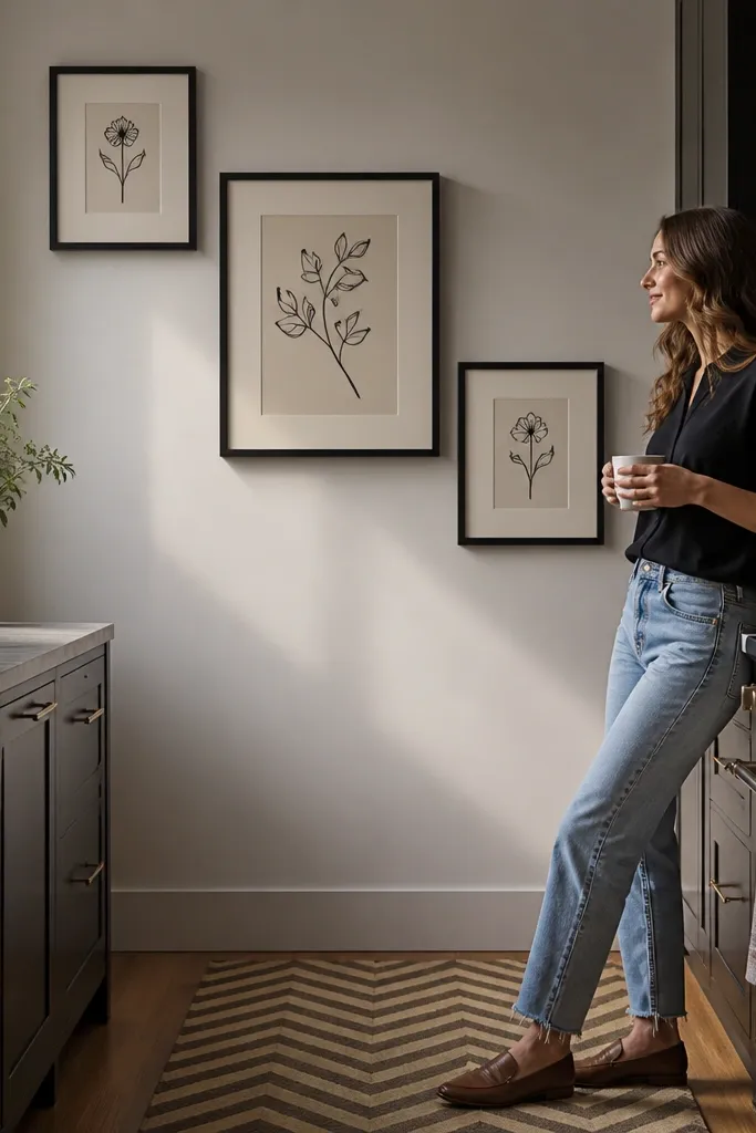
A zigzag gallery creates movement, which makes a kitchen wall feel active even when the rest of the room is static. Use prints that share the same palette, like black line art on cream, so it looks like one pattern system. The trick is to use three sizes: one large center frame and two smaller frames offset above and below it. This is a strong choice above a breakfast nook or on a wall next to a window where you want the eye to travel. Matching mats keep the zigzag from looking accidental.
Try thisUse consistent print thickness and line weight — thin line art can disappear under kitchen lighting.
Pick frames that share the same outer dimensions style, even if inner print sizes differ. Arrange them in a zigzag so the center frame is the anchor, then place the other two so their edges align visually. Hang by measuring from a fixed reference point like the countertop edge and keep consistent spacing between frames (2-4 inches). Use matte black or warm white mats to keep glare down. Budget usually lands around $90-220 depending on frame quality.
Common mistakeAvoid random frame finishes like chrome next to wood — it breaks the pattern unity.
8. Twelve-inch checker stripe runner framed like a panel
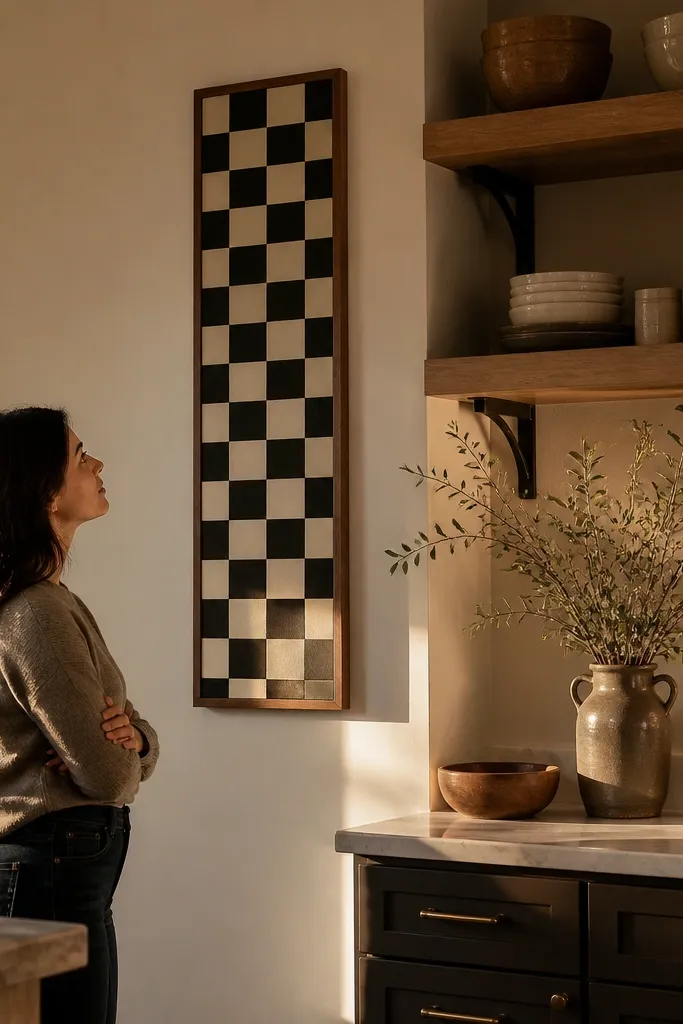
If your wall is narrow, a long framed panel gives you pattern impact without needing a big mural. Choose a checker stripe that repeats in 3-4 inch bands, then frame it in a slim black or walnut frame. Mount it vertically or slightly above eye level so it pulls the eye upward. This works in hall-to-kitchen transitions or on small walls between doors where a large art piece would feel too dominant. The framed edges make the pattern feel crisp and finished.
Measure the wall and pick a frame size that leaves at least 4-6 inches of margin on each side. Hang the panel so its center is around 62 inches from the floor. Use a matte backing board and low-glare glass or acrylic if you can. This is a DIY-friendly project if you can print the pattern or source it as wallpaper, then mount it under glass. Cost is usually $60-140 depending on frame and print size.
Match the frame color to one existing element, like cabinet hardware or a black faucet.
Skip glossy glass — reflections from ceiling lights will ruin the pattern.
9. Oversized circular pattern plates wall cluster
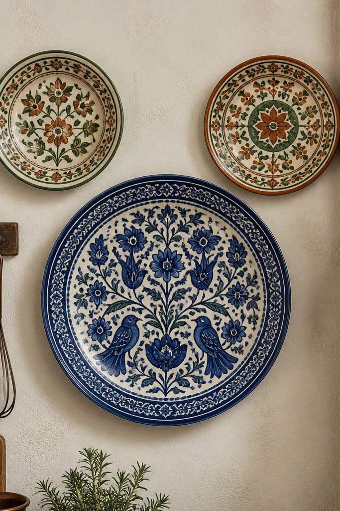
Plate walls look gorgeous in kitchens because the pattern is already baked into the object. Use oversized plates with bold, readable designs — blue-and-white, deep green, or terracotta with cream — and cluster them in an intentional triangle. Keep the largest plate near the center and place two smaller plates above and to the side for a balanced composition. This idea works best when your kitchen has plain walls and you want texture without painting. Ceramic also handles humidity better than paper-based decor.
Try thisChoose plate patterns that share one color family, so the cluster looks like a single set.
Find plate hooks or plate hangers designed for the plate’s rim size, then mark their positions on the wall. Plan spacing so plates don’t overlap — aim for 2-4 inches between edges. Use command strips only for lightweight plates; for most decorative plates, use proper wall anchors. Hang first by leveling the center plate, then align the two others from that reference point. Cost is $40-180 depending on plate count and size.
Common mistakeDon’t mix tiny plates with one huge plate — the wall looks unbalanced.
10. Patterned fabric wall panels with tension rod look
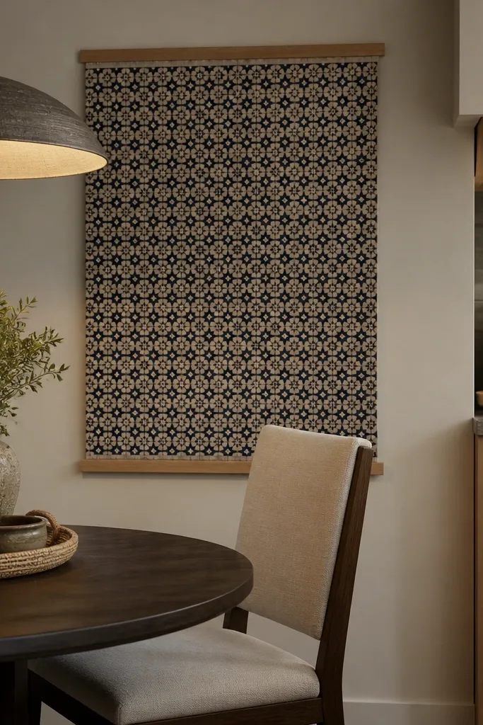
Fabric panels give you pattern and softness, which is great when your kitchen feels too hard and echo-y. The best look is a straight, flat panel with crisp top tension, not draped fabric. Choose a cotton-linen blend with small geometric pattern in two tones, like navy and natural. This works in dining corners or breakfast nooks where you want warmth without adding more hard decor. Fabric also hides minor wall texture differences because it lays smoothly.
Try thisKeep the pattern small enough that it reads as texture from 6-10 feet away.
Buy two tension rods and a fabric panel width that covers your target area with 2-4 inches of fold overlap on each side. Iron the fabric flat, then hang the panel so the top edge sits level at your chosen height band. If you want extra polish, add a simple fabric-covered board behind the rod so the top line stays perfectly straight. Use a washable fabric and avoid patterns with heavy metallic threads if your kitchen is bright. Cost is typically $35-120.
Common mistakeAvoid stretchy knit fabrics — they sag and the pattern looks crooked.
11. Patterned tile-look peel strip + floating shelf combo
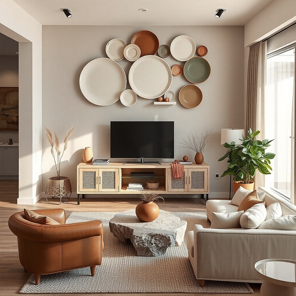
This is one of the best ways to get Kitchen Wall Decor that looks complete because it combines a patterned background with a functional top line. Use a tile-look peel strip behind a floating shelf, then keep the shelf styling minimal: two bowls, one canister, one small plant. The pattern gives you the “wall design,” and the shelf gives you a reason for the height. It works when you want a pattern but don’t want the wall to feel like a museum exhibit. Choose grout-like lines in a neutral gray so the shelf items don’t clash.
Try thisMatch the shelf item color to one tone in the tile pattern, like cream or gray, so everything feels planned.
Install the floating shelf first by finding studs and using the manufacturer’s bracket spacing. Then apply the peel strip behind the shelf line, leaving a clean edge where the shelf covers it. Place shelf items after installation, keeping the tallest object centered and the rest lower and grouped. Use one metal finish, like matte black or brushed brass, for the shelf hardware so the look stays cohesive. Cost is $80-250 depending on shelf length and peel strip coverage.
Common mistakeDon’t overload the shelf — the pattern strip already has visual activity.
12. Wood lattice pattern wall with removable paint panels
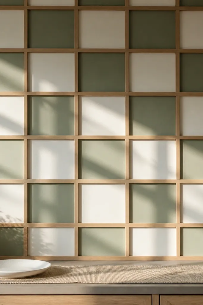
Wood lattice gives you a pattern you can feel, not just see, and it works beautifully over a long blank wall. Add alternating painted squares inside the lattice to create a controlled geometric pattern without needing wallpaper or murals. Use a light wood finish and paint two square tones, like warm white and soft sage, so the wall stays calm. This is a strong option if you want something architectural that doesn’t look like temporary decor. It also hides small wall bumps because the lattice bridges imperfections.
Try thisUse matte paint for the squares and keep the wood sealed with a satin finish so the contrast looks deliberate.
Choose a lattice size that fits your wall width in whole sections, then assemble it on the floor for straight alignment. Mount to studs or use heavy-duty anchors, then paint the squares before attaching any final trim. Keep square sizes consistent, around 10-14 inches, so the pattern reads from the dining area. Seal the painted areas with a matte clear coat to resist kitchen grease splatter. Cost is usually $150-400 depending on lattice size and whether you buy pre-made panels.
Common mistakeDon’t paint every square the same color — you need contrast for the lattice pattern to show.
13. Washi tape pattern grid on a neutral wall
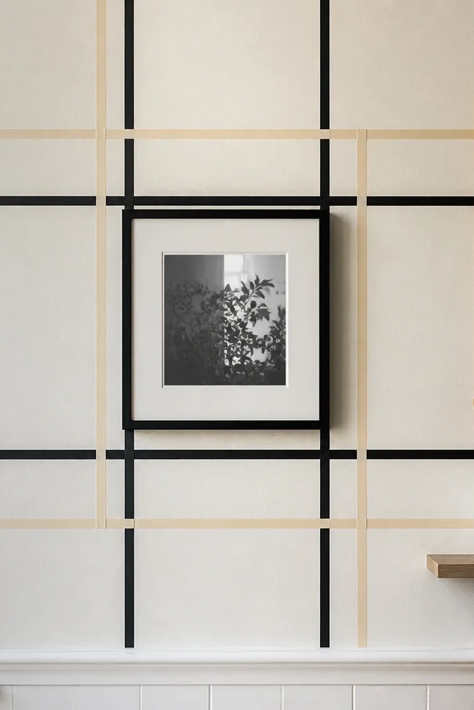
Washi tape grids are a fast way to test a pattern layout before committing to paint or wallpaper. You can create a clean geometric pattern that looks intentional because the tape lines are straight and consistent. Use two tape colors only — black and warm cream — and build a grid around a central focal point like a small chalkboard menu or a framed photo. This idea is best for renters or anyone who wants Kitchen Wall Decor that can change with seasons. It also works in kitchens where outlets or cabinet doors make permanent installs annoying.
Start by cleaning and drying the wall, then mark a centerline and tape a light grid using a ruler. Build squares or rectangles that are 6-12 inches wide, keeping line thickness consistent. Press tape firmly with a plastic edge and test a small corner first to ensure it lifts cleanly. After you’re happy, remove and reapply any crooked sections right away while the tape is still fresh. Cost is low, usually $10-40 for enough tape for a standard section.
Use painter’s tape to mask the tape edges while you work — it keeps the grid razor straight.
Avoid stacking too many tape layers — thick borders look messy under overhead lighting.
14. Bold Moroccan-style arch pattern in a single painted frame
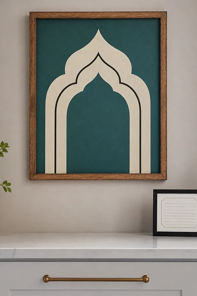
A Moroccan-style arch pattern looks dramatic without covering the entire wall. Paint it inside a simple rectangular frame so the pattern stays contained and reads like a design panel. Choose teal and cream, with one thin line accent in dark charcoal, so you get contrast without turning the wall into a circus. This works best on a wall segment near a doorway or on a side wall where you want a focal point. The arch shape also adds softness compared with straight stripes and grids.
Lightly sketch the arch using a projector grid or a printed template, then tape the rectangular border first. Paint the base color, let it dry, then use a small angled brush for the arch lines. Add one accent line last so it pops under kitchen lighting. Keep the panel width around 24-36 inches for most kitchens so it’s noticeable but not overpowering. Effort is moderate and cost is $25-80 if you’re using leftover paint.
Use painter’s tape with a firm burnish so the edges stay sharp — fuzzy edges make the pattern look cheap.
Don’t add multiple arch sizes in one wall — it can look like an unfinished mural.
15. Monochrome stripe wallpaper on one wall section with framed border
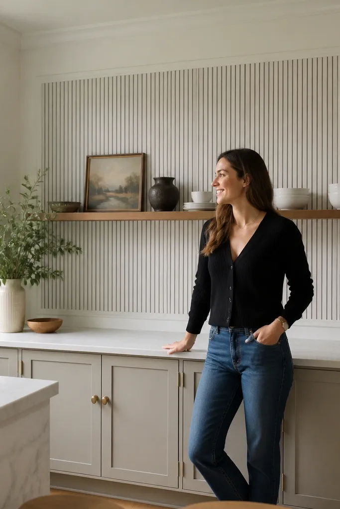
One-wall-section wallpaper works when you want impact but don’t want to commit to the whole kitchen. Keep it monochrome with thin black stripes on off-white so it feels graphic, not busy. Add a thin painted border around the panel to make it look like a custom built-in. This is a great option for kitchens with bold cabinet colors because it gives the wall pattern without adding color chaos. The stripe direction also matters: vertical stripes make the space feel taller; horizontal stripes calm a long wall.
Measure the panel area and plan a border that’s 2-3 inches wide around the wallpaper. Apply wallpaper carefully with smoothing tools, then trim edges with a sharp blade for clean lines. Paint the border with matte paint after the wallpaper is fully dry. Hang or place decor so its height aligns with the panel centerline, around 60-66 inches. Cost is usually $60-180 depending on wallpaper price and panel size.
If your kitchen has a lot of shiny surfaces, keep the wallpaper matte and skip vinyl sheen.
Avoid mismatched stripe widths — inconsistent stripes look like a design mistake.