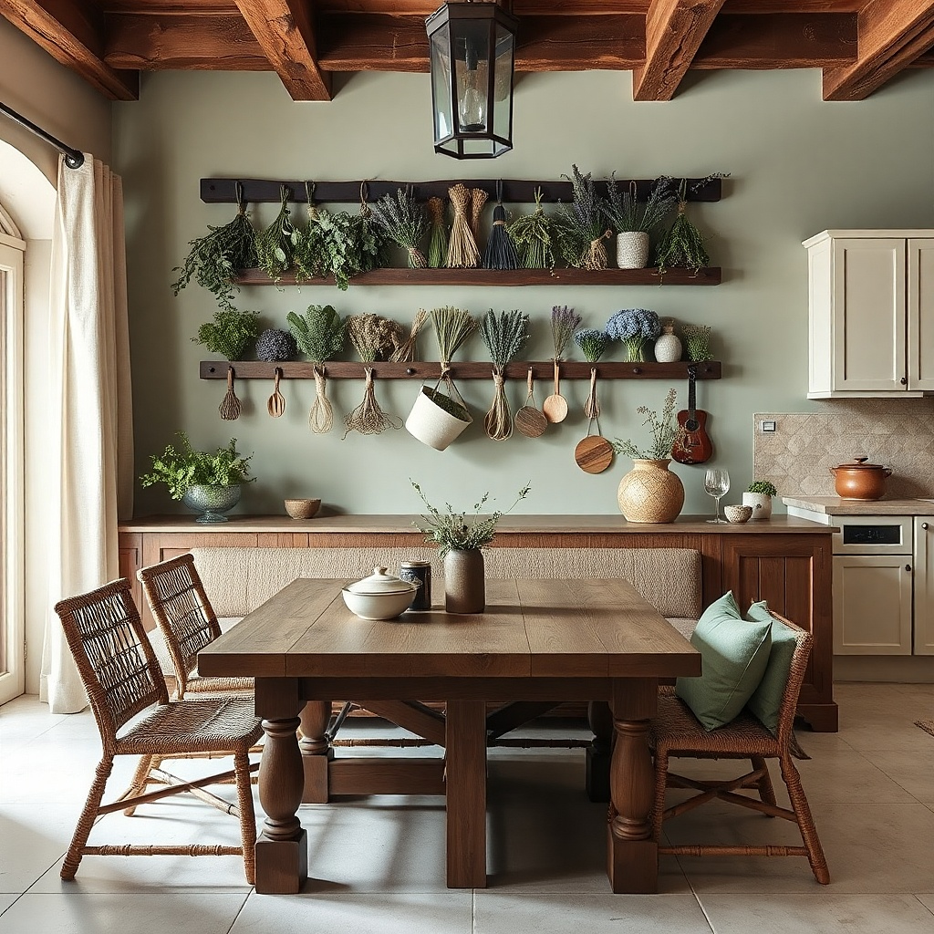
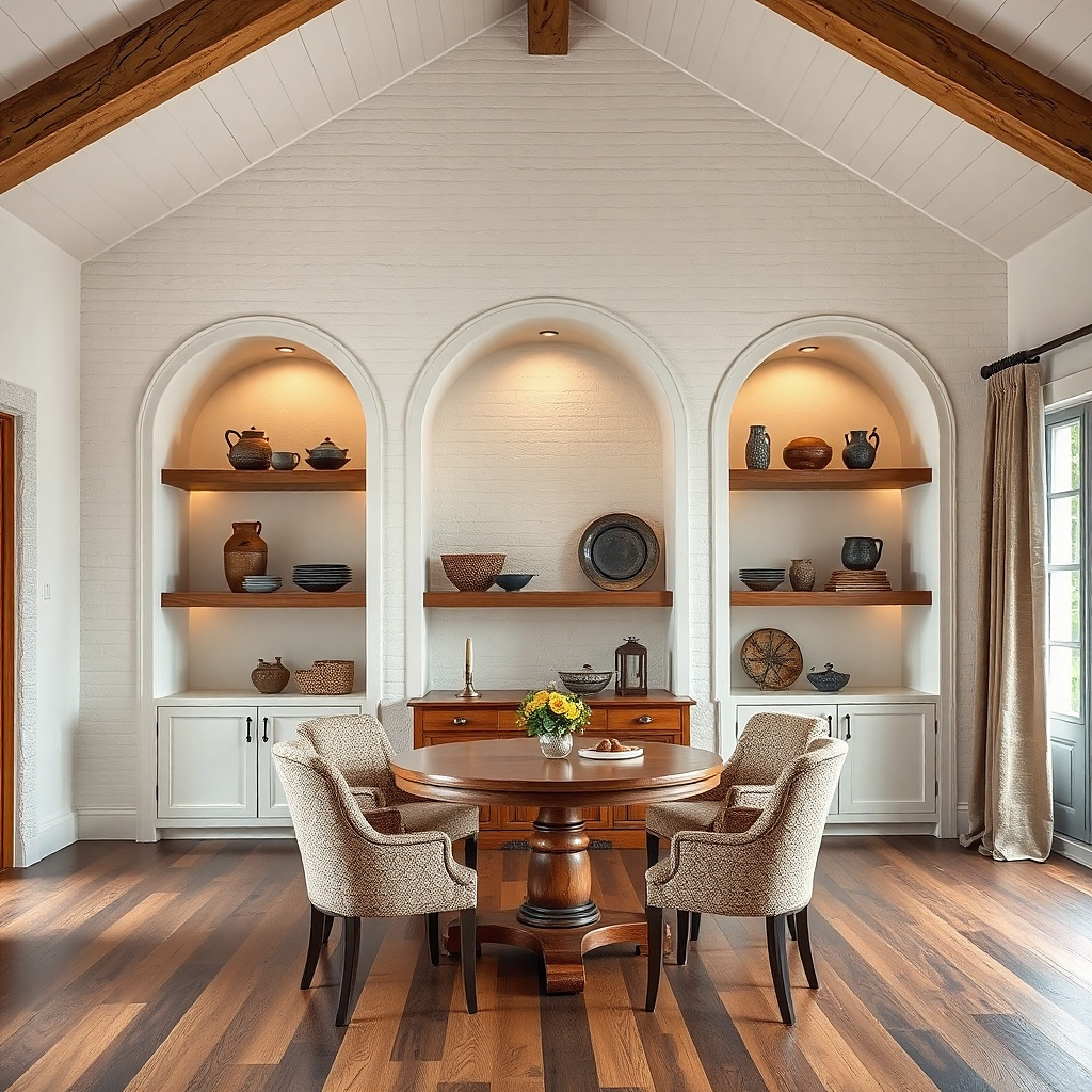
1. Black Frame Gallery Row Above the Table
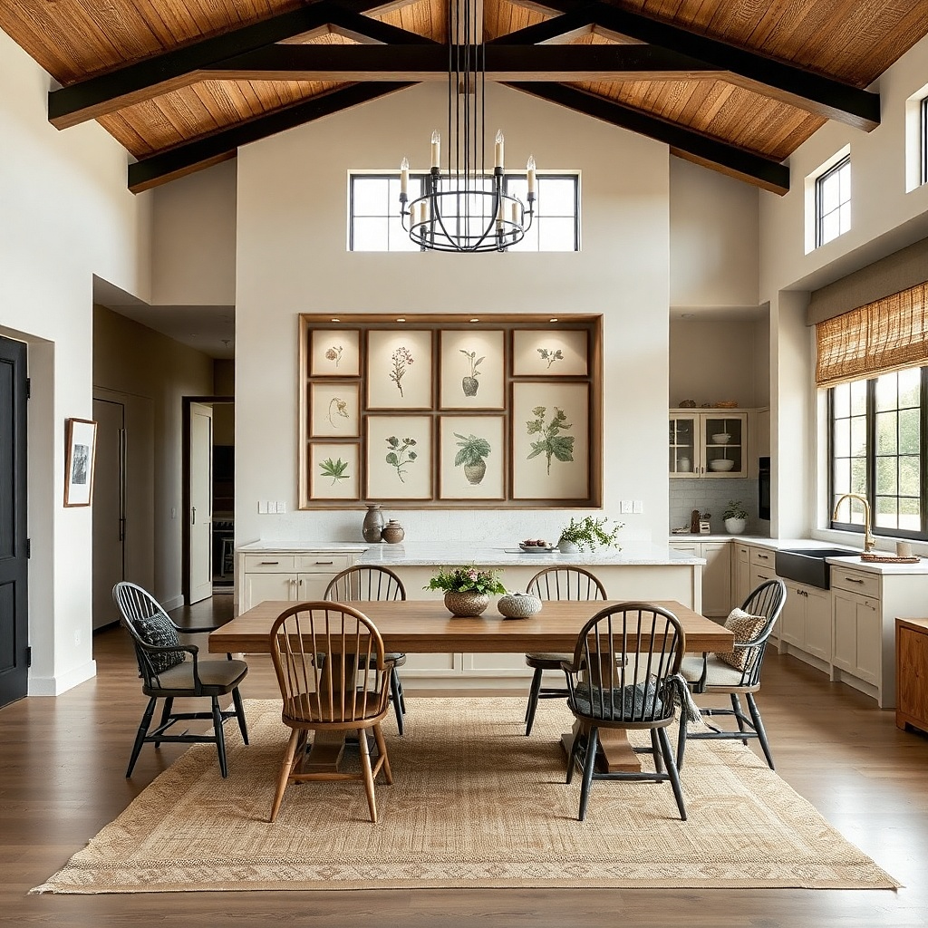
A gallery row works because it creates a clean rhythm across the wall and visually pulls your dining area together. Use three frames in the same width for a uniform look, and keep the art simple: cream paper, subtle botanical line work, or small typographic prints in dark charcoal. Black frames look especially good in kitchens with warm wood cabinets because they add contrast without looking heavy. Place the row centered above the table so the wall reads as finished when you’re standing in the kitchen.
Try thisKeep all three artworks the same color temperature warm cream with dark ink so the row looks intentional, not mixed.
Start by measuring your table width and aiming for the frames to span about 70-85% of it. Choose frames with the same outer dimensions (for example, 11x14 or 12x16) and use a consistent mat color like off-white. Mark a level line where the center of the middle frame will land at about 58 inches from the floor, then space the side frames so gaps match (about 2-3 inches between frames). Hang using two wall anchors or studs if available; for drywall without studs, use proper toggle anchors rated for the frame weight.
Common mistakeAvoid mixing frame finishes like black, brass, and wood in the same row.
2. Oversized Linen Wall Panel With Rod Pocket
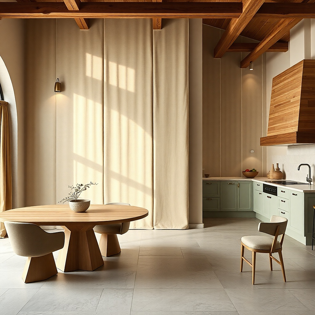
A linen panel is the fastest way to make a kitchen dining wall feel soft and styled, especially if your wall is blank and echoey. Linen has a textured, matte surface that reduces glare from ceiling lights and makes the wall look calm in photos. Choose a color that relates to your room’s palette: cream, oatmeal, or pale sage. The key is scale: an oversized panel fills the wall space so it looks like decor with purpose, not a small accent.
Try thisIron or steam the linen before hanging so the folds look deliberate instead of random.
Pick a panel size that covers at least 24-36 inches in width and 36-60 inches in height depending on your wall. Use a rod pocket linen panel and a slim wall-mounted curtain rod, mounted so the panel hangs straight. Set the top of the panel about 6-10 inches below any upper trim or cabinet line, then adjust until the bottom edge lands around 6-12 inches above the tabletop if it’s over dining. Install with a level, then use two rod brackets into studs when possible; if not, use heavy-duty anchors and keep the rod length short for stability.
Common mistakeAvoid sheer or very thin fabrics that show wall texture and make the panel look unfinished.
3. Floating Shelf With One Tall Vase and Two Low Objects
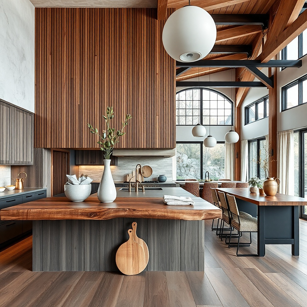
A shelf gives you a curated, changeable look without turning the wall into a clutter pile. The visual trick is height stacking: one tall piece in the back and two lower items in front create depth and make meals feel styled. Keep the shelf narrow enough to look intentional, not like storage. Choose matte ceramics and one wood element to warm the space, such as a light oak tray or a small cutting-board-style riser.
Try thisRepeat one color in all three objects for example, cream glaze then add one contrasting accent like olive or black.
Choose a shelf length around 24-36 inches for most dining walls, with a depth of about 4-6 inches. Mount it so the shelf surface sits roughly 60-62 inches from the floor, or centered to the wall art you already have. Start your arrangement dry: place the tall vase in the center back, add two smaller objects on either side, and keep the front edge clear by at least 2 inches. Use removable adhesive felt pads under ceramics to prevent shifting, and anchor the shelf brackets into studs or use rated wall anchors for the shelf weight.
Common mistakeAvoid crowding the shelf with more than three main pieces; it reads busy under kitchen lighting.
4. Kitchen-Style Plate Wall With a Centered Set of 7
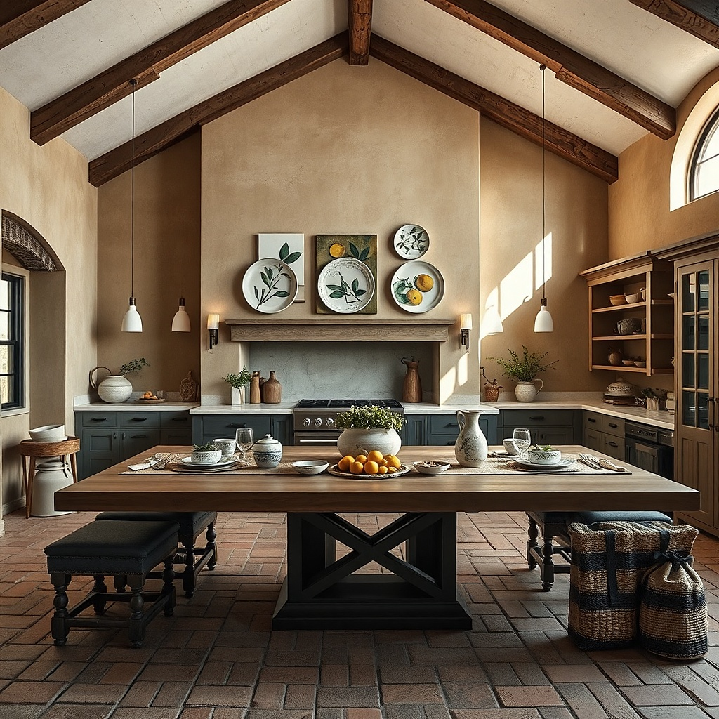
Plate walls look special because they bring color and pattern into the room while staying flat and easy to maintain. A centered set of seven creates a focal point that feels like intentional dining decor, not a scattered collection. Choose plates that share a theme: same background color with different motifs, or all solids with one accent plate. If your dining area has neutral walls, a plate wall in deep blue, sage, or terracotta will make every meal feel styled without needing furniture changes.
Try thisMatch glaze finishes matte with matte or gloss with gloss so the plate wall doesn’t look mixed under glare.
Select plate sizes so you have one large plate (about 10-12 inches), two medium (8-10 inches), and four smaller (6-8 inches). Use plate hangers or adhesive plate mounts designed for the plate weight; for heavier ceramics, use wall hooks with proper anchoring. Layout on the floor first: center the largest plate at the layout midpoint, then form a gentle triangle or flower shape with the smaller plates. Transfer measurements to the wall, keeping vertical spacing about 3-5 inches between plates, and hang using a level so the set looks symmetrical.
Common mistakeAvoid mixing wildly different plate sizes without a clear size hierarchy; it stops reading as decor.
5. Warm Wood Framed Chalkboard Recipe Print
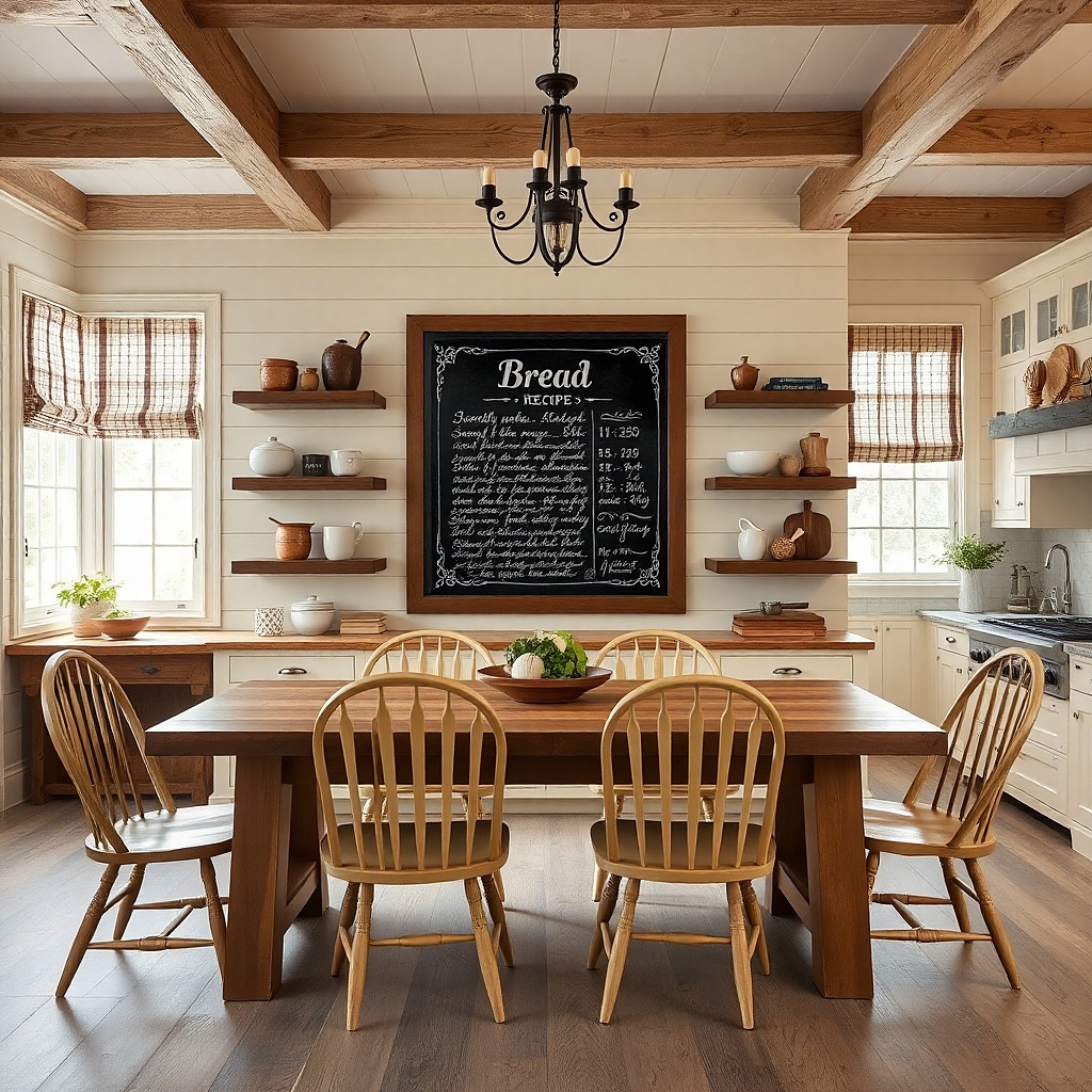
A chalkboard-style print adds a kitchen vibe while staying clean and readable. The look works best when the frame is warm wood and the art has a limited palette: black background with cream lettering, or charcoal background with white. This gives you a strong contrast point that still feels friendly. Hang it where you’ll notice it when you sit down, and you’ll get that “there’s a plan here” feeling every meal.
Try thisUse a frame with a simple profile; ornate frames fight the chalkboard look and make the wall feel busy.
Pick a print size around 18x24 or 20x30 for most dining walls. Choose a frame with a warm wood finish like oak or walnut and a matte backing to reduce glare. Mount the center of the frame at about 58 inches from the floor, then keep the bottom edge 6-10 inches above the tabletop if it’s over the table. Use two hanging points if the frame is heavy, and anchor into studs when possible for stability.
Common mistakeAvoid glossy chalkboard prints that reflect overhead lights into your dining sightline.
6. Oversized Circle Woven Wall Art
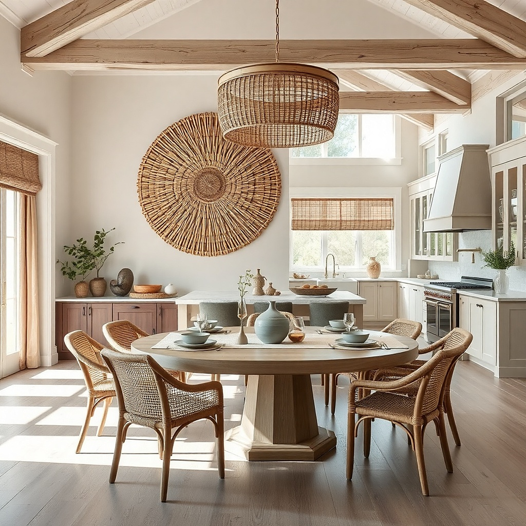
Woven wall art brings texture that feels handmade without requiring craft skills. A large circular piece is forgiving for beginners because it reads as one clear shape from across the room. Natural fibers like jute or rattan add warmth and help kitchens look less sterile, especially with white walls and stainless appliances. For aesthetics, pair it with a simple wall color and keep nearby decor minimal so the weave becomes the star.
Choose a diameter between 18 and 30 inches depending on wall size; bigger than 24 inches looks best over dining tables. Hang using a hook designed for woven pieces or a picture rail if you have one. Position the center at about 58 inches from the floor, then check sightlines from the dining chairs. If you’re mounting on drywall, use a stud for the hook or use a rated toggle anchor; woven pieces can be surprisingly heavy.
Add a second texture nearby a linen runner or a woven placemat so the wall art doesn’t feel isolated.
Avoid placing a woven piece too high; if the center sits above 62 inches, it looks like it’s floating.
7. Two-Tone Vertical Wood Wall Slats
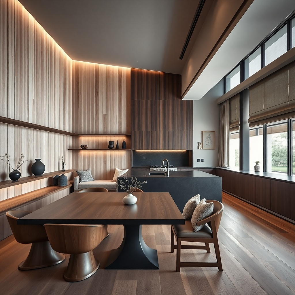
Vertical slats add structure and make a blank wall feel designed, especially in dining rooms with plain paint and simple furniture. The two-tone trick works because it creates rhythm without needing prints or photos. Choose one warm wood tone and one darker tone like walnut, keeping the slat width consistent for a clean look. This idea is great if you want wall decor that doesn’t change seasonally and still photographs well.
Decide on a slat panel size first, usually 24-48 inches wide and 36-60 inches tall for dining walls. Use pre-made wall slat panels or measure and space slats evenly with a guide board. Mount level using wall anchors into studs or with brackets depending on the panel back. Keep a 1/2 to 1 inch gap between slats for airflow and visual separation, then paint or stain only if the panels are unfinished.
Match the darker slat tone to your cabinet hardware or dining chair legs for a tight color connection.
Avoid mixing slat widths; inconsistent widths make the wall look DIY in a messy way.
8. Macrame-Inspired Cotton Wall Hanging in One Color
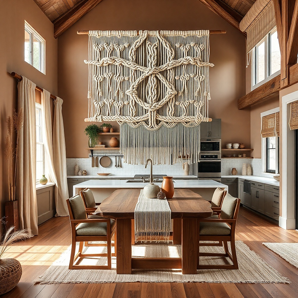
A macrame-inspired hanging adds softness and movement without needing lots of small objects. Keep it in one color family cream, ecru, or warm beige so it looks polished instead of craft-like. The best versions have a clean top bar and a controlled length so the strands don’t tangle visually. This works well when your dining area has hard surfaces like tile floors and metal lighting and you want a warmer feel.
Pick a hanging that is about 24-36 inches wide and 36-50 inches long. Mount a single hook or small bracket above the hanging so the top bar sits level and centered. If your dining wall is over a buffet, hang it so the bottom ends about 6-10 inches above the furniture surface. Use wall anchors appropriate to your wall type, and keep the hanging away from direct stove steam paths if it’s near the kitchen area.
Comb the strands with a wide-tooth comb once it’s hung to remove twists and make the pattern look intentional.
Avoid multicolor macrame; it reads busy under kitchen lighting.
9. Framed Botanical Lines With Mat Color Matching Your Table
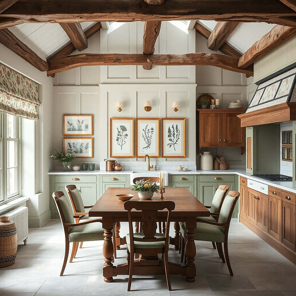
Botanical line art stays beginner-friendly because the design is simple and usually looks good in sets. The real difference is the mat color: match the mat to your table tone or chair fabric so the art blends into the space instead of floating. Use two or three frames with the same mat and frame color, then choose art that has thin lines and a limited ink palette like olive and charcoal. This gives you a clean, calm wall that still adds visual interest for meals.
Try thisPick botanical art that includes one color found in your dining textiles napkins, cushions, or rug for a cohesive look.
Choose frames that match each other and use mats that are off-white or warm gray, not bright white. Start with two frames if you’re hanging over a narrow dining table, three if the wall is wider. Place the center of the middle frame at 58 inches from the floor, then keep equal spacing between frames (about 2-3 inches). Hang using two points per frame for stability and use stud anchors when possible.
Common mistakeAvoid thick, colorful prints; they compete with food and glassware.
10. Chopboard-Style Wall Organizer With Hooks and a Small Tray
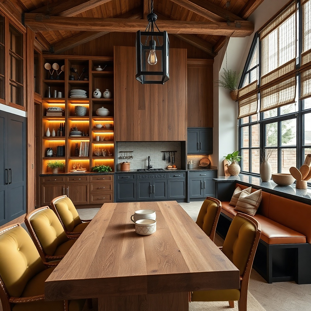
This is decor that earns its place because it’s functional and still looks styled. A chopboard-style organizer in warm wood with a few hooks and a small tray turns “kitchen clutter” into a neat wall vignette. Use it in dining-adjacent kitchens where you hang serving tools, like a small spatula, a towel, or a utensil set. The aesthetic stays tight when you keep the tray empty most of the time or use one decorative item like a ceramic jar.
Try thisUse matching hooks or hang a towel with a consistent fold so the organizer looks curated, not random.
Choose a wall board about 20-30 inches wide with 3-5 hooks and a tray shelf. Mount it near where you plate food, typically 48-60 inches from the floor for the hooks so towels and tools are easy to grab. Install with studs when possible; if you can’t, use wall anchors rated for the board’s weight and avoid placing heavy items on the tray. Finish the look by hanging one towel and placing one ceramic jar or small bowl on the tray.
Common mistakeAvoid using too many tools on the hooks; it looks like storage, not decor.
11. Oversized Mirror With Thin Black Frame Over Sideboard
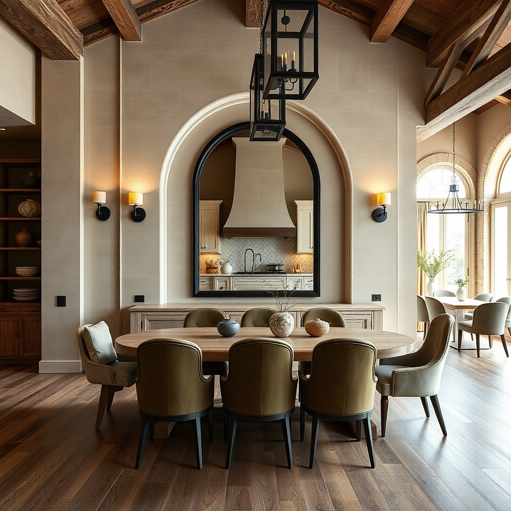
A mirror makes the dining area feel more complete and it’s especially useful in low-light spaces. Choose a thin black frame so it looks modern and doesn’t overpower wall art. The mirror reflects table lighting and makes the room feel brighter during dinner. For aesthetics, pair it with a simple styling formula on the sideboard: one tall element, one low tray, and one small candle then let the mirror do the rest.
Pick a mirror size around 24-36 inches wide for most sideboards, with the top edge not too high so it doesn’t feel like a ceiling decoration. Mount the mirror so the center is around 58 inches from the floor. Use the included hanging hardware and anchor into studs if possible; mirrors are heavy and need secure mounting. Then style the sideboard: place a tray about 12-18 inches wide in the center, add a tall vase or candle holder behind it, and keep the rest of the surface clear.
Angle the mirror so it catches the dining lamp or pendant light you’ll see the glow in the reflection.
Avoid thick, ornate frames in kitchens; they visually fight with cabinet hardware and lighting.
12. Color-Matched Typographic Print Triptych
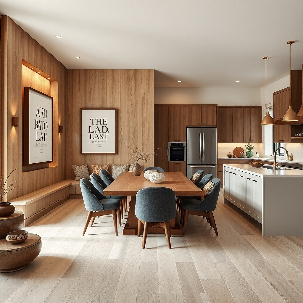
Typography on the wall looks clean, modern, and easy to keep consistent with your kitchen palette. A triptych gives you enough design impact without needing a big installation. Choose text that fits the dining mood: “Gather,” “Eat,” “Slow,” or a simple word in a serif or clean sans font. Keep the ink colors tied to your kitchen for example, olive ink on cream paper with black frames.
Try thisUse cream or warm gray paper so the text doesn’t look harsh under warm bulbs.
Pick three prints that match in size, such as 8x10 or 11x14, and use one frame style for all three. Arrange them vertically or as a tight horizontal row depending on wall height; vertical works well on narrow walls. Center the middle piece at 58 inches from the floor, then keep equal gaps of about 2 inches between frames. Hang with level and use stud anchors or rated wall anchors based on frame weight.
Common mistakeAvoid using bright primary colors; they fight with food colors and tableware.
13. Ceramic Tile Accent Wall Panel in a Single Color
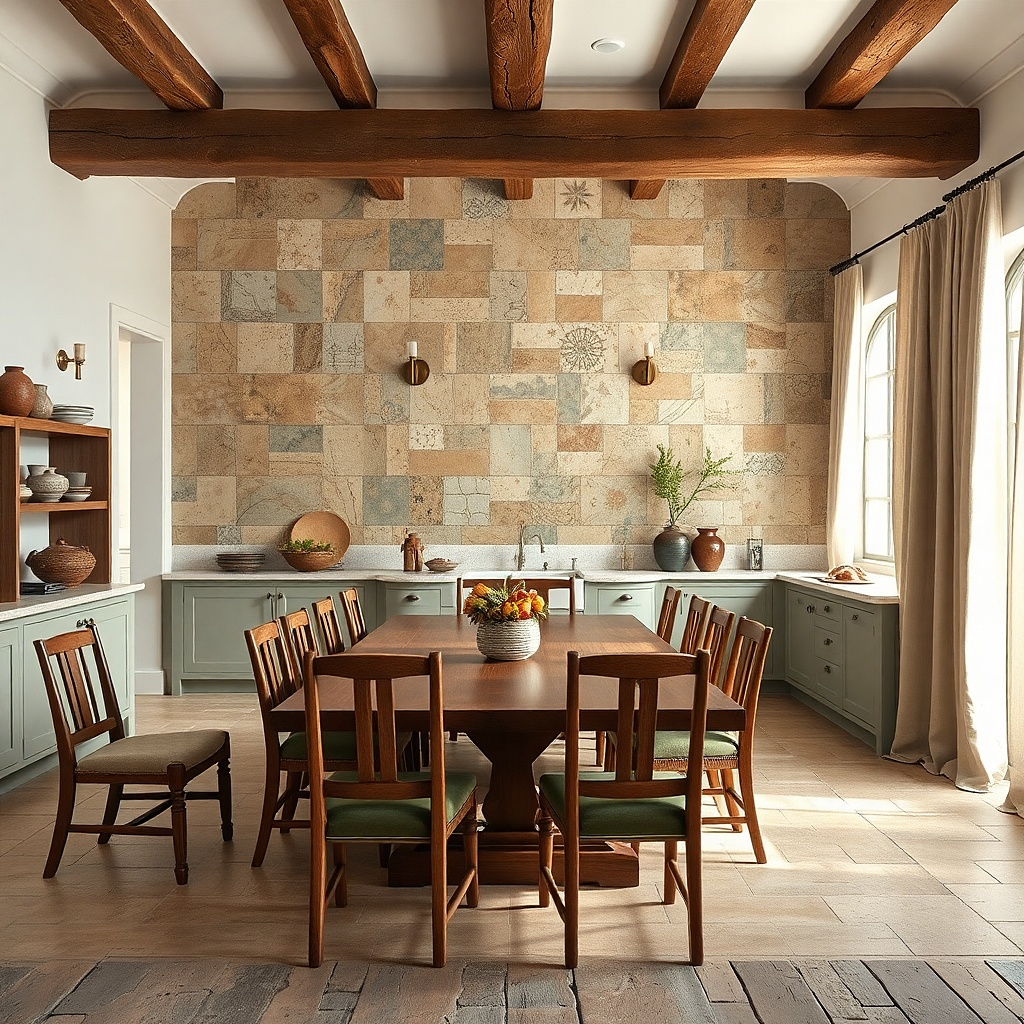
A small ceramic tile panel adds a handcrafted look that still reads polished and architectural. If your kitchen is mostly paint and metal, tile gives you a surface that catches light in a controlled way. Choose one color family matte white, soft blue, or deep charcoal and keep the pattern subtle. This works well on a blank wall where you want texture and color without clutter.
Try thisPair tile with one matte wood or linen element nearby so the tile doesn’t feel cold.
Select a tile panel size around 12x24 or 16x32 depending on wall scale. Make sure it’s designed for wall mounting or comes with a backing system; don’t try to mount loose tiles without proper support. Mount it like a framed piece, with the center about 58 inches from the floor and the top edge level. Use a suitable adhesive or wall hardware based on the backing type, and keep it clear of steam paths if it’s near the stove.
Common mistakeAvoid glossy multi-color tile; it reflects too much and looks busy under overhead lights.
14. Shadowbox With Neutral Dried Grasses and Citrus Decor
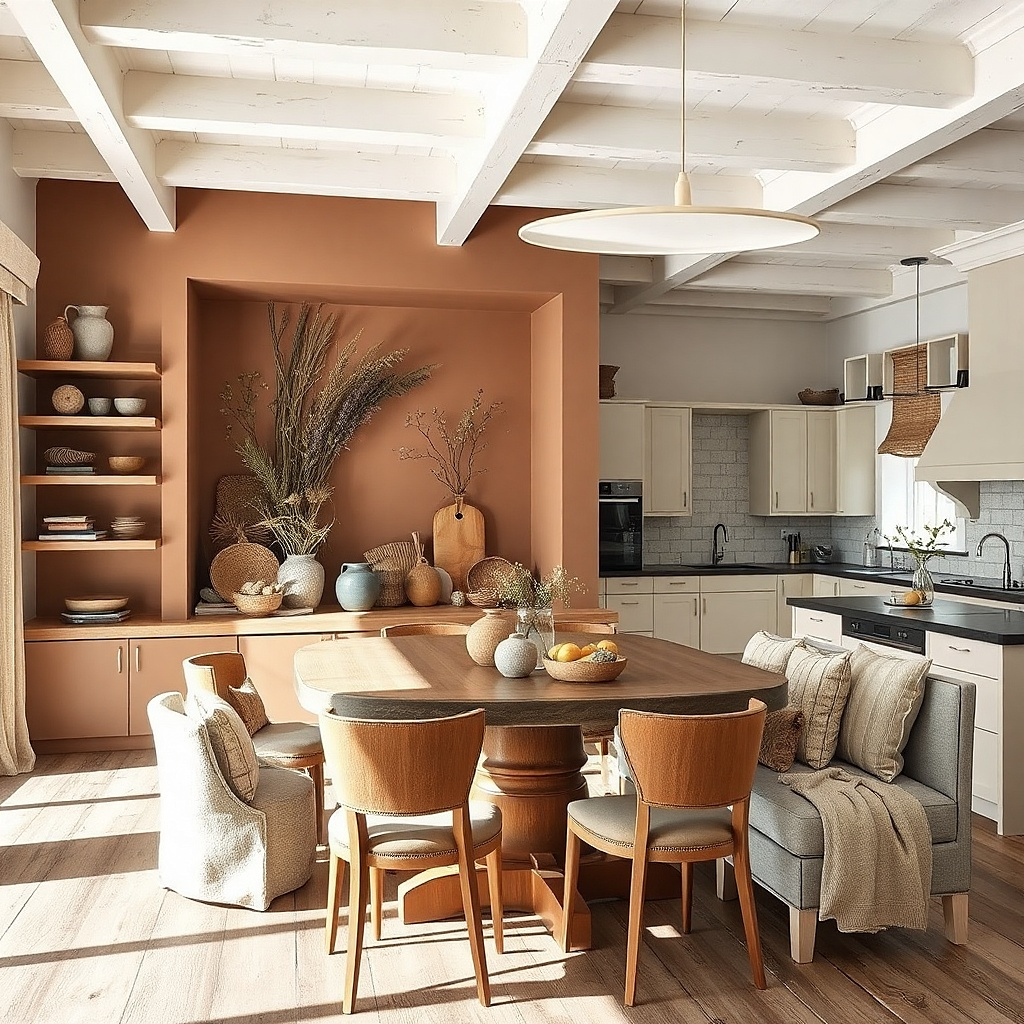
A shadowbox looks like a curated still life, and it stays photogenic because everything is contained behind glass. Neutral dried grasses bring movement and softness, while small citrus accents add dining energy without being seasonal clutter. Keep the palette controlled: oat, tan, and pale cream with a hint of muted orange or lemon. This is a smart choice if you want wall decor that looks styled even when you’re not swapping seasonal items.
Choose a shadowbox frame size around 16x20 or 18x24, with glass and a depth that fits your arrangement. Build the interior layout on paper first: put dried grasses in the back center, add one small citrus or citrus-toned element on one side, and keep the front clear. Secure materials with floral pins or non-slip adhesive dots made for crafts. Hang the shadowbox at 58 inches from the floor center and anchor into studs when possible.
Use a matte or lightly tinted backing paper inside the shadowbox so the arrangement looks warm, not flat.
Avoid overfilling the shadowbox; dense arrangements block the light and look messy.
15. Staggered Wall Hooks With Matching Towel Colors
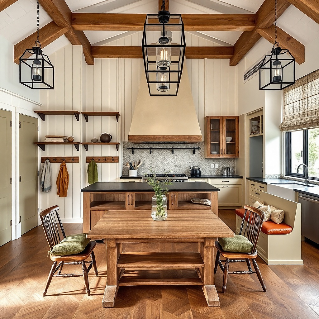
Hook decor works because it adds a functional pattern to the wall. When you keep the towels in one color story, the hooks look like part of the design instead of storage. Use two or three hooks staggered slightly in height, with towels folded the same way each time. This is ideal for kitchens that connect to dining where you want the wall to change with daily use but still look tidy.
Try thisUse one towel fabric type across all three hooks, like cotton waffle or linen, so the texture matches.
Pick three hooks with the same finish, like matte black or brushed brass, and choose towel colors that match your dining textiles. Mount the hooks so the top hook sits around 52-54 inches from the floor and the lower hooks step down by about 4-6 inches. Fold each towel into a consistent rectangle about 10-12 inches wide, then hang them so the top edge aligns. Install into studs when possible; if not, use anchors rated for the hook’s load and avoid hanging heavy wet towels on lightweight anchors.
Common mistakeAvoid mixing random towel patterns; solids or subtle textures look best.
16. Rope-Edged Woven Basket Wall With Three Sizes
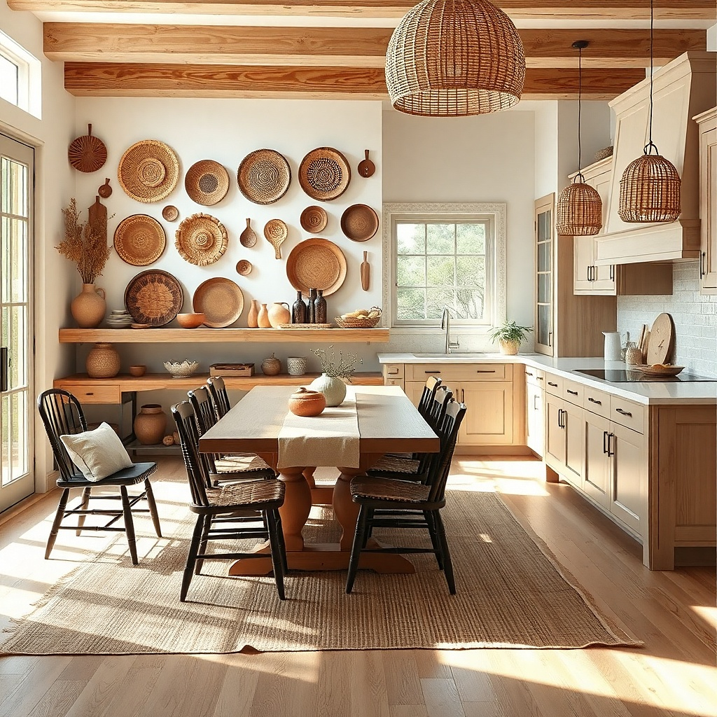
Baskets look warm and lived-in, but you have to hang them in a system to keep the look intentional. Three baskets in increasing size create a clear focal point and give your wall depth. Choose baskets with rope trim or consistent weave pattern so the set reads cohesive. This works well in kitchens with natural materials like wood cutting boards, rattan chairs, or linen curtains because the textures match.
Try thisDust the baskets before hanging; clean fibers catch light and look sharper under dining lighting.
Pick three baskets with diameters around 10-12 inches, 14-16 inches, and 18-22 inches. Arrange them in a vertical stack with the largest on bottom and smallest on top, or in a triangle if your wall is wider. Mount each using wall hooks or basket hangers designed for basket weight, then center the whole cluster so the middle basket aligns with your table center. Keep spacing between baskets about 3-5 inches so the weaves don’t blur together from a distance.
Common mistakeAvoid baskets with totally different styles; mixed weaves often look like a random collection.
17. Single Oversized Chalkboard Menu Sign With Wood Trim
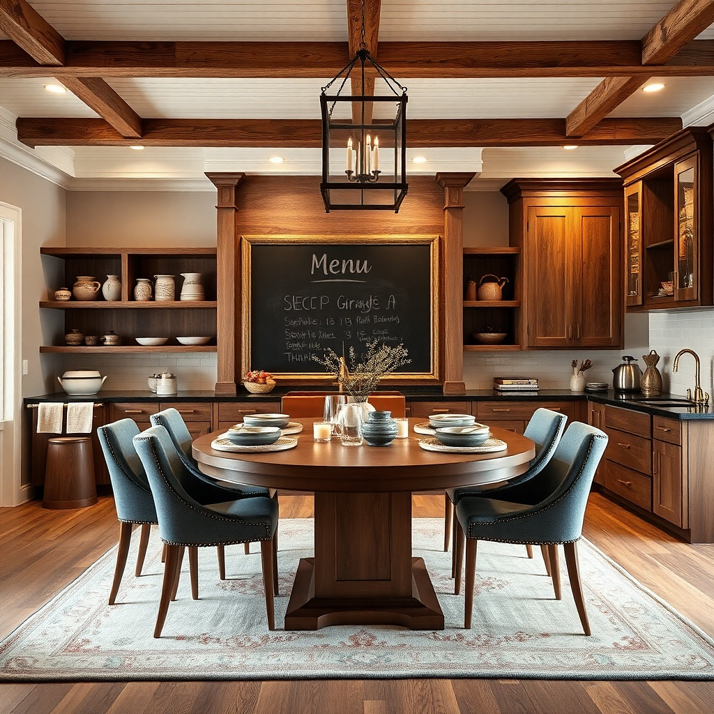
One oversized menu sign creates a strong focal point and makes the dining wall feel like it has a job. Wood trim keeps it warm and grounded, while chalkboard texture adds a slightly rustic note without needing extra styling. Choose a sign size that reads from your seats typically wider than 20 inches for dining rooms. Keep your message simple and limited: one heading and a few short lines so the wall looks clean rather than cluttered.
Buy or build a chalkboard menu sign with a wood frame, sized around 20x30 to 24x36 for most dining walls. Mount it with the center around 58 inches from the floor, then verify it doesn’t overlap pendant lights or cabinet trim. Use two anchors or a stud if possible; chalkboard signs can be heavier than they look. When you write, use the same chalk color for every line and keep the layout consistent — heading at top, then 2-4 short lines.
Stick to one chalk color like white or cream so the menu looks intentional in photos and at night.
Avoid tiny signs; small menu boards disappear and leave the wall still feeling blank.