1. Oversized botanical print in a warm wood frame
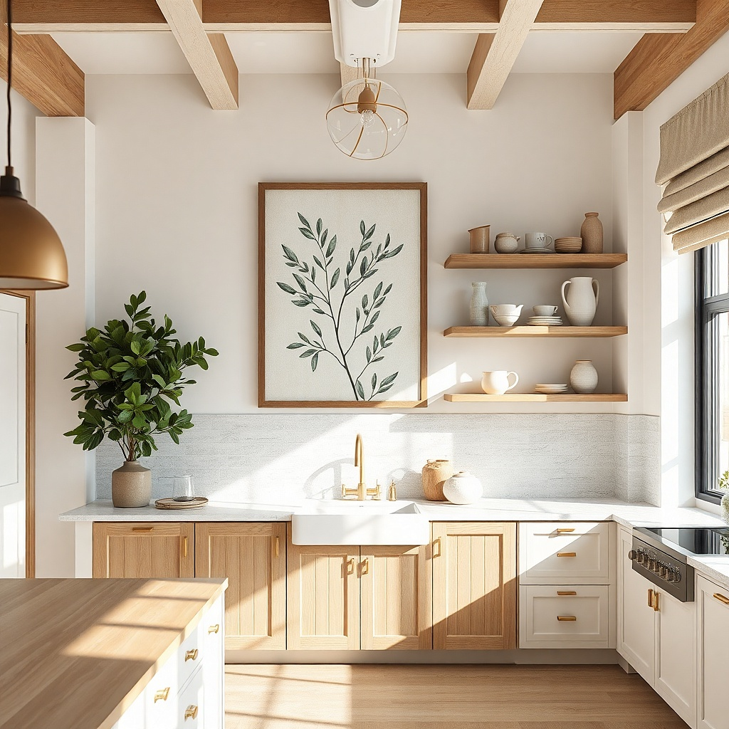
A single oversized botanical print makes the wall feel finished because it creates one clear focal point. Go for a matte print with muted greens and soft cream backgrounds, then frame it in warm wood so it blends with natural textures like cutting boards and wicker. This setup works best above a coffee bar, breakfast nook, or any spot where you want calm color without busy patterns. The warm frame also reduces harsh contrast from overhead lighting, which is where kitchen art often looks off.
Measure the empty wall width first and aim for the print width to be about 70-90% of that space. Choose a frame with a 1-2 inch outer border so the artwork looks substantial even on a budget. Hang the center of the frame at 58 inches from the floor, then use two wall anchors if the frame is over 12 pounds or the wall is drywall. Cost stays low because you’re buying one hero piece instead of multiple small prints.
Match the frame finish to one other element within 6 feet, like a wooden spoon crock or a wood cutting board on the counter.
Avoid glossy botanical prints — they reflect the kitchen lights and flatten the colors.
2. Kitchen map print paired with a black metal shelf
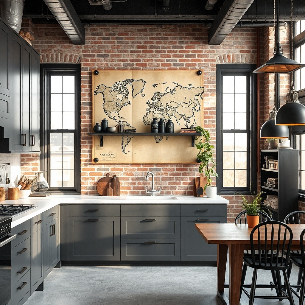
If your kitchen has industrial or modern hardware, a black-and-cream kitchen map print looks sharp and grown-up. The map style adds structure without needing bright colors, and the black metal shelf gives you a practical visual anchor below the art. This works especially well on walls that already have open shelving, because the shelf ties the art into the storage area. Keep the palette limited: cream paper, black lines, and maybe one tiny accent color like muted red or sage.
Pick a map-style print sized around 18x24 inches or 20x30 inches for most kitchen walls. Mount a narrow black metal shelf directly below, leaving about 3-6 inches between the bottom of the frame and the top of the shelf. Install the shelf first using a level, then hang the print so its center lines up with the shelf middle. Use picture-hanging hooks rated for your frame weight and keep the top of the frame roughly at 54-56 inches from the floor.
Add one small item on the shelf in the print’s accent color, like a ceramic jar with a muted label.
Don’t choose a multicolor map — it competes with countertop clutter.
3. Three-piece spice label gallery grid
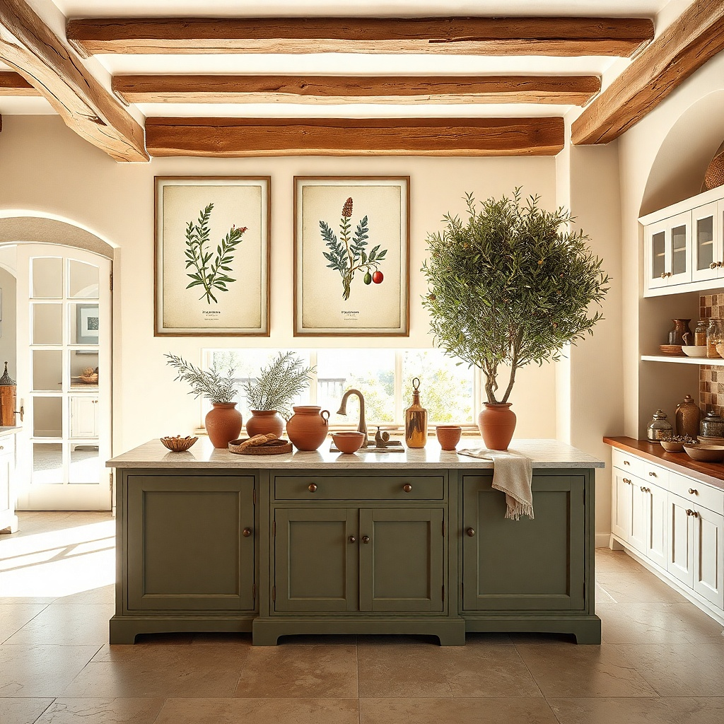
Spice label art looks perfect in kitchens because it matches the theme without turning the wall into a joke. A three-piece horizontal row reads clean and intentional, especially in narrow dining areas or between cabinets. Choose labels with simple typography and muted colors like mustard, burnt orange, and charcoal on off-white paper. This setup works when you want personality but still need the wall to stay airy.
Choose three matching frames and keep their outer sizes within 1-2 inches of each other. Set the pieces so the total width spans about the width of the zone you’re decorating — usually 36-48 inches above a sideboard or dining wall. Hang the center piece first at 58 inches from the floor, then use painter’s tape marks for the left and right pieces to keep spacing even. Use lightweight frames and strong adhesive hooks if the wall is textured and you want to avoid drilling.
Use the same frame color for all three, even if the prints vary slightly in tone.
Avoid random mixed frame sizes — the grid collapses visually.
4. Black-and-white wine tasting poster look
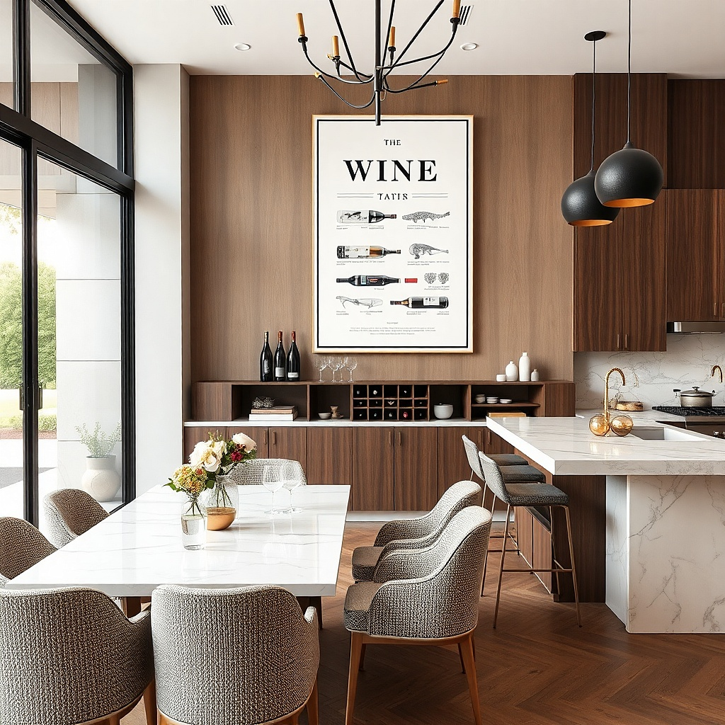
A black-and-white tasting note print gives you restaurant energy without spending restaurant money. The high-contrast typography looks bold against light walls and stands up to kitchen glare better than soft watercolor art. Place it where it’s visible during meals: above the dining chair wall, near a bar cart, or on the main kitchen transition wall. Keep the frame clean and simple so the typography stays the hero.
Pick one print sized 24x36 inches for the strongest impact, or 18x24 inches for smaller walls. Use a thin black frame with a matte finish to prevent reflections. Hang with the center at 59 inches from the floor and keep at least 6 inches from any backsplash edge or cabinet trim so steam and splatter don’t hit the frame. If you’re using drywall anchors, use two for stability.
Choose a print with thick lettering and lots of negative space kitchens already have busy surfaces.
Avoid thin, light-gray text prints — they disappear under overhead lighting.
5. Framed faux subway tile print panel
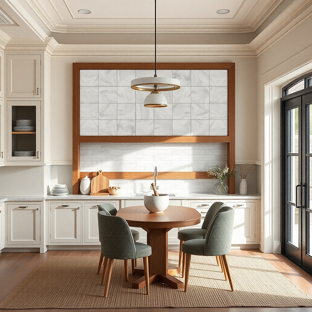
A faux subway tile pattern looks like architecture, not decoration. It’s photogenic because it creates repeating lines and subtle texture, which makes the wall feel intentional even if you keep everything else simple. Go for off-white tile with soft gray grout lines so it doesn’t look harsh. This is a great move for kitchens with modern cabinets or clean white walls that need visual interest without adding new colors.
Choose a print that fills a 30-48 inch width area, such as 24x36 inches. Frame it with a slim white or off-white frame so the “tile” pattern stays the focus. Hang it centered at 58 inches from the floor, and keep the bottom edge at least 6 inches above any splash-prone counter ledge. If you want extra polish, add a second matching smaller tile-print frame to the left or right, but only if the wall width supports it.
Match the frame color to your cabinet trim, not to your countertop it reads cleaner.
Skip glossy tile-style prints; they reflect light like a mirror.
6. Gallery wall using 4 small thrift frames
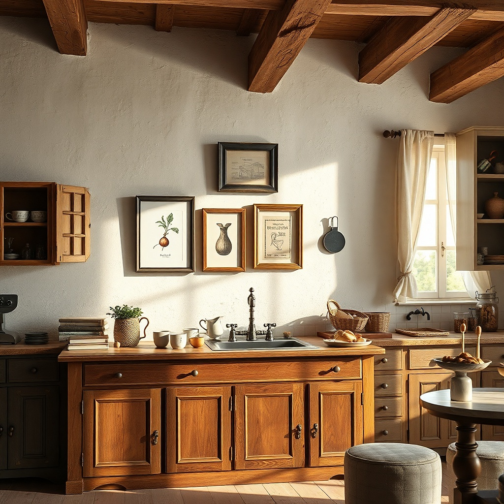
A tight little gallery wall makes a budget wall look styled because it creates a pattern of frames, not a random pile of prints. Use four small frames in the same color family, like black, brushed brass, or natural wood, so the collection looks cohesive. For the prints, pick kitchen-appropriate themes: utensils, herbs, fruit slices, or typography quotes with minimal color. This setup works on smaller walls where a single big piece would look too empty.
Find four frames with similar outer dimensions, ideally 8x10 or 9x12 each. Lay them out on the floor and aim for 2-3 inches of spacing between frames in the final layout. Tape the arrangement to the wall and check it from standing height before hanging. Mount each frame with two hooks if the frame is heavy; otherwise one hook per frame can work for very light frames.
Try thisUse one print type as the “glue” across all four, like all typography or all botanical line art.
Common mistakeDon’t mix wildly different frame widths — it turns into a bargain-bin look.
7. Oval mirror + herb illustration print pair
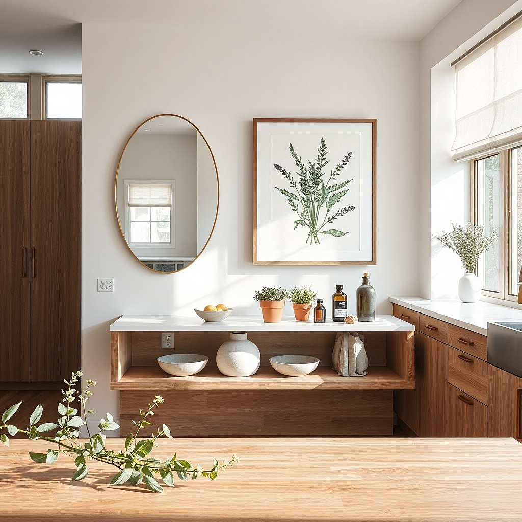
This is a smart way to add wall impact without buying a massive print. The oval mirror brings light and depth, and the herb illustration gives you the kitchen connection. Choose a mirror with a thin black or warm brass edge, then pair it with a small framed print featuring simple herbs in muted tones. This works especially well in kitchens that feel flat because the mirror reflects light and makes the wall feel fuller.
Pick an oval mirror about 18-24 inches tall and a print about 8x10 or 9x12. Place the mirror slightly higher than the print so the pair looks intentional, with the mirror center around 60 inches and the print center around 54-56 inches. Keep the spacing between them around 4-6 inches. Use a wall anchor for the mirror — mirrors are heavy and you want it secure.
Choose herb art with mostly line work, not heavy watercolor splashes, so the pair stays crisp under kitchen lighting.
Avoid placing the mirror directly above a glare-heavy light fixture.
8. Large linen-look fabric wall hanging with kitchen line art
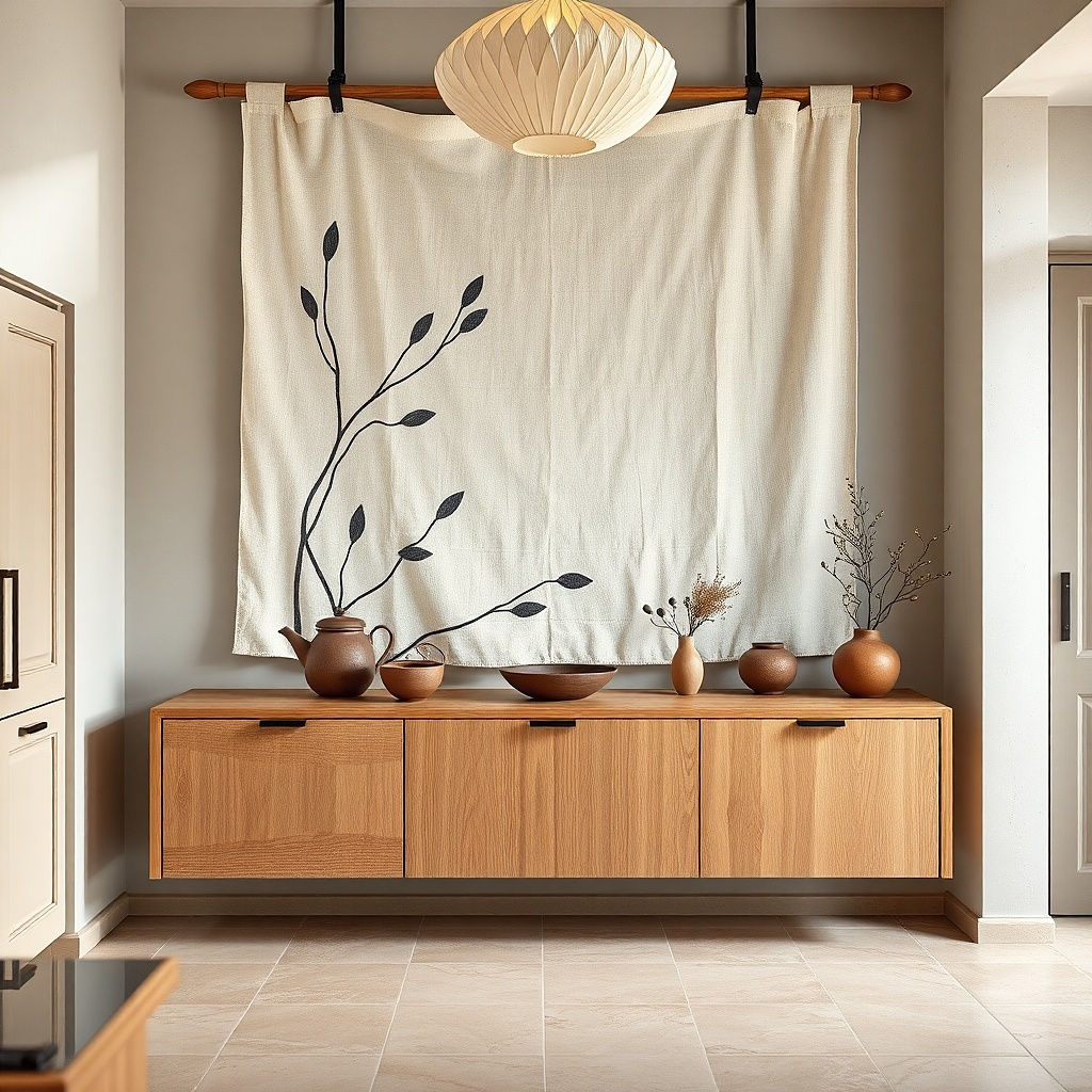
Fabric wall art is photogenic because it has soft texture and reduces glare. A linen-look hanging with kitchen line art like a skillet outline, whisk, or herbs looks intentional and calm. This is a strong choice for renters because it can be hung with a tension rod or adhesive command strips depending on weight. It also works well in kitchens where you want warmth and softness without adding more hard surfaces.
Choose a fabric piece that’s roughly 24-40 inches wide depending on your wall space. If it has a rod pocket, use a small curtain rod mounted with two brackets; if it’s light, use strong picture-hanging strips on the top edge. Center it at 58 inches from the floor, and leave 2-4 inches from any nearby cabinet trim so it doesn’t look crowded. Budget-friendly fabric art often costs less than framed prints and feels more expensive because of texture.
Press the fabric gently before hanging so the folds look crisp and straight.
Skip thin, shiny fabric; it catches light and looks cheap.
9. Vintage-style chalkboard menu print in a black frame
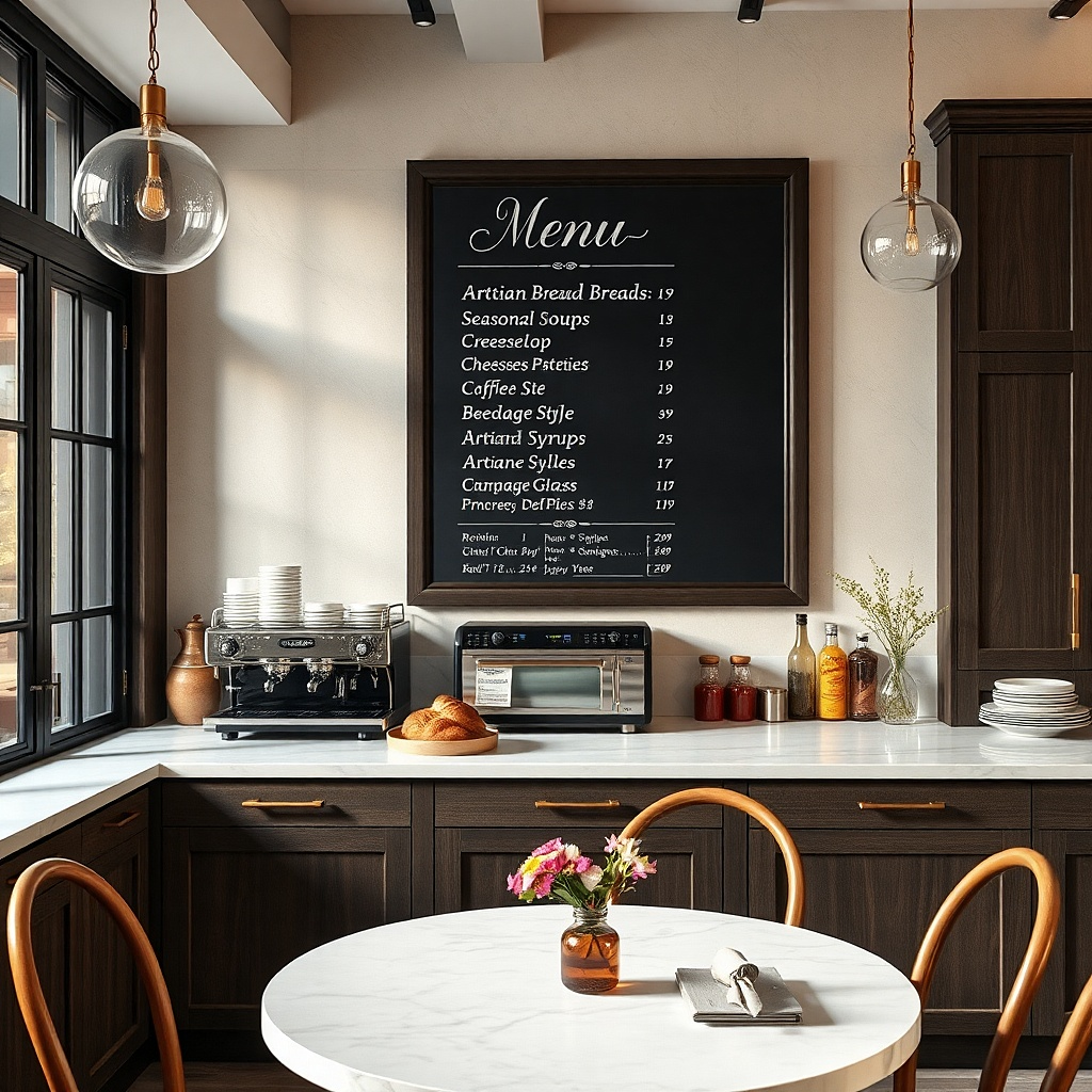
A chalkboard menu print gives you instant kitchen character without the mess of a real board. The key is to use a menu design that looks like typography on matte black, not glossy chalk. Put it in a black frame so it reads like a real sign. This works best in kitchens with farmhouse touches, but it also looks good in modern spaces if the rest of your palette is neutral.
Pick a menu print sized 16x20 inches or 18x24 inches. Use a frame with a 1 inch border and matte finish, then hang it with the center at 58 inches from the floor. Keep it at least 6 inches away from the stove area so steam doesn’t discolor the print. For installation, use a single heavy-duty hook rated for the frame weight.
Choose a print with big readable headings so it looks good from across the room.
Don’t pick a busy menu with tiny text — it turns into visual noise.
10. Monochrome utensil silhouettes in a vertical pair
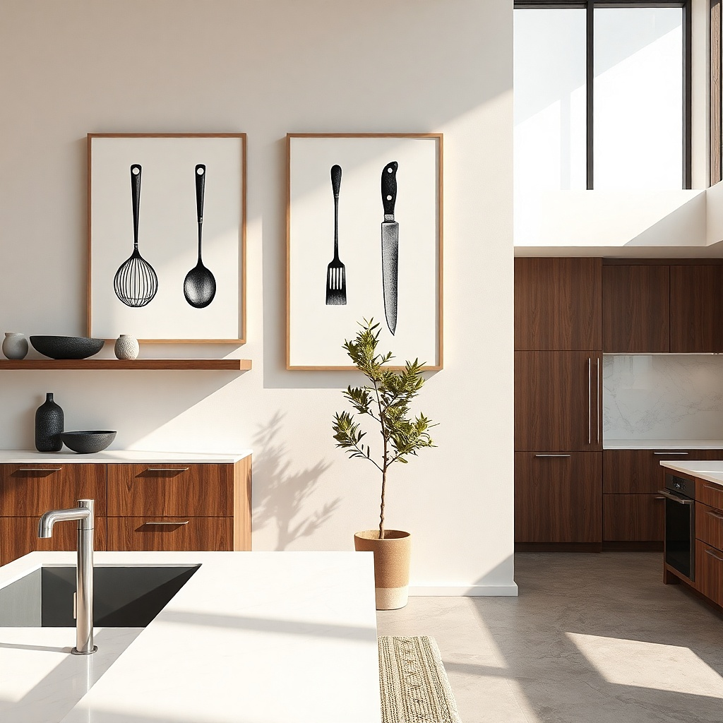
Utensil silhouettes look graphic and clean, which makes them perfect for kitchen walls that already have color. A vertical pair keeps your wall from feeling too horizontal and helps narrow spaces feel taller. Use monochrome prints with thin linework or solid silhouettes, then match frames in black or natural wood. This setup works near a hallway that leads to the dining area or on walls beside a tall cabinet where you want a vertical rhythm.
Select two prints around 11x14 to 12x16 each, in matching proportions. Hang them so their centers are about 10-12 inches apart horizontally, depending on your wall width, with the left and right pieces aligned to the same height. Center the combined layout at 58 inches from the floor. Use two anchors for the frames if they’re heavier than 8 pounds total.
Try thisStick to one utensil theme across both prints so the pair looks curated, not random.
Common mistakeAvoid adding a third different-style print — the vertical pair loses its clean look.
11. Fruit slice poster strip above a dining nook
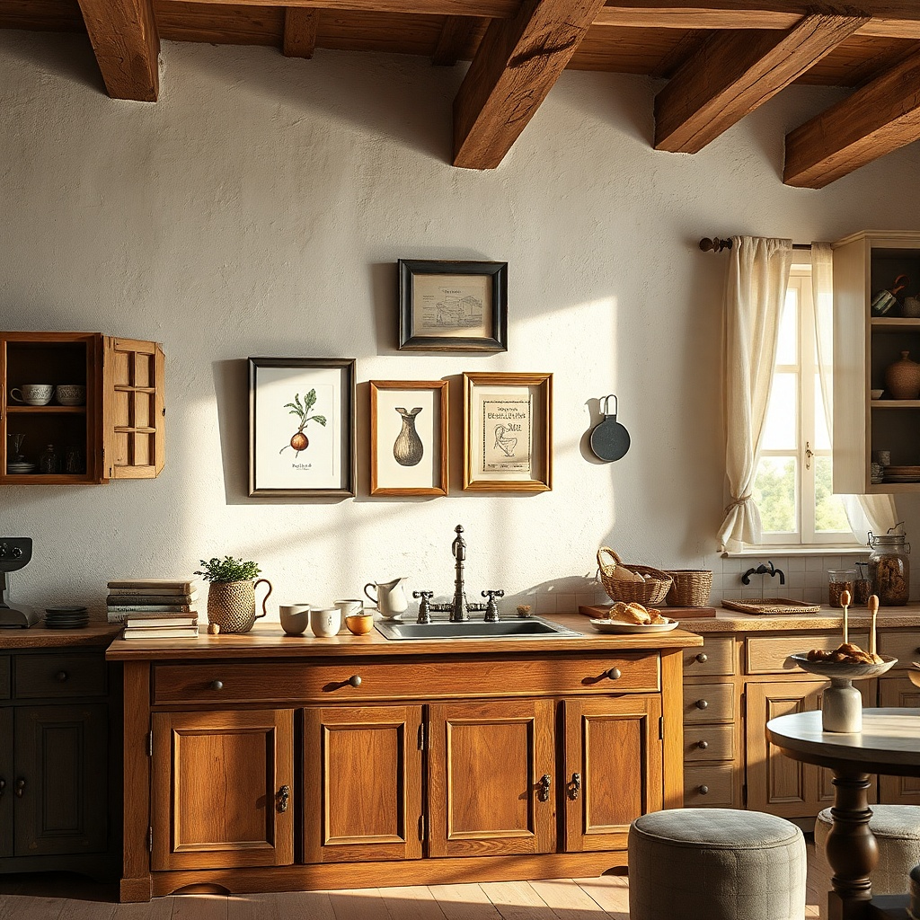
Fruit slice art reads fresh and makes a dining nook feel more lively without cluttering the counters. The look works best when the fruit palette is restrained: think lemon, lime, and soft red berries on a cream background. Use three matching frames or three prints on one backing board for a cohesive strip. This setup is especially good when your kitchen has plain walls and you want a bold color hit that won’t fight your dishes.
Measure the width of the nook wall and aim for the combined art width to be 80-95% of it. Use three frames with the same outer border size for a neat strip, each roughly 8x10, 10x12, or 12x16 depending on space. Hang the strip so the center line sits at 58 inches from the floor, then use tape to lock in equal spacing before mounting. Budget stays reasonable because you’re buying multiples of the same size.
Pick fruit art that has a cream or off-white field, not white it looks warmer under kitchen lighting.
Don’t choose neon fruit colors; they look harsh near fluorescent fixtures.
12. Large typographic 'Gather' print with off-white mat
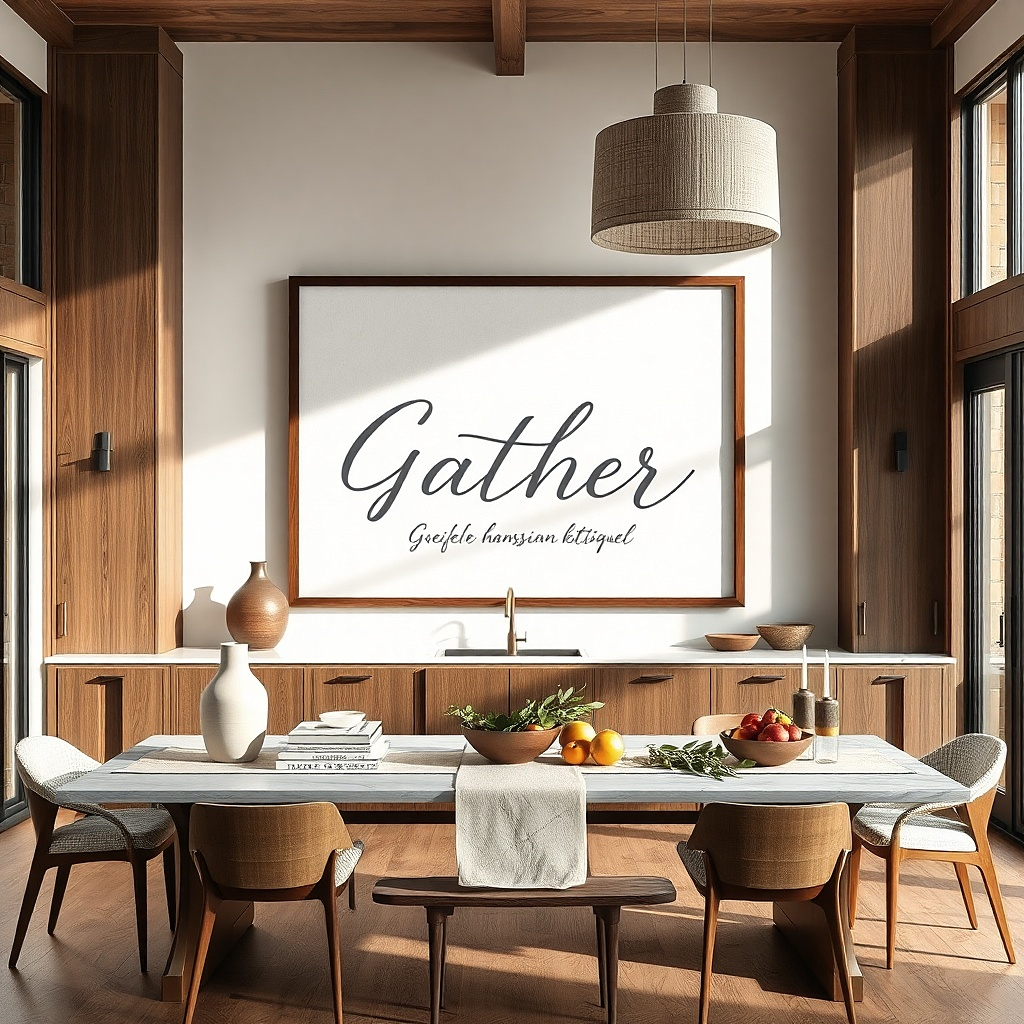
A bold typography print is the easiest way to make a kitchen wall look styled fast. The off-white mat is what makes it feel finished: it creates breathing room around the letters and prevents the print from looking like a cheap poster. Use black or deep espresso text on cream paper, and frame it in a simple wood or black frame. This is a strong choice for dining walls because it adds warmth and a clear focal point without turning the wall into a theme park.
Choose a print size around 18x24 inches or 24x30 inches depending on your wall width. Add an off-white mat board if the print comes unframed; you want about a 2-3 inch mat border. Hang the center at 58-60 inches from the floor, and keep the frame’s outer edge about 6-10 inches away from nearby cabinets. Use two hangers for stability, especially if you add a mat which increases frame weight.
Use a frame that matches your cabinet hardware finish so the typography looks like it belongs.
Skip thin poster-only frames without mats; they look flat in kitchens.
13. Pressed herb shadowbox in a simple black box
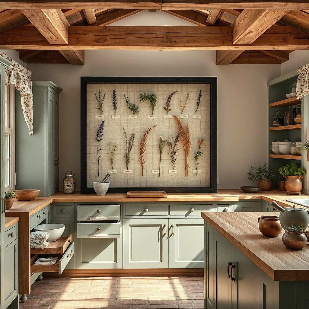
A shadowbox feels expensive because you get depth and it fits kitchens perfectly. Pressed herbs or a small collection of dried flowers look best when the background is neutral and the shadowbox is clean. Use a simple black shadowbox to keep it modern, and choose herbs in muted greens and tans so the colors don’t clash with your cabinets. This setup works on walls where you want texture and a more personal touch without adding loud colors.
Buy a ready-made shadowbox or a blank one sized around 10x12 or 12x14. Plan placement so the box sits centered at 58 inches from the floor and stays away from steam zones. If you’re making the herb arrangement, keep stems and leaves flat and use a backing color that matches the herbs (cream or light tan). Secure with the shadowbox’s insert system and mount with two hooks if the box is over 2 pounds.
Try thisUse one consistent herb color family so the shadowbox looks styled, not scattered.
Common mistakeDon’t use a busy background behind the herbs — it competes with the natural shapes.
14. Two framed chalk-style recipe cards with linen mat
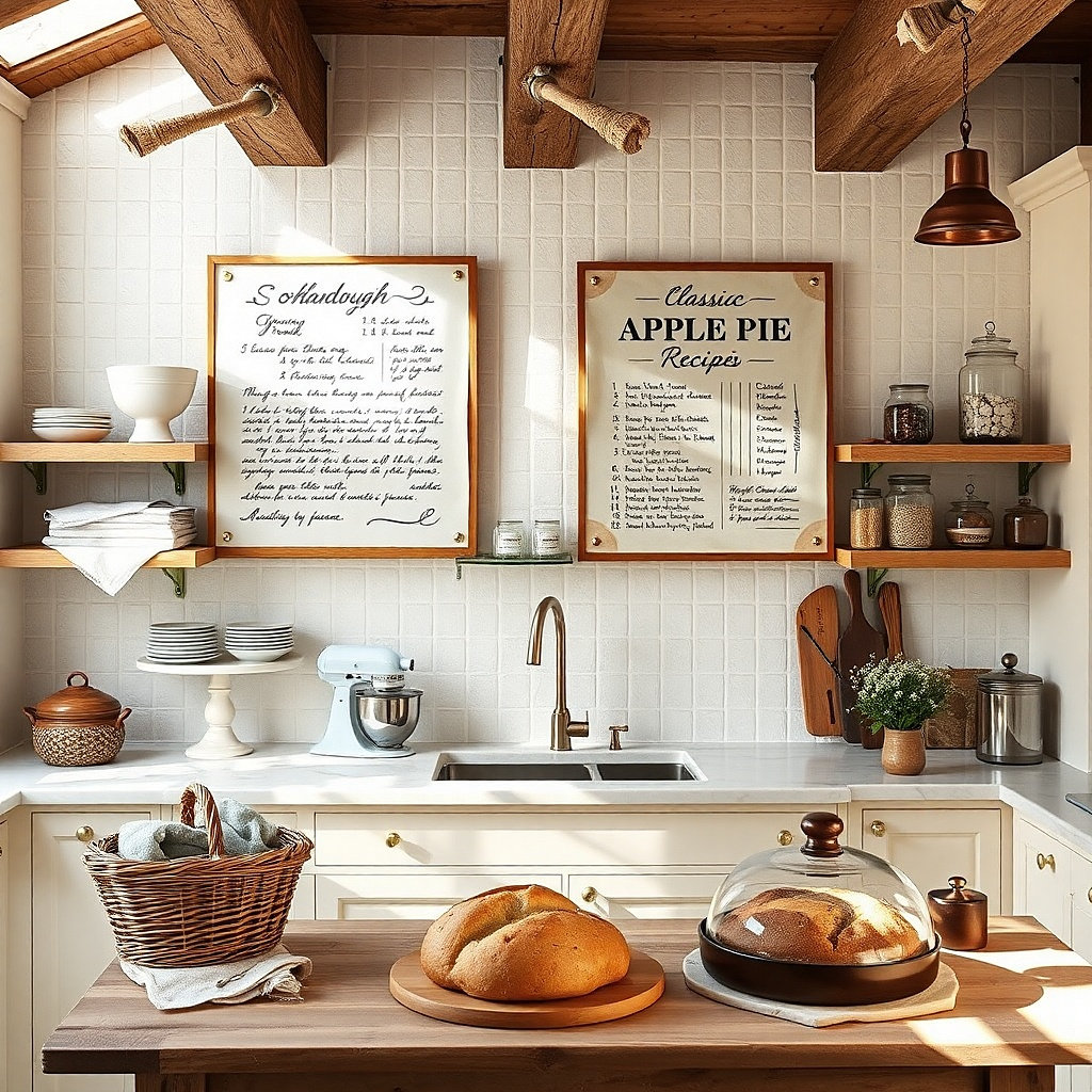
Recipe-card wall art works because it connects to cooking without needing cartoon icons. The chalk-style lettering looks authentic when it sits on a linen-textured mat, which adds softness under kitchen lighting. Make it a pair so the wall looks designed, not lonely. This setup works great above a small sideboard, on the wall near a coffee station, or anywhere you have open counter space and want a cozy, lived-in look.
Use two frames that match exactly, ideally 11x14 or 12x16 each. Choose prints that look like chalk on dark slate or chalk on cream, then add linen-texture mats if the frames allow it. Hang the pair with equal spacing and place the center of the group at 58 inches from the floor. Mount both frames with level measurements so the top edges align.
Try thisPick recipe cards with large headings and simple ingredient lists so the text reads from across the room.
Common mistakeAvoid tiny handwriting fonts — kitchens make it hard to read small text.
15. Oversized woven basket wall art with monochrome print behind
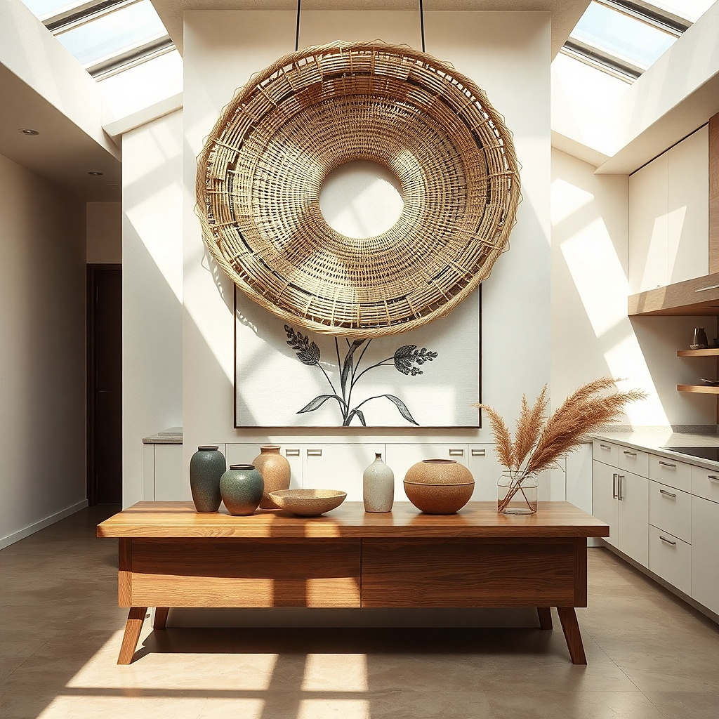
Texture does a lot of heavy lifting in kitchens. A woven basket hung on the wall adds dimension, and pairing it with a monochrome print behind it gives you a layered, styled look. Choose a basket in natural tan or light brown, then use a simple black-and-white print behind it so the colors don’t fight. This setup works when your kitchen is mostly smooth surfaces and you want warmth without adding clutter.
Find a wall basket about 16-20 inches wide and choose a monochrome print slightly larger than the basket’s inner opening. Mount the basket first with a stud finder and a strong screw hook if possible. Place the print behind or just above the basket so it peeks through, then measure so the top of the print aligns with the basket top by eye. Keep the group centered at 58 inches from the floor.
Try thisUse a basket with tight weaving it looks cleaner and more “intentional” on camera.
Common mistakeDon’t place the basket too low; it reads like a forgotten decoration.
16. Framed black-and-white photo strip of table settings
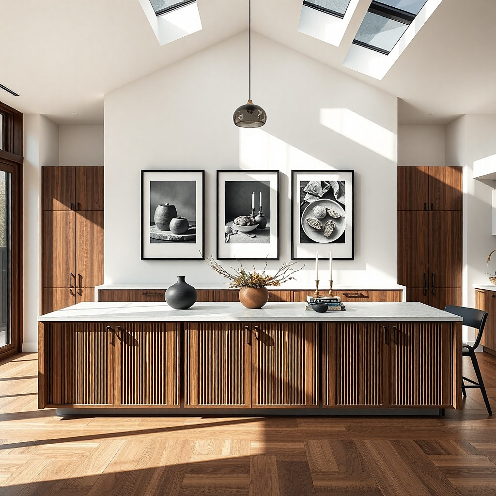
A black-and-white photo strip makes a dining wall feel like a magazine spread. The trick is choosing table-setting images with lots of negative space and clean styling, so the wall doesn’t look busy. Keep the frames consistent and use a matte finish to prevent glare. This works best when your kitchen/dining area has neutral colors and you want a strong, elegant focal point without adding color chaos.
Use 3 or 4 photos in one horizontal strip, each sized around 8x10 or 9x12. Mount them in matching frames or one multi-opening frame if you can find it. Hang the strip centered at 58 inches from the floor and keep it 6-10 inches above the dining table line if you have one below. Use a level and mark the width of the finished strip so it doesn’t skew.
Choose images with similar tones (cream plates, black cutlery) so the strip looks cohesive.
Avoid colorful prints — they compete with dishes and seasonal decor.
17. Color-block line art in a single modern frame
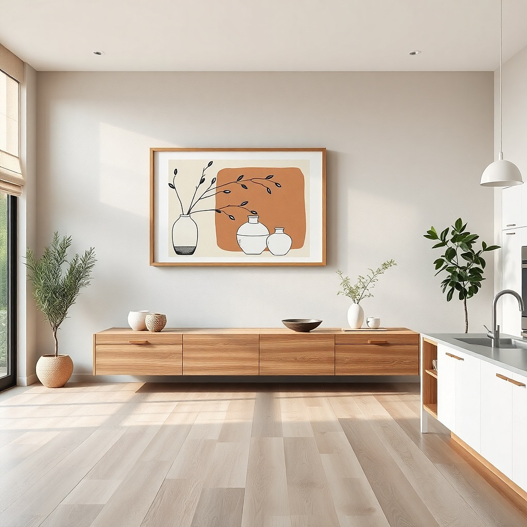
Color-block line art gives you a modern look without needing a complicated gallery. Pick one statement frame that includes a few kitchen-friendly colors like terracotta, sage, and charcoal on a cream background. The line art keeps it clean and graphic, while the color blocks keep it from feeling too minimal. This is a strong choice for kitchens with white cabinets and simple countertops because it adds a controlled pop.
Choose a frame size around 20x30 inches or 24x36 inches for a clear focal point. Use a black frame with a matte finish and keep the art margin visible so it doesn’t look like a stretched poster. Hang with the center at 58 inches from the floor and align it with cabinet doors or the center of a window for symmetry. Installation is straightforward: two hangers for the frame and you’re done.
Try thisMatch one of the color blocks to something small on the counter, like a terracotta jar or sage napkins.
Common mistakeDon’t pick art with too many colors; kitchens already have visual clutter.
18. Mirrored tray wall art with faux "menu" typography
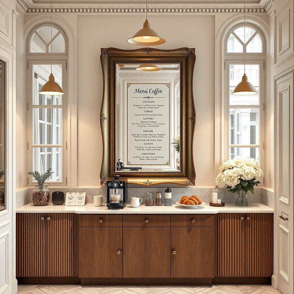
Mirrored tray wall art looks polished because it reflects light and makes the wall feel brighter. Pair the mirror with a small typography card or print underneath so you get both function and theme. Use a tray with a clean border and keep the typography minimal: one line title, one date, or simple “today’s menu” style text. This is especially good in kitchens that feel dim, because the mirror bounces overhead light across the wall.
Choose a mirrored tray about 12-18 inches wide and mount it using a strong picture hook rated for the tray’s weight. Add a small framed print or a card behind it so the typography sits 2-3 inches below the tray bottom. Mark placement carefully so the tray sits level — the mirror will exaggerate any tilt. For mounting, use a stud when possible; otherwise use appropriate drywall anchors.
Try thisWipe the mirror before hanging; fingerprints show up instantly in kitchen lighting.
Common mistakeAvoid ornate trays with heavy gold filigree — they can look dated quickly.
19. Wood slat shadowbox with small framed prints
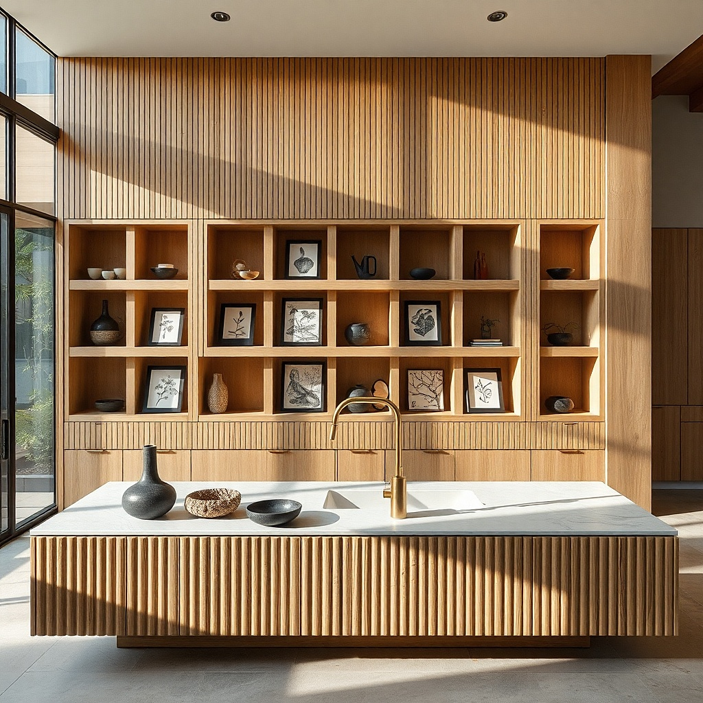
A wood slat shadowbox creates a modern, layered frame that makes small art look intentional. You’re not relying on one big print; you’re creating depth and structure with the slats, which reads well from across the room. Use two small prints inside: one botanical line drawing and one utensil silhouette, both in black and cream. This setup works when you want your kitchen wall to feel designed but your budget is for small pieces.
Buy a pre-made wood slat shadowbox or build one by mounting slats to a backing board, then adding two small frame openings. Choose small prints around 5x7 or 6x8 to fit comfortably. Mount the shadowbox centered at 58 inches from the floor and use two hooks or screws depending on weight. Keep the prints in the same color palette so the box looks cohesive, not like a craft project.
Try thisUse mat-less frames in black inside the shadowbox so the art looks crisp against the wood.
Common mistakeDon’t mix paper textures that clash; keep prints matte for a consistent look.
20. DIY framed fabric scraps in matching frames
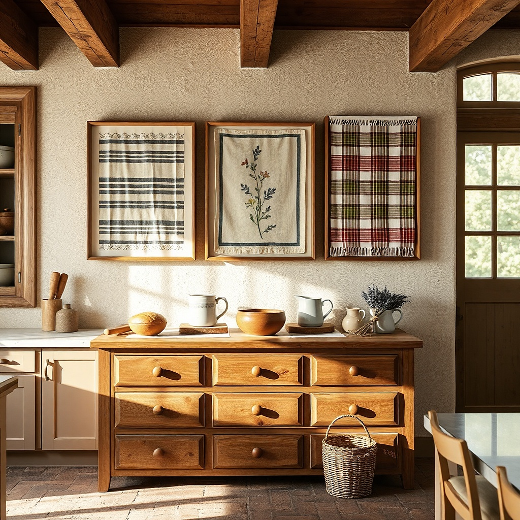
Fabric scrap wall art looks surprisingly high-end because it’s tactile and avoids the flat look of paper posters. Pick fabric with kitchen-friendly patterns like small checks, micro florals, or simple stripes in cream and muted colors. Frame each scrap like a print with a backing board so it stays smooth and flat. This is a great option for kitchens with neutral walls that need warmth and softness without adding more prints.
Cut two fabric squares to fit inside frames, leaving 1 inch of fabric overlap on the backing board. Use matching frames in either warm wood or black, and keep the same mat color across both. Mount them side by side with centers aligned at 58 inches from the floor. Budget is low if you use fabric remnants, but you’ll spend a bit on frame quality so it looks finished.
Try thisUse one dominant fabric pattern and one supporting solid, so it reads like design, not randomness.
Common mistakeSkip stretchy fabrics; they warp behind the glass and look messy.
21. Kitchen typography set in matching frames with equal spacing
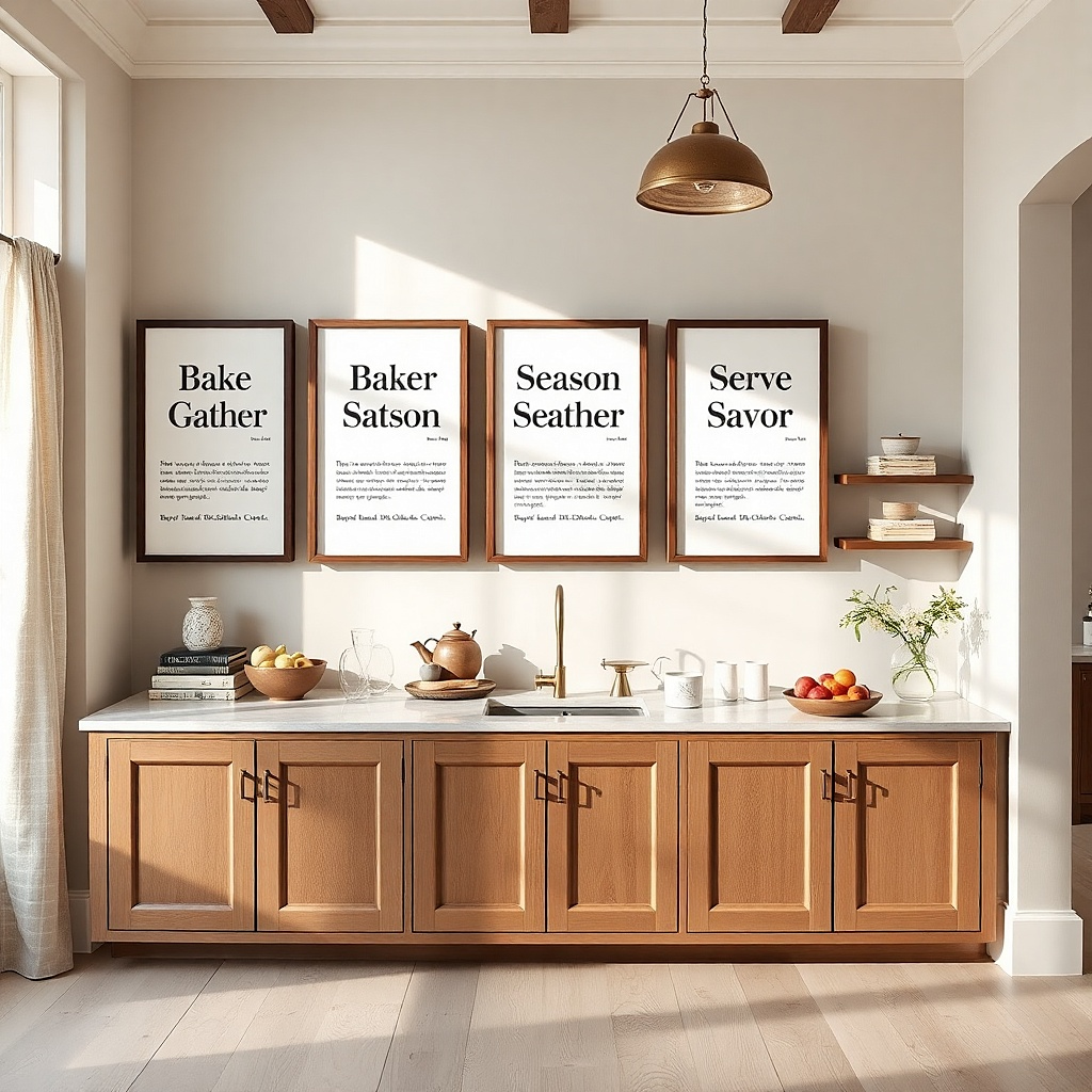
A typography set looks clean and modern when every piece matches in frame and spacing. Pick three phrases related to kitchen life coffee, eat, gather, or short cooking terms and keep fonts consistent across the set. Use a palette of one dark tone and one warm neutral so the wall doesn’t turn into a color collage. This setup is ideal for walls between cabinets or above a narrow console because it fills the space with readable design.
Choose three prints in the same size, like 8x10, and use matching frames with identical mat colors. Hang the center piece first at 58 inches from the floor, then measure equal spacing between frames using a ruler or tape measure. Keep the full set width around 36-42 inches for most kitchen walls. Install each frame with two hooks if possible for stability.
Pick phrases with big letterforms so they read clearly in daylight and at night.
Avoid mixing fonts and sizes; it breaks the tidy rhythm.