1. Countertop Reset With a Single Tray Zone
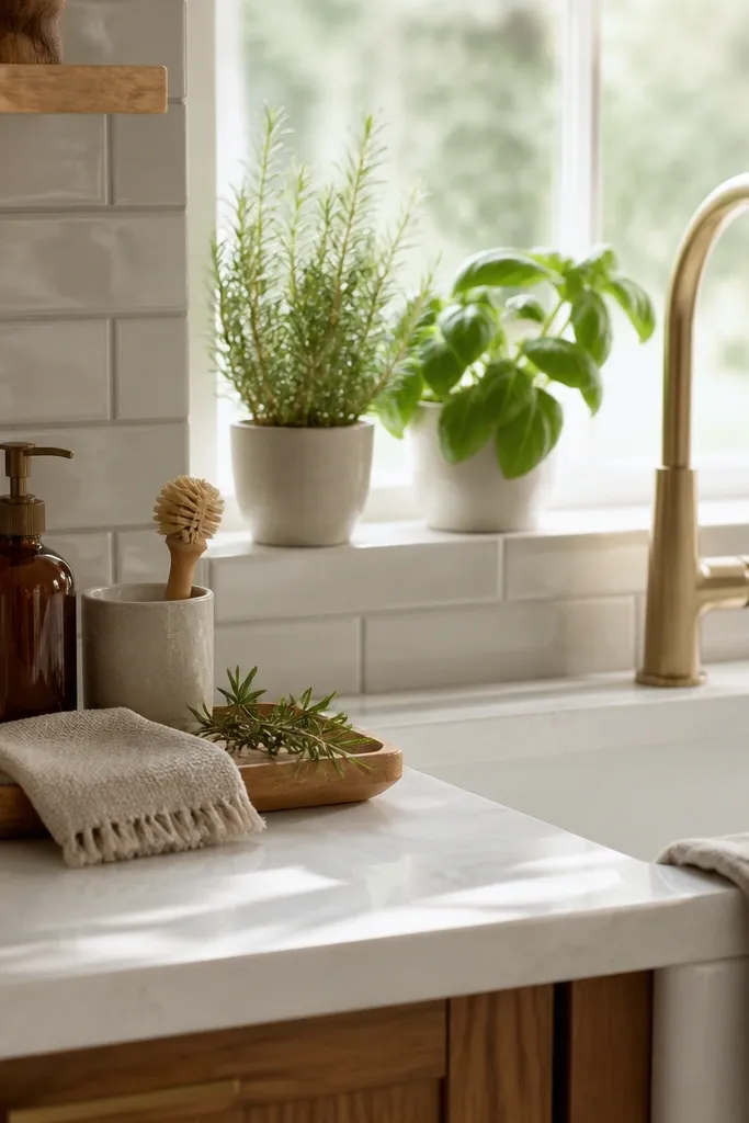
The sink is one of those spots people use all day but rarely decorate. I’ve found that when this area looks messy, the whole kitchen feels untidy even if everything else is clean. Instead of leaving a plastic soap bottle and a wet sponge on the counter, I like to create a simple sink setup that feels intentional. A wooden tray instantly groups everything together, while an amber glass soap dispenser, a ceramic brush holder, and a neatly folded linen towel bring warmth without taking up extra space. If your sink sits below a window, adding a couple of small herb pots makes the area feel fresh and lived in. Since this is already a functional zone, every decorative piece should also have a purpose. The result is a sink area that feels calm, organized, and much more inviting every time you walk into the kitchen.
Start by taking a photo of your counter from standing height so you can see what the eye lands on first. Clear everything off, then wipe the surface and let it dry completely. Place a tray that fits your counter width with at least 2 inches of breathing room on each side. Build your tray in a triangle: soap dispenser at one end, canister at the other, and a single-stem vase in the middle-back. Finally, put paper towels and sponges into a closed caddy under the sink so nothing spills into the open counter again.
Keep only the items you use daily beside the sink. Everything else should stay inside a cabinet to keep the countertop looking clean.
Don’t leave three different-size organizers on the counter — it reads like storage, not decor.
2. Under-Cabinet LED Strip Glow for Instant "After" Lighting
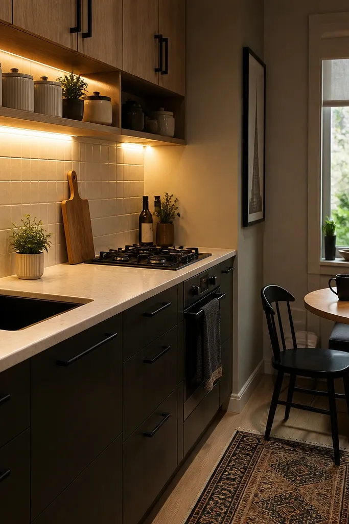
If your kitchen feels small, your lighting is usually the problem, not the walls. Under-cabinet LED strips change how your counters and backsplash look because they light the vertical surfaces where your eyes travel in a tight room. I use warm white (2700K) strips because cool white makes wood look gray and makes black hardware look harsh. The “after” effect is subtle but real: colors look deeper, and your decor items look styled instead of accidentally scattered. This works best in kitchens with any overhead-only lighting, especially those with recessed lights that create shadows under cabinets.
Start by turning off your overhead lights and checking where the shadows land on your counter. Clean the underside of the cabinets with alcohol wipes so the adhesive sticks for real. Install the LED strips 1 inch back from the front cabinet edge so the light washes down, not into your eyes. Choose a dimmable controller if you can — I set mine to about 40% in the evening for a cozy look. After installing, style your coffee or cooking corner with just three items so the new light doesn’t reveal extra clutter.
Try thisTape a strip in place temporarily for 10 minutes before peeling the backing so you can confirm the glow angle.
Common mistakeSkip “daylight” 5000K bulbs — they make small kitchens feel clinical and cheap fast.
3. Peel-and-Stick Tile Panel Behind the Coffee Nook
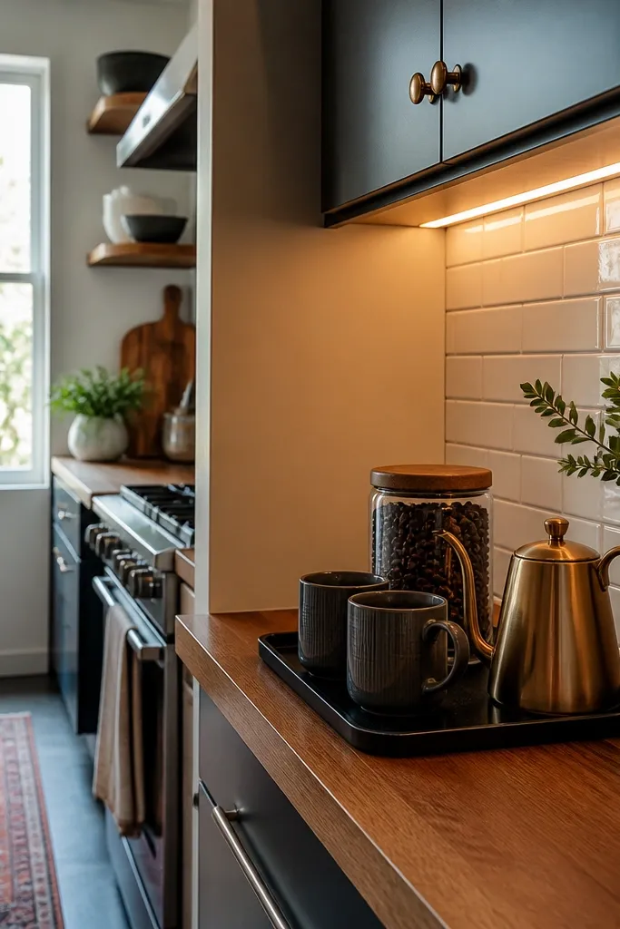
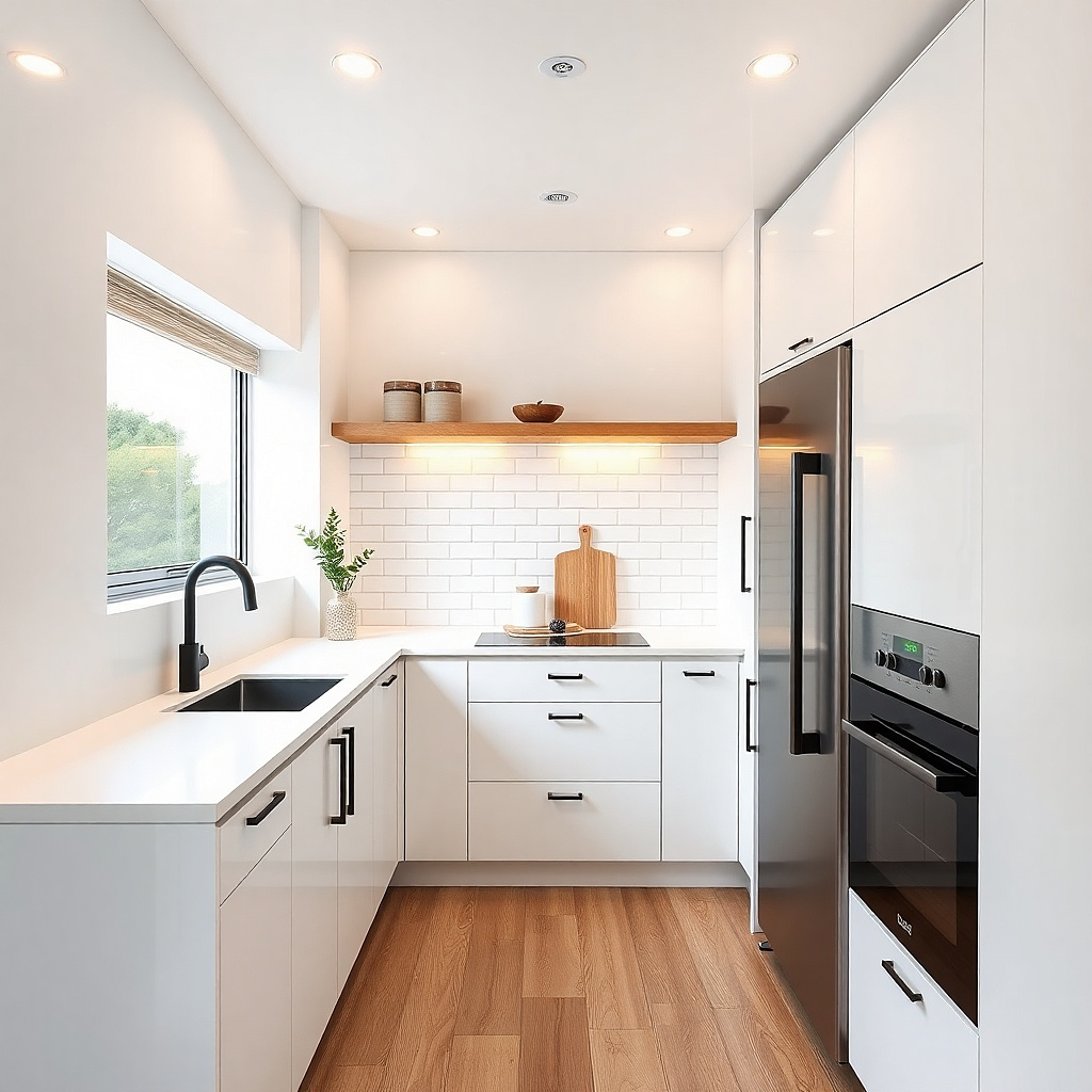
A small kitchen needs one place where the eye can rest, and a tile panel gives you that without construction dust. I’ve used peel-and-stick subway tile in soft cream or warm white because it looks like real ceramic under LED glow. It also makes simple coffee items look intentional: matching mugs, one tray, and a few neatly stacked bags. This works well when your existing backsplash is plain or mismatched and you don’t want to redo the whole wall. The panel creates a built-in look, especially when the coffee station sits directly under it.
Measure the exact rectangle you want to upgrade, usually 24 to 36 inches wide and 18 to 24 inches tall. Clean the wall with degreaser, then let it dry and check for any paint texture that might prevent adhesion. Start at the bottom corner and use a level to keep the first row straight; crooked tiles show immediately in close quarters. Press each tile firmly along the edges and use a plastic squeegee to push out air bubbles. Finish with trim strips if your tile edges meet a cabinet or corner so it looks finished, not stuck-on.
Try thisChoose grout-line depth that matches your existing backsplash vibe — shallow lines look cleaner in small spaces.
Common mistakeDon’t put the panel behind a cluttered counter — tile makes everything around it look louder.
4. Open Shelving With Matching Canisters and a 2-Inch Rule
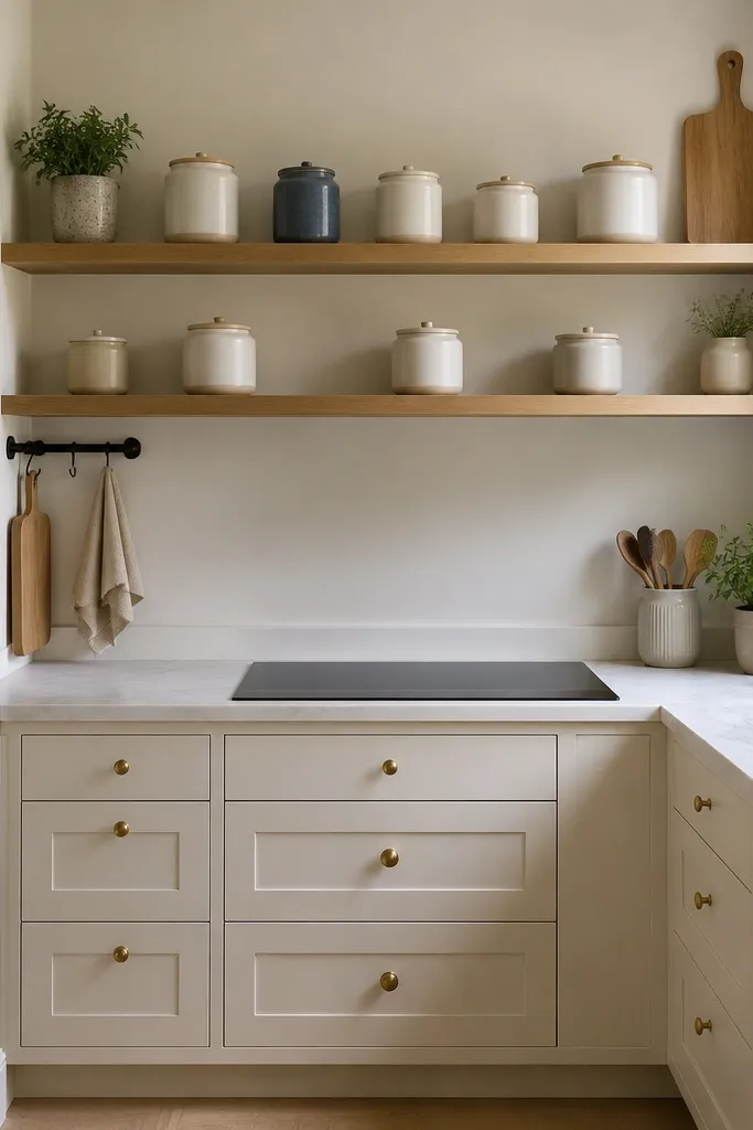
Open shelving can look amazing in a small kitchen, but only if you control the number and spacing. I use matching canisters because consistent shapes calm the visual noise. Keep the palette tight: white, cream, and light wood, then add one darker accent like matte black or deep olive. The “after” look also depends on leaving space — shelves that are packed look smaller even if the room isn’t. This is perfect when your kitchen has good wall space and you want everyday items to look like decor.
Start by removing everything from the shelves and sorting into keep, relocate, and donate. Measure the shelf depth and place items so the front edge stays consistent; aim for 2 inches of clear space between major objects. Use canisters that stack cleanly and leave room for one flat item like a tray or cookbook. Add plates vertically at the back if you have room, because vertical stacks take less visual width. Finish by styling one height element — a small plant, a utensil crock, or a framed print — so the shelf has a top anchor.
Try thisDust before you style. A tiny film of kitchen dust shows on white canisters under direct light.
Common mistakeDon’t mix random jar sizes — the shelf looks like pantry storage instead of decor.
5. Cabinet Door Hardware Swap to Make Everything Look New
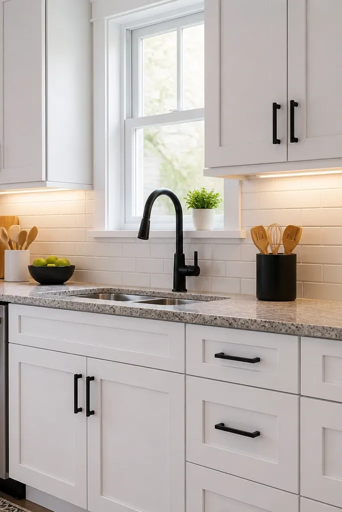
You don’t need to paint cabinets to get a dramatic before and after. A hardware swap changes the way the room reads because it’s one of the first things your eyes catch in a small kitchen. I’ve done matte black pulls on white cabinets and it looks sharp without feeling heavy, especially with warm lighting. If your kitchen already has brass faucets, swap to brushed nickel or matte black to avoid a third metal showing up. This works best when your cabinets are solid but the hardware looks dated or mismatched.
Start by counting pulls and measuring hole spacing so you don’t end up with extra-drill work. Remove one piece and take it to the store with you, or match the center-to-center measurement precisely. Install the new hardware with a drill guide so holes stay straight; crooked hardware is the giveaway that it’s DIY. Keep the finish consistent across drawers and doors. After the swap, clean the cabinet fronts and add one matching element like a black utensil crock to tie it together.
Use a small bit of painter’s tape around the drill point to prevent chipping and keep the finish clean.
Don’t mix pull sizes randomly across cabinets — it reads like a half-finished project.
6. Vertical Plate Rack Wall Hang for Dining Corner Tightness
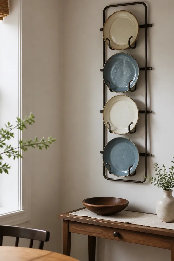
When your kitchen and dining area share the same wall, you need decor that doesn’t eat floor space. A vertical plate rack wall hang uses height instead of width, which matters in small rooms. I like using plates in two tones — cream and muted blue, or white and sage — because it looks designed, not collectible chaos. This also hides empty wall space that usually makes small kitchens feel unfinished. It flatters narrow dining corners because it draws the eye up and makes the wall feel “decorated” without adding bulky furniture.
Pick a plate rack that matches your table hardware or faucet finish so it doesn’t look random. Lay out your plates on the floor and choose 6 to 10 that share a similar color temperature. Install the rack with anchors if you’re going into drywall — I use two anchors per stud gap when possible. Hang the rack so the center plate sits around 60 inches from the floor for a natural view height. Style your table with a runner that matches one plate color, then keep the centerpiece low so it doesn’t block sightlines.
Try thisUse command hooks for a test hang first, then commit once you know the height feels right.
Common mistakeDon’t hang plates too low. In small spaces, low placement makes the room feel heavier.
7. Woven Runner That Matches Your Chair Seat Color
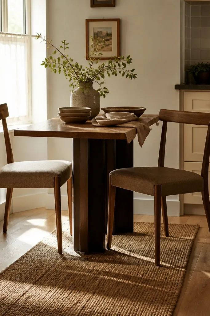
A runner is the easiest way to make a small kitchen dining nook look styled because it adds texture and defines the eating zone. I always match the runner’s undertone to the chair seats or cabinet wood, not to the kitchen wall paint. Woven jute looks warm and forgiving because it hides dust and light spills better than smooth fabric. If your chairs are upholstered in tan, choose a runner with similar warm fibers and a subtle stripe. This works for apartments and tiny kitchens where you can’t add a rug without swallowing the room.
Measure the table footprint and choose a runner length that leaves 8 to 12 inches of runner visible past each end. Position the runner so the centerline hits the table center, not the cabinet line — alignment matters. If your runner has a natural color variation, rotate it so the darker fibers sit toward the edges. Add one low centerpiece no taller than 6 inches — a ceramic bowl with lemons or a small vase with greenery. Finish with napkins in a solid color picked from the runner stripe or weave shade.
Try thisShake the runner outside once a week. Dust makes woven textures look gray fast.
Common mistakeDon’t choose a runner with a loud busy pattern if your kitchen already has patterned tiles or curtains.
8. Countertop Refresh
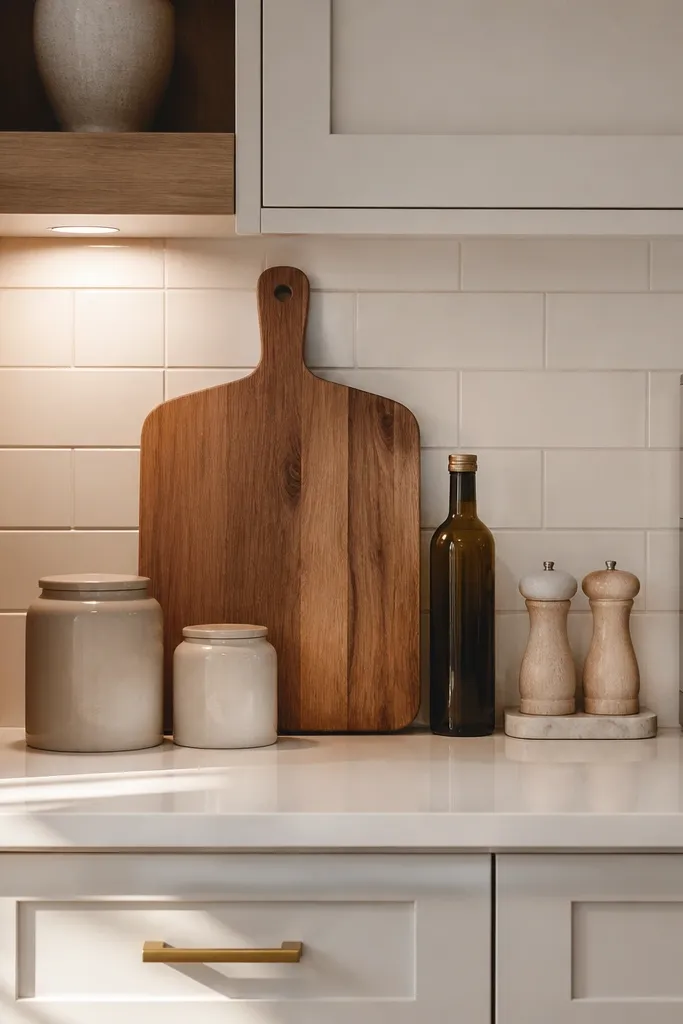
A cluttered countertop is usually the first thing that makes a small kitchen feel cramped. I don’t try to decorate every inch. Instead, I remove anything that isn’t used every day and leave just a few carefully chosen pieces. A large wooden cutting board leaning against the backsplash adds height, ceramic canisters keep everyday ingredients close, and a decorative tray gives smaller items a designated home. If you need a coffee maker or toaster on the counter, place it in one consistent area rather than spreading appliances across the room. This creates breathing space, making the kitchen look larger without changing the layout. I’ve found that styling with fewer but better-looking pieces always feels more expensive than filling the counter with decorations.
Start by finding the exact wall spot where you can reach the knives without stepping into a walkway. Mount the knife strip level and use proper anchors if it’s not hitting studs. Arrange knives by size — chef knife and bread knife first, then smaller knives to the sides — so the layout looks balanced. Remove the knife block and clear the counter completely for a day so you feel the difference. Put spatulas and ladles into one crock and keep only cooking tools, not random gadgets.
Leave at least one clear prep area completely empty. A little negative space makes the entire kitchen feel bigger.
Don’t hang the strip above a cluttered prep zone. It looks like you added a new storage problem.
9. Cabinet Under-Shelf Baskets for Paper Goods
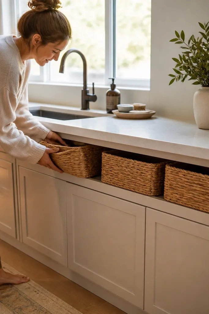
Small kitchens look better when paper goods disappear. Under-shelf baskets are one of the most practical decor moves I’ve done because they hide the stuff that visually screams “mess” — paper towels, napkins, and takeout bags. I like woven baskets because they soften the hard lines of cabinets and don’t look like plastic storage. Place them where you reach them during meal prep, not randomly under any shelf. This works best in kitchens where your counter is already tight and you need storage that doesn’t take floor space.
Choose baskets with a flat back or mounting brackets so they sit flush under the shelf. Measure the clearance under your cabinet so the basket bottom doesn’t interfere with door swing or your knees. Mount the baskets with screws into cabinet framing when possible; use anchors only if you’re sure it’s secure. Put napkins in one basket and backup paper towels in the other, capped by a small roll so it looks neat. After installing, clear the counter and keep a single napkin stack on the dining side only.
Try thisLabel the baskets with a small card on the inside edge so guests can find backups without cluttering the counter.
Common mistakeDon’t choose baskets that are too large — big baskets sag and look sloppy in tight kitchens.
10. Floating Shelf Styling
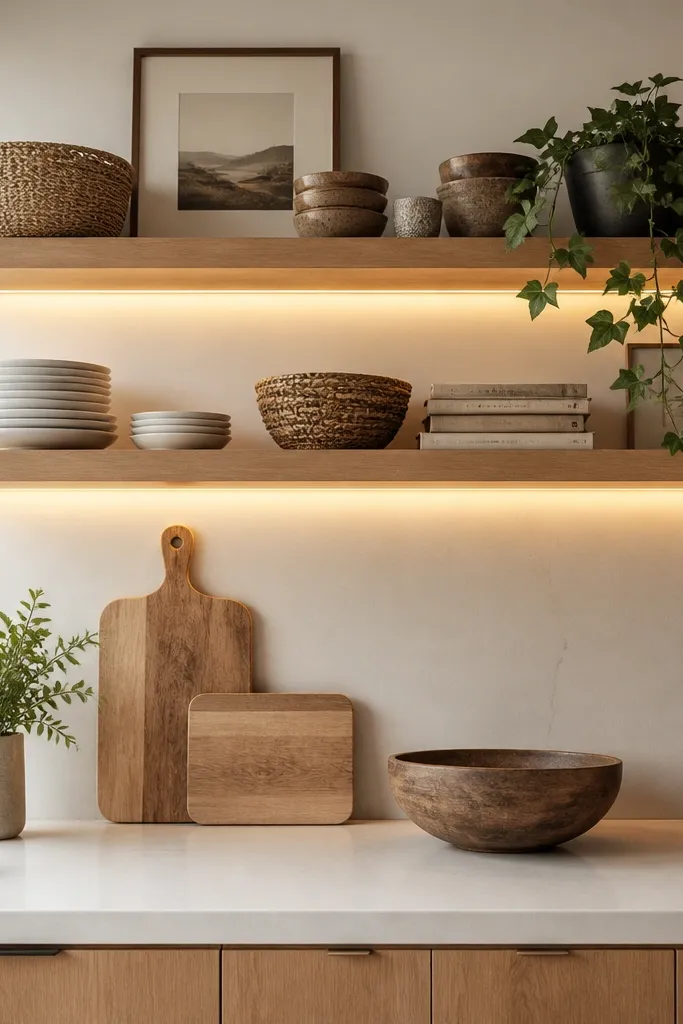
Open shelves can either make a kitchen look beautifully styled or completely cluttered. The difference is how you arrange them. I usually mix practical items with decorative ones so the shelves still feel useful. Stack everyday plates, add a couple of pottery bowls, lean a wooden cutting board against the wall, then finish with one trailing plant or a small framed print. Keeping similar colors throughout the shelf creates a calm look instead of visual noise. I also avoid filling every inch because empty space helps each item stand out. The goal isn’t to display everything you own-it’s to make everyday kitchen essentials look like part of the decor.
Measure the space around your sink and choose a drying rack that fits without touching cabinet doors when open. Pick a rack with a removable drip tray so you can keep the area clean. Add a sink mat in a neutral color like charcoal, cream, or warm gray — choose one that doesn’t show water spots easily. Place it so the mat extends 1 inch past the rack edges. Style the sink area after dishes dry: one soap dispenser, one small scrub brush in view, and everything else in a drawer.
Try thisFollow the “less is more” rule. If a shelf feels full, remove one or two pieces before adding anything new.
Common mistakeDon’t leave random sponges and brushes on the counter — they look like clutter even when you’re using them.
11. Dining Table Centerpiece With One Height (Under 6 Inches)
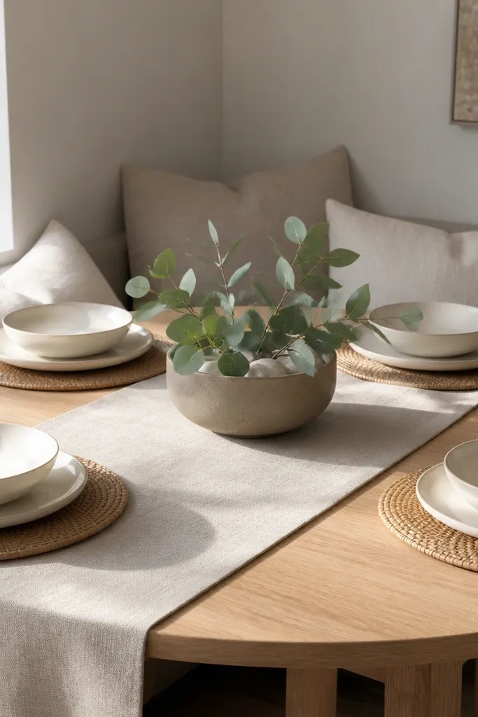
Small dining zones look messy when every item is the same height. One low centerpiece creates a calm focal point and makes the rest of the table feel organized. I keep centerpiece height under 6 inches because taller arrangements block sightlines and make the room feel tighter. Use a ceramic bowl or low vase in the same color family as your runner or plates. This works for kitchens where the dining table is right next to the kitchen prep area, and the two spaces blend visually.
Start by clearing the table completely and placing a runner first. Center a low ceramic bowl or tray so it matches the table’s centerline. Add either a short vase with greenery or a simple stack of lemons — keep it to one material type so it reads clean. Fold napkins into rectangles and place them on either side of the centerpiece so the layout feels balanced. If you use candles, pick short pillar candles and group them in a holder that sits flat, not tall.
Try thisUse painter’s tape on the table once to mark the centerline. It keeps your centerpiece from creeping each week.
Common mistakeDon’t use tall bottles or stacked books on the dining table in a small space.
12. Linen Curtain Panels on a Cafe Rod for More Light
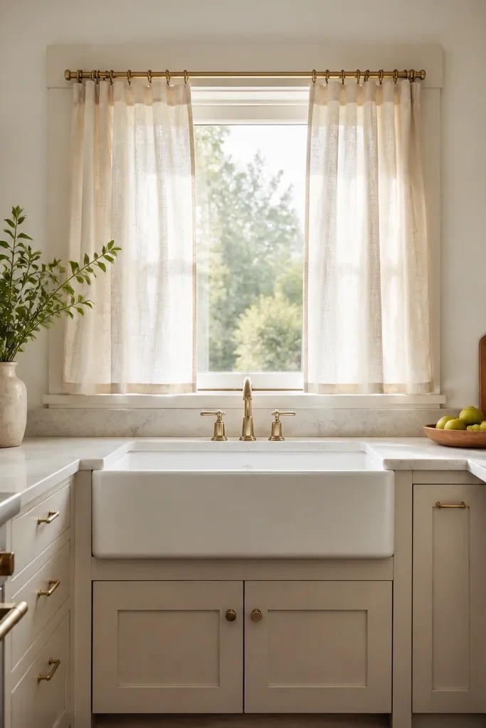
Curtains control how big a small kitchen feels because they frame the light. I use linen cafe panels on a rod mounted close to the top of the window so the fabric doesn’t swallow the glass. Linen also hides slight wrinkles better than smooth polyester, so it looks lived-in instead of stiff. Choose a warm white or oatmeal tone if your kitchen has wood elements, and add one other warm material like a woven runner. This works when your window is near your dining nook or when you feel like the room looks flat.
Measure the window width and choose panels that add up to 1.5 times the glass width so they drape softly. Mount the cafe rod 1 to 2 inches above the top of the window trim. Hang the panels so they fall 1 to 2 inches above the sill for a clean look. Keep the sill clear except for one small plant or a single ceramic tray. Steam the linen once and let it settle; don’t crank it tight because linen should have gentle folds.
Try thisIf your kitchen is small and you want privacy, choose a slightly thicker linen blend but keep it light in color.
Common mistakeDon’t hang curtains too low — they visually shrink the window.
13. Corner Shelf With a Slim Spice Ladder and a Tall Plant
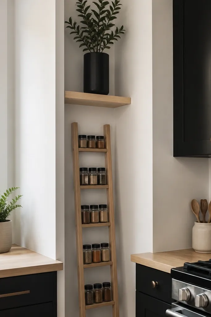
Corners are where small kitchens go to die visually. A slim spice ladder turns a dead corner into storage that looks vertical and neat. I like adding one tall plant on the top shelf because it gives the corner height and breaks up the “boxy” cabinet shapes. Choose a shelf with a light wood or matte black finish based on your hardware. This works for kitchens that have a corner near the stove or fridge where you can’t place a full rack.
Start by cleaning the corner wall and checking for studs if you’re mounting. Choose a corner shelf depth that leaves at least 2 inches of clearance from door swing or walkway. Install the shelf level, then set the spice ladder centered so jars face forward. Use identical jars with matching labels or wrap labels so they look uniform. Place a tall plant in a pot that matches your shelf finish, and keep the rest of the corner empty for a clean before and after.
Try thisRotate the plant pot so the densest leaf mass faces the room — it makes the plant look fuller immediately.
Common mistakeDon’t add three decor items in the corner. One plant and one storage feature is enough.
14. Corner Storage Styling
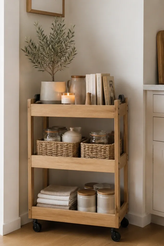
Kitchen corners often become a place where random things collect because they’re awkward to use. I prefer turning these forgotten spots into storage that also looks decorative. A slim rolling cart or compact shelving unit can hold baskets, folded towels, cookbooks, or pantry jars while keeping everything within easy reach. Adding one small plant or candle softens the space so it doesn’t feel purely functional. Since the corner already exists, you’re simply giving it a purpose instead of letting it become wasted space. This works especially well in apartments where every square foot matters.
Remove everything from the target cabinet and clean the interior surface with alcohol wipes. Measure the back panel area and cut contact paper to size with a sharp utility knife. Apply slowly from the top, smoothing as you go so you don’t trap bubbles. If your cabinet has corners, wrap the paper around edges only if it stays flat; otherwise cut clean lines and keep edges tight. After applying, arrange plates vertically and line containers up so they sit against the new background.
Try thisChoose storage that can move easily so you can still clean behind it and adjust the layout whenever needed.
Common mistakeDon’t pick a loud large-scale pattern — it makes the cabinet opening feel busy.
15. Paper Towel Holder on the Side With a Matching Tray
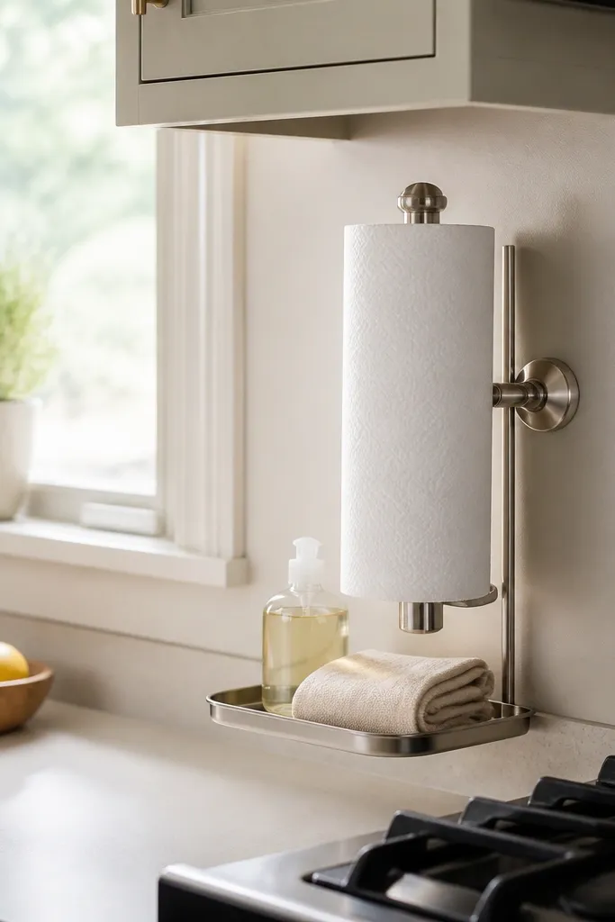
If your paper towels live flat on the counter, they eat visual space and make the kitchen look unstyled. A wall-mounted or side-mounted paper towel holder changes the whole rhythm of the counter. I pair it with a small tray under the holder so the base doesn’t look empty or random. Pick a finish that matches your hardware — matte black with black pulls, brushed nickel with nickel faucets. This works in narrow kitchens where every inch of counter matters and you need the sink zone to look clean.
Choose a holder that mounts vertically and fits your paper towel roll width. Hold it up to the wall and mark the screw points, then check where it hits studs or use appropriate anchors. Install the holder level and test by pulling the roll forward once so you can see how it hangs. Add a small tray below it, placed so the tray edge aligns with the counter edge. Clear the counter completely and keep only a soap dispenser and one small utensil crock nearby.
Try thisMeasure the clearance between the holder and any cabinet door so the door opens without tugging the roll.
Common mistakeDon’t mount it too low. Low placement makes the counter feel cluttered even when it’s organized.
16. Decorative Tray Styling
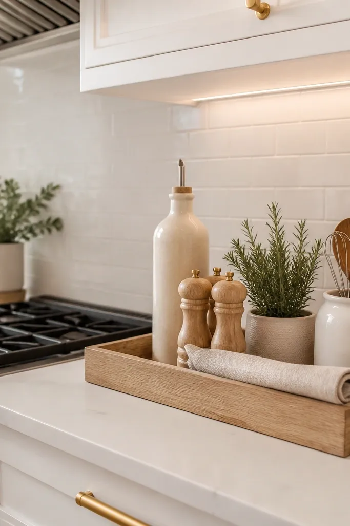
A decorative tray is one of my favorite ways to make a small kitchen feel instantly organized. Instead of leaving oils, salt, pepper, and everyday essentials scattered across the countertop, I group them on a simple wood or marble tray. It creates one intentional focal point while making the counter look cleaner and easier to maintain. This works especially well beside the stove or in an empty corner where you want a little personality without adding clutter.
Remove everything from the shelves and clean the interior. Tape off edges and paint a test swatch first to confirm the color under your kitchen lighting. When you’re happy, paint the entire back surface and let it cure fully. Use a small foam roller for smooth coverage and avoid brush streaks. Style with cream or white dishes and one darker accent item like a matte black tray so the color feels planned, not random.
Try thisStick to three to five items on the tray. Too many accessories will make it look crowded instead of thoughtfully styled.
Common mistakeDon’t pick a bright saturated color. It makes small shelves feel like they’re vibrating.
17. Framed Recipe Prints at Eye Level Above the Dining Table
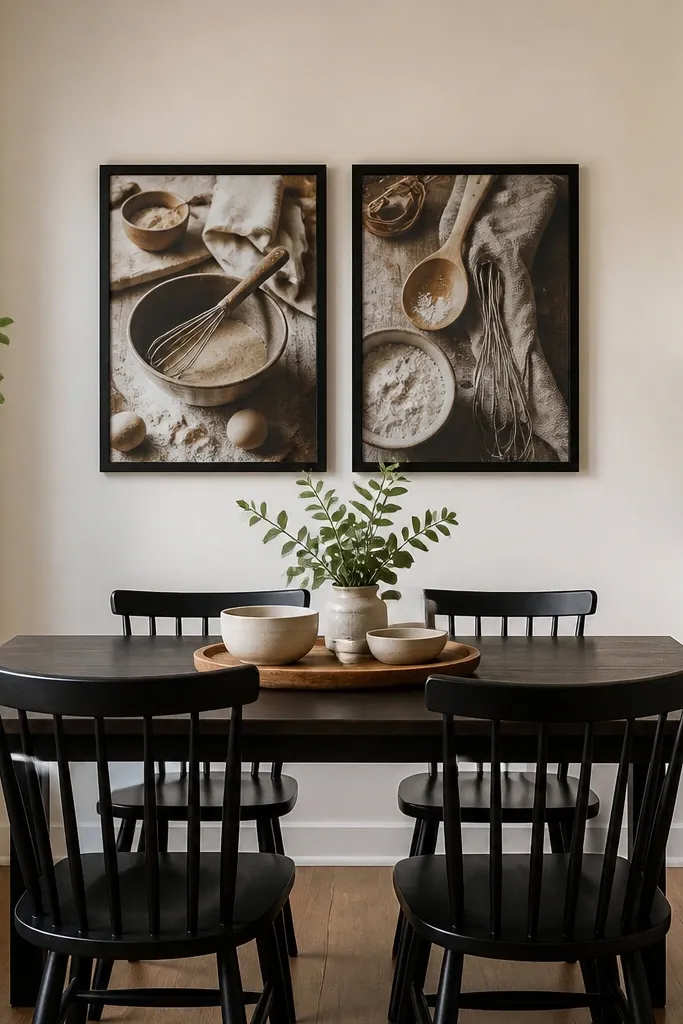
A wall gallery above the dining table makes the whole kitchen feel finished because it gives your eyes a focal point away from counters. I keep it simple with two matching frames and recipe prints that share a similar color palette. Black frames look crisp against light walls and tie into matte black hardware. The height matters: if frames hang too high or too low, the room looks off. This works when your kitchen has blank wall space and your dining table is close enough that you see the frames while cooking or eating.
Measure the table width and choose frames that span about 60 to 80% of that width when placed side by side. Use a level to mark a center point on the wall, then hang the top of the frame so the center sits around 60 inches from the floor. Use picture-hanging hardware that matches wall type — studs for best hold, anchors if needed. Pick prints with limited colors, like cream paper with dark text and small red accents. Style the table with a runner that matches one print color so the wall and table feel connected.
Try thisSwap the glass for anti-reflective if you have strong window light — glare makes frames look messy.
Common mistakeDon’t hang three frames in a small space. Two looks intentional and clean.
18. Cabinet Toe-Kick Lighting for a Cozy, Hidden Glow
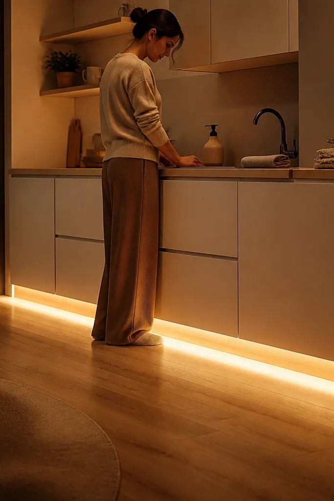
Toe-kick lighting is the after effect you feel more than you see. In small kitchens, it makes the room look bigger because it reduces the harsh shadow line at the cabinet base. I use warm white strips and set them to low brightness for evening — it looks like the kitchen is softly illuminated from the floor. This is especially good if your kitchen has dark floors or if your cabinets sit close to the ground. It also makes open decor accents look better because the base area isn’t swallowed by shadow.
Find a power source near your lower cabinets and plan wire routing before sticking strips. Clean the underside of the cabinet base with alcohol wipes and install the strip along the inside edge of the toe-kick. Use a diffuser channel if you want a smoother glow without visible dots. Place your dimmer switch where you’ll actually use it. After installing, keep your floor clear around the cabinets so the glow doesn’t highlight clutter and crumbs.
Try thisTest the color temperature with a phone camera photo. If it looks yellow or too orange, change bulbs before finishing.
Common mistakeDon’t crank toe-kick lights to full brightness — it makes small kitchens look flat and over-lit.
19. Stove-Top Rail With Hooks for One Tool Set
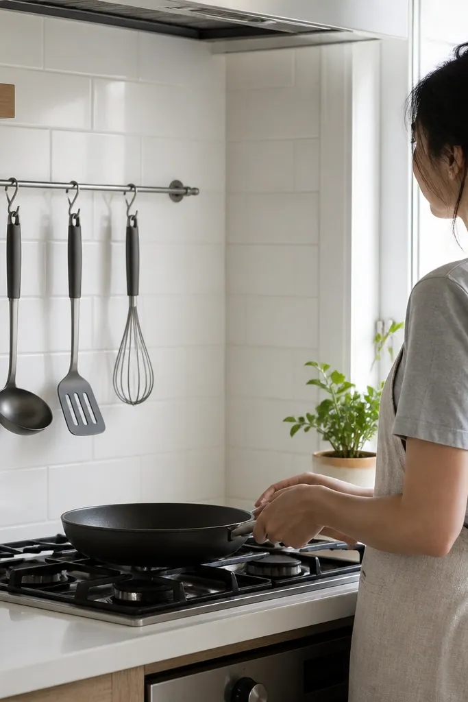
A utensil rail is decor and function, but only when you keep the tool set small. In a small kitchen, hanging too many tools makes everything look chaotic. I hang a single “daily cook” set: one ladle, one spatula, and one whisk — nothing else. The rail adds a vertical line that makes the stove area look intentional, and it frees counter space. This works if your backsplash can handle mounting and you want tools visible without cluttering the countertop.
Choose a rail length that spans the stove width plus a little extra on each side, typically 24 to 36 inches. Mount it securely with the correct anchors so it doesn’t sag when tools are on. Hang tools by weight — heavier ladle closer to the center, lighter whisk at the end. Clear the counter completely for a day, then add only a single crock or utensil holder if you need it. Finish by wiping the hooks and tools so they look dark and clean under the range light.
Use matching hooks or add small matching rings so the hanging ends look uniform.
Don’t hang every gadget. Keep it to the tools you grab weekly.
20. Cabinet Top Decor
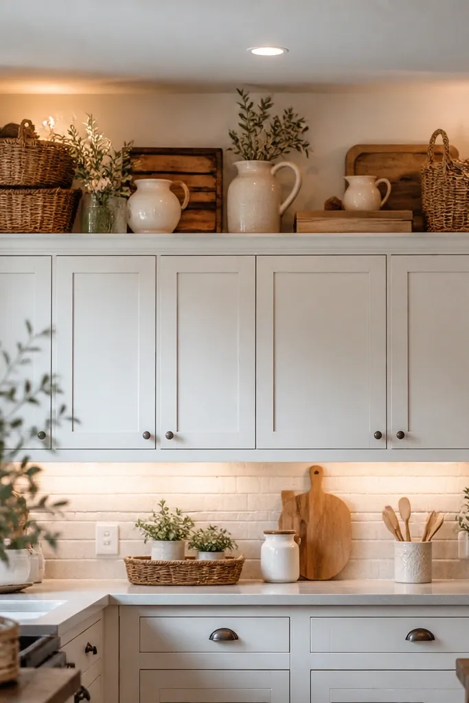
The space above kitchen cabinets is often left empty or becomes a place where dusty boxes get forgotten. I like treating it as a finishing layer instead. Large woven baskets, vintage pitchers, wooden crates, or faux olive branches fill the height without making the kitchen feel busy. The trick is using fewer oversized pieces rather than lots of small decorations. That creates balance and draws the eye upward, making standard-height ceilings appear a little taller. I also keep everything in a similar color family so the display feels intentional instead of like extra storage.
Measure your chair seat width and depth so the cushions fit without hanging over the edges. Choose a cushion fabric with a matte finish — cotton-linen blends look best. Place the cushions and check alignment from standing height. Then style the table with a runner in a neutral and napkins that pick up the cushion color. Keep the centerpiece low and simple so the cushions stay the main color element.
Try thisDecorate this area only if you can easily reach it for regular dusting. Clean styling loses its charm once dust builds up.
21. Pantry Cabinet Makeover
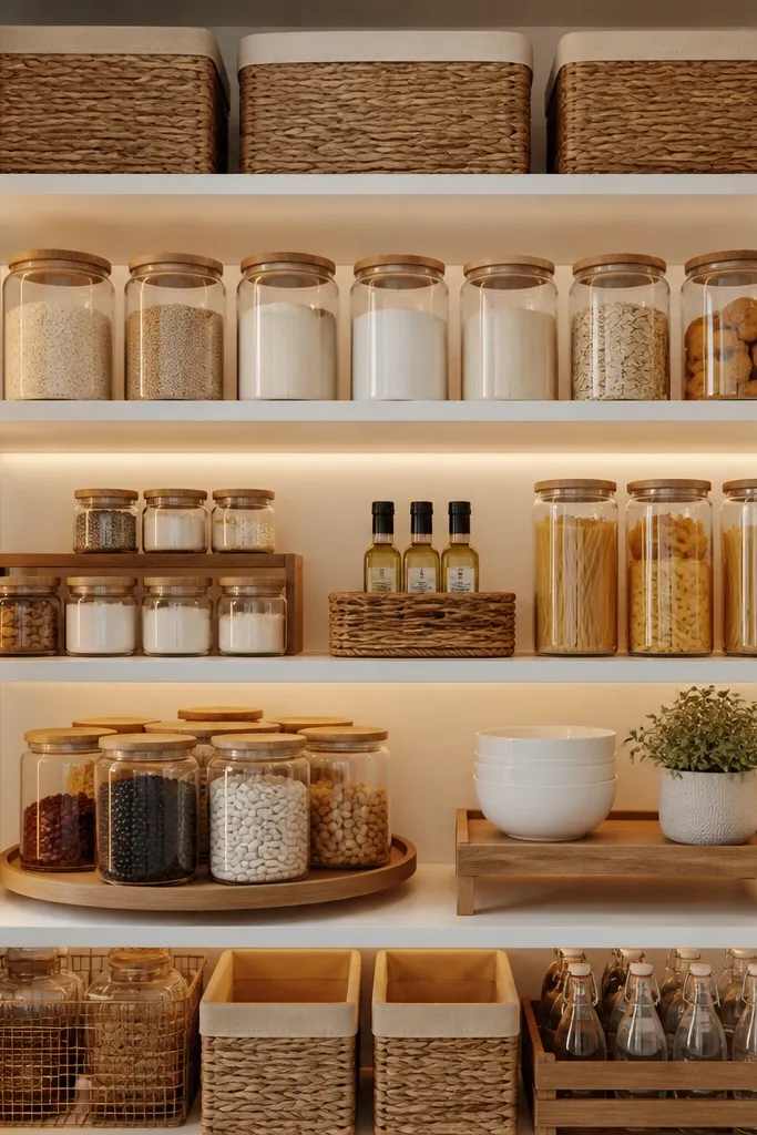
A pantry doesn’t have to be visible to make a difference. Every time you open an organized cabinet, cooking feels easier and less stressful. I replace bulky food packaging with matching glass jars for everyday staples like flour, pasta, rice, and cereal. Woven baskets keep snacks together, while shelf risers and lazy Susans prevent smaller items from disappearing at the back. The goal isn’t perfection it’s making everything easy to find without digging through shelves. Even a small pantry feels more spacious when similar containers and simple labels create consistency.
Clean the cabinet tops thoroughly and let dust settle. Place the tall item first in the back center, then add the medium item slightly forward and to one side. Put the smallest item on a tray to control the footprint. Step back and check that the group occupies about half the cabinet width so the rest stays empty. Finally, wipe the items again with a microfiber cloth — cabinet tops show fingerprints under daylight.
Try thisOnly decant foods you buy regularly. There’s no need to purchase matching jars for ingredients you rarely use.
Common mistakeDon’t stack baskets or boxes up there. Small kitchens look cluttered when storage is visible.
22. Backsplash Glow-Up
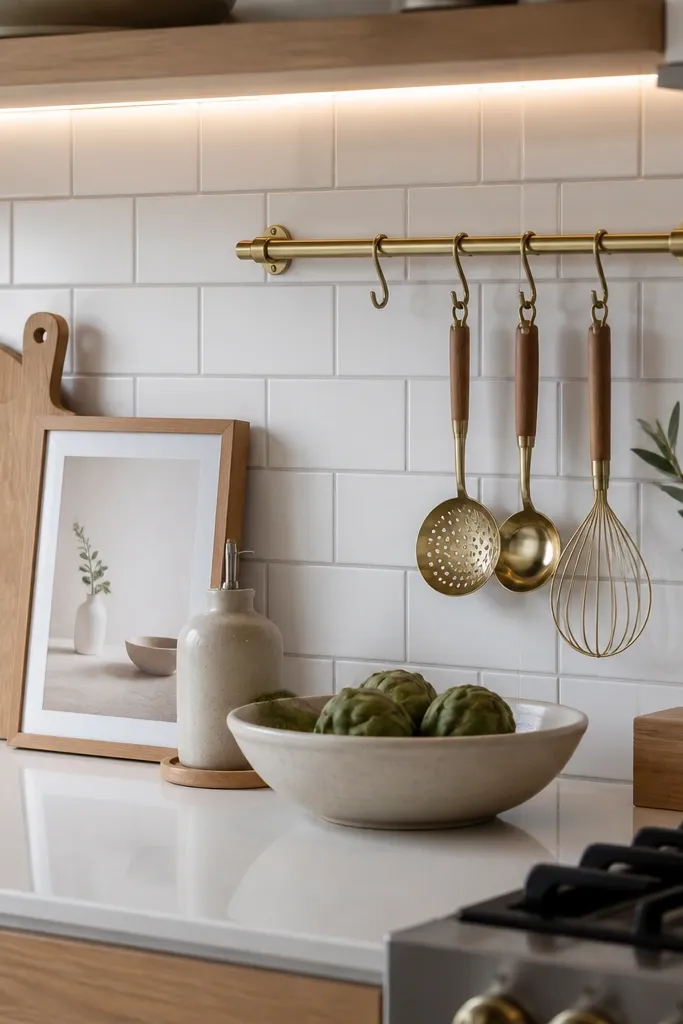
The backsplash naturally catches your eye, which makes it one of the easiest places to add personality without overwhelming a small kitchen. I like starting with a simple tile design, then layering in practical details such as a brass rail for utensils or wooden cutting boards leaning against the wall. These pieces add warmth while keeping everyday tools close at hand. A small framed print or decorative olive oil bottle can finish the look without making the counter feel crowded. When the backsplash feels styled, the entire kitchen instantly looks more custom and thoughtfully designed.
Start by choosing your dish color family — cream, white, or pale blue works well in small spaces. Remove any mismatched mugs from visible areas and store them in a closed cabinet. Place your matching soap dispenser and one matching canister on the counter or shelf. Keep the visible dish stack to 6 to 10 pieces so it doesn’t look crowded. Add one accent in the same family as your hardware — for example, matte black tray with black hardware.
Keep decorative accessories close to the wall so your prep space stays open for everyday cooking.
Don’t keep a “rainbow” set of mugs visible. It looks like clutter in photos.
23. kitchen window decor
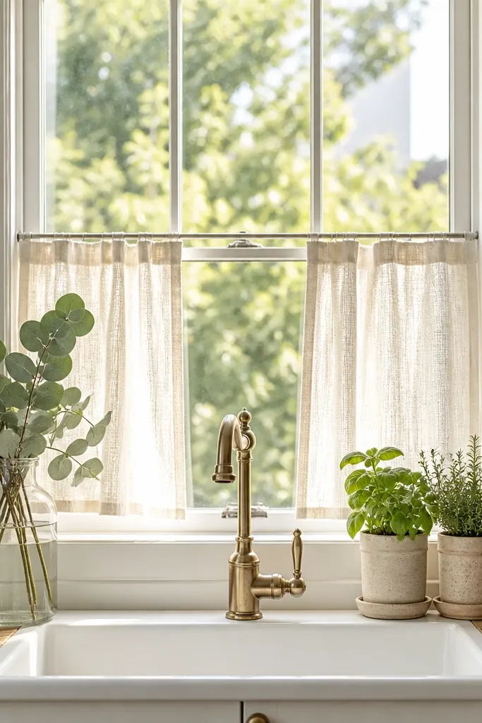
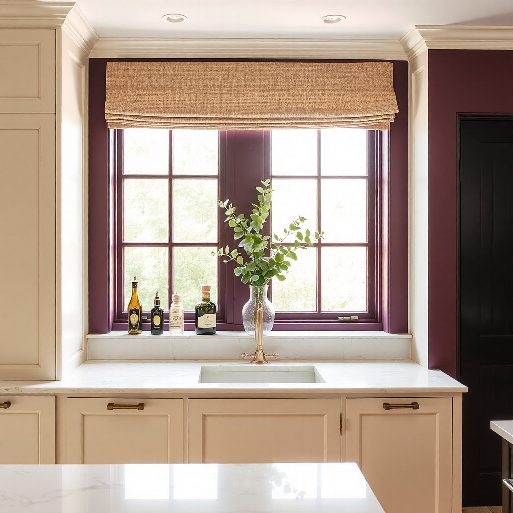
A kitchen window already brings in natural light, so I prefer decorating it with items that feel fresh instead of heavy. Small herb pots are both beautiful and useful, while simple linen café curtains soften the space without blocking sunlight. A clear glass vase with seasonal greenery adds texture without overwhelming the windowsill. Since this area changes throughout the day with the light, even a few carefully chosen pieces can make the whole kitchen feel brighter and more welcoming. I always keep the styling minimal so the window remains the main feature.
Measure your drawer width and depth and pick dividers that match those dimensions. Pull everything out and group utensils by type: cooking utensils, baking tools, and everyday cutlery. Install dividers so each group has a dedicated section and leave a small empty buffer space for new items. Put the most-used tools in the front row so you don’t reach and shuffle everything. After organizing, style the counter with only what you use daily, and store the rest back in the drawer.
Try thisRotate fresh herbs every few weeks. Healthy plants always look better than decorative ones that have been forgotten.
Common mistakeDon’t cram tools into one bin. Overstuffed drawers force people to leave things out.