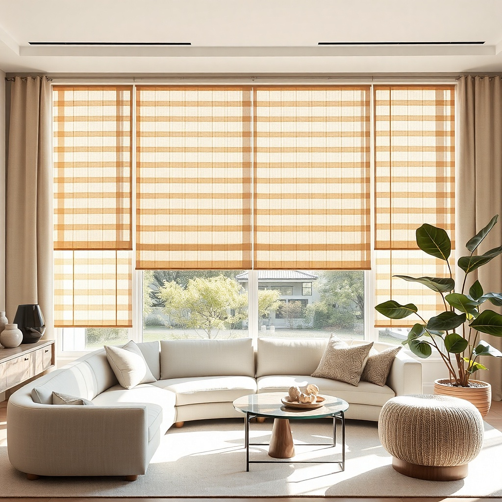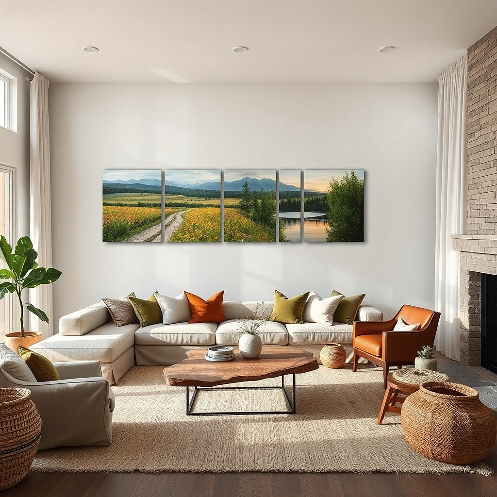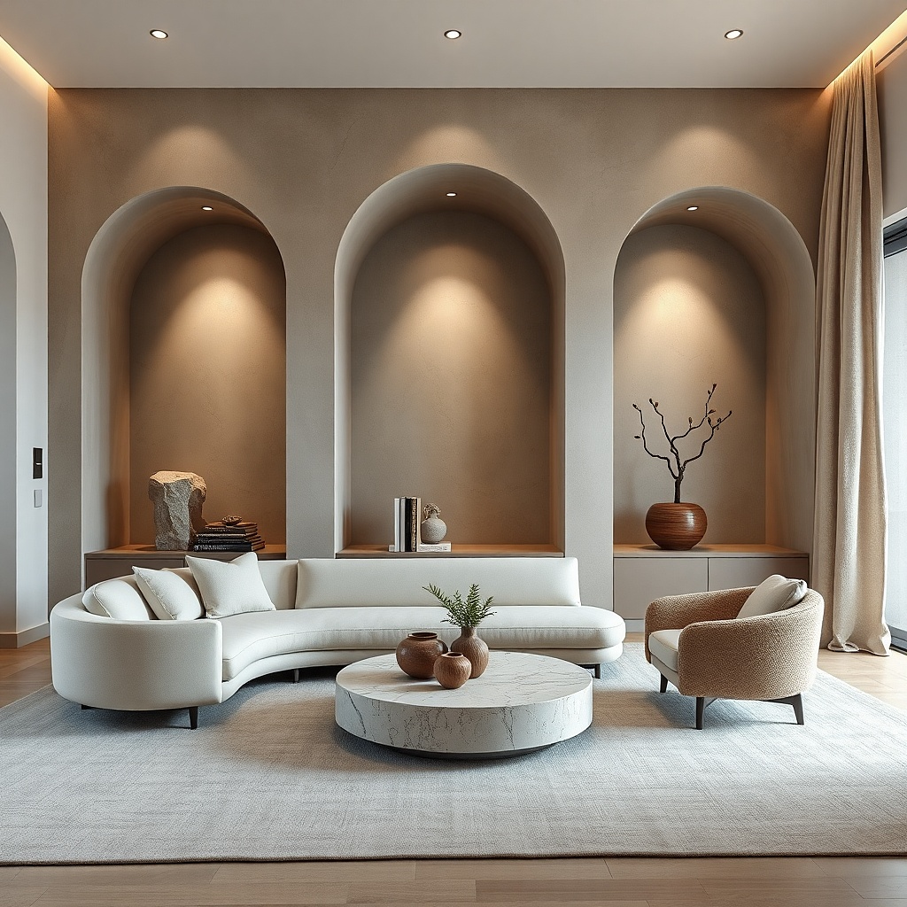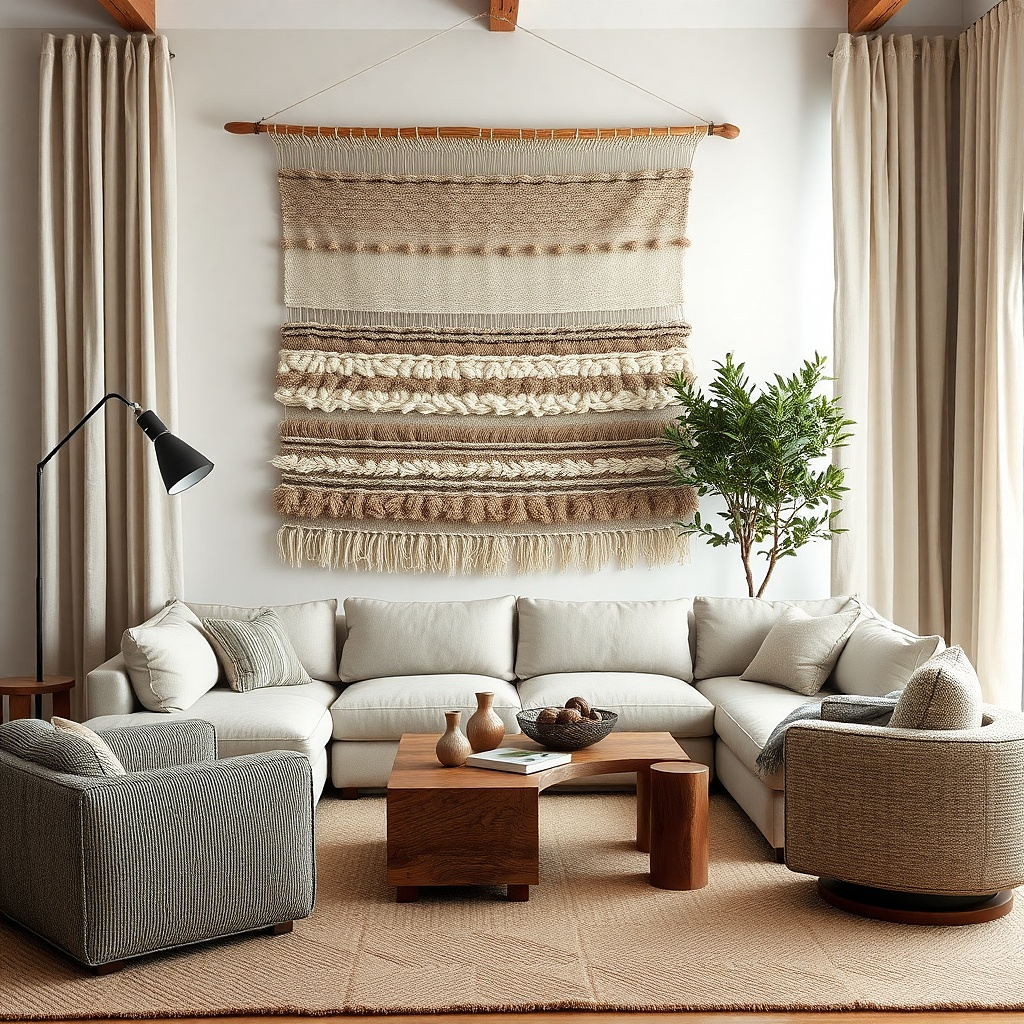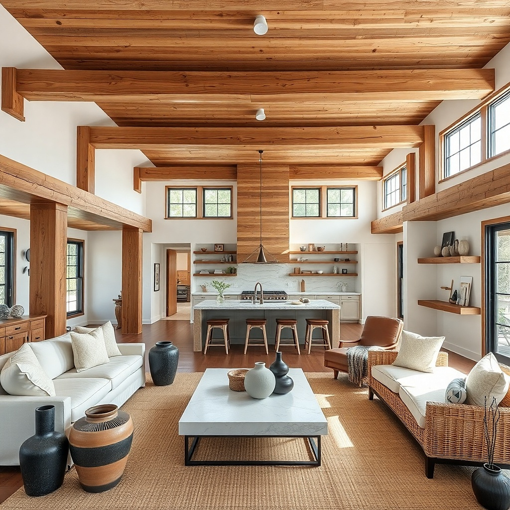
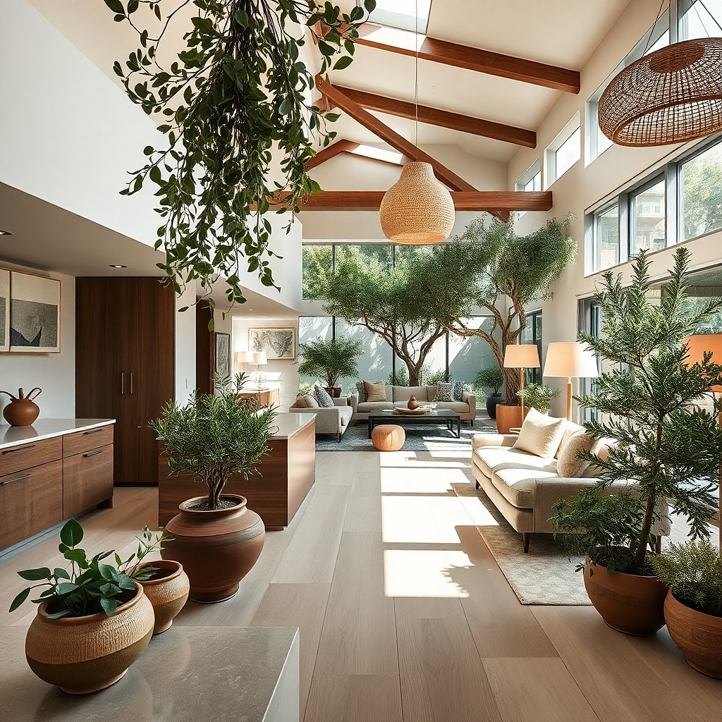
1. Stone-to-coffee-table continuity
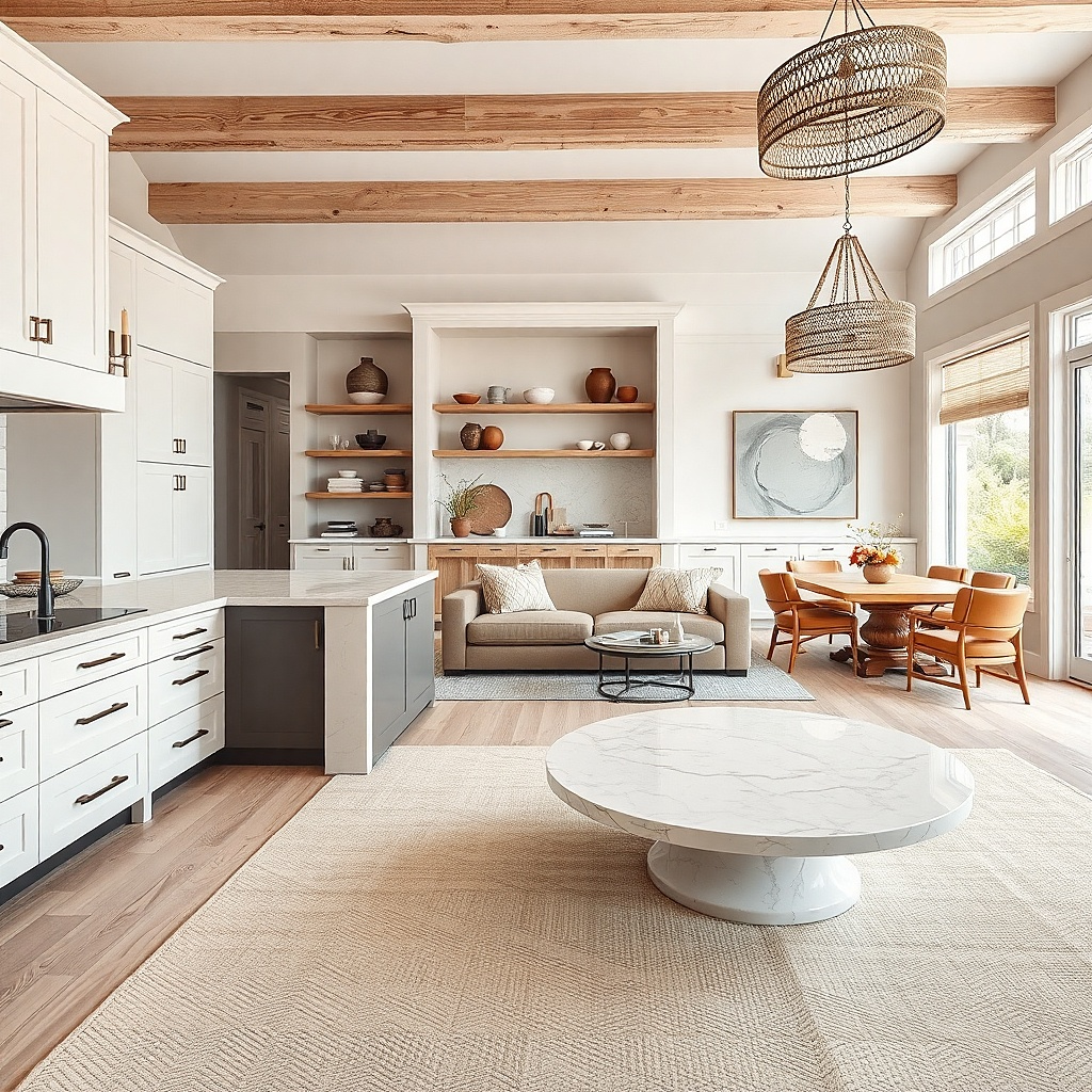
This is the fastest way to make two zones feel like one room. Choose your kitchen countertop material as the “hero” and repeat it in the living room with a coffee table top in the same stone or a close match. Keep the palette neutral around it — think warm white walls, camel or oat textiles, and black or bronze accents. The stone brings a natural pattern that ties visually across the opening, so the living room doesn’t feel like it starts over. It also looks great in photos because stone veining creates texture even when everything else stays simple.
Start by selecting the living room coffee table top material that matches your countertop undertone. If your counters are warm beige with gold veining, pick travertine-look or warm limestone-look; if they’re cool gray, pick marble-look with gray veining. Then style it with two repeated elements: a ceramic bowl in the same warm white as your backsplash and a tray with metal that matches your kitchen hardware. Finally, place the table centered on the rug with at least 14-16 inches between table edge and sofa cushions so it feels airy, not cramped.
Use a light-colored rug with low pile so the stone stays the visual focus instead of competing with thick texture.
Avoid using a countertop-matching coffee table but pairing it with a totally different metal finish everywhere else.
2. Matte black bridge lighting
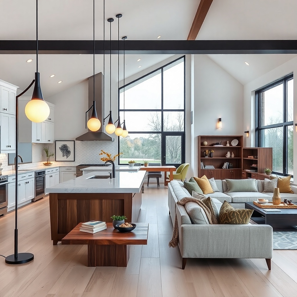
Pick one metal finish family first — matte black or brushed bronze — and commit to it across pendants, sconces, and lamp bases. Install or adjust island pendants so the bottom sits about 30-36 inches above the island countertop. In the living room, choose one or two fixtures that match the pendant silhouette and place them so the light spreads toward the seating area. Then keep shade colors consistent — black, linen, or off-white — and avoid mixing glossy black with brass-toned shades.
Open plans often fail because kitchen lighting looks “tasky” while living room lighting looks “decorative.” Bridge that with matching matte black fixtures — same finish, similar shade shape, and consistent drop height. In practice, hang pendants over the island so their bottoms align roughly with the line of a living room focal light like a wall sconce or floor lamp. Keep bulbs warm (2700K) for a cozy connection at night. The result reads cohesive even when the rooms have different functions.
Common mistakeDon’t mix matte black kitchen pendants with shiny chrome living room lamps; the finish difference reads like separation.
Try thisIf you have a TV wall, consider a matching black picture light or sconce on each side to visually “echo” the island pendants.
3. Rug that lands under the sofa
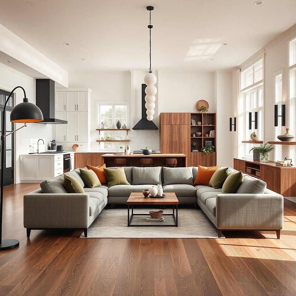
A lot of open-concept rooms feel disconnected because the living room rug is too small. When the rug stops short, the seating group floats, and the kitchen feels like its own separate “world.” Choose an 8x10 or 9x12 rug (depending on your room) and make sure the front legs of your sofa and at least one chair land on it. Then match the rug undertone to kitchen finishes — if your cabinets are creamy white, pick a rug with warm beige; if they’re cool white, pick a rug with gray or greige. This creates a clear visual boundary that still feels open.
Measure from the back edge of your sofa to the farthest point of the seating area you want to include, then choose a rug that extends 6-10 inches beyond each side. Place the rug so the sofa front legs land on it and the rug is centered on the seating conversation. If you have an open kitchen behind, keep rug pattern subtle so it doesn’t fight the kitchen backsplash. Finish by adding two matching throw pillows in rug colors and one solid curtain panel that echoes the rug’s main neutral.
Use a rug pad with grip to prevent shifting; a drifting rug reads sloppy in open plans.
Avoid choosing a rug that only sits under the coffee table — it won’t anchor the living room.
4. Kitchen backsplash repeats in a living room frame
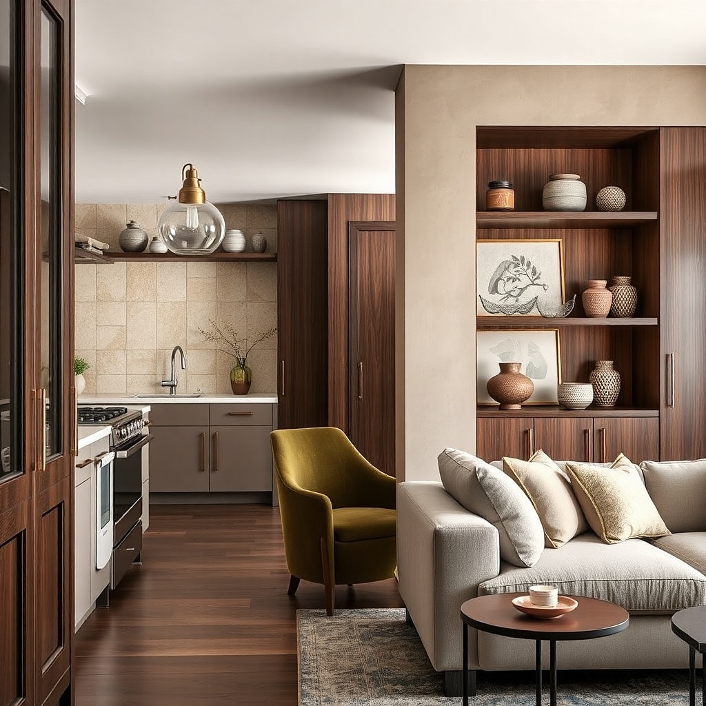
Choose one backsplash tile element you can repeat — the color, the grout tone, or the pattern shape. Then pick one living room item that can carry that element at a similar scale: a small framed tile panel, a side table top with a tile insert, or a console tray with tile edging. Place it where it’s visible from the kitchen — usually near the seating or on a console facing the open doorway. Style around it with plain solids so the tile stays the connection point.
If your kitchen has a distinctive backsplash tile — subway with a specific grout, small hex, or a patterned ceramic — you can use it as the glue without retiling anything. The trick is to repeat the tile in a living room object that has the same scale rhythm. A framed tile insert behind glass, a small tile-topped side table, or even a pair of tile-backed coasters can do the job. When the eye catches the same pattern across the open gap, the whole home reads connected instead of two separate design choices.
Common mistakeAvoid repeating the backsplash pattern in three different living room items; it looks busy instead of cohesive.
Try thisMatch grout color, not just tile color; warm vs cool grout changes how the tile reads.
5. Same wood tone in floors and shelves
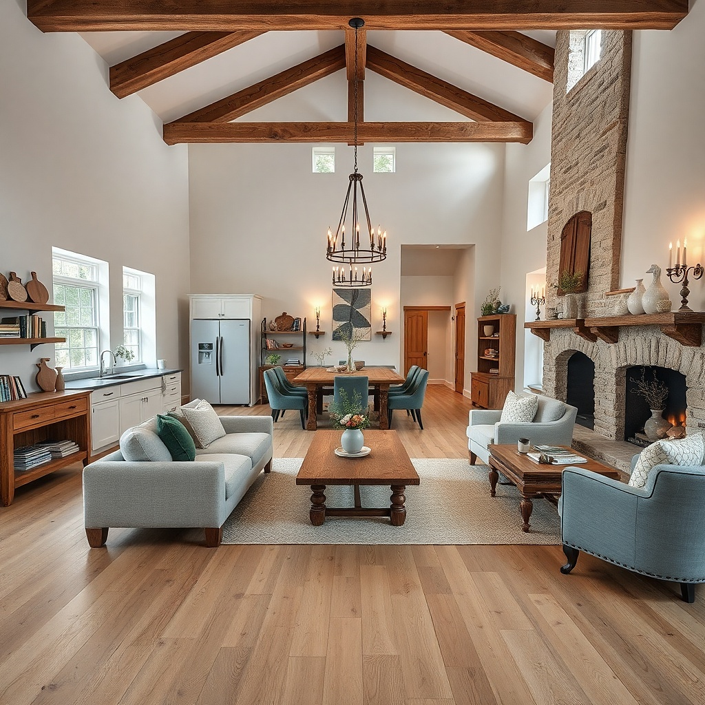
Identify your wood undertone by looking at it in natural daylight. Light oak reads golden and yellow; walnut reads deeper with brown-red undertones; painted cabinets need to be matched by undertone too. Choose a living room shelf or console in the same undertone and keep the finish sheen similar (matte or satin, not glossy). Place the shelf on the living room side where it’s visible from the kitchen and leave at least 6 inches of empty space at the top shelf for breathing room. Style with three vertical elements (books or vases) spaced evenly and one flat object like a tray to anchor the arrangement.
Open plans exaggerate undertone mismatch. If your kitchen has oak-toned floors or warm wood cabinets, bring that exact undertone into living room storage so the eye doesn’t bounce between warm and cool. Use open shelving or a low media console in the same wood family — light oak, natural walnut, or painted white with warm undertones. Then keep the shelf styling disciplined: a few books, one ceramic set, and one tall vase. Wood tone continuity makes the space look calm and intentional, and it shows up clearly in photos because it creates a consistent base layer across the open sight line.
Common mistakeAvoid mixing two wood tones in the living room within the same line of sight.
Try thisIf your floors are warm, don’t pair them with gray-washed shelving; it looks like “floating furniture” in photos.
6. Half-height screen wall with matching trim
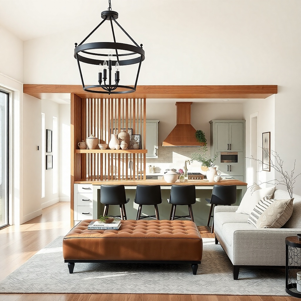
Measure the open gap where you want the separation and choose a divider height around 36-48 inches so it doesn’t block sight lines. Install a freestanding screen or mount a wall-mounted slat panel with matching trim color. Position the divider so it centers between the island edge and the main seating conversation. Then choose a rug that reaches under the seating and place the coffee table centered to the divider for symmetry. Expect cost to range from $200-800 depending on whether you buy a ready-made screen or have a custom slat panel made.
Want the connection without the chaos? Use a half-height screen wall or slatted divider that stops short of full separation. This gives you a clear design “breathing point” while still letting light move and keeping the open feel. Make the divider’s frame match your kitchen trim — same white, same black, or same wood. Then style the living room behind it with a rug and seating that align with the divider’s width. In photos, the screen creates a strong vertical line that ties both zones together and gives you a clean backdrop for decor.
Common mistakeAvoid a tall divider above 60 inches; it starts acting like a wall and fights the open plan.
Try thisUse the same paint color as your kitchen cabinet trim for the frame so the screen disappears visually in daylight.
7. Color-matched cabinetry and media wall
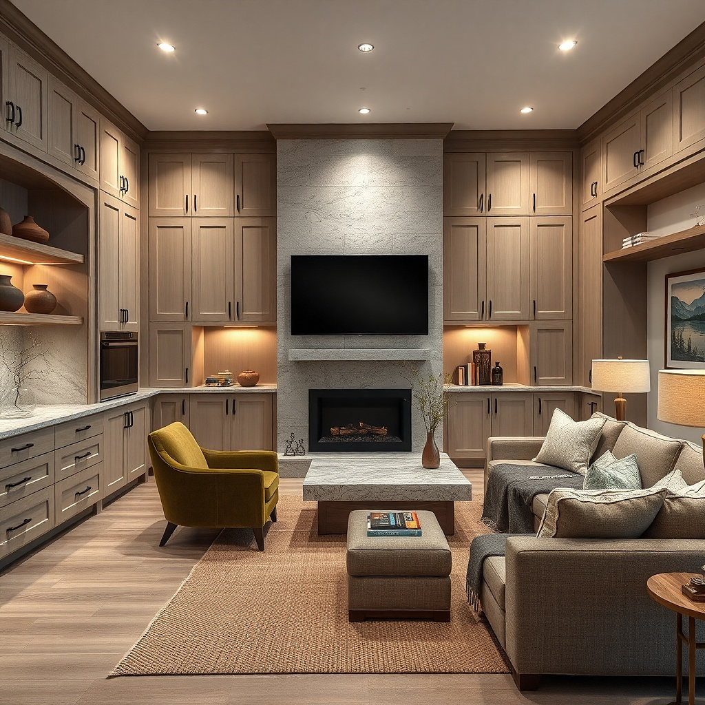
When cabinets are white and the living room has dark furniture, the open plan often looks like a mismatch of eras. The fix is to repeat the cabinet color and hardware finish in your living room media wall. Choose a low console or built-in look in the same white (warm vs cool) and use hardware or metal details that match kitchen pulls. Add one large framed art piece above the console in a color pulled from kitchen countertops or backsplash. This makes the living room feel like it belongs to the kitchen’s architecture.
Find your cabinet color undertone by checking it next to natural light and light from under-cabinet LEDs. Buy or paint a media console in that same undertone and match the hardware finish family (brushed nickel, matte black, or bronze). Mount or place the console centered to your TV with enough clearance for ventilation. Then hang one oversized artwork with a frame that matches the hardware finish and add two matching lamps with the same metal bases. Keep cable management tight; open plans show messy cords fast.
If your kitchen has crown molding or trim, echo that profile on the media wall for a cleaner connection.
Avoid mixing warm white cabinets with a blue-gray “white” console; the undertone clash reads immediately.
8. Island pendant height matches floor lamp
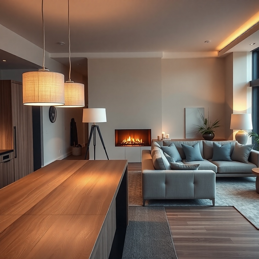
Open plans look connected when the vertical design rhythm matches. If your island has pendants, match their visual height to a floor lamp in the living room so the eye sees one consistent lighting architecture. Choose shades in the same shape family — both linen drum or both tapered — and keep the metal finish consistent. Then place the lamp so it lights the seating conversation, not just the far wall. This is a small adjustment that makes the home feel designed, not assembled.
Measure the island pendant bottom height from the countertop, then pick a floor lamp with a shade size that creates a similar visual height when standing in the living room. In most rooms, pendant bottoms land around 30-36 inches above the countertop; aim for the floor lamp shade bottom around 58-66 inches from the floor depending on your ceiling height. Use 2700K bulbs in both. Finally, place the lamp near a side chair or between two seating pieces so it visually supports the conversation area.
Use dimmers for both zones; matching brightness at night makes the connection feel effortless.
Avoid having pendants that hang too high while the living room lamp hangs too low; the rhythm looks broken.
9. Contemporary sling seating with warm textiles
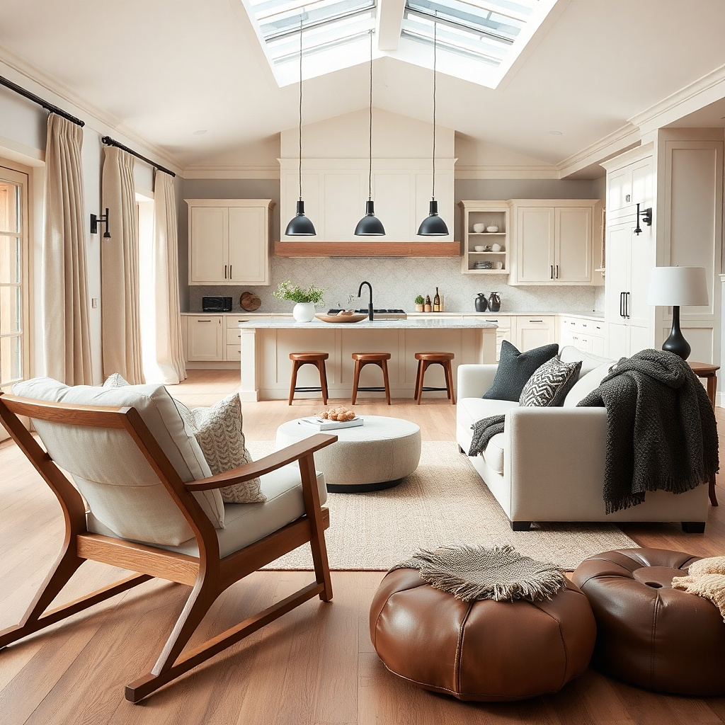
Pick a sofa color first based on kitchen undertone: warm beige, oatmeal, or light greige. Then choose two pillow covers and one throw in different textures but within the same color family. Add a rug that supports the warmth — avoid stark black-and-white patterns if your kitchen is creamy or warm. Place a side table with a stone top or a wood finish that matches your floors. Expect this to be a moderate upgrade if you’re changing textiles only; it’s low-cost compared to replacing furniture.
In open plans, hard-edged modern seating can look cold next to kitchen materials like stone and tile. The connection comes from textile warmth and repeatable neutral tones. Choose a sofa with a clean silhouette (straight arms, simple legs) but dress it in warm textures: boucle throw, linen look cushions, and a woven blanket. Keep the sofa fabric in a neutral that matches your kitchen cabinetry or backsplash undertone. Then repeat one accent color from the kitchen — like sage from a tile, or terracotta from ceramics — in two pillows max. This reads connected because the kitchen’s materials influence the living room’s softness.
Common mistakeAvoid adding five accent colors; open plans amplify color clutter.
Try thisUse pillow sizes like 20x20 plus one 22x22 square to create a layered look that reads intentional in photos.
10. Ceiling-height art rail for the whole wall
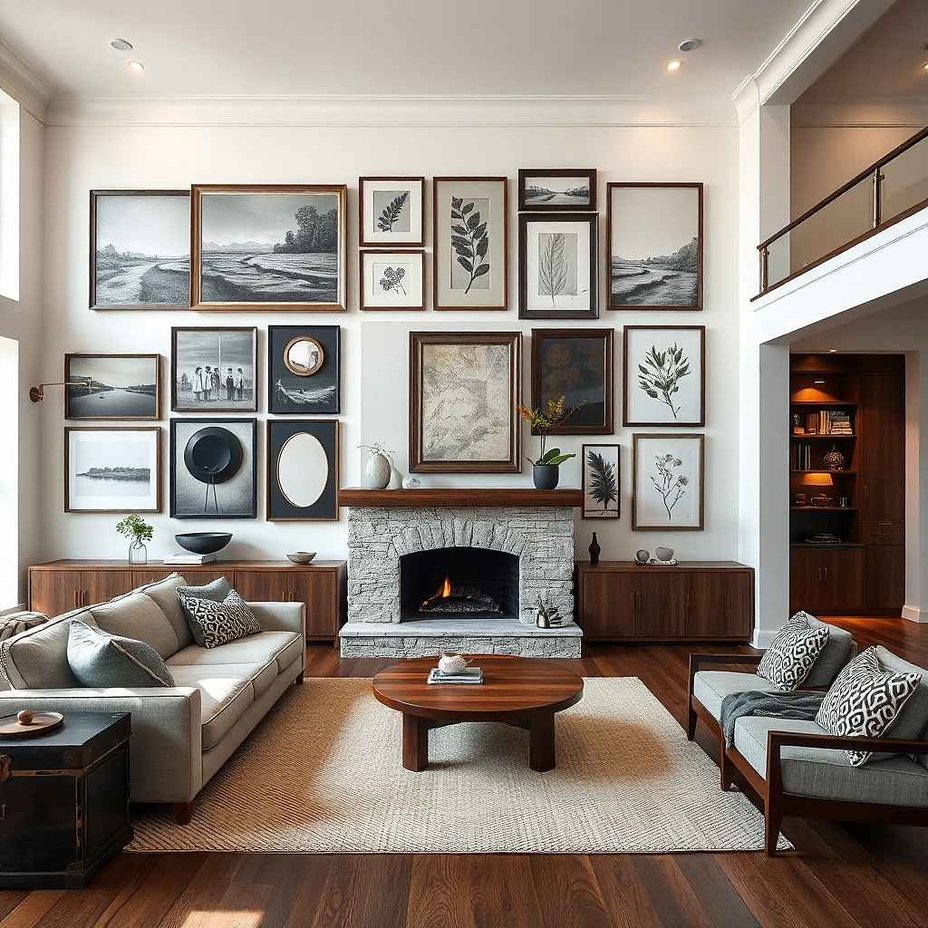
Measure the wall length facing the open kitchen and decide how many frames you want across. Use a consistent frame size for most pieces, then add one larger anchor piece in the center. Install a picture rail or mark a grid so the top edges of frames align at the same height. Keep the gallery centered around eye level and maintain 2-3 inches between frame edges. For materials, choose frames with the same finish and mats in off-white to avoid harsh contrast with warm kitchen lighting.
When your kitchen has a strong upper visual line — like tall uppers or an extended backsplash — the living room wall needs a matching rhythm. A picture rail or a consistent gallery grid gives you that rhythm and ties the open spaces together. Use frames in one finish family (matte black or brushed oak) and keep mat colors consistent. Hang the set so it aligns with the kitchen’s upper cabinetry height line, not just the wall center. The result is cohesive because the wall becomes an extension of the kitchen’s vertical structure.
Common mistakeAvoid mixing frame finishes; two metal finishes in the same open sight line reads like separation.
Try thisUse art that repeats a color from the kitchen — even one small terracotta or charcoal detail counts.
11. Same tile pattern under the rug edge
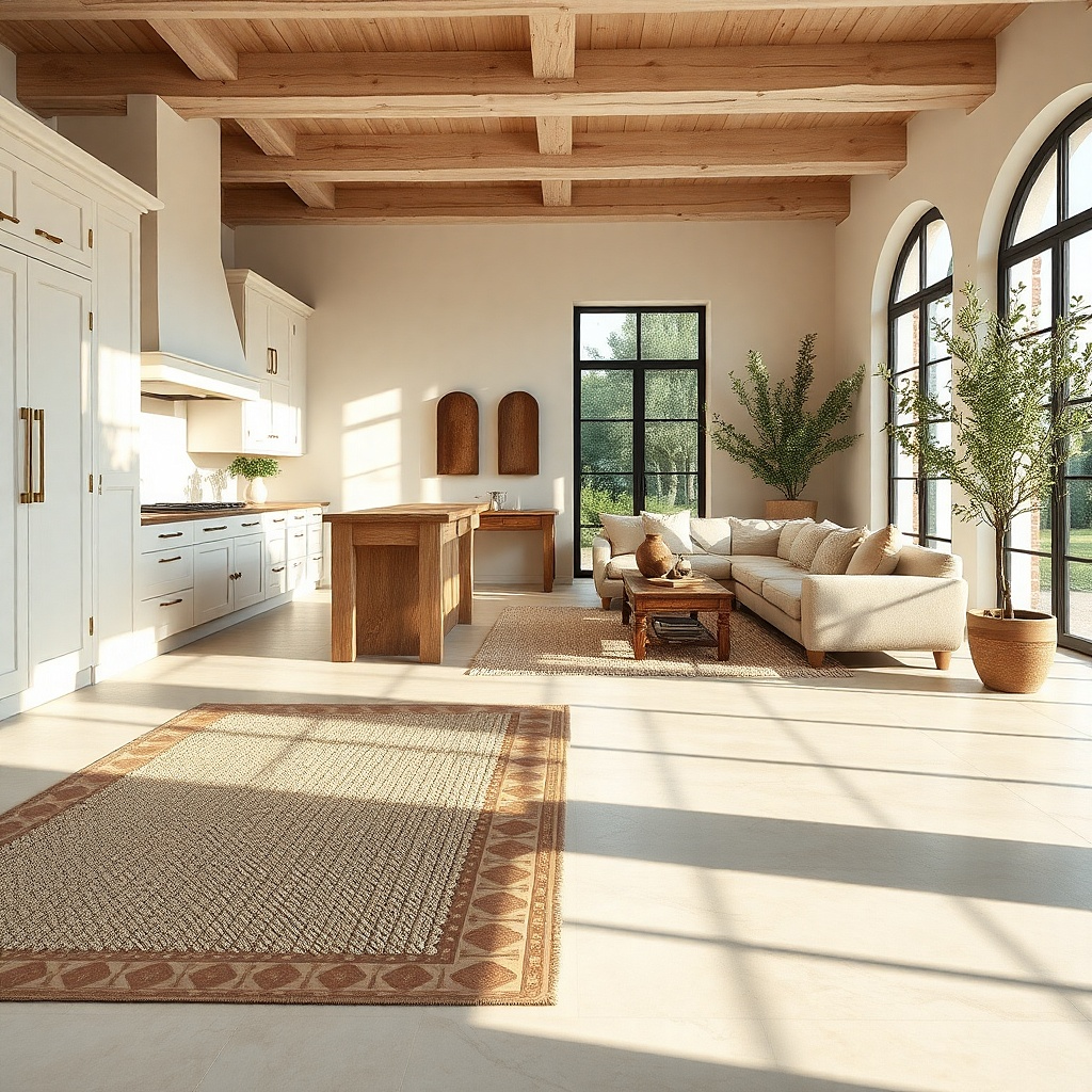
Choose a runner or small rug that includes one element from the kitchen tile pattern — color or shape — but keep it narrower (2-3 feet wide). Place it so it runs from the kitchen threshold toward the front edge of the living room rug, with the runner overlapping the main rug by about 6-10 inches. Secure with a pad to prevent slipping. Style the living room with plain solids and one accent color pulled from the runner. Cost is usually reasonable because you’re buying a smaller rug rather than replacing the main one.
Pattern is a connection tool when you use it as a bridge, not a repeat everywhere. If your kitchen has patterned tile, echo that pattern at the entry edge of the living room with a narrow runner or a small patterned border rug placed where people walk. It visually links the kitchen floor detail to the living room seating area. Keep the main living room rug mostly solid or low-pattern so the bridge pattern doesn’t fight. This makes the whole home feel connected because your feet and eyes both travel through the same design language.
Common mistakeAvoid putting a high-pattern rug as the main rug; keep pattern to the bridge.
Try thisIf your kitchen tile has warm tones, pick a runner with warm grout-like neutrals instead of cool grays.
12. Kitchen countertop color in a bar cart
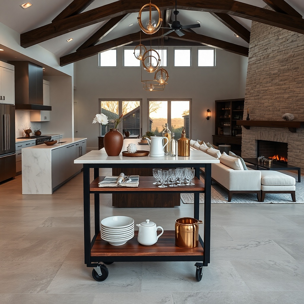
Pick a bar cart with a finish that matches your kitchen hardware metals. Add a removable tray or top that matches your countertop color — stone-look tray for stone counters, or light wood tray for wood tones. Style with 2-3 items: a ceramic pitcher, a stack of napkins in one color, and a small bowl for citrus or coffee pods. Position it near a chair or between seating and the open kitchen entry. Keep the cart width in check so it doesn’t block paths — leave at least 36 inches for walking clearance.
A bar cart looks good, but it also works like a visual translator between kitchen and living room. Use a cart with a tray top in the same color family as your kitchen countertop — stone-look, wood, or a matching solid. Then style it with glassware and ceramics that match your backsplash or cabinet undertones. Place it where it’s visible from both the kitchen and the seating area. The cart creates a moving point of continuity without requiring you to match everything exactly.
Common mistakeAvoid overfilling; open plans show clutter fast and it kills the connection effect.
Try thisUse one repeating ceramic color across the kitchen and living room, like warm white or black speckle.
13. Warm white curtains that stop at the same height
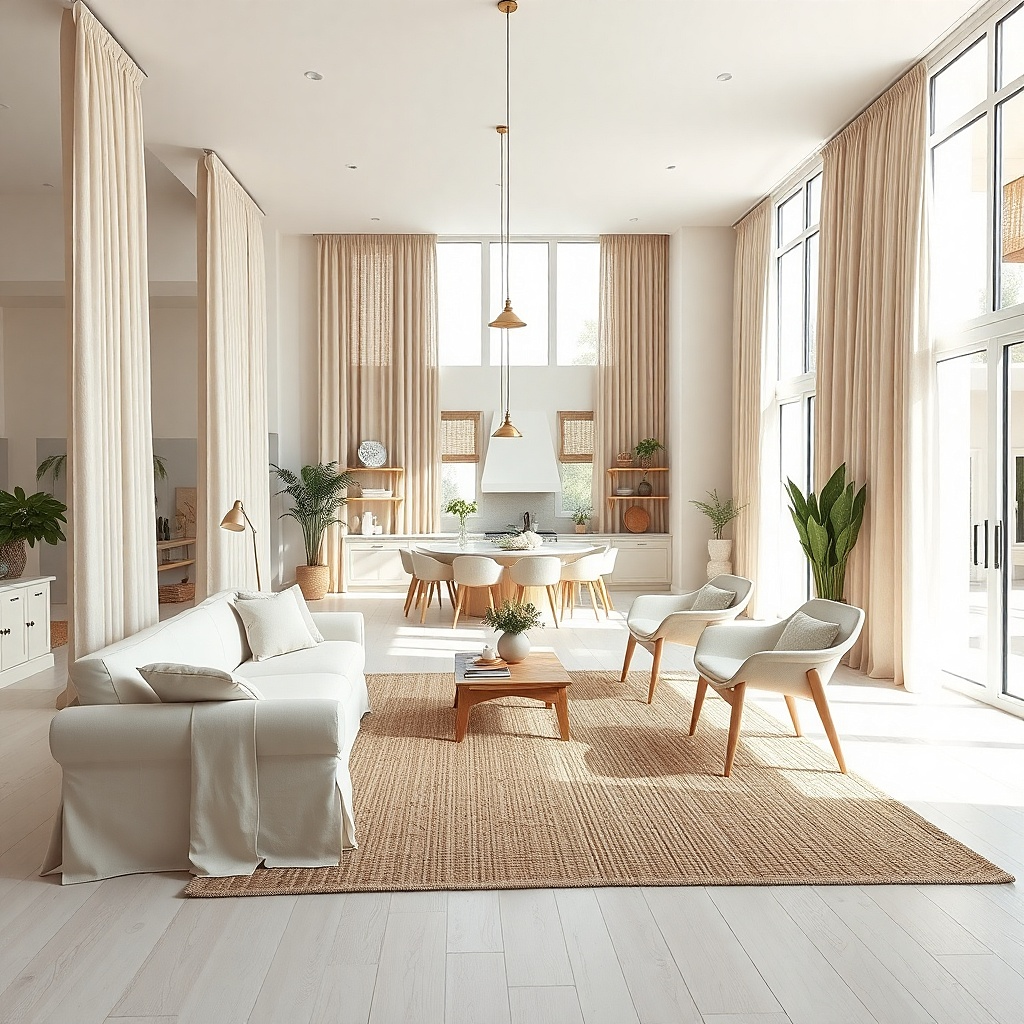
Curtains can unify open plans when they’re treated as architecture, not decoration. If your kitchen has big window areas or the living room windows face the kitchen, match curtain rod height and fabric color so the whole backdrop feels consistent. Use warm white or cream sheers with a matte texture so they don’t look shiny under kitchen LEDs. Then pull the curtain color into your living room textiles — a throw or pillow in the same warm white. This gives a soft visual buffer between zones and makes the open space feel intentional in daylight and at night.
Measure from floor to where you want the rod — aim for 4-6 inches above the window trim and 1-2 inches wider than the window on each side. Choose a warm white or cream sheer with a matte weave and hang it so it kisses the floor without pooling. If you have multiple windows facing the open area, keep the rods at the same height across rooms. Tie in one accent: a cushion cover or a small ceramic in the same warm white tone. Install blackout panels only if you need them; otherwise keep it airy with sheers.
Use curtain rings or clips that keep fabric from bunching; straight drape reads cleaner in photos.
Avoid cool gray curtains with warm white cabinets; undertone mismatch shows immediately.
14. Corner shelving that tracks the island edge
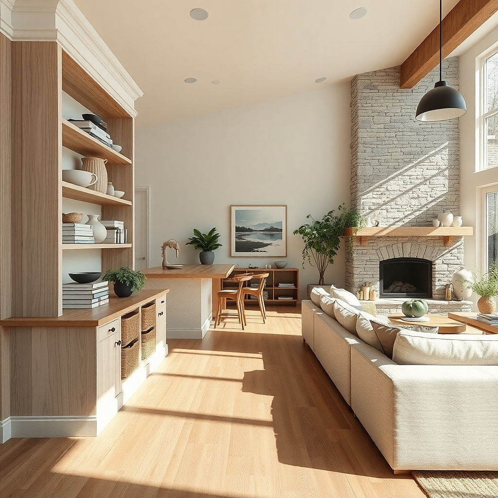
Open plans need “visual choreography.” Corner shelving can create it when you align the shelf’s vertical line with the island edge or the main kitchen opening. This gives the eye a planned path instead of random furniture edges. Choose shelves in the same metal finish as your kitchen hardware or the same wood tone as your floors. Style with a small set of repeating objects: three vases, a stack of books all the same color family, and one framed print. The shelves become a bridge that reads connected because their line matches the kitchen’s main geometry.
Locate the main sight line from the kitchen into the living room — usually from the island or sink area. Place the corner shelf so one of its vertical edges aligns with that line. Choose a shelf depth around 10-12 inches so it doesn’t feel bulky in an open plan. Install with a stud finder and use wall anchors for safety. Style with 70% neutral ceramics and books; keep one accent color repeated twice. Cost depends on whether you buy ready-made shelving or build; ready-made units are usually the best route for speed.
Keep shelf back panels light (white or natural wood) so the display doesn’t darken the open room.
Avoid mixing too many small decor items; open plans make shelf clutter look chaotic.
15. Monochrome seating with one strong texture
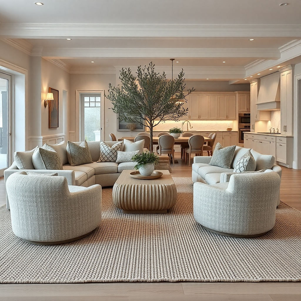
Choose a neutral family like warm white, oat, or soft greige and stick to it in furniture and main textiles. Pick one texture material to lead — boucle for softness or a loop pile for a cozy look — and keep the rest smoother. Match your lighting metals to the kitchen hardware and keep lamp shades in one tone. Choose a rug in the same neutral family with either subtle texture or a low-contrast pattern. Style with 3-5 items max on surfaces so the monochrome doesn’t become blank.
You can connect living room and kitchen with a monochrome seating palette, then add one strong texture that reads across the open distance. If your kitchen is mostly light — white cabinets, pale stone, light tile — pick a living room sofa and chairs in shades of the same neutral family. Then choose one texture to carry the visual interest: boucle, ribbed knit, or a thick woven rug. Pull a small metal accent from the kitchen hardware into lamp bases or frames. This approach works because it reduces visual noise and makes the open plan feel calm and cohesive.
Common mistakeAvoid full monochrome with identical textures everywhere; it can look flat and sterile.
Try thisUse one accent color in a single spot, like a charcoal vase, to keep the connection without adding clutter.
16. Counter-height bar in the living room
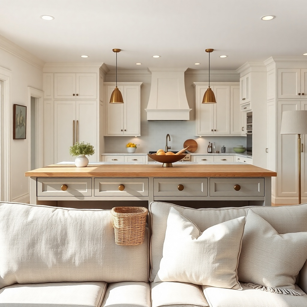
Choose a console height around 34-36 inches to match typical counter height. Match the surface finish to the kitchen countertop — stone-look laminate or real stone is fine. Place the console where the kitchen opening visually meets the living room side — often along a wall facing the seating. Add two stools with enough clearance: leave about 36 inches between stool footrests and the nearest seating edge. Style the top with a tray and two repeating objects; keep it clean so it doesn’t look like storage.
If your kitchen island is the visual center, bring that same height into the living room with a counter-height console. This makes the zones feel like they share a single “social” area rather than one being purely functional. Use a console with a countertop surface that echoes the kitchen — same stone look or same color family. Add two stools that match the kitchen’s dining vibe and place a small tray with ceramics. The counter-height element creates a clear connection line in an open plan and looks great in wide-angle photos because it frames the seating area.
Common mistakeAvoid placing a bar-height console directly in the main walking path; open plans punish narrow clearances.
Try thisUse bar-height lighting above the console if you have ceiling space; it visually ties it to the kitchen island pendants.
17. Large-format artwork sized to the open wall
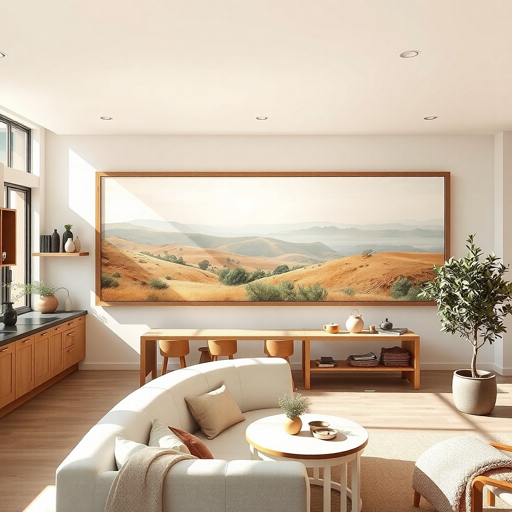
Measure the wall width above your sofa. Choose artwork so it spans about 2/3 to 3/4 of the sofa width and keep the bottom edge around 8-10 inches above the sofa back. Use a frame with a finish that matches your kitchen hardware metals. Hang it centered and level. For cost, prints and frames are usually cheaper than rearranging furniture; aim for one piece rather than five.
Small, scattered art pieces can make an open plan feel like it’s missing structure. Instead, use one large-format artwork sized to the living room seating wall and pick colors that echo the kitchen. If your kitchen has teal or warm terracotta accents, include those tones in the artwork so the open gap feels tied. Keep the frame finish consistent with kitchen hardware or lighting metals. Large art reads clean in photos and gives the eye a stable landing spot while looking across the open kitchen.
Common mistakeAvoid hanging multiple small pieces too low; it makes the living room feel chopped up against the kitchen.
Try thisIf your kitchen backsplash has a pattern, choose artwork with one repeated color and a calmer background so the connection feels intentional.
18. Matte white + natural rattan warmth
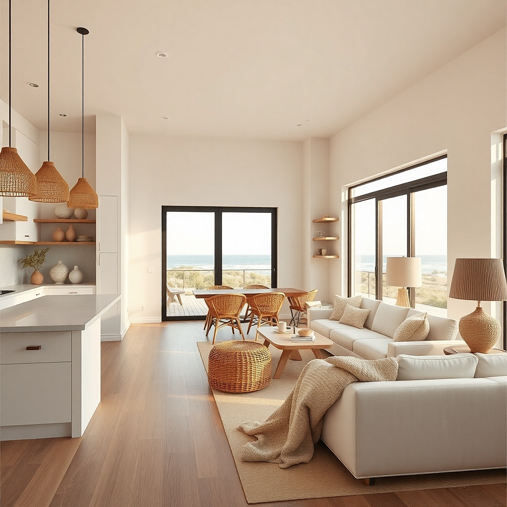
Choose one living room rattan piece with a clean silhouette — a rattan side chair or a woven pendant shade. Make sure the rattan color matches your wood undertone: warm honey rattan for warm oak, lighter natural rattan for cooler wood tones. Place it near the open kitchen side so it’s visible from the kitchen. Then add one woven basket for blankets and a neutral rug with a low pile. Finish by using a matching metal finish in the lamp base so it doesn’t compete with kitchen hardware.
When kitchens are bright and clean, living rooms can feel stark unless you add warmth. Rattan and woven textures connect because they look natural alongside wood and stone. Pair matte white furniture details (or white-painted frames) with natural rattan accents like a chair, a basket, or a lamp shade. Then repeat one kitchen element in color — like the undertone of your cabinets or the warmth of your countertop. Keep textiles neutral and let the rattan be the texture star. This gives you a connected, airy look that still feels human.
Common mistakeAvoid adding rattan in five places; one hero piece plus a basket looks designed.
Try thisUse rattan with matte white or soft beige, not glossy black — glossy finishes make rattan look heavy in open plans.
19. Kitchen island color in a low media cabinet
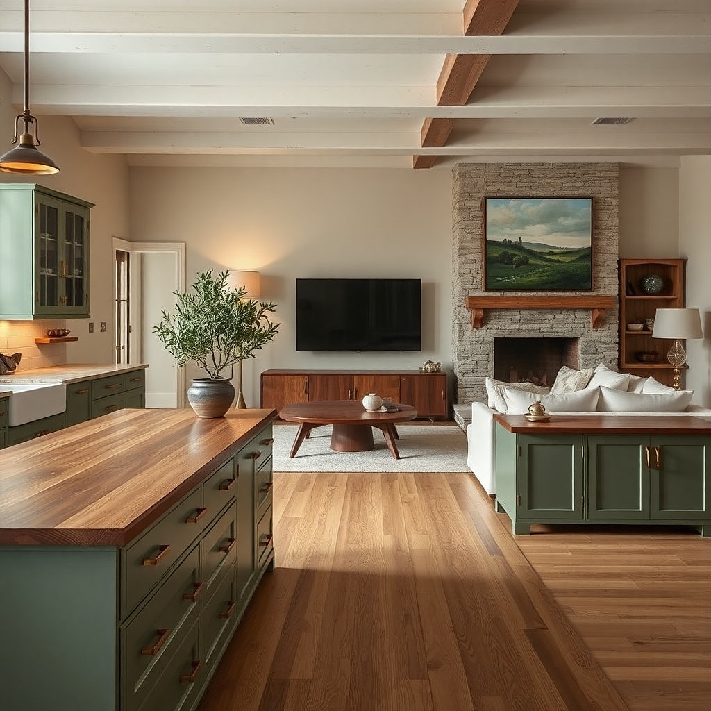
Find your island color and decide whether it’s paint or stain. Buy or paint a living room console in the same color family and keep sheen consistent (matte paint for matte islands). Place the console on the living room wall opposite the kitchen opening or where it’s visible from the island. Then match hardware finish with kitchen pulls and add a single large artwork above or beside it. Leave 2-4 inches of wall breathing space on the sides so it doesn’t feel like a box.
If your kitchen island is a different color than the perimeter cabinets, repeat that island color in the living room with a low media cabinet or console. This is a direct visual handshake: the island color becomes the thread between zones. Choose a cabinet finish that matches the island paint or wood stain and keep the hardware finish consistent. Style it with a pair of tall vases and one larger framed print that includes a countertop or backsplash color. In an open plan, this makes the room feel intentional because the eye sees one continuous color story.
Common mistakeAvoid repeating island color in curtains and rugs at the same time; it can overpower the living room.
Try thisIf your island is darker, keep the living room rug lighter to avoid a heavy block across the open plan.
20. Warm metal gallery mirrors aligned to kitchen windows
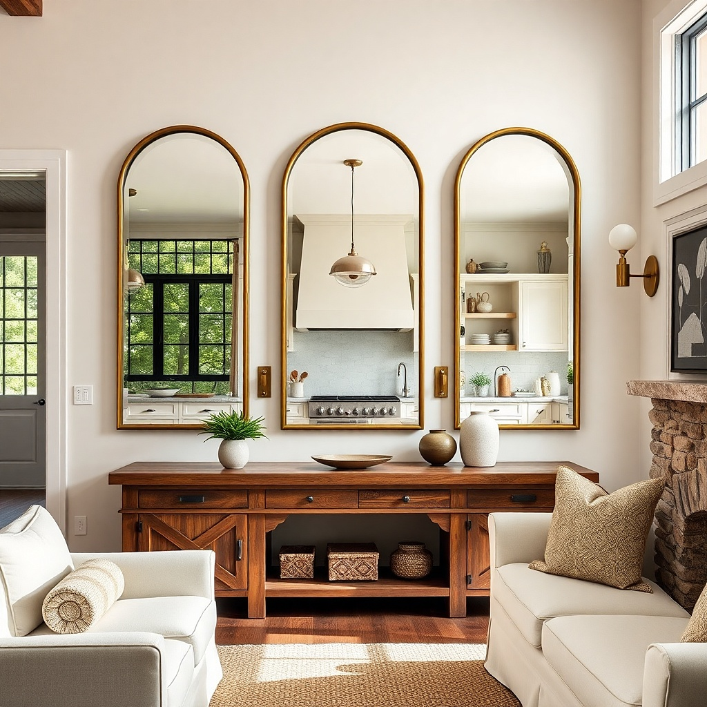
Choose a mirror frame finish that matches kitchen hardware and pick a shape that fits your room — arched for softer spaces, rectangular for modern. Hang it so the center is about 58-64 inches from the floor and align it with the kitchen window line if possible. Place it on the living room wall visible from the kitchen so it reflects back. Style beneath with a narrow console and keep decor minimal: one vase and one tray. Use anti-tip hardware for safety if you have kids.
Mirrors connect open rooms by reflecting the kitchen’s light and materials back into the living room. Use a mirror with a warm metal frame that matches your kitchen hardware — brass or bronze — and hang it so it catches daylight from kitchen windows or pendant light. Keep the mirror size large enough to matter: around 30-40 inches wide for most living rooms. Then style the console or wall beneath with one repeating material like stone or wood. In photos, mirrors brighten and create a sense of depth that makes the open concept feel seamless.
Common mistakeAvoid silver cool mirrors with warm brass hardware; the finish mismatch reads like separation.
Try thisUse a dimmable warm bulb in nearby lamps so the mirror doesn’t look harsh at night.
21. Textile repeat with kitchen bar stools
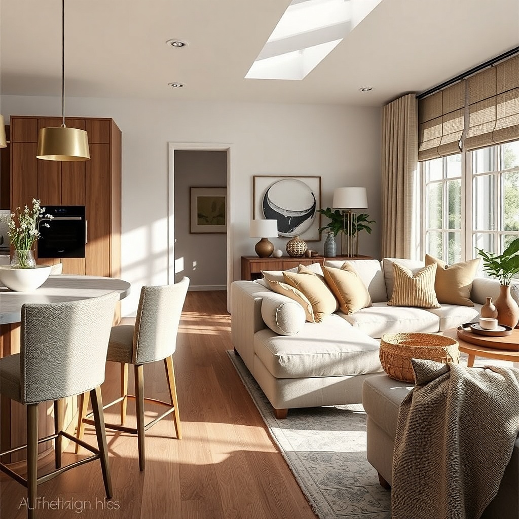
Identify the dominant color on your bar stools — seat fabric, not the metal base. Buy pillow covers in the same color family and similar texture, ideally one size 20x20 and one 22x22. Add a small accent rug or runner in a matching tone near the seating entry. Keep other accents neutral so the repeated textile becomes the connection. If your stools are patterned, repeat only the dominant color and keep pillows solid.
If your kitchen has bar stools, you already have a big textile presence in the open plan. Repeat that stool fabric color in the living room through throw pillows or a small accent rug. This makes the connection feel natural because the eye recognizes the same color and texture across distance. Choose a fabric that takes light well — boucle, linen, or a tightly woven neutral — and keep it consistent rather than matching only color. The living room then feels like it belongs to the kitchen’s seating style.
Common mistakeAvoid repeating the stool pattern in multiple living room textiles; it becomes busy fast.
Try thisMatch the pillow undertone to the stool fabric, not the wall paint; fabric undertones show more under warm lighting.
22. Two-tone ceiling color to guide the zones
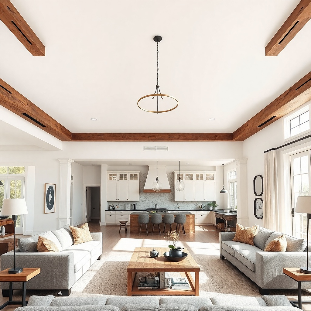
Ceilings are a hidden connector in open plans. Add a subtle two-tone ceiling treatment so the living room area feels visually framed while still open to the kitchen. Use a slightly deeper shade for the perimeter or a simple ceiling border, then keep the main ceiling a soft warm white. This creates a gentle “room within a room” effect without building walls. It also improves photos because ceiling contrast guides the eye and makes lighting look intentional.
Choose your main ceiling paint as a warm white and pick a second shade that is one step deeper for the border or perimeter. Mask and cut clean lines with painter’s tape and a level — ceiling lines show mistakes. Paint the border first, then the main ceiling to avoid bleed issues. Install or keep lighting aligned within the framed area so the eye follows the contrast. For cost, expect paint and supplies; if you’re hiring out, labor is the biggest line item.
Keep the border width subtle — around 6-10 inches — so it frames without shrinking the open plan.
Avoid high-contrast ceiling colors; they can make the open space feel segmented.
23. Kitchen hardware finish repeated in living room hardware
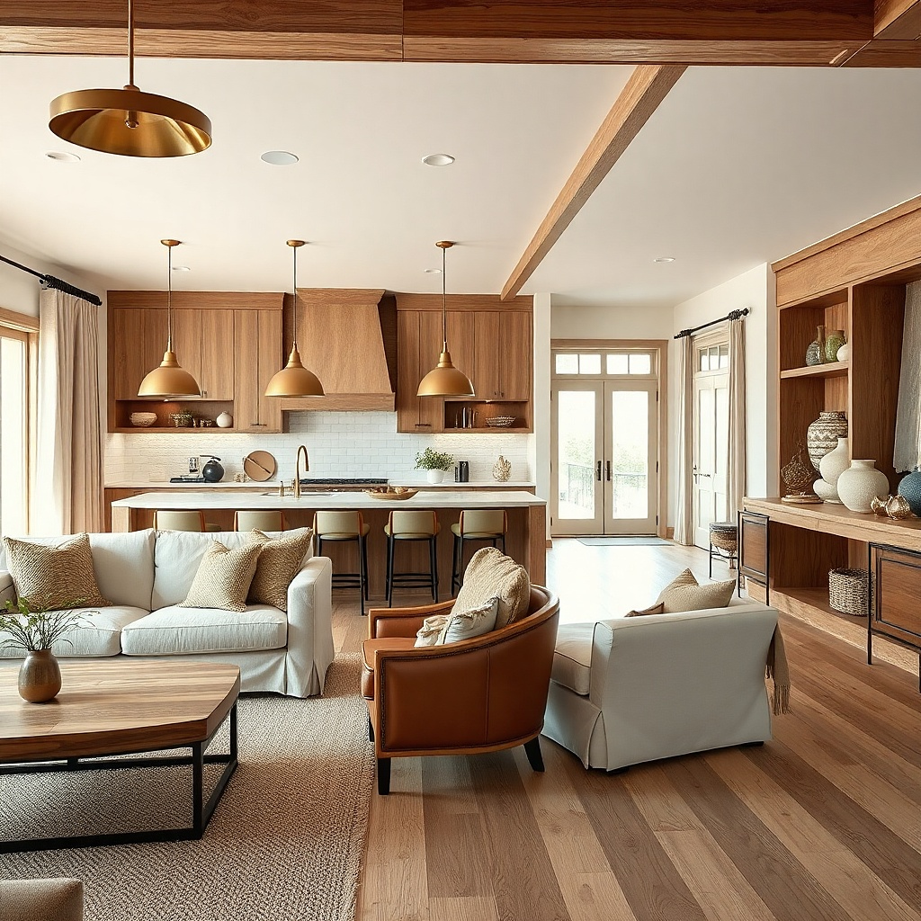
List your kitchen metal finish: brushed nickel, matte black, or bronze. Then scan your living room for metal elements you can control — frames, lamp bases, console legs, curtain rods, and any baskets with metal handles. Replace or swap the most visible ones first. If you’re shopping, use the finish family name and look at sheen in daylight. Finally, choose one or two accent metals at most; too many finishes break the connection.
This is the boring fix that works because it’s specific. If your kitchen cabinet pulls are brushed nickel, use brushed nickel in the living room where you have hardware: media console legs, lamp bases, picture frame corners, and even door pulls on any storage. The connection comes from one finish family repeated consistently, not from random decor. In open plans, metal is one of the first things your eye notices across distance. When the finish matches, the rooms look like they belong to the same design system.
Common mistakeAvoid mixing matte black and oil-rubbed bronze in the same open sight line.
Try thisIf you have matte black in the kitchen, go matte black for light switches and outlet covers too where possible.
24. Ceiling-height bookshelves that "thread" the kitchen into the living room
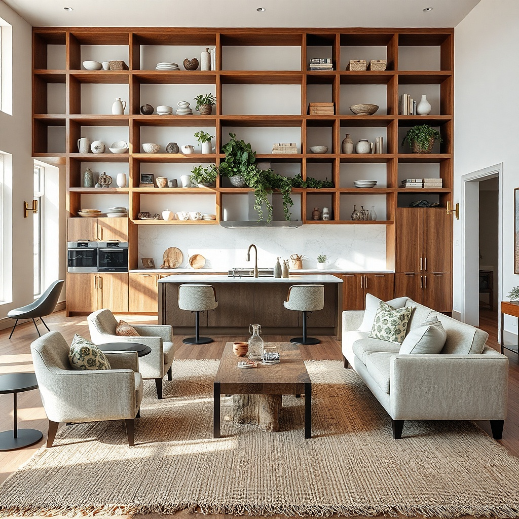
1) Measure the opening width where the zones meet and plan the bookshelf to sit on that line, not floating off it. Aim for shelves that reach the ceiling or leave a tight 1-2 inch shadow gap; typical depth is 10-12 inches so books and decor read cleanly without swallowing the room. 2) Choose a single material family for the carcass (oak veneer, white oak, or painted plywood) and match the face trim to your existing millwork or cabinet color. Install the backer first, then anchor the unit to studs; add a top trim strip that matches your ceiling line so the bookshelf looks intentional from every angle. 3) Style in bands: put heavier items like stacked books and small baskets at the bottom, then keep the middle third lighter with one repeating object per shelf run. Add two small table lamps or plug-in wall sconces on the living side with the same shade color you use elsewhere (warm white linen shades work well). Budget is usually $800-$2,500 for a ready-to-assemble unit plus $150-$500 for trim/paint and $200-$600 for mounting hardware.
A ceiling-height bookshelf wall creates connection without turning the space into one big glare box. It visually links the kitchen and living room because it runs through the same sightline and repeats the same vertical rhythm across both zones. Use the bookshelf as a divider only where you need it — at the edge of the kitchen opening or along the back of the living area — so conversation and sightlines still travel. Pick a finish that matches something already in the room, like your floor tone or the media wall trim, and keep the hardware consistent. For a connected look, style the shelves with the same palette you see in the kitchen — warm neutrals, stone tones, and one metal finish — so both spaces feel like one interior, not two rooms glued together.
Common mistakeAvoid mixing shelf finishes (like oak shelves with black cabinet trim) because it breaks the connection faster than any color mismatch.
Try thisUse one repeated vertical object across both zones, like the same ceramic vase color or the same framed print size, so the bookshelf styling reads like part of the kitchen story.