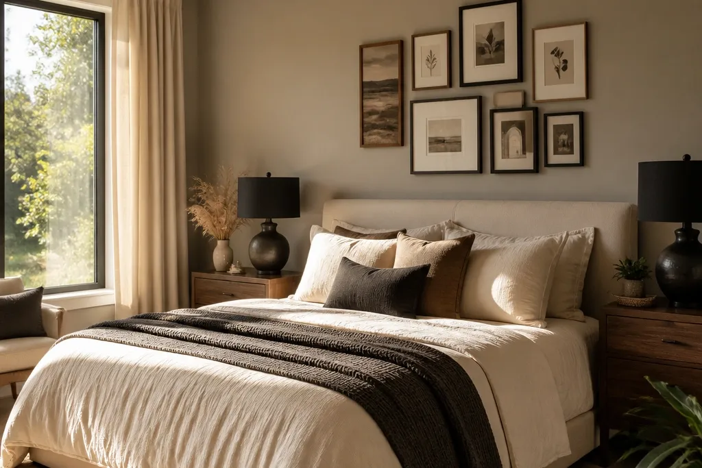
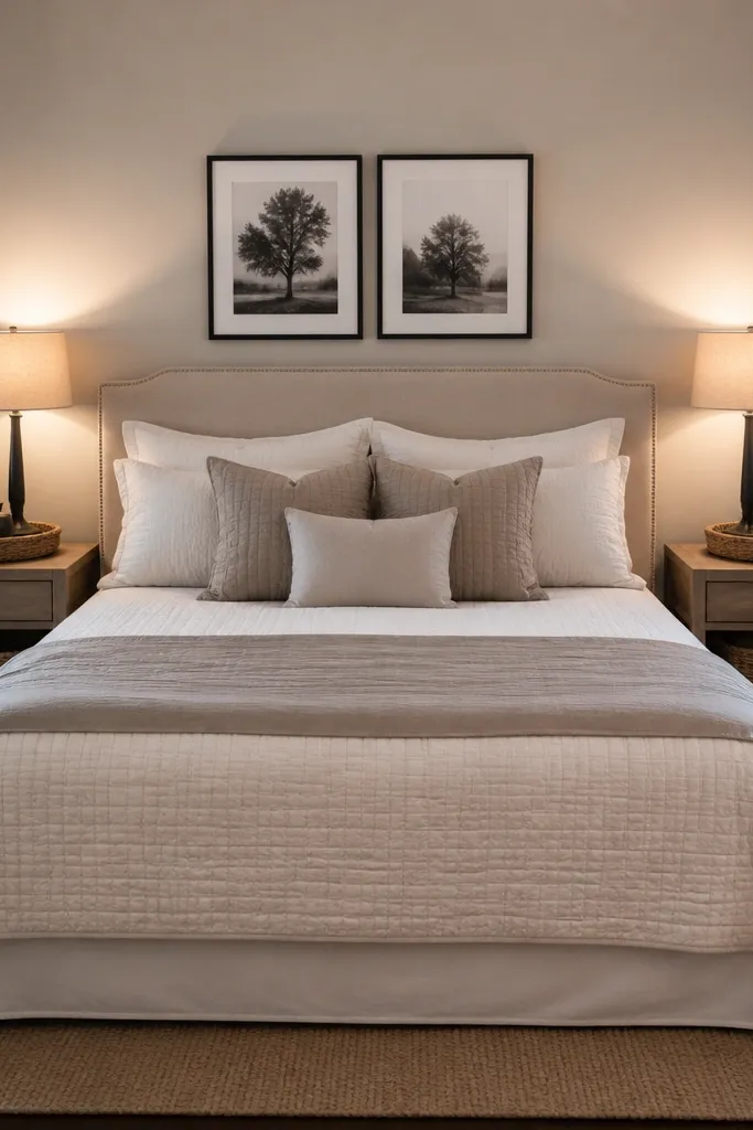
1. Soft Greige Bed + Two Different Nightstands (Same Height)
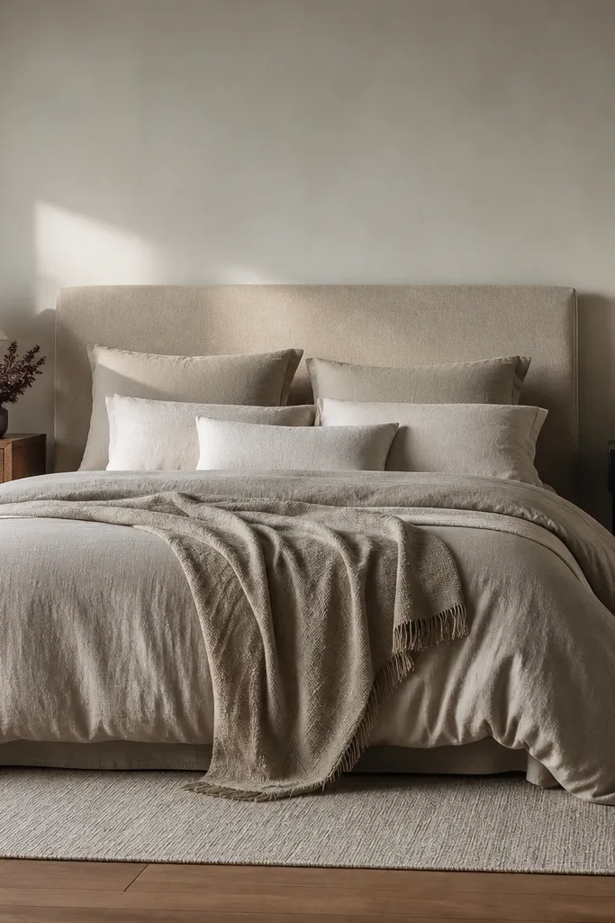
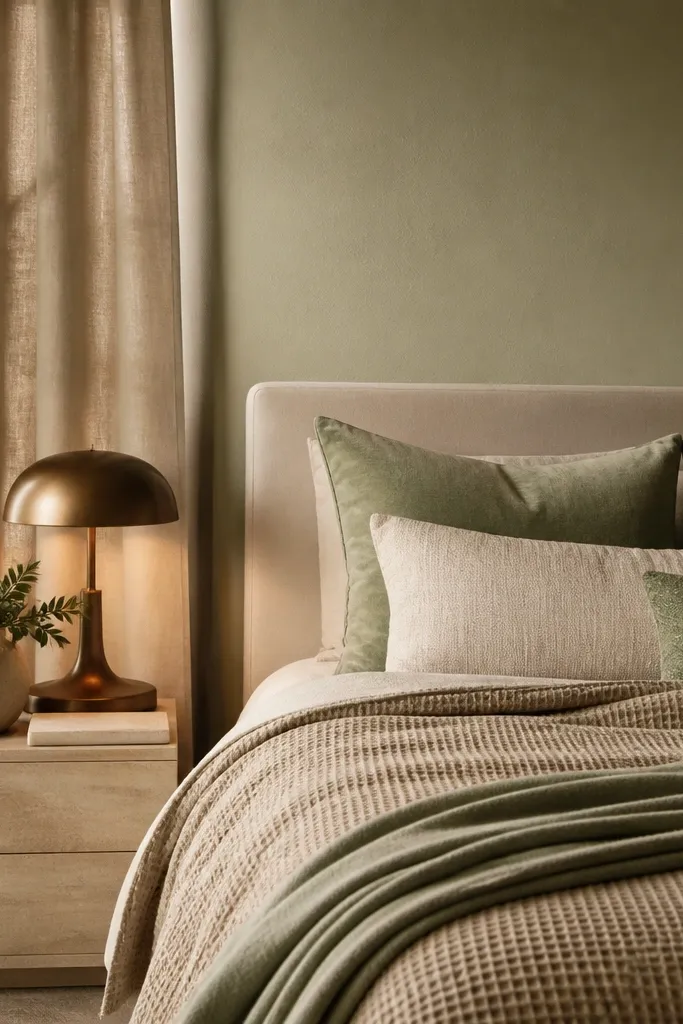
Start with a greige duvet cover and pillowcases in a matte cotton or cotton-linen blend. The greige gives you a neutral base that doesn’t fight either partner’s taste, and it looks clean in daylight and warm at night. Use two nightstands that match in height and finish family, even if the shape differs — like one slimmer drawer unit and one open-shelf cabinet. Add two matching lamps with matte ceramic or frosted glass shades to keep the room feeling “together.” This setup solves the common couples problem where one side looks intentional and the other looks unfinished.
Measure from the floor to where you want the lamp shade top to sit, then buy or adjust nightstands so both lamps land within 2 inches of each other. Choose a duvet in soft greige and add a second layer: a throw blanket in oatmeal or sand with visible weave. Finish by placing two lamps with the same shade color and shape, then center a single art piece above the bed so the wall looks planned.
Try thisIf your nightstands are different, make them match in tone: both should be either warm oak or both should be espresso, not one of each.
Common mistakeAvoid mismatched lamp heights; it makes the room look accidentally staged.
2. Navy + Warm White Stripe Bedding With Brass-Trim Lamps
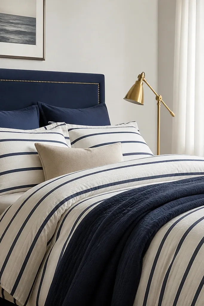
A navy and warm white stripe reads crisp without feeling harsh, and it’s one of the few patterns that stays flattering for both traditional and modern tastes. Pair it with warm white curtains in a linen-look fabric so the stripes don’t feel too bold. Add lamps with brass trim or brass bases, but keep the shades white or cream and matte. The contrast between navy depth and warm whites creates a balanced photo even with budget-friendly pieces. It fixes the “our styles clash” issue because you’re using one strong color story instead of mixing multiple prints.
Pick a duvet with navy stripes where the stripe thickness is medium, not tiny pinstripes. Install curtains so they puddle slightly or hit near the floor with a soft break, then place two lamps that share the same shade size. Hang a single piece of wall art above the bed that repeats navy or cream tones, keeping the palette to two colors plus wood warmth.
Use one patterned element only the bedding. Everything else should be solid-toned or lightly textured.
Avoid adding a second busy pattern (like geometric pillow covers) right next to striped bedding.
3. All-White Bedding With One Charcoal Accent Pillow Pair
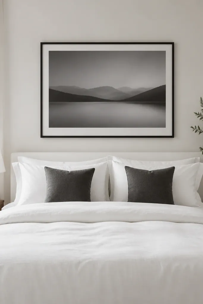
This look is for couples who want calm, hotel-like photos. Use an all-white duvet in a fabric that doesn’t look shiny, like cotton or cotton-sateen with a soft sheen. Add two charcoal accent pillows, ideally with a subtle texture like a woven cover or a matte velvet. Then bring charcoal into the room with a framed print above the bed and a charcoal lamp base on both sides. The room stays balanced because you’re repeating charcoal exactly twice pillows and frames not scattering it everywhere. It solves the budget trap where people buy too many small decor items instead of making one clean statement.
Wash and press the duvet cover if it wrinkles easily; crisp bedding reads expensive. Place two charcoal pillows symmetrically at the headboard side, then keep the rest of the pillows white. Choose matching frames above the bed or one large centered frame; keep the frame color charcoal or black. Finish with two matching table lamps or wall sconces in white or neutral shades.
Try thisAdd one textured throw in cream chunky knit folded at the foot it shows up beautifully in photos without adding color.
Common mistakeAvoid stark, high-gloss white bedding; it looks cheap under warm bulbs.
4. Two-Tone Curtains That Tie Into the Rug
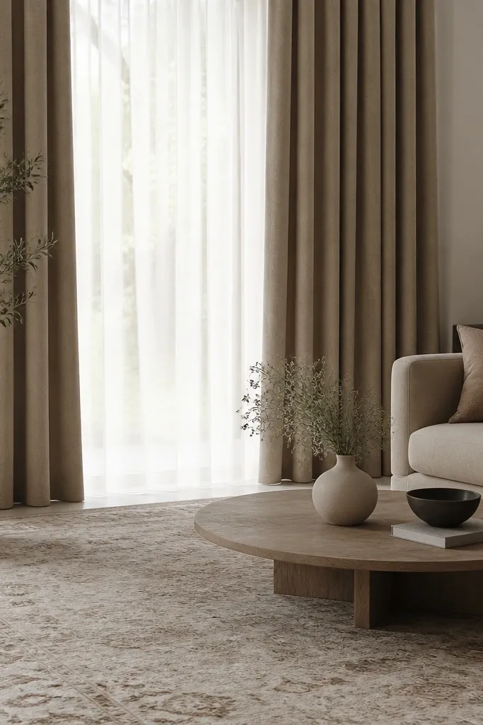
If you already own a patterned rug, use it as your color translator. Choose curtains with two-tone neutrals that echo the rug’s dominant beige/taupe and one deeper shade. Keep the bedding in a solid warm white or pale oatmeal so the rug doesn’t fight the bed. This look is aesthetic because the eye reads one continuous palette from floor to ceiling. For couples, it’s a practical compromise: the rug stays the “shared” element, and everything else can be toned to it.
Find the rug’s two strongest colors and write them down. Buy curtain panels in a fabric that drapes well (linen-look or cotton blend), and aim for a width that gives 2 to 2.5 times fullness over the window. Set the rod height 4-6 inches above the window frame for a taller look, then match bedding to the lighter rug tone.
Use curtain rings or clips in a matte finish that matches your lamp base color.
Avoid curtains that are too narrow; thin curtains make the room look unfinished.
5. Textured Stonewall Accent Using Peel-and-Stick Panels
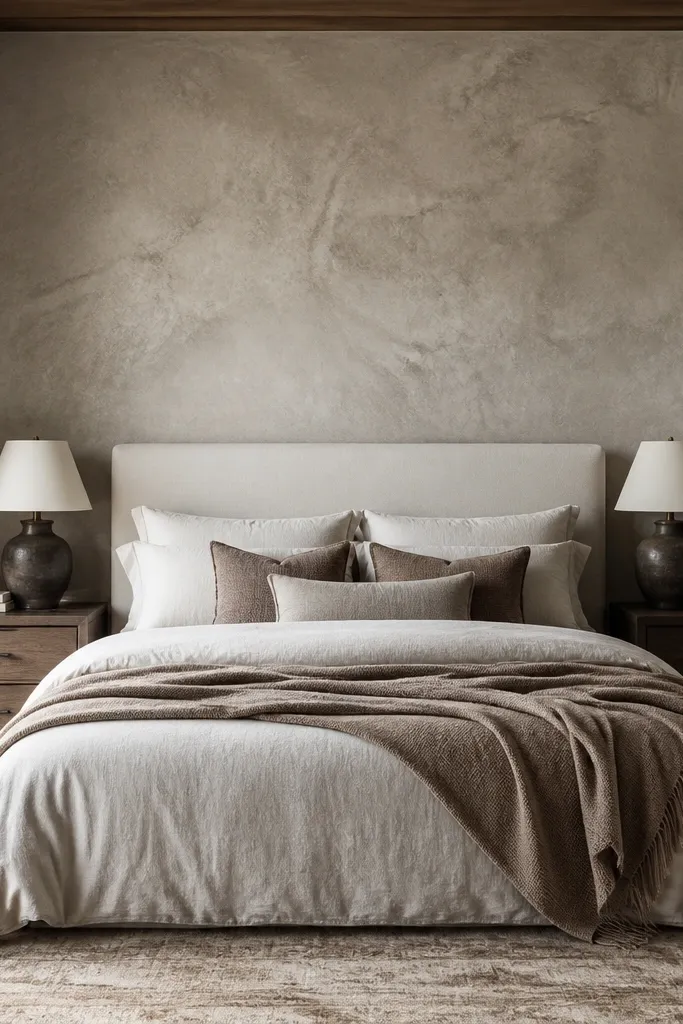
A textured accent wall makes the whole bedroom feel designed, and peel-and-stick panels are one of the best budget tools for it. Pick a warm stone or plaster tone in cream-beige, not gray — warm tones look cozier on camera. Keep the bed simple: solid duvet in oatmeal, a white pillow, and one throw in a heavier weave. Then repeat that warm stone tone in small ways: a lamp base, a wood tray, or a frame mat. This solves the couples problem where one person wants “design” and the other wants “calm,” because the texture adds interest without loud colors.
Measure the wall area behind the bed and choose panels that cover the space in straight lines without cutting too many small pieces. Clean the wall thoroughly, apply panels carefully starting from a level reference line, then press edges firmly. After the wall is up, install a centered art piece or use a headboard-led arrangement so the accent wall doesn’t feel like a random sticker job.
Try thisUse blackout or thick curtains after you install the panel so the texture stays visible in low light.
Common mistakeAvoid placing the bed too high against the wall if your wall texture has a pronounced direction; it can look misaligned.
6. Walnut-Frame Headboard Look With Crisp White Bedding
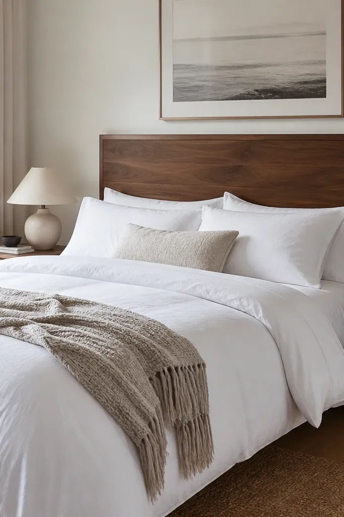
A walnut-toned headboard frame gives you a strong, masculine-leaning line and still works with soft bedding. Pair it with crisp white sheets and a duvet that has a subtle texture, like a cotton weave. Add two small wood trays on either nightstand to unify the look, plus lamps with warm beige shades. The warm wood anchors both partners because it’s a neutral material — it doesn’t force anyone’s personality, it just makes the room feel intentional. It’s especially good for couples who want a “grown-up” look without adding lots of decor clutter.
Choose a headboard or headboard cover in walnut tone, then keep bedding white and slightly layered: fitted sheet, duvet, and one throw at the foot. Place two wood trays at the same height on nightstands and use them to hold matching items like a candle and a small plant pot. Hang one large art piece above the bed with a white mat so it doesn’t compete with the headboard frame.
Try thisMatch the lamp base to the headboard tone, not to the floor color.
Common mistakeAvoid mixing walnut and espresso in the same line of sight (headboard + nightstands).
7. Olive Green Bedding With Black Metal Lamps
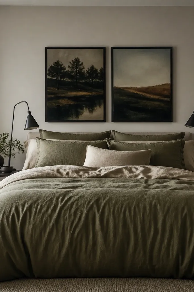
Olive bedding is a couples cheat code: it feels grounded but not heavy, and it works with both warm and cool personal styles. Pair it with black metal lamps so the room has sharp edges and clear contrast. Keep wall color warm white or light cream so olive stays rich instead of muddy. Add one small black element above the bed — a frame or a simple print — so the black doesn’t feel random. This look is photogenic because olive reads dimensional, and black metal creates clean silhouettes.
Pick an olive duvet with a matte finish and add a cream or ivory pillow layer. Choose black metal lamps with similar shade shapes and place them symmetrically. Hang one centered print with a black frame above the bed, then keep the rest of the decor minimal: one tray per side and one plant or candle total.
Try thisUse warm bulbs (2700K) so olive looks flattering instead of gray-green.
Common mistakeAvoid pairing olive with bright red accents; it turns the look into a theme instead of a palette.
8. Blush-Through-Beige Bedding With Two Matching Wall Sconces
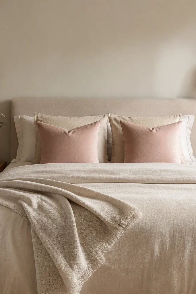
Wall sconces instantly solve the couples “nightstand mismatch” problem because both sides feel equal. Use matching sconces with linen-look shades so the light is soft, then keep bedding in beige with blush accents (think dusty rose, not hot pink). The room looks balanced because the lighting is symmetrical and the color story is narrow: beige base, blush highlight. It’s a great option if you have uneven nightstands or limited floor space.
Pick sconces that mount at the same height and use a shade size that matches on both sides. Install them at about 60 inches from the floor to the center of the fixture (adjust based on your bed height). Use a beige duvet, add two blush pillows, and keep the wall art above the bed centered so it doesn’t compete with the sconces.
Try thisChoose sconces with dimmers if you can; the bedding tones look better at low light.
Common mistakeAvoid placing sconces too high; the light should land around pillow height.
9. Budget Gallery Wall Above the Bed Using One Color Story
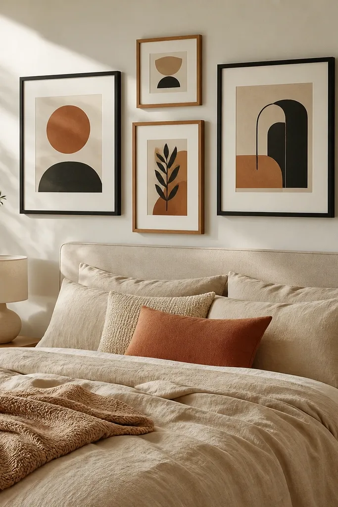
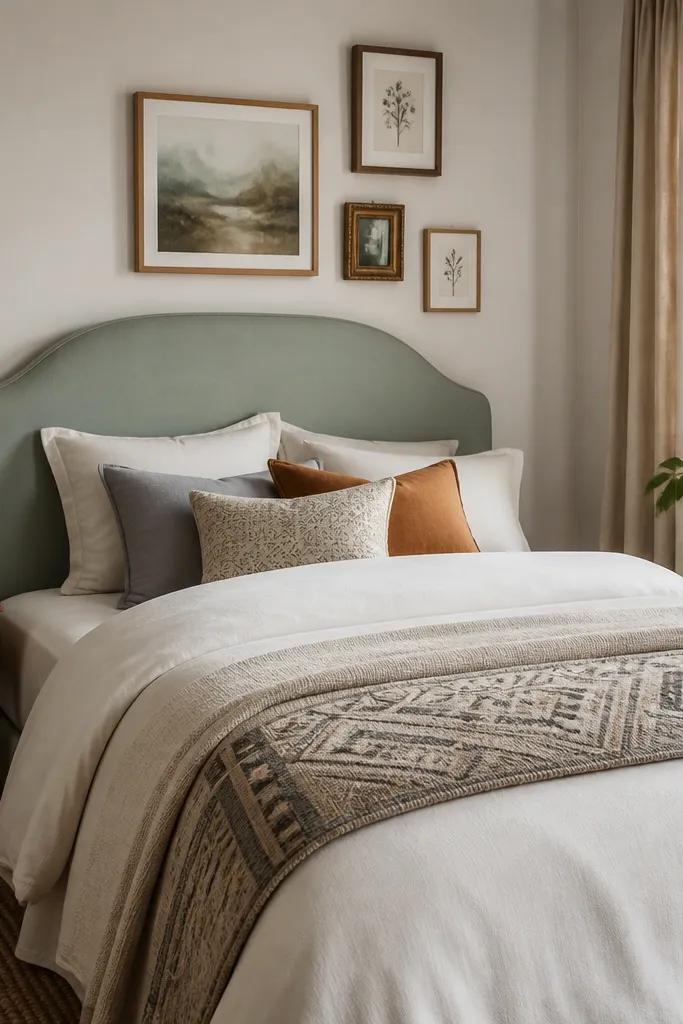
A gallery wall above the bed can look expensive when the frames share a palette. Use black and warm wood frames only, plus matting in cream. Choose prints that repeat the same two or three tones — like beige, black, and one muted color such as terracotta. For couples, this works because you can include both people’s tastes through different subjects while still keeping the color story unified. It’s also practical: you can build it piece by piece without buying one huge expensive print.
Lay your frames on the floor and arrange them into a rectangle that spans roughly 2/3 the width of the bed. Use painter’s tape on the wall to mark the outer edges, then hang the center piece first and work outward. Keep frame gaps consistent (about 2-3 inches between frames) and use cream mats if your prints look too busy.
If you have art anxiety, stick to one print style: either line drawings or minimalist photography.
Avoid mixing bright colors like neon yellow into a mostly neutral gallery wall.
10. Rattan + Linen Combo With Matching Basket Storage
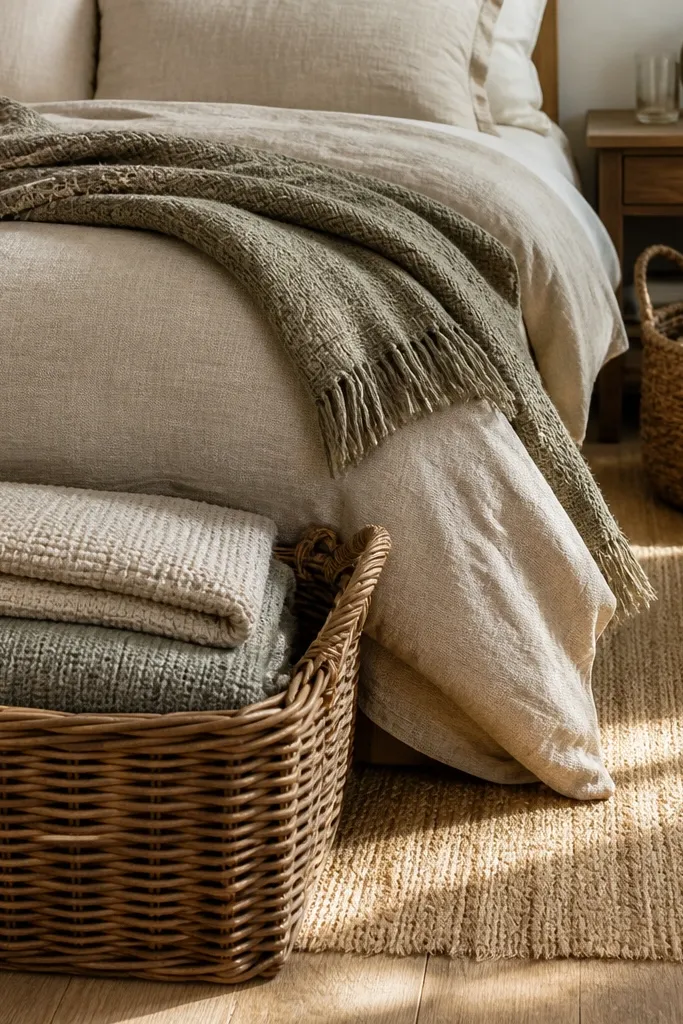
Rattan and linen is a visual shortcut to “relaxed, but put together.” Use a beige linen-look duvet, then add a woven throw and two matching rattan baskets at the foot of the bed or beside each nightstand. The baskets are functional and photogenic, and they give you a place to stash items that otherwise make a couples room look cluttered. Keep wall art simple and muted so the texture can do the heavy lifting. This setup is ideal if one partner’s stuff tends to pile up on the floor or on the chair.
Choose two identical baskets so the room reads symmetrical. Place them either at the foot (one on each side of center) or next to the bed so they don’t block circulation. Add a woven throw in a similar tone, then keep bedding color to beige and cream with texture variations only. Finish with a lamp shade that matches the linen tone so the textures feel intentional.
Try thisPick baskets with the same weave tightness; loose and tight weaves together look mismatched.
Common mistakeAvoid stacking baskets at random heights; keep them level.
11. Charcoal Bedding With Cream Sheer Layer Curtains
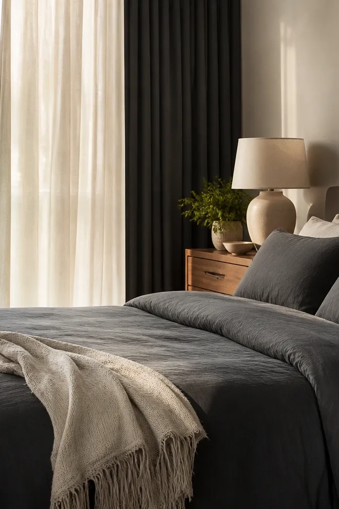
Charcoal bedding looks dramatic, but it can feel heavy unless you add a light layer. The trick is to pair charcoal with cream sheers plus a darker blackout behind them. In photos, the sheers soften the room and make the charcoal feel intentional instead of gloomy. For couples, this is a strong compromise: one person gets a darker, moodier look, and the other gets the bright softness from the sheer layer. It also makes morning light look better.
Hang sheers first on a rod above the window, then add blackout panels behind them on a second rod or the same system if your hardware allows layering. Use charcoal duvet bedding and add one cream throw at the foot. Keep wall art light-toned with charcoal accents so the wall doesn’t feel crowded.
Try thisChoose blackout panels with a matte surface; shiny black curtains look budget.
Common mistakeAvoid using only dark curtains — the room will feel closed in.
12. Two-Color Palette With Matching Quilt Sets and Simple Frames
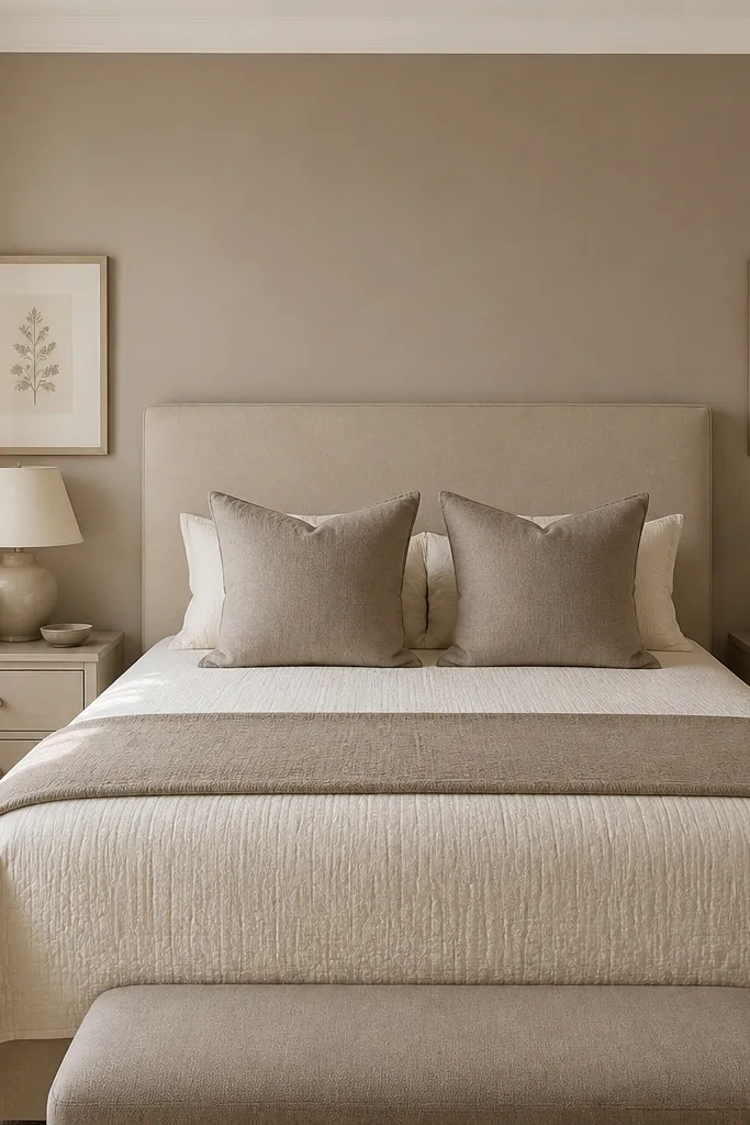
If you want a balanced space for two without guesswork, lock the room to two colors. A quilt or coverlet in two tones, like cream and taupe, instantly unifies everything: pillows, throw, and wall art can all stay within that palette. Add simple frames with the same mat color and frame finish on both sides of the bed. This look photographs clean because there’s no visual noise just a controlled palette and texture. It’s one of the simplest bedroom decor ideas budget setups that still reads designed.
Pick two colors you both tolerate — cream plus taupe, or warm white plus navy. Buy bedding that already contains those two colors in one piece, then choose pillows that repeat the palette without adding new colors. Hang one or two prints above the bed using frames in one finish, and keep the rest of the decor to neutral wood and metal.
Don’t add more than one accent color in the entire room; use it only in the art if you want a pop.
Avoid adding patterned rugs or curtains with a third dominant color when your bedding is already two-tone.
13. Oversized Wall Mirror Behind the Bed for Instant Light
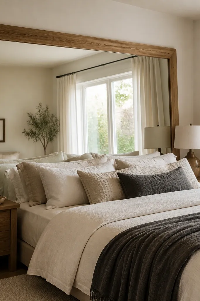
A large mirror can make a couples bedroom feel brighter and more expensive with almost no decor clutter. Place it on the wall opposite a window or where it catches daylight, and choose a frame finish that matches your lamp bases. Keep the bedding warm and textured so the mirror reflects softness instead of harsh glare. This works well for couples because it adds symmetry and visual balance — the reflection creates a “second” bed area visually. It solves the problem of small bedrooms that look crowded when two people share one narrow space.
Measure the wall behind or opposite the bed and choose a mirror that is at least the width of your headboard or about 1/2 to 2/3 the bed width. Hang it centered at eye level, then place two lamps that match in style and shade color. Keep wall art minimal since the mirror already adds visual interest.
Use a bulb with warm tint and avoid placing bright overhead lights that create mirror glare.
Avoid a mirror frame that clashes with your wood tone; pick one finish family.
14. Chunky Knit Throw Laddered Across the Foot and One Side
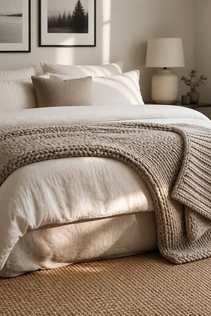
This is a styling move that makes budget bedding look layered and intentional. Use a chunky knit throw in oatmeal, cream, or sand and drape it at the foot of the bed, then add a smaller fold on one side to create a diagonal rhythm. Keep the rest of the bedding solid and matte so the knit texture is the star. The look is photogenic because chunky weave catches light in a way smooth blankets don’t. For couples, it works because it’s easy to adapt to one partner’s preference for cozy without forcing a new color theme.
Choose a throw that is thick enough to hold shape when folded, not thin jersey. Fold it into thirds and place it centered at the foot, then fold a second section and drape it slightly toward one nightstand. Add two matching pillows in a solid tone and one pillow with a subtle texture, then keep lamp shades neutral and matte.
If you have a patterned duvet, keep the throw solid and vice versa.
Avoid throwing a knit blanket in a messy pile; it should look placed, not dumped.
15. Matched Lamps + One Shared Tray Per Side
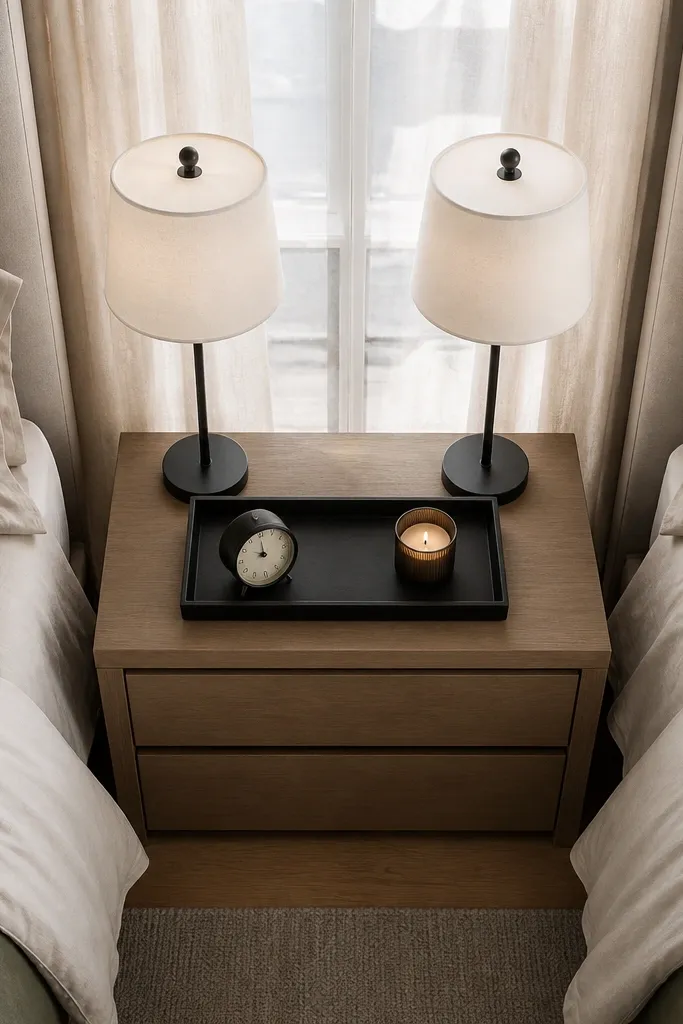
Couples bedrooms often look messy because each side accumulates random items. The fix is simple: matched lamps for equality, and one shared tray per nightstand for controlled clutter. Use the same tray material on both sides, like matte black metal or natural wood, and keep what goes on it limited to one functional item and one aesthetic item. Then keep the rest of the nightstand surface empty. This setup photographs as “balanced” because the visual weight is symmetrical and the surfaces look calm.
Set up two matching lamps first, so the height and shade size match within 2 inches. Place a tray on each nightstand and style each tray with the same category items: a candle or diffuser plus a small object like a book or tray-safe plant. If one partner needs a charging station, place the charger inside the tray so cables don’t show.
Try thisUse a tray lip height that hides cords; a low tray makes cables creep into the photo.
Common mistakeAvoid stacking multiple small decor pieces on the nightstand; it breaks the clean look.
16. Patterned Pillow Pairing With One Shared Duvet Color
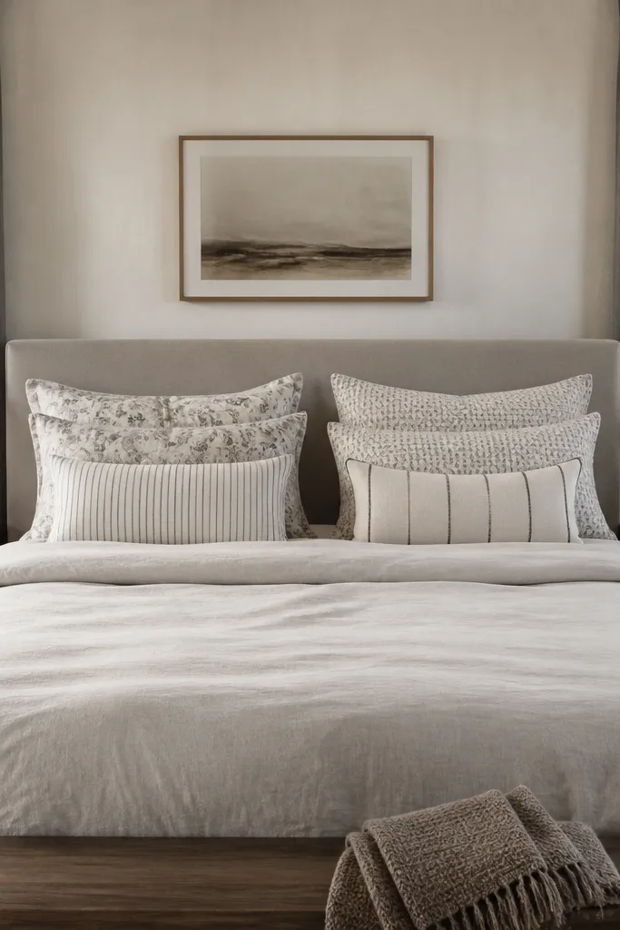
You can handle two different tastes without turning the bed into a patchwork by using one shared duvet color and letting patterns live only in the pillow layer. Pick a duvet in a solid warm white, cream, or greige, then choose two pillow covers per side that share the same base color. For example: one pillow is a subtle stripe, the other is a small-scale botanical, but both should use the same beige and charcoal tones. This creates visual interest where the eye expects it, and it keeps the room balanced because the bed is still a single, unified anchor.
Buy a solid duvet first, then select four pillow covers total: two for each side. Each side should have two covers that share at least one dominant color and one neutral base. Add a simple throw in the duvet’s neutral tone so the patterns don’t compete with each other. Finish with pillow arrangement: larger pillows in back, smaller in front, and keep the top edges aligned.
Try thisStick to pillow patterns that are the same scale family (both small-scale or both medium-scale).
Common mistakeAvoid mixing huge abstract prints with tiny micro patterns on the same bed.
17. Two-Plant Styling With Matching Ceramic Pots
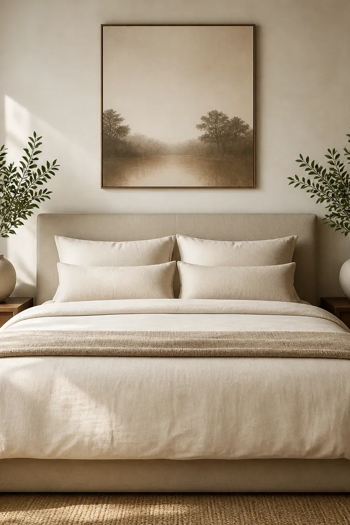
Plants make a bedroom feel lived-in, but couples rooms look better when the plant styling is symmetrical. Use two matching ceramic pots, one on each nightstand, with plants that have similar height and leaf spread. Choose a matte pot color that matches your frame finish — black, warm white, or terracotta. Keep the bedding and wall art neutral so the greens read fresh rather than busy. This solves the “one side feels empty” problem because both sides get the same living detail.
Pick pots first and match them exactly in color and size. Place a plant with similar height on each side so leaf tops land at about the same level. Style with a simple tray or small stones inside the pot to keep the soil from looking messy on camera. Keep other nightstand decor minimal so the plants stay the focal point.
Try thisWipe leaves with a damp cloth before photos; dust makes plants look dull.
Common mistakeAvoid mixing pot colors with different finishes like glossy on one side and matte on the other.
18. Budget Headboard Upgrade With Padded Backdrop Panel
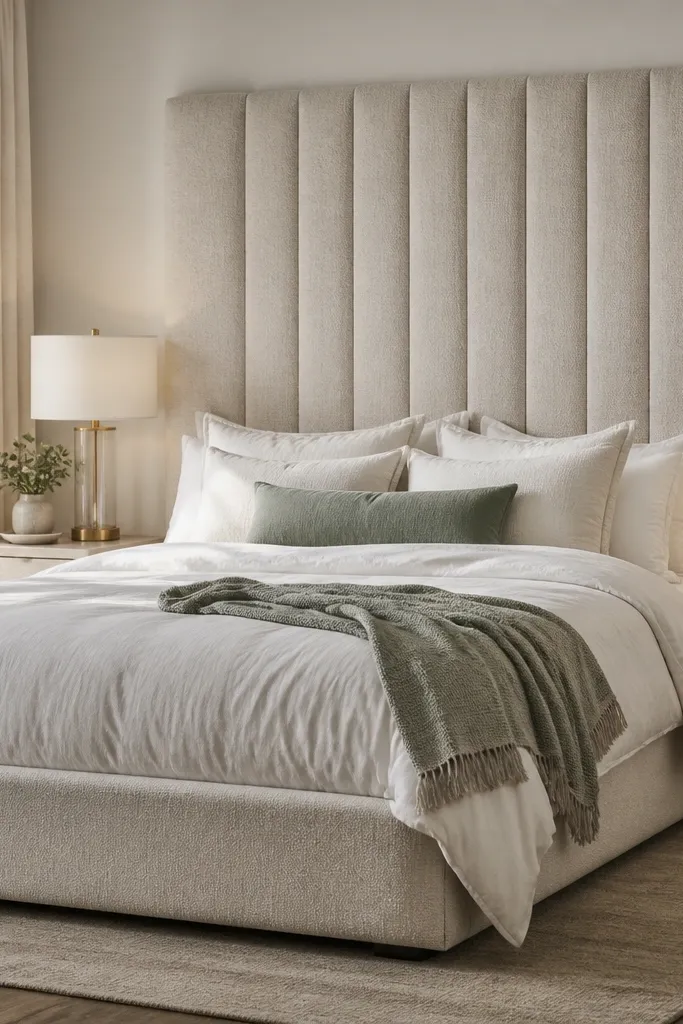
If your bed frame feels plain, a padded headboard panel changes the whole photo. Choose a neutral fabric like oatmeal boucle-look or light gray-beige that won’t show lint too easily. Pair it with bedding in warm white and one accent color that matches the headboard tone. Then keep nightstands simple with matched lamps so the headboard becomes the anchor. This is a strong couples solution because it gives both partners a “finished” back line behind the bed, even if you don’t buy new furniture.
Measure the width of your bed and choose a padded panel that spans at least the top width of the mattress. Attach the panel to the wall or frame using the manufacturer’s mounting method or wall studs for stability. Add bedding in warm white and place two pillows in matching sizes, one solid and one with subtle texture. Finish with symmetrical lamps and a centered art piece above or slightly behind the panel line.
Use a duvet with a visible weave so the headboard fabric and bedding texture play nicely together.
Avoid thin, slippery fabric panels; they look cheap and don’t photograph well.
19. Terracotta Accent Through Art + One Throw
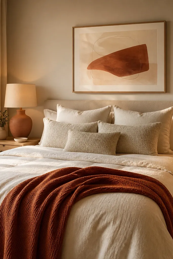
Terracotta is warm, romantic, and reads good on camera without being loud. Keep the bed mostly cream or oatmeal, then add one terracotta throw and a wall piece that includes terracotta. Choose art with a neutral background so it doesn’t add extra colors. For couples, this works because you get one warm accent that feels personal but still balanced when repeated in only two spots. It avoids the common mistake of mixing terracotta with too many other colors and losing the clean palette.
Pick a terracotta throw that matches the tone of your wall art. Place the throw at the foot, centered, and keep pillows in cream with one neutral textured option. Choose wall art above the bed that repeats terracotta and one neutral, then use a frame finish that matches your lamp bases. Keep curtains in oatmeal or warm white so the terracotta stays warm, not orange-hot.
Try thisUse terracotta in a matte fabric, not shiny, so it looks soft in photos.
Common mistakeAvoid bright orange terracotta with cream bedding; it can look like a craft project.
20. Nude Pink and Sand Tones With Black Picture Frames
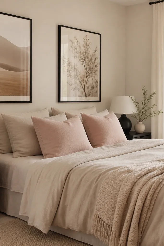
A nude pink and sand palette is flattering for couples because it adds softness without turning the room into a single-person style. Use sand bedding as the base, then add nude pink pillows in matte fabric cotton or woven. Bring in black only through frames and lamp bases to keep the look grounded. This combo photographs well because the warm neutrals glow and the black gives crisp structure. It solves the “one partner wants soft, the other wants modern” conflict by giving both: softness in textiles and modern edges in black hardware.
Choose a sand duvet cover and add two nude pink accent pillows symmetrically. Select black-framed art above the bed with a neutral background, then match lamp base color to the frame finish. Keep curtains in warm white or sand so they don’t add more color. Style a small black tray on each nightstand to unify the sides.
Pick pillow covers with a subtle weave so nude pink doesn’t look flat.
Avoid using multiple pink shades; one nude tone is enough.
21. Midnight Navy Accent Wall With White Bedding and Gold-Tone Details
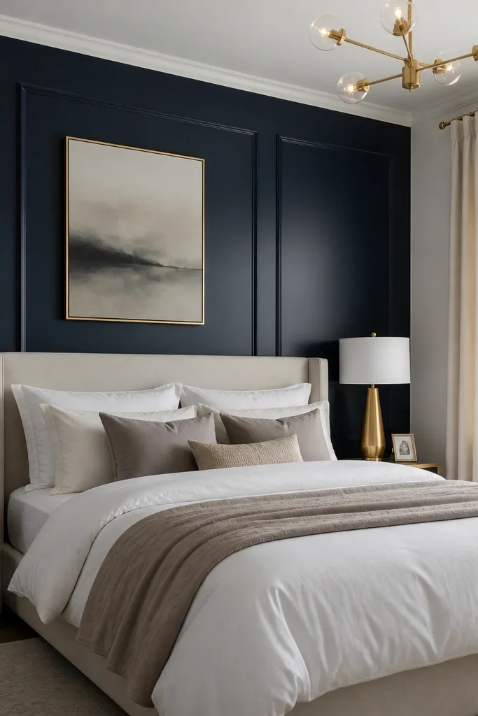
A midnight navy accent wall makes a couples bedroom feel designed without needing lots of decor. Keep bedding crisp white and add a warm gold detail through lamp bases or a metal frame so the navy doesn’t feel cold. The room stays balanced because the wall provides one strong statement, while the bed bedding stays calm and bright. In photos, the navy wall creates depth and makes your bedding look cleaner. This works best when you want a dramatic look but still want a budget-friendly path because paint is cheaper than replacing furniture.
Tape and prep the wall behind the bed, then roll midnight navy paint in two coats with a matte or eggshell finish. Let it cure fully before moving furniture back. Use white bedding and add one warm gold accent through lamp bases or a single gold frame above the bed. Keep other decor neutral and avoid extra patterns so the wall remains the focal point.
Try thisUse warm bulbs and keep bedding matte; shiny white against navy can look harsh.
Common mistakeAvoid accent walls in gray-blue if your room has warm wood floors; it can turn the navy dull.