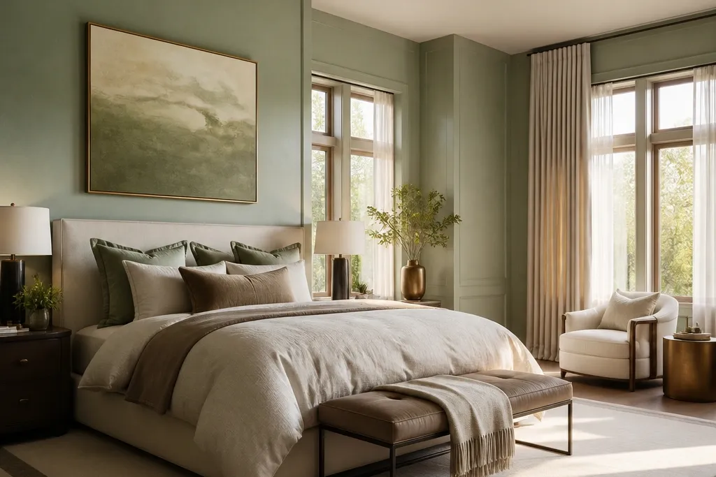
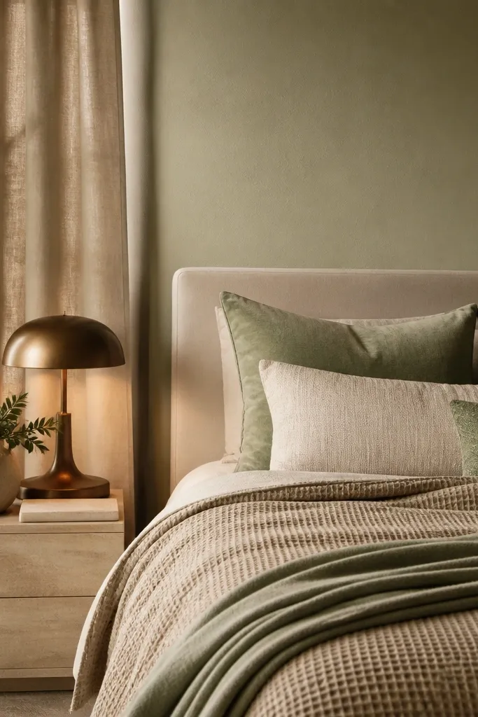
1. Matte Warm Sage Walls with Linen-Texture Duvet
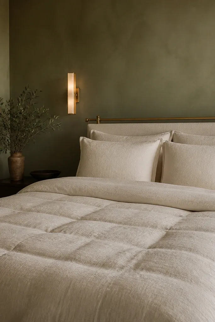
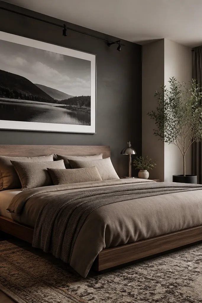
Start with the wall color because sage decides the whole mood. Go for a matte finish so the green looks like pigment in plaster, not paint sheen. Pair it with a duvet that has real linen texture (slubbed cotton or linen blend) in off-white or warm cream, not bright optical white. This combination keeps the sage from looking flat while still feeling quiet and expensive. It also solves the common problem where sage walls turn gray in the evening matte paint plus warm bedding stops that shift.
First, paint the walls in a warm-gray sage and use a matte or eggshell-matte sheen. Test a sample board in daylight and at night with your planned bulbs, then commit. Next, style the bed with an off-white linen duvet, add two textured pillow shams, and finish with a throw in warm taupe. Keep the bed skirt minimal or tailored — a crisp edge reads higher-end than a ruffled one.
If you want it to look designer, add one subtle pattern only in the pillows (small tonal weave) and keep the duvet plain.
Don’t use glossy sage paint — it makes the color look cheap under warm lighting.
2. Tall Upholstered Headboard in Oat Boucle with Bronze Sconces
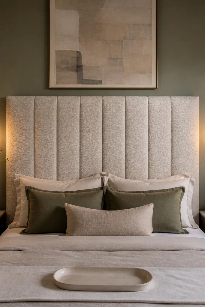
A headboard is where luxury is won or lost. Choose a tall upholstered headboard in oat bouclé or a boucle-adjacent fabric so it catches light softly without looking shiny. The oat tone plays perfectly with soft sage walls because it reads creamy, not stark. Then add bronze or champagne-brass sconces with warm bulbs so the texture shows at night. This setup fixes two issues at once: the bed looks like furniture, and the room stops feeling empty above the mattress.
Start by measuring from the floor to where you want the headboard to land; aim for it to sit about 10-14 inches above the top of the mattress. Install the sconces so the light hits the wall behind the bed, keeping the shade height aligned with your pillow height. Use warm bulbs around 2700K and place the sconces roughly 24-30 inches apart centered over the bed. Finish with a headboard that has a clean edge and double-check it’s centered before you mount anything.
Pick sconces with a fabric or frosted glass shade to keep the light soft against sage.
Don’t hang sconces too high — if they aim at your forehead, the room feels harsh.
3. Floor-to-Ceiling Sheer-Layer Drapes in Sage Tinted Oat
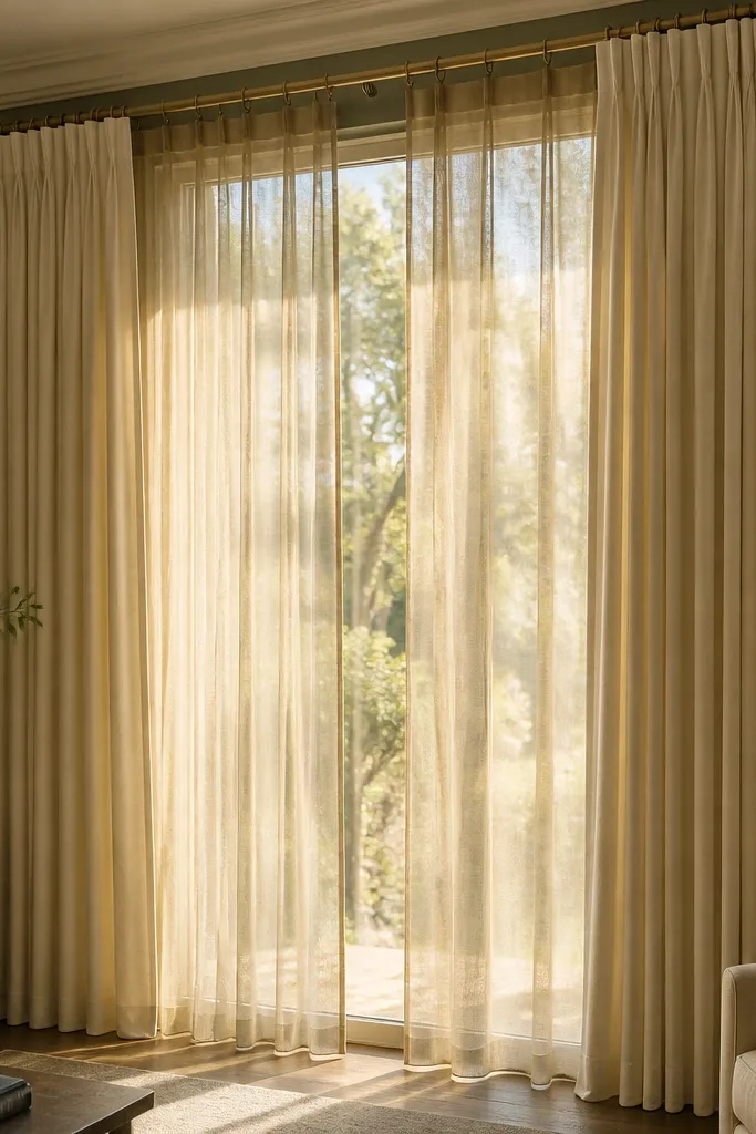
Window treatment is the fastest way to make sage feel luxury because it adds height and weight. Use a two-layer system: a sheer panel for diffusion and a heavier drape for structure. Choose a sage-tinted oat or warm cream for the main drape so it harmonizes with the walls without going matchy-matchy. The sheers should look airy, while the heavier layer should fall in smooth folds. This solves the “pretty but unfinished” look where bare windows make even expensive bedding feel temporary.
Try thisUse rings or back tabs in the same metal as your bed hardware for a more intentional look.
Install a ceiling or high-wall curtain rod so the top of the drapes sits 4-6 inches above the window frame. Hang sheers first, then layer the heavier panels so they overlap slightly at the center. For a luxury fold, use panels that are 1.5 to 2 times the window width and choose a fabric with enough weight to hold shape. Hem to the floor so the drapes just kiss the surface — avoid puddling.
Common mistakeDon’t use thin, flat drapes — they collapse and kill the “tailored” effect.
4. Oversized Cream Rug with Warm Taupe Border
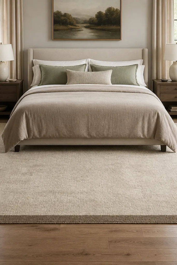
A rug makes sage look expensive when it anchors the room instead of floating under the bed. Choose a larger size than you think you need: enough that at least the front legs of the bed sit on the rug. Go for a cream field with a warm taupe border or subtle tonal pattern so it looks clean, not busy. Natural-fiber looks like wool or wool-blend with a low pile height help the room feel grounded. This fixes the common problem where small rugs make bedrooms feel cramped and staged.
Try thisAdd a thin rug pad so the pile sits crisp — saggy rugs look cheaper instantly.
Measure your bed width and pick a rug size so the front legs land fully on the rug. If the bed is 60 inches wide, aim for a rug around 80x90 inches or larger, depending on room flow. Choose a rug with a low-to-medium pile so it doesn’t fight the drapes and keep the palette warm. Place rug so it’s centered under the bed, then align the border lines with the room’s main axis.
Common mistakeDon’t pick a tiny patterned rug with bright white — the contrast looks harsh with sage.
5. Sandstone Nightstands with Hidden Drawers and Champagne Hardware
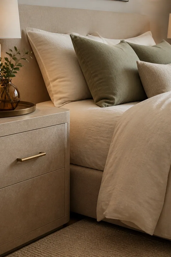
Nightstands are where luxury becomes obvious up close. Choose a finish that looks like stone or soft matte lacquer in a warm sandstone tone, not glossy “oak” or high-contrast wood. Hidden drawers keep the lines clean, and champagne hardware ties the set together with your lighting and mirrors. The drawers should close with weight and align perfectly wobbly hardware reads bargain. This idea solves the look where the bed is dressed nicely but the sides look temporary.
Try thisUse a slim tray in warm gray or stone texture to collect charger cords and keep the surface clean.
Match your nightstand height to your mattress height so the top aligns with where your hands rest while sitting up. Leave 2-3 inches of space between the bed and each nightstand for a comfortable walk-by. Pick hardware in champagne-brass and keep it consistent across sconces, mirror frames, and dresser pulls. Place a tray on top only if it’s used — otherwise, keep surfaces clear with one lamp and one small object.
Common mistakeDon’t mix three metal finishes — it makes the room feel assembled instead of finished.
6. Warm Taupe Textured Bedding with Sage Accent Pillows
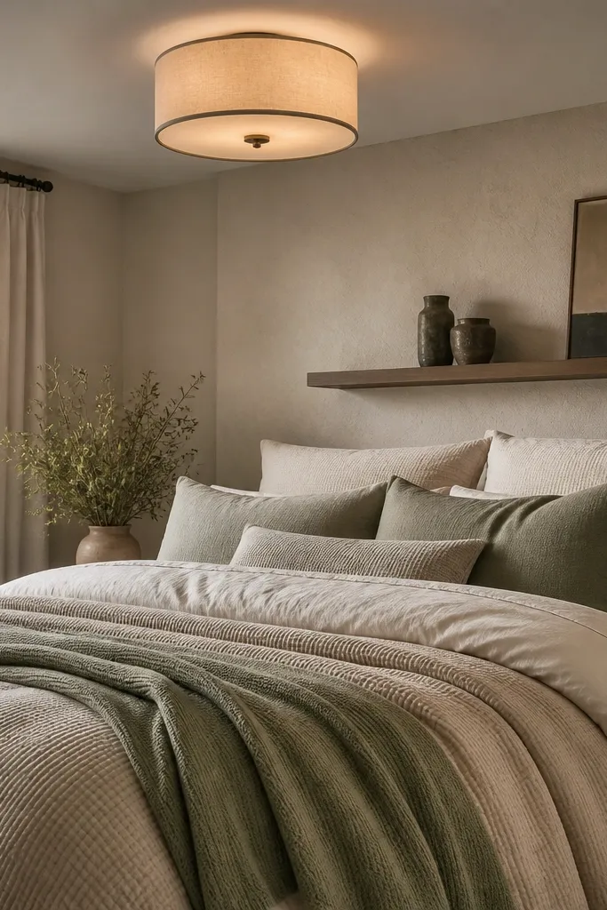
If sage is your hero, you still need a base that reads warm and tactile. Build the bed in warm taupe and cream, then add sage only in smaller doses through pillows or a throw. Use textured bedding like a waffle coverlet, a cotton knit throw, or a duvet with subtle channeling so the bed has shape. This makes the sage feel intentional rather than like a single-color paint job. It also fixes the problem of sage bedding looking flat texture does the heavy lifting.
Start with a duvet cover in warm taupe or oatmeal, then layer a second texture like a knit throw at the foot. Add 2 larger pillows in cream and 2 accent pillows in sage, keeping the sage tone slightly muted. Finish with one pillow in a tonal weave that includes a hint of gray-beige to connect to your walls. Keep the bed’s color spread controlled — sage should be about 15-25% of the bed’s visual area.
Choose pillow fabrics that differ from the duvet — linen with knit or woven with boucle reads more expensive.
Don’t use all-sage bedding in one shade — it turns into a monochrome blur under warm bulbs.
7. Sage + Walnut Gallery Wall with Slim Black Frames
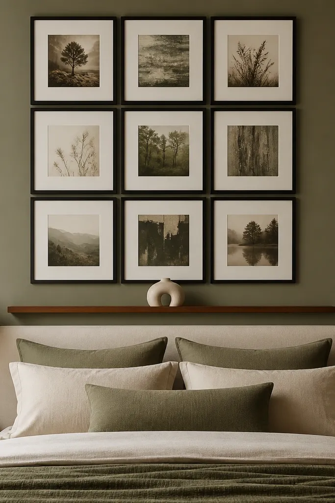
You can make sage luxury without adding more color by using contrast and framing discipline. Put art or prints above the bed in a tight grid using slim black frames or dark espresso frames. Add a narrow walnut ledge or one small floating shelf to hold one sculptural object, not five small things. The warm walnut counters the coolness in sage, and the thin frames keep the look crisp rather than heavy. This solves the “empty wall” problem that makes even a perfect bed feel unfinished.
Pick a frame finish first: slim black or dark espresso, then match it across every piece. Measure the space above the bed and aim for the art to span about 60-70% of the bed width. Lay everything on the floor, then dry-fit with painter’s tape before you drill. Anchor the layout so the center aligns with the bed center, and keep the shelf depth under 5 inches for a light look.
Use matte paper or textured prints — glossy art reflects harsh light and kills the calm vibe.
Don’t mix thick frames and thin frames in the same cluster — it looks random.
8. Matte Black Ceiling Flush Light with Linen Shade
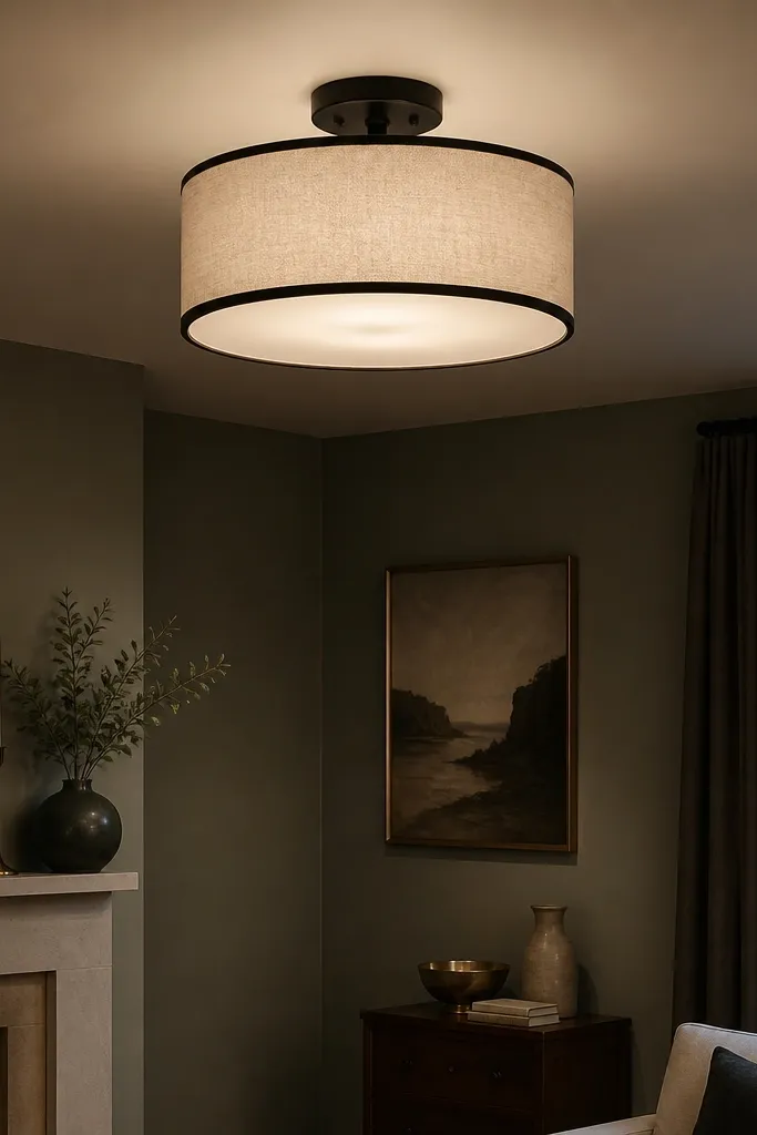
Lighting is where luxury either shows up or falls apart. Sage looks best under warm, diffused light, and the easiest way to achieve that is a flush or semi-flush fixture with a linen shade. Matte black hardware gives you a grounded contrast, while the shade spreads light evenly so the walls look smooth. Add it as your base layer, then rely on sconces or a table lamp for detail lighting. This approach solves the common issue where sage walls look patchy because overhead light is too directional.
Try thisUse a dimmer luxury lighting is mostly controlled brightness, not maximum brightness.
Choose a fixture with a shade material like linen, fabric, or a diffuser glass that softens glare. Mount it so the bottom of the shade sits around 7-9 feet from the floor in most bedrooms, then adjust for ceiling height. Use 2700K bulbs and check the brightness: aim for a warm dimmable LED, then set the dimmer if your wiring allows. If you already have ceiling wiring, install the fixture first before you buy matching lamps.
Common mistakeDon’t use a bare bulb or glossy drum shade — it creates hotspots on sage walls.